The three stock navigation models aren't all or nothing. You can blend them together in the same app, using one model to organize the app's primary features and the others to move around secondary screens for subnavigation. Rather than creating a hideous frankenapp, this kind of navigation mashup can help overcome the shortcomings of individual navigation methods, particularly for apps with lots of content or features to explore. An especially common design pattern uses tab-bar navigation to organize the app's primary features but adds tree-structure navigation to one or more individual tabs. The Gowalla app, for example, uses tabs to organize its four primary app categories, with three of those tabs presenting standard table-view lists of options on their main screens. Within each tab, you drill down through a tree structure to find the information you want for that particular category.
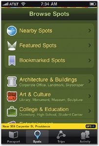
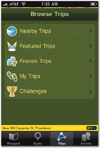
Figure 4-14. Gowalla uses tab-bar navigation for moving among its primary features but offers list-based tree navigation from three of those main screens as subnavigation. Here, the top-level Spots and Trips screens let you browse local places and scavenger hunts. Tap a category to drill down into the app's collection of content.
This approach files the sharp edges off a tree structure's big drawback, the inability to hop easily from one primary feature category to another. By lodging your app's main features in a tab bar, people don't have to climb all the way back to the app's surface to switch features; just tap the feature on the tab bar instead. If you go this route, your app can and should remember the state of affairs for each tab as users move around the tab bar. In developer lingo, this is called restoring state, and the principle is simple: when someone leaves one of your app's "rooms," don't redecorate while they're away. Returning to a tab should restore its screen to the same tree-structure position, or search results, or detail view, or whatever they were last looking at. Whatever you do, don't dump them at the top of the tab's tree structure and make them drill their way down to find their place again. This keep-my-place politesse is important throughout the iPhone experience, and it's a topic you'll revisit in Chapter 7 (page 226).
Gowalla also shows how flat-page navigation can likewise be embedded inside an app at a secondary level. The app's Passport screen shows your collected icons, and tapping one reveals its details and history, letting you flip through your collection as a set of flat-page cards by swiping left and right. The effect is like firing up a separate mini-app inside Gowalla. The view slides up from the bottom, covering the previous screen, including the app's tab bar, so that the screen is dedicated entirely to browsing your collection. When you're finished browsing your treasures, tap Done to dispatch the items and return to the main Passport view.
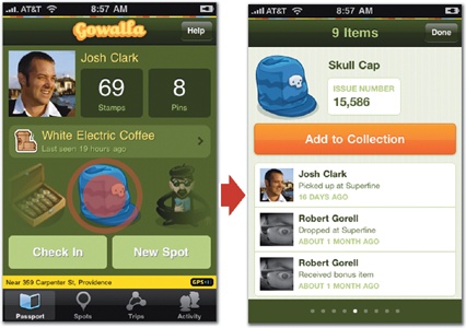
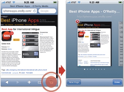
Figure 4-15. Both Gowalla and Safari put flat pages to work for secondary navigation inside the app. In Gowalla (top), tapping an item on the Passport screen conjures a slideshow-style view for flipping through your icon collection. In Safari (bottom), tapping the toolbar's window button lets you flip through the various pages you have open.
This deck-of-cards display is well-suited to layouts with few or no buttons or controls, so using flat pages for just a portion of an app's content works best inside a dedicated view like those used by Gowalla and Safari. Extra controls tend to fight the card-flipping metaphor and muddy otherwise simple navigation from screen to screen. Better to let flat-page views temporarily take over the full screen while users swipe through the cards, save for any controls you need to dismiss the screen. (While Safari keeps its toolbar when you're flipping through open pages, for example, the app's typical icons are replaced by New Page and Done buttons.)
This treatment, where a screen temporarily takes over the entire app's display, is called a modal view, a brief detour from the app's normal operation. The important role of modal views is worth a detour of its own.