The design of individual list items is important, but only if you can actually find the items you're looking for. Flicking through enormous lists can be frustrating for both thumb and eye. Categorizing the list can be a big help, providing visual landmarks to help locate content. The table view provides two methods of adding headings to a list: indexed lists and grouped lists.
An indexed list embeds headings directly into the flow of the list as bold strips introducing each new category. As you scroll through the list, these headings "stick" to the top of the screen while their subitems scroll past, ensuring that you can always see what category you're in. Indexed lists are ideal for very long lists with many category headings. A big list of US cities might be organized by headings for each of the 50 states, for example, or countries by continent. You can optionally display these headings along the right side of the screen as a tappable table of contents, the index. Tap an item in the index and you leap straight to its corresponding heading in the list. This is a huge time-saver for long lists. Do your users' thumbs a favor and consider an index for lists that spill into more than two screenfuls of items.
A Contacts-style alphabetical index is by far the most popular use for this style of list exploration, with an A–Z index letting you skip through an alphabetized list. The index doesn't have to hew to the alphabet, though; you can use any headings you like. State abbreviations, airport codes, whatever. If you plan to use this right-edge index, though, it's best to keep your headings short and sweet so that they don't jut too far into your cells. Even when they're single-character A–Z headings, though, the index already takes up a precious slot; when you display the index, you don't have room for right-side icons or controls, and you should leave them out of your table cells. The index should always have sole occupancy of the cell's right side.
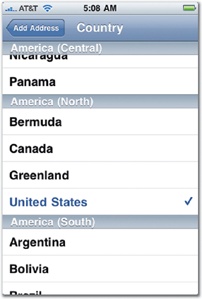
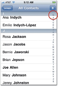
Figure 5-17. The Contacts app uses indexed lists to select a country when adding a new contact address (left). When you scroll the list, the continent headings stay glued to the top until all of their subitems have rolled off the screen. When browsing contacts (right), the app adds an index to the right edge, and you can tap a letter to jump to that section of your Rolodex (or tap the magnifying glass at the top of the index, circled here, to jump to the search bar at the top of the list).
Grouped lists (shown in Table View Editing Tools) are simpler than indexed lists, and they're designed for relatively smaller collections of items, ideal for displaying settings, feature menus, or distinct groups of content. Grouped lists visually cluster the table view list into blocks, an archipelago of list islands sprinkling down the screen. Unlike plain lists, grouped lists are inset from the edge of the screen with a rounded border. Because each group is separated by a physical gap along with an optional headline, the visual distinction between groups is much stronger in a grouped list than an indexed list. Although you can further subdivide each group into headings just like an indexed list, grouped lists can't display those headings along the right edge like an indexed list can. That means a grouped list offers no single-tap navigation shortcut for skimming its headings, another reason grouped lists aren't as well-suited to very long collections as their indexed cousins.
In addition to adding a headline, or header, to each cluster of a grouped list, you can also add a footer—small text that appears immediately below the group. Footer text is useful for explanatory text or fine-print caveats about the info or controls above. You can also add a header or footer to the overall table, not just individual groups, and you can do that for plain and indexed lists, too. It's worth noting that headers don't have to be traditional descriptive headlines. The Phone app, for example, displays your phone number as the header introducing its Contacts table view, a convenient but non-obtrusive place to tuck a reminder in case you forget.
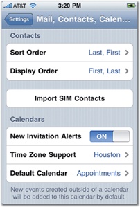
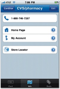
Figure 5-18. Grouped lists subdivide a table view into islands of sublists. Each of these groups can optionally display a header or footer, like the table view in the Settings app at left, or you can leave them completely unlabeled, like the table view in the CardStar app at right. If a group includes just one item, it looks like a wide button, a useful effect that can replace the need for a regular rectangle button (page 172).