Quick Insight features are enabled in Power BI Desktop by default, allowing users to right-click data points in visuals and execute the relevant analysis. In the following example, the user has right-clicked the data point for 2017-Apr, and as a result, an option to explain the decrease is exposed in the Analyze menu:

Clicking Explain the decrease executes machine learning algorithms against the dataset and populates a window with visuals representing the insights retrieved. The user can scroll vertically to view the different insights obtained such as the Customer Gender column accounting for a majority of the decrease, or Product Name XYZ, which had the largest decrease among all products.
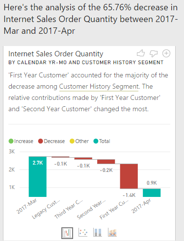
By default, a waterfall visual is used to display each insight, but other visuals such as the scatter chart and the 100 percent stacked column chart are available too. In the following example, the user has scrolled to an insight based on the Customer History Segment column and views the data as a waterfall chart:
Clicking the plus sign at the top right corner of the text box explaining the insight adds the visual to the report page. Adding the visual to the report page automatically populates the associated field wells and visual level filters as though the visual was created manually. If necessary, the report author can apply further formatting to align the visual with the design and layout of the page.
Additionally, there are several limitations on the kinds of measures and filters supported. For example, measures which use the DISTINCTCOUNT() and SUMX() functions are not supported, and measures containing conditional logic (for example, IF()) cannot be either.