Key Performance Indicators (KPIs) are often prominently featured in Power BI dashboards and in the top left area of Power BI report pages, given their ability to quickly convey important insights. Unlike card and gauge visuals which only display a single metric or a single metric relative to a target respectively, KPI visuals support trend, variance, and conditional formatting logic. For example, without analyzing any other visuals, a user could be drawn to a red KPI indicator symbol and immediately understand the significance of a variance to a target value as well as the recent performance of the KPI metric. For some users, particularly executives and senior managers, a few KPI visuals may represent their only exposure to an overall Power BI solution, and this experience will largely define their impression of Power BI's capabilities and the Power BI project.
Given their power and important use cases, report authors should become familiar with both the standard KPI visual and the most robust custom KPI visuals such as the Power KPI Matrix, the Dual KPI, and the Power KPI. Each of these three visuals have been developed by Microsoft and provide additional options for displaying more data and customizing the formatting and layout.
One significant limitation of custom KPI visuals is that data alerts cannot be configured on the dashboard tiles reflecting these visuals in the Power BI service. Data alerts are currently exclusive to the standard card, gauge, and KPI visuals.
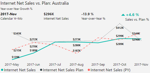
In the following Power KPI visual, Internet Net Sales is compared to Plan, and the prior year Internet Net Sales and Year-over-Year Growth percent metrics are included to support the context:
The Power KPI provides many options for report authors to include additional data and to customize the formatting logic and layout. Perhaps its best feature, however, is the Auto Scale property, which is enabled by default under the Layout formatting card. Similar to the responsive visuals feature described in the Mobile optimized reports section of the previous Chapter 11, Creating and Formatting Power BI Reports, Auto Scale causes the visual to make intelligent decisions about which elements to display given the available space.
For example, in the following image, the Power KPI visual has been pinned to a Power BI dashboard and resized to the smallest tile size possible:
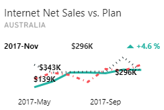
As per the preceding dashboard tile, the less critical data elements such as July through August and the year-over- year % metric were removed. This auto scaling preserved space for the KPI symbol, the axis value (2017-Nov), and the actual value ($296K). With Auto Scale, a large Power KPI custom visual can be used to provide granular details in a report and then re-used in a more compact format as a tile in a Power BI dashboard.
Another advantage of the Power KPI is that minimal customization of the data model is required. The following image displays the dimension column and measures of the data model mapped to the field inputs of the aforementioned Power KPI visual:
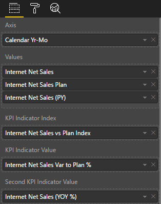
As described in previous chapters, the Sales and Margin Plan data is available at the monthly grain and thus the Calendar Yr-Mo column is used as the Axis input. In other scenarios, a Date column would be used for the Axis input provided that the actual and target measures both support this grain.
The order of the measures used in the Values field input is interpreted by the visual as the actual value, the target value, and the secondary value.
In this example, Internet Net Sales is the first or top measure in the Values field and thus is used as the actual value (for example, $296K for November). A secondary value as the third measure in the Values input (Internet Net Sales (PY)) is not required if the intent is to only display the actual value versus its target.
The KPI Indicator Value and Second KPI Indicator Value fields are also optional. If left blank, the Power KPI visual will automatically calculate these two values as the percentage difference between the actual value and the target value, and the actual value and the secondary value respectively. In this example, these two calculations are already included as measures in the data model and thus applying the Internet Net Sales Var to Plan % and Internet Net Sales (YOY %) measures to these fields further clarifies how the visual is being used.
The only customization required is the KPI Indicator Index field. The result of the expression used for this field must correspond to one of five whole numbers (1-5) and thus one of the five available KPI Indicators. In the following example, the KPI Indicators KPI 1 and KPI 2 have been customized to display a green caret up icon and a red caret down icon respectively:

Many different KPI Indicator symbols are available including up and down arrows, flags, stars, and exclamation marks. These different symbols can be formatted and then displayed dynamically based on the KPI Indicator Index field expression. In this example, a KPI index measure was created to return the value 1 or 2 based on the positive or negative value of the Internet Net Sales Var to Plan % measure respectively:
Internet Net Sales vs Plan Index = IF([Internet Net Sales Var to Plan %] > 0,1,2)
Given the positive 4.6 percent variance for November of 2017, the value 1 is returned by the index expression and the green caret up symbol for KPI 1 is displayed. With five available KPI Indicators and their associated symbols, it's possible to embed much more elaborate logic such as five index conditions (for example, poor, below average, average, above average, good) and five corresponding KPI indicators.