
Please note files for the “Hands-On” project may be found on the companion CD-ROM.
| Chapter 19 | CONTEXT MENU PROGRAMMING AND RIBBON CUSTOMIZATIONS |
Users have come to expect easy ways to select commands and options in any Windows application. Therefore, after you have written VBA procedures that provide solutions to specific worksheet automation dilemmas, you should spend additional time adding features that will make your application quick and easy to use. The most desired features of the user interface (UI) in Excel are customizations of the context menus and the Ribbon. While it is easy for users to get quick access to a specific command by placing it in the Quick Access toolbar located to the right of the Microsoft Office Menu button, your application’s tools will need to appear either on the Ribbon or in a context menu. This chapter teaches you how to work with the context menus and the Fluent Ribbon interface programmatically.
A context (also referred to as shortcut) menu appears when you right-click on an object in the Microsoft Excel application window. You can customize built-in context menus by using the CommandBar object or by applying Ribbon customizations as demonstrated later in this chapter. This section focuses on using the CommandBar object’s properties and method to create, modify, or disable context menus depending on your application’s needs.
Each object in the CommandBars collection is called CommandBar. The term CommandBar is used to refer to a context menu only. This object comes with a special Type property that can be used to return the specific type of the command bar (see Table 19.1).
TABLE 19.1. Types of CommandBar objects in the CommandBars collection |
||
Type of Object |
Index |
Constant |
Toolbar |
0 |
msoBarTypeNormal |
Menu Bar |
1 |
msoBarTypeMenuBar |
Context/Shortcut Menu |
2 |
msoBarTypePopup |
NOTE |
In versions of Excel prior to 2007, the CommandBar object was used to programmatically work with menu bars and toolbars. Since the introduction of the Ribbon interface, the CommandBar object can only be used with context menus. Later on in this chapter you will learn how to programmatically customize the RibbonX (Ribbon extensibility) model, which replaced the menus and toolbars found in Excel 2003 and earlier. |
Microsoft Excel offers 67 context menus with different sets of frequently used menu options. Using VBA, you can return the exact number of the context menus, as well as their names. Let’s write a VBA procedure that returns the names of the context menus to the Immediate window.
|
Please note files for the “Hands-On” project may be found on the companion CD-ROM. |
|
1. Create a new workbook and save it as C:\VBAExcel2016_ByExample\Chap19_VBAExcel2016.xlsm.
2. Switch to the Visual Basic Editor screen and insert a new module into VBAProject (Chap19_VBAExcel2016.xlsm).
3. Use the Properties window to rename the module ContextMenus.
4. In the ContextMenus Code window, enter the ContextMenus procedure as shown below:
Sub ContextMenus()
Dim myBar As CommandBar
Dim counter As Integer
For Each myBar In CommandBars
If myBar.Type = msoBarTypePopup Then
counter = counter + 1
Debug.Print counter & ": " & myBar.Name
End If
Next
End Sub
Notice the use of the msoBarTypePopup constant to identify the context menu in the collection of CommandBars.
5. Run the ContextMenus procedure.
The result of this procedure is a list of context menus printed to the Immediate window.
Now that you know the exact names of Excel’s context menus, you can easily add other frequently used commands to any of these menus. Let’s find out how you can add the Insert Picture command to the context menu activated when you right-click a worksheet cell.
|
1. In the ContextMenus Code window that you created in the previous Hands-On, enter the following procedures:
Sub AddToCellMenu()
With Application.CommandBars("Cell")
.Reset
.Controls.Add(Type:=msoControlButton, Before:=2).Caption = "Insert Picture…"
.Controls("Insert Picture…").OnAction = "InsertPicture"
End With
End Sub
Sub InsertPicture()
CommandBars.ExecuteMso ("PictureInsertFromFile")
End Sub
The Reset method of the CommandBar object used in the AddToCellMenu procedure prevents placing the same option in the context menu again when you run the procedure more than once.
To add a built-in or custom control to a context menu, use the Add method with the following syntax:
CommandBar.Controls.Add(Type, Id, Parameter, Before, Temporary)
CommandBar is the object to which you want to add a control. Type is a constant that determines the type of custom control you want to add. You may select one of the following types:
|
1 |
|
10 |
|
2 |
|
3 |
|
4 |
Id is an integer that specifies the number of the built-in control you want to add. Parameter is used to send information to a Visual Basic procedure or to store information about the control.
The Before argument is the index number of the control before which the new control will be added. If omitted, Visual Basic adds the control at the end of the specified command bar.
The Temporary argument is a logical value (True or False) that determines when the control will be deleted. When you set this argument to True, the control will be automatically deleted when the Excel application is closed.
CommandBar controls have a number of properties that help you specify the appearance and functionality of a control. For example, the Caption property specifies the text displayed for the control. In the above procedure, you will see the “Insert Picture…” entry in the cell context menu. Note that it is customary to add an ellipsis (…) at the end of the menu option’s text to indicate that the option will trigger a dialog box in which the user will need to make more selections. The OnAction property specifies the name of a VBA procedure that will execute when the menu option is selected. In this example, upon selecting the Insert Picture… option, the InsertPicture procedure will be called. This procedure uses the ExecuteMso method of the CommandBar object to execute the Ribbon’s PictureInsertFromFile command.
2. Run the AddToCellMenu procedure.
3. Switch to the Microsoft Excel application window, right-click any cell in a worksheet, and select the Insert Picture… command (see Figure 19.1).

FIGURE 19.1. The built-in cell context menu displays a new item (Insert Picture…) that was added by a VBA procedure.
Excel displays the Insert Picture dialog box from which you can insert a picture from a file. The same dialog box is displayed when you click the Pictures button on the Ribbon’s Insert tab.
NOTE |
Custom menu items added to Excel context menus are available in all open workbooks. It does not matter which workbook was used to add a custom item. For this reason, it’s a good idea to ensure that the custom menu item is removed when the workbook is closed. (See the next section titled “Removing a Custom Item from a Context Menu.”) |
Notice that some options in the context menu are preceded with a small graphic image. Let’s write another version of the AddToCellMenu procedure to include an image next to the Insert Picture… command.
4. Enter the following procedure in the ContextMenus Code window:
Sub AddToCellMenu2()
Dim ct As CommandBarButton
With Application.CommandBars("Cell")
.Reset
Set ct = .Controls.Add(Type:=msoControlButton, Before:=11, Temporary:=True)
End With
With ct
.Caption = "Insert Picture…"
.OnAction = "InsertPicture"
.Picture = Application.CommandBars.GetImageMso("PictureInsertFromFile", 16, 16)
.Style = msoButtonIconAndCaption
End With
End Sub
In this procedure code, we tell Visual Basic to add our custom menu item in the 11th position on the cell context menu. We also specify that this custom menu option is removed automatically when we exit Excel. This is accomplished by setting the value of the Temporary parameter to True. Next, we use the With…End With statement block to set a couple of properties for the newly created control object (ct). In addition to setting two standard properties (Caption and OnAction), we assign the imageMso image to the Picture property of our new control. To return the image, you must use the CommandBars.GetImageMso method and specify the name of the image and its size (width and height). The size of the image is specified as 16 × 16 pixels. The Style property is used here to specify that the control button should display both the icon and its caption.
5. Run the AddToCellMenu2 procedure.
6. Switch to the Microsoft Excel application window, right-click any cell in a worksheet, and look for the Insert Picture… command (see Figure 19.2).
Notice that built-in context menu commands have a special hot key indicated by the underlined letter. To invoke a menu option, you simply press the underlined letter after opening the menu.
7. Add a hot key to your custom menu option by modifying the Caption property in the above procedure like this:
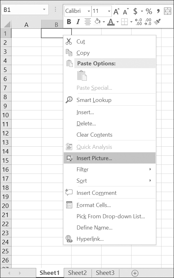
FIGURE 19.2. A custom Insert Picture… menu item is now identified by an icon and positioned jutst above the built-in Filter command.
.Caption = "Insert Pict&ure…"
The “&” symbol in front of the letter “u” indicates that the lowercase “u” will serve as the hot key. Remember that hot keys are unique; you cannot use a letter that is already used by another menu item.
8. After rerunning the modified procedure, switch to the Microsoft Excel application window, right-click any cell in a worksheet, and then press the lowercase u. You should see the Insert Picture dialog box.
When you modify context menus, your customizations will not go away when you close the workbook. Restarting Excel will remove your custom changes to the context menu only if you set the value of the Temporary parameter to True when adding your custom menu item. To ensure that the custom item is removed from the menu, consider writing a delete procedure similar to the one shown below:
Sub DeleteInsertPicture()
Dim c As CommandBarControl
On Error Resume Next
Set c = CommandBars("Cell").Controls("Insert Pict&ure…")
c.Delete
End Sub
For automatic cleanup, call the previous procedure from the Workbook_BeforeClose event procedure like this:
Private Sub Workbook_BeforeClose(Cancel As Boolean)
Call DeleteInsertPicture
End Sub
The previous event procedure has to be entered in the ThisWorkbook code module. The Workbook_BeforeClose procedure will be executed just before the workbook is closed.
To ensure that your custom menu option is in place when you open the workbook, call the procedure that adds a custom menu item from the Workbook_Open event procedure entered in the ThisWorkbook Code window:
Private Sub Workbook_Open()
Call AddToCellMenu2
End Sub
To disallow using a particular context menu item, you may want to disable it or hide it.
When a context menu item is disabled, its caption appears dimmed. When a menu item is hidden, it simply does not appear on the menu.
To disable a menu item, set the Enabled property of the control to False. For example, the following statement will disable the Insert Picture command that you’ve added earlier to the Cell context menu:
Application.CommandBars("Cell"). Controls("Insert Pict&ure…").Enabled = False
To enable a disabled menu item, simply set the Enabled property of the desired control to True.
To hide a menu item, set the Visible property of the control to False:
Application.CommandBars("Cell"). Controls("Insert Pict&ure…").Visible = False
And to unhide the hidden menu item set the Visible property of the control to True:
Application.CommandBars("Cell"). Controls("Insert Pict&ure…").Visible = True
A good place to use the previous commands is in the Worksheet_Activate and Worksheet_Deactivate event procedures. For example, to disable the specific context menu item only when Sheet1 is active, write the following event procedures in the Sheet1 code module:
Private Sub Worksheet_Activate()
Application.CommandBars("Cell").Controls("Sort").Enabled = False
End Sub
Private Sub Worksheet_Deactivate()
Application.CommandBars("Cell").Controls("Sort").Enabled = True
End Sub
NOTE |
When writing code to control Excel context menus with the CommandBar object’s properties and methods, you may find out that certain VBA statements will work in some but not all circumstances. Unless you need to write an application for Excel 2007 or earlier, you should move toward programming the RibbonX interface, which allows you to control commands in the context menus (see the section titled “Modifying Context Menus Using Ribbon Customizations” later in this chapter). |
When you design your custom forms, you may want to add context menus to various controls placed on the form. The following set of VBA procedures demonstrates how right-clicking a command button can offer users a choice of options to select from.
|
1. In the ContextMenus Code window, enter the Create_ContextMenu procedure as shown below:
Dim sm As Object
Set sm = Application.CommandBars.Add("MyComputer", msoBarPopup)
With sm
.Controls.Add(Type:=msoControlButton).Caption = "Operating System"
With .Controls("Operating System")
.FaceId = 1954
.OnAction = "OpSystem"
End With
.Controls.Add(Type:=msoControlButton).Caption = "Active Printer"
With .Controls("Active Printer")
.FaceId = 4
.OnAction = "ActivePrinter"
End With
.Controls.Add(Type:=msoControlButton).Caption = "Active Workbook"
With .Controls("Active Workbook")
.FaceId = 247
.OnAction = "ActiveWorkbook"
End With
.Controls.Add(Type:=msoControlButton).Caption = "Active Sheet"
With .Controls("Active Sheet")
.FaceId = 18
.OnAction = "ActiveSheet"
End With
End With
End Sub
This procedure creates a custom context menu named MyComputer and adds four commands to it. Notice that each command is assigned an icon. When you select a command from this context menu, one of the procedures shown in Step 2 will run.
2. In the ContextMenus Code window, enter the following procedures that are called by the Create_ContextMenu procedure:
Sub OpSystem()
MsgBox Application.OperatingSystem, , "Operating System"
End Sub
Sub ActivePrinter()
MsgBox Application.ActivePrinter
End Sub
MsgBox Application.ActiveWorkbook.Name
End Sub
Sub ActiveSheet()
MsgBox Application.ActiveSheet.Name
End Sub
3. Run the Create_ContextMenu procedure.
To test the custom context menu you just created, use the ShowPopup method, as shown in Step 4.
4. Type the following statement in the Immediate window and press Enter:
CommandBars("MyComputer").ShowPopup 0, 0
The ShowPopup method for the CommandBar object accepts two optional arguments (x, y) that determine the location of the context menu on the screen. In the above example, the MyComputer context menu that was added by running the Create_ContextMenu procedure will appear at the top left-hand corner of the screen.
Let’s make our context menu friendlier by attaching it to a command button placed on a user form.
5. In the Visual Basic Editor screen, choose Insert | UserForm to add a new form to the current VBA project.
6. Using the CommandButton control in the Toolbox, place a button anywhere on the empty user form. Use the Properties window to change the Caption property of the command button to System Information. You may need to resize the button on the form to fit this text.
7. Switch to the Code window for the form by clicking the View Code button in the Project Explorer window or double-clicking the form background.
8. Enter the following procedure in the UserForm1 Code window:
Private Sub CommandButton1_MouseDown(ByVal Button As Integer, ByVal Shift As Integer, ByVal X As Single, ByVal Y As Single)
If Button = 2 Then
Call Show_ShortMenu
Else
MsgBox "You must right-click this button."
End If
End Sub
This procedure calls the Show_ShortMenu procedure (see Step 9) when the user right-clicks the command button placed on the form. Visual Basic has two event procedures that are executed in response to clicking a mouse button. When you click a mouse button, Visual Basic executes the MouseDown event procedure. When you release the mouse button, the MouseUp event occurs. The MouseDown and MouseUp event procedures require the following arguments:
• The object argument specifies the object. In this example, it’s the name of the command button placed on the form.
• The Button argument is the Integer value that specifies which mouse button was pressed.
Value of Button Argument |
Description | |
1 |
Left mouse button | |
2 |
Right mouse button | |
3 |
Middle mouse button |
• The Shift argument determines whether the user was pressing the Shift, Ctrl, or Alt key when the event occurred.
Value of Shift Argument |
Description | |
1 |
Shift key | |
2 |
Ctrl key | |
3 |
Shift and Ctrl keys | |
4 |
Alt key | |
5 |
Alt and Shift keys | |
6 |
Alt and Ctrl keys | |
7 |
Alt, Shift, and Ctrl keys |
9. In the ContextMenus Code window, enter the code of the Show_ShortMenu procedure:
Sub Show_ShortMenu()
Dim shortMenu As Object
Set shortMenu = Application.CommandBars("MyComputer")
With shortMenu
.ShowPopup
End With
End Sub
10. In the Project Explorer window, double-click UserForm1 and press F5 to run the form. Right-click the System Information button, and select one of the options from the context menu.
Notice that the ShowPopup method used in this procedure does not include the optional arguments that determine the location of the context menu on the screen. Therefore, the menu appears where the mouse was clicked (see Figure 19.3).

FIGURE 19.3. A custom context menu appears when you right-click an object.
11. To delete the context menu named MyComputer, enter and then run the following Delete_ShortMenu procedure in the ContextMenus Code window:
Sub Delete_ShortMenu()
Application.CommandBars("MyComputer").Delete
End Sub
When modifying context menus, you will most likely want to include an image next to the displayed text, as we did in Hands-On 19.3 (see Figure 19.3). The good news is that the CommandBars collection has hundreds of images that you can use. Each command bar control button has a FaceID that determines the look of a control. But how do you know which ID belongs to which control button? The FaceID property returns or sets the ID number of the icon on the control button’s face. In most cases, the icon ID number (FaceID) is the same as the control’s ID property. The icon image can be copied to the Windows clipboard using the CopyFace method. The Images procedure demonstrated below iterates through the CommandBars collection and writes to a new workbook a list of control buttons that have a FaceID number. If you’d like to see this procedure in action, enter the code shown below in the ContextMenus Code window in the Chap19_VBAExcel2016.xlsm workbook and then run it.
Dim i As Integer
Dim j As Integer
Dim total As Integer
Dim buttonId As Integer
Dim buttonName As String
Dim myControl As CommandBarControl
Dim bar As CommandBar
On Error GoTo ErrorHandler
Workbooks.Add
Range("A1").Select
With ActiveCell
.Value = "Image"
.Offset(0, 1) = "Index"
.Offset(0, 2) = "Name"
.Offset(0, 3) = "FaceID"
.Offset(0, 4) = "CommandBar Name (Index)"
End With
For j = 1 To Application.CommandBars.Count
Set bar = CommandBars(j)
total = bar.Controls.Count
With bar
For i = 1 To total
buttonName = .Controls(i) .Caption
buttonId = .Controls(i).ID
Set myControl = CommandBars
FindControl(ID:=buttonId)
myControl.CopyFace ' error could occur here
ActiveCell.Offset(1, 0).Select
Sheets(1).Paste
With ActiveCell
.Offset(0, 1).Value = buttonId
.Offset(0, 2).Value = buttonName
.Offset(0, 3).Value = myControl.FaceID
.Offset(0, 4).Value = bar.Name & " (" & j & ")"
End With
StartNext:
Next i
End With
Columns("A:E").EntireColumn.AutoFit
Exit Sub
ErrorHandler:
Resume StartNext
End Sub
Because you cannot copy the image of an icon that is currently disabled, Visual Basic encounters an error when it attempts to copy the button’s face to the clipboard. The procedure traps this error with the On Error GoTo ErrorHadler statement. This way, when Visual Basic encounters the error, it will jump to the ErrorHandler label and execute the instructions below this label. This will ensure that the problem control button is skipped and the procedure can continue without interruption. A partial result of the procedure is shown in Figure 19.4.

FIGURE 19.4. A list of icon images and their corresponding FaceID values generated by the VBA procedure.
The Ribbon contains the titlebar, the Quick Access toolbar, and the tabs. Each tab on the Ribbon provides access to features and commands related to a particular task. For example, you can use the Insert tab to quickly insert tables, illustrations, charts, links, or text (see Figure 19.5). Related commands within a tab are organized into groups. This type of organization makes it easy to locate a particular command.
FIGURE 19.5. The rectangular area at the top of the Microsoft Excel window is called the Ribbon. Each tab on the Ribbon contains groups of related commands.
Various program commands are displayed as large or small buttons. A large button denotes a frequently used command, while a small button shows a specific feature of the main command that you may want to work with. Some large and small command buttons include drop-down lists of other specialized commands. For example, the small More Functions button drop-down in the Function Library group on the Formulas tab contains additional types of functions you can insert: Statistical, Engineering, Cube, Information, Compatibility, and Web (see Figure 19.6).

FIGURE 19.6. Additional commands can be accessed by clicking on the down arrow to the right of the button control.
Some controls that you find on the Ribbon do not display commands. Instead, they provide a visual clue of the output you might expect when a specific option is selected. These types of controls are known as galleries. The gallery control is often used to present various formatting options, such as the margin settings shown in Figure 19.7.
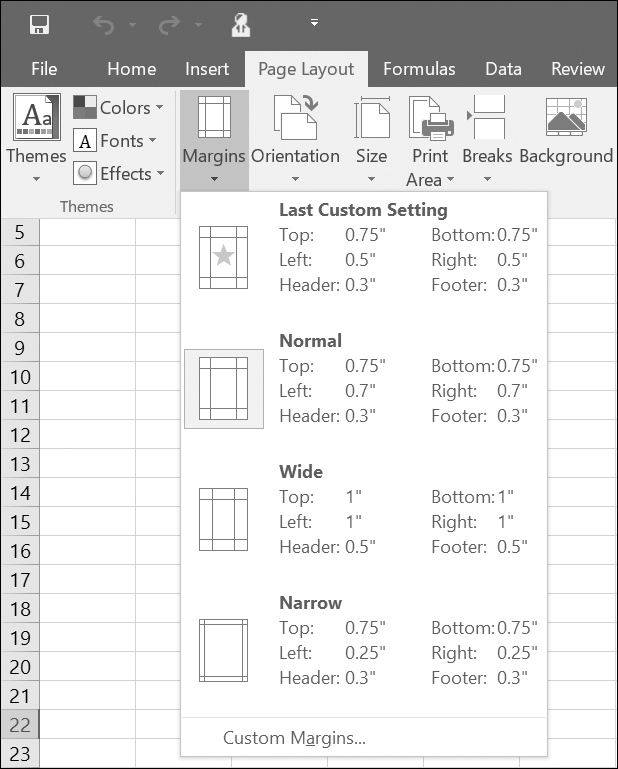
FIGURE 19.7. The margin layouts are displayed in a gallery control.
As mentioned earlier, the commands on the Ribbon tabs are organized into groups for easy browsing. Some tab groups have dialog box launchers in the bottom right-hand corner that display a dialog box where you can set several advanced options at once. For example, see the Alignment group in Figure 19.5.
In addition to main Ribbon tabs, there are also contextual tabs that contain commands that apply to what you are doing. When a particular object is selected, the Ribbon displays a contextual tab that provides commands for working with that object. For example, when you select an image in a worksheet, the Ribbon displays a contextual tab called Picture Tools, as shown in Figure 19.8.

FIGURE 19.8. Contextual tabs will appear when you work with a particular object such as a picture, PivotTable, or chart.
Clicking on the Picture Tools tab activates the Format tab that has commands for dealing with a Picture object. The contextual tab disappears when you cancel the selection of the object. In other words, if you select a different cell in a worksheet, the Picture Tools tab will be gone.
When you open a workbook created in Excel 2003 or earlier that contains menu or toolbar customizations, the changes made in the user interface appear on an Add-Ins tab in the Ribbon.
The tooltips of the controls display the name of the command, the control keyboard context (where available), and a description of what the command does (see Figure 19.9).

FIGURE 19.9. The enhanced tooltips, known as Super ToolTips, provide more information about the selected command.
All Ribbon commands and the Quick Access toolbar can be easily accessed via the keyboard. Simply press the Alt key on the keyboard to display small boxes with key tips (see Figure 19.10). Every command has its own access key. For example, to access the File tab, press Alt and then F. Within the menus you will see other key tips for every command. To view key tips for the commands on a particular tab, first select the access key for that tab. To remove the key tips, press the Alt key again.

FIGURE 19.10. To view the Ribbon’s key tips, press the Alt key.
When you are working in command mode (after pressing the Alt key), you can also use the Tab key and arrow keys to move around the Ribbon.
Now that you’ve reviewed the main features of the Ribbon interface, let’s look at how you can extend it with your own tabs and controls. The next section introduces you to Ribbon programming with XML and VBA.
|
In addition to customizing the Quick Access Toolbar (QAT), you can create custom Ribbon tabs and groups by choosing File | Options | Customize Ribbon. You can also rename and change the order of the built-in tabs and groups.
The components of the Ribbon user interface can be manipulated programmatically using Extensible Markup Language (XML) or other programming languages. All Office applications that use this interface rely on the programming model known as Ribbon extensibility, or RibbonX.
This section introduces you to customizing the Microsoft 2016 Office Fluent user interface (UI) by using XML markup (refer to Chapter 28 for detailed information on using XML with Excel). While no special tools are required to perform Ribbon customizations, it is much quicker and easier to work with the Custom UI Editor. Therefore, in the examples that follow, we’ll be using this free tool to create Ribbon customizations.
Please take a few minutes right now to download and install the Office Custom UI Editor from: http://openxmldeveloper.org/blog/b/openxmldeveloper/archive/2006/05/26/customuieditor.aspx
NOTE |
Look for the file named OfficeCustomUIEditorSetup.zip. When you unzip this archive you should get the Windows Installer Package named OfficeCustomUIEditorSetup.msi. Run this installation file to get your computer ready for working with Ribbon customizations in this chapter. |
You can find out the names of the Ribbon controls by downloading the Office Fluent User Interface Control Identifiers from: http://www.microsoft.com/en-us/download/details.aspx?id=50745
NOTE |
The identifier names can also be accessed in the QAT customization dialog box. Simply hover over control that interests you and look at Screen Tip of the control. |
To make custom changes to the Ribbon user interface in Excel 2016 you need to prepare an XML markup file that specifies all your customizations. The contents of the XML markup file that we will use in Hands-On 19.4 is shown in Figure 19.11, and the resulting output appears in Figure 19.12.
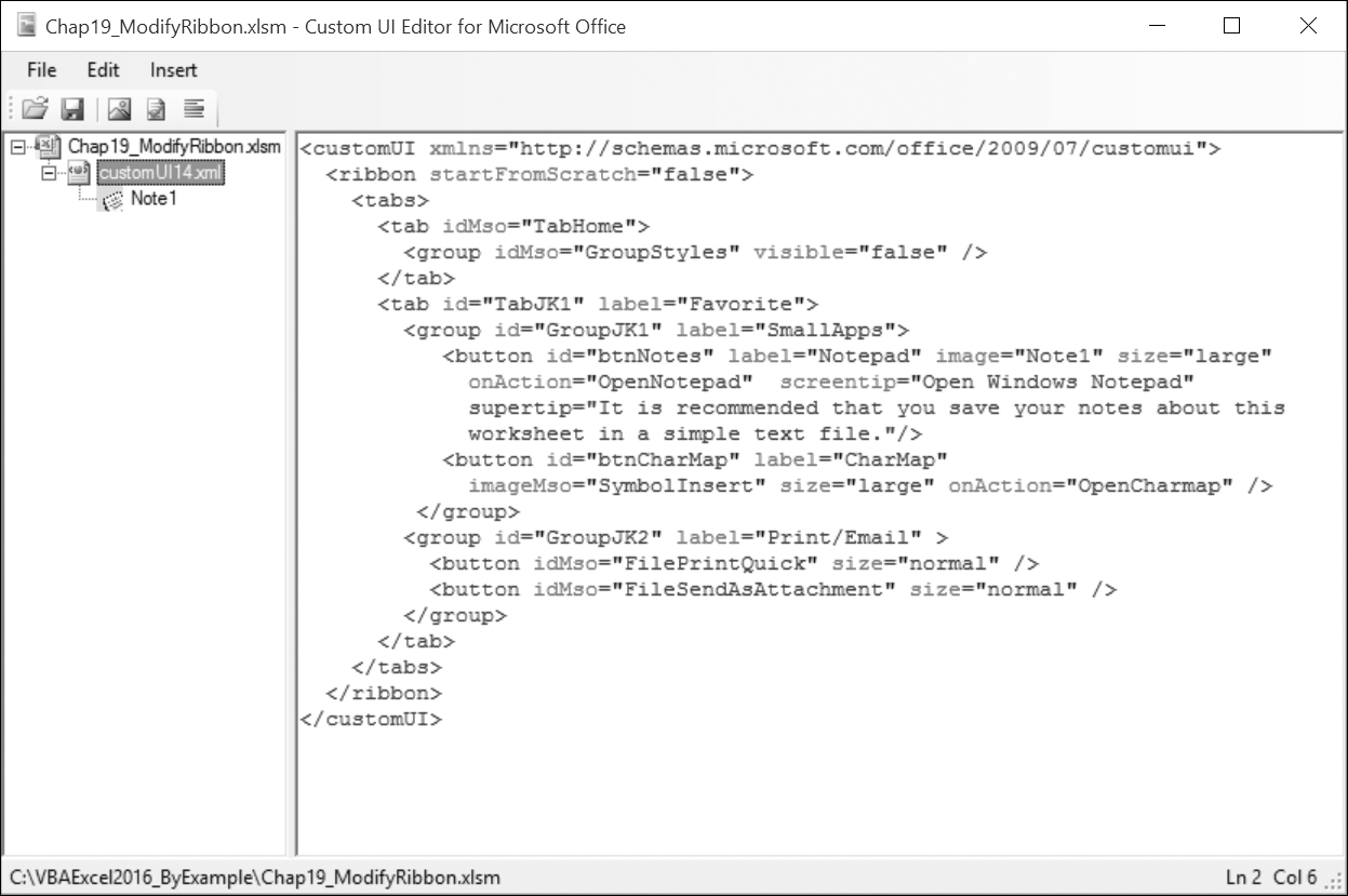
FIGURE 19.11. This XML file defines a new tab with two groups for the existing Excel 2016 Ribbon. This file produces the output shown in Figure 19.12.

FIGURE 19.12. The custom Favorite tab is based on the custom XML markup file shown in Figure 19.11.
|
Hands-On 19.4. Creating an XML Document with Ribbon Customizations |
This Hands-On and all the remaining Hands-On exercises in this chapter rely on the Custom UI Editor for Microsoft Office. See the instructions on how to get and install this free tool in the previous section.
1. Launch Microsoft Office Excel 2016 and create a new workbook. Save this workbook as Chap19_ModifyRibbon.xlsm in your VBAExcel2016_ByExample folder. Be sure to save the workbook as Excel-Macro Enabled workbook (*.xlsm).
2. Close the workbook and exit Excel.
3. Launch the Custom UI Editor for Microsoft Office.
4. Choose File | Open.
5. Select the C:\VBAExcel2016_ByExample\Chap19_ModifyRibbon.xlsm workbook file you created in Step 1 above and click Open.
6. Choose Insert | Office 2010 Custom UI Part as shown in Figure 19.13. This creates a CustomUI14.xml file in the workbook.

FIGURE 19.13. Use the Custom UI Editor for Microsoft Office to insert an Office 2010 Custom UI Part into an Excel 2016 workbook you want to customize. This option works for Ribbon customizations in Excel 2010–2016. To customize the Ribbon in Excel 2007, you would choose the Office 2007 Custom UI Part instead.
7. In the right panel, enter the XML Ribbon customization markup as shown below (see also Figure 19.11 earlier). If you prefer, you can copy the code from the companion CD. Look for the file named CustomUI14_ver01.txt.
<customUI xmlns="http://schemas.microsoft.com/office/2009/07 customui">
<ribbon startFromScratch="false">
<tabs>
<tab idMso="TabHome">
<group idMso="GroupStyles" visible="false" />
</tab>
<tab id="TabJK1" label="Favorite">
<group id="GroupJK1" label="SmallApps">
<button id="btnNotes" label="Notepad" image="Note1" size="large" onAction="OpenNotepad" screentip="Open Windows Notepad" supertip="It is recommended that you save your notes about this worksheet in a simple text file."/>
<button id="btnCharMap" label="CharMap" imageMso="SymbolInsert" size="large" onAction="OpenCharmap" />
</group>
<group id="GroupJK2" label="Print/Email" >
<button idMso="FilePrintQuick" size="normal" />
<button idMso="FileSendAsAttachment" size="normal" />
</group>
</tab>
</tabs>
</ribbon>
</customUI>
XML is case sensitive, so make sure you enter the statements exactly as shown above.
8. Click the Validate button  on the Custom UI Editor Toolbar to verify that your XML does not contain errors. You should see the message “Custom UI XML is well formed.” If there are errors, you must correct them to ensure that the XML is well formed.
At this point, you should have a well-formed CustomUI.xml document containing Ribbon customizations.
Let’s go over the XML document content. As you will learn in Chapter 28, every XML document consists of a number of elements, called nodes. In any XML document, there must be a root node, or a top-level element. In the Ribbon customization file, the root tag is <customUI>. The root’s purpose is to specify the Office RibbonX XML namespace:
<customUI xmlns="http://schemas.microsoft.com/office/2009/07/customui">
Namespaces are used to uniquely identify elements in the XML documents and avoid name collisions when elements with the same name are combined in the same document.
If you were to customize the Office 2007 Ribbon, you would use the following namespace instead:
<customUI xmlns="http://schemas.microsoft.com/office/2006/01/customui">
The xmlns attribute of the <customUI> tag holds the name of the default namespace to be used in the Ribbon customization. Notice that the root element encloses all other elements of this XML document: ribbon, tabs, tab, group, and button. Each element consists of a beginning and ending tag. For example, <customUI> is the name of the beginning tag and </customUI> is the ending tag. The actual Ribbon definition is contained within the <ribbon> tag:
<ribbon startFromScratch="false">
[Include xml tags to specify the required ribbon customization]
</ribbon>
The startFromScratch attribute of the <ribbon> tag defines whether you want to replace the built-in Ribbon with your own (true) or add a new tab to the existing Ribbon (false).
|
Hiding the Elements of the Excel User Interface |
Setting |
To create a new tab in the Ribbon, use the <tabs> tag. Each tab element is defined with the <tab> tag. The label attribute of the tab element specifies the name of your custom tab. The name in the id attribute is used to identify your custom tab:
<tabs>
<tab id="TabJK1" label="Favorite">
Ribbon tabs contain controls organized in groups. You can define a group for the controls on your tab with the <group> tag. The example XML markup file defines the following two groups for the Favorite tab:
<group id="GroupJK1" label="SmallApps">
<group id="GroupJK2" label="Print/Email">
Like the tab node, the group nodes of the XML document also contain the id and label attributes. Placing controls in groups is easy. The group labeled SmallApps has two custom button controls, identified by the <button> elements. The group labeled Print/Email also contains two buttons; however, unlike the SmallApps group, the buttons placed here are built-in Office system controls rather than custom controls. You can quickly determine this by looking at the id attribute for the control. Any attribute that ends with “Mso” refers to a built-in Office item:
<button idMso="FilePrintQuick" size="normal" />
Buttons placed on the Ribbon can be large or small. You can define the size of the button with the size attribute set to “large” or “normal.” Buttons can have additional attributes:
<button id="btnNotes" label="Notepad" image="Note1" size="large" onAction="OpenNotepad" screentip="Open Windows Notepad" supertip=" It is recommended that you save your notes about this worksheet in a simple text file." />
<button id="btnCharMap" label="CharMap" imageMso="SymbolInsert" size="large" onAction="OpenCharmap" />
The screentip and supertip attributes allow you to specify the short and longer text that should appear when the mouse pointer is positioned over the button. The imageMso attribute denotes the name of the existing Office icon. You can use images provided by any Office application. To provide your own image, use the image attribute as shown in this Hands-On, or use the getImage attribute in the XML markup (see more information in the section “Creating a Gallery Control,” later in this chapter).
The controls that you specify in the XML markup perform their designated actions via callback procedures. For example, the onAction attribute of a button control contains the name of the callback procedure that is executed when the button is clicked. When that procedure completes, it calls back the Ribbon to provide the status or modify the Ribbon. You will write the callback procedures for the onAction attribute in Hands-On 19.5.
Buttons borrowed from the Office system do not require the onAction attribute. When clicked, these buttons will perform their default built-in action.
Before finishing off the XML Ribbon customization document, always make sure that you have included all the ending tags:
</tab>
</tabs>
</customUI>
Because our first Ribbon customization calls upon a custom image, let’s add it to the file.
9. Copy the Images folder from the Companion CD to your VBAExcel2016_ByExample folder.
10. In the Custom UI Editor for Microsoft Office, select CustomUI14.xml in the left pane and choose Insert | Icons….
11. Change the file filter to show all files in the C:\VBAExcel2016_ByExample\Images folder, then select Note.gif and click Open.
12. In the left pane of the Custom UI Editor window, click the plus sign next to the CustomUI.xml file. You should see the Note image. Right-click the image and choose Change ID. Rename the image to Note1 to match the name of the image attribute in the XML markup:
<button id="btnNotes" label="Notepad" image="Note1" size="large" onAction="OpenNotepad" screentip="Open Windows Notepad" supertip="It is recommended that you save your notes about this worksheet in a simple text file."/>
13. Choose File | Save and then exit Custom UI Editor.
The first part of the Ribbon customization is now completed. In the next part you will load the workbook file into Excel and view the custom tab you have just created. You will also write callback procedures that perform specific actions.
Hands-On 19.5 walks you through the remaining steps that are necessary in order to integrate Ribbon customizations into your workbook.
|
Hands-On 19.5. Adding VBA Code for Use by the Ribbon Customizations |
1. Open the C:\VBAExcel2016_ByExample\Chap19_ModifyRibbon.xlsm workbook in Excel 2016. Notice the Favorite tab at the end of the Ribbon (see Figure 19.12 earlier).
2. Switch to the Visual Basic Editor window and activate VBAProject (Chap19_ModifyRibbon.xlsm) in the Project Explorer window. Next, choose Insert | Module to add a new module to the selected project.
3. In the module’s Code window, enter the following procedures:
Public Sub OpenNotepad(ctl As IRibbonControl)
Shell "Notepad.exe", vbNormalFocus
End Sub
Public Sub OpenCharmap(ctl As IRibbonControl)
Shell "Charmap.exe", vbNormalFocus
End Sub
OpenNotepad and OpenCharmap are the names of the callback procedures that were specified in the onAction attribute of the button (see Hands-On 19.4). As mentioned earlier, a callback procedure executes some action and then notifies the Ribbon that the task has been completed. The onAction callback is handled by a VBA procedure. The callback includes the IRibbonControl parameter, which is the control that was clicked. This control is passed to your VBA code by the Ribbon.
Sub OpenNotepad(ctl as IRibbonControl)
Sub OpenCharmap(ctl as IRibbonControl)
For VBA to recognize this parameter, you must make sure that the References dialog box (Tools | References) has a reference to the Microsoft Office 16.0 object library.
The OpenNotepad and OpenCharmap procedures tell Excel to use the Shell function to open Windows Notepad or the Charmap application. Notice that the program’s executable filename is in double quotes. The second argument of the Shell function is optional. This argument specifies the window style, that is, how the program will appear once it is launched. The vbNormalFocus constant will open the application in a normal size window with focus. If the window style is not specified, the program will be minimized with focus (vbMinimizedFocus).
|
The IRibbonControl Properties |
You can view the properties (Context, Id, and Tag) of the IRibbonControl object in the Object Browser. The Context property returns the active window that contains the Ribbon interface, in this case Microsoft Excel. The Id property contains the ID of the control that was clicked. The Tag property can be used to store additional information with the control. To use this property, you need to add a tag attribute to the Ribbon customization XML document. By using the Tag property, you can write a more generic procedure to handle the callbacks. |
4. Switch to the Excel application window and test the Notepad and Charmap buttons on the Ribbon. These buttons should invoke the built-in Windows applications.
5. Save and close the Chap19_ModifyRibbon.xlsm workbook. Keep the Excel application window open. Proceed to Step 6 to make sure that Excel is set up to display the RibbonX errors.
6. Click File | Options. In the Excel Options dialog box, click the Advanced tab and scroll down to the General section. Make sure that the Show Add-in User Interface Errors checkbox is selected, and click OK.
When you enable Show Add-in User Interface Errors, Excel will display errors in your Ribbon customization when you load a workbook that contains errors in the custom RibbonX code. This is very helpful in the process of debugging. If you want to successfully use your customized Ribbon interface, you must make sure that Excel does not find any errors when loading your workbook.
7. Exit Microsoft Excel.
If Excel finds any errors in the Ribbon customization markup, it displays an error message. For example, if the file is missing a matching opening or closing tag or you typed the name of an attribute in uppercase when lowercase was expected, you will see a message indicating a line and a column number, and the name of the attribute where the problem is located (see Figure 19.14). You should open the workbook file in the Custom UI Editor for Microsoft Office, find and correct the error, and then try again to open the workbook in Excel. The error messages will continue to pop up until the entire file is debugged.

FIGURE 19.14. Excel displays an error message when it finds an error in the Custom UI XML code of the workbook file you are attempting to open.
Some problems found within the file may cause Excel to generate an error message about unreadable content and ask you if you want to recover the contents of the workbook. When you click Yes, Excel will try to repair the file and let you know whether it has succeeded. Sometimes the correction will be made for you, and other times you will have to locate and fix the problem yourself.
So far in this chapter you have learned how to use built-in and custom images in your Ribbon customizations. You already know that to reuse an Office icon you must use the imageMso attribute of a control. You also know that to call your own BMP, GIF, and JPEG image files you should use the image attribute. Images can be added to the workbook file by using the Custom UI Editor (see Hands-On 19.4). You can also load the images at runtime when you open a workbook. To implement this particular scenario, use the loadImage callback procedure in the loadImage attribute for the customUI element as shown below:
<customUI xmlns="http://schemas.microsoft.com/office/2009/07 customui" loadImage=”OnLoadImage”>
<ribbon startFromScratch="false">
<tabs>
<tab idMso="TabHome">
<group idMso="GroupStyles" visible="false" />
</tab>
<tab id="TabJK1" label="Favorite">
<group id="GroupJK1" label="SmallApps">
<button id="btnNotes" label="Notepad" image="Note1" size="large" onAction="OpenNotepad" screentip="Open Windows Notepad" supertip="It is recommended that you save your notes about this worksheet in a simple text file." />
<button id="btnCharMap" label="CharMap" imageMso="SymbolInsert" size="large" onAction="OpenCharmap" />
<button id="btnCalc" label="Calculator" image="DownArrow.gif" onAction="OpenCalculator" />
</group>
<group id="GroupJK2" label="Print/Email">
<button idMso="FilePrintQuick" size="normal" />
<button idMso="FileSendAsAttachment" size="normal" />
</group>
</tab>
</ribbon>
</customUI>
|
The previous XML markup is located in the CustomUI14_ver02.txt file on the Companion CD. |
NOTE |
To update your Chap19_ModifyRibbon.xlsm file, perform the following steps: • Open the Chap19_ModifyRibbon.xlsm workbook file in the Custom UI Editor (make sure the file is not open in Excel prior to loading it into the Editor application). • Replace the XML markup in the CustomUI.xml part by entering or pasting the existing XML in the right pane with the new XML markup. The new code should replace the code from the previous example. • Use the Validate icon in the Editor’s toolbar to make sure that the revised XML is well formed. • Save the file and exit the Custom UI Editor. • Open the Chap19_ModifyRibbon.xlsm file in Excel to view Ribbon customizations. You may encounter errors due to the missing callbacks. • Continue with the explanations in the section below and enter any necessary callback procedures in the VBA module. Be sure to save the changes in the workbook. • Follow the same steps as you progress through the rest of the chapter. Whenever you see a revised Ribbon customization markup, you should enter it in the Custom UI Editor and then do the callbacks in Excel. |
In the previous XML markup, the new statements are indicated in bold print. Notice that the first statement contains the loadImage attribute:
<customUI xmlns="http://schemas.microsoft.com/office/2009/07 customui" loadImage="OnLoadImage">
The loadImage attribute specifies the following OnLoadImage callback procedure, which needs to be entered in a VBA code module of your Chap19_ModifyRibbon.xlsm workbook:
Public Sub OnLoadImage(imgName As String, ByRef image)
Dim strImgFileName As String
strImgFileName = "C:\VBAExcel2016_ByExample\Extra Images\" & imgName
Set image = LoadPicture(strImgFileName)
End Sub
Notice that to load a picture from a file, you need to use the LoadPicture function. This function is a member of the stdole.StdFunctions library. The library file, which is called stdole2.tlb, is installed in the Windows\System or Windows\System32 folder on your computer and is available to your VBA procedures without setting additional references. The LoadPicture function returns an object of type IPictureDisp that represents the image. You can view objects, methods, and properties available in the stdole library by using the Object Browser in the Visual Basic Editor window.
The following new button control in the CustomUI.xml document has an image control that specifies the name of the image file:
<button id="btnCalc" label="Calculator" image="DownArrow.gif" onAction="OpenCalculator" />
This button, pictured in Figure 19.12 earlier, uses the following callback procedure entered in a VBA code module (Chap19_ModifyRibbon.xlsm):
Public Sub OpenCalculator(ctl As IRibbonControl)
Shell "Calc.exe", vbNormalFocus
End Sub
|
About Tabs, Groups, and Controls |
Built-in tabs and groups can be made invisible by setting the visible property of the <tab> or <group> elements to “false”. A built-in tab can contain a custom group. Built-in groups can also be added to other built-in or custom tabs. Some Ribbon tabs, called contextual tabs, appear only when certain objects are in focus. For example, inserting a table will bring up the Table Tools contextual tab that contains table-related options. You can add your custom groups to the built-in contextual tabs using the <tabSet> element within the <contextualTabs> element, like this: |
<contextualTabs>
<tabSet idMso="TabSetTableTools">
<tab idMso="TabTableToolsDesign">
<button id="btnID1"/>
</group>
</tab>
</tabSet>
</contextualTabs>
Now that you know how to go about creating the XML markup for your Ribbon customizations and applying the custom Ribbon to a workbook, let’s look at other types of controls you can show in the Ribbon.
A toggle button is a button that alternates between two states. Many formatting features such as Bold, Italic, or Format Painter are implemented as toggle buttons. When you click a toggle button, the button will stay down until you click it again. To create a toggle button, use the <toggleButton> XML tag as shown below:
<group id="GroupJK3" label="Various Controls">
<toggleButton id="tglR1C1" label="Reference Style" size="normal" getPressed="onGetPressed" onAction="SwitchRefStyle" />
</group>
You will find the above Ribbon customization in the CustomUI14_ver03.txt file on the Companion CD. You can add a built-in image to the toggle button with the imageMso attribute or use a custom image as discussed earlier in this chapter. To find out whether or not the toggle button is pressed, include the getPressed attribute in your XML markup. The getPressed callback procedure provides two arguments: the control that was clicked and the pressed state of the toggle button.
Sub onGetPressed(control As IRibbonControl, ByRef pressed)
If control.ID = "tglR1C1" Then
pressed = False
End If
End Sub
The previous callback procedure entered in a VBA code module of the Chap19_ModifyRibbon.xlsm workbook will ensure that the specified toggle button is not pressed when the Ribbon is loaded.
To perform an action when the toggle button is clicked, set the onAction attribute to the name of your custom callback procedure. This callback also provides two arguments: the control that was clicked and the state of the toggle button. The code below should be added to the VBA code module of the Chap19_ModifyRibbon.xlsm workbook:
Sub SwitchRefStyle(control As IRibbonControl, pressed As Boolean)
If pressed Then
Application.ReferenceStyle = xlR1C1
Else
Application.ReferenceStyle = xlA1
End If
End Sub
If the toggle button is pressed, the value of the pressed argument will be True; otherwise, it will be False. Figure 19.15 in the next section shows a custom toggle button named Reference Style. When you click this button, the worksheet headings change to display letters or numbers. For more information on using R1C1 style references instead of A1 style, see the online help.
A split button is a combination of a button or toggle button and a menu. Clicking the button performs one default action, and clicking the drop-down arrow opens a menu with a list of related options to select from. To create the split button, use the <splitButton> tag. Within this tag, you need to define a <button> or a <toggleButton> control and the <menu> control, as shown in the following XML markup:
<splitButton id="btnSplit1" size="large">
<button id="btnGoTo" label="Navigate To…" imageMso="GoTo" />
<menu id="mnuGoTo" label="Spreadsheet Navigation" itemSize="normal">
<menuSeparator id="mnuDiv1" title="Formulas and Constants" />
<button id="btnFormulas" label="Select Formulas" onAction="GoToSpecial" />
<button id="btnNumbers" label="Select Numbers Only" onAction="GoToSpecial" />
<button id="btnText" label="Select Text Only" onAction="GoToSpecial" />
<menuSeparator id="mnuDiv2" title="Special Cells" />
<button id="btnBlanks" label="Select blank cells" onAction="GoToSpecial" />
<button id="btnLast" label="Select last cell" onAction="GoToSpecial" />
</menu>
</splitButton>
You will find the above Ribbon customization in the CustomUI14_ver04.txt file on the Companion CD. You can specify the size of the items in the menu with the itemSize attribute. The <menuSeparator> tag can be used inside the menu node to break the menu into sections. Each menu segment can then be titled using the title attribute, as shown in the previous example. You can add the onAction attribute to each menu button to specify the callback procedure or macro to execute when the menu item is clicked. The above XML markup uses the following callback procedure entered in a VBA code module of the Chap19_ModifyRibbon.xlsm workbook:
Sub GoToSpecial(control As IRibbonControl)
On Error Resume Next
Range("A1").Select
If control.id = "btnFormulas" Then
Selection.SpecialCells(xlCellTypeFormulas, 23).Select
ElseIf control.id = "btnNumbers" Then
Selection.SpecialCells(xlCellTypeConstants, 1).Select
ElseIf control.id = "btnText" Then
Selection.SpecialCells(xlCellTypeConstants, 2).Select
ElseIf control.id = "btnBlanks" Then
Selection.SpecialCells(xlCellTypeBlanks).Select
ElseIf control.id = "btnLast" Then
Selection.SpecialCells(xlCellTypeLastCell).Select
End If
End Sub
In addition to button controls, menus can contain toggle buttons, checkboxes, gallery controls, split buttons, and other menus. Figure 19.15 displays a Reference Style toggle button introduced in the previous section and a split button control with a menu discussed in this section.
The checkbox control is used to show the state—either true (on) or false (off). It can be included inside a menu control or used as a separate control on the Ribbon. To create a checkbox, use the <checkBox> tag, as shown in the following XML:

FIGURE 19.15. A toggle button (Reference Style) and a custom split button control (Navigate To) with a menu.
<separator id="OtherControlsDiv1" />
<labelControl id="TitleForBox1" label="Show or Hide Screen Elements" />
<box id="boxLayout1">
<checkBox id="chkGridlines" label="Gridlines" visible="true" getPressed="onGetPressed" onAction="DoSomething" />
<checkBox id="chkFormulaBar" label="Formula Bar" visible="true" getPressed="onGetPressed" onAction="DoSomething" />
</box>
You will find the previous Ribbon customization in the CustomUI14_ver05.txt file on the Companion CD. In the above XML markup, the <separator> tag will produce the vertical bar that visually separates controls within the same Ribbon group (see Figure 19.16). The <labelControl> tag can be used to display static text anywhere in the Ribbon. In this example, we use it to place a header over a set of controls. To control the layout of various controls (to display them horizontally instead of vertically), use the <box> tag. You can define whether a checkbox should be visible or hidden by setting the visible attribute to true or false. To disable a checkbox, set the enabled attribute to false; this will cause the checkbox to appear grayed out.
To get the checked state for a checkbox, add a callback procedure in the VBA Code window of the Chap19_ModifyRibbon.xlsm workbook. You can modify the onGetPressed procedure that we used earlier with the toggle button:
Sub onGetPressed(control As IRibbonControl, ByRef pressed)
If control.id = "tglR1C1" Then
End If
If control.id = "chkGridlines" And ActiveWindow.DisplayGridlines = True Then
pressed = True
ElseIf control.id = "chkGridlines" And ActiveWindow.DisplayGridlines = False Then
pressed = False
End If
If control.id = "chkFormulaBar" And Application.DisplayFormulaBar = True Then
pressed = True
ElseIf control.id = "chkFormulaBar" And Application.DisplayFormulaBar = False Then
pressed = False
End If
End Sub
The action of the checkbox control is handled by the callback procedure in the onAction attribute. To make this checkbox example work, you need to enter the following procedure in a VBA code module of the Chap19_ModifyRibbon.xlsm workbook:
Sub DoSomething(ctl As IRibbonControl, pressed As Boolean)
If ctl.id = "chkGridlines" And pressed Then
ActiveWindow.DisplayGridlines = True
ElseIf ctl.id = "chkGridlines" And Not pressed Then
ActiveWindow.DisplayGridlines = False
ElseIf ctl.id = "chkFormulaBar" And pressed Then
Application.DisplayFormulaBar = True
ElseIf ctl.id = "chkFormulaBar" And Not pressed Then
Application.DisplayFormulaBar = False
End If
End Sub
Similar to other controls, labels for checkboxes can contain static text in the label attribute as shown in the above XML, or they can be assigned dynamically using the callback procedure in the getLabel attribute.
NOTE |
Callback procedures don’t need to be named the same as the attribute they are used with. Also, you may change the callback’s argument names as desired. |

FIGURE 19.16. The checkbox controls (Gridlines and Formula Bar) are laid out horizontally.
Use the <editBox> tag to provide an area on the Ribbon where users can type text or numbers:
<editBox id="txtFullName" label="First and Last Name:" sizeString="AAAAAAAAAAAAAAAA" maxLength="25" onChange="onFullNameChange" />
You will find the above Ribbon customization in the CustomUI14_ver06.txt file on the Companion CD. The sizeString attribute specifies the width of the edit box. Set it to a string that will give you the width you want. The maxLength attribute allows you to limit the number of characters and/or digits that can be typed in the edit box. If the text entered exceeds the specified number of characters (25 in this case), Excel automatically displays a balloon message on the Ribbon: “The entry may contain no more than 25 characters.” When the entry is updated in an edit box control, the callback procedure specified in the onChange attribute is called:
Public Sub onFullNameChange(ctl As IRibbonControl, text As String)
If text <> "" Then
MsgBox "You've entered '" & text & "' in the edit box."
End If
End Sub
Enter the above procedure in the VBA code module of the Chap19_ModifyRibbon.xlsm workbook. When the user enters text in the edit box, the procedure will display a message box. The edit box control is shown in Figure 19.17.
There are three types of drop-down controls that can be placed on the Ribbon: combo box, drop-down, and gallery.

FIGURE 19.17. An edit box control allows data entry directly on the Ribbon.
These controls can be dynamically populated at runtime by writing callbacks for their getItemCount, getItemID, getItemLabel, getItemImage, getItemScreentip, or getItemSupertip attributes. The combo box and drop-down controls can also be made static by defining their drop-down content using the <item> tag, as shown below:
<separator id="OtherControlsDiv2" />
<comboBox id="cboDepartment" label="Departments" supertip="Select Department" onChange="onChangeDept">
<item id="Marketing" label="Marketing" />
<item id="Sales" label="Sales" />
<item id="Personnel" label="Personnel" />
<item id="ResearchAndDevelopment" label="Research and Development" />
</comboBox>
You will find the combo box Ribbon customization in the CustomUI14_ver07.txt file on the Companion CD. To separate the combo box control from other controls in the same Ribbon group, the previous example uses the <separator> tag. Notice that each <item> tag specifies a new drop-down row.
NOTE |
A combo box is a combination of a drop-down list and a single-line edit box, allowing the user to either type a value directly into the control or choose from the list of predefined options. Use the |
The combo box control does not have the onAction attribute. It uses the onChange attribute that specifies the callback to execute when the item selection changes:
Public Sub onChangeDept(ctl As IRibbonControl, text As String)
MsgBox "You selected " & text & " department."
End Sub
Notice that the onChange callback provides only the text of the selected item; it does not give you access to the selected index. If you need the index of the selection, use the drop-down control instead, as shown below:
<dropDown id="drpBoro" label="City Borough" supertip="Select City Borough" onAction="onActionBoro">
<item id="M" label="Manhattan" />
<item id="B" label="Brooklyn" />
<item id="Q" label="Queens" />
<item id="I" label="Staten Island" />
<item id="X" label="Bronx" />
</dropDown>
You will also find the dropDown Ribbon customization in the CustomUI14_ver8.txt file on the Companion CD.
The onAction callback of the drop-down control will give you both the selected item’s ID and its index:
Public Sub onActionBoro(ctl As IRibbonControl, ByRef SelectedID As String, ByRef SelectedIndex As Integer)
MsgBox "Index=" & SelectedIndex & " ID=" & SelectedID
End Sub
Be sure to enter the above callback procedures in the VBA code module of the Chap19_ModifyRibbon.xlsm workbook. The combo box and a drop-down control are shown in Figures 19.18 and 19.19.
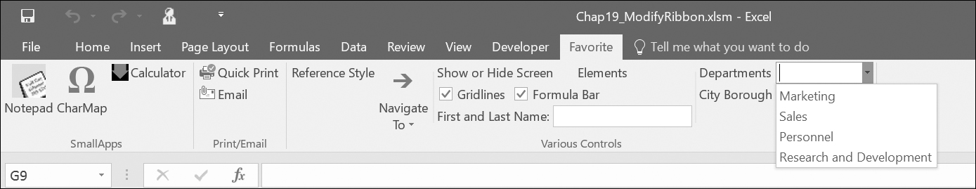
FIGURE 19.18. A combo box with a list of departments.
A gallery control is a drop-down control that can display a grid of images with or without a label. Built-in galleries cannot be customized, but you can build your own using the <gallery> tag. The following XML markup dynamically populates a custom gallery control at runtime:
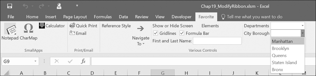
FIGURE 19.19. The City Borough combo box on the Ribbon lists the New York City boroughs.
<gallery id="glHolidays" label="Holidays" columns="3" rows="4" getImage="onGetImage" getItemCount="onGetItemCount" getItemLabel="onGetItemLabel" getItemImage="onGetItemImage" getItemID="onGetItemID" onAction="onSelectedItem" />
You will find the Holidays gallery Ribbon customization in the CustomUI14_ver09.txt file on the Companion CD. In the above XML markup, the gallery control will perform the action specified in the onSelectedItem callback procedure. Notice that the gallery control has many attributes that contain static text or define callbacks. We will discuss them later. Right now, let’s focus on the image loading process. The gallery control uses the getImage attribute with the OnGetImage callback procedure. This procedure entered in the VBA code module of the Chap19_ModifyRibbon.xlsm workbook will tell Excel to load the appropriate image to the Ribbon:
Public Sub onGetImage(ctl As IRibbonControl, ByRef image)
Select Case ctl.ID
Case "glHolidays"
Set image = LoadPicture( "C:\VBAExcel2016_ByExample\Extra Images\Square0.gif")
End Select
End Sub
Notice that the decision as to which image should be loaded is based on the ID of the control in the Select Case statement. The gallery control also uses the OnGetItemImage callback procedure (defined in the getItemImage attribute) to load custom images for its drop-down selection list (see Figure 19.20). Use the columns and rows attributes to specify the number of columns and rows in the gallery when it is opened. If you need to define the height and width of images in the gallery, use the itemHeight and itemWidth attributes (not used in this example due to the simplicity of the utilized images). The getItemCount and getItemLabel attributes contain callback procedures that provide information to the Ribbon on how many items should appear in the drop-down list and the names of those items. The getItemImage attribute contains a callback procedure that specifies the images to be displayed next to each gallery item. The getItemID attribute specifies the onGetItemID callback procedure that will provide a unique ID for each of the gallery items.
Now let’s go over other VBA callbacks that are used by the gallery control. All the VBA procedures in this section need to be added to the VBA module for the previous XML markup to work:
Public Sub onGetItemCount(ctl As IRibbonControl, ByRef count)
count = 12
End Sub
In the previous procedure, we use the count parameter to return to the Ribbon the number of items we want to have in the gallery control.
Public Sub onGetItemLabel(ctl As IRibbonControl, index As Integer, ByRef label)
label = MonthName(index + 1)
End Sub
The above procedure will label each of the gallery items. The VBA MonthName function is used to retrieve the name of the month based on the value of the index. The initial value of the index is zero (0). Therefore, index + 1 will return January. To display an abbreviated form of the month’s name (Jan, Feb, etc.), specify True as the second parameter to this function:
label = MonthName(index + 1, True)
If you are using a localized version of Microsoft Office (French, Spanish, etc.), the MonthName function will return the name of the month in the specified interface language.
The next callback procedure shows how to load images for each gallery item:
Public Sub onGetItemImage(ctl As IRibbonControl, index As Integer, ByRef image)
Dim imgPath As String
imgPath = "C:\VBAExcel2016_ByExample\Extra Images\square"
Set image = LoadPicture(imgPath & index + 1 & ".gif")
End Sub
Each item in the gallery must have a unique ID, so the onGetItemID callback uses the MonthName function to use the month name as the ID:
Public Sub onGetItemID(ctl As IRibbonControl, index As Integer, ByRef id)
id = MonthName(index + 1)
End Sub
The last procedure you need to write for the Holidays gallery control should define the actions to be performed when an item in the gallery is clicked. This is done via the following onSelectedItem callback that was specified in the onAction attribute of the XML markup:
Public Sub onSelectedItem(ctl As IRibbonControl, selectedId As String, selectedIndex As Integer)
Select Case selectedIndex
Case 6
MsgBox "Holiday 1: Independence Day, July 4th", vbInformation + vbOKOnly, selectedId & " Holidays"
Case 11
MsgBox "Holiday 1: Christmas Day, December 25th", vbInformation + vbOKOnly, selectedId & " Holidays"
Case Else
MsgBox "Please program holidays for " & selectedId & ".", vbInformation + vbOKOnly, " Under Construction"
End Select
End Sub
In the previous callback procedure, the selectedId parameter returns the name that was assigned to the label, while the selectedIndex parameter is the position of the item in the list. The first item in the list (January) is indexed with zero (0), the second one with 1, and so forth. In the previous procedure we have just coded two holidays: one for the month of July (selectedIndex=6) and one for December (selectedIndex=11). The Case Else clause in the Select Case statement provides a message when other months are selected.
On some Ribbon tabs you can see a small dialog box launcher button at the bottom-right corner of a group (see Figure 19.5 earlier in this chapter). You can use this button to open a special form that allows the user to set up many options at once, or you can display a form that contains specific information. To add a custom dialog box launcher button to the Ribbon, use the <dialogBoxLauncher> tag, as shown below:

FIGURE 19.20. Customized Ribbon with the gallery control.
<dialogBoxLauncher>
<button id="Launch1" screentip="Show Auto Correct Dialog" onAction="onActionLaunch" />
</dialogBoxLauncher>
You will find the dialogBoxLauncher Ribbon customization in the CustomUI14_ver10.txt file on the Companion CD. The dialog box launcher control must contain a button. The onAction attribute for the button contains the callback procedure that will execute when the button is clicked:
Public Sub onActionLaunch(ctl As IRibbonControl)
Application.Dialogs(xlDialogAutoCorrect).Show
End Sub
The dialog box launcher control must appear as the last element within the containing group element. The following XML code contains the entire definition of the Ribbon customization discussed so far in this chapter and depicted in Figure 19.21:
<customUI xmlns="http://schemas.microsoft.com/office/2009/07/customui" loadImage="OnLoadImage">
<ribbon startFromScratch="false">
<tabs>
<tab idMso="TabHome">
<group idMso="GroupStyles" visible="false" />
</tab>
<tab id="TabJK1" label="Favorite">
<group id="GroupJK1" label="SmallApps">
<button id="btnNotes" label="Notepad" image="Note1" size="large" onAction="OpenNotepad" screentip="Open Windows Notepad" supertip="It is recommended that you save your notes about this worksheet in a simple text file." />
<button id="btnCharMap" label="CharMap" imageMso="SymbolInsert" size="large" onAction="OpenCharmap" />
<button id="btnCalc" label="Calculator" image="DownArrow.gif" onAction="OpenCalculator" />
</group>
<group id="GroupJK2" label="Print/Email">
<button idMso="FilePrintQuick" size="normal" />
<button idMso="FileSendAsAttachment" size="normal" />
</group>
<group id="GroupJK3" label="Various Controls">
<toggleButton id="tglR1C1" label="Reference Style" size="normal" getPressed="onGetPressed" onAction="SwitchRefStyle" />
<splitButton id="btnSplit1" size="large">
<button id="btnGoTo" label="Navigate To…" imageMso="GoTo" />
<menu id="mnuGoTo" label="Spreadsheet Navigation" itemSize="normal">
<menuSeparator id="mnuDiv1" title="Formulas and Constants" />
<button id="btnFormulas" label="Select Formulas" onAction="GoToSpecial" />
<button id="btnNumbers" label="Select Numbers Only" onAction="GoToSpecial" />
<button id="btnText" label="Select Text Only" onAction="GoToSpecial" />
<menuSeparator id="mnuDiv2" title="Special Cells" />
<button id="btnBlanks" label="Select blank cells" onAction="GoToSpecial" />
<button id="btnLast" label="Select last cell" onAction="GoToSpecial" />
</menu>
</splitButton>
<separator id="OtherControlsDiv1" />
<labelControl id="TitleForBox1" label="Show or Hide Screen Elements" />
<box id="boxLayout1">
<checkBox id="chkGridlines" label="Gridlines" visible="true" getPressed="onGetPressed" onAction="DoSomething" />
<checkBox id="chkFormulaBar" label="Formula Bar" visible="true" getPressed="onGetPressed" onAction="DoSomething" />
</box>
<editBox id="txtFullName" label="First and Last Name:" sizeString="AAAAAAAAAAAAAAAA" maxLength="25" onChange="onFullNameChange" />
<separator id="OtherControlsDiv2" />
<comboBox id="cboDepartment" label="Departments" supertip="Select Department" onChange="onChangeDept">
<item id="Marketing" label="Marketing" />
<item id="Sales" label="Sales" />
<item id="Personnel" label="Personnel" />
<item id="ResearchAndDevelopment" label="Research and Development" />
</comboBox>
<dropDown id="drpBoro" label="City Borough" supertip="Select City Borough" onAction="onActionBoro">
<item id="M" label="Manhattan" />
<item id="B" label="Brooklyn" />
<item id="Q" label="Queens" />
<item id="I" label="Staten Island" />
<item id="X" label="Bronx" />
</dropDown>
<gallery id="glHolidays" label="Holidays" columns="3" rows="4"
getImage="onGetImage" getItemCount="onGetItemCount"
getItemLabel="onGetItemLabel" getItemImage="onGetItemImage"
getItemID="onGetItemID" onAction=" onSelectedItem" />
<dialogBoxLauncher>
<button id="Launch1" screentip="Show Auto Correct Dialog" onAction="onActionLaunch" />
</dialogBoxLauncher>
</group>
</tab>
</tabs>
</ribbon>
</customUI>
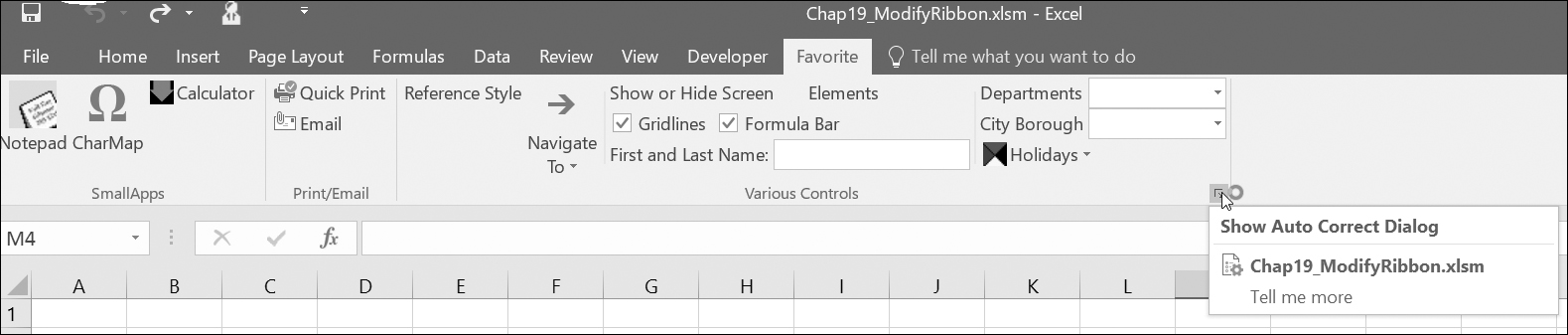
FIGURE 19.21. A dialog box launcher control on the Ribbon.
You can disable a built-in or custom Ribbon control by using the enabled or getEnabled attribute. The following XML markup uses the enabled attribute to disable our custom checkbox control that we created earlier:
<checkBox id="chkGridlines" label="Gridlines" visible="true" getPressed="onGetPressed" enabled="false" onAction="DoSomething" />
You can use the getEnabled attribute to disable a control based on some conditions. For example, the following XML markup uses the getEnabled attribute to disable the custom checkbox control named Formula Bar when Sheet3 is activated:
<checkBox id="chkFormulaBar" label="Formula Bar" visible="true" getPressed="onGetPressed" getEnabled="onGetEnabled" onAction="DoSomething" />
You will find the previous Ribbon customizations for checkboxes in the CustomUI14_ver11.txt file on the Companion CD.
The checkbox customization requires the following variable declaration at the top of the VBA module and a callback procedure in the module body:
Public blnEnabled As Boolean
Public Sub onGetEnabled(ctl As IRibbonControl, ByRef returnedVal)
returnedVal = blnEnabled
End Sub
In addition to the previous procedure, you will need to implement the procedures and markup as explained in the “Refreshing the Ribbon” section later in this chapter.
The Sheet3 Code window of the Chap19_Ribbon.xlsm workbook should contain the following two event procedures and the declaration at the top of the VBA module (You may need to add the necessary sheets to the workbook):
' enter the declaration at the top of
' the Module1 code window
Public objRibbon As IRibbonUI
' enter these two procedures in Sheet3 code window
Private Sub Worksheet_Activate()
blnEnabled = False
objRibbon.Invalidate
MsgBox "Formula bar checkmark is disabled in this sheet only."
End Sub
Private Sub Worksheet_Deactivate()
blnEnabled = True
objRibbon.Invalidate
End Sub
You can use a callback procedure to display a “not authorized” message when a Ribbon control is selected. The following XML code shows how to disable the built-in Name Manager button on the Ribbon’s Formulas tab:
<!-- Built-in commands section -->
<commands>
<command idMso="NameManager" onAction="DisableNameManager" />
</commands>
You will also find the NameManager command Ribbon customization in the CustomUI14_ver12.txt file on the Companion CD.
To make your XML code more readable, you can include comments between the <!-- and --> characters. The <command> tag can be used to refer to any built-in command. This tag must appear in the <commands> section of the XML code. To see how this works, simply add the above code fragment to the XML code shown in the previous section just before the line:
<ribbon startFromScratch="false">
The onAction attribute contains the following callback procedure that will display a message when the Name Manager button is clicked:
Sub DisableNameManager(ctl As IRibbonControl, ByRef cancelDefault)
MsgBox "You are not authorized to use this function." cancelDefault = True
End Sub
You can add more code to the above procedure if you need to cancel the control’s default behavior only when certain conditions have been satisfied. To ensure that the Ribbon customization introduced in this section works, be sure to enter all of the procedures in the VBA code module of the Chap19_ModifyRibbon.xlsm workbook.
It is possible to change the purpose of a built-in Ribbon button. For example, when the user clicks the Picture button on the Insert tab when Sheet1 is active, you could display a Copy Picture dialog box instead of the default Insert Picture dialog box. To try this out, you need to add the following XML markup to your xml document (CustomUI14.xml):
<command idMso="PictureInsertFromFile" onAction="CopyPicture" />
You will find the previous Ribbon customization in the CustomUI14_ver13.txt file on the Companion CD.
The onAction attribute requires the following callback procedure in a VBA code module of the Chap19_ModifyRibbon.xlsm workbook:
Public Sub CopyPicture(ctl As IRibbonControl, ByRef cancelDefault)
If ActiveSheet.Name = "Sheet1" Then
' display the CopyPicture dialog box instead
Application.Dialogs(xlDialogCopyPicture).Show
Else
cancelDefault = False
End If
End Sub
Only simple controls that perform an action when clicked can be repurposed. You cannot repurpose advanced controls such as combo boxes, drop-downs, or galleries.
So far in this chapter you’ve seen how to use callback procedures to specify the values of control attributes at runtime. But what if you need to update your custom Ribbon or the controls placed in the Ribbon based on what the user is doing in your application? The good news is that you can change the attribute values at any time by using the InvalidateControl method of the IRibbonUI object. To use this object, start by adding the onLoad attribute to the customUI element in your Ribbon customization XML:
<customUI xmlns="http://schemas.microsoft.com/office/2009/07/customui" loadImage="OnLoadImage" onLoad="RefreshMe">
You will find the above Ribbon customization in the CustomUI14_ver14.txt file on the Companion CD.
NOTE |
When you open the Chap19_ModifyRibbon.xlsm workbook with the previous customization in Excel, you will get errors because of the missing procedures. Simply click OK to the error messages and then switch to the VBA window and enter the code as explained further in this section. |
The onLoad attribute points to the callback procedure that will give you a copy of the Ribbon that you can use to refresh anytime you want. In this example, the onLoad callback procedure name is RefreshMe. Let’s say that upon entry you want the text of the edit box to appear in uppercase. Implementing the onLoad callback requires the Public module-level variable of type IRibbonUI declared earlier at the top of the VBA code module of the Chap19_ModifyRibbon.xlsm workbook:
Public objRibbon As IRibbonUI
To keep track of the state of the edit box control, declare a Private module-level variable:
Private strUserTxt As String
Next, enter the callback procedure that will store a copy of the Ribbon in the objRibbon variable:
'callback for the onLoad attribute of customUI
Public Sub RefreshMe(ribbon As IRibbonUI)
Set objRibbon = ribbon
End Sub
When the Ribbon loads, you will have a copy of the IRibbonUI object saved for later use. Now let’s take a look at the XML markup used in this scenario:
<editBox id="txtFullName" label="First and Last Name:" sizeString="AAAAAAAAAAAAAAAAAA" maxLength="25"
getText="getEditBoxText" onChange="onFullNameChangeToUcase" />
You will find the editBox Ribbon customization in the CustomUI14_ver15.txt file on the Companion CD.
This edit box control was introduced earlier in this chapter (see Figure 19.17). You need to modify the original XML markup for the edit box by adding the getText attribute, which points to the following callback:
Public Sub getEditBoxText(control As IRibbonControl, ByRef text)
text = UCase(strUserTxt)
End Sub
The above callback uses the VBA built-in UCase function to change the text that the user entered in the edit box to uppercase letters. When text is updated in the edit box, the procedure in the onChange attribute is called (be sure to change the procedure name in your original XML markup):
Public Sub onFullNameChangeToUcase(ByVal control As
IRibbonControl, text As String)
If text <> "" Then
strUserTxt = text
objRibbon.InvalidateControl "txtFullName"
End If
End Sub
The above callback begins by checking the value of the text parameter provided by the Ribbon. If this parameter contains a value other than an empty string (“”), the text the user entered is stored in the strUserTxt variable. Before a change can occur in the Ribbon control, you need to mark the control as invalid. This is done by calling the InvalidateControl method of the IRibbonUI object that we have stored in the objRibbon variable:
objRibbon.InvalidateControl "txtFullName"
The above statement will tell the txtFullName control to refresh itself the next time it is displayed. When the control is invalidated, it will automatically call its callback functions. The onFullNameChangeToUcase callback procedure in the onChange attribute will execute, causing the text entered in the txtFullName edit box control to appear in uppercase letters, as shown in Figure 19.22.
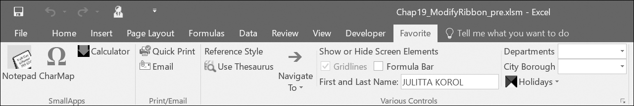
FIGURE 19.22 The entry in the First and Last Name edit box on the Ribbon’s Favorite tab now appears in uppercase letters. Notice also that the Gridlines checkbox is now disabled.
NOTE |
If you find that some controls on the Favorite tab don’t behave as programmed, make sure that the top of the VBA module contains the following three module-level variables and the RefreshMe procedure: |
Public objRibbon As IRibbonUI
Private strUserTxt As String
Public blnEnabled As Boolean
'callback for the onLoad attribute of customUI
Public Sub RefreshMe(ribbon As IRibbonUI)
Set objRibbon = ribbon
End Sub
Reload the Chap19_ModifyRibbon.xlsm workbook and check if the problem was resolved.
You can make your custom Ribbon button match any built-in button by using the CommandBar object. This object has been extended with several get methods that expose the state information for the built-in controls: GetEnabledMso, GetImageMso, GetLabelMso, GetPressedMso, GetScreentipMso, GetSupertipMso, and GetVisibleMso. Use these methods in your callbacks to check the built-in control’s properties. For example, the following statement will return False if the Ribbon’s built-in Cut button is currently disabled (grayed out) or True if it is enabled (ready to use):
MsgBox Application.CommandBars.GetEnabledMso("Cut")
Notice that the GetEnabledMso method requires that you provide the name of the built-in control. To see the result of the above statement, simply type it in the Immediate window and press Enter.
The GetImageMso method is very useful if you’d like to reuse any of the built-in button images in your own controls. This method allows you to get the bitmap for any imageMso tag. For example, to retrieve the bitmap associated with the Cut button on the Ribbon, enter the following statement in the Immediate window:
MsgBox Application.CommandBars.GetImageMso("Cut", 16, 16)
The previous GetImageMso method uses three arguments: the name of the built-in control, and the width and height of the bitmap image in pixels. Because this method returns the IPictureDisp object, it is very easy to place the retrieved bitmap onto your own custom Ribbon control by writing a simple VBA callback for your control’s getImage attribute.
In addition to the methods that provide information about the properties of the built-in controls, the CommandBar object also includes a handy ExecuteMso method that can be used to trigger the built-in control’s default action. This method is quite useful when you want to perform a click operation for the user from within a VBA procedure or want to conditionally run a built-in feature.
Let’s take a look at the example implementation of the GetImageMso and ExecuteMso methods. Here’s the XML definition for a custom Ribbon button:
<button id="btnWordWizard" label="Use Thesaurus" size="normal" getImage="onGetBitmap" onAction="DoDefaultPlus" />
You will find the above Ribbon customization in the CustomUI14_ver16.txt file on the Companion CD.
The above XML code can be added to the custom Ribbon definition you’ve worked with in this chapter. Now let’s look at the VBA part. You want the button to use the same image as the built-in button labeled ResearchPane. When the button is clicked, you’d like to display the built-in Research pane set to Thesaurus only when a certain condition is true. Here is the code you need to add to your VBA module:
Sub onGetBitmap(ctl As IRibbonControl, ByRef image)
Set image = Application.CommandBars.
GetImageMso("ResearchPane", 16, 16)
End Sub
When the Ribbon is loaded, the onGetBitmap callback automatically retrieves the image bitmap from the ResearchPane button’s imageMso attribute and assigns it to the getImage attribute of your button. When your button is clicked and the active cell contains a text entry, the Thesaurus opens up in the Research pane; if the active cell is empty or it contains a number, the user will see a message box:
Sub DoDefaultPlus(ctl As IRibbonControl)
If Not IsNumeric(ActiveCell.Value) Then
Application.CommandBars.ExecuteMso "Thesaurus"
Else
MsgBox "To use Thesaurus, select a cell " & "containing text.", vbOKOnly + vbInformation, "Action Required"
End If
End Sub
Be sure to enter the above procedures in the VBA code module of the Chap19_ModifyRibbon.xlsm workbook. Figure 19.23 shows the Thesaurus button in the Various Controls group of the Favorite tab.

FIGURE 19.23 A custom button can conditionally trigger a built-in control’s action.
Tab activation makes it possible to activate a specific tab in response to some event.
To activate a custom tab on the Excel Ribbon, use the ActivateTab method of the IRibbonUI object passing to it the ID of the custom string. For example, to activate the Favorite tab you created in this chapter, use the following statement:
objRibbon.ActivateTab "TabJK1"
Recall that objRibbon is the module-level Public variable we declared earlier for accessing the IRibbonUI object.
To activate a built-in tab, use the ActivateTabMso method. For example, the following statement activates the Data tab:
objRibbon.ActivateTabMso "TabData"
Finally, there is also a special ActivateTabQ method used to activate a tab shared between multiple add-ins. In addition to the tabID, this method requires that you specify the namespace of the add-in. The syntax is shown below:
expression.ActivateTabQ(tabID As String, namespace as String)
where expression returns an IRibbonUI object.
Keep in mind that tab activation applies only to tabs that are visible.
Group auto-scaling enables custom Ribbon groups to change their layout when the user resizes the window (see Figures 19.24 and 19.25).
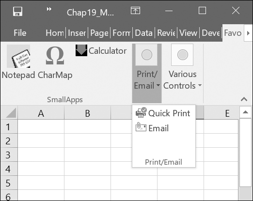
FIGURE 19.24. The commands in the Print/Email and Various Controls groups are compressed to a single button when the Excel application window is made smaller. To change the icon that appears when the group is compressed, assign an image to the group itself.
You can enable auto-scaling by setting the autoScale attribute of the <group> tab to true as in the following:
<group id="GroupJK3" label="Various Controls" autoScale="true">

FIGURE 19.25. When you set the autoScale attribute to true, the group of controls will change its layout to best fit the resized window
You will find the above Ribbon customization in the CustomUI14_ver17.txt file on the Companion CD. Notice that the value of the autoScale attribute is entered in lowercase. Auto-scaling is set on a per-group basis.
The completed workbook file with all Ribbon customizations that have been added up to this point can be found in the Chap19_RibbonCustomization1.xlsm workbook in your VBAExcel2016_ByExample folder.
The File tab provides an entry point to the Office UI known as Backstage View. This view is specifically designed for working with workbooks. It contains commands known as Fast commands that provide quick access to common functionality such as saving, opening, or closing workbooks. Here you also find the Exit command for exiting Microsoft Excel and the Options command for customizing numerous Excel features. In addition to Fast commands, the navigation bar on the left-hand side of the Backstage View includes several tabs that group related tasks. For example, clicking the Print tab in the navigation bar displays all the information related to the installed printers and allows you to easily access and change many of the print settings. A large area in the Print Backstage is used for the presentation of the workbook’s Print Preview. The Info tab organizes tasks related to workbook permissions, versions, file sharing, and numerous other workbook properties.
As an Excel developer already familiar with Ribbon UI customization, you will feel very comfortable customizing the Backstage View. Like the Ribbon, the Backstage View uses XML markup that you can add to the workbook file by using the Custom UI Editor.
The Backstage View is a perfect place to include custom solutions that present summaries of business processes or workflows (see the sidebar with links to Microsoft documents that will walk you through the process of customizing the Office 2016 Backstage View). In this section you’ll do a couple of simple things in the Backstage View to get your feet wet so that you can later move on to more advanced customizations with the downloads recommended in the sidebar.
|
Backstage View Development |
|
For an advanced introduction to the Backstage View, you may want to download the following Microsoft papers (note that 2010 versions of these docs are still applicable to the current 2016 version): Customizing the Office 2010 Backstage View for Developers from http://msdn.microsoft.com/en-us/library/ee815851(printer).aspx Dynamically Changing the Visibility of Groups and Controls in the Office 2010 Backstage View http://msdn.microsoft.com/en-us/library/ff645396(printer).aspx |
The Backstage View XML markup should be entered between <backstage></backstage> elements within the <customui></customui> tags and below any Ribbon customization markup. The following XML markup adds a custom button named Synchronize and a custom tab named Endless Possibilities to the Backstage View:
<backstage>
<button id="btnSync" label="Synchronize" imageMso="SyncNow" isDefinitive="true" insertBeforeMso="FileClose" onAction="onActionCopyTo Archive" />
<tab id="mySpecialTab" label="Endless Possibilities" insertAfterMso="TabRecent">
<firstColumn>
<group id="grp01" label="Home Group" helperText="This is group 1 help text">
<topItems>
<button id="myButton1" label="My button" />
</topItems>
</group>
<group id="gr02" label="Cheat Sheet">
<topItems>
<button id="myButton2" label="Cheat Ideas" />
</topItems>
<layoutContainer id="set1" layoutChildren="horizontal" >
<editBox id="item1" label="Cheat Item 1" />
<editBox id="item2" label="Cheat Item 2" />
</layoutContainer>
</bottomItems>
</group>
</firstColumn>
<secondColumn>
<group id="grpHyperlinks" label="Frequently Accessed Websites" visible="true">
<primaryItem>
<button id="top1" label="Primary Button" imageMso="HyperlinkProperties" />
</primaryItem>
<topItems>
<button id="msft" label="Microsoft" onAction="onActionExecHyperlink" />
<layoutContainer id="set2" layoutChildren="vertical" >
<hyperlink id="YouTube" label="http://www.YouTube.com" onAction="onActionExecHyperlink" />
<hyperlink id="amazon" label="http://www.amazon.com" onAction="onActionExecHyperlink" />
<hyperlink id="merc" label="http://www.merclearning.com" onAction="onActionExecHyperlink" />
</layoutContainer>
</topItems>
</group>
</secondColumn>
</tab>
</backstage>
You will find the previous Backstage View customization in the CustomUI14_ver18.txt file on the Companion CD.
The resulting Backstage customization is shown in Figure 19.26.
In the previous example XML markup, the <button> element is used to incorporate into the Backstage View navigation bar a custom command labeled Synchronize:

FIGURE 19.26. The Backstage View is highly customizable. The Synchronize button and the Endless Possibilities tab were created by adding some XML markup into the Ribbon customization file.
<button id="btnSync" label="Synchronize" imageMso="SyncNow" isDefinitive="true" insertBeforeMso="FileClose" onAction="onActionCopyToArchive" />
The <button> element contains the isDefinitive attribute. When this attribute is set to true, clicking the button will trigger the callback procedure defined in the onAction attribute and then automatically close the Backstage View and return to the worksheet.
The onAction callback for the custom Synchronize button follows. Notice that the callback calls the CopyToArchive procedure. This procedure allows you to make a copy of the current workbook file in a folder of your choice. Be sure to enter the procedure code in the VBA code module of the Chap19_ModifyRibbon.xlsm workbook.
Sub onActionCopyToArchive(ctl As IRibbonControl)
Archive
End Sub
Sub Archive()
Dim folderName As String
Dim MyDrive As String
Dim BackupName As String
Application.DisplayAlerts = False
On Error GoTo ErrorHandler
folderName = ActiveWorkbook.Path
If folderName = "" Then
MsgBox "You can't copy this file. " & Chr(13) & "This file has not been saved.", vbInformation, "File Archive"
Else
With ActiveWorkbook
If Not .Saved Then .Save
MyDrive = InputBox("Enter the Pathname:" & Chr(13) & "(for example: D:\, " & "E:\MyFolder\, etc.)", "Archive Location?", "D:\")
If MyDrive <> "" Then
If Right(MyDrive, 1) <> "\" Then
MyDrive = MyDrive & "\"
End If
BackupName = MyDrive & .Name
.SaveCopyAs Filename:=BackupName
MsgBox .Name & " was copied to: " & MyDrive, , "End of Archiving"
End If
End With
End If
GoTo ProcEnd
ErrorHandler:
MsgBox "Visual Basic cannot find the " & | "specified path (" & MyDrive & ")" & Chr(13) & "for the archive. Please try again.", vbInformation + vbOKOnly, "Disk Drive or " & "Folder does not exist"
ProcEnd:
Application.DisplayAlerts = True
End Sub
The Backstage View XML markup also adds to the Backstage View navigation bar a custom tab labeled Endless Possibilities. Each <tab> element can have one or more columns. Our example contains two columns. Each tab can contain multiple <group> elements. Here we have two groups in the first column and one group in the second column. The Backstage group can contain different types of controls. You can group the controls into three types of sections listed as follows:
This element is used to specify the most important item in the group. The primary item control can be a button or a menu with buttons, toggle buttons, checkboxes, or another menu. |
|
<topItems> |
This element defines controls that will appear at the top of the group. |
<bottomItems> |
This element defines the controls that will appear at the bottom of the group. |
The layout of controls in the Backstage View is defined using the <layoutContainer> element. This element’s layoutChildren attribute can define the layout of controls as horizontal or vertical. The second column of our example XML markup uses the following callback procedure for the button labeled Microsoft and the three hyperlinks. Enter the following procedure in the VBA code module of the Chap19_ModifyRibbon.xlsm workbook.
Sub onActionExecHyperlink(ctl As IRibbonControl)
Select Case ctl.id
Case "YouTube"
ThisWorkbook.FollowHyperlink Address:="http://www.YouTube.com", NewWindow:=True
Case "amazon"
ThisWorkbook.FollowHyperlink Address:="http://www.amazon.com", NewWindow:=True
Case "merc"
ThisWorkbook.FollowHyperlink Address:="http://www.merclearning.com", NewWindow:=True
Case "msft"
ThisWorkbook.FollowHyperlink Address:="http://www.Microsoft.com", NewWindow:=True
Case Else
MsgBox "You clicked control id " & ctl.id & " that has not been programmed!"
End Select
End Sub
|
Hiding Backstage Buttons and Tabs |
The following XML will hide the Save button in the Backstage View navigation bar:
<button idMso="FileSave" visible="false" />
The Backstage View uses the following button IDs: FileSave, FileSaveAs, FileOpen, FileClose, ApplicationOptionsDialog, and FileExit.
To hide the Info tab in the Backstage, use this markup:
<tab idMso="TabInfo" visible="false" />
The Backstage View tab IDs are as follows: TabInfo, TabRecent, TabNew, TabPrint, TabShare, and TabHelp.
|
Things to Remember When Customizing the Backstage View |
• The maximum number of allowed tabs is 255.
• You cannot reorder built-in tabs.
• You can add your custom tab before or after the built-in tab.
• You cannot modify the column layout of any built-in tab.
• You cannot reorder built-in groups; however, you can specify the order of groups you create.
If the Excel workbook with the customized Ribbon will be opened both in Excel 2016 and Excel 2007, it is a good idea to include the Office 2007 Custom UI Part using the Custom UI Editor for Microsoft Office. This will create the customUI.xlm file for Excel 2007. The sample XML markup for the Office Button menu is shown below (it is also available in the CustomUI_Office2007.txt file on the Companion CD):
<customUI xmlns="http://schemas.microsoft.com/office/2006/01/customui">
<ribbon startFromScratch="false">
<!-- Office Button Menu section -->
<officeMenu>
<control idMso="MenuPublish" visible="false" />
<menu idMso="FileSaveAsMenu">
<button idMso="FileSaveAsWebPage" />
</menu>
<button id="btnNotes1" label="Open Notepad" image="Note1" insertBeforeMso="FileSave" onAction="OpenNotepad" />
</officeMenu>
<!--Other Ribbon Customization section -->
</ribbon>
</customUI>
The Office 2007 menu customization must appear between the <officeMenu> and </officeMenu> tags, just below the <ribbon startFromScratch=”false”> element.
In the previous XML, we hide one default command in the Microsoft Office Button menu by setting the value of its visible attribute to false. We also add a new option to the FileSaveAs command:
<menu idMso="FileSaveAsMenu">
<button idMso="FileSaveAsWebPage" />
</menu>
Similar to the Backstage View in Excel 2016, you can include your own custom buttons as commands in the Microsoft Office Button menu in Excel 2007:
<button id="btnNotes1" label="Open Notepad" image="Note1" insertBeforeMso="FileSave" onAction="OpenNotepad" />
The Quick Access toolbar that appears just above the File tab gives application users quick access to tools they use most frequently. These tools can be easily added to the toolbar by selecting More Commands from the Customize Quick Access Toolbar drop-down menu. The QAT can only be customized in the start from scratch mode by setting the startFromScratch attribute to true in the Ribbon XML customization file:
<ribbon startFromScratch="true">
When you load a workbook that contains this setting, Excel hides all built-in tabs. You must add your own custom tabs as demonstrated earlier in this chapter. QAT modifications are specified using the <qat> element. Within this element you should use the <sharedControls> element to include controls that are shared by all open workbooks, and the <documentControls> element to specify the controls that should appear in the Quick Access toolbar when the workbook has the focus. The following XML markup creates the custom Quick Access toolbar shown in Figure 19.27. You will find this code in the CustomUI_QAT.txt file located on the Companion CD.
<customUI xmlns="http://schemas.microsoft.com/office/2009/07/customui" >
<ribbon startFromScratch="true">
<qat>
<sharedControls>
<button idMso="FilePrintQuick" />
</sharedControls>
<documentControls>
<button id="btnCalc2" label="Calculator" imageMso="SadFace" onAction="OpenCalculator" />
</documentControls>
</qat>
</ribbon>
</customUI>

FIGURE 19.27. Customized Quick Access toolbar.
The button labeled Calculator that is represented by the SadFace image calls the OpenCalcuator procedure as shown below:
Public Sub OpenCalculator(ctl As IRibbonControl)
Shell "Calc.exe", vbNormalFocus
End Sub
The above procedure can be found in the Chap19_ModifyQAT.xlsm file on the Companion CD.
Excel 2016 allows you to modify context menus using the same XML markup and callbacks that you used earlier in this chapter to customize the Ribbon UI. By using the Ribbon extensibility you can add built-in and custom controls to menus and submenus as well as hide controls in built-in menus. When creating custom submenus, you can dynamically populate them with controls by using the dynamicMenu control. The following example XML markup will help you get acquainted with context menu extensibility.
|
1. Launch Microsoft Excel and create a new workbook. Save this workbook as Chap19_ContextMenu.xlsm in your VBAExcel2016_ByExample folder. Be sure to save the workbook as Excel Macro Enabled workbook (*.xlsm).
2. Close the workbook and exit Excel.
3. Launch the Custom UI Editor for Microsoft Office that you installed and worked with earlier in this chapter.
4. Choose File | Open.
5. Select the C:\VBAExcel2016_ByExample\Chap19_ContextMenu.xlsm workbook file you created in Step 1 above and click Open.
6. Choose Insert | Office 2010 Custom UI Part. This creates a CustomUI14.xml file in the workbook.
7. In the right pane, enter the context menu XML markup as shown in Figure 19.28. If you prefer, you can copy the code from CustomUI14_ContextMenu.txt on the Companion CD.

FIGURE 19.28. XML markup for customizing context menus.
8. Click the Validate button on the Custom UI Editor Toolbar to verify that your XML does not contain errors. You should see the message “Custom UI XML is well formed.” If there are errors, you must correct them to ensure that the XML is well formed.
9. Save the file and close the Custom UI Editor.
10. Open the Chap19_ContextMenu.xlsm workbook in Excel and switch to the Visual Basic Editor window.
11. Choose Insert | Module.
12. In the Code window enter the callback procedures discussed below.
13. Switch to the Excel application window and right-click on any cell to view the custom commands added to the worksheet cell menu. Test each newly added command to ensure that it behaves as expected.
Notice that the context menu customization markup appears between the <contextMenus> </contextMenus> tags. The previous XML markup adds three new button controls and a menu control to the context menu that appears when you click on any worksheet cell. These controls are shown in Figure 19.29.

FIGURE 19.29. Standard worksheet cell context menu and the same context menu after applying the customization shown in Figure 19.28.
The first control added by the previous markup is a built-in Excel command with the idMso set to FileSaveAsWebPage. This command appears at the top of the context menu and is labeled Single Web Page (*.mht). Recall from earlier sections of this chapter that built-in commands use the idMso attribute while the custom commands use the id attribute. When clicked, this command will execute Excel’s built-in action that will allow you to save the worksheet as a Web page. The second command in the previous markup adds a custom button labeled Open Recent File. When clicked, this command will run the following onActionBuiltInCmd callback procedure:
Sub onActionBuiltInCmd(ctl As IRibbonControl)
CommandBars.ExecuteMso "FileOpenRecentFile"
End Sub
The onActionBuiltInCmd procedure uses the ExecuteMso method of the CommandBars object to run the built-in action assigned in Excel to the FileOpenRecentFile command.
The third button in the XML markup adds the custom control labeled Text Cells to Uppercase and designates the letter “U” as the keyboard accelerator. This command when clicked will convert any text cell found within the selection of cells to uppercase letters by running the following callback procedure:
Sub onActionUppercase(ctl As IRibbonControl)
Dim cell As Variant
For Each cell In Selection
If WorksheetFunction.IsText(cell) Then
cell.Value = UCase(cell.Value)
End If
Next
End Sub
The last command in the XML markup is a custom menu command labeled Select Special. This command when clicked displays a menu of options as shown in Figure 19.29. When you select a menu option, the following callback procedure is executed:
Sub onActionSelSpec(ctl As IRibbonControl)
Select Case ctl.ID
Case "text"
Selection.SpecialCells(xlCellTypeConstants, 2).Select
Case "num"
Selection.SpecialCells(xlCellTypeConstants, 1).Select
Case "blank"
Selection.SpecialCells(xlCellTypeBlanks).Select
Case "zero"
Dim cell As Variant
Dim myRange As Range
Dim foundFirst As Boolean
foundFirst = True
Selection.SpecialCells(xlCellTypeConstants, 1).Select
For Each cell In Selection
If cell.Value = 0 Then
If foundFirst Then
Set myRange = cell
foundFirst = False
End If
Set myRange = Application.Union(myRange, cell)
End If
Next
myRange.Select
Case Else
MsgBox "Missing Case statement for control id=" & ctl.ID, vbOKOnly + vbExclamation, "Check your VBA Procedure"
End Select
End Sub
In this chapter, you learned how to use VBA to work with built-in context menus and customize the Ribbon interface as well as the Backstage View using a combination of XML and VBA. While working with context menus, you learned about various properties and methods of the CommandBar object. Next, you learned how to use the Custom UI Editor for Microsoft Office to create XML Ribbon customization markup. You familiarized yourself with various controls that can be added to the Ribbon. You wrote VBA callback procedures in order to set your controls’ attributes at runtime. You also learned how to modify the Backstage View and the Quick Access toolbar. Finally, you learned how to manipulate the context menus via XML and VBA callbacks.
The knowledge and experience you gained in this chapter can be used to make similar customizations in all of the Microsoft Office 2016 applications that use the Ribbon interface.
In the next chapter, we focus on writing VBA code that handles printing and sending emails.