Chapter 6
Data Science 101
There are many excellent books and courses focused on teaching people how to become a data scientist. Those books and courses provide detailed material and exercises that teach the key capabilities of data science such as statistical analysis, data mining, text mining, SQL programming, and other computing, mathematical, and analytic techniques. That is not the purpose of this chapter.
The purpose of Chapter 6 is to introduce some different analytic algorithms that business users should be aware of and to discuss when it might be most appropriate to use which types of algorithms. You do not need to be a data scientist to understand when and why to apply these analytic algorithms. A more detailed understanding of these different analytic algorithms will help the business users to collaborate with the data science team to uncover those variables and metrics that may be better predictors of business performance.
Data Science Case Study Setup
Data science is a complicated topic that certainly cannot be given justice in a single chapter. So to help grasp some of the data science concepts that are covered in Chapter 6, you are going to create a fictitious company against which you can apply the different analytic algorithms. Hopefully this will make the different data science concepts “come to life.”
Our fictitious company, Fairy-Tale Theme Parks (“The Parks”), has multiple amusement parks across North America and wants to employ big data and data science in order to:
- Deliver a more positive and compelling guest experience in an increasingly competitive entertainment marketplace;
- Determine maximum potential guest lifetime value (MPGTV) to use as the basis for determining guest promotional spend and discounts and prioritizing Priority Access passes and in-park hotel rooms;
- Promote new technology-heavy 3D attractions (Terror Airline and Zombie Apocalypse) to ensure the successful adoption and long-term viability of those new rides that appeal to new guest segments;
- Ensure the success of new movie and TV characters in order to increase associated licensing revenues and ensure long-term character viability for new movie and TV sequels.
The Parks is deploying a mobile app called Fairy-Tale Chaperon that engages guests as they move through the park and helps guests enjoy the different attractions, entertainment, retail outlets, and restaurants. Fairy-Tale Chaperon will:
- Deliver Priority Access passes to different attractions and reward their most important guests with digital coupons, discounts, and “Fairy Dust” (money equivalent that can be spent only in the park).
- Promote social media posts to drive gamification and rewards around contests such as most social posts, most popular social posts, and most popular photos and videos.
- Track guest flow and in-park traffic patterns, tendencies, and propensities in order to determine which attractions to promote (to increase attraction traffic) and which attractions guests should avoid because of long wait times.
- Deliver real-time guest dining and entertainment recommendations based on guests' areas of interest and seat/table availability for select restaurants and entertainment.
- Reward guests who share their social media information that can be used to monitor guest real-time satisfaction and enjoyment via Facebook, Twitter, and Instagram. It also provides an opportunity to promote select photos in order to start viral marketing campaigns.
This chapter reviews a number of different analytic techniques. You are not expected to become an expert in these different analytic algorithms. However, the more you understand what these analytic algorithms can do, the better position you are in to collaborate with your data science team and suggest the art of the possible to your business leadership team.
Fundamental exploratory analytic algorithms that are covered in Chapter 6 are:
- Trend analysis
- Boxplots
- Geography (spatial) analysis
- Pairs plot
- Time series decomposition
More advanced analytic algorithms that are covered in this chapter are:
- Cluster analysis
- Normal curve equivalent (NCE) analysis
- Association analysis
- Graph analysis
- Text mining
- Sentiment analysis
- Traverse pattern analysis
- Decision tree classifier analysis
- Cohorts analysis
Throughout the chapter, you will contemplate how The Parks could leverage each of these different analytic techniques.
Fundamental Exploratory Analytics
Let's start by covering some basic statistical analysis that was likely covered in your first statistics course (yes, I realize that you probably sold your stats book the minute the stats class was over). Trend analysis, boxplots, geographical analysis, pairs plot, and time series decomposition are examples of exploratory analytic algorithms that the data scientists use to get a “feel for the data.” These exploratory analytic algorithms help the data science team to better understand the data content and gain a high-level understanding of relationships and patterns in the data.
Trend Analysis
Trend analysis is a fundamental visualization technique to spot patterns, trends, relationships, and outliers across a time series of data. One of the most basic yet very powerful exploratory analytics, trend analysis (applying different plotting techniques and graphic visualizations) can quickly uncover customer, operational, or product trends and events that tend to happen together or happen at some period of regularity (see Figure 6.1).
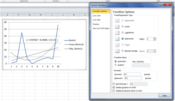
Figure 6.1 Basic trend analysis
In Figure 6.1, the data scientist manually tested a number of different trending options in order to identify the “best fit” trend line (in this example, using Microsoft Excel). Once the data scientist identifies the best trending option, the data scientist can automate the generation of the trend lines using R.
Next, the data scientist might want to dissect the trend line across a number of different business dimensions (e.g., products, geographies, sales territories, markets) in order to undercover patterns and trends at the next level of granularity. The data scientist can then write a program to juxtapose the detailed trend lines into the same chart so that it is easier to spot trends, patterns, relationships, and outliers buried in the granular data (see Figure 6.2).
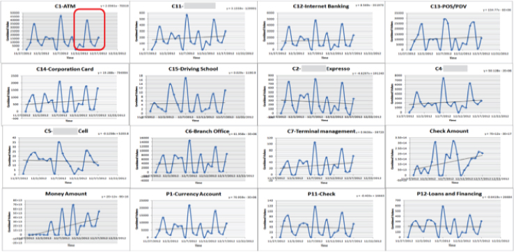
Figure 6.2 Compound trend analysis
Finally, trend analysis yields mathematical models for each of the trend lines. These mathematical models can be used to quantify reoccurring patterns or behaviors in the data. The most interesting insights from the trend lines can then be flagged for further investigation by the data science team (see Figure 6.3).
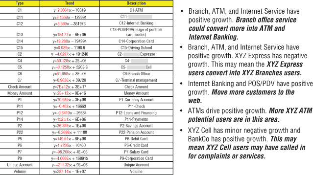
Figure 6.3 Trend line analysis
Boxplots
Boxplots are one of the more interesting and visually creative exploratory analytic algorithms. Boxplots quickly visualize variations in the base data and can be used to identify outliers in the data worthy of further investigation. A boxplot is a convenient way of graphically depicting groups of numerical data through their quartiles. Boxplots may also have lines extending vertically from the boxes (whiskers) indicating variability outside the upper and lower quartiles, hence the terms box-and-whisker plot and box-and-whisker diagram (see Figure 6.4).
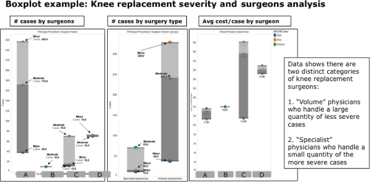
Figure 6.4 Boxplot analysis
One can quickly see the distribution of key data elements from the Boxplot in Figure 6.4. When you change the dimensions against which you are doing the boxplots, underlying patterns and relationships in the data start to surface.
Geographical (Spatial) Analysis
Geographical or spatial analysis includes techniques for analyzing geographical activities and conditions using a business entity's topological, geometric, or geographic properties. For example, geographical analysis supports the integration of zip code and data.gov economic data with a client's internal data to provide insights about the success of the organization's geographical reach and market penetration (see Figure 6.5).
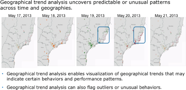
Figure 6.5 Geographical (spatial) trend analysis
In the example in Figure 6.5, geographical analysis is combined with trend analysis in order to identify changes in market patterns across the organization's key markets. Geographical analysis is especially useful for organizations looking to determine the success of their sales and marketing efforts.
Pairs Plot
Pairs plot analysis may be my favorite analytics algorithm. Pairs plot analysis allows the data scientist to spot potential correlations using pairwise comparisons across multiple variables. Pairs plot analysis provides a deep view into the different variables that may be correlated and can form the basis for guiding the data science team in the identification of key variables or metrics to include in the development of predictive models (see Figure 6.6).
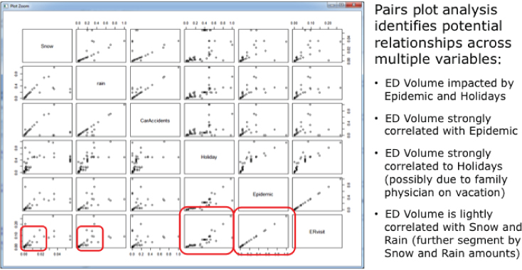
Figure 6.6 Pairs plot analysis
Pairs plot analysis does lots of the grunt work of quickly pairing up different variables and dimensions so that one can quickly spot potential relationships in the data worthy of more detailed analysis (see the boxes in Figure 6.6).
Time Series Decomposition
Time series decomposition expands on the basic trend analysis by decomposing the traditional trend analysis into three underlying components that can provide valuable customer, product, or operational performance insights. These trend analysis components are
- Cyclical component that describes repeated but non-periodic fluctuations,
- Seasonal component that reflects seasonality (seasonal variation),
- Irregular component (or “noise”) that describes random, irregular influences and represents the residuals of the time series after the other components have been removed.
From the time series decomposition analysis, a business user can spot particular areas of interest in the decomposed trend data that may be worthy of further analysis (see Figure 6.7).
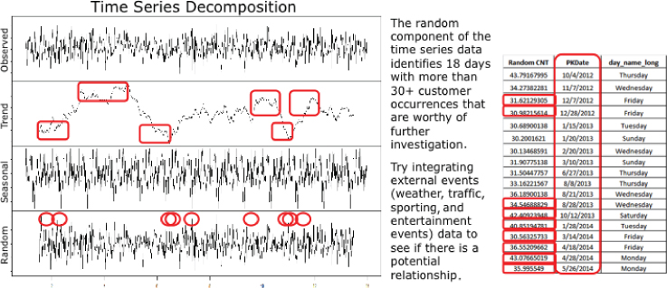
Figure 6.7 Time series decomposition analysis
For example in examining Figure 6.7, one can spot unusual occurrences in the areas of Seasonality and Trend (highlighted in the boxes) that may suggest the inclusion of additional data sources (such as weather or major sporting and entertainment events data) in an attempt to explain those unusual occurrences.
Analytic Algorithms and Models
The following analytic algorithms start to move the data scientist beyond the data exploration stage into the more predictive stages of the analysis process. These analytic algorithms by their nature are more actionable, allowing the data scientist to quantify cause and effect and provide the foundation to predict what is likely to happen and recommend specific actions to take.
Cluster Analysis
Cluster analysis is used to uncover insights about how customers and/or products cluster into natural groupings in order to drive specific actions or recommendations (e.g., personalized messaging, target marketing, maintenance scheduling). Cluster analysis or clustering is the exercise of grouping a set of objects in such a way that objects in the same group are more similar to each other than to those in other groups (clusters).
Clustering analysis can uncover potential actionable insights across massive data volumes of customer and product transactions and events. Cluster analysis can uncover groups of customers and products that share common behavioral tendencies and, consequently, and can be targeted with the same marketing treatments (see Figure 6.8).
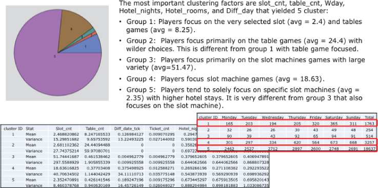
Figure 6.8 Cluster analysis
Normal Curve Equivalent (NCE) Analysis
A technique first used in evaluating students' testing performance, normal curve equivalent (NCE), is a data transformation technique that approximately fits a normal distribution between 0 and 100 by normalizing a data set in preparation for percentile rank analysis. For example, an NCE data transformation is a way of standardizing scores received on a test into a 0–100 scale similar to a percentile rank but preserving the valuable equal-interval properties of a z-score (see Figure 6.9).
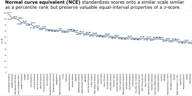
Figure 6.9 Normal curve equivalent analysis
What I find most useful about the NCE data transformation is taking the NCE results and binning the results to look for natural groupings in the data. For example in Figure 6.10, you build on the NCE analysis to uncover price points (bins) across a wide range of high-margin, mid-margin, and low-margin product categories that might indicate the opportunity for pricing and/or promotional activities.
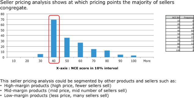
Figure 6.10 Normal curve equivalent seller pricing analysis example
Association Analysis
Association analysis is a popular algorithm for discovering and quantifying relationships between variables in large databases. Association analysis shows customer or product events or activities that tend to happen together, which makes this type of analysis very actionable. For example, the association rule {buns, ketchup} → {burger} found in the point-of-sales data of a supermarket would indicate that if a customer buys buns and ketchup together, she is likely to also buy hamburger meat. Such information can be used as the basis for making pricing, product placement, promotion, and other marketing decisions.
Association analysis is the basis for market basket analysis (identifying products and/or services that sell in combination or sell with a predictable time lag) that is used in many industries including retail, telecommunications, insurance, digital marketing, credit cards, banking, hospitality, and gaming.
In Figure 6.11, the data science team examined the credit card transactions for one individual and uncovered several purchase occurrences that tended to happen together. For example, you can see a very strong relationship between Chipotle and Starbucks in the second line of Figure 6.11, as well as a number of purchase occurrences (e.g., Foot Locker + Best Buy) that tend to happen in combination.
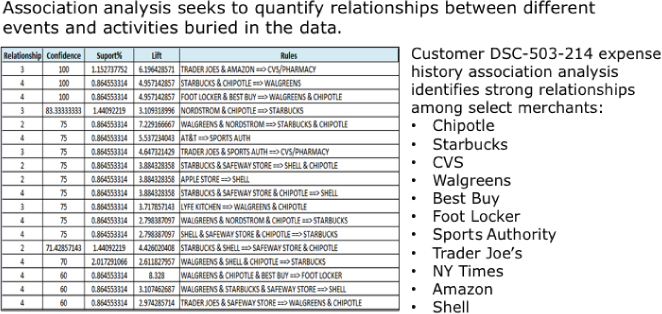
Figure 6.11 Association analysis
One very actionable data science technique is to cluster the resulting association rules into common groups or segments. For example, in Figure 6.12, the data science team clustered the resulting association rules across tens of millions of customers in order to create more accurate, relevant customer segments. In this process, the data science team
- Runs the association analysis across the tens of millions of customers to identify association rules with a high degree of confidence,
- Clusters the customers and their resulting association rules into common groupings or segments (e.g., Chipotle + Starbucks, Virgin America + Marriott),
- Uses these new segments as the basis for personalized messaging and direct marketing.
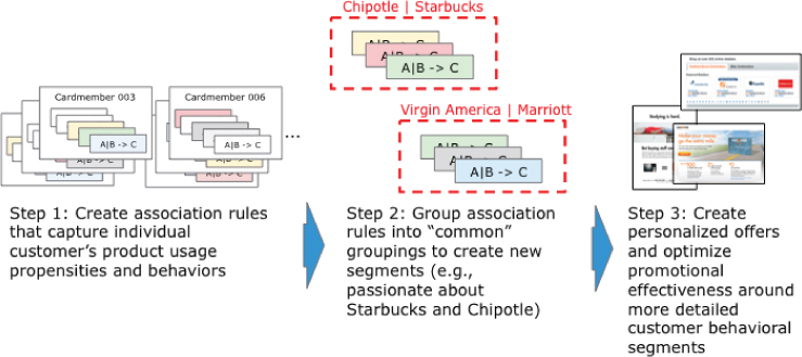
Figure 6.12 Converting association rules into segments
One of the interesting consequences of this association rule clustering technique is that a customer may appear in multiple segments. Artificially force-fitting a customer into a single segment obscures the fine nuances about each particular customer's buying behaviors, tendencies, and propensities.
Graph Analysis
Graph analysis is one of the more powerful analysis techniques made popular by social media analysis. Graph analysis can quickly highlight customer or machine (think Internet of Things) relationships obscured across millions if not billions of social and machine interactions.
Graph analysis uses mathematical structures to model pairwise relations between objects. A “graph” in this context is made up of “vertices” or “nodes” and lines called edges that connect them. Social network analysis (SNA) is an example of graph analysis. SNA is used to investigate social structures and relationships across social networks. SNA characterizes networked structures in terms of nodes (people or things within the network) and the ties or edges (relationships or interactions) that connect them (see Figure 6.13).
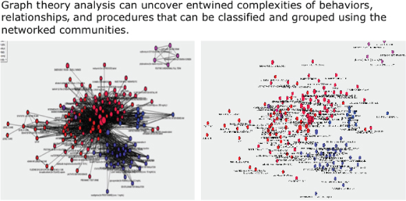
Figure 6.13 Graph analysis
While graph analysis is most commonly used to identify clusters of “friends,” uncover group influencers or advocates, and make friend recommendations on social media networks, graph analysis can also look at clustering and strength of relationships across diverse networks such as ATMs, routers, retail outlets, smart devices, websites, and product suppliers.
Text Mining
Text mining refers to the process of deriving usable information (metadata) from text files such as consumer comments, e-mail conversations, physician or technician notes, work orders, etc. Basically, text mining creates structured data out of unstructured data.
Text mining is a very powerful technique to show during an envisioning process, as many business stakeholders have struggled to understand how they can gain insights from the wealth of internal customer, product, and operational data. Text mining is not something that the data warehouse can do, so many business stakeholders have stopped thinking about how they can derive actionable insights from text data. Consequently, it is important to leverage envisioning exercises to help the business stakeholders to image the realm of what is possible with text data, especially when that text data is combined with the organization's operational and transactional data.
For example, in Figure 6.14, the text mining tool has mined a history of news feeds about a particular product to uncover patterns and combinations of words that may indicate product performance and maintenance problems.
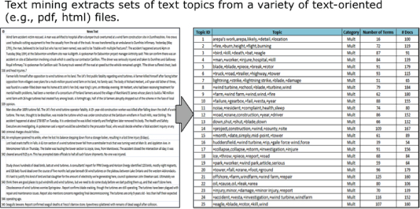
Figure 6.14 Text mining analysis
Typical text mining techniques and algorithms include text categorization, text clustering, concept/entity extraction, taxonomies production, sentiment analysis, document summarization, and entity relation modeling.
Sentiment Analysis
Sentiment analysis can provide a broad and general overview of your customers' sentiment toward your company and brands. Sentiment analysis can be a powerful way to glean insights about the customers' feelings about your company, products, and services out of the ever-growing body of social media sites (Facebook, LinkedIn, Twitter, Instagram, Yelp, Snapchat, Vine, etc.) (see Figure 6.15).
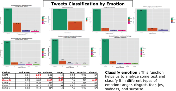
Figure 6.15 Sentiment analysis
In Figure 6.15, the data science team conducted competitive sentiment analysis by classifying the emotions (e.g., anger, disgust, fear, joy, sadness, surprise) of Twitter tweets about our client and its key competitors. Sentiment analysis can provide an early warning alert about potential customer or competitive problems (e.g., where your organization's performance and quality of service is considered lacking as compared to key competitors) and business opportunities (e.g., where key competitor's perceived performance and quality of service is suffering).
Unfortunately, it is sometimes difficult to get the social media data at the level of the individual, which is required to create more actionable insights and recommendations at the individual customer level. However, leading organizations are trying to incent their customers to “like” their social media sites or share their social media names in order to improve the collection of customer-identifiable data.
Traverse Pattern Analysis
Traverse pattern analysis is an example of combining a couple of analytic algorithms to better understand customer, product, or operational usage patterns. Traverse analysis links a customer or product usage patterns and association rules to a geographical or facility map in order to identify potential purchase, traffic, flow, fraud, theft, and other usage patterns and relationships.
The process starts by creating association rules from the customer's or product's usage data, and then maps those association rules to a geographical map (store, hospital, school, campus, sports arena, casino, airport) to identify potential performance, usage, staffing, inventory, logistics, traffic flow, etc. problems.
In Figure 6.16, the data science team created a series of association rules about slot and table play in a casino, and then used those association rules to identify potential foot flow problems and game location optimization opportunities. The data science team
- Created player performance association rules about what games the players tend to play in combination,
- Linked the game playing association rules to location ID, and then,
- Mapped rules and game performance data to a layout of the casino.
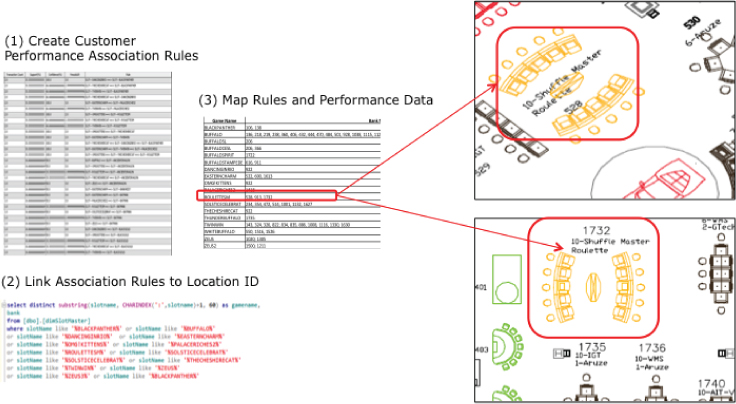
Figure 6.16 Traverse pattern analysis
The results of this analysis highlights areas of the casino that are sub-optimized when certain types of game players are in the casino and can lead to recommendations about the layout of the casino and the types of incentives to give players to change their game playing behaviors and tendencies.
Decision Tree Classifier Analysis
Decision tree classifier analysis uses decision trees to identify groupings and clusters buried in the usage and performance data. Decision classifier analysis uses a decision tree as a predictive model that maps observations about an item to conclusions about the item's target value.
In Figure 6.17, the data science team used the decision tree classifier analysis technique to identify and group performance and usage variables into similar clusters. The data science team uncovered product performance clusters that, when occurring in certain combinations, were indicative of potential product performance or maintenance problems.
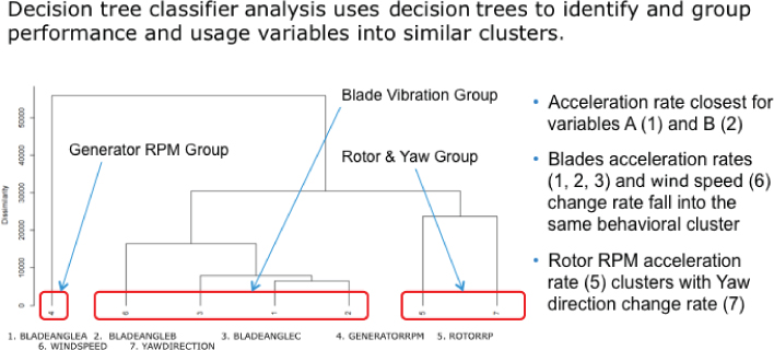
Figure 6.17 Decision tree classifier analysis
Cohorts Analysis
Cohorts analysis is used to identify and quantify the impact that an individual or machines have on the larger group.
Cohorts analysis is commonly used by sports teams to ascertain the relative value of a player with respect to his or her influence on the success of the overall team. The National Basketball Association uses a real plus-minus (RPM) metric to measure a player's impact on the game, represented by difference between the team's total scoring and its opponent's. Table 6.1 shows top RPM players from the 2014–2015 NBA season.
Table 6.1 2014–2015 Top NBA RPM Rankings
| Rank | Player | Team | MPG | RPM |
| 1 | Stephen Curry, PG | GS | 32.7 | 9.34 |
| 2 | LeBron James, SF | CLE | 36.1 | 8.78 |
| 3 | James Harden, SG | HOU | 36.8 | 8.50 |
| 4 | Anthony Davis, PF | NO | 36.1 | 8.18 |
| 5 | Kawhi Leonard, SF | SA | 31.8 | 7.57 |
| 6 | Russell Westbrook, PG | OKC | 34.4 | 7.08 |
| 7 | Chris Paul, PG | LAC | 34.8 | 6.92 |
| 8 | Draymond Green, SF | GS | 31.5 | 6.80 |
| 9 | DeMarcus Cousins, C | SAC | 34.1 | 6.12 |
| 10 | Khris Middleton, SG | MIL | 30.1 | 6.06 |
Source: http://espn.go.com/nba/statistics/rpm/_/sort/RPM
This powerful technique (with slight variations due to the different nature of the variables and relationships) can be used to quantify the impact that a particular individual (student, teacher, player, nurse, athlete, technician) has on the larger group (see Figure 6.18).
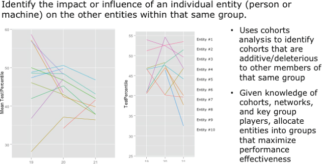
Figure 6.18 Cohorts analysis
Summary
The objective of Chapter 6 is to give you a taste for the different types of analytic algorithms a data science team can bring to bear on the business problems or opportunities that the organization is trying to address. This chapter better acquainted you with the different algorithms that the data science team can use to accelerate the business user and data science team collaboration process. While it is not the expectation of this book or chapter to turn business users into data scientists, it is my hope that Chapter 6 will set the foundation that helps business users and business leaders to “think like a data scientist.”
This chapter introduced a wide variety of analytic algorithms that the data science team might use, depending on the problem being addressed and the types and varieties of data available. It also introduced a fictitious company (Fairy-Tale Theme Parks) against which you applied the different analytic techniques to see the potential business actions (see Table 6.2).
Table 6.2 Case Study Summary
| Analytics | Fairy-Tale Parks Use Cases | Potential Business Actions |
| Trend analysis | Perform trend analysis to identify the variables (e.g., wait times, social media posts, consumer comments) that are highly correlated to the increase or decrease in guest satisfaction for each attraction, restaurant, retail outlet, and entertainment | Flag problem areas and take immediate corrective actions (e.g., open more lines, promote less busy attractions, move kiosks, resituate characters) Identify the location for future attractions, restaurants, and entertainment |
| Boxplots | Leverage boxplots to determine most loyal guests for each of the park's attractions (e.g., Canyon Copter Ride, Monster Mansion, Space Adventure, Ghoulish Gulch) | Create guest current and maximum loyalty scores and use those scores to prioritize to whom to reward with Priority Access passes and other coupons and discounts |
| Geography (spatial) analysis | Conduct geographical trend analysis to spot any changes (zip+4 and household levels) in the geo-demographics of visitors over time and by seasonality and holidays | Create geo-specific marketing campaigns and promotions to increase attendance from under-penetrated geographical areas based on day of week, holidays, seasonality, and events (on-park and off-park events) |
| Pairs plot | Compare multiple variables to identify those variables that drive guests to which attractions, entertainment, and restaurants | Make in-park promotional decisions and offers that moves guests to under-utilized attractions, entertainment, retail outlets, and restaurants |
| Time series decomposition | Leverage time series decomposition analysis to quantify the impact that seasonality and events (in-park and off-park) has on guest visits and associated spend | Create season-specific marketing campaigns and promotions to increase number of guest visits and associated spend Determine which local events outside of the parks (concerts, professional sporting events, BCS football games) are worthy of promotional and sponsorship spend |
| Cluster analysis | Cluster guests to create more actionable profiles of The Parks's most profitable and highest potential guest clusters | Leverage cluster results to prioritize and focus guest acquisition and guest activation, cross-sell and up-sell marketing efforts |
| Normal curve equivalent (NCE) analysis | Leverage NCE analysis to understand the price inflection points for different packages of attractions and restaurants | Leverage the price inflection points to create packages of attractions and restaurants to optimize pricing (by season, day of week, etc.) and create new Priority Access packages |
| Association analysis | Leverage market basket analysis to identify most popular and least popular “baskets” of attractions | Leverage most common “baskets” to create new pricing and Priority Access packages in order to better control traffic and wait times Leverage least common “baskets” to create new pricing and Priority Access packages in order to drive traffic to under-utilized attractions |
| Graph analysis | Leverage graph analysis to uncover direction and strength of relationships among groups of guests (leaders, followers, influencers, cohorts) | Send promotions (discounts, restaurant vouchers, travel vouchers) to group leaders in order to encourage leaders to bring their groups back to the parks more often |
| Text mining | Mine guest comments, social media posts, and e-mail threads to flag areas of concern and problem situations | Identify and locate unsatisfied guests in order to prioritize and focus personal (face-to-face) guest intervention efforts |
| Sentiment analysis | Establish a sentiment score for each attraction and character and monitor social media sentiment for the attractions and characters in real-time | Leverage real-time sentiment scores to take corrective actions (placate unhappy guests, open additional lines, open additional attractions, remove kiosks, move characters) |
| Traverse pattern analysis | Leverage traverse pattern analysis to understand park and guest flows with respect to attractions, entertainment, restaurants, retail outlets, characters, etc. | Identify where to place characters and situate portable kiosks in order to drive increased revenue Determine what promotions to offer in order to drive traffic to under-utilized attractions and restaurants |
| Decision tree classifier analysis | Use decision tree classifier analysis to quantify the variables that drive guest satisfaction | Leverage decision tree classifier analysis to determine which variables to manipulate in order to drive guest satisfaction and increase guest associated spend |
| Cohorts analysis | Identify specific employees and characters that tend to increase the overall park, attractions, characters, guest satisfaction, and spend levels | Leverage cohorts analysis to decide how many and where to situate characters Identify and reward park employees that drive higher guest satisfaction scores |
I strongly recommend that you stay current with the different analytic techniques that your data science team is using. Take the time to better understand when to use which analytic techniques. Buy your data science team lots of Starbucks, Chipotle, and whiskey, and your team will continue to open your eyes to the business potential of data science.
Homework Assignment
Use the following exercises to apply what you learned in this chapter.
- Exercise #1: Review each of the analytic algorithms covered in this chapter and write down one or two use cases where that particular analytic algorithm might be useful given your business situations.
- Exercise #2: Revisit the key business initiative that you identified in Chapter 2. Write down two or three of the analytic algorithms covered in this chapter that you think might be appropriate to the decisions that you are trying to make in support of that key business initiative.
- Exercise #3: Write down two or three bullet points about why you think those selected analytic algorithms might be most appropriate for your targeted business initiative.