Different Approaches to Painting
Finding Your Style
There are many ways to approach painting outdoors. This chapter features some of the ways you might like to start, but it is by no means all-inclusive. There are days when I abandon all previous methods of beginning, so that I can explore something new or just make a big mess!
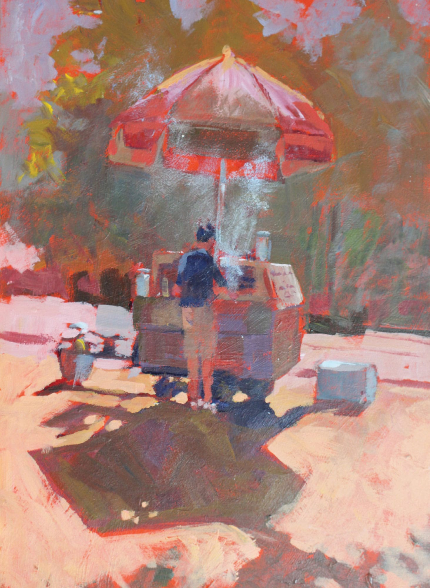
Hot Dog Vendor (acrylic on panel)
Starting with Basic Shapes
I created this 12-by-9-inch painting on-site in New York City. It was morning, and the guy who owned the hot dog cart was just getting started. The scene was backlit, throwing shadows toward me. That strong morning light negated some of the color, turning the local color into a warm neutral. I loved the steam that was rising up from that first batch of hot dogs, and I used dry-brush scumbling over an already dry passage to indicate it. I did not have much time that morning, so it was necessary to get the gist of the vision I had for the painting in a short amount of time.
First, I eliminated the buildings behind the trees. The buildings would help set the scene in the city, but the vendor’s setup is my story. I also eliminated about a dozen other people. I felt that to include them would prove unnecessary distraction. I want the viewer to focus on the vendor, the setup, the shadows, and particularly that steam.
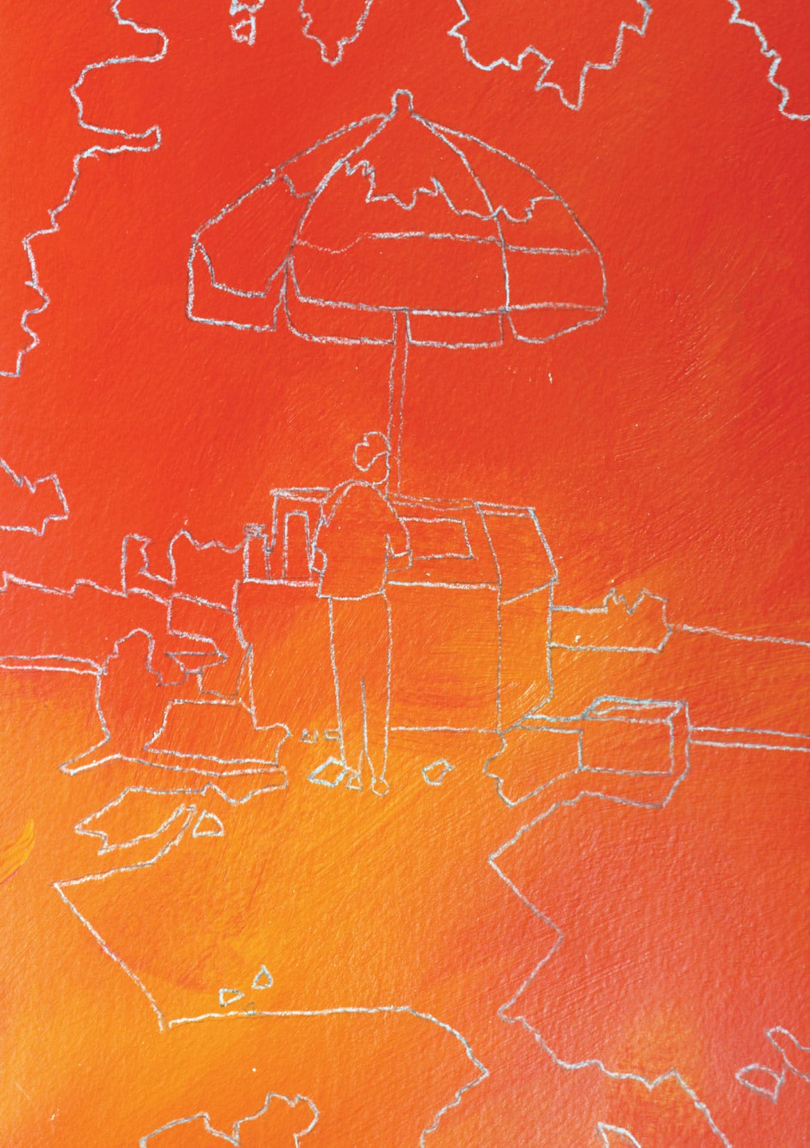
For the sake of this demonstration, I’ve reproduced my toned panel, including the outlines of all the basic shapes I needed. Notice that there are two lines: one dark line in pencil and another in white pencil on top of that. My cadmium red light-toned panel was too close in value to the graphite pencil lines, making the lines hard to see. I always carry a white water-soluble pencil for such occasions. White against the mid-value cadmium red light shows up much better.
Starting in Grayscale
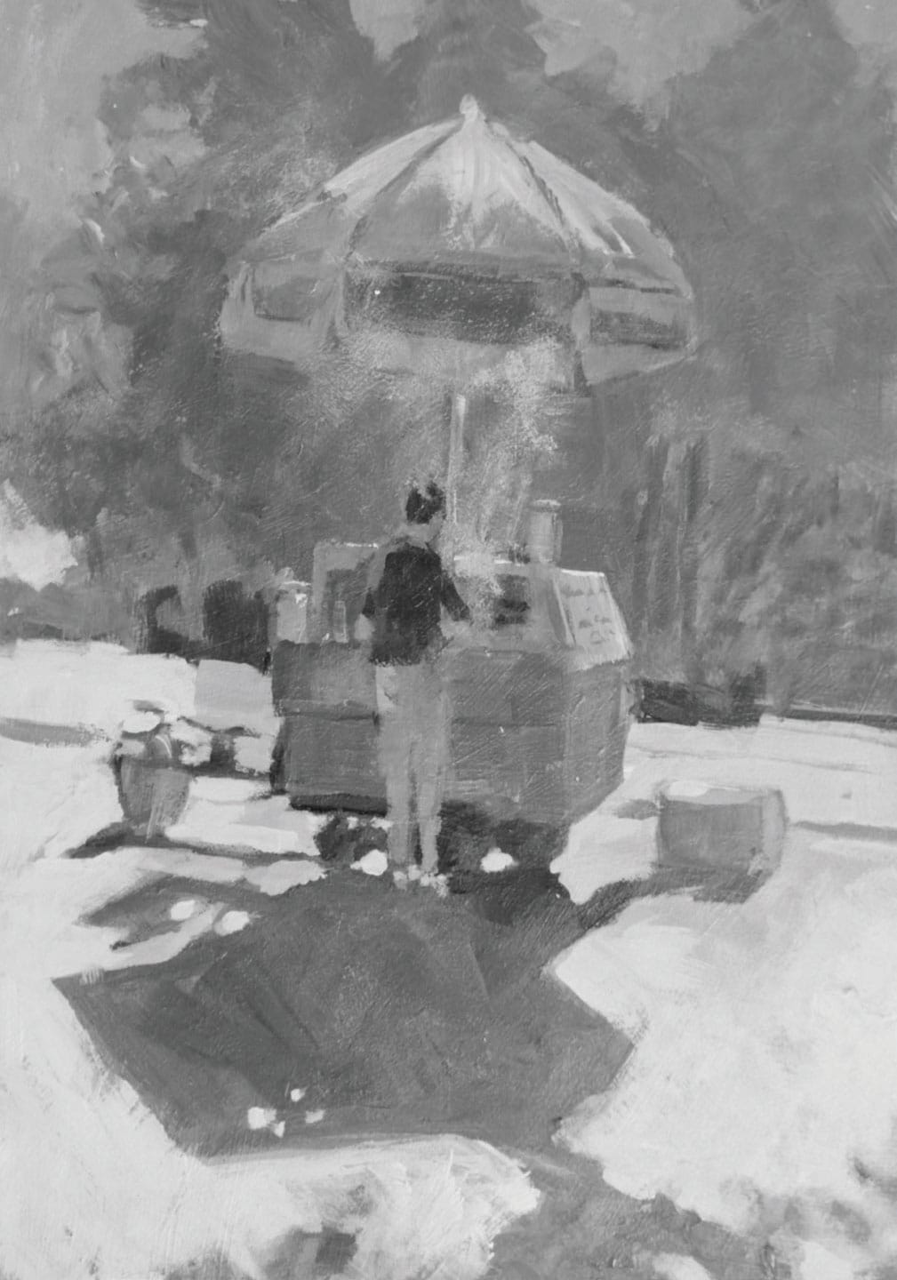
Many artists like to do a value study (black, white, and grays) before they begin the final painting. This is also called a grisaille. Most often this is done as a small version to help the artist better see their value plan, but this gray beginning can also be used as the first base layer. I skip this step when painting in the field. If I deem it necessary to have a value plan, I do it in pencil in my sketchbook.
Let’s take a look at my vendor painting in grayscale. This would be a fair approximation of an actual grisaille painting using values only. I like the way the middle values hold the lights and darks together. In this painting, there are lots of middle values: mostly light with a bit of dark. This is a good ratio of values, and this relationship also holds true for color temperature. It can be visually confusing to have fifty percent warm colors and fifty percent cool colors. With an equal balance of warm to cool, there is no clear dominance and your painting will lack unity. As I paint, I keep this idea close. I try to lean my paintings either warm or cool, with bits of the opposite also included. Take a look at the examples provided here.
Color Temperature Unity
We want to avoid an even split of warm and cool colors. As soon as you get close to an even split in temperature, the visual vibration can be unsettling to the viewer. I believe it was Picasso who said something like, “You should be able to say, this is a ‘blue’ painting or this is a ‘red’ painting.” He also believed that a dominance of hue (and therefore temperature) holds everything together. Let’s take a look at two examples of a warm-dominant painting and a cool-dominant painting.
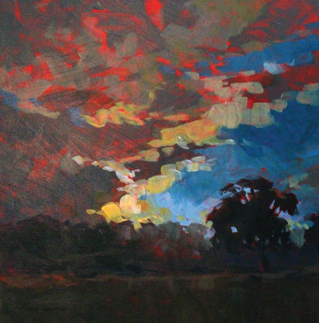
Dawn Sky (acrylic on panel, plein air)
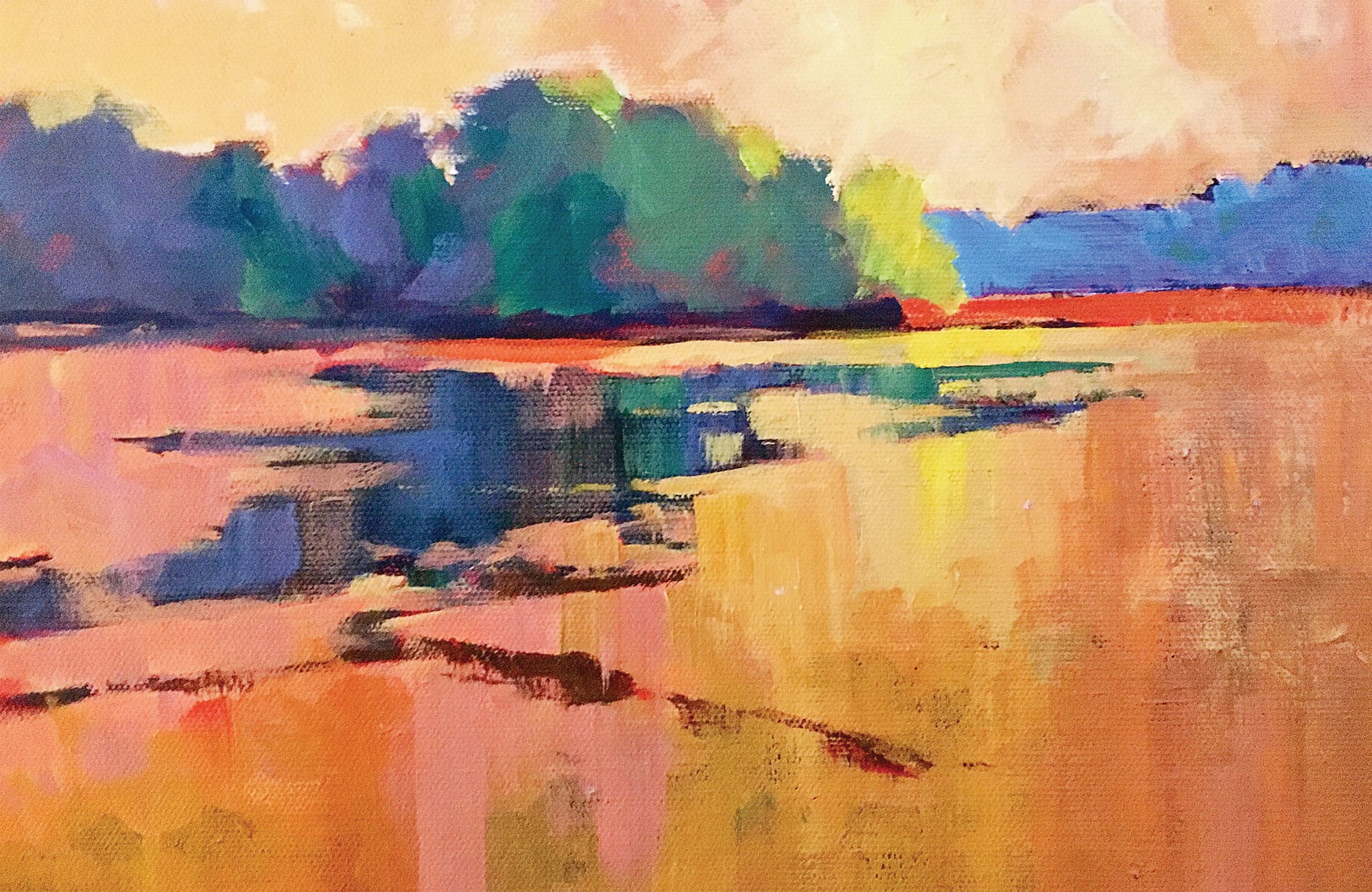
Warm clouds; warm hints of the sun; warm, dark foreground; and trees—that warm temperature dominance sets off the hint of blue (cool) sky peeking through the clouds. I always try to avoid a 50-50, 60-40 split of temperature. A 70-30 or, better yet, an 80-20 split between your warm and cool colors is a better balance for your painting and for the viewer.
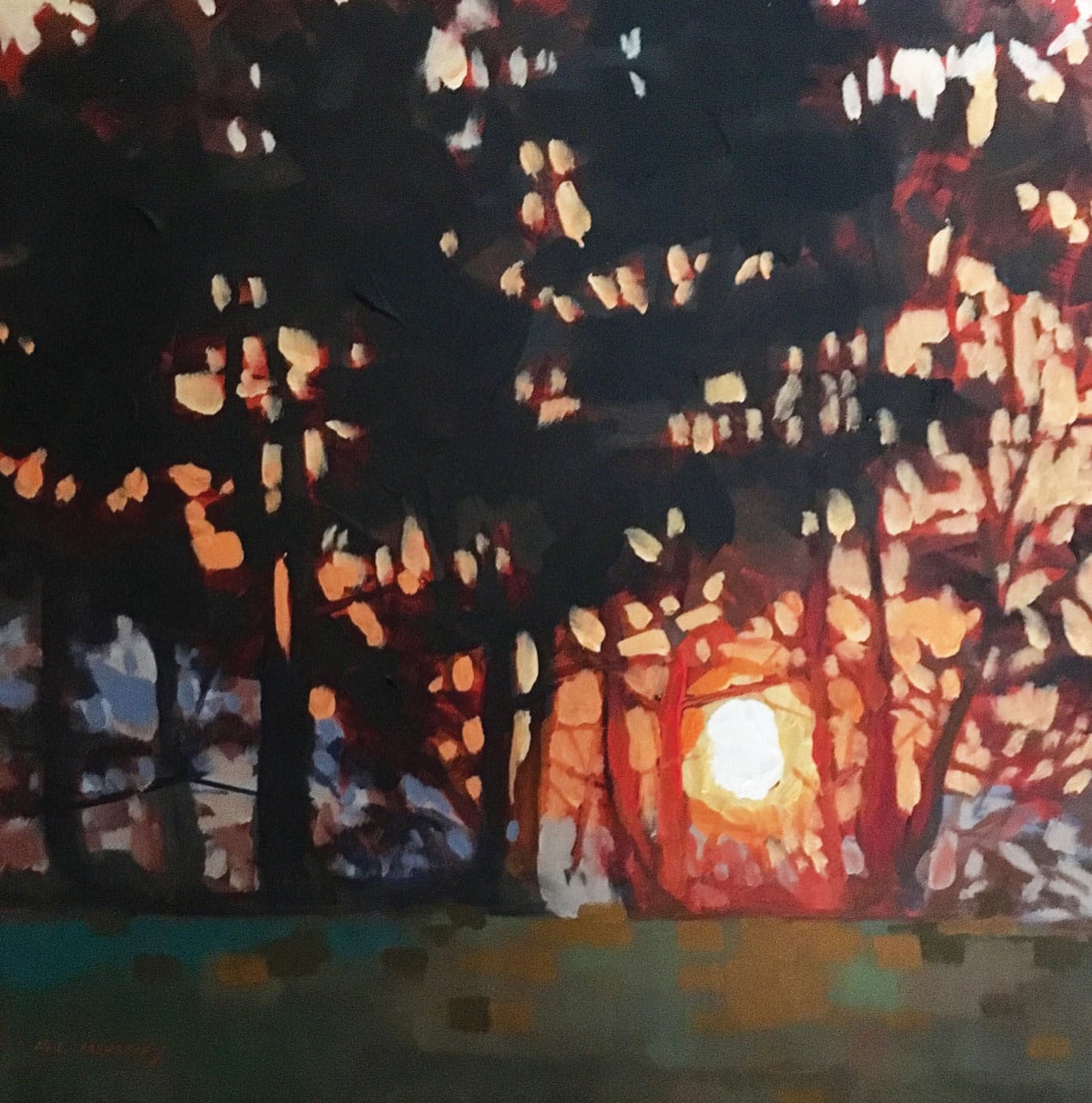
Morning Glow (acrylic on panel, studio)
The greens are warm, pushing toward a neutralized orange. The sky is warm and gets even warmer as you move toward the light where red and red-orange enter the picture. All this warmth holds together that strip of blue that runs along the horizon. This blue is the complement to all that orange and red-orange and acts as a foil to set off that beautiful sunrise.
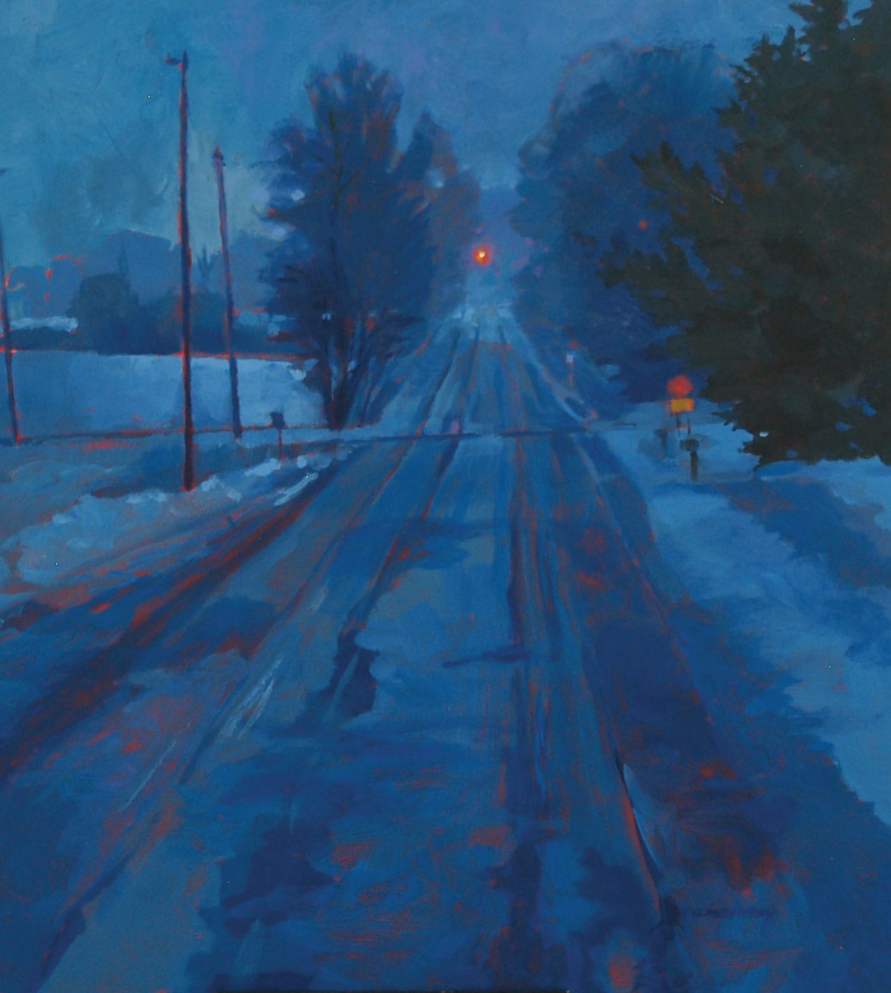
Corner in Winter (acrylic on panel, studio)
This is a corner about three miles from my house. It had just snowed, and the sunlight was starting to lighten the eastern sky. Everything had that blue, pre-dawn glow to it. You can see a hint of green in the pine tree on the right. The blinking light at the intersection, the stop sign, and very small amounts of my red ground are the only hints of warmth in the entire painting. This is a blue painting. That cool dominance holds the composition together and forms a nice foil for those tiny amounts of red and red-orange.
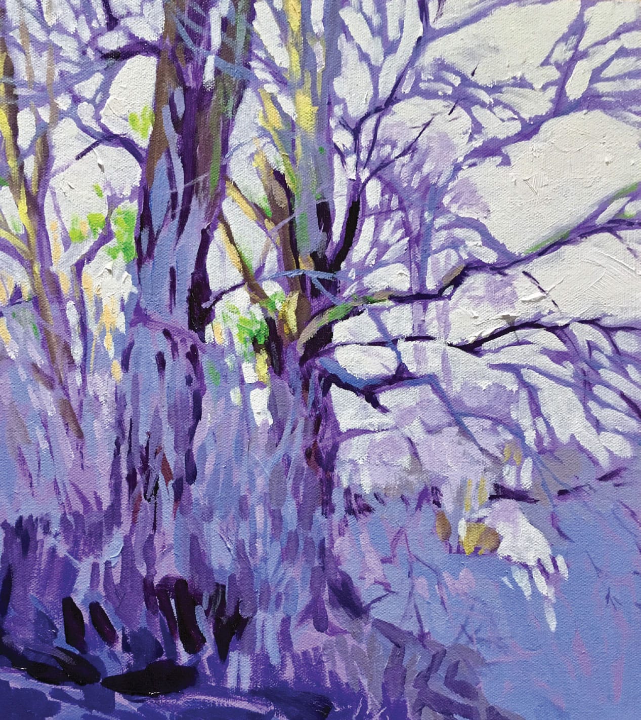
Deep Woods Violets (acrylic on panel, studio)
This is a violet painting, and the cool dominance was chosen to help say “deep woods” (to myself and the viewer). The complement to violet is yellow, and the near complement is yellow-green. I used both of those as hints of light on the tree trunks in the upper left. Using complements sets up a vibration that draws attention to that juxtaposition. Add the most value and color contrast to the focal area of the painting.
Step-by-Step Project: Red Dogwood
Occasionally, I may skip creating the pencil sketch and go directly to painting because I’m anxious to capture the scene and light before it changes. If I make a mistake in terms of value (how light or dark one shape is compared to another), hue (the actual color used), or temperature (how warm or cool the selected color is), I can correct it because I know how fast acrylics dry.
It was a rare January day in Michigan with temperatures in the high forties. The accumulated snow had melted. The afternoon light was coming in at a low angle from left to right, and the red dogwood bush seemed to glow. I set up in my front yard to capture the evening light hitting the pine trees, the field grass, and the red dogwood. I had to work fast, so I got right to work. No preliminary value plan this time. My easel was loaded with my usual eight or nine colors: cobalt blue, phthalo blue, ultramarine blue, alizarin crimson, cadmium red light, cadmium yellow deep, cadmium yellow light, and titanium white.
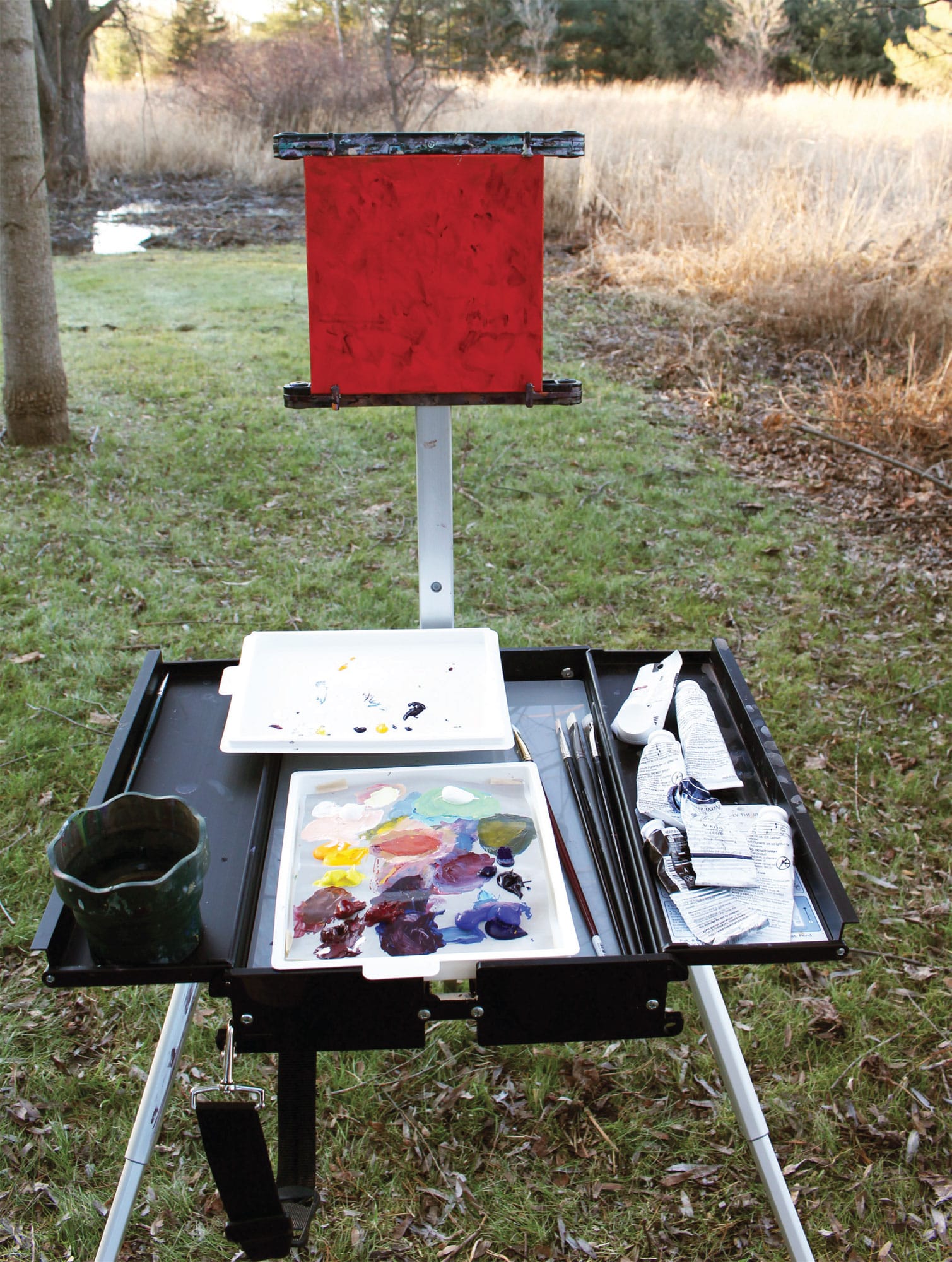
This photograph shows my equipment with the scene directly behind. My setup includes my easel, brushes, paint tubes, and prepared painting panel. I also have with me water, a paint palette, a collapsible water container, and paper towels. It is not my lightest setup, but it is my most self-contained easel.
Step 1
I previously applied cadmium red light to an 8-inch square birchwood painting panel. I often use this color, as cadmium red light is a middle value straight out of the tube. This means that when I apply a stroke of another color, I can tell if that passage is lighter or darker than a mid-tone. It helps me determine my values. Another advantage is allowing some of the warm red to peek out as I paint. If I want my painting to have a warm dominance, I allow more of the cadmium red light to show. If I want my painting to have a cool dominance, I let less cadmium red light show. It acts as a warm accent to my cool colors.
I sometimes tone my canvases or panels with other colors, either to create the sky before I begin or to create a color scheme more fitting to the scene. I also sometimes begin on a white, gessoed surface that comes from a commercially prepared canvas or panel. Similar to an oil painting, my first pass is sometimes a wash of a warm neutral color to knock down the white.
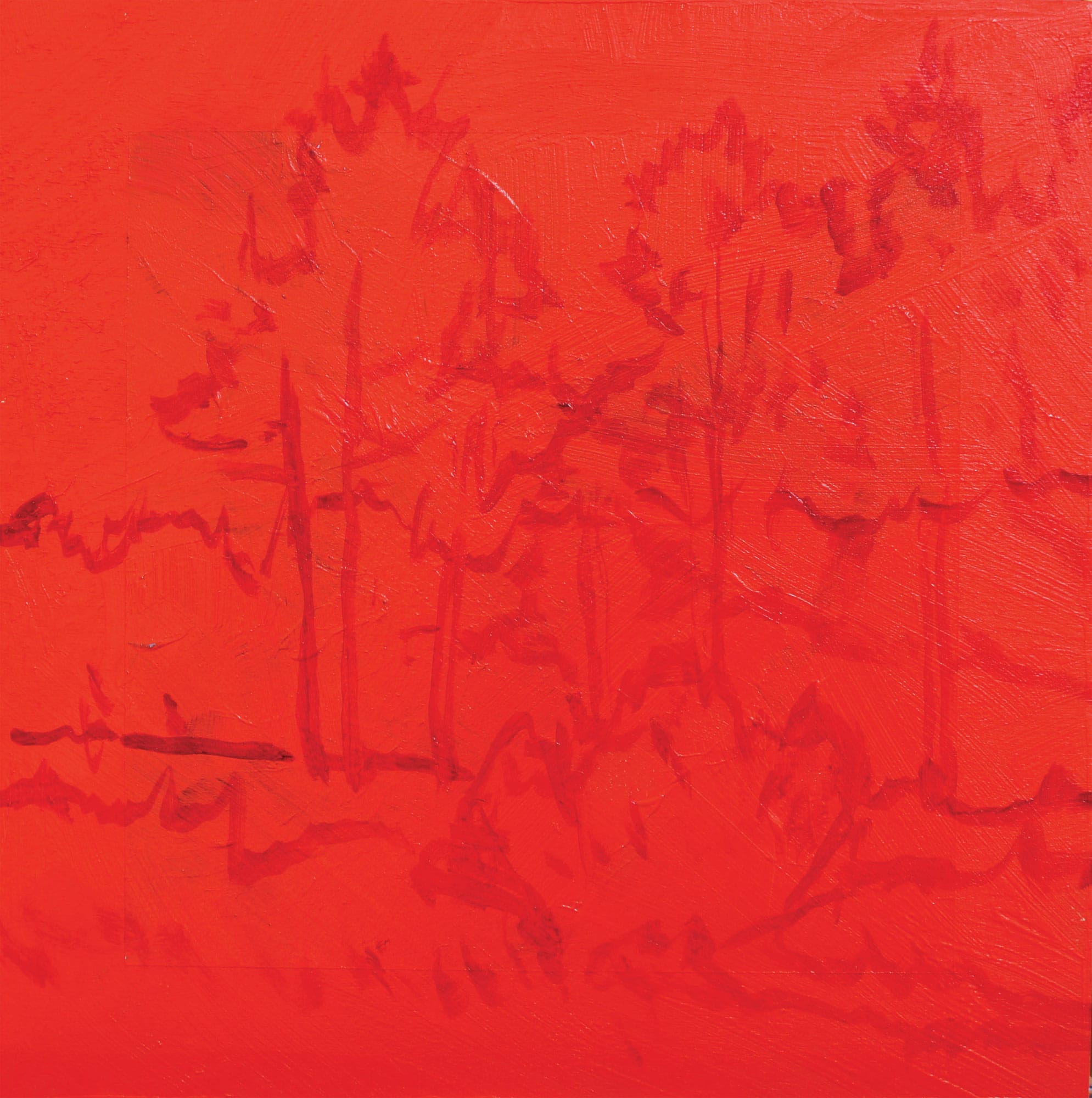
Using my smaller size 4 short flat brush, alizarin crimson, and a bit of water, I outline the big shapes to set my composition on my 8-by-8-inch panel.
Step 2
The atmosphere changes the way we see color; as colors recede into the distance, they get both cooler and grayer. I almost always exaggerate atmospheric, or aerial, perspective. This painting will have a warm dominance, and I want the tree line to act as a foil to those warm colors.
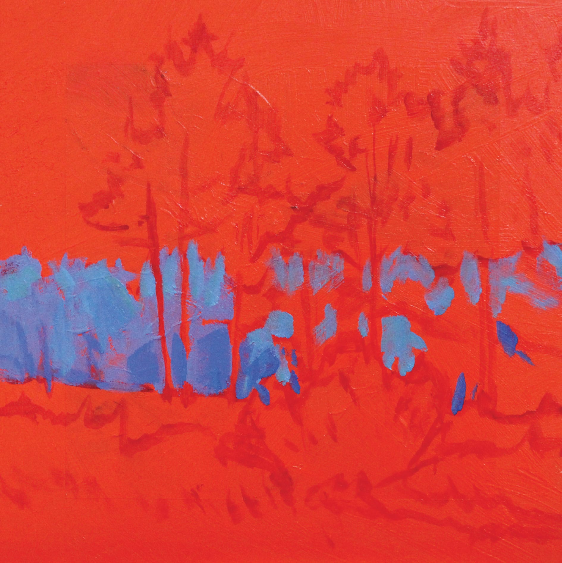
Using a size 6 short brush, I combine a mixture of cobalt blue, a small amount of alizarin crimson, cadmium yellow light, and titanium white on my palette. I use this mixture (mostly blue) to paint the distant tree line at the horizon.
Step 3
I wipe my brush off with a paper towel. I don’t always clean my brush between color changes because it saves both water and time. When the brush has a little bit of the previous mixture on the bristles, it blends with the next mixture and provides a bit of unity to the whole painting. Some of everything is everywhere!
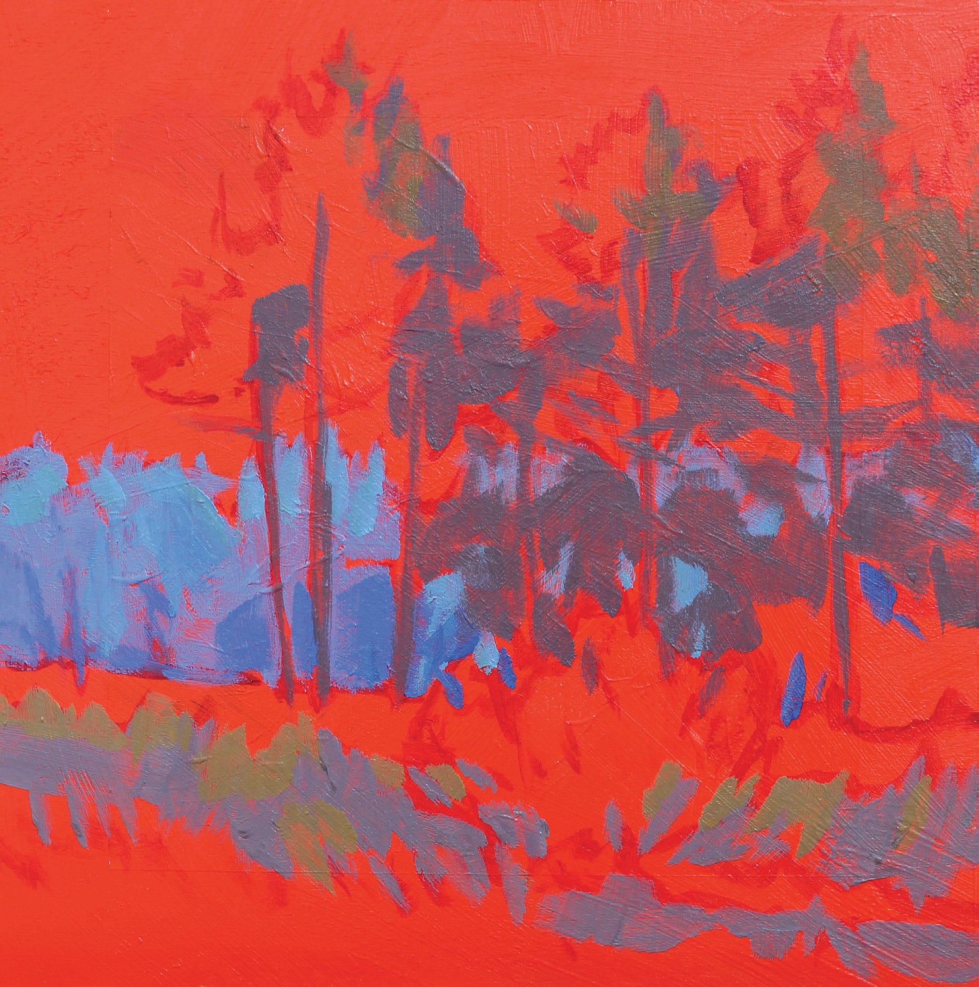
Using a mixture of cobalt blue, alizarin crimson, a bit of cadmium yellow light, and white, I make a middle value of neutralized violet. I use this mixture to paint the shadow side of the pine trees, the shadow side of the tree trunks, and the top of the weeds in the foreground.
Step 4
I use cobalt blue, ultramarine blue, alizarin crimson, and a bit of cadmium yellow deep to create a dark, neutral violet. Still using my size 6 short flat, I paint this darker mixture (still one value lighter than black) on the lower part of the pines and in the foreground weeds. Both areas are in shadow.
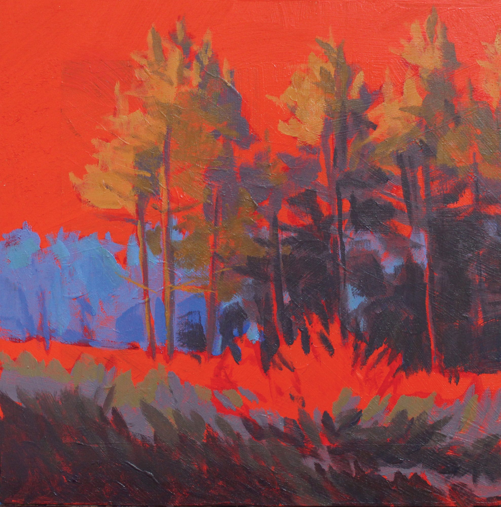
Step 5
Time to add the light. For the red dogwood bush itself, I use a mixture of cadmium red light, alizarin crimson, a small amount of cadmium yellow deep, and white. I paint the sunlit side of the bush, and as I work my way around to the shadow side, I add more alizarin to the mixture. I use short, quick strokes to create an impression of the light hitting that bush.
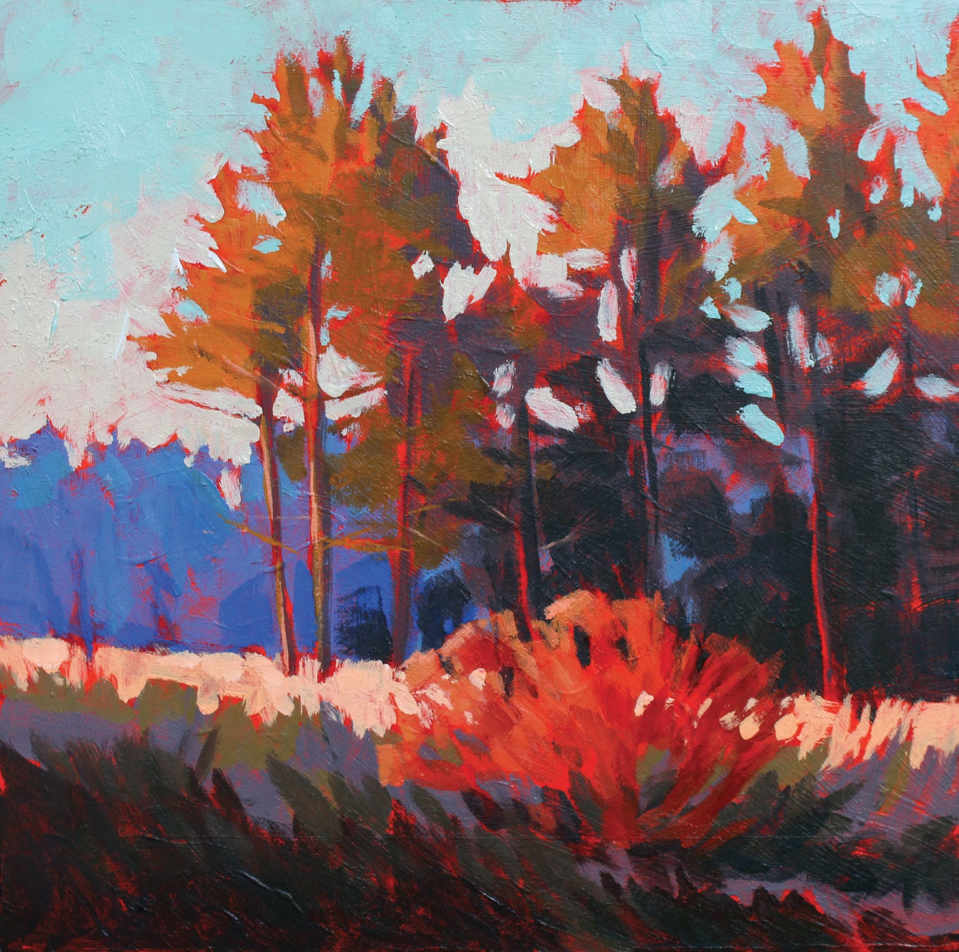
I wipe my brush and use a mixture of cadmium red light, cadmium yellow deep, and lots of white to make the color of the light weeds that rake across the entire composition. I paint this passage quickly, almost allowing my brush to skip across, just as the light did.
Step 6
I sometimes leave the sky for last. It helps me key the rest of the painting both in terms of value (the lighter the sky, the darker the other shapes appear) and in terms of the dominant temperature of the whole. In this case, I use lots of titanium white with some cadmium yellow light and just a touch of phthalo blue. I apply this mixture starting along the top of the distant tree shapes and in and around the middle ground pines. As I work my way up the panel (the sky usually gets darker as you approach the zenith), I add more phthalo blue into the mix.
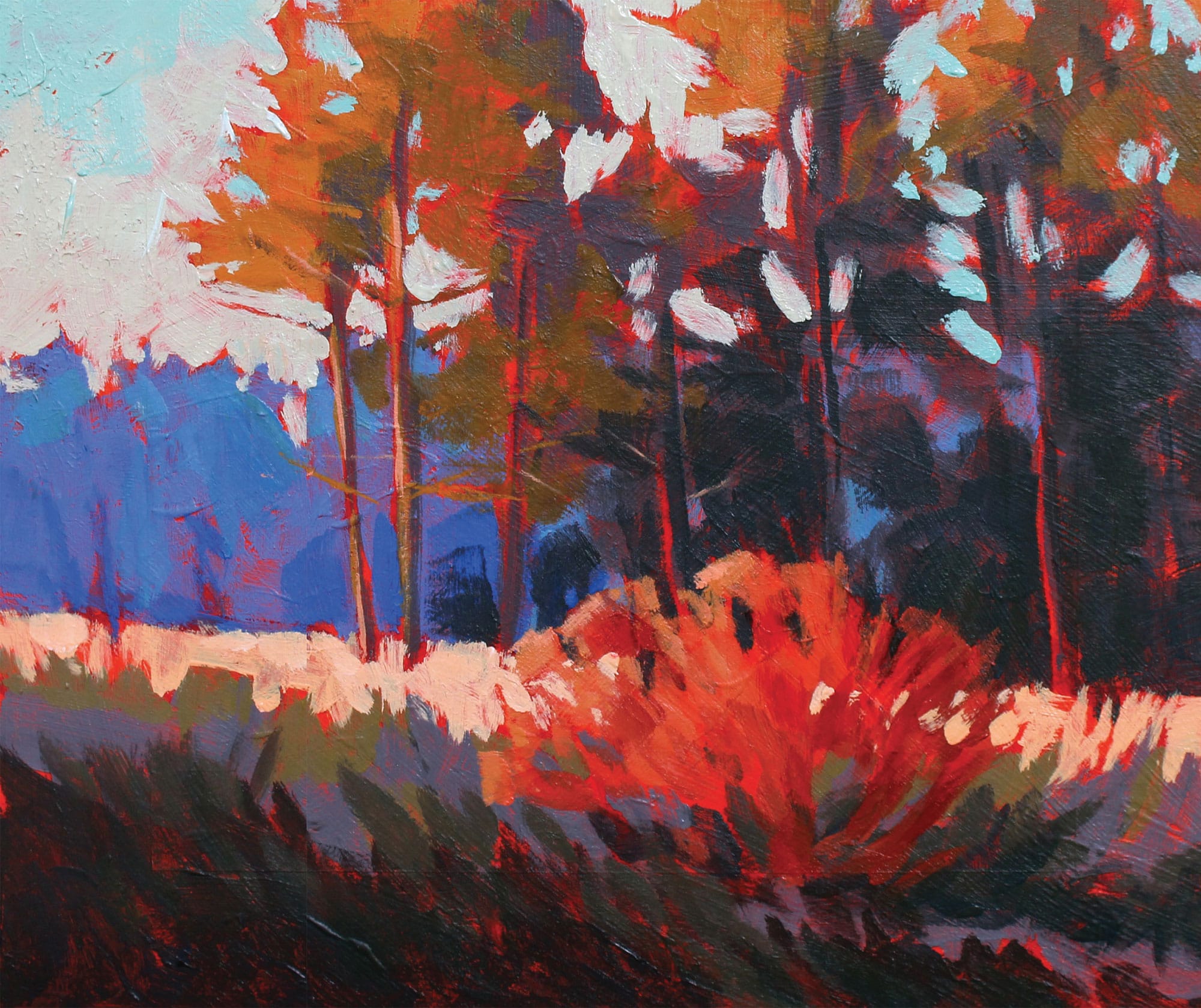
To finish, I switch to the smaller size 4 short flat and use that with the sky color to depict the gaps of sky in the pine trees. I’m always careful with those sky strokes; a few go a long way.
Finding Beauty
If I have to choose between finding a beautiful scene and painting it, and finding an acceptable scene and making the best painting I can, I almost always choose the latter.
Why? There is much beauty in the world. As I write this, I look out over the gardens that fill our backyard, and even though it is early spring, I can already see the flowers poking through. The grass is starting to green up, and the birds—back from their winter migration—are singing loudly. A beautiful scene for sure, but painted as is, I’m afraid it would be very boring. There’s still a lot of brown, only one temperature of green, a cloudless blue sky, and small shadows (as it’s close to noon).
Could I make a painting from what I’m seeing? Of course! But I’d have to get creative: change some of those browns to warm and cool grays; add variety to the greens; add clouds to an otherwise uninspiring sky; elongate the shadows; and connect foreground, middle ground, and background.
While I do sometimes paint exactly what I see, the excitement for me comes from rearranging what nature provides to make the best painting I can. This often means leaving out much of what I see. Like a camera, our eyes visually gather too much information. The problem with attempting to include everything in our paintings is that it becomes a confusing bundle of imagery.
What to do? There are two choices: Search until you find a scene that needs little in terms of adjustment, or paint the first thing that captures your eye and redesign what you see to make a good painting.
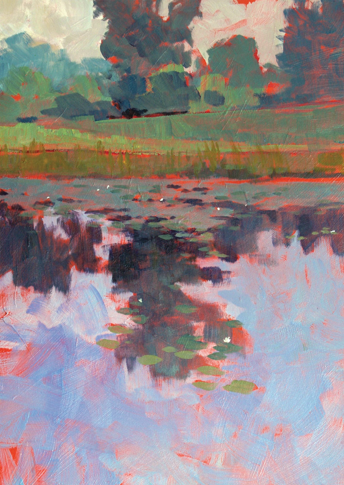
In Morning Reflections with Pond (opposite), I painted the scene almost exactly as I perceived it. The light was subdued, and the greens were varied. It was early in the morning so the sky appeared more yellow than blue, and the reflections in the pond were a close mirror to the grasses and trees from above.
Even the title is a “reflection” of what I was seeing. I felt I captured my sense of being there, and I was happy with that day’s effort. There is a certain joy in painting things we find beautiful. And while I find that kind of effort to be fulfilling, sometimes I want to do much more.
The light was very strong both from above and from behind. In fact, the light was so strong that it washed out some of the color and made the shadows appear almost black. The ground was dirt. The scene looked almost monochromatic—just one color plus black and white. It was very graphic, with hard edges everywhere and lots of value contrast between the lightest light and the darkest dark. I had to paint it!
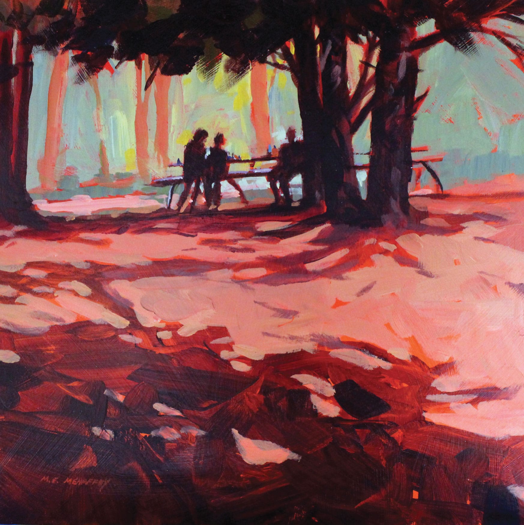
Let’s look at two paintings that feature the same composition but were painted two different ways. The result is more or less the way I saw it as I set up. This first painting was done en plein air. Even the title of the painting, Picnic in Color, alludes to the dark silhouettes of the figures, the trees, and the shadows. It features strong lights and darks, but very little color detail. The composition was sound, with small shapes (the picnic tables and figures) to draw the viewers’ attention, while the foreground shadow leads the eye right to the focal area.
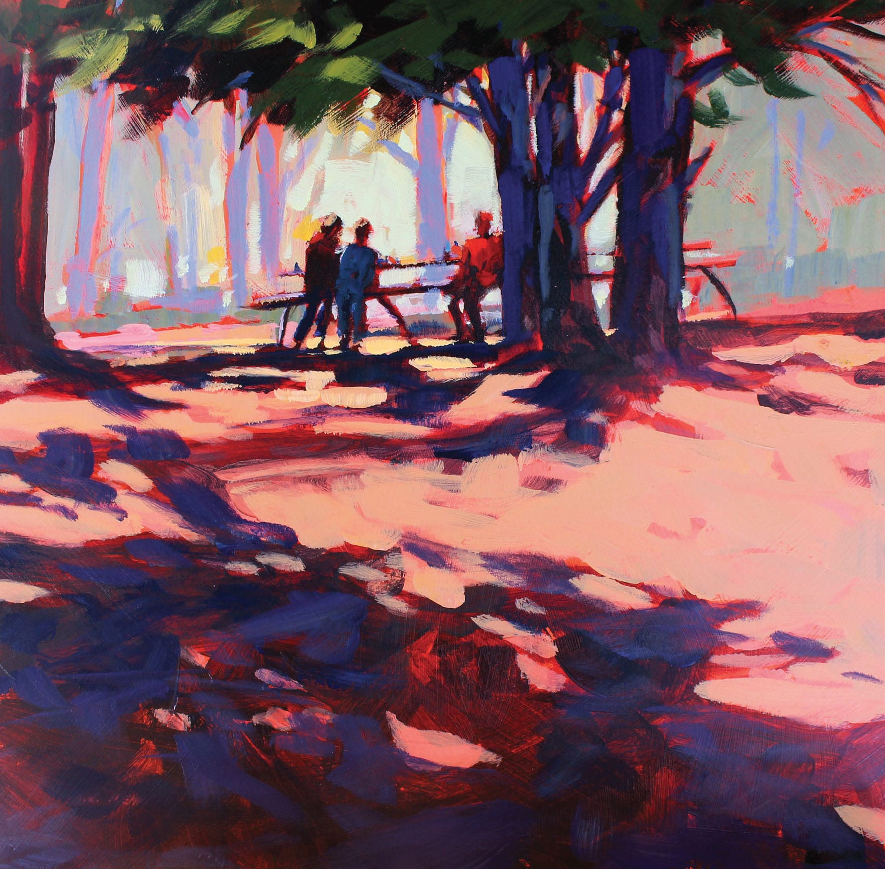
This version of Picnic in Color was done in the studio as a counterpoint to the plein air work. I liked the design, the brushwork, and the basic value pattern (of lights and darks), but I wanted to see more color and light. The resulting painting has the same arrangement of shapes and the same value contrast between the lightest light and darkest dark, but with added color. To make sure the painting featured brushstrokes, I used the same size 8 nylon flat brush for the whole thing. Using ultramarine blue, a bit of gamboge (deep saffron), and lots of white, I both lightened and cooled the entire background. I used dark blue and violet (a mix of ultramarine blue and alizarin crimson) for the tree and all the shadows. For the strong sunlight, I added a bit more yellow and white. I added green to the pine boughs and red and blue for the figures’ shirts, hoping that this added some strength to the focal area.
Painting the Light
Many variables determine the final version of any painting. Location, time, mood, visual problems to solve—the list is endless. The time of day and the atmospheric conditions at the time are also major determinants of how your painting will turn out.
Capturing natural light changes will help you tell your visual story with more clarity. You have two choices: Do your best to paint the light and atmosphere exactly as you perceive it, or artistically alter what you see to make the painting you conceive in your mind’s eye (in other words, exercise your artistic license). Both options are entirely valid.
As the day progresses, the angle of the sun and quality of the light change. As plein air painters, we can follow this progression. The quality of the light is a combination of these factors: time of day and the relative atmospheric conditions at the time of set up. The atmosphere can vary from day to day—even hour to hour—and change within minutes. When I’m planning to spend a day painting outside, one of the first things I do is check the morning weather report to see what conditions to expect.
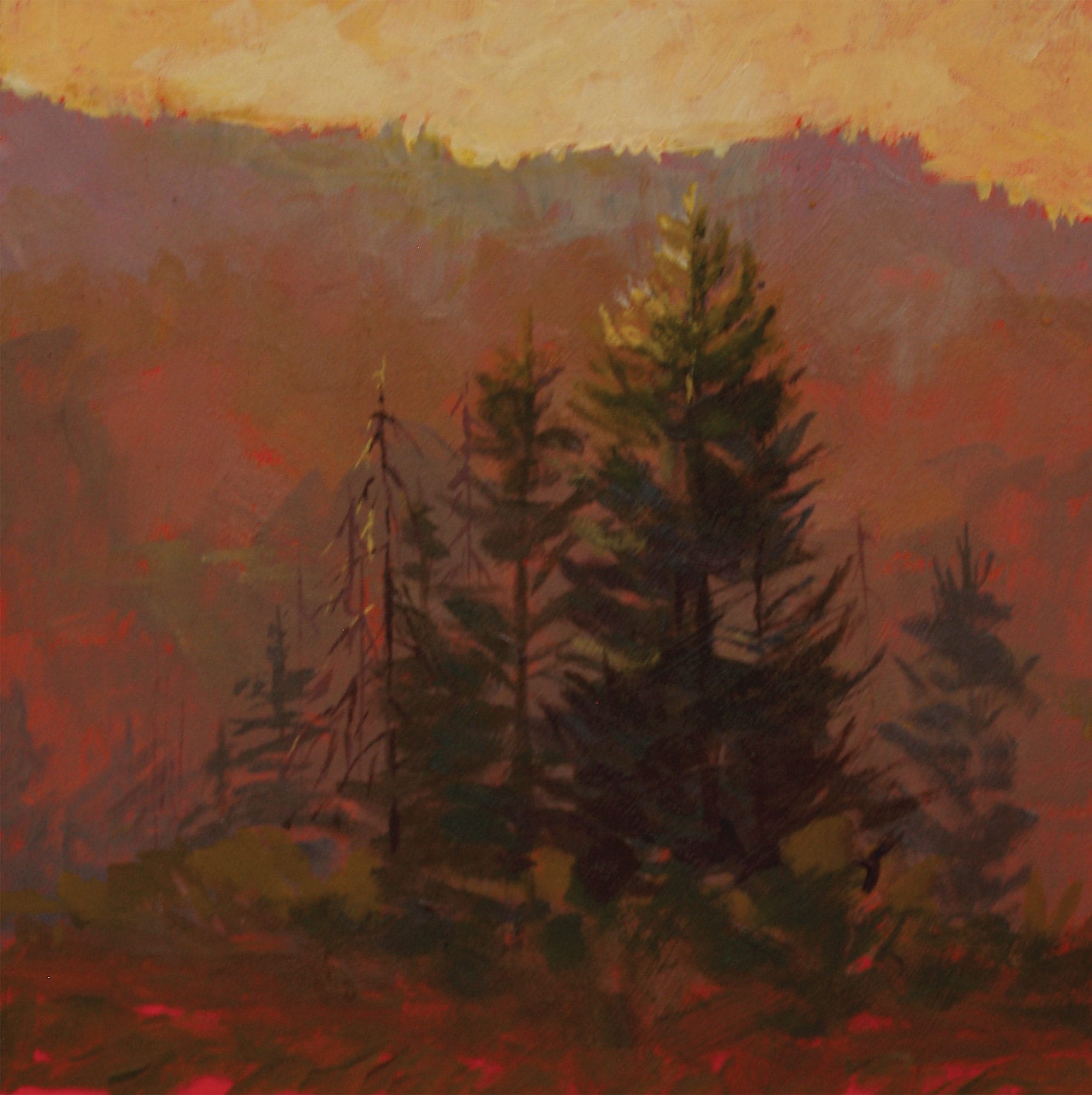
Dawn and dusk provide a lower angle of sunlight and a lower level of light intensity. Humidity in the form of rain, mist, or fog will dramatically change the atmosphere, particularly at those times.
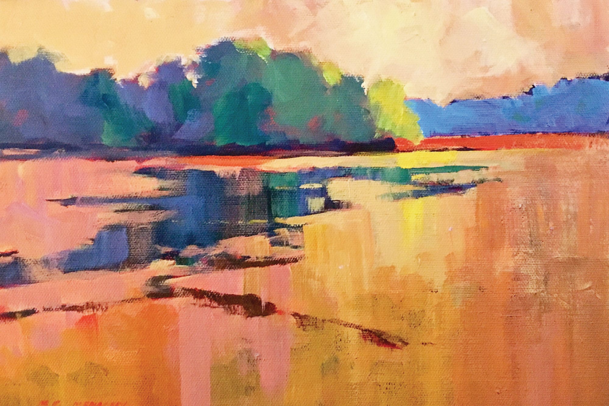
A bright, sunny, cloudless day will be altogether different from a cloudy day. Then again, the conditions will differ considerably between dawn and noon, and the quality of the light will change yet again later in the afternoon. Painting during the middle of the day allows us to come up with a creative solution. We can search for a more complicated scene or one that relies on something other than the lengthy shadows of dawn or dusk.
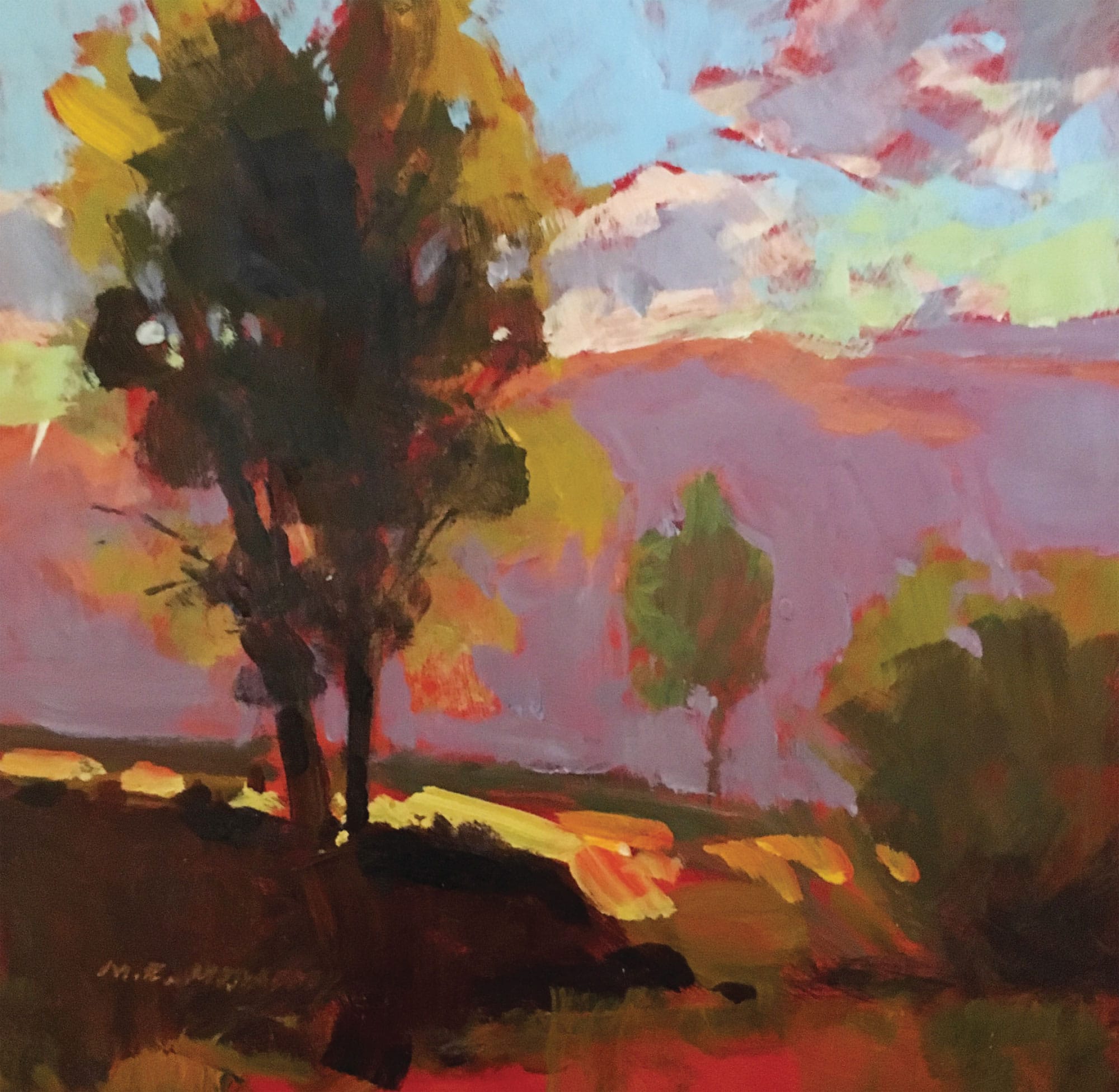
Later in the day, the shadows begin to lengthen again. Here the late afternoon and evening light is warmer than the light at dawn or early morning. Most of my on-site painting happens in the morning, although I do occasionally get out in the evening.
Painting the Seasons
Here in Michigan we fully experience all four seasons: spring, summer, fall, and a four- to six-month winter. If I were to wait for perfect weather, I would not get out to paint much! In the colder months, cloudy skies are the norm, as are chilly and frigid temperatures. Painting outside in Michigan can be a rugged affair, but as long as the outside temperature is above freezing (32°F), I am ready to go.
It is helpful to paint the same area or view in the different seasons. The light changes from season to season, just as it does at different times of the day. The foliage changes as the season progresses, and the amount of light that bounces into the shadows also changes. Take a look at the next four plein air paintings completed from the same location: a stand of trees about two miles from my home (opposite page). They sit on the edge of a farmer’s field. All four paintings are small and were completed in under an hour.
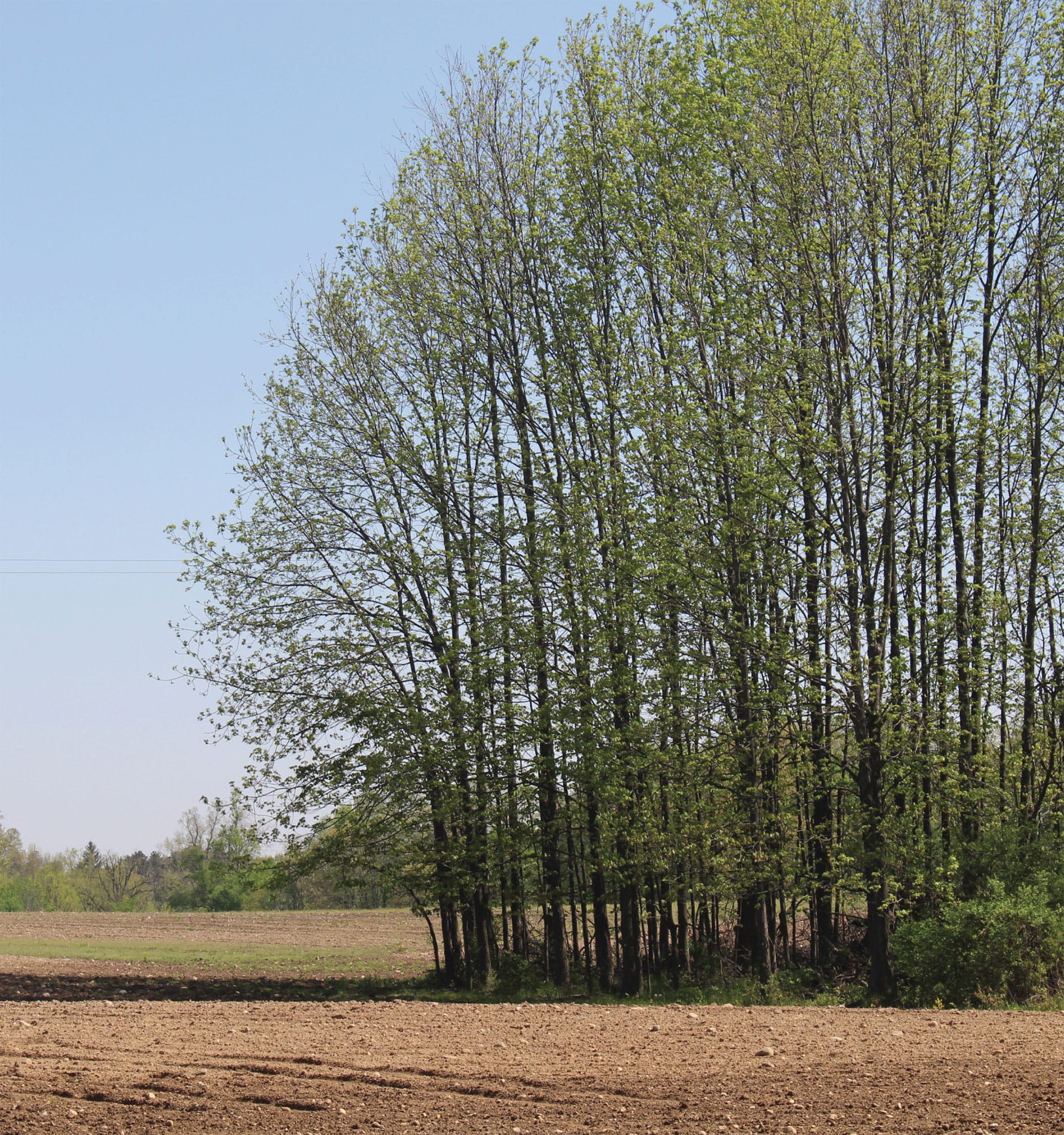
This is a photo of one of my favorite places to paint during early spring. The leaves have just started to unfurl and are still a fresh yellow-green. The farmer has been busy preparing the soil for spring planting, and the warm red of the freshly turned soil contrasts nicely with the yellow-green of the new leaves.

Favorite Place, Spring (acrylic on panel)
I used a cadmium red light underpainting and left lots of it showing to indicate the freshly turned soil. I simplified the distant trees and made the bright green of spring a bit bluer to push into the background. I mixed anthraquinone blue and white for most of the trees that form the background. A mixture of anthraquinone blue, alizarin crimson, and a bit of cadmium yellow light created the brown I used to form the furrows made by the farmer’s tractor. I used his tracks to lead the eye into the dark tree trunks (a mixture of mostly anthraquinone blue and a bit of alizarin crimson) and then up into saturated yellow-green foliage (a small amount of anthraquinone blue and cadmium yellow light) to convey the freshness of spring.
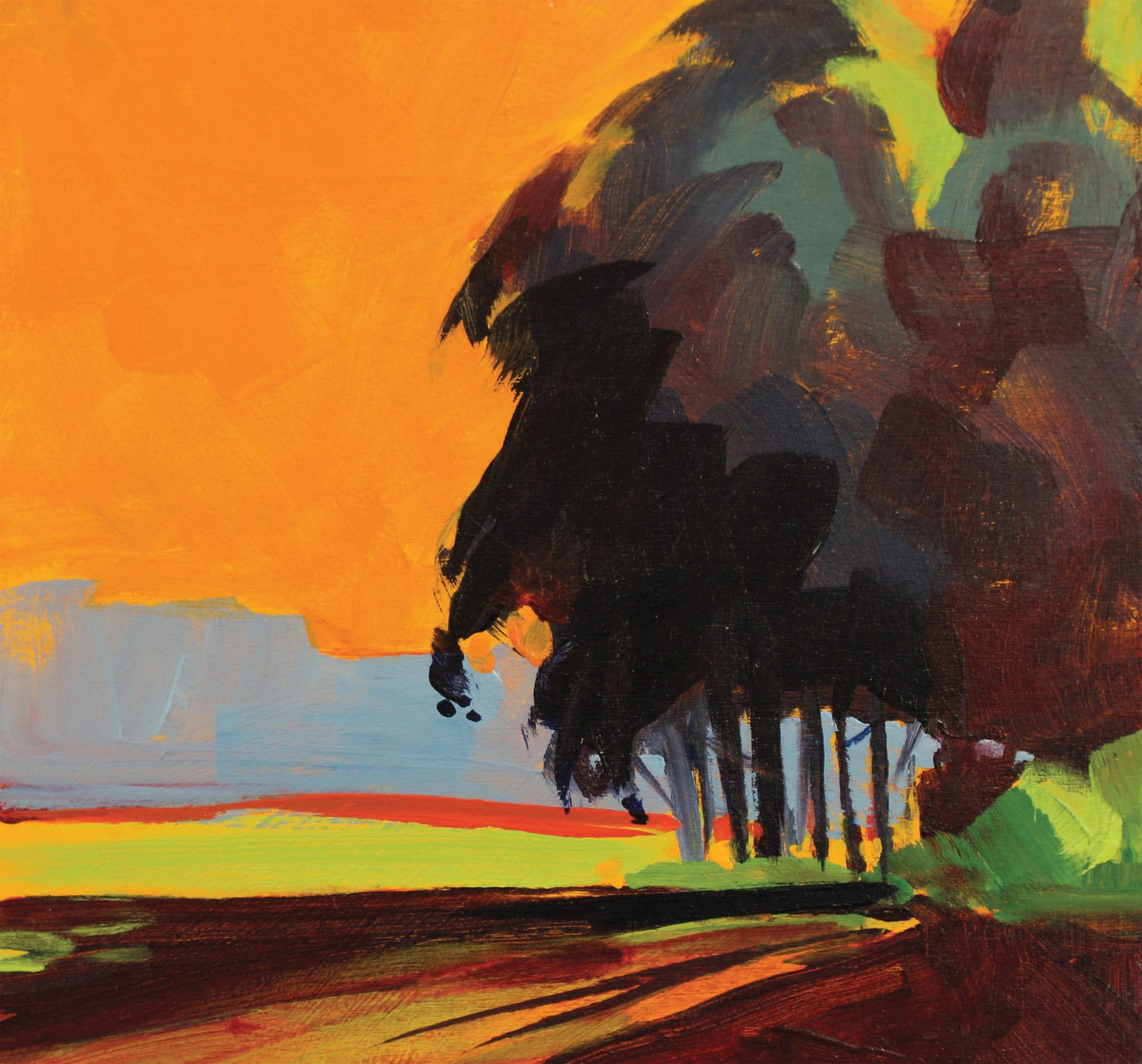
Favorite Place, Summer (acrylic on panel)
When the light comes in from the east, the trees throw some dramatic, lengthy shadows into and across the field. To emphasize the warm summer light, I used orange (a mixture of cadmium red light and cadmium yellow deep) for most of the sky and for the light in the foreground. I also greatly increased the dark value of both the trees and their shadows to create more visual drama.

Favorite Place, Fall (acrylic on panel)
It’s still morning with the light coming in from the east, but now, later in the year, the angle of the sunlight is lower. The morning light was just kissing the tops of the trees with a bit of light. Most of the leaves had dropped, and the fields were plowed under. To make the focus of this piece the light hitting the treetops, I completed the rest of the painting using blues, violets, and neutrals.

Favorite Place, Winter (acrylic on panel)
On this cold day, snowflakes were in the air, and the light was subdued with a heavy cloud cover. I used warm and cool neutrals to keep the mood deliberately somber. I used the edge of my palette knife and a small round brush to indicate the bare trees. Because acrylic dries so quickly, I was able to add spattered, watered down white acrylic for the snowflakes. If you do this, the key is to make different size spatters. The larger dots will appear close, and the small ones will recede into the distance.
Taking Liberties
Sometimes, as we search for subject matter, we spend more time looking for that “perfect spot” than we do actually painting. Instead, use what nature provides and manipulate what you observe to make a better painting. Find one or two interesting things; then build a painting around them. Remember, you are the artist—you can add, subtract, and alter anything you like. Design or arrange the elements in your painting to make a unified whole. Let your initial enthusiasm direct your efforts to make the painting you want to make.
We don’t have many sunny days in our Michigan winters. It’s cold and snowy for up to six months of the year, and spring comes slowly. I love to go for a drive on those rare occasions when the sun shines. My cameras are always with me: a point-and-shoot with a good telephoto lens and, of course, my cell phone camera.
I was out for an evening drive, and the sun had almost set. There was a warm glow touching the tops of the distant trees. The foreground and middle ground were bathed in shadow. I snapped a photograph (at right) that shows the scene; it also shows too many telephone poles, mailboxes, and traffic.
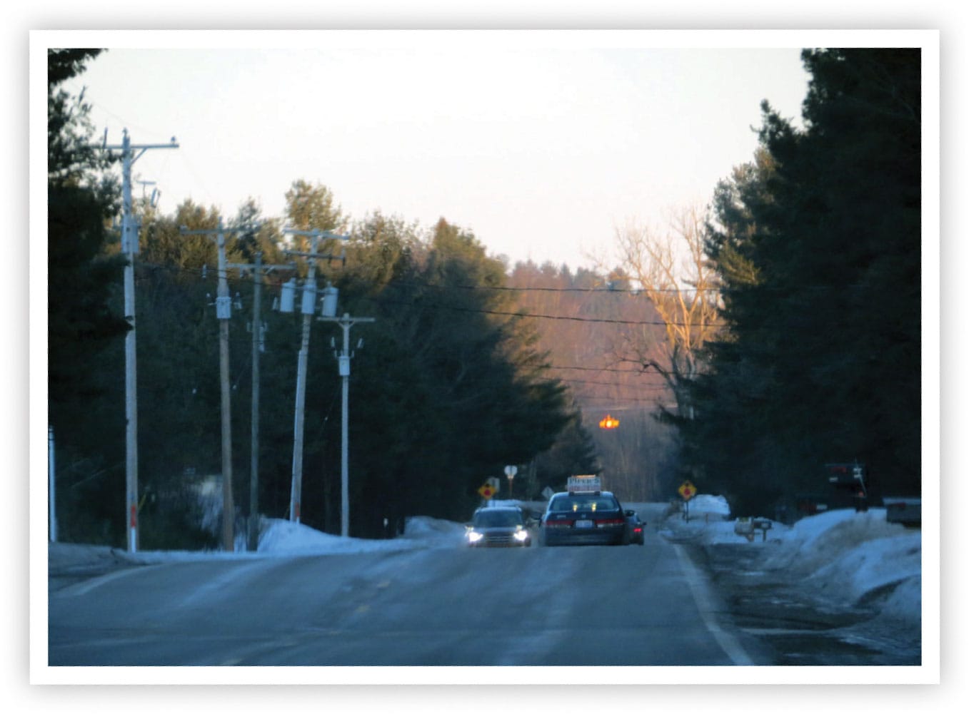
I used the photo as inspiration, but I did not do the painting outside. It was too cold! Instead, I worked with what nature gave me to make a painting. I kept just three telephone poles, leaning the middle one toward the center of interest—that glow of sunset. I saturated the cool blue of the snow to a bright violet. I also added a cool blue in the sky to replace the warm neutral tone that was washed out by the sun.
Using this cool blue heightened the warm red-orange I chose for the distant tree line. Finally, I changed from a rectangular format to a square composition to put more emphasis on the red-orange trees.
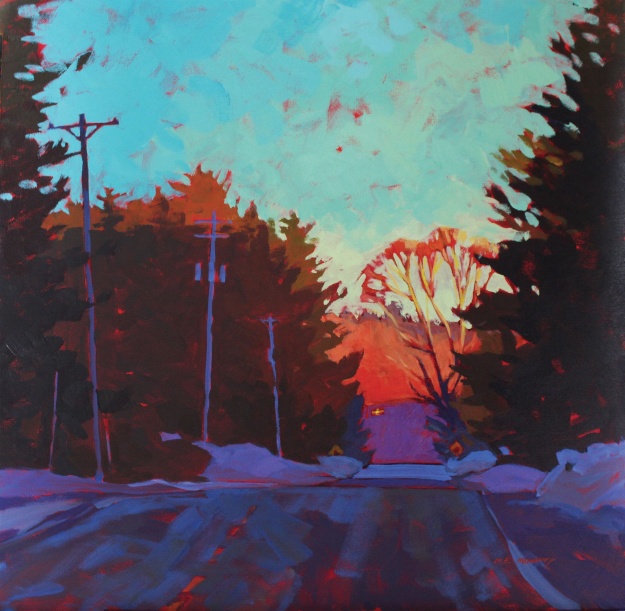
As the artist, you can manipulate what you see and what you paint at any time. It is a realization that allows an enormous amount of freedom for composition.
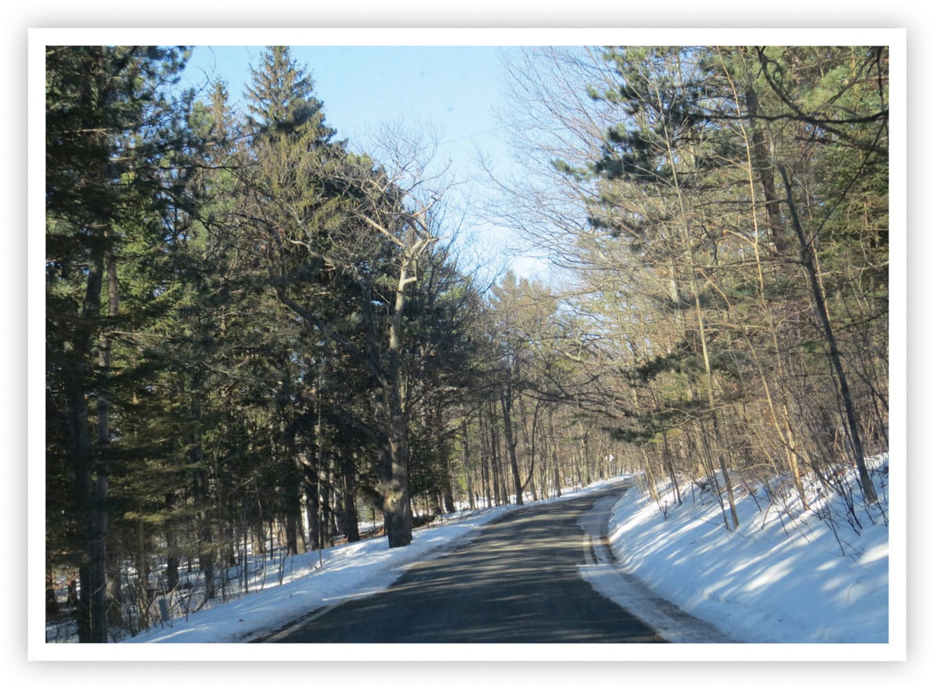
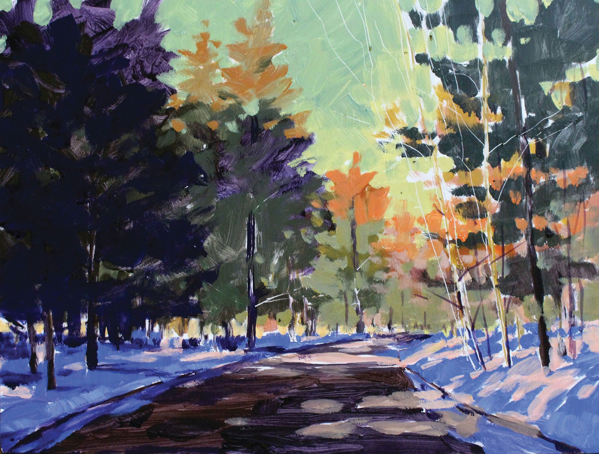
Here is another example. As I came around a bend, the converging lines that formed the edges of the road captured my interest. This led to a vanishing point of sunlit trees around the bend. I also enjoyed the dance of light across the road and up the snow-covered hill on the right.
I took the photo (below), which gave me enough information to complete the painting in the studio. I wanted to capture the road leading into the distance, the dappled light across the snow, and the deep blue-violet of the shadows.
When working from photographic references, I always consider whether I like the painting more than the photo.
In this case, I do. As an artist, you should never feel you are locked into any given scene, colors, or methods. The creative and fun part is to change things to make a great painting!
