Chapter 1. The Black and White on All of the Gray Areas of Black and White
Color is my day-long obsession, joy, and torment.
—Claude Monet
Before going any further in this book be sure to install the Color Efex 4 Promo 5 from Nik Software that comes free with this book. Also, every black-and-white conversion that is discussed in this book has been made into an action and a configurator, as have the additional things that are done to an image, all of which can be found in the Oz Power tools action set. Be sure to download them and install them. If you are using a Wacom Intuos or Cintiq tablet, be sure to install the tablet presets that also come with this book. (These presets are for both right- and left-handed users, as well as for Windows and Mac.) A description of the layout of my presets, as well as a PDF discussing an overview of my image editing workflow, is also part of this book. The link for the Nik Software plug-ins that come with this book and the tablet presets can be found on the download page for this book. Be sure to have this installed before you move on any further in this book.
The web address for the book’s download page can be found at the back of the book, at the end of the book’s index.
Coming to Terms
Of two equivalent theories or explanations, all other things being equal, the simpler one is to be preferred.
—William of Ockham
In the world of traditional analog photography, a black-and-white photograph is defined as an image whose colors range, in tones of gray, from black to white. Such an image usually will contain an area of pure black and move through the grayscale to an area of pure white. In the pre-press world, the world of offset printing, a black-and-white image is made up of blacks (ink) and whites (paper tone). In the world of digital photography, such an image will contain an area of pure black in which the RGB values will be 0, 0, 0 and move through the grayscale to an area of pure white in which the RGB values will be 255, 255, 255. The more accurate description for a traditional, silver, black-and-white photograph is to call it a grayscale image, and the more accurate definition of a digital black-and-white image is to refer to it as a chromatic grayscale image (see the sidebar: Terms of Engagement). I chose the term chromatic grayscale image for digital black-and-white images, not simply as an exercise in semantics, but because such accuracy in terminology is extremely important for conceptualizing the conversion of an image from a full color palette to a chromatic grayscale one without ever leaving the RGB color space. What you will see throughout the course of this book is how you address all the colors of an image will directly affect the chromatic grayscale image (Figures 1.1 and 1.2).
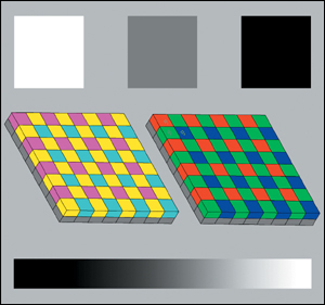
Figure 1.1. Color target captured in color
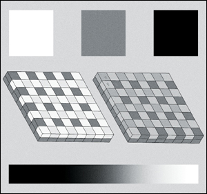
Figure 1.2. Color target captured on Kodak TMAX 400 film
Consider what constitutes a black-and-white capture on film, and which of its characteristics you might want to replicate. Panchromatic black-and-white film (pan means “all” and chromatic means “colors”) is the film type that is most often used to take black-and-white photographs because it records light in the range visible to the human eye. Visible light, which is measured in nanometers (nm), is in the 400–700 nm range. A general approximation is that blue ranges from 400 to 500 nm, green from 500 to 600 nm, and red from 600 to 700 nm. The human eye is most sensitive at 555 nm, right in the middle of the green spectrum.
Throughout the course of this book, I will frequently use the following terms and have defined them as follows:
Bit Depth—is a measure of the amount of color information in each pixel. In a digital system, information is represented by bits that can have a value of 0 or 1. The more bits that are used to represent information, the greater the number of discrete values that information can have. In a bitmapped image (such as a TIFF, PSD, or JPEG), the number of bits used to represent the red, green, and blue pixels determines the number of colors that can be created. With a bit depth of 8, each pixel can have 256 possible values per color channel, so that the number of possible colors is 256 x 256 x 256 or over 16 million. An RGB image with a bit depth of 8 bits per color channel is considered a 24-bit image (8 bits per color channel times 3 channels). An RGB image with a bit depth of 16 bits per color channel is considered a 48-bit image. In a gray-scale image, an 8-bit image is one with a maximum of 256 shades of gray.
Black-and-White—In pre-press printing terms, a black-and-white image is one that is made up of blacks (ink) and whites (paper tone). Photographers refer to their images as black-and-white, but they are better defined as chromatic grayscale images.
Brightness—is the perception of the intensity of light emitted or transmitted by an object or group of objects.
Chromatic Grayscale—(as defined for the discussions in this book) is an image containing black, white, and a range of gray shades made up of colors that have equal values of R, G, and B. The best conversions of full color to monochromatic gray images are best done in the RGB color spaces. Even though the gamut of color in a monochromatic grayscale image can be easily reproduced in as small a color space as sRGB, the file from which the grayscale image is being created is a full color one. Thus, it is important to preserve the full color integrity of the source image. Also, the best continuous tone, monochromatic, grayscale, digital photographic prints are made when all of the color heads of an inkjet printer are used and when the image has never left the RGB world.
Color Space—is a theoretical model that is useful to explain how colors are detected, managed, and displayed by a particular device or system. Color spaces have distinctive capabilities that define what intensity of saturation colors will appear and how well they will retain shadow and highlight detail. They contain digitized, numerical representations of color and differ from one another in the quality and quantity of colors that they can handle and display. I like to think of a color space as a painter’s panel in three dimensions that not only (digitally/numerically) defines colors and color combinations, but their hues, saturation, and brightness as well.
Contrast—(as defined for the discussions in this book) is the difference in visual properties that makes an object (or its representation in an image) distinguishable from other objects and the background. It is a measure of the ratio of the luminance of the brightest color (white or near white) to that of the darkest color (black or near black). If the difference between the luminance of the brightest and darkest colors is large (e.g., the brightest area is 500 times brighter than the darkest area that is black), the image will appear to have high contrast. If the difference between the luminance of the brightest and darkest colors is small (e.g., the brightest area is five times brighter than the darkest one), then the contrast will appear low. Low contrast images are typically described as “washed out.”
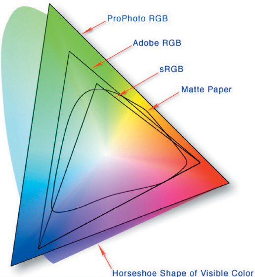
Diagrammatic relationship of many color spaces to all of human vision
For an in-depth discussion of contrast, see Professor Alan Gilchrist’s book, Seeing Black and White, New York, NY: Oxford University Press, Inc., 2006.
Curves—result when a smooth line is drawn to connect the intersecting points of two related variables (one plotted on the X axis of a graph and the other on the Y axis).
Grayscale Image—is an image in which the value of each pixel is a single sample, that is, it carries only intensity information. These are images composed exclusively of shades of gray, varying from black at the weakest intensity to white at the strongest.
Lightness—the brightness of an area judged relative to the brightness of a similarly illuminated area that is white or highly transmitting.
Luminance—is the measured amount of light emitted from a source or reflected from a surface. While the luminance is an exact photometrically measured value, human perception of luminance depends on many factors, such as how dark or light adapted you are.
Tone Reproduction—Tone, as it applies to photography, is a description of the quality of an object or scene’s luminance. Tonal reproduction is the process by which photographers try to take the range of light that they see (which is vast) and compress it to meet the limited capabilities of output media (e.g., silver-based photographic paper, the color gamut of ink jet prints, or a screen display device), while retaining much of the tonal appeal of the actual object or scene.
Tonal Reproduction Curves—are derived by plotting the original scene luminance against the resulting print or display luminance. When a line connects the points at which they intersect, a curve results rather than a straight line, because the relationship is non-linear. These curves can be applied to the image information so that the computer can either compress or expand the tonal elements in a photograph in order to make it look more like the original scene. This may be done in the software that is built into some cameras, or in post-processing, by the photographer using software with this capability.
When mixes of colors (or relationships among the colors of light) change, film can record that change. In the digital world, digital cameras record the relationships among red, green, and blue light within the image. Red, green, and blue are words used to describe three independent wavelengths of light. Any color that you capture with a digital camera can be defined by its mixture of red (R), green (G), and blue (B) light, and by its profile.
Without explicit reference to an RGB profile (e.g., Adobe RGB-1998), RGB is meaningless; you simply have no idea what the colors really are. Without a reference RGB profile, all you know is that the red is some shade of red and the green is some shade of green. With a reference RGB profile, you know what those particular shades truly are.
Film works with density and digital cameras work with luminance, so they have different RGB responses and tone reproduction curves. Images captured with digital cameras produce digital values relative to the scene luminance as automatically calculated by the camera’s tonal reproduction curve. This means that equal changes in scene brightness will produce equal changes in digital values. This is why it is critical to maintain the relationships among R, G, and B when converting a digitally captured image from color to chromatic grayscale if you want to replicate the look and feel of traditional black-and-white film photography.
RGB Is Not a Color; It Is a Formula to Mix Color
Film and digital cameras record colors differently. There are many reasons for this, but two of the more significant ones are that spectral sensitivities and tonal reproduction curves are unique to each medium. Every film type has unique RGB characteristics because of the chemistry of its photographic emulsion. Each digital camera type has unique RGB responses and tonal reproduction characteristics because of its RGB sensors and filters, as well as its signal (image) processing characteristics.
Neither film nor digital cameras reproduce color the way the human eye sees it. The eye has unique color and tone responses. Film and digital cameras attempt to approximate the way people see color, but there are design trade-offs that compromise this goal.
If you simply remove all of the color from a color image by desaturating it, which is the way many of us created our first digital black-and-white image, all you will see is an image in which different colors of equal luminance will all be the same gray. If you look at the Info panel, where the colors once had an RGB value of R=255, G=255, and B=255 (Figures 1.3 and 1.4), they now have an RGB value of R=127, G=127, and B=127; almost middle gray (Figures 1.5 and 1.6). You lost 100% of the colors (other than gray) and 1% of image density, but the 1% that you lost contained the aesthetic qualities of the silver, black-and-white image that you were aiming to replicate. You also lost two-thirds of the file’s data.
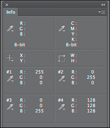
Figure 1.3. Info panel before desaturation
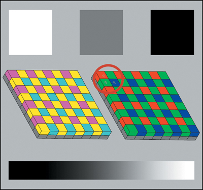
Figure 1.4. Color target before desaturation
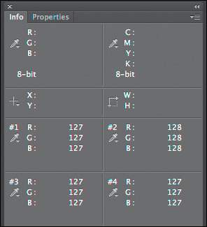
Figure 1.5. Info panel after desaturation
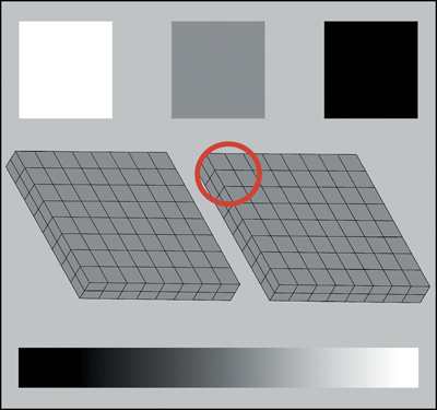
Figure 1.6. Color target after desaturation
Photoshop keeps all the color/luminance information in Lab and then translates it as necessary to ProPhoto RGB, CMYK, sRGB, Grayscale, etc. To see this, convert an RGB image to Lab and watch what happens in the Info panel. Applying the desaturate command discards the A (green-magenta) and B (blue-yellow) color channels, retaining only the Luminance (L) channel information. Two of three channels are lost, therefore, you have lost two-thirds of the original file’s information, and the file size shrinks accordingly. Translating the file back to RGB, returns it to the original file size, but what remains in the R, G, and B channels, is only the L channel information. The same thing happens if you convert RGB to Grayscale; the file size is reduced by two-thirds.
Desaturation: Why You Should Not
To compare the results of desaturation with the results from black-and-white film, look at the three RGB channels of this image of Challen Cates (Figures 1.7, 1.8, 1.9, and 1.10). You see that each has a different grayscale value. By my working definition, each channel is a black-and-white image. This is what the image would look like if I shot it using Ilford HP5 Plus (a 400 ISO film) and processed it at 200 ISO (Figure 1.11). This is what the image would look like if I desaturated the digital image (Figure 1.12), and this is what the individual RGB channels would look like after desaturation (Figures 1.13, 1.14, and 1.15). Note that the film and the desaturated image are both grayscale images and that they are different from each other. Note also that all three channels of the desaturated image are grayscale images and look alike. According to my definition, all five of these images are black-and-white ones.
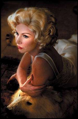
Figure 1.7. The color image
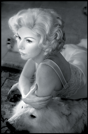
Figure 1.8. The Red channel
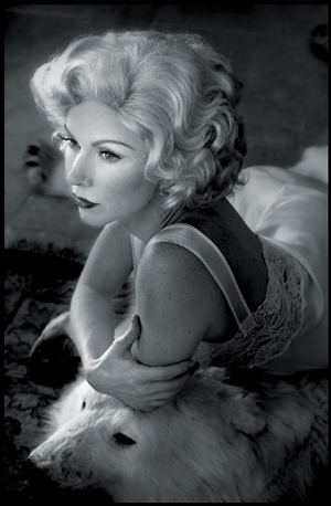
Figure 1.9. The Green channel
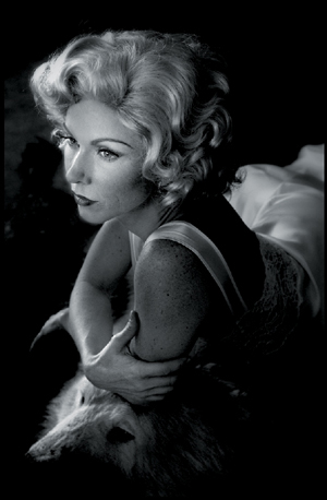
Figure 1.10. The Blue channel
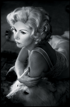
Figure 1.11. Ilford HP5 Plus film
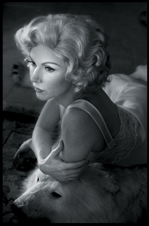
Figure 1.12. The image desaturated
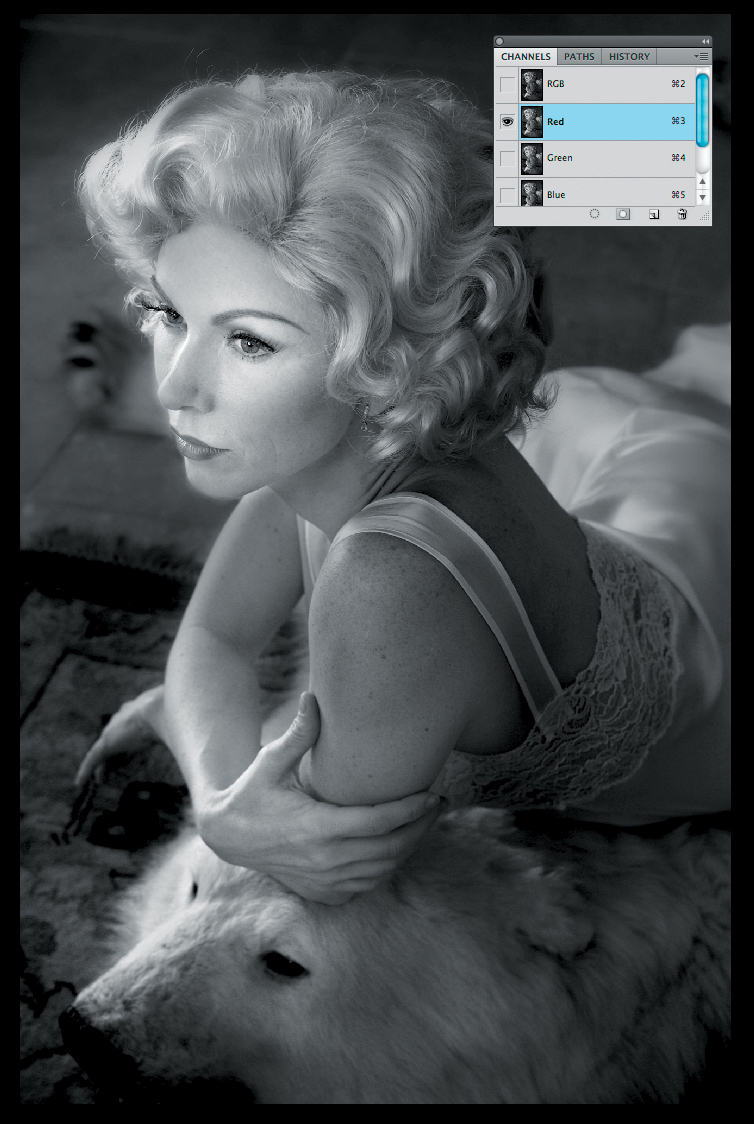
Figure 1.13. The Red channel desaturated
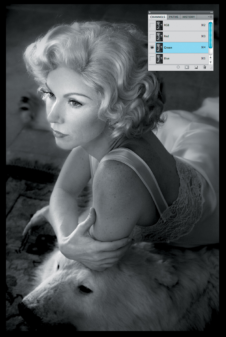
Figure 1.14. The Green channel desaturated
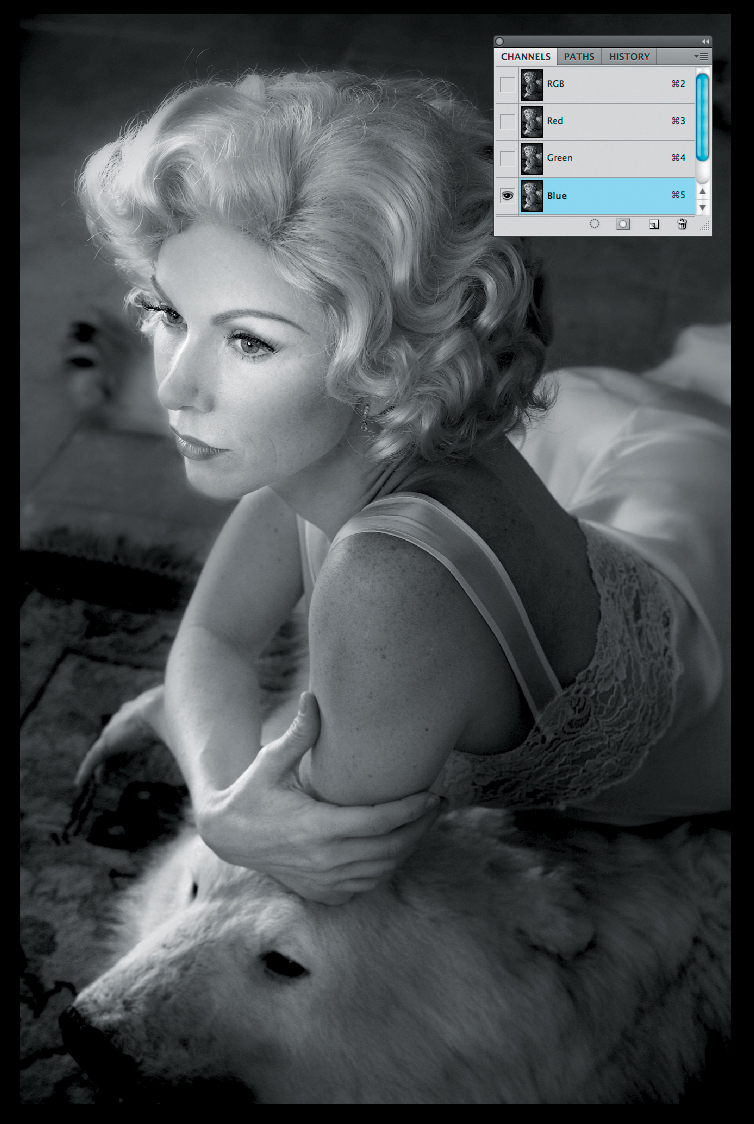
Figure 1.15. The Blue channel desaturated
What was lost, however, when the image was desaturated, was all the color information. What was left was simply the luminance, or light-to-dark aspect of the image. What is not present, as would be the case with a film image, is the relationship between red, green and blue translated to the grayscale. So would you ever use such a conversion technique? The answer may surprise you.
Desaturation: When You Should
Everything should be made as simple as possible, but not simpler.
—Albert Einstein
The simplest way to do something is usually the best way, it is important to make things as simple as possible and no simpler. For the image of Challen, what appeared to be the simplest way was not the best way. Using desaturation to make things simpler than possible proved damaging to the integrity of the image.
An example of an image in which desaturation might be a good idea is an image of clouds. Most often (except at sunrise and sunset) you perceive clouds to be black-and-white, not color. They are either light or dark and their luminance varies. How they appear in a photograph, however, is frequently different from how you perceive them.
I would argue that the image of clouds from the Valley of 4000 Temples in Bagan, Burma (Figure 1.16) is mostly a chromatic grayscale one, even though there is some blue in it. But if you zoom into the bottom area of the image, you will notice that there is a lot of color in these clouds (Figure 1.17). Frequently, clouds look blue-gray in a photograph versus the white or gray that we think we see, because they often take on the color of the light that is reflected from the surrounding blueness of the sky or up from the ground beneath them. In this instance, the color is a yellow-brown, because the grass of the valley is mostly yellowish-brown during the time of year in which this image was captured.

Figure 1.16. An image of clouds from the Valley of 4000 Temples in Bagan, Burma
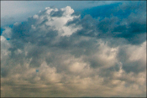
Figure 1.17. A detail of the coloring in the clouds
Would you use a Multi-Channel Mixer adjustment layer, multiple plug-in chromatic grayscale conversion approach or simply use desaturation to get the color contamination out of something that is (for the most part) already in grayscale? If you agree with Albert Einstein, as quoted previously, you would try desaturation.
For Every Repetitive Action You Take, React by Making an Action
For every action, there is an equal and opposite reaction.
—Sir Isaac Newton
Even though Newton was discussing forces and not programming actions, from this point forward, everything that you will do in this book that can be made into an action or a configurator, has been, and you can download them from the download page for this book. (See the sidebar: For Every Action That You Take, Make an Action in this chapter.) The actions are for all versions of Photoshop and the configurator is for CS6. You can save time on repetitive actions in Photoshop by creating an action or a configurator to do most of the heavy lifting. Also on the download page, is a QuickTime movie that shows you how to load the actions and configurators. Actions and configurators will be updated when the need arises.
I would highly recommend, unless otherwise directed, that you do the lessons manually first. After that, try the action with the same image. I feel that it is important to know what is going on under the hood. By doing every step in this book before simply running the actions, you will reinforce your understanding of how to control the way your viewer reacts to the image that you create. Also, by doing each step, you will gain a better understanding of how to, why to, when to, and why not to use a given approach. As Vince Lombardi said, “Practice does not make perfect. Perfect practice makes perfect,” and what you need to do is practice at practicing.
Removing color contamination Using selective Desaturation
The more things change, the more they remain the same.
—Alphonse Karr
1. Open the CLOUDS1.tif file located in the Chapter 1 section of the download page for this book.
2. Go to the Adjustment panel (CS4 and above) or the Create New Fill or Adjustment Layer icon (Photoshop version 3 and above) located at the bottom of the Layers panel, and create a Hue/Saturation Adjustment Layer (Figure 1.18).
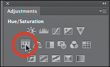
Figure 1.18. Adding a Hue/Saturation adjustment layer
3. In the Hue/Saturation Adjustment Layer dialog box, move the Saturation slider to –100 and the Lightness slider to –1 (Figure 1.19).
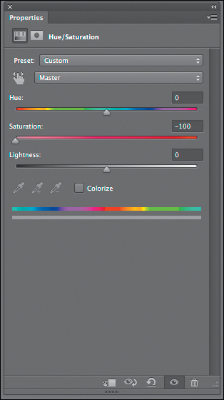
Figure 1.19. The Hue/Saturation adjustment
The Lightness slider adjusts the lightness of the pixels. You are adjusting it to –1 to add darkness, or density, that was lost by removing all of the color.
For Every Action That You Take, Make an Action
Actions
An action is a stored Photoshop record of the steps that you perform on an image. You decide what and when Photoshop will start and stop recording. Once an action is recorded, you can run it any time, on any image. The action does everything you record just as if you were executing the commands yourself, but does them much faster than you can. Actions work in all versions of Photoshop.
Actions are misunderstood, because they may appear difficult to create. That is not the case. They can, however, be tedious to make and are unforgiving, because they record everything you do, and I do mean everything. So, once you press record, do only the steps that you want recorded. When creating actions, especially long ones, I have found that it is best to record small groups of steps and make duplicates along the way. This approach compartmentalizes the work, and you do not have to start at the beginning should something go wrong.
configurators
Adobe Configurator is a utility that enables the easy creation of panels for use in Adobe Photoshop CS4, CS5, and CS6. Configurator is designed to make it easy to drag and drop tools, menu items, scripts, actions, and other objects into a panel design, and then export the results for use in Photoshop. It helps you gain back screen acreage that was lost with the user interface changes that occurred in CS4. Configurator allows you to customize Photoshop CS4 (and above) to your workflow, but the configurators made for CS4 do not work in CS5 or CS6 and vice versa.
How to Load an Action
1. Go to Menu > Window > Actions to bring up the Actions panel (Figures 1.20 and 1.21).
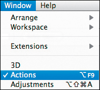
Figure 1.20. Window Menu
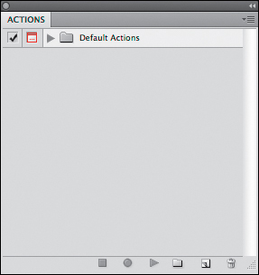
Figure 1.21. The Actions panel
2. Click on the Actions Menu icon located in the upper right corner of the Actions panel, and select Load Actions (Figure 1.22).
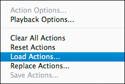
Figure 1.22. The Actions panel menu
3. Locate the action that you want to load onto your computer. In this case, it is the OZ_2_KANSAS_12 action. Select “OZ_2_KANSAS_12.atn” from the Load Actions dialog box and click OK (Figure 1.23).
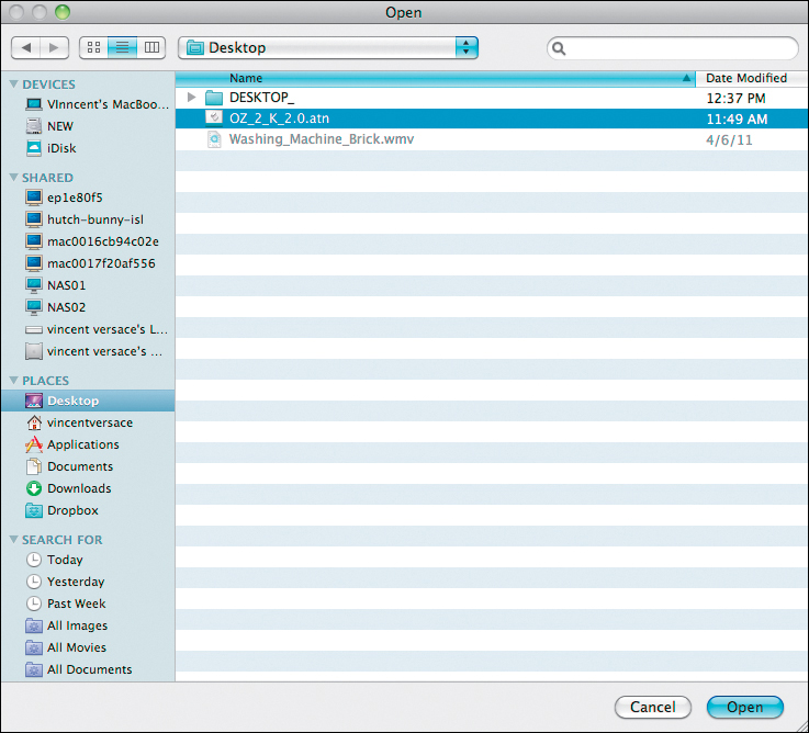
Figure 1.23. Selecting the action set from the hard drive
Whenever I load an action, I simplify my workflow by placing it on the Desktop so that it is easy to locate.
Now you have loaded all of the actions for this book and you should see the actions loaded into the Actions panel when you open the OZ_2_KANSAS_12 actions folder.
4. Set the foreground color to white and the background color to black (the D key sets the foreground and background to the default colors of white and black, and the X key toggles the foreground and background colors) and fill the layer mask with black (Command + delete / Control + backspace).
5. Select the Brush tool (keyboard command B) and set the Brush opacity to 100% (keyboard command 0 [the number zero]), and the brush width to 500 pixels.
I determined the brush size by making the brush slightly smaller than the area on which I wanted to do brushwork. Unless otherwise specified, whenever you select the Brush tool, it will be a soft brush with a hardness of 0. (This gives you a feathered brush.)
6. Brush the entire lower area of the clouds that are contaminated with the unwanted color. (Figures 1.24, 1.25, 1.26, 1.27, 1.28, and 1.29).
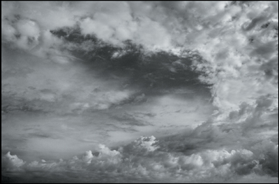
Figure 1.24. The image after the Hue/Saturation adjustment without the layer mask
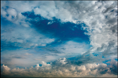
Figure 1.25. The image before the brushwork
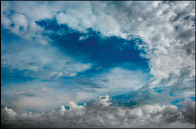
Figure 1.26. The image after the brushwork

Figure 1.27. The layer mask of the brushwork
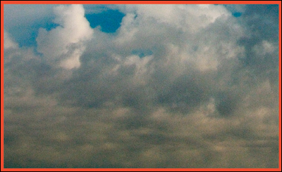
Figure 1.28. Detail of the clouds before the brushwork
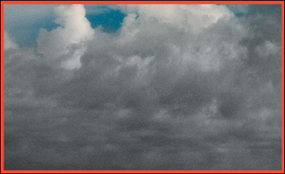
Figure 1.29. Detail of the clouds after the brushwork
7. Bring up the Fade Effect dialog box (Command + Shift + F / Control + Shift + F) and dial back some of the color (go from 100% to 68%) (Figures 1.30 and 1.31). Save the file (Command + S / Control + S).
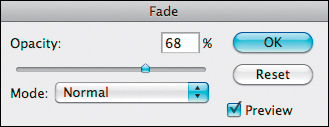
Figure 1.30. Adjusting the Fade Effect dialog box
Figure 1.31. Detail of the clouds after adjustment
Examine the final result in Figure 1.32.

Figure 1.32. The image after the adjustments
Desaturating to Remove color contamination, Adding Drama with curves Adjustment Layers, Blend Modes, and the Nik software contrast Only Plug-In
In this lesson, you are going to completely desatu-rate the image, and then you are going to play with contrast and blend modes to add drama. Also in this lesson, you are going to get your feet wet and do part of it using actions.
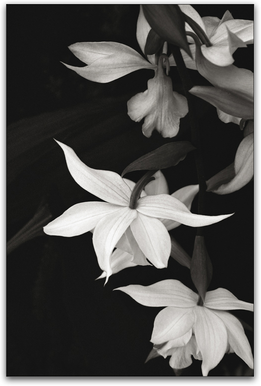
This image of clouds (Figure 1.33) was also shot in the Valley of 4000 Temples, taken moments after the first set of clouds on which you just worked. I simply turned 90 degrees to my right. Whenever I am out shooting, I approach my time with the attitude that the journey is the destination. I try to capture as many different expressions of the moments that take me as time, battery, and flash card will allow. I take my time; as much as I can. I do not indulge in “drive by” shooting. The only thing that makes me move quickly is the speed with which the light changes. If the considerations of light matter anywhere, they matter most when it comes to creating a chromatic grayscale (black-and-white) image. Black-and-white photography is all about the dance of light, dark, and contrast, and it is how you choose to play with these variables that result in images that reflect your vision.
Figure 1.33. An image of clouds also at the Valley of 4000 Temples in Burma
Because the entire process of photography has been accelerated by the digital camera and accompanying software, some of us expect to create masterpieces with every click of the shutter. And some believe that if they miss it, they can fix it in post-processing. Such people have lost their organic connection to the joy of creating an image. You would never think to rush in the analog black-and-white darkroom. There, time and care is reflected in the quality of the final image.
What holds true there must also hold true in the digital darkroom. Take your time. Take as much time as the image deserves.
In Figure 1.34, there is color (primarily blues and yellows) throughout the clouds that you may not want. You may also want to make the clouds appear more dramatic.
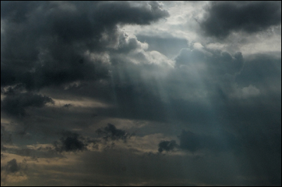
Figure 1.34. A detail of the color in the clouds
Getting the Other colors Out
If you can see it with your eyes, it’s a color.
—Matisse
8. Open the file CLOUDS2.tif (located in the Chapter 1 section of the download page for this book).
9. From the Actions panel in the OZ_2_KANSAS_12 actions folder, click on the DESATURATE action and then on the Run button located at the bottom of the Actions panel.
The moment that you click the Run button, the action will start. (Even when it pauses to have you do something, it is still running.) The action will not stop until all of the steps of the action are complete.
10. Photoshop will open the Save As dialog box (Figure 1.35). When it comes up, click on the New Folder button located in the lower left corner of the Save As dialog box. When the New Folder dialog box comes up, name the folder CLOUDS2 (Figure 1.36).
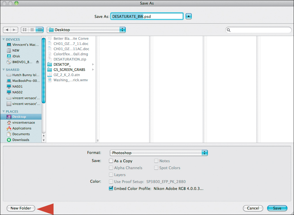
Figure 1.35. The Save As dialog box
Figure 1.36. Creating a new folder called CLOUDS2
11. Type CLOUDS2_after the DESATURATE_BW in the naming box located in the top middle of the Save As dialog. Click Save. The action will then restart and desaturate the image (Figure 1.37).
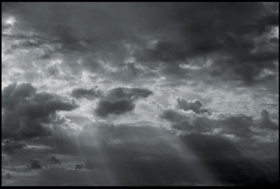
Figure 1.37. The image desaturated
To add words to a file name in the Naming dialog box, place the cursor either before the first letter or after the last letter where you want to add text. In this case, it is before, because you are adding a name to the description. If you were adding something like the size of the image (e.g., _13x19 or _20x34), you would put the cursor to the right of the last letter of the filename.
You can double-click on an action to load it, but occasionally, it will not appear when you next open Photoshop. Loading actions, as previously described, guarantees that the action will be loaded when you reopen Photoshop.
Getting Drama Using contrast
There are two ways that you can go about getting contrast. You can use either Curves or Nik Software’s Contrast Only filter (one of the five, free filters that you get with this book). You are going to learn how to use both, because both are extraordinarily useful.
Adding contrast with curves Adjustment Layers
The following steps have also been made into an action called “PS_CONTRASTS_LIGHTEN_BM” located in the “OZ_POWER_TOOLS” action set located on the download page for this book.
12. Create a Curves adjustment layer. Name this layer CONTRAST_NORM (for Contrast Normal Blend mode) either from the Adjustment Layer panel or the Adjustment Layer icon located at the bottom of the Layers panel (Figures 1.38 and 1.39).

Figure 1.38. The Curves option in the Adjustments panel
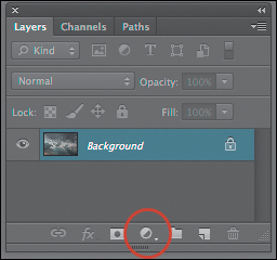
Figure 1.39. The Adjustment layer button in the Layers panel
From this point on, I will show only screen captures of dialog boxes that have not previously been used. If I have described a technique or how to do something at length, I will not repeat all of the steps.
13. Once you are in the Curves dialog box, there are several choices located in the Presets pull-down menu. For this image, only two are of interest: Medium contrast and Strong contrast and, because you may want a lot of drama, Strong contrast is the best choice (Figures 1.40, 1.41, 1.42, and 1.43).
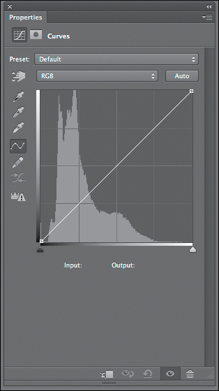
Figure 1.40. A Curves adjustment
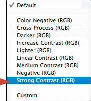
Figure 1.41. Selecting the Strong Contrast (RGB) preset
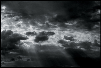
Figure 1.42. The image before the Curves adjustment
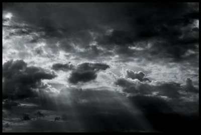
Figure 1.43. The image after the Curves adjustment
14. Duplicate the CONTRAST_NORM Curves adjustment layer and rename it CONTRAST_LIGHTEN. Select the Lighten blend mode from the Blend Mode pull-down menu located in the upper left corner of the Layers panel. Holding down the Shift key, click on both CONTRAST_NORM and the CONTRAST_LIGHTEN Curves adjustment layers. Drag them to the Make New Layer Group icon located at the bottom of the Layers panel and name the new layer group CURVES_CONTRAST. You will see the lighter clouds get brighter with increased contrast while the darker clouds stay dark (Figures 1.44, 1.45, and 1.46).
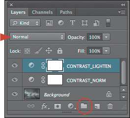
Figure 1.44. The Blending mode drop down menu (arrow) and the New Layer Group icon (circle)

Figure 1.45. Before Lighten blend mode is applied
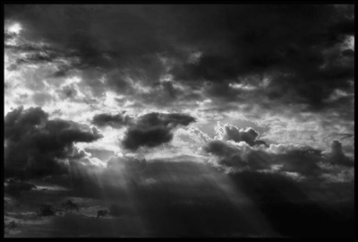
Figure 1.46. After Lighten blend mode is applied
If you are using a Wacom tablet or a Wacom Cintiq I have programmed the Express keys and Radial dial. To see how they work, refer to the Why to of My How PDF on the download page for this book. This approach to contrast creation has also been made into an action.
Brewing Up the Perfect Blend
In the simplest of terms, a Photoshop blend mode affects how the pixels of one layer will interact with the pixels of the layer or layers beneath it it. Photoshop has 27 layer blend modes that you can apply to any layer.
Blending modes are algorithms assigned to layers (or tools) which affect how they interact with other layers. The blending mode assigned to a layer (the “blend” color layer) determines how the colors of the pixels on that layer interact with the colors of the pixels on the base color layer or layers below. The result of that interaction is know as the “result color.” When working with tools, the blending mode of the tool affects how that tool will alter the pixels on every layer below.
There are two ways to lighten an image using blend modes: Lighten and Screen. You will be using the Screen blend mode later in this book, so I will define them both now because what to best do with your image involves understanding how each of these blend modes function.
The Lighten blend mode looks at the color information in each channel and selects the base or blend color—whichever is lighter—as the result color. Photoshop lightens any pixels that are darker than the blend color, while leaving those that are lighter unchanged.
The Screen blend mode looks at each channel’s color information and multiplies the inverse of the blend and base colors. The result color is always lighter. (The effect is similar to projecting multiple photographic slides on top of each other. The resultant image will be 50% lighter.)
Because you want to brighten the lighter clouds and maintain the contrast boost without adding lightness to the darker clouds, using the Lighten blend mode is the better choice. Also, because you are using an adjustment layer to do this, a layer mask is automatically attached to it when you create one. So, if an area is too hot or blown out (i.e., brighter than you desire), simply brush it back. You can also adjust the layer’s opacity to diminish the affect of contrast lightening. Again, make things a simple as possible, but no simpler.
To streamline and simplify the learning process, rather than give you a description of all 27 blend modes at once, I will describe them as they are pertinent.
Adding contrast with the Nik software contrast Only Plug-In
Go to an extreme and retreat to a usable position.
—Brian Eno
15. Turn off the CURVES_CONTRAST layer group.
16. Duplicate the background layer (Command + J / Control + J).
17. Make the layer that you just created into a Smart Filter (Filter > Convert to Smart Filter). Name this layer CONTRAST_ONLY (Figure 1.47).

Figure 1.47. Converting a layer for Smart Filters
18. Go to Filter > Nik Software > Color Efex Pro 4 Promo 5 (Figure 1.48).
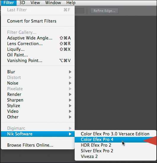
Figure 1.48. Launching Color Efex Pro 4 Promo 5
19. When the Color Efex Pro 4 Promo 5 dialog box comes up, select Contrast Only and Split Screen mode (Figure 1.49).
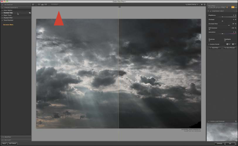
Figure 1.49. Selecting Contrast Only and the Split Screen mode
20. Increase the brightness to 13 and increase the contrast to 54 (Figure 1.50).
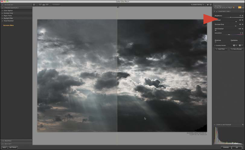
Figure 1.50. Adjusting the Brightness and Contrast sliders
For the actions to run correctly, even if you have Color Efex 4.0 installed, you will need to install the Color Efex 4.0 Promo 5 version that comes with this book.
21. Click on the disclosure triangle for the Loupe and Histogram located in the bottom right corner of the dialog box to reveal the Loupe and Histogram, and click on the Histogram section. This will change the view from the Loupe to the Histogram. Move the Protect Shadows to 50% and the Protect Highlights to 65%. (See the sidebar: How Protect Shadows and Highlights Works later in this Chapter.) If you look closely at the histogram, you can see where you are working, what you are doing, and how you are protecting the shadows and highlights (Figure 1.51).

Figure 1.51. Protecting the shadows and highlights
22. Save the file.
Figures 1.52 and 1.53 show the image before and after using the Contrast Only filter.
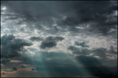
Figure 1.52. Before the Contrast Only filter
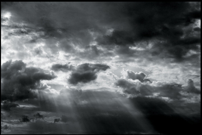
Figure 1.53. After the Contrast Only filter
I arrived at these numbers by trial and error and by having the ability to “re-bake the cake” and undo what I had done, because the Contrast Only layer is a Smart Filter. This allows me to go to an extreme correction and, if need be, retreat until I have a usable value. This is the case with both contrast approaches. You have the ability to selectively brush contrast out or in by using a layer mask and you can further dial in the effect you want by using layer opacity.
How Protect Shadows and Highlights Works
The Protect Shadows and Protect Highlights sliders help you protect image details at both ends of the tonal range (from pure white with no texture to pure black with no detail) (Figure 1.54). The controls take advantage of the TrueLight function in Color Efex Pro 4. The Protect Shadows and Highlights section displays one slider for protecting shadows and one for protecting highlights. As you click and drag either slider to the right or left to increase or decrease protection, notice the change in the image’s details. A histogram representing the full tonal range of the active image after the current enhancement has been applied can be found in the Loupe and Histogram section of the dialog box. The histogram changes in real time as you adjust the filter controls and Protect Shadows/Protect Highlights sliders. The top and bottom 2.5% of tonal values represent Shadows without Detail on the left and Highlights without Detail on the right. The next 2.5% of the shadows and highlights (indicating Shadows with Detail on the left and Highlights with Detail on the right) appear in green. Connected to each of the four colored areas (Shadows without Detail, Shadows with Detail, Highlights without Detail, and Highlights with Detail) are numerical call-outs displaying the percentage of pixels from the active image that exist in each of those four areas after the enhancement has been applied.
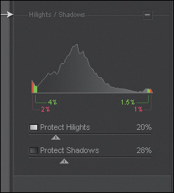
Figure 1.54. The Protect Shadows and Highlights tool
Use the Protect Shadows and Protect Highlights sliders to keep the greater part of the image between the green areas (Shadows with Detail and Highlights with Detail) of the histogram. Portions of the image in Shadows without Detail will likely print pure black; those in Highlights without Detail will likely print as paper white. Click and drag the Protect Shadows slider to the right to adjust the filter’s effect and prevent details from being moved into the Shadows without Detail area. Click and drag the Protect Highlights slider to the right to adjust the filter’s effect and prevent details from being blown out or being moved into the Highlights without Detail area.
In general, it is best to maintain the histogram in the region between the Shadows with Details and the Highlights with Details sections. Nevertheless, many good images have spectral values in those areas of the histogram (e.g., highlights on a chrome bumper).
Believing Is Seeing: The Way the Eye “Sees” What it Saw
Wherever there is light, one can photograph.
—Alfred Stieglitz
As I discussed at some length throughout the book Welcome to Oz 2.0, the human eye sees in a predictable manner. The photographer must decide what journey the viewer’s eye will take through his/her image because controlling that journey can strongly influence the viewer’s perception. I have come to believe that there are two types of eyes at play: the unconscious one that sees the image, and the conscious one that interprets the story that the unconscious eye sees.
Seeing: The Unconscious Eye
The tricks of today are the truths of tomorrow!
—Man Ray
To best understand how to control the journey of the unconscious human eye through an image, you first have to understand some of the biomechanics of how the eye sees. The human eye is always in a seek mode; it tends to wander rather than to look at any one thing for very long. One of your goals should be to create an image at which the human eye is compelled to linger in order to short circuit its wandering tendencies. The longer the eye looks at your image, the more likely you are to convey to the viewer the emotion that you felt when you captured it, and, therefore, the more likely it will be that the viewer will consider purchasing your image if it is for sale. The purchaser then displays your work to others because it stirred an emotional response in him/her, regardless of whether or not it is the identical response that you had.
Oscar Wilde said, “Amateurs speak in terms of art. Artists speak in terms of money.” The primary reason that I create an image, from the moment of capture to the final print, is for my own edification and pleasure, but I also hope to sell what I create. I believe that if your image pleases you, it will please others who share your sense of the aesthetic and, the more visually compelling it is, the more likely it will be that your viewer will be compelled to transplant a cemetery of dead patriots from their wallet into yours.
If your goal is artistic and monetary, how do you get the viewer’s unconscious eye to stay locked onto your photograph so that their conscious eye can see into it? The answer lies in understanding how the biological mechanism that is the unconscious eye sees; what attracts it and how you can cause it to move through your photograph.
Briefly, this is how the human eye “sees.” The eye moves from patterns that it recognizes first: from light to dark, high contrast to low contrast (for a full description of contrast, see the sidebar: Terms of Engagement at the beginning of this chapter), high sharpness (see note below) to low sharpness, in focus to blur (which is different than high to low sharpness), and from high saturation of color to low saturation of color. The eye tends to see warm colors as bright and moving forward in an image and cool colors as less bright and receding. If you think about each of these statements, they describe the propensity of the eye to track subjects based on contrast.
Sharpening (performed with a technique called unsharp mask in Photoshop and most image editing programs) refers to the increase of apparent edge contrast by increasing contrast on either side of the pixels’ edges. In this way, contrast and sharpness are related. It is worth noting, however, that contrast is normally spoken of on a global scale, and sharpness is highly localized. When an image is sharpened using Unsharp Mask, nothing is actually sharpened. What is created is a visually appealing artifact that gives an illusion of sharpness.
The technique of Unsharp Mask is an old darkroom printing technique developed in the 1930s. Its actual name is the Craik-O’Brien-Cornsweet Edge illusion, or the Cornsweet edge for short. According to the Journal of Neuroscience, a Cornsweet edge is created “by increasing the apparent edge contrast of an image by adjusting through a blurred copy of the image.”
The human eye is frequently compared to a camera, but it is so much more. The human eye is an optical biological device that has the ability to record time and motion. A still camera can record only fractions of time and, therefore, stops motion with stillness.
The human eye is roughly a sphere. (It is actually a fused, two-piece unit.) It is completely light-tight except for one opening at the front of the eye; the pupil. The amount of light that is allowed in is controlled by the iris, which opens in low light and closes in bright light. You are able to focus on what you see because the ciliary muscle (which completely surrounds the lens) is capable of changing the shape of the lens so quickly that (in a completely normal eye) everything that you look at appears to be in focus from near to far. Images are projected onto the retina (a light sensitive tissue lining the inner surface of the back of the eye), upside down and backwards. This reversed image is then translated into electric impulses that are sent to the brain to be interpreted (Figure 1.55).
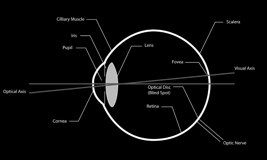
Figure 1.55. Diagram of the human eye
The human eye has a dynamic range that is equivalent to approximately 30 f/stops; considerably more than film or digital cameras can achieve. This extraordinary dynamic range is achieved through a combination of the physical properties of the human eye. First, there is the iris, which can expand from 8 mm (when wide open) to 2 mm when closed. This alone is the equivalent of four f/stops.
Dynamic range in photography describes the ratio between the maximum (lightest) and minimum (darkest) measurable light intensities.
The answer to how the human eye makes up for the remaining 26 f/stops is found in the two photoreceptor cells (the rods and cones) that are present in the retina. Rods respond to low light and cones respond to bright light accounting for a range of about six f/stops. The remaining range of 20 f/stops is achieved because the sensitivity of both the rods and cones is increased or decreased by the production or degradation of pigments inside those cells. Thus, you arrive at a dynamic range for the human eye that is equivalent to approximately 30 f/stops.
The building up and breaking down of pigments in the rods and cones is not an instantaneous process. To completely build up the light-sensitive pigments in rods takes about five minutes, but in cones, upwards of a half-hour. This explains why your vision only gradually improves when moving from a bright to a dark room.
Because all rods are highly specialized for low-light sensitivity, they are used mainly for night vision. While there is only one type of rod, there are three types of cones. Each of these produces a different kind of pigment sensitized to different wavelengths of light. When there is adequate light intensity, humans have color vision, not unlike the way that red, green, and blue color receptors on a DSLR sensor create a color image.
The anatomy, cell biology, and physiology of the human eye are extremely complex subjects. I have chosen to include only a simplification of those facts that I think are most germane.
Believing: The Conscious Eye
Photography, as we all know, is not real at all. It is an illusion of reality with which we create our own private world.
—Arnold Newman
Even after you have some small understanding of how the eye sees what it saw, how does that translate into identifying, classifying, and analyzing what you see and believing it is the truth? If you allow me a severe over-simplification, the human eye is not unlike a camera, and the brain is not unlike a high speed, image-processing computer. Together they make up the hardware of the human visual system. The eye merely transforms the light that impinges on its retina into an upside-down, backward image converted into electric impulses in the rods and cones. It is not until those impulses travel down the optic nerve and into the visual cortex, that the first part of the interpreting process occurs. In this part of the brain, determinations about edge definition and what is light and dark are formed. Then those determinations are translated into simple shapes.
After this, the data moves to the parietal lobe and cerebral cortex of the brain where it is compared to previously stored information so that faces and objects can be separated from the background and recognized. Then, the resulting information is moved to the temporal lobe, where a meaning is assigned to what we have seen and names can be given to faces and objects. From there, all of this is moved to the frontal lobe, where feelings are added and, finally, to the prefrontal lobe, where decisions are made about doing or saying something based on what our eyes have just seen.
While this exceedingly simplified description of how human vision works is extremely limited, even the best scientists do not thoroughly understand the complexities of the processes that occur in the brain. What science does know is that, whatever those processes are, they happen so quickly that they appear to be instantaneous and happen in real time.
This means that what we believe we see is not based simply on what the eye saw; it is the raw data of the eye interpreted by the brain. So, in a sense, seeing is not believing; rather believing happens after we see.
This, in turn, brings up many questions, one of which is, “What seems most rational; creating images based solely on the rules of composition or based on the mechanics of how the eye sees and our brain interprets that information?” One could argue that rules of composition are an attempt to describe the reasons why certain images are more successful than others. Over the years, however, these rules have become the dogma that we use to tell ourselves what we should and should not do when we create. But I do not pause before I click the shutter and say to myself, “Self, I think I will use Grecian Mean composition, the rule of thirds, and not fill the center of the frame.” I just capture an image that moves me. But I already have an understanding of how the eye tracks and how the mind creates understanding from what the eye sees, and I believe that this knowledge makes my image captures more successful than they would be if I did not have that understanding. And that is what I wish for you.
Every choice that has gone into making the images in this book to this point, and every choice that will be made hereafter, is made from this perspective. If you have an image that you feel is worthy of all the effort needed to convert it into a chromatic grayscale, it is control of how the viewer’s eye will move through the image that needs to move your hand as you craft that image.
The Black and White About Light and Dark
The science fiction author Sir Terry Pratchett said, “However fast light travels, the darkness always gets there first and is waiting for it.” The photographer W. Eugene Smith said, “In music I still prefer the minor key, and in printing I like the light coming from the dark. I like pictures that surmount the darkness, and many of my photographs are that way.” Those are two different ways of saying that dark is as important to an image as light. It is the understanding and controlling of the relationship between dark and light that results in more successful images.
As we seek to understand and control the relationship of dark to light, we encounter a problem because how we determine the lightness (or brightness) of a surface when we look at it, is still a mystery. When light is reflected off a surface, although the rods and cones on the surface of the retina are sensitive to changes in brightness, the signal that they eventually transmit to the brain does not contain information that would allow us to determine what shade of gray that surface would appear if its color were extracted.
Apparently, much of what we see is an illusion. Although the mountain of knowledge that describes how our visual system works is dwarfed by the one representing what science does not know about it, it is important to understand what little is known and exploit that knowledge to create memorable images and prints that move others.
White’s Illusion
I want to show you an example of an illusion called “White’s Illusion” that, once understood, can be used to control the viewer’s eye.
White’s Illusion describes changes in the apparent lightness of mid-grays surrounded by black and white. (This effect also occurs when the grays are replaced by colors.) Dr. White explains that the illusion occurs because, “the mid-gray elements assimilate to the color of the uninterrupted bars at their sides, such that the gray elements in the gray–black test region become darker, while the gray elements in the gray–white test region become lighter.” Start by looking at two gray rectangles that have an equal value of red, green, and blue that is 128 or middle gray (Figures 1.56 and 1.57).

Figure 1.56. The grey rectangles and the four sample points

Figure 1.57. The Info panel for just the gray bars
Both are the same gray and both appear to be the same brightness. This will hold true even when parts of the left rectangle are removed (Figures 1.58 and 1.59).

Figure 1.58. The grey rectangle with part of the left rectangle removed
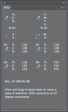
Figure 1.59. The Info panel after removing part of the left rectangle
But when horizontal black bars are added to the image, things change (Figures 1.60 and 1.61).
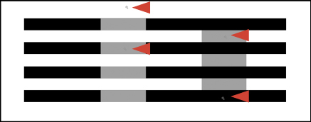
Figure 1.60. The grey rectangle with parts of the left rectangle removed and black horizontal bars added
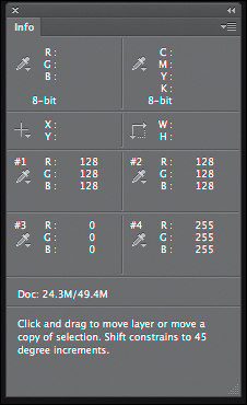
Figure 1.61. The Info panel after black horizontal bars are added
The gray rectangles on the left appear to be lighter than before while the gray rectangles on the right appear darker, even though they are the same value of gray. Also, the gray bars to the left appear to be in the foreground and wider than the gray bars on the right that appear to be narrower and in the background. Let me reiterate. Things are not always what they appear to be, but if you learn to manipulate them, you will successfully create illusions that tell the truth of what you feel.
What White’s Illusion shows is that by manipulating the darks, lights, and grays in an image, you can change the viewer’s perception of it. You can create the illusion of depth, hold the viewer’s eye in one place in the image longer than in another, and compel the viewer to look at your image rather than look away.
The point of all of this is to eventually understand how the unconscious and the conscious eye work in concert. Learning some of the unconscious eye’s bio-mechanics and how the conscious eye perceives what the unconscious eye sees, allows you to control the journey that the viewer of your image takes when they look at your image. Also, by comprehending the capabilities and limitations of the eye, you can better know how to create an image that selectively replicates what you saw.
Most importantly, if you understand how the eye sees and perceives, you start the journey toward understanding why black-and-white photographs (chromatic grayscale in digital) are so emotionally powerful. In very low to almost-no-light situations, we see only in black-and-white instead of color. So when we look at a black-and-white photograph in the bright light of day with our full color vision, there is a part of us that knows that we should not be able to do that. It captures and holds our attention because of this and gives us time to become emotionally involved with the image.
Lastly, it should now be crystal clear that everything you do to an image, every step of the way, is about maximizing your control of the viewer’s eye and preserving all of the capture’s image structures so that you can best express that moment of capture in the image that others see.