Chapter 2. Variations on a Theme
The Power of Hue: The Black and White on the Film and Filter Approach
The enemy of photography is the convention, the fixed rules of “how to do.” The salvation of photography comes from the experiment.
—Laszlo Moholy-Nagy
Film and Filter: Three Approaches
In this chapter, I would like you to think about the full spectrum of colors in your image file as sheet music that, when converted into a chromatic grayscale symphony, will emotionally move your viewers. Also, think about creating an interesting, simple plainness; one with no more or less than the image requires to express what moved you. But, you may be beginning to see that an interesting plainness is a difficult thing to achieve. You may also be beginning to see that there is nothing simple or plain about a file that you choose to convert into chromatic grayscale or the choices that you make when creating what will appear to be an interesting plainness.
Little if anything about making a truly memorable black-and-white photograph is black and white. Things that you think you would never do are sometimes your best option, and what you think is the best may turn out to be no option at all. In other words, there are lots of gray areas in your black-and-white conversion process as you are about to observe in the next series of lessons that make up this chapter.
Approach One: The Classic Film and Filter
The combination of experience and experimentation will ultimately yield a personal sound.
—Mark White
You have been working with the removal of color and addressing issues of contrast. Now it is time for you to start working with the formula to mix color. In the digital world (the world of image sensors, LCD monitors, and inkjet printers), if your eye can see it, it is a color. Gray and white are colors, and black is the queen of all colors. Black-and-white film, as I have discussed, records colors as shades of gray. You must keep this in mind when you try to replicate the kind of black-and-white images with which you may have fallen in love. Those images were recorded on film and printed on silver paper, but you can realize your vision and express your voice in a chromatic grayscale, digitally-created print.
The first of the three ways to approach what is reffered to as a “Film and Filter” conversion is yet another variation of the desaturation approach. Because this approach is best explained using an image with more color components than the previous two images had, you will use an image of the actress Challen Cates (Figure 2.1).
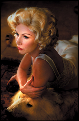
Figure 2.1. Challen Cates
This first technique was created by Adobe’s Russell Brown. The technique uses, not one, but two Hue/Saturation adjustment layers and the Color blend mode. As previously described, blend modes determine how two layers will blend together.
The Color blend mode creates a result color with the luminance of the base color and the Hue/Saturation of the blend color. This preserves the gray levels in the image and is useful for coloring monochrome images and tinting color images. In other words, the Color blend mode preserves the brightness of the bottom layer, while adopting the hue and color of the top layer.
1. Open the File CHALLEN2_.tif (located in the Chapter 2 section of the download page for this book).
2. Select Save As (Command + Shift + S / Control + Shift + S), click on the Create New Folder button (Figure 2.2), and name the folder FILM_AND_FILTER. Then, rename the file CHALLEN2_FILM_FILTER, and select the Large Document Format (.psb) file format (Figure 2.3) and save it.

Figure 2.2.
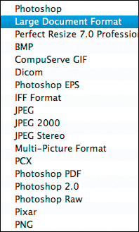
Figure 2.3.
If you are running the Film and Filter action, the Duplicate Image dialog box will show “FILM_FILTER” in the naming box. Insert the specific name of your file in front of FILM_FILTER. Notice that the action flattens the duplicated file so that the file size is reduced which speeds the image editing process.
3. Go to the Create Layer Group icon located at the bottom of the Layers panel and click on it to create a new layer group. Name this layer group C_FILM_FILTER.
4. Go to the Adjustment panel (CS4 and above) or the Create New Fill or Adjustment Layer icon (Photoshop version 3 and above) located at the bottom of the Layers panel and create a Hue/Saturation adjustment layer.
5. Set the blend mode to Color (Figure 2.4).
Figure 2.4. Setting the blend mode to Color
6. Name this Hue/Saturation adjustment layer FILTER.
7. Create a second Hue/Saturation adjustment layer and name this layer FILM.
8. Move the Saturation slider completely to the left (–100) and click OK.
The image should look like Figure 2.5.

Figure 2.5.
9. Make the FILTER Hue/Saturation adjustment layer active. Click on the Hue slider and move it to the left until you get the desired effect (–51 for this image) (Figures 2.6, 2.7, and 2.8).
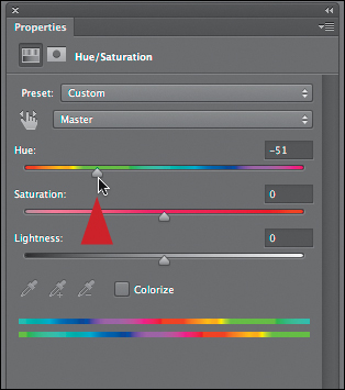
Figure 2.6. Moving the Hue slider to -51
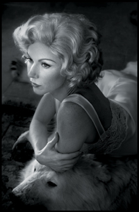
Figure 2.7. Before

Figure 2.8. After
10. From the Colors pull-down menu, select Reds (Figure 2.9).

Figure 2.9. Select Reds
11. Click on the Scrubbing slider icon located in the upper left corner of the Hue/Saturation adjustment layer to make it active (Figure 2.10).
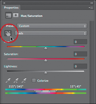
Figure 2.10. The Scrubbing slider
12. Place a sample point on an area that you want to adjust, which for this image is Challen’s forehead (Figure 2.11).
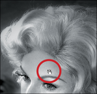
Figure 2.11. Placing the Scrubbing slider sample point on her forehead
13. Click-drag the Scrubbing slider sample point to the right until you see 39 in the Saturation dialog box (Figures 2.12 and 2.13).

Figure 2.12. Increasing the Saturation to +39
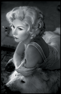
Figure 2.13. After moving the Scrubbing slider
14. From the Colors pull-down menu, select Yellows. Click on the Scrubbing slider icon and place the sample point on an area that you want to adjust (Challen’s forehead). Set the Saturation to –70 (Figures 2.14 and 2.15).
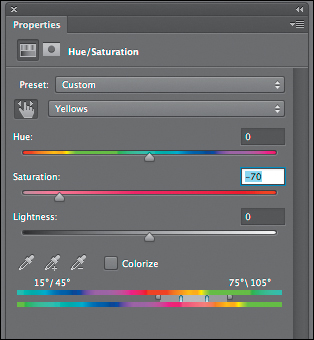
Figure 2.14. The Saturation slider set to -70
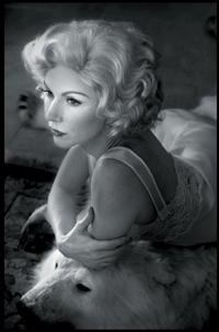
Figure 2.15. The final image
15. Create a master layer (Command + Option + Shift + E / Control + Alt + Shift + E), and name it C_FILM_FILTER.
16. Save the file.
You can also move the Hue slider either left or right which allows you to play with all the colors.
Approach Two: Neo-Classic Film and Filter
No amount of experimentation can ever prove me right; a single experiment can prove me wrong.
—Albert Einstein
The main difference in the next variation of the Film and Filter technique and the one that you have just finished is simple, but the effects are profound. Just by changing which of the two Hue/Saturation adjustment layers you convert from the Normal blend mode to the Color blend mode you dramatically affect the image that you create. The idea for changing the blend mode positions came to me during simple experimentation and from asking the question, “If the Color blend mode preserves the brightness of the bottom layer, while adopting the hue and color of the top layer, what happens if the colors of that layer are monochromatic?”
To speed this experiment up a bit, you will duplicate the folders that you have already created and change blend modes.
1. Duplicate the C_FILM_FILTER layer group folder. Rename the copy, NC_FILM_FILTER.
2. Turn off (click on the eyeball in the Layers panel) C_FILM_FILTER.
3. Making the NC_FILM_FILTER layer group the active one, open this layer group folder.
4. Change the blend mode of the FILTER Hue/Saturation adjustment layer from Color to Normal.
5. Change the blend mode of the FILM Hue/Saturation adjustment layer from Normal to Color.
6. Create a Master layer (Command + Option + Shift + E / Control + Alt + Shift + E), and name the new layer NC1_FILM_FILTER and save the file.
This is what you should see (Figures 2.16 and 2.17).
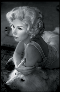
Figure 2.16. Before

Figure 2.17. After
When you look at two variations of the FILM & FILTER approach (both the chromatic grayscale images and the underlying adjusted color images that produce those grays), this is what you should see (Figures 2.18, 2.19, 2.20, 2.21, and 2.22).
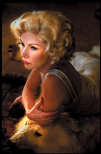
Figure 2.18. The color image before
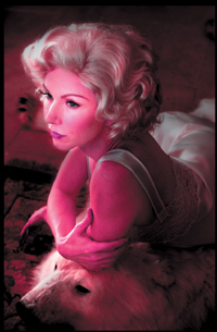
Figure 2.19. The image after Classic Film and Filter
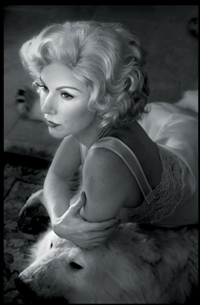
Figure 2.20. The monochromatic Classic image
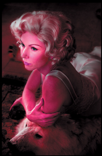
Figure 2.21. The color Neo Classic 1 image
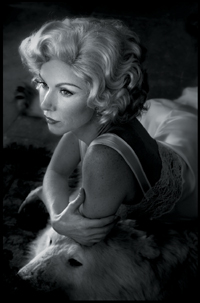
Figure 2.22. The Monochromatic Neo Classic Film and Filter image
To better understand what occurs when you change the position or order of the layers or change blends modes from Normal to Color, look at what happens when you boost the saturation of the Reds and Yellows in the image (Figures 2.23, 2.24, 2.25, 2.26, 2.27, and 2.28).
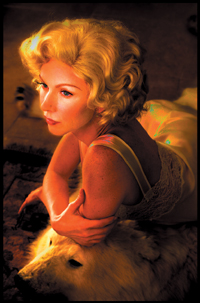
Figure 2.23. Classic Film and Filter approach with the Reds saturation slider and Yellows saturation slider at 100%
Figure 2.24. The image with the Black-and-White Monochromatic Classic Film and Filter applied
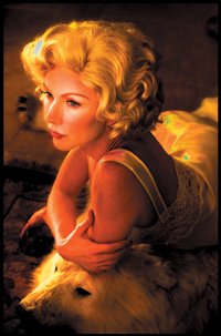
Figure 2.25. The Neo Classic Film and Filter image Reds saturation slider and Yellows saturation slider at 100%
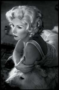
Figure 2.26. The Black-and-White Monochromatic Neo Classic Film and Filter image
Figure 2.27. Closeup of Classic Film and Filter conversion

Figure 2.28. Closeup of Neo Classic Film and Filter conversion
Approach Three: Neo-Neo-Classic Film and Filter–Yet Another Variation on a Theme
Using a Layer of Black, White, or Gray and the Color Blend Mode to Create a Chromatic Grayscale Image
Change is inevitable—except from a vending machine.
—Robert C. Gallagher
If the Color blend mode preserves the brightness of the bottom layer, while adopting the hue and color of the top layer, and if the Lighten blend mode takes the lightest pixel from each layer, and if Normal blend simply takes each pixel from the top layer if present, you should be able to create a layer, fill it with a color that has equal amounts of RGB (anywhere between R=0, G=0, B=0 to R=255, G=255, B=255) and create a grayscale image that you can then adjust with a Hue/Saturation adjustment layer. You should also be able to add a tint to the image (to create a warm or cool tone) exactly the same way. Because you can change contrast with Curves adjustment layers and can lighten the image with blend modes, you should also be able increase the contrast and lighten an image at the same time.
1. Open the file LIZZET2_.tif.
This image of the actress Lizzet Lopez was originally created for the Acme Educational Nikon Capture NX 2 tutorial. It was lit with a work lamp purchased at a local home improvement store, two daylight balanced 100 watt florescent bulbs, and a Westcott silver/gold reflector to shape the light. This was the first time that I worked on this image in Photoshop, and because the Capture NX2 workflow is different from Photoshop’s, it felt totally new.
2. Select Save As (Command + Shift + S / Control + Shift + S).
3. When the Save As dialog box appears, change the file’s name to LIZZET_COLOR_MODE_BW.
4. Save the file as a Photoshop Large File Format Document (.psb) and save it to the FILM_FILTER folder that you created in the previous lesson.
A .psb file allows for files larger than 2 GB to be saved, while a .psd file does not allow for files to be larger than 2 GB. In order to ensure yourself an exit strategy and so you can keep all of your edits in one file, you will want a file type that can support any size file. This is why I choose to save my images as .psb files. Also, when it comes to workflow, when I see .psd, I know that I have a file with print-specific corrections. When I see a .psb, I know that it is a working file that contains many layers; it is not a printing file. When I see a Tiff, if it does not have a paper size like LIZZET_13x19, which tells me this is a printing file for 13” x 19”, I know that this is an intermediate file from my RAW processor (that for me is Capture NX2). I do all of this so that when I look at any file name, I understand the capabilities of that file.
5. Create a new layer (Command + Shift + N / Control + Shift + N), and set this layer to the Color blend mode. Duplicate the layer two times (Command + J / Control + J).
6. Fill the top-most layer with white and rename this layer WHITE_COLOR_BM. Fill the middle layer with 50% gray and rename this layer GRAY_COLOR_BM. Fill the bottom layer with black and rename this layer BLACK_COLOR_BM. (You do this by going to Edit > Fill and in the Contents portion of the Fill dialog, select the respective fill colors for each layer.)
Turn all three of the Color blend modes off and on separately and in combination to see what happens. Once done, discard any two of the layers. (I usually keep the white one.) You do not need them and they only increase the file size.
Also, there is an action that creates just the WHITE_COLOR_BM layer.
What you should see is a chromatic grayscale image. No matter which of the three layers you make active or turn on or off, as long as one of them is turned on, the image will be a grayscale one (Figure 2.29).

Figure 2.29. Chromatic grayscale image
7. Make the background layer active and create a Hue/Saturation adjustment layer. Name this adjustment layer FILTER_NORM (for Filter Normal blend mode).
That there is not much visual drama in the model’s face is a significant issue. The next steps will address that issue.
8. Adjust the Hue until it is visually appealing. The left side of the image needs more depth, so set the Hue in the main or Master part of the dialog box to –95 and the Saturation slider to +41 (Figures 2.30 and 2.31).
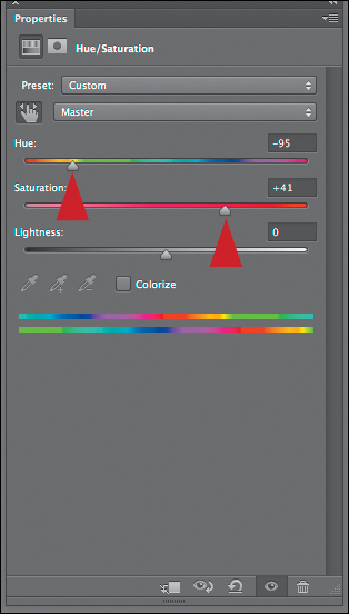
Figure 2.30. Adjusting the Hue/Saturation
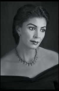
Figure 2.31. The image after
9. Select the Reds (Command + Option + 3 / Control + Alt + 3) and fine-tune the red’s saturation by moving the saturation slider to +17 (Figure 2.32).
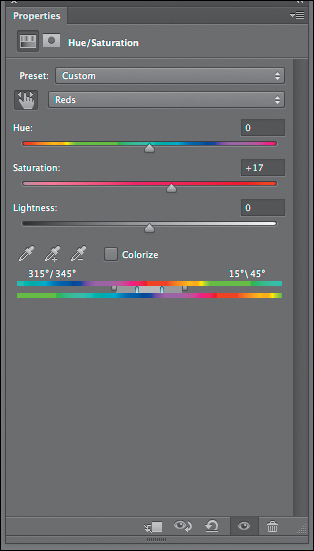
Figure 2.32. The Reds dialog box
10. Next, select the Yellows (Command + Option + 4 / Control + Alt + 4) and fine-tune the yellow’s saturation by moving the saturation slider to –41 and the Lightness slider to –39 (Figure 2.33).
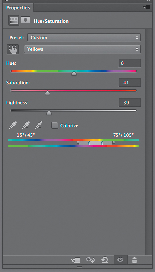
Figure 2.33. The Yellows dialog box
You have added depth to the image by changing the image’s Hue/Saturations (Figures 2.34, 2.35, and 2.36).
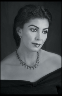
Figure 2.34. Before
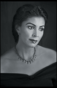
Figure 2.35. After
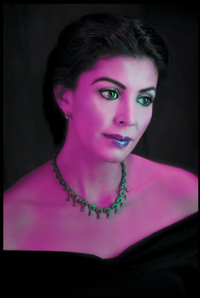
Figure 2.36. The image without the WHITE_COLOR_BM layer active
Creating a Finer Tune
It is time to further refine this image through the use of selective contrast, as well as selective brightness contrast. Specifically, you will use the layer masks of the adjustment layers.
As I discussed at great length in my book Welcome to Oz 2.0, the human eye scans a scene in a predictable sequence. It goes first to patterns it recognizes, then moves from areas of light to dark, high contrast to low contrast, high sharpness to low sharpness, in focus to blur (which is different than high to low sharpness), and high color saturation to low.
In order to make the viewer’s eye move across the image in a way that you decide it should so that the image will be seen in the same way you did, you must manipulate the light and dark areas, their contrast, their sharpness, their degree of focus or blur, and their color saturation. This is what you will do in these next steps.
Once you have created the desired look, you will add a warm tone to the final image. Remember, no matter what you do, layer order matters. (Everything dovetails into everything else.)
Lightening with Contrast: Using Curves and Blend Modes
There is value in knowing how to increase contrast using only Curves adjustment layers as well as knowing how to create contrast using the Nik Software Contrast Only plug-in that comes free with this book, so I will give you directions to do both.
11. Create a Layer group and name it L2D_CONTRASTS.
12. Create a Curves adjustment layer, and name it L2D_CONTRAST_SCREEN (L2D = Light to Dark). Select the Screen blend mode.
As I discussed earlier, the Screen blend mode looks at each channel’s color information and multiplies the inverse of the blend and base colors. The resultant color is always lighter.
13. Select Strong Contrast from the Curves presets (Figures 2.37 and 2.38).
Figure 2.37. Before Strong Contrast
Figure 2.38. After Strong Contrast
14. Fill the layer mask with black.
You are now going to do selective brushwork to guide the viewer’s eye through the image. The journey you want the eye to take in this image is as follows: from the center part of Lizzet’s face, to her whole face, and then to her body. The viewer’s eye is controlled best by selectively increasing the brightness (or lightness), contrast, and sharpness in the areas that you want that viewer’s eye to see first.
In this image, you will be working with brightness and contrast. This is an image map of the areas on which you will be doing brushwork (Figure 2.39).
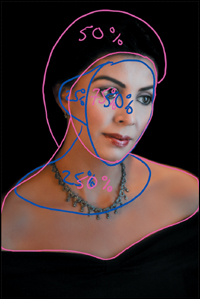
Figure 2.39. Image map
The numbers in the image maps are not absolute values. They are meant merely as notations so that you know how to proceed. The concept of image mapping was covered in Chapter 1 of Welcome to Oz 2.0 and there is a QuickTime movie on the download site for this book that shows you how to create one.
15. Making sure that the foreground color is white and the background black (because you always paint with the foreground color) select the Brush tool (keyboard command B). Set the brush opacity at 50% (see the sidebar: The Power of 50% in this chapter) at a brush size of 400 pixels. Brush in the model’s face, ears, and shoulders. Bring up the Fade Effect dialog box (Command + Shift + F / Control + Shift + F) and reduce the opacity to 23% (Figures 2.40, 2.41, 2.42, and 2.43).

Figure 2.40. Layer mask before Fade effect

Figure 2.41. The Fade effect dialog box
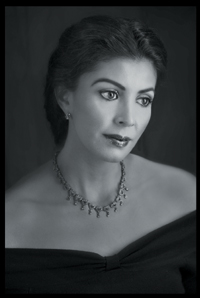
Figure 2.42. After the brushwork

Figure 2.43. The layer mask after the Fade effect
16. Keeping a brush width of 400 pixels and 50% opacity, brush the center part of Lizzet’s face. Next, brush in the front of her chest, bring up the Fade Effect dialog box (Command + Shift + F / Control + Shift + F) and reduce the opacity to 23% (Figures 2.44, 2.45, and 2.46).
17. Turn off the L2D_CONTRAST_SCREEN.
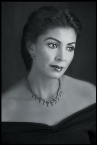
Figure 2.44. Before brushwork

Figure 2.45. After brushwork

Figure 2.46. Final layer mask
You are turning this layer off so that you can make an informed decision about each type of contrast on its own merits without your last correction affecting what you are doing.
18. Create a Curves adjustment layer, and name it CONTRAST_NORM. From the Curves presets, select Strong Contrast (Figures 2.47 and 2.48).
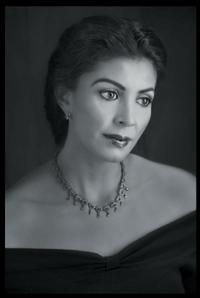
Figure 2.47. Before
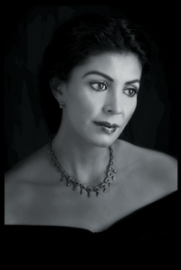
Figure 2.48. After the Strong Contrast
You filled the L2D_CONTRAST_SCREEN layer with black so that you could add brightness to the image, and because you wanted only a specific area to be lit. (See the sidebar: Unmasking Layer Masks and the 80/20 Rule.)
In this next series of steps, because you will darken most of the image, you will paint on the L2D_CONTRAST_NORM layer’s layer mask with black on white in order to hold back some of the darkening effect.
19. Leave the layer mask white.
20. Making sure that the foreground color is black and the background color is white, and with the Brush tool (keyboard command B) still selected, set the brush opacity at 50% and the brush size to 400 pixels. Brush in the model’s face, neck, and a small area of her shoulders just outside of her necklace. Bring up the Fade Effect dialog box (Command + Shift + F / Control + Shift + F) and reduce the opacity to 33% (Figures 2.49, 2.50, 2.51, and 2.52).
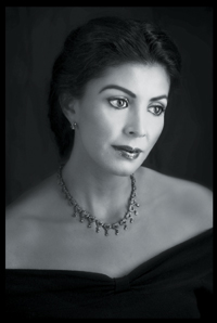
Figure 2.49. Before
Figure 2.50. Layer mask

Figure 2.51. After
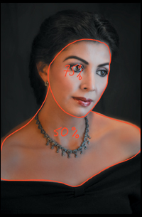
Figure 2.52. Image map
21. Keeping a brush width of 400 pixels and a brush opacity of 50%, brush the center part of her face. Leave the opacity at 50% (Figures 2.53 and 2.54).

Figure 2.53. After

Figure 2.54. Layer mask
You have made changes based on how you want the viewer’s eye to journey through the image. Now, it is time to blend or “chord” the changes that you made to the L2D_CONTRAST_NORM layer with those that you made to the L2D_CONTRAST_SCREEN layer.
Chording is a term that is sometimes used in retouching, and it refers to the interplay among different layers. In music, it is like the interplay of notes in a chord; several notes making up a harmonic sound.
22. Turn the L2D_CONTRAST_SCREEN layer on, and observe what the image looks like with the L2D_CONTRAST_SCREEN layer both below the CONTRAST_NORM and above it. Notice that when CONTRAST_NORM is above L2D_CONTRAST_SCREEN, the image is lighter than when the order is reversed.
I think that this image looks better when the L2D_CONTRAST_SCREEN layer is below the CONTRAST_NORM layer, because you are using the Screen blend mode layer to brighten. (Remember to be open to change. What you anticipate and reality may be different.) Now, you will further fine-tune this image by reducing the layer opacity of each of the contrast layers that you just created. This is so that they blend or chord so that the two layers work together harmoniously. Also, by working this way, you better control the cumulative and multiplicative aspects of artifacting in your image.
23. Start by lowering the opacity of the CONTRAST_NORM layer until you have some detail back in the model’s hair. I chose an opacity of 49% (Figures 2.55 and 2.56).
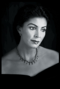
Figure 2.55. Before

Figure 2.56. After
24. Make the L2D_CONTRAST_SCREEN layer active and reduce the opacity until you have the desired effect at 67% (Figures 2.57 and 2.58).
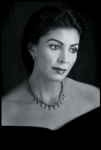
Figure 2.57. Before
Figure 2.58. After
25. Turn off the WHITE_COLOR_BM layer.
26. Create a Master layer (Command + Option + Shift + E / Control + Alt + Shift + E). Name this L2D_CONTRASTS and turn off the L2D_CONTRASTS layer group.
Once you have a layer mask, this is the way to have one that has no missed areas or unwanted overlaps.
When you are working on a layer mask, you are working in grayscale. This means that when you change the opacity of white or black (depending on whether you are revealing or concealing), you are changing the density of the color with which you are working. That change in density manifests itself as shades of gray on the layer mask.
When you are working with opacity on a layer mask, you might miss an area. Because brushing is cumulative, it is almost impossible to match up the areas that you missed with the areas that you did not. Rather than try the conventional approach to brushing, treat the layer mask as a color, the color gray.
Approach 1: Make the layer mask visible at full screen (see the section: Being in Two Places at Once in the previous sidebar), and make the layer mask active. Select the Brush tool and set the brush opacity at 100%. Option-click / Alt-click on the area that you want to sample (the Option / Alt key brings up the sample tool eyedropper when you are in the Brush tool), and brush over the area that you missed or in which you have an unwanted overlap. (Remember, you are painting with gray.)
Approach 2: Set the brush opacity to 100%. Option-click / Alt-click on the area that you want to sample. Select the Polygonal Lasso tool. (The keyboard command is the letter L. If you want to scroll through any tool, hold down the Shift key and click on the tool’s letter until the desired tool appears.) Click around the area and, when you have the desired area selected, Option + Delete / Alt + Backspace to fill that area with the foreground color. Examine Figures 2.59 and 2.60 for a visual representation of the correction.
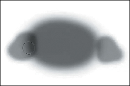
Figure 2.59. Before correcting the layer mask
Figure 2.60. After correcting the layer mask
27. Turn on the WHITE_COLOR_BM layer.
You turn off the WHITE_COLOR_BM layer, because when you create a master layer, Photoshop combines all the layers that are turned on, both below and above the layer into which you are merging them.
This book comes with five free plug-ins from the Nik Software Color Efex Pro 4 plug-in suite. They are Contrast Only, Skylight, Tonal Contrast, Color Stylizer, and Paper Toner. You can download a QuickTime tutorial from the download site for details on how all five plug-ins work.
Also, before moving on to the next section, be sure to have the Color Efex Pro 4 Promo Edition 5 plug-ins installed.
Lightening with Contrasts Using Nik Software Contrast Only and Blend Modes
Next, you are going to use the Nik Software’s Contrast Only filter to create contrast. When you are finished, you will see if chording these two approaches (the one you just did with the two Curves adjustment layers and blend modes with the one that you are about to do) makes for a more interesting image.
28. Make the Background layer active and, beneath the FILM adjustment layer, create a layer group and name it L2D_NIK_CONTRASTS.
In Step 28, you created a layer group because, in Step 29, you will begin working with layers that contain pixels. (As you will see throughout the course of this book, layer order is extremely important when you are working on a chromatic grayscale image.)
Notice that the FILM adjustment layer has seriously shifted the color to create a visually appealing chromatic grayscale image. Any adjustments you are going to make with regard to approaching contrast this way, you should do before you make adjustments to the underlying color image. This workflow sequence is important because, even though all of the colors contained in the chromatic grayscale fit into an 8-bit sRGB file, it is the colors that exist in the layers underneath your active layer that influence the visual nuances of your image. Therefore, you want to start with a 16-bit file in the ProPhoto color space. In the simplest of terms, the more colors there are in the image file, the more data there is in the image file. The more data there is in the image file, the more depth and detail, and the less artifacting you will have in your finalized chromatic gray-scale images.
29. Duplicate the background layer (Command + J / Control + J) and place it into the L2D_NIK_CONTRASTS layer group folder.
30. Make this layer into a Smart Filter and name it NIK_CONTRAST_NORM.
31. Go to Filter > Nik Software > Color Efex Pro 4 Promo 5 and select Contrast Only from the three filters.
32. Adjust the image until you have the desired effect. I set the Brightness at +21, the Contrast at +44, the Protect Shadows at 27%, and the Protect Highlights at 67%. Click OK (Figures 2.61 and 2.62).
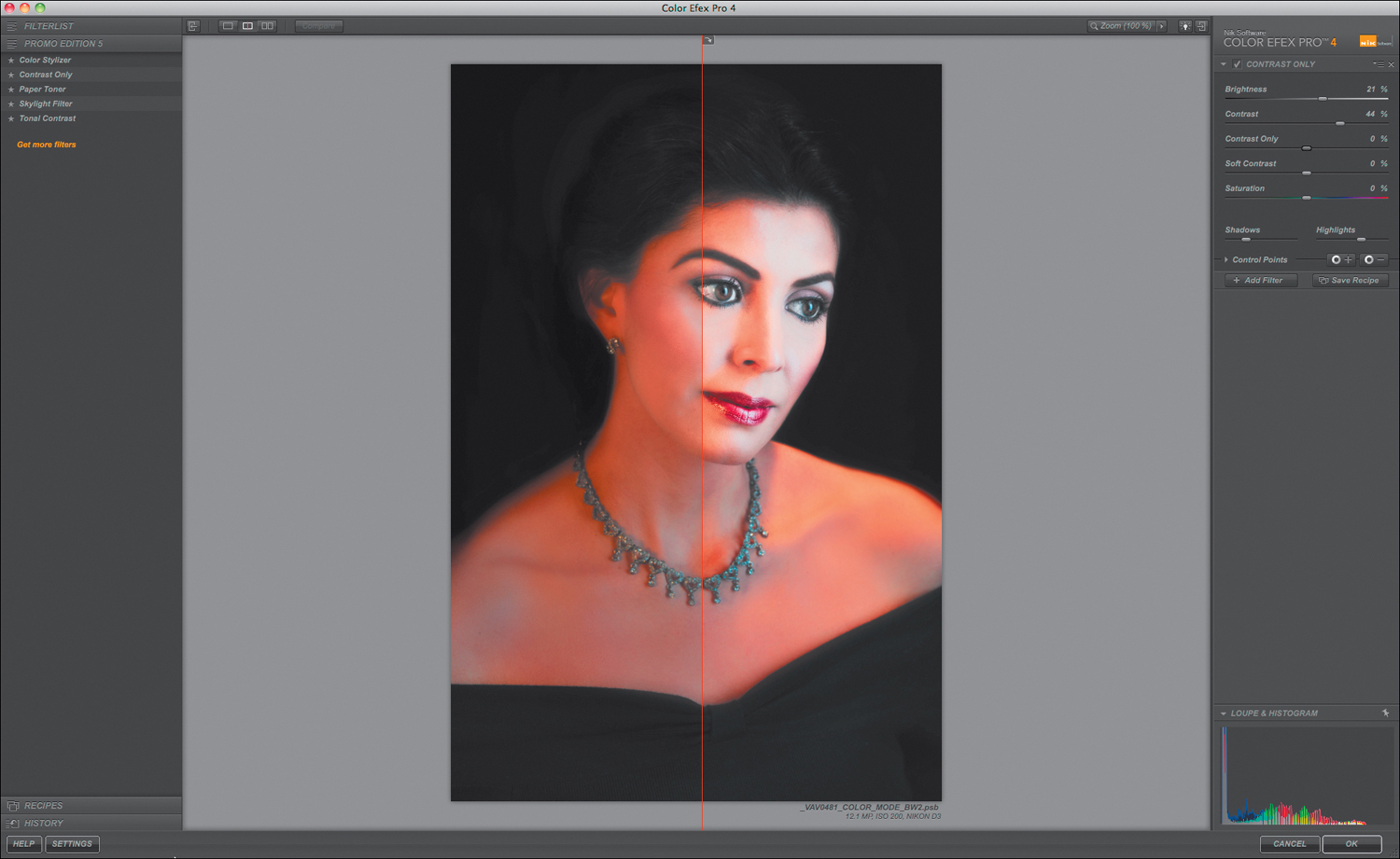
Figure 2.61. The Contrast Only dialog box
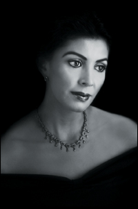
Figure 2.62. After the Contrast Only filter
33. Add a layer mask.
34. Duplicate the NIK_CONTRAST_NORM layer (Command + J / Control + J) and rename it.
35. Place the L2D_NIK_CONTRAST_SCREEN layer beneath the NIK_CONTRAST_NORM layer.
36. Copy the layer mask from the L2D_CONTRAST_SCREEN layer to the L2D_NIK_CONTRAST_SCREEN. You do this by holding down the Option / Alt key, clicking on the layer mask that you wish to copy, and dragging it into the target layer. When the “Do you want to replace this layer mask?” dialog box comes up, click Yes.
37. Copy the layer mask from the L2D_CONTRAST_SCREEN layer to the L2D_NIK_CONTRAST_SCREEN.
38. Make the NIK_CONTRAST_NORM layer active.
39. Lower the opacity of the NIK_CONTRAST_NORM layer until you have some detail back in the model’s hair (at an opacity of 62%) (Figures 2.63 and 2.64).

Figure 2.63. Before brushwork
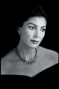
Figure 2.64. After lowering the opacity of NIK_CONTRAST_NORM
40. Make the NIK_CONTRAST_SCREEN layer active.
41. Lower the opacity of the NIK_CONTRAST_SCREEN layer to 39% or until you have some detail back in her hair (Figure 2.65).
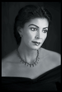
Figure 2.65. After lowering the opacity of NIK_CONTRAST_SCREEN
42. Turn off the WHITE_COLOR_BM layer.
43. Make the FILTER_NORM layer active.
44. Create a Master layer (Command + Option + Shift + E / Control + Alt + Shift + E). Name this NIK_L2D_CONTRASTS and turn off the NIK_L2D_CONTRASTS layer group.
45. Turn on the WHITE_COLOR_BM layer.
Chording Contrasts
As you can see, each approach to manipulating contrast does something different. Before you begin working on an image, you must analyze what about it you like, and then work toward removing everything else. There are things that I like about both the Curves Contrast and the Nik Contrast Only approaches. I like the visual softness of the Curves Contrast and I like the depth of detail and the deep blacks achieved with the Nik Contrast Only approach. So, the goal of this next step is to have both the cake and eat it too—without gaining any weight; something that can happen only in the digital domain.
46. Create a new layer group above the L2D_CONTRASTS layer group and name it CHORDED_CONTRASTS.
47. Drag the L2D_NIK_CONTRASTS Master layer and the L2D_CONTRASTS Master layer into that folder.
Decide which of the two layers contains more of what you want to say. I liked the deep blacks and the detail definition in the L2D_NIK_CONTRASTS master layer, so I made it the lower one.
48. Add a layer mask to the L2D_CONTRASTS Master layer and fill the layer mask with black.
49. Select the Brush tool, set the brush size to 400 pixels, the brush opacity to 50%, the foreground color to white, and the background to black.
50. Brush in the model’s hair, face, and shoulders.
51. Rebrush over her face (Figures 2.66, 2.67, 2.68, and 2.69).
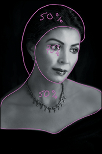
Figure 2.66. Image map

Figure 2.67. Layer mask
Figure 2.68. Before
Figure 2.69. After
52. Fine-tune the image even further by reducing the opacity of the CHORDED_CONTRASTS layer group to 74%.
53. Make a Master layer and name it FINAL, and save the file.
Examine the image before and after (Figures 2.70 and 2.71).

Figure 2.70. Before
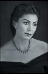
Figure 2.71. After
Why Knowing This Matters
If you can see it with your eyes, it is a color, and black is the queen of all colors.
—Matisse
At this point, you will have realized that things are not exactly as they appear. At first glance, global desaturation appeared to be absolutely the worst way to create a black-and-white or chromatic gray-scale image. It turns out, however, that sometimes the worst way can be the best way. Not every color image makes a good black-and-white one, and one that plays well in the chromatic grayscale, may sing a completely different and less pleasant tune when viewed in color.
You have seen that changing the blend modes of adjustment layers drastically affects an image, as well as changing the way the adjustment layers behave with regard to the adjustment layers’ functionality. In other words, the same numerical color values can create different effects that change the expression of image structure and detail when rendered in the chromatic grayscale. You should now be realizing that everything builds on everything else that you do; that everything dovetails into everything else.
All of the variations on the theme of desaturation that you have just considered represent only the tip of the iceberg that represents all of the methods for creating a chromatic grayscale image. In each step of this lesson, you gathered grains of knowledge. Now, take each of these grains and learn how to create a beach of understanding.
From a Grain of Sand: The Poetry of Being Present
What Is the Shape of a Name?
We are the landscape of all we have seen.
—Isamu Noguchi
Play a game with me for a moment. Say out loud, to no one in particular, “Hi. My name is.....” and your full name. Then pause for a moment. This time, again out loud, say, “Hi. My name is Izzy Smith.” Unless your name really is Izzy Smith, you should observe a difference in the way those two statements make you feel. It is most likely that the former statement felt comfortable and personal, while the latter felt empty. The difference is that your real name is inhabited by who you are, and the latter is just some words with no meaning to you. This is because your name is your personal icon; the representation of everything you have experienced up to this moment. Think of your name as having a shape that contains everything you have ever said and done, all you have ever seen and felt, and every lesson learned in your life. The shape of your images should contain nothing less.
A Beach Is Made Up of Grains of Sand
Every thing you need to know you will know, when you need to know it if you choose to simply be present at the time you first experience it.
—Tad Z. Danielewski
The impact of Danielewenski’s quote requires that you think about what it means to “be present.” To me, it means that you approach all experiences with no preconceptions and that you allow yourself to be open to learning at all times. It means realizing that while any lesson may have specific and immediate significance, it may also have the same or greater significance for things you have yet to experience. It means approaching learning as if it is a giant cloud of knowledge or an infinitely expansive beach of ideas in which things are always in flux.
We need to approach the way we learn the same way we live, poetically and not literally. Poetry is the language of heightened emotion; the form of expression we use when words cannot explain what we feel. Poetry is symbolic; a few words can convey a complex thought. When we express things literally, the words we choose describe a single thought or thing. A poetic approach is expansive, dynamic, and felt within us, while the literal approach, although constructive, is constrictive and static.
But life is dynamic and not static. Life is about the way in which our experiences interact with each other in a nonlinear way, and it is that interaction that results in the poem that is who we are. Just like a beach is made up of grains of sand, every experience we have is a grain that makes up the beach of our lives. They interact and shift, changing the landscape of who we are.
About 4,000 years ago, an Emperor of the Xia Dynasty in China said, “A picture speaks a thousand words.” Since I believe this to be true, I then suggest that a photograph is a visual poem, the greatest of which are ones that move us the way the photographer was moved when he or she captured it. I would argue, therefore, that we should approach learning how to express our creativity in the images we create, in the same manner that we approach life, poetically rather than literally.
I think there are two ways to approach learning: literally or granularly and poetically or globally. Traditionally, when we are taught about creativity in photography, we are taught in a granular manner, and not in a global one. We learn to do steps in a set way and sequence to get a prescribed result.
The problem inherent with this approach is that when we learn in a granular way, what we learn tends to be confined to doing things exactly like, or very similar to, the first time that we learned it. Sometimes this leads to techniques being revered as if they were an art form unto themselves. Also, the images that are created by following this path tend to be repetitive.
Eventually, we hit the glass ceiling and gilded cage of photography—the perfection of technique to the point where we create pretty pictures; technically excellent, but sterile in their beauty. We become frustrated with our work and ourselves, and the images that we might create, we do not. We are tourists in the creative world.
Do not misunderstand me. As beginners to anything, we need to learn things in grains of thought. But from the outset of our journey, we need to be open to something more. It is being open and receptive to that something more from the beginning of our granular learning experience that keeps us from experiencing creative stagnation.
If we keep the grains of knowledge within the confines of where and when we learned them, we generate little creative thought. If, however, we allow them to pile up and interact with each other, we come to a more global way of thinking, and perhaps, create an entirely new train of thought. If you allow yourself this level of presence, everything you need to know, you will know when you need to know it.
For example, I teach two techniques for retouching skin. (There are QuickTime videos of these techniques on the download page for this book.) The first is a technique to remove unwanted redness or ruddiness from skin tone, and the second is a way to add texture back to skin once blemishes have been removed by being blurred.
In Chapter Four of my first book, Welcome to Oz, pp. 119-120, I wrote about how to diminish contrast or “gray up” an image by clipping a curve to help replicate aspects of the atmospheric haze of light. (You can download a PDF of those pages from the download page for this book.) I use this technique to retouch almost 100% of my color portraits. But I had an image of a yellow orchid that had a green cast, as well as a slightly over-exposed photograph of an actress’s face. I found that I could successfully use the same technique that I used for color portraits to remove the green cast from the petals of the orchid and rebuild the blown-out highlights of the actress’s face. I now use this technique in almost 100% of my fine art and landscape work, as well as in portraits. I allowed myself to take a piece of knowledge that I knew worked in one instance, and generated a new train of thought.
There is a revolution happening in photography, and we are witnessing it. The digital image allows anyone willing to take it, the pathway to unlimited creativity; a path to a place were impossible is merely an opinion—an opinion held not by the viewer of the image, but by its creator. This means that the photographer’s imagination is the only limitation.
Do not focus on technique for technique’s sake, but to discover what it means to see rather than to merely look. It is in that direction that you will come full circle and find the creative voice within you. Once you discover that technique is merely a detail, you will be free to create images that will change the world of those who view them.
Become a beach that is ever-changing. Create images that capture the poetic moments of your life, and they will take the viewer of those images, just as those images took you.
I invite you to give yourself permission to become that photographer. We are all waiting to believe with you in what you see.