Chapter 6
On Equity Styles
Tick-Tack-Toe
Irecent years, “style purity” has become the catchphrase of portfolio managers, investment advisers, and mutual fund investors. Mutual funds—sometimes enthusiastically, sometimes reluctantly—are defining their investment strategies and investment policies more clearly. The managers of individual stock funds today feel pressured to keep the portfolios they manage fully invested at all times, and to confine themselves to a given portfolio style that defines the fund’s strategy—growth stocks versus value stocks, for example, or large-cap stocks versus small-cap stocks.
A powerful argument can be made that the choice of equity fund styles—like the choice of fund portfolio managers—is just one more example of industry witchcraft. Just as absolutely no brute evidence exists that past fund returns are the precursors of future returns, so there is little, if any, evidence that there are superior investment styles that prevail over time. In both cases, above-average returns and below-average returns revert to normal levels; individual fund returns revert to appropriate market index norms, and equity styles revert to total stock market norms. (In both cases, I am speaking of fund returns before the deduction of costs.)
Why bother with styles at all? This is not a trivial question. There are powerful reasons for owning the entire stock market, or even large - capitalization blended (growth and value) funds, the particular fund style that most strongly tends to track (again, before costs are deducted) the total return of the market.
But if there is little, if any, evidence of persistence in the investment performance of an individual mutual fund relative to its peers, there is substantial evidence of persistence in the relative risks assumed by individual funds, largely because of the investment style they follow. Style, it turns out, does make a difference. And since style differences are persistent, sheer logic leads us to the conclusion that there is greater probability of persistence in risk-adjusted returns than in total returns earned by each fund. Selecting a particular fund style can enable investors to have an important degree of risk control. (Large-cap value funds, for example, have assumed about 50 percent less volatility than the average fund, and small-cap growth funds have assumed about 50 percent more.)
Most investors, properly in my view, will emphasize a strategy that focuses on funds in the large-cap category, especially blended growth and value funds, as a conservative, centrist approach to equity investing. Some investors may want to consider two other options: stock-picking funds without a clear mandate, but with a broad opportunity to rotate from one market sector to another, or funds that hew to the benchmarks of specific style categories. Investors who rely on style-specific funds can then reflect personal risk preferences or balance out the risks in an existing portfolio that is overweighted—or underweighted—relative to the market in one style or another. This latter case may be described as a risk-control strategy. Hovering over the entire strategy issue is another major investment decision: whether, regardless of the investment style chosen, it should be implemented with a traditionally managed fund or with an index fund that emulates its style. My goal in this chapter is to help you deal sensibly with these challenges.
Enter Tick-Tack-Toe
Consider the child’s game of tick-tack-toe. There is simply no way for the second player to win, even if a genius is playing against an opponent of only moderate intelligence. Each player simply blocks the other player’s next move. (A schematic version is shown in
Figure 6.1.) Of course, if one player is slow to see the possibilities or lacks concentration, his or her opponent can win the game. Tick -tack-toe is a game that cannot be won. It is the consummate loser’s game.
Curiously enough, the Morningstar “Category Rating” system, introduced in 1996, is played in a nine-box pattern identical to that of tick-tack-toe. Because of that similarity, the nine-box system for analyzing fund investment styles raises this question: Does the search for fund performance resemble the search for three Xs (or Os) in a row? Or, put another way: If no one can win consistently when nearly all participants have at least average skill, is not fund selection also a loser’s game?
More than two decades ago, Charles Ellis wrote, in The Loser’s Game, that the premise that professional managers can beat the market appeared to be false. Then, the Standard & Poor’s 500 Index was virtually the only standard used by financial institutions to measure market returns. (And even that index wasn’t used very often!) The portfolios of most institutional managers and mutual funds were in fact dominated by a blended list of the large-cap stocks in the S&P 500. Today, other styles have emerged; some funds place extreme emphasis on value or growth, or on mid-cap or small-cap stocks. These various styles differ from one another both in the returns that they achieve (at least over interim periods) and in the volatility risk they assume (which proves to be fairly consistent over time). Good judgment dictates comparing funds with those in the same style categories.
Comparing Apples to Apples
To date, most evaluations of mutual fund performance have been fairly simplistic: How has a fund performed relative to “the market”? The Standard & Poor’s 500 Stock Price Index is usually used as a proxy for the market, despite the fact that it accounts for only about 75 percent of the capitalization of the U.S. stock market and is dominated by corporations with gigantic market capitalizations. (Its 50 largest stocks account for 35 percent of the entire market. The combined weight of the 6,900 non-500 stocks in the market is 25 percent.)
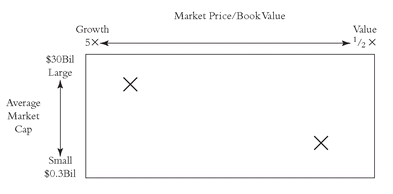
Many funds resemble “the market” only tangentially. Practitioners of style analysis compare a mutual fund with other funds that are following a similar investment style, not with the market. For many years, institutional investors represented this type of analysis by drawing a box with a vertical axis extending from large to small market capitalization, and a horizontal axis extending from value to growth (usually based on ratios of market to book value or price to earnings). Each account got an “X” somewhere along each axis. It wasn’t a very complicated exercise, but neither was it a particularly simple way to evaluate comparative performance. A typical style box used by institutional investors is shown in
Figure 6.2, which compares a large-cap growth portfolio (left) with a small-cap value portfolio (right).
Enter Morningstar. Its contribution—and it is, as advertised, “a more intelligent way to select and monitor mutual funds”—was to replace the institutional style box with a nine-box matrix (just like tick-tack-toe) in which each fund is, in effect, forced into a dual description: large, medium, or small capitalization on the vertical axis, and value or growth at the extremes of the horizontal axis, with blend (a combination of the two) in the middle.
The beauty of this system is that it immediately makes it possible to quantify the vital statistics of each fund’s performance relative to that of its peers, based on a combination of risk and return. Large-cap growth funds are compared with other large-cap growth funds; small-cap value funds are compared with other small-cap value funds; and so on. Under the Morningstar system, each fund then gets a Category Rating in a range from one (lowest 10 percent) to five (highest 10 percent). Both the top and bottom performance ratings are tough leagues to break into. Eighty percent of the funds are in the middle categories (45 percent in categories two and four; 35 percent in category three).
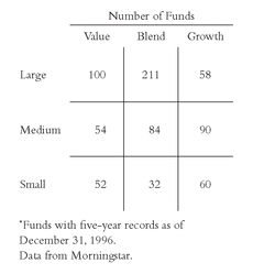
Figure 6.3 is the first of nine tick -tack-toe boxes in this chapter. It shows the mix of 741 equity funds with five-year records as of the beginning of 1997. These funds are tracked by Morningstar, which makes their detailed records readily accessible through its database. While this analysis is significant, achieving superior total returns in the long run, irrespective of style or category, is infinitely more significant. The task of the investor is to achieve the highest possible portion of the return of the total stock market, whether by style or by skill.
FIGURE 6.3 Morningstar Style Boxes (741 Equity Funds)*
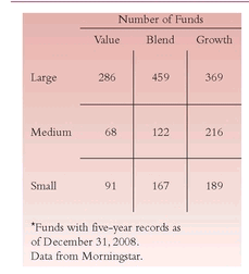
TEN YEARS LATER FIGURE 6.3 Morningstar Style Boxes (1,967 Equity Funds)*
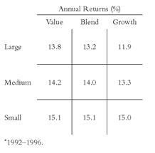
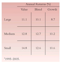
The Morningstar Category Rating system accurately reflects general differences or similarities in the returns earned by the funds in various style categories. In the five-year period ended 12/31/96 that is analyzed in this chapter, similarities were most apparent. Only large-cap growth funds (annual returns averaging about 12 percent) strayed from the 13 percent to 15 percent returns of the other groups. The annual returns for each of the nine categories are shown in
Figure 6.4.
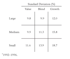
Differences in risk, however, are much more sharply defined among the nine categories. Using standard deviation (described in Chapter 1) as a proxy for risk, the variability of returns over the five years has ranged from a low of 9.8 percent (large-cap value) to a high that is nearly double that figure: 18.7 percent (small-cap growth). Curiously, despite the nearly identical
returns among the three small-cap categories, the differences in
risk were extreme (11.6 percent for value and 18.7 percent for growth).
Figure 6.5 shows these sharp differences in risk.
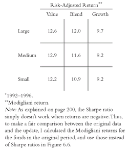
These differences in risk, in the face of the similarity of returns, give rise to large differences in risk-adjusted returns—in effect, the return earned per unit of risk assumed by the fund. We use the Sharpe ratio, based on the number of percentage points of a fund’s excess return (over the risk-free rate) for each percentage point of volatility. As
Figure 6.6 shows, the differences in
risk-adjusted return ratios are also extremely wide—in fact, almost double—from 1.23 for large-cap value funds to 0.67 and 0.69 for mid-cap and small-cap growth funds, respectively.
TEN YEARS LATER FIGURE 6.4 Annual Returns by Fund Category*

Adjusting returns to take risk into account is an important consideration for investors. To understand why, consider this example: Assume that the market volatility is 10 percent and the market’s annual rate of return is 14 percent. Reducing that return by an assumed risk-free rate of 4 percent would bring the market’s risk-adjusted net to 1.00. Now consider two mutual funds with the same 14 percent return: Fund A has more volatility than the market (11 percent), and Fund B has less volatility (9 percent). Fund A would have a risk-adjusted return of .90; Fund B, a risk-adjusted return of 1.11. If investors in Fund B wish to assume risk that is slightly larger than the market and equal to Fund A, they could theoretically borrow 20 percent on their investment and place it in the fund, gaining 20 percent leverage. Their risk would increase to 11 percent, but their return would rise to 16.8 percent. Thus, their return would be 20 percent higher than their original 14 percent return. These 2.8 percentage points of extra return would be gained without assuming any more risk than Fund A. If the intelligent investor’s goal is to earn the highest returns possible for a given level of risk, Fund A would clearly be the inferior investment.
TEN YEARS LATER FIGURE 6.6 Risk-Return Ratio by Fund Category*

A Ratio Too Acute?
Although it is essential to consider fund returns in the context of fund risks, the Sharpe ratio is a bit of a blunt instrument to measure risk-adjusted returns. Past returns don’t predict future returns. And although relative risks among funds have a good deal of consistency over time, standard deviation is only a rough proxy for a concept as elusive as risk. Further, weighting risk as equal to return in importance in the formula is completely arbitrary. Here is the reality of investing, as I see it: An extra percentage point of standard deviation is meaningless, but an extra percentage point of return is priceless. Large differences in risk are extremely important—there is a difference between a stock portfolio and a bond portfolio—but the expedient of weighting risk and return equally, in a simple formula, leaves much to be desired. In the final analysis, risk-adjusted returns, like beauty, may be in the eye of the beholder.
Despite these weaknesses, the Sharpe ratio is the principal instrument used by investment analysts to measure risk-adjusted returns. It presents a more complete picture of fund performance than raw return, and can help investors to evaluate the relative success of competing funds following the same broad investment strategies. Perhaps, like all statistics, it can be remarkably useful, but only if its limitations are recognized.
I know this analysis is complicated. This example may clarify the concept: Assume that two funds had an equal volatility of 10 percent. A fund with a 1.20 risk-return ratio would return 16 percent, and a fund with a risk-return ratio of 0.60 would return 10 percent (assuming a risk-free rate of 4 percent). The difference of 6 percentage points per year is hardly trivial.
Because the average returns for each of the nine boxes during the period were fairly consistent, the wide variations in risk-adjusted return ratios largely reflect the differences in the risks of the nine market segments. Before the advent of style analysis, it was difficult to associate these differences in risk-adjusted return with the performance of a particular market segment. Often, variations were attributed to differences in manager skill, rather than to the fact that one manager invested in small-cap growth stocks while another plied his trade among large-cap value stocks. Style analysis enables investors to appraise the ability of managers to use the tools they have chosen. The nine-box peer-group comparison, while by no means perfect, is the best available.
TEN YEARS LATER
Style Boxes, Returns, and Risks
As we bring the data in the 1999 edition up to date, profound differences in five-year returns take place. The charts and tables covering the bull market of 1992 to 1997—a period with the S&P 500 up by some 20 percent per year—are succeeded by the sobering returns of 2004 to 2009, with S&P 500 down by about 2 percent per year, reflecting the bear market of 2007 to 2009. But while market conditions were almost opposite, the principles of style boxes, returns, and risks were reaffirmed, albeit less dramatically and less uniformly. Caution: Even five-year periods can provide considerable randomness in average returns, so consider both sets of data as directional rather than definitive.
Most notably, the number of equity funds with five-year his tory (
Figure 6.3) exploded from 741 in 1998 to 1,967 in 2009, with the biggest increase coming in the large-cap growth group (only 58 funds a decade ago; 369 funds today). While annual returns in all nine Morningstar boxes declined in the updated period, the style boxes again produced remarkably similar returns. With the exception of the large-cap growth and small- cap value styles, the ranges remained as narrow in the most recent period as they were in the earlier edition—from +12 I percent to +15 percent in the first period to 10.1 percent to 12.8 percent in the latter—in both cases a spread of some 3 percentage points. Such differences can be fairly described as trivial.
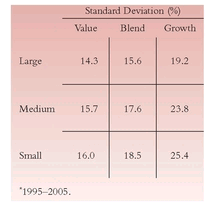
In the more volatile recent markets, however, the funds in each style box displayed far higher standard deviations (ranging from 14 percent to 25 percent in the recent period versus 10 percent to 18 percent in the previous rendering of
Figure 6.5). Nonetheless, the risks assumed by large-cap funds remained well below the risks assumed in the other categories.
But a funny thing happened on the way to presenting these data. When we put these two series together in order to calculate the risk-adjusted returns for each style (
Figure 6.6), our earlier methodology failed.
In down markets, Sharpe ratios don’t convey accurate information. In 1999, I had described this ratio as “a bit of a blunt instrument . . . useful, but only if its limitations are recognized.” But I am surprised by its failure. As Morningstar declared in mid-2009, Sharpe ratios “should not be used,” when negative since they “produce counter-intuitive results.”
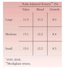
Instead, we calculated risk-adjusted returns using the Modigliani formula, essentially adjusting—upward or downward—fund annual returns relative to the risks they assumed. (For example, if the S&P 500 return were 10 percent and its risk were 15 percent, a fund with the same 10 percent return and a 13 percent risk would have a risk-adjusted return of 11.5 percent; a fund with a 17 percent risk would have a risk-adjusted return of 8.8 percent.) We’ve also used a longer and a more representative period, the 10 years ending in February 2005, when returns on stocks were slightly above long-term norms. Note the remarkable similarity in the data in the two versions of
Figure 6.6 despite the difference in time periods. Both cases reflect a period-dependent bias in favor of value funds over growth funds.
Equity Funds—Risks, Returns, and Costs
What happens when we begin to evaluate equity funds on the basis of their investment styles, as measured by their Morningstar categories? I’m now going to attempt to answer this question, using returns and standard deviations of return during the five-year period from 1992 through 1996. The first example is the large-capitalization blend group—mutual funds that invest in giant companies that have both value and growth characteristics. Of the 741 funds analyzed by Morningstar, this category has 211—more than twice as many as any other group—and represents some 40 percent of the assets of all domestic equity funds ($450 billion of $1.2 trillion of equity assets in the Morningstar database at year-end 1996). It provides a solid platform on which to begin the analysis.
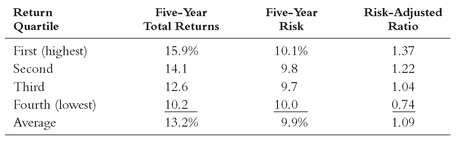
Table 6.1 shows the returns and risks for the large-cap blend group. The funds are ranked in four quartiles, based on total returns for the period. Even though returns rise, risk in this category remains virtually unchanged, and standard deviation remains remarkably constant over the quartiles. The risk-adjusted return ratio increases by the same magnitude as the total return, from a ratio of 0.74 to 1.37—fully 63 ratio points from the lowest to the highest, an astonishing 85 percent difference. And this outcome for the large-cap blend (middle-of-the-road) fund category seems to be typical. Seven of the nine categories (the exceptions are small-cap value and medium-cap growth) have fairly steady risk scores, whether returns are high or low. Hence, the top
risk-adjusted ratings were consistently earned by the funds with the highest total returns.
TABLE 6.1 Large-Capitalization Blend Funds (Ranked by Return)
TEN YEARS LATER TABLE 6.1 Large-Capitalization Blend Funds (Ranked by Return)
*
But if risk does not account for these differences in return, what does? Is it manager skill, or luck, or something more tangible? One thing that is tangible is fund expenses. And it is one element of fund performance that has a powerful tendency to remain fairly persistent in a given fund.
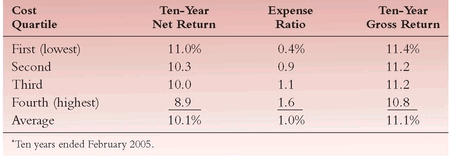
So, I divided the funds into cost quartiles. The funds with the lowest expense ratios constituted the first quartile, and the funds with the highest ratios were placed in the fourth quartile. It will come as no surprise to anyone who has seriously studied investment returns—either on a theoretical academic basis or from pragmatic experience—that
cost matters. In fact, the funds in the group with the lowest expense ratios had the highest net returns. At the same time, they assumed a nearly identical level of risk (volatility), and therefore provided distinctly higher risk-adjusted returns. The data presented in
Table 6.1 are arrayed according to expense quartiles in
Table 6.2.
We are now onto something important. With risk astonishingly constant, high returns are directly associated with low costs. In the large-cap blend group, the average risk-adjusted rating provided by the lowest - expense funds (1.23) is 24 percent higher than the 0.99 average rating for the highest-expense funds. Expenses are clearly a compelling factor.
There is another way of viewing the relationship. If we relate returns to expense ratios for the 211 funds in the large-cap blend category by performing a statistical regression that measures the extent of their reciprocal dependence, the slope is -1.80 percent. Each 1 percent increase in expense ratio has, on average, reduced the net total return earned by fund shareholders by 1.80 percent. Our intuition might tell us that each point of cost should cost exactly one point of return, but something much more onerous is taking place. Although the causative factors are not exactly clear, one explanation seems to hold some merit: High-cost funds tend to have high turnover, and portfolio transactions carry a substantial cost of their own.
TABLE 6.2 Large-Capitalization Blend Funds (Ranked by Costs)
TEN YEARS LATER TABLE 6.2 Large-Capitalization Blend Funds (Ranked by Costs)
*
Given the finding in
Table 6.2, it is relevant to add the expense ratios to the
net returns to see how similar the
gross returns would have been. Again, perhaps not surprisingly, the
gross returns in each quartile are substantially the same, albeit with an advantage to the funds with below-average costs (see
Table 6.3).
This example confirms my theory: Cost is a key determinant of the relative returns earned by funds. This reality prevails not only among large-cap blend funds, but also among the funds in all investment styles. Slightly less extreme than the slope for large-cap blend funds is the slope of the all-fund regression line: -1.30, meaning that each 1 percent of cost reduces returns, on average, by 1.30 percent. Why high-cost managers display apparently lower stock-picking skills remains unclear.
TABLE 6.3 Large-Capitalization Blend Funds—Net Returns versus Gross Returns
TEN YEARS LATER TABLE 6.3 Large-Capitalization Blend Funds—Net Returns versus Gross Returns*
The next question is: Do these relationships between return and risk prevail across the style boxes? The answer is: Yes, they do—remarkably well.
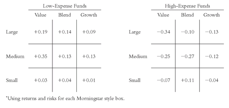
Figure 6.7 shows the percentage difference between the risk-adjusted returns of the first-quartile (lowest-expense) funds and the fourth-quartile (highest-expense) funds, using the average risk-adjusted rating
for that style box as the standard. For example, in the large-cap blend category, low-expense funds have risk-adjusted returns 14 percent greater than the average, and high-expense funds’ returns are 10 percent lower than the average—a compelling 24 percent spread.
TEN YEARS LATER FIGURE 6.7 Relative Risk-Adjusted Return Ratios*
The consistency of the relative risk-adjusted ratings in each matrix is powerful. In every box, low-cost funds provide above-average ratings. In every box but one, high-cost funds provide below-average ratings. The only exception is in the small-cap blend category, where the funds in the high-expense quartile provided a better rating (+0.11) than those in the low-expense quartile (+0.04). (This is the smallest group—32 funds—in any of the nine style categories, and therefore may be less reliable in a statistical sense.)
The strong implication of these figures is clear: Whatever style they seek, investors who don’t seriously consider limiting selections to funds in the low-expense group and eschewing funds in the high-expense group should take off their blinders. Mutual fund expense ratios are published periodically in the financial pages of major newspapers, in financial magazines, and by fund evaluation services such as Morningstar. They are required to be stated in fund prospectuses. “Seek and ye shall find.”
In the mutual fund world, forecasting the relative returns (to say nothing of the absolute returns) of an unindexed fund based on its past performance is indeed a fool’s game—in general, a zero-sum game relative to other funds, and a negative-sum game relative to the market indexes, as I’ll show shortly. Investing on an absolute basis is a positive-sum game; that is, over time, financial markets have provided positive returns. Yet past performance data are all we have . . . almost.
For those willing to look at them, we have cost data. And future fund expense ratios, unlike future fund relative returns, are highly predictable. We now know—as a certainty—that cost matters. It matters for equity funds in the aggregate; it matters far more for bond funds (as we will see in the next chapter), and infinitely more—indeed, cost is virtually everything—for money market funds. And we’ve seen how much it matters—indeed, it is a prime differentiator—in the nine-box equity style analysis, where the pattern parallels that of a tick-tack-toe game.
TEN YEARS LATER
Risks, Returns, and Costs
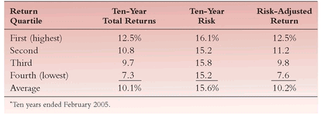
When we update the data for the large-cap blend funds presented in the 1999 edition, the same general conclusions emerge. Again, as shown in
Table 6.1, the top
risk-adjusted ratings in the decade ended in February 2005 were consistently earned by the funds with the highest
total returns. In
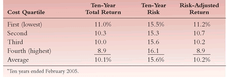
Table 6.2, we again see that “
with risk astonishingly constant, high returns are directly associated with low costs.” Whereas in the earlier study each cost quartile earned about the same gross returns, this time around that was true of the top two quartiles and of the bottom two quartiles, although the former pair produced gross returns that were significantly higher.
In
Figure 6.7, yet again (unsurprisingly) the low-expense funds, well, blow away their high-expense peers in risk-adjusted returns. In seven of the nine Morningstar style boxes, low- expense funds provide a substantial advantage in risk-adjusted returns relative to their peers, just as the high-expense funds lag their peers in all nine style boxes. Over all, low cost funds outperform their high cost peers by an average of 2.6 percent age points per year, generating annual risk-adjusted returns of 11.2 percent, versus just 8.6 percent for high-cost funds.
Index Funds—Risks, Returns, and Costs
Why should you not act on the full implication of the thesis that cost matters? The lowest-cost funds in the marketplace today are invariably index funds, so why not just buy index funds in each of the nine style boxes? This proves to be neither a specious argument nor one bereft of common sense.
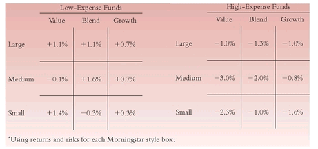
Figure 6.8 shows both the returns and risks of equity funds managed in that style, compared with the returns and risks of a low-cost index fund
following the same style. The index funds are operating index funds in the three large-cap groups (Standard & Poor’s/Barra Indexes), and hypothetical index funds based on publicly produced indexes (with returns reduced by estimated fund costs of 0.3 percent) in the medium-and small-cap groups (Frank Russell Indexes).
Figure 6.8 reflects the spread of risk and return in each category.
To summarize the outcome: The average return for all the funds in the index group was 1.4 percentage points above the average return for the equity group: +15.1 percent versus +13.7 percent. In six of the nine boxes, the passively managed market index fund outpaced the average return of the actively managed equity funds; in two cases, the results were about even; and in just one case (this time among the 60 small-cap growth funds), the actively managed funds did better.
FIGURE 6.8 Index Funds versus Managed Funds: Returns and Risks (Percentage Points)
But the average risk assumed by the equity mutual funds—and this is a truly remarkable finding—is far higher: 11.9 percent for the equity fund group, and 9.7 percent for the comparably weighted indexes. (Small- and medium-cap growth funds took particularly large extra risks.) The average risk for all 741 funds is fully 23 percent higher than the risk assumed by the index funds.
The net result is that the
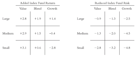
risk-adjusted ratios average 1.23 for the index group and 0.99 for the regular funds—an average premium of more than 24 percent in risk-adjusted return. It is a strikingly consistent premium, and, as shown in
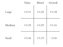
Figure 6.9, it is remarkably parallel across the matrix. The relative risk-adjusted ratings are so dramatically in favor of the low-cost index approach as to defy even the most optimistic (or, for active managers, pessimistic) expectations.
There is one exception to the pattern. I acknowledge that the results in the small-cap growth category could be considered an exception to the rule. In this particular five-year period, active managers for these 60 funds were able to overcome their costs and surpass the index. Yet, the relatively small size of the fund group in the sample, or perhaps the particular period presented, may have simply resulted in an anomaly in the data.
FIGURE 6.9 Risk-Adjusted Ratings of Index Funds versus Equity Funds
Overall, the magnitudes of difference are so large and so consistent as to devastate the concept of high-cost active management. In fact, I could barely believe the figures, but we checked them “eight ways to Sunday,” and they are correct.
By way of example, the large-cap value figure of +0.31 reflects an index fund rating of 1.54 versus a mutual fund rating of 1.23. Lest this difference seem unimportant, consider this example of what a difference of 31 ratio points means. First, assume that Index Fund A and Managed Fund B have equal standard deviations of 10 percent. Second, assume a risk-free rate of 4 percent. Result: Index Fund A, with a risk-adjusted return of 15.4 percent (1.54 ratio) would enjoy a total return of 19.4 percent annually. Managed Fund B, with a risk-adjusted return of 12.3 percent (1.23 ratio), would enjoy a total return of 16.3 percent annually—a truly remarkable enhancement of 3.1 percentage points per year. Much of this spread is accounted for by the lower expense ratios and lower portfolio transaction costs for index funds. Further, the index funds would carry substantial tax advantages.
The matrix presented in
Figure 6.9 demonstrates a striking pattern that appears to give the lie to the often-expressed—now even trite—notion that indexing works only in large-cap markets.
Given these data, that notion no longer has the ring of truth. In each of the three broad size categories, the appropriate index funds hold a consistent advantage in risk-adjusted return—indeed, an advantage that
increases, if only slightly, as capitalization size
declines. Holding risk
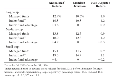
constant at the level assumed by the funds, the index fund would produce ascending excess annual returns as follows: large-cap, +3.6 percent; medium-cap, +4.2 percent; small-cap, +4.4 percent.
Table 6.4, in which the index fund returns have been increased to statistically equalize risk, shows how these calculations were derived.
This pattern—and these truly remarkable differences—will surely surprise many casual observers of mutual fund data. To the extent to which our five-year period can be accepted as reasonable, the Morningstar Category Ratings may ultimately prove to be the biggest boon to spreading the gospel of indexing since the first S&P 500 Index mutual fund was founded in 1975.
TEN YEARS LATER
Index Funds
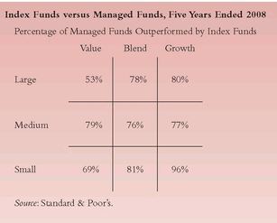
In recent years, Standard & Poor’s Corporation has provided five-year performance data that compare, for each of the nine style boxes, the percentage of actively managed funds that have been outpaced by index funds in the same category. These new and valuable data have a special advantage: S&P has taken into account survivor bias. Without including these failed funds (which we can assume did not fail because they demonstrated superior performance—to the contrary!), we would compare index funds only with the best performers.
So instead of updating
Figures 6.8 and
6.9, we show in this revised table S&P data for each group over the past five years. Astonishingly, the relevant index funds (i.e., small-cap growth, large-cap value, etc.) outpaced some 70 percent of managed funds in the same style boxes.
In the previous edition, I took sharp exception to the “notion that indexing works only in large-cap markets.” Based on the data that I then presented, that notion, I wrote, “no longer has the ring of truth.” The more comprehensive (and independent) work now done by S&P only confirms my conclusion of a decade ago.
God, Pascal, and War Games
As Peter Bernstein tells the story in his marvelous book, Against the Gods, Blaise Pascal, the father of probability theory, cast the question of the existence of God as a game of chance: “A coin is tossed. Which way would you bet: on heads (God is) or tails (God is not)?”
Paraphrasing Pascal, consider the chances of being on the losing side of the bet. If you bet God is, you will live a holy life and give up a few enjoyable temptations, but that’s all you lose. If you bet God is not and you are wrong, and you give in to all temptations, your evil life will cause you to be forever damned. Consequences must outweigh probabilities.
Turning to the stock market, Bernstein continues, if you believe it is efficient and you are right, the best strategy is to buy an index fund. If you believe it is efficient and you are wrong, you will earn the market’s return, but a few actively managed funds will beat you. But if you bet that the market is not efficient and you are wrong, the consequences of underperforming with an actively managed fund could be very painful. The risk, in short, is much greater if you bet on inefficiency rather than on efficiency.
And that is ultimately the conclusion of equity style analysis in the mutual fund industry. No matter what fund style you seek, you should emphasize low-cost funds and eschew high-cost funds. And, for the best bet of all, you should consider indexing in whichever style category you want to include. Index funds boast the additional benefit of absolute fidelity to their investment style. Although there is no guarantee that, say, small-cap growth managers will limit their investment selections to small-cap growth stocks, it’s a certainty that a small-cap growth index fund will invest only in small-cap growth stocks. Rather than emphasizing particular styles, however, a simpler course would be for you to index your entire equity portfolio with the Standard & Poor’s 500 Stock Index. A more conservative—and more certain—wager would be to index your portfolio to the total stock market.
If, because of high costs, investing with mutual fund managers is a (relative) loser’s game (although almost surely a winner’s game in absolute terms over the long run), is it not similar to another game—one between battling global armies? I answer the question by way of analogy, using an example from the 1983 movie War Games.
We are in the NORAD war room, where our generals are trying to ward off an incipient global nuclear war, precipitated by a young computer nerd who has cracked the U.S. security system. The boy says he can solve the problem he has created, and, with all other hope lost, the generals agree to let him try. He programs the U.S. air defense computer . . . with a game of tick-tack-toe.
Calculating at a furious pace, the computer realizes that neither opponent can win the game—or the nuclear war—and the screen goes blank. The action ceases. Peace reigns. Then these words appear on the computer screen: “A strange game. The only winning move is not to play. . . . How about a nice game of chess?”
It is entirely appropriate to consider that mutual fund managers, with all their intelligence, training, and ability—and with all of the computer power at their command—are engaged in a vast competition with one another to draw the best stocks and discard the worst, all with a view toward winning the performance game and attracting the most dollars to manage. And all the while, consider that funds that do not play the game at all—the index funds—may be accumulating the most capital for their investors. So it is fair to ask: Have investment management games, like global warfare games, become losers’ games, just like tick-tack-toe? The compelling evidence presented in this chapter suggests that the answer is “Yes.”
TEN YEARS LATER
Equity Styles
In the long run, as we will see again in Chapter 10, the various styles of investing defined by those Morningstar boxes have a powerful tendency to revert to the stock market mean. As market trends that favor large and then small companies, or growth and then value, ebb and flow, only the investor who is both smart and lucky can win those, well, “war games.”
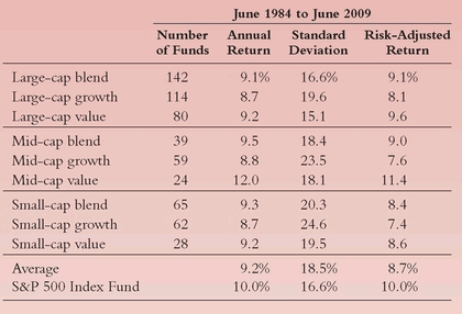
The past quarter century, with all its opportunities and challenges, seems a fair period to test this thesis. Here’s what it shows:
Please note that, with but a sole small exception (mid-cap value funds, with only 24 funds represented), the styles produced remarkably consistent average annual returns, ranging from 8.7 percent to 9.5 percent, averaging 9.2 percent. The S&P 500 Index fund turned in a return of 10.0 percent, nearly 10 percent higher. But it did so at a risk level that was 11 percent lower. As a result, the index fund’s risk-adjusted return was 15 percent higher than the risk-adjusted return of the average managed fund—10 percent versus 8.7 percent. Compounding those two returns over that 25-year period, a $10,000 initial investment in the index fund produced a profit of $98,300, a 40 percent enhancement of capital over the $70,500 profit earned by the average managed fund.
Warning: This comparison, however favorable to the concept of all-stock-market indexing (through its close proxy the S&P 500 Index), vastly understates the index advantage. Why? First, we have ignored sales loads—payable on purchases of most equity funds—a drain of something like 0.5 percent to 1.0 percent per year. Second, we have ignored the onerous tax liabilities incurred by investors in actively managed funds (described in Chapter 13). Third, we have presented, inevitably, only the records of the 863 equity funds that survived the 25-year period, ignoring the records of the countless hundreds of funds that failed. Fourth, we have ignored the fact that the returns earned by shareholders of most actively managed funds substantially lag the returns reported by the funds themselves (as discussed in Chapter 11). How much would these adjustments reduce the 9.2 percent annual return reported by the average fund? Perhaps by one-fourth, maybe even more. For those who believe that fund managers can add value for fund investors, it is not a pretty picture.
So, now you know why, a decade later, I hold to my earlier conclusion with a stronger conviction than ever. Betting on styles is indeed a “strange game” (and ultimately a loser’s game). “The only winning move is not to play.” So how about staying out of the game, and simply relying on an index fund? Yes! (This time with an exclamation mark.)
A Dependence on Time
As all investors have come to learn, one way or another, the mutual fund returns presented in any analysis are time-dependent. Because markets and fund returns change from one period to another, the presenters of the data, through their ability to pick the period for analysis, have a powerful advantage in proving their case. Nevertheless, the analysis presented in this chapter is as fair and objective as I can make it. I deliberately selected the five-year period 1992-1996 (inclusive) rather than the more recent five-year periods ending in 1997 or 1998 because the return of the Standard & Poor’s 500 Index relative to that of the average fund was considerably lower during the earlier period. My objective in this chapter was to minimize, to the extent possible, any arguable large-cap bias.
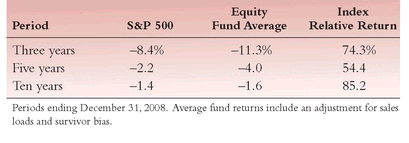
As to the choice of the length of the period, I chose five years simply because a shorter period (say, three years) would have been even less satisfactory, and a longer period (say, 10 years) would have cut the number of funds in the study by half, creating a less reliable sample. I freely acknowledge that we can conclude only so much with five-year numbers in a strong equity market, even though this period included two poor market years and three good ones—hardly unrepresentative of the market’s long-term pattern. However, not only was the average annual return of the S&P 500 Index for the five years the lowest of any of the potential choices for the three periods (3, 5, and 10 years), but its return was also the lowest relative to the returns of the average managed equity fund. The following table compares relative returns during the 3-, 5-, and 10-year periods. The style analysis of the data presented in this chapter deserves testing in other periods and under a variety of market conditions.
S&P 500 Index Return versus Average Equity Fund
TEN YEARS LATER S&P 500 Index Return versus Average Equity Fund
