Chapter 3
The first sentence of Edgar Allan Poe’s “The Telltale Heart” reads: “True!—nervous—very, very awfully nervous I have been and t am . . . but will you say that I am mad?” And I confess to being a tad nervous in tackling a subject that I frankly wouldn’t dare to tackle before most investors. The key to whatever success I may have enjoyed during my long investment career is that the Lord gave me enough common sense to recognize the majesty of simplicity. But I’ve learned that to discover the priceless jewels of simplicity, it’s often necessary to cut through a swath of complexity. The complex subject I’ll now address is reversion to the mean (RTM); the jewel of simplicity is revealed in “The Telltale Chart,” the title of this essay.
“The Telltale Heart,” of course, is the story of a heart that doesn’t seem to stop beating (sort of like mine, come to think of it!). Even after the death of its owner, its steady drumbeat ticks away like “a watch enveloped in cotton,” as Poe described it, and becomes more and more distinct. RTM—the pervasive law of gravity that prevails in the financial markets—never stops. While its drumbeat is hardly regular, it never fails. For the returns of market sectors, of managed investment portfolios, and even of the market itself mysteriously return, over time, to norms of one kind or another.
Six Manifestations of RTM
Today I’m going to talk about how RTM can help us to understand financial markets and thereby become more successful investors. I’ll talk first about RTM in market sectors, focusing first on large-cap and small-cap stocks and second on growth and value stocks. Next, I’ll turn to RTM in the returns of the recently beleaguered Standard & Poor’s 500 Stock Index relative to total U.S. stock market. Third, I’ll talk about the reversion of equity mutual fund returns to the market mean. Then—in part because the Bogleheads would be disappointed if I didn’t—I’ll turn to RTM as it is reflected in the results of what have become known as “slice-and-dice” portfolios, essentially diversified portions that seek to outpace the broad market index by systematically overweighting various sectors. Finally, I’ll examine the question of whether stock market returns themselves revert to one kind of mean or another.
Giving you this copious stream of information requires me to present a total of no less than 11 charts. That’s a tall order, but less so when we consider the remarkable similarity of each of the charts showing RTM—the irregular swings above and below the mean before returning to it—with which I summarize each of these six points; I think you’ll understand my line of argument. For the telltale chart that demonstrates the tendency of investment phenomena to revert to the mean repeats itself in each example. When I’m finished, I hope you’ll share my conclusion: The most successful investors will respect the power of reversion to the mean.
Let me begin by criticizing the vastly oversimplified but typical way we look at long-term results. We hear, for example, that “small-cap stocks outperform large-cap stocks by almost two percentage points a year,” using as evidence the entire historical record we have available (from, as it happens, 1926 to 2002). Or that the, well, Magic Fund “has beaten the market by eight-and-a-half percentage points a year over its lifetime.” Or that “stocks provide higher returns than bonds,” in each case without acknowledging that each and every comparison we see is period dependent. Whether or not the period has been selected to prove a point, neither the starting date of a comparison nor its concluding date are random. Compilations of historical financial market returns are not actuarial tables, and, as you’ll see, the past is not prologue. Indeed, it is usually anti-prologue. Each thesis, it turns out, tends to bear the seeds of its own antithesis.
RTM—Large-Cap Stocks versus Small-Cap Stocks
Few investment principles are as unchallenged as the perennial assertion that over the long-run small-cap stocks outperform large-cap stocks. The data we have available are unequivocal on this point: Since 1928, according to the University of Chicago Center for Research in Securities Prices (CRSP), small stocks have provided an annual return of 12.5 percent, versus 10.8 percent for large caps. And, over that 74-year period, the long-term compounding works its magic; each dollar in small-cap stocks grows to $6,000, while each dollar in large-cap stocks grows to just $2,000. Bear in mind, of course, small-caps carried a higher risk (standard deviation of 30 percent vs. 22 percent). But after adjustment to that higher risk level, the large-cap annual return rises to 12.9 percent, higher than for small-caps. So never ignore risk.
But that imposing chart—like the proverbial bikini—conceals more than it reveals. I would strongly urge you to not accept that conclusion without transforming it into the telltale chart that is devised simply by dividing the
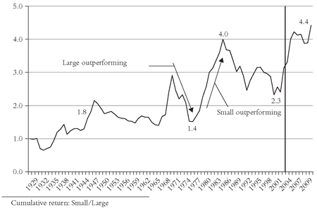
cumulative returns of one data series into another, year after year—in this case dividing the cumulative large-cap stock return into the cumulative small-cap return. Then we see that the long period was punctuated by a whole series of reversions to the mean. Virtually the
entire small-cap advantage took place during the first 18 years. Then large-cap (14.2 percent per year) dominates small-cap (11.7 percent) from 1945 through 1964; small-cap through 1968 (32.0 percent vs. 11.0 percent); large-cap through 1973 (2.5 percent vs. -10.8 percent); then small-cap through 1983, large through 1990, and so on. On balance, these to-and-fro reversions have canceled each other out, and since 1945 the returns of large-cap stocks and small-cap stocks have been virtually
identical (12.7 percent vs. 13.3 percent). So ask yourself whether the evidence to justify the claim of small-cap superiority isn’t too fragile a foundation on which to base a long-term strategy.
By the end of 2009, the respective returns were: large-cap 10.2 percent; small-cap 12.2 percent. The ratio rose to 4.2 in 2004 and ended 2009 at 4.4, a record high, but in fact about where it reposed three decades earlier (see Figure 3.1).Ask yourself, too, if the data are accurate. Reconstructing past returns of market segments is no mean task, especially among small-cap stocks. Ask yourself whether transaction costs are accurately imputed (or even imputed at all), and whether survivor bias is present. Together, these issues raise questions about the validity of even the most responsibly conducted of academic studies. And then, even if they’re valid, ask yourself whether the game is worth the 40 percent increase in investment risk.
Finally, ask yourself the extent to which any of the results of what are in effect indexes of market sectors can be replicated in the real world of investing. Investing costs money, and it is a truism—and increasingly a trite one—that all of the investors in the stock market (or in any discrete market sector) earn the market return before the costs of financial intermediation, but actually receive the return after those costs. If the cost of implementing a small stock strategy exceeds the costs of a large stock strategy by one percentage point a year or more, as seems to be the case, even if the alleged long-term advantage reflected in the data in fact materializes, the victory may be pyrrhic.
RTM—Value Stocks versus Growth Stocks
I won’t belabor those important qualifications of data integrity, risk, and real-world costs. But each also comes into play in the next area that I’ll consider, value stocks versus growth stocks.
31 Here, the long-term difference is even
more dramatic than small versus large: The annual return since 1928 is reported as 12.2 percent for large-cap value stocks and 9.6 percent for large-cap growth stocks, a difference of fully 2.6 percentage points. The compounding of those returns results in a stunning chasm in the final value of an initial dollar: Value $5,100, Growth $900. Again, higher risk (standard deviation of value was 27 percent, vs. 20 percent for growth) accounts for much of the gap, but even the increased
risk-adjusted return of 11.2 percent for growth stocks falls one percentage point short of the value outcome. The data are so impressive that one wants simply to say:
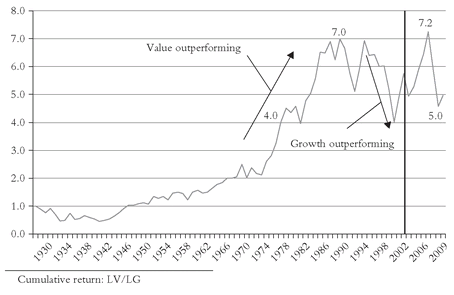
Case closed! Through 2009, large-cap growth’s annual return was 9.1 percent, and large-cap value’s was 11.2 percent. After an especially nasty 2008 for value stocks, the updated ratio had fallen to 5.0, well below the high of 7.2 reached in 2006 and the near-peak level of 6.5 achieved a full quarter-century earlier (see Figure 3.2).But now let’s turn to our telltale chart and carefully examine the record. While the RTM is hardly as clear as its earlier counterpart, we can observe some significant things going on. Curiously, during the first 27 years(!), not much happens. Growth wins by a bit in the first 12 years, value in the next 11, after which both series deliver about the same annual returns through 1961 (16 percent). Value leads again through 1968, and after a four-year hiatus rises again through 1977, pauses for four years, and then surges through 1988. Then comes the heft of the great bull market, with growth leading value fairly consistently and by a wide margin (21 percent vs. 16 percent annually) through 1999. That sharp dichotomy was then followed by the sharpest mean reversion in market history, with growth toppling by -28 percent in 2000-2001, with value off less than 1 percent. RTM strikes again! But, perhaps surprisingly, over the entire period 1984-2001, growth (15.3 percent per year) retains a fragile grip on its leadership over value (14.4 percent).
FIGURE 3.2 RTM: LARGE VALUE VERSUS LARGE GROWTH, 1928-2009

The data I’ve shown you, of course, represent the statistical reconstruction of market sector returns. So, I’d like to examine not abstract portfolios, but growth and value mutual funds that operate in the real world. The data are available from 1937, and the general patterns parallel those of the French-Fama study, but with a curious dichotomy. While the average annual return of the growth mutual funds (11.6 percent) during this long period actually exceeded the French-Fama large-cap growth stocks (11.2 percent), the value mutual fund return of 11.0 percent fell far below that of French-Fama value return of 15.2 percent, perhaps because the French-Fama value portfolio has a risk fully 45 percent above the value funds. Nonetheless, the French-Fama combined growth and value returns exceed the combined fund returns by 1.9 percent per year, a pretty good approximation of the costs that mutual funds incur. So investors should not ignore the obvious costs of implementing a strategy that rises, pristinely, out of academic studies that cannot be precisely replicated in the real world.
The reason for the dichotomy between these markedly different sets of growth fund and value fund relative returns may rest on the fact that value managers invest less on the basis of the statistical criteria that sector indexes use to differentiate growth stocks from value stocks (usually price-to-book-value) and more on other factors. But in any event, the validity of the growth and value index statistics rests on the soundness of the indexes used in measuring the sectors they purport to represent. Consider, for example, the S&P/Barra Growth Index. Based on relative price-to-book ratios, this index categorizes 50 percent of the weight of the S&P 500 index as growth stocks. When their prices soared during the 1990s, the number of growth stocks in the index tumbled from 220 to 106 in 1999—114 erstwhile growth stocks were unceremoniously shoved into the Value Index. Then, when growth stocks stumbled, 51 “value” stocks returned to the Growth Index, bringing the present total to 157—and rising! With the huge asset write-downs we’re currently seeing, many former growth stocks are now defined as value stocks. So differences in both management costs and index composition should make us extremely cautious about the application of abstract data to the real world.
In any event, place me squarely in the camp of the contrarians who don’t accept the inherent superiority of value strategies over growth strategies. I’ve been excoriated for my views, but I’m comforted by this reported exchange between Dr. Fama and a participant at a recent investment conference: “What do you say to otherwise intelligent people like Jack Bogle who examine this same data and conclude that there is no size or value premium?” His response: “How far are they from the slide? If I get far enough away, I don’t see it either . . . Whether you decide to tilt toward value depends on whether you are willing to bear the associated risk. . . . The market portfolio is always efficient. . . . For most people, the market portfolio is the most sensible decision.”
RTM in the Market Portfolio
Like Dr. Fama, I believe that the market portfolio is the most sensible decision . It takes the need for judgment out of your decision making; it reduces cost; it increases tax-efficiency; it avoids the need to pore over past market data to figure out why the data are what they are. Then, if you accept the data, you have to decide whether the patterns they have revealed will persist during the span of years remaining on your investment horizon.
In a temporal sense, the all-market portfolio is consistent with the spiritual argument about the existence of God put forth by Pascal three centuries ago. If you bet God is, you live a moral life at puny cost of giving up a few temptations. But that’s all you lose. If you bet God is not and give in to all your temptations, you’re forever dammed. Consequences, Pascal concluded, must outweigh possibilities. Similarly in the stock market, if you bet the market is efficient and hold the market portfolio, you’ll earn the market’s return. But if you bet against it and are wrong, the consequences could be painful. Why would you run the risk of losing, perhaps badly, when the market return, earned by so few over the long-run, is there for the taking?
Still, we are faced with the question of how to define the market portfolio. When I started the first index mutual fund 27 years ago, the Standard & Poor’s 500 Composite Stock Price Index was generally considered to be the appropriate market portfolio. Of course it represented only 80 percent of the market, but there were few other indexes from which to choose. (The Wilshire 5000 Total Market Index, dating to 1970, was little-known and untested.) Today, the Wilshire is readily available and widely accepted, its validity as a proxy for the total U.S. stock market confirmed by both CRSP and French-Fama, which take the data as far back as 1926. The three indexes share correlations of something like 0.999, so there can be little doubt about their validity. An all-market index fund is clearly the optimal way to hold the U.S. stock market.
But I must spring to the defense of index funds linked to the Standard & Poor’s 500 index. Whereas the 500 index has been excoriated by Morningstar (“500 Index Funds Losing Their Allure?”), by Money magazine (“Is the S&P 500 Rigged?”), and by Institutional Investor (“Is Time Running Out for the S&P 500?”), I would answer those questions, “No,” “No,” and “No.” The criticism has been greatly overdone. Yes, the 500 is heavily weighted by large stocks. But so is the U.S. stock market. Yes, during the great bubble, the 500 was dominated by overpriced technology stocks. But so was the U.S. stock market. Yes, many of the additions of large tech stocks in the 500 in recent years seem, in retrospect, absurd. But these companies were already major factors in the market itself. Yes, its composition changes substantially over the years, but so does the composition of investors’ portfolios. And yes, the 500 didn’t even become the 500 until 1955. From its inception in 1926, it had been comprised of just 90 stocks. In all of these respects, the S&P 500 is a flawed index. But for all of the criticism heaped on it, the S&P 500 works.
So now the most important “yes” of all: For all of its real and imagined failings, yes, the S&P 500 has provided a truly remarkable representation of what we now know to be the returns of the total U.S. stock market. What is more, with a 10.7 percent annual return since 1926, it has actually
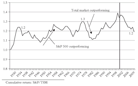
outperformed the broader market’s 10.3 percent return. But yet another telltale chart warns us not to look to the 500 for excess returns. This entire excess arose during 1926-1932. Since then, the 12.2 percent annual return of the S&P 500 has been
exactly the same as the return of the total stock market. But overall, the RTM has been remarkably small; almost trivial. Yes, when large-caps dominate, as in most of the 1982-2000 bull market, the S&P 500 will dominate. And yes, when small-caps dominate (as in 1975-1980), the S&P will lag. But since the S&P continues to represent more than 75 percent of the market’s capitalization, it would seem a bit naïve to doubt that it will continue to revert to the market mean in the years ahead. One more valuable lesson from our telltale chart: Investors in 500 index funds need feel no compulsion to change horses and switch to a total market portfolio—especially if it would result in a taxable capital gain. Over the long haul, the S&P 500 will do the same job of matching the market that it has always done.
Through 2009, the annual returns were: S&P 500, 9.8 percent; total stock market, 9.5 percent. The ratio reverted sharply to the mean, falling from nearly 1.4 to 1.2, as small- and mid-cap stocks outpaced the S&P 500 (see Figure 3.3).
RTM in Equity Mutual Funds
The telltale chart also helps us to observe the important role played by RTM in the returns of mutual funds. How much more we can learn if we look, rather than at a simple summary of a fund’s long-term record, at a chart showing its market-related returns over time! Consider the remarkable record of one of America’s greatest mutual fund success stories. I’ll call it the “Magic Fund,” for its long-term record is probably as good a record as we can find. Formed in 1964, the annual return of Magic Fund averaged 19.7 percent per year, fully 8.5 percentage points ahead of the Standard & Poor’s 500 index. Result: $10,000 invested at the outset, with all dividends reinvested, would have been worth $9.3 million(!) as 2002 began. The same investment in the index would have been valued at just $560,000. It sounds like a marvelous record. And it is!
FIGURE 3.3 RTM: S&P 500 VERSUS TOTAL STOCK MARKET, 1927-2009
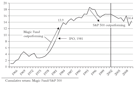
But now let’s convert those figures to an RTM chart. Like so many funds, the record was sensational in the early years when assets were small, and, in this case, before the fund ever became available to the public. From 1964 through 1981, Magic Fund’s return averaged 22 percent a year, putting to shame the relatively dismal 9 percent return of the S&P 500. By the time it was first offered to the public in 1981, it had soared to 10 times the market return. And in the first five years thereafter, it rose to almost 14 times the market’s return. Even as assets grew into the billions, and the tens of billions, and then over the $30 billion mark, it continued to prosper, rising to nearly 19 times in 1993.
From such lofty heights, RTM becomes a virtual certainty, and accelerates as the fund gets larger and larger, its portfolio inevitably more and more marketlike. By 1993, the game was over. It lost one-sixth of its edge by 1997, and since then, it has been in lockstep with the S&P 500. As the telltale chart shows us (see
Figure 3.4), Magic Fund’s return has been virtually identical to that of the S&P index (14 percent). Indeed the chart suggests that it has now become a closet index fund, its old magic long gone. But the magic of the telltale
chart remains, making obvious that the old order hath changeth, more than a dozen years ago.
Through 2009, the spread continued to shrink: the Magic Fund’s return was 16 percent; the S&P 500’s return was 9.5 percent. The reversion to the mean continued, as the ratio of the fund’s return relative to the S&P 500 closed at 14.4, virtually the same as 1983, more than a full quarter-century ago.I’ll offer up just two more RTM charts to reinforce the message that the telltale chart is virtually essential in appraising the records of individual funds (see
Figures 3.5 and
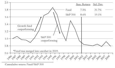
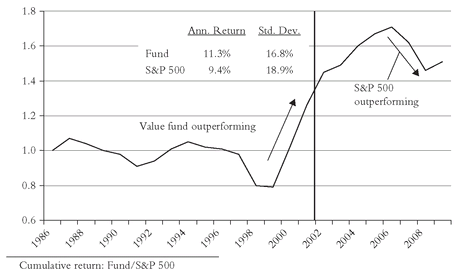
3.6). In retrospect, such charts might have protected fund investors from the ghastly penalties they paid for adverse fund selection during the late bubble. One is a well-managed, low-cost, value-oriented equity fund. Despite its low-risk strategy, it tracked the bull market nicely in 1986-1997, only to fall back during the technology mania. But when the day of reckoning came, it showed its staunch character. The other pattern is just the reverse: An aggressive growth fund is not particularly impressive during the early part of the period, but then soars as its high-risk strategy pays off in 1991-1995. Attracting large assets, it falters badly during 1996-1998, only to make one last surge in 1999. Then comes the bust that always follows the boom, and the fund collapses again. No, higher risk doesn’t necessarily equate to higher returns.
Such charts would have helped investors avoid the perils of the recent bubble. The large growth fund never recovered from its collapse from 1995 to 2002, and was merged out of existence in 2009. The large value fund’s ratio, 1.3 in 2001, rose to 1.7 in 2006, only to fall back in 2009 to a level of about 1.5.FIGURE 3.4 RTM: MAGIC FUND VERSUS S&P 500, 1964-2009
FIGURE 3.5 RTM: LARGE GROWTH FUND VERSUS S&P 500, 1986-2008*
FIGURE 3.6 RTM: LARGE VALUE FUND VERSUS S&P 500, 1986-2009
Years ago, I suggested that Morningstar replace its traditional chart with one that included the RTM that is so clearly illustrated by these telltale charts. Alas, the editors decided against it. In fairness, however, by showing quarterly returns relative to peer funds, the revised charts Morningstar now provides do capture some of the spirit of the idea. But, ever the optimist, I still hold out hope that Morningstar will reconsider and decide to employ the telltale chart on its fund pages.
RTM and “Slice and Dice”
“Slice and dice”—S&D to the Bogleheads—is often talked about not only on the Morningstar web site, but among financial engineers, including those at (dare I admit it!) Princeton University. In its simplest form, the idea is to garner excess returns by holding a portfolio that (1) adds to the market portfolio those asset classes that are deemed likely to deliver superior returns; (2) introduces assets having a low correlation with the stock market; and (3) periodically rebalances each asset class to its original weight.
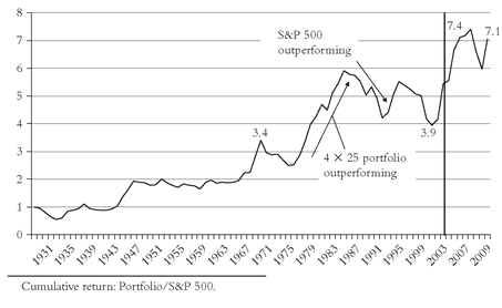
Let’s quickly examine two such portfolios. First, a conventional one, one-quarter each in the S&P 500 index, large value stocks, small value stocks, and stocks in the smallest two deciles—that is, a portfolio that overweights value and small-cap shares. Over history, it has clearly delivered: an annual return of 12.9 percent vs. 10.3 percent for the S&P index, albeit with a 41 percent higher risk—a standard deviation of 28 percent, versus 20 percent for the S&P 500. When we bring the telltale
Figure 3.7 into play, however, we see period-dependency and RTM at work. Note, for example, how much of its success came in the 1942-1945 bull market, when it rose by 410 percent(!), nearly three
times the 150 percent return of the S&P index—doubtless a non-recurring event.
Through 2009, the annual return on the first slice-and-dice portfolio declined to 12.1 percent, and the S&P 500 fell to 9.5 percent. The ratio rose to 7.1.Note, too, that the returns of the S&P index and S&D portfolios were virtually identical (13.8 percent and 14.0 percent annual return) for the next two decades, ending in 1964. Then the S&D portfolio surges intermittently through 1983, only to falter over the following 17(!) years (annual return of 13.9 percent, vs. 16.3 percent for the S&P)—meaning that there was virtually no gap for 32 years—a pretty long horizon when you think about it. For the full period, of course, the S&D portfolio dominated, but if we simply levered the S&P 500 to equalize its risk with the S&D portfolio, its risk-adjusted return would have risen to 12.4 percent. Surely a shortfall of 0.5 percent is mere rounding error in a numerical exercise of this nature.
FIGURE 3.7 RTM: 4 ×
25 PORTFOLIO VERSUS S&P 500, 1928-2009

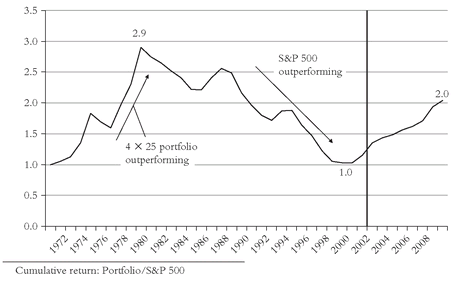
It is not insignificant, of course, that the value/small-cap tilted S&D portfolio we’ve examined was chosen largely in hindsight, reflecting the all-too-human temptation to rely on sectors that commend themselves by their past success. So, let’s take a look at what an investor might have done 30 years ago. We’ll hold a 25 percent S&P 500 position and then add three 25 percent allocations to alternative classes that might have been popular at the time: Small-cap, international, and, because it is the single asset class that most diversifies an equity portfolio (i.e., has the lowest correlation to the stock market of any asset class), gold (it didn’t look silly then!). Now let’s examine the record of this alternative portfolio. Obviously, this chart tells a different story. While the S&D portfolio again wins, it wins by only a modest amount—a 12.8 percent annual return for the 4 × 25 portfolio versus 12.3 percent for the S&P 500. Still, the value of $1 grew to $42 in the 4 × 25 portfolio, compared to $36 for the S&P index, a nice payoff for what proved to be, on balance, a smart selection of sectors.
But now see what the telltale chart reveals. First, the entire excess return—and then some!—appears in the first nine years, when gold boomed. Second, strength in the international sector pretty well maintained that gain through 1988, after which international stocks lagged the S&P 500, often by double-digit amounts, for 7 of the next 10 years. Yet, despite the recovery of this alternative 4 × 25 portfolio during the past two years, its cumulative average return of 10 percent since 1979 pales by comparison with the S&P 500 return of 15 percent. The telltale chart then, tells us two distinctly contradictory tales about this version of the S&D strategy: Yes, it wins during the first 8 years; no, it loses during the last 22.
Through 2009, the soaring price of gold has helped offset the below-average returns of the other components of the alternative slice-and-dice portfolio, which has provided an annual return for the full period of 12 percent. The S&P 500’s return was 10 percent. The RTM ratio increased from 1.1 in 2001 to 2.0 in 2009, still far below its 2.9 peak reached back in 1979 (see Figure 3.8).So slice and dice is what you make it. Like all other investment strategies ever devised by the mind of man, sometimes it works and sometimes it doesn’t. Uncertainty rules. Even if the overall program appears to outpace the S&P index, over a long inevitably period-dependent span of years, don’t forget how little(!) it costs to emulate the total stock market in the real world nor how much(!) it costs to use active funds to fill the S&D boxes, and even to use passive funds to do so. If we take the extra risk into account, there’s a real question about whether the game is worth the candle. And even if you don’t accept my challenge to S&D, I urge you, before you plunge into a 4 × 25 portfolio, to put more than 25 percent in the total market—say 55 percent. Then put just 15 percent in the three slices that you dice, thereby taking much of the risk out of your decision. Think then, about a 1 × 55 percent + 3 × 15 percent portfolio. If it is true, as Dr. Fama (and most other academics, to say nothing of many, many practitioners) says, that “for most people, the market portfolio is the most sensible decision,” you might as well make the most of it.
FIGURE 3.8 RTM: ALTERNATIVE 4 ×
25 PORTFOLIO VERSUS S&P 500, 1971-2009
RTM and the Stock Market
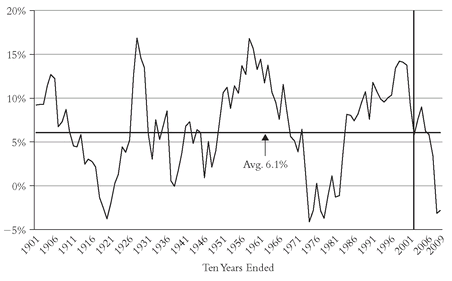
And, yes, reversion to the mean is the rule, not only for stock sectors, for individual equity funds, and for investment strategies that mix asset classes, it is also the rule for the returns provided by the stock market itself. If we go back through a century of stock market history (using Jeremy Siegel’s data), it’s easy enough to chart it: The real (inflation-adjusted) return on stocks has
averaged 6.6 percent per year, but with considerable extremes (see
Figure 3.9). This powerful panorama shows that the highest 10-year annual returns have ranges around 15 percent, coming in the mid-1900s, the late 1920s, the early 1960s, and the late 1990s. Then, in the late 1910s, the late 1930s, and the late 1970s, returns tumbled to 2 percent or less, sometimes even negative. Since the market’s 15 percent return in the decade ended in 1998 was the third highest in all history, one can only hope that the full might of RTM does not strike again.
32 Of course, RTM did strike again, and the real market return of -2.8 percent for the decade ended 2009 was close to the historical lows. Now let’s hope RTM—upward this time—will strike again.FIGURE 3.9 ROLLING 10-YEAR STOCK MARKET REAL RETURNS, 1901-2009
Why do stocks provide such high returns in some periods and such low—even negative—returns in others? Part of the reason is that the course of our economy is not smooth. We have prosperity and recession, even boom and bust. Those are simply the economics of enterprise, and while they may be tamer than in the past, they are not tamed. But there is more: the emotions of investors, whose greed leads them to value stocks too dearly at one moment and whose fear leads them to value stocks too cheaply at another. It is this combination of economics—reality—and emotions—illusion—that shapes stock market returns.
Economics is reflected in
investment return (earnings and dividends); emotions are reflected in the
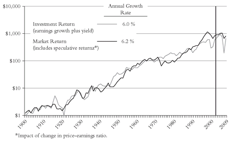
speculative return (the impact of changing price-to-earnings ratios). During the past century, the real investment return was 6.5 percent, accounting for the lion’s share of the market’s 6.6 percent real return, with speculative returns contributing just 0.1 percent. Clearly, the cumulative investment return is the piper that plays the tune, with earnings and dividends climbing year after year—sometimes faster, sometimes slower, sometimes even falling. Stock market returns dance assiduously to the investment tune, but periodically move above or below, seemingly independently. But the iron law of investing is apparent:
In the short run, speculative return drives the market. In the long run, investment return is all that matters.
By the close of 2009, the annual long-term real return had dropped to 6.2 percent; the investment return had dropped to 6.0 percent; and the speculative return had risen to 0.2 percent (see Figure 3.10).FIGURE 3.10 GROWTH OF $1: FUNDAMENTAL REAL RETURN VERSUS MARKET REAL RETURN, 1900-2009

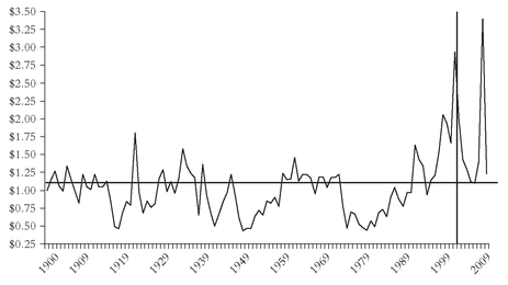
While only our faith that our nation’s capitalistic economy will continue to thrive can give us confidence in the long-term course of dividends and earnings, it is not faith but common sense that tells us when stock prices get substantially misaligned with corporate values. When the stock market’s cumulative total return diverges significantly from the market’s investment return, then it is only a matter of time until the two converge again. Here is where RTM comes into play. This final telltale chart reflects the division of the cumulative investment return into the actual market return at the end of each year. Result: These aberrations between investment return and market return are dramatically highlighted. Thus, the misalignment of prices with values at the 1929 peak was followed by the crash of the 1930s. On the other hand, the low valuations of the late 1940s and early 1950s laid the foundation for the go-go era of the mid-1960s and the “Favorite Fifty” craze of the early 1970s. The resulting bust set the stage for the Great Bull Market that began in August 1982 and ended abruptly in March 2000.
At that point as the chart shows, the disjunction between market returns—stock prices—and investment returns—enterprise values—only once before had been wider, so predicting a subsequent decline was no great challenge. But while we may know a lot about what will happen in the financial market, we never know when it will happen. Indeed the ratio was at 120—a clear warning sign—at the end of 1997. Yet the ratio continued to rise until it hit 150 at the end of 1999, and rose even further to 160 at what proved to be the 2000 peak. Yet despite the subsequent 40 percent market drop we have so far endured, the ratio remains at 110, still above the baseline. Where it goes next, nobody knows.
But history and the iron rule of RTM strongly suggest caution, since valuations remain high today. The future will depend on subsequent earnings growth. So we’d best hope American business turns its attention away from the ghastly financial manipulation of recent years—focused on hyping stock
prices in the short-term—and toward its traditional character—focusing on building corporate
values over the long term. That’s a far harder job, for innovation, productivity, efficiency, economy—yes, and leadership and character, too—are tough standards to measure up to in a competitive global economy. But it is what our society must demand of our corporate stewards.
“Caution” proved to be a good idea. The ratio fell from 2.9 in 2001 to 1.1 in 2006, soared to 2.4 in 2008, and collapsed, ending at 1.2 in 2009, reverting almost precisely to the long-term mean (see Figure 3.11).FIGURE 3.11 A CENTURY OF RTM IN THE STOCK MARKET: REAL MARKET VERSUS REAL INVESTMENT RETURN, 1900-2009
This, Too, Shall Pass Away
The message of the telltale chart is universal. Unlike the regular, louder, ever-more-distinct pulsations of the telltale heart in Poe’s frightening story, however, reversion-to-the-mean in the financial markets is irregular and unpredictable—sometimes fast and sometimes slow, sometimes distinct and sometimes almost invisible. Just when we despair of its universality, it strikes again. And so there is always hope today for those who await the almost inevitable recovery in stock prices. But I remind you that while we may know what will happen, we never know when. So rather than relying on hope—never a particularly good idea in the stock market—rely on an asset allocation that focuses on not only the probability of reward, but the consequences of risk.
It occurs to me that the best advice I can leave with today’s investors came in my first book, written way back in 1993. It was a
Caveat Emptor entitled, “This Too Shall Pass Away”:
An Eastern monarch asked his Wise Men to give him advice that would be “true and appropriate in all times and situations.” Similarly, I sought such advice for investors in the financial markets, who “feel richer when the market rises and poorer when it declines . . . although the underlying value of the business enterprises that comprise the market may have changed not a whit.” I cautioned investors not to give way to a bull market atmosphere and become infected with the enthusiasm and greed of the great public, any more than they should give way to a bear market atmosphere and become infected with the negativism and fear displayed by the great public. Success in investing, I wrote, “will depend on your ability to realize, at the heights of ebullience and the depths of despair alike”—to answer the question asked by the monarch—that “this too shall pass away.”
33In 2010, after the trials and tribulations of the past 17 years, I wouldn’t change a word of this paragraph.
