7.2 Tiles
The entry point to SAP S/4HANA Cloud is the SAP Fiori launchpad. Its importance as a gateway to apps goes without saying—but tiles are much more than just entry points for specific applications. Tiles can be set up to provide dashboard-style metrics for critical operational data. Beyond just showing metrics, tiles can be set up with limits and then color-coded to help drive attention to where it’s needed most. As a result, tiles and their usage become a very useful analytical tool. The following sections will cover two methods for creating tiles.
7.2.1 SAP Smart Business Tiles
There are two ways to create tiles. For a business user, user-specific SAP Smart Business tiles can be created easily on the fly with a few clicks. For example, assume an accounts receivable manager needs to review outstanding receivables. The manager simply can click the Total Receivables tile (see Figure 7.4).
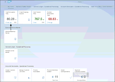
Figure 7.4 Total Receivables Tile
A chart of total receivables sorted By Due Period will be displayed (see Figure 7.5).
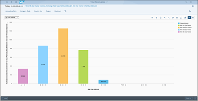
Figure 7.5 Total Receivables Chart
If the manager prefers to focus on a specific account, he or she can filter results by using the Filter button shown in Figure 7.5 to select a specific customer of interest. A new chart is then generated, as shown in Figure 7.6.
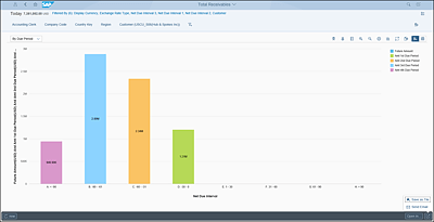
Figure 7.6 Filtered Receivables Chart
Because this information is of interest to the manager, she or he might choose to click the Action icon located at the lower right of the window and save this graph as a tile. As shown in Figure 7.7, a new window will appear, asking for a subtitle name for the tile (which is being built based on the Total Receivables main tile) and asking for range boundaries if desired.
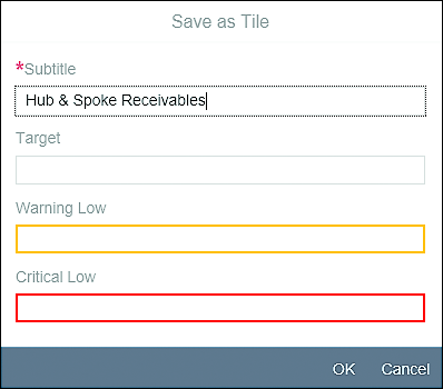
Figure 7.7 Saving SAP Smart Business Tile
The new tile will appear in the group of the master tile it’s based on, as shown in Figure 7.8.
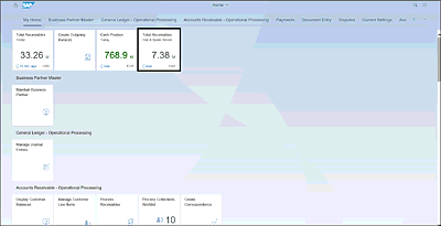
Figure 7.8 New SAP Smart Business Tile
The new tile is automatically updated with the revised total receivables amount for the selected customer.
New tiles like this can be created for graphics and to point to specific apps with preloaded, filtered data. Ad hoc tiles like these can serve a short-term purpose by directing attention to a critical issue. In this case, the business user can easily remove the tile once the need for it is over.
7.2.2 Custom Tiles
Custom tile development begins with key performance indicators (KPIs). KPIs can be specific to a company’s operations or a common industry metric. The Create KPI app (see Figure 7.9) provides an entry point and allows you to perform the following actions:
- Assigning a name to the KPI
-
Providing a goal type for the KPI (e.g., establishing if a higher number is better than a lower number or vice versa, or noting if the number needs to be within a specified range)
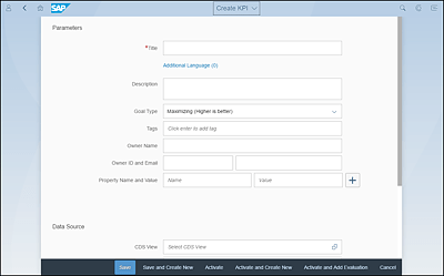
Figure 7.9 Create KPI
- Defining data source details from the system, based on Core Data Services (CDS) views and OData services
- Saving and activating the new KPI
The analytics specialist role is required to manage KPIs.
Once created, KPIs can’t be edited. However, they can be copied and modified should business needs dictate via the KPI Workspace (see Figure 7.10).
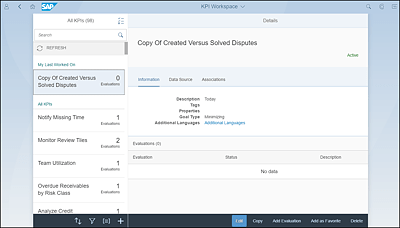
Figure 7.10 KPI Workspace
Once a KPI is created, an evaluation must be created. An evaluation is a combination of parameters, filter settings, input parameters, thresholds, targets, and trends that are applied to a KPI. The evaluation defines what information about the KPI is visible to the user. In addition, it’s possible to define target and threshold values (e.g., target, warning, and critical levels of a KPI that would indicate whether some action is required by the business). Fixed values or measures can be used for the threshold values. For warning and critical thresholds, a percentage of a measure also can be used.
When creating an evaluation, it’s possible to choose an additional set of measures. Additional measures can be used to create a comparison tile and to define targets and thresholds. A warning, for example, can be triggered when the KPI reaches a certain percentage of another measure.
With the KPI and evaluation(s) in place, it’s now possible to create a tile using the Create Tile app. The first step in creating the tile is to select the evaluation that was created (as shown in Figure 7.11).
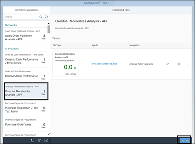
Figure 7.11 Associating New Tile with Evaluation and KPI
This step creates the association of the new tile with the KPI and associated evaluation. From there, the Add Tile button can be used to create the tile (as shown in Figure 7.12). Beyond just creating a visualization of the KPI, this app also allows for configuring a drilldown navigation path to an application for exploring the KPI or its implications in more detail.
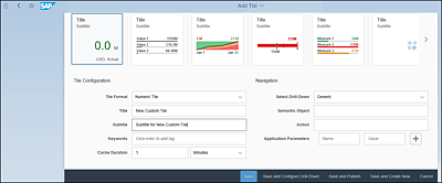
Figure 7.12 Create Tile
As Figure 7.12 shows, there are multiple tile formats to choose from, as listed in Table 7.1.
| Tile Type | Description |
|---|---|
| Numeric | The aggregate value of the KPI is presented in a number format. If thresholds are defined, color-coding will indicate which threshold category the number is in. |
| Comparison | A dimension (e.g., vendor or customer) is selected, and the top KPI values across that dimension are presented. |
| Trend | Based on a provided time dimension, the KPI data is presented as a trend over that time. |
| Actual versus target | Data is presented as a graphical chart that compares the KPI to defined targets and/or thresholds. |
| Multiple measure comparison | Two or three different measures can be displayed. Options include the KPI and a threshold measure, or if multiple measures were defined in the evaluation, those could be displayed. |
| Dual | This tile is a double-wide tile with any KPIs on the left side and a mini chart on the right. |
| Blank | This tile is like the numeric tile, but without a number. It’s used to drill down into an app. |
Once created, the tile will be available for business users to add to their SAP Fiori launchpads and use. Tile security and availability is based on the catalog the tile is assigned to (and the business roles that include that catalog).
Figure 7.13 shows an example of how KPI tiles can be used to provide a dashboard. The boxed tiles are the standard KPI tiles for a receivables manager.
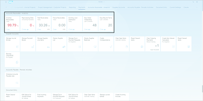
Figure 7.13 Receivables Manager KPI Tiles