7.3 Standard Graphical Reports
KPIs, visible through tiles, are extremely useful for taking the pulse of the business. Often, however, it’s necessary to view more detailed information; for example, it’s one thing to know how many order issues there are, but it’s another to know the number of issues by type or by customer. Such data certainly can help clarify the nature of an issue, but if the data is only provided in a tabular or spreadsheet view, sorting through it to reach a conclusion may take an inordinate amount of time. Worse, a number could be missed or misinterpreted, leading to an invalid conclusion. As a result, graphical representation of data becomes very useful for quick and accurate analysis.
Rather than requiring users to download data to Excel and create graphics, SAP S/4HANA Cloud provides extensive graphical reporting capabilities. A partial list of graph types includes the following:
- Horizontal bar chart
- Vertical column chart
- Line chart
- Pie chart
- Doughnut chart
- Heat map
- Bubble chart
- Bullet chart
- Vertical bullet chart
- Stacked bar chart
- Stacked column chart
- 100 percent stacked bar chart
- 100 percent stacked column chart
- Waterfall chart
- Horizontal waterfall chart
No one chart is better than another; each type represents data differently and allows for different conclusions.
In addition, by using the analysis path capability within SAP S/4HANA Cloud, business users can develop multiple graphs on the same data quickly to see the complete story of a situation. The pie chart in Figure 7.14, for example, indicates that sales volume is fairly balanced across all customers.
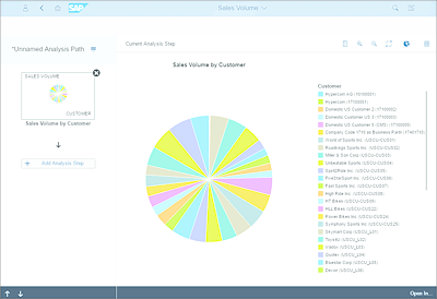
Figure 7.14 Sales by Customer Pie Chart
Significant differences across customers hide in this picture, however, due to the scale of the numbers and the volume of customers. Changing to a bar chart, as shown in Figure 7.15, makes it much easier to quickly identify the highest-revenue customer at a glance. It also helps to better identify customer revenue concentration.
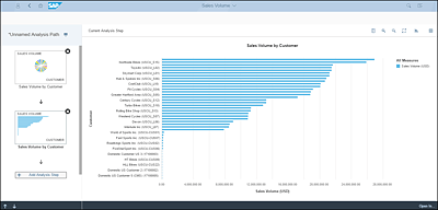
Figure 7.15 Sales by Customer Bar Chart
Viewing by customer is helpful, but an analyst may want to see the best-selling products. Another new graph, as shown in Figure 7.16, can be added easily to support viewing sales by product.
Still, this graph doesn’t show which products are growing in sales relative to last year. A fourth graph (see Figure 7.17) can be added with a few simple clicks to provide this comparative view.
This analysis path functionality is available across multiple functions (orders, purchasing, etc.), and additional analysis paths can be created. The possibilities are virtually endless—but the truly impressive aspect of all this is that it’s all produced with real-time data, all from within the SAP S/4HANA Cloud application. No downloads to Excel required, nor any additional expense for a reporting tool.
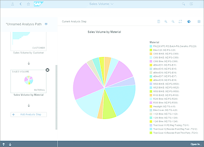
Figure 7.16 Sales by Product
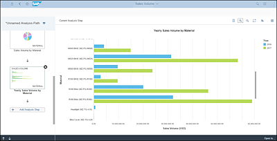
Figure 7.17 Sales by Product by Year