7.5 Multidimensional Analytics
In addition to graphical analysis, a major rationale behind downloading data to Excel or another external reporting tool is the requirement for multidimensional analysis. Slicing and dicing data across multiple dimensions can provide significant insight into operations. Examples for this type of analysis are limitless, bounded only by the business user’s imagination and the data dimensions available, such as the following:
- Sales by store by month
- Sales by store by product
- Sales by product by salesperson
- Travel expenses by type by employee by month
Tools such as Excel pivot tables provide this capability, but once data is downloaded to Excel it’s out-of-date, creating multiple versions of the truth. As discussed earlier, insight without action has very limited value.
Because the SAP HANA database allows for real-time data inquiry, SAP S/4HANA Cloud can provide multidimensional data analysis as a built-in function. Beyond this capability, however, is the user interface, as shown in Figure 7.20 for the Sales Volume app.
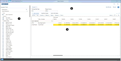
Figure 7.20 Sales Volume Multidimensional Analysis
As shown, the screen is split into three sections:
| 1 |
Navigation panel On the left is the navigation panel. This section provides all the dimension options available for this analysis. The dimensions are determined by an SAP Best Practices CDS view (discussed in further detail in Section 7.6). Adding or removing dimensions from the analysis is as easy as clicking the horizontal or vertical bar to the left of a data element name. Figure 7.21 shows the view after adding a new customer dimension. 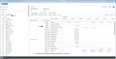 Figure 7.21 Adding New Dimension to Analysis |
| 2 |
Filters The top section allows the user to filter the results. Standard filters will default to the initial view, but additional filters can be added by the user. In addition, if specific filters are used often, a variant can be saved for quicker access. Figure 7.22 shows some filters in use for a cost center analysis. 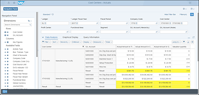 Figure 7.22 Adding Filters to Cost Center Analysis In this case, the results are filtered to the manufacturing cost centers for the US operating company. |
| 3 |
Data The third section provides the data results. Figure 7.20, Figure 7.21, and Figure 7.22 provide several examples of the data displays. The highlighted rows are summary rows, which can be hidden if desired. Additional options are provided for further customizing the analysis with filters, sorting, and more. One option is to change the view type to a graphical display; Figure 7.23 shows a graphical display from the profit and loss (P&L) analysis. 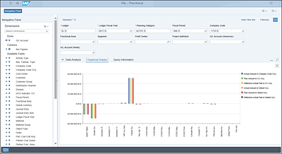 Figure 7.23 Graphical Analysis in Multidimensional View The graphical analysis will require variables to be limited to two dimensions. In addition to viewing data graphically and across multiple dimensions, this section allows for jumping back into the applications that manage the data, thus enabling insight to action (as shown in Figure 7.24). After clicking the Jump To button, the user is shown a list of logical options based on the open analysis. In Figure 7.24, while viewing cost center data, the user can access cost center management applications as well as G/L and cost line item management applications.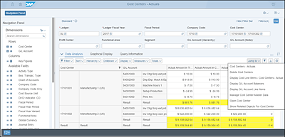 Figure 7.24 Moving from Viewing Data to Acting on Data |
As you can see, the multidimensional analysis tool provides comprehensive capabilities not only for exploring and interrogating data but also for using newfound knowledge to act on that data. Users nevertheless may still want to download the data to Excel—and that capability is provided as well, at the click of a button.