METHOD 13
Design Brief
METHOD 14
Design Principles
METHOD 15
Sketching
METHOD 16
Sketchboards
METHOD 17
Task Flows
METHOD 18
Wireframes
If You Only Do One Thing...
Designer Damien Newman created the design process illustration in Figure 7.1 to help illustrate a fundamental but little known truth about the design process: the path to a clean, complete, well-considered product is messy, messy, messy. You generally have to throw away a lot of work before you get to something that you keep. And often you don’t know what should be kept and what’s headed for the trash until you get other people involved in the process. But showing your colleagues the messy design process can be a bit like making sausage: sometimes it can ruin their appetite for the meal. The trick is to follow an iterative design process that enables you to do your best work, but also brings people along for the ride. The methods described in this chapter are tailor-made to get you through that process. They focus on iterative design coupled with structured, facilitative activities that you can do with your non-UX colleagues to make them partners and co-owners of the UX design process. In this chapter, we’ll cover:
• Design Brief. At a high level, how would you describe your target design solution? What are the features and personality of the product? Who is it designed for, and what activities is it intended to encourage or enable?
• Design Principles. What should the experience of using the product feel like to a user?
• Sketching. What are some different forms the product design could take?

FIGURE 7.1
Damien Newman created “the squiggle” to convey the messiness of the design process.
• Sketchboards. What might the overall system or product look like, and what range of ideas are possible at each point in the process?
• Task Flows. How will the experience unfold over time?
• Wireframes. How will the product look and function in detail?
NOTE A NOTE ON VISUAL DESIGN
The methods in this chapter cover high-level design direction, flow, and interaction design. They do not cover visual design which would require its own book to do it justice. If you’re interested in learning more about visual design, check out these resources:
• The Principles of Beautiful Web Design, by Jason Beaird www.amazon.com/The-Principles-Beautiful-Design-Edition/dp/098057689X/
• Designing for the Web, by Mark Boulton www.fivesimplesteps.com/products/a-practical-guide-to-designing-for-the-web
• Non-Designer’s Design Book, by Robin Williams www.amazon.com/Non-Designers-Design-Book-Robin-Williams/dp/0321193857/
At a high level, how would you describe your target design solution? What are the features and personality of the product? Who is it designed for, and what activities is it intended to encourage or enable?
The design brief documents your working assumptions about the optimal design of the product and puts forth your hypotheses for how best to bring that design to life. Much like a project brief, a design brief is intended to be a clear summary of what direction you plan to move (see Figure 7.2). But the design brief is a little more focused on design specifics. It seeks to articulate the vision for the user experience and connect the dots on how that vision will be brought to life. The design brief is something you create for your team, for any stakeholders who need to approve the design direction, and for yourself. Where the project brief helps you get shared vision on the overall project goals, a design brief helps you get shared vision on the personality and essence of the user experience design.
FIGURE 7.2
An example of a design brief.
2–3 hours to summarize what you’ve learned and put it into a document
• You want to clarify the team’s expectations as far as design is concerned and address early on any gaps or discrepancies in expectations.
• As the output of the strategy and research work described in the previous chapters.
There are two ways to do a design brief. One way is to start from a good template and fill in the details. (You can use a layout like the one shown in Figure 7.2.) The second is to look at what you know or have learned through your discovery and research work and build from the ground up. In either case, there are a few basic questions that you should answer with your design brief:
1. Focus.
What is the focus of the design work? What will be created, improved, etc. as an outcome to this work?
2. Audience.
Who will the design serve? Who are the primary audiences or personas that you will be designing for? While a design brief is intended to be brief, this is an area where a little more description will enable you to double-check that your assumptions about users—their needs, mindsets, and priorities—match your teammates’ assumptions.
3. Features and functions.
What are the core screens, states, or scenarios? What pieces of the experience will be central to the product?
4. Feeling.
If you are successful, what will the feeling of the user experience be? This is basically about brand. When people use the product, will it feel fun and playful, dark and serious, or crisp and professional? As you’re talking to stakeholders and team members about how they would like to see the products take shape, you will find that in addition to talking about features and functions, people do slip in words that effectively describe the desired feeling of the product. If you notice that language and write it down, put it in the design brief.
5. Restrictions and expectations.
What constraints must be obeyed? What is most critical to the success of the design? What parts must you absolutely get right, and what things can you absolutely not do?
What should the experience of using the product feel like to a user?
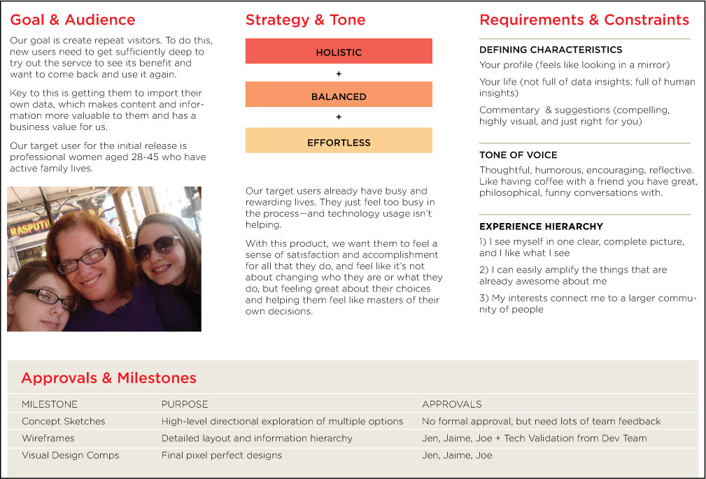
Design principles help you articulate the characteristics that should endow the user experience with a memorable personality or feeling. Does it sound strange to say that a product has a personality or a feeling? Some products may not have intentional personalities, but they may leave a distinct impression nonetheless. Some may feel confusing, complex, or technical. You may also have encountered products that feel fun, friendly, simple, and smooth (see Figures 7.3–7.4), or playful, social, productive, creative, and so on. Users tend to appreciate products with those kinds of personalities a bit more.
Design principles are a tool to help you clarify what personality is right for your product, and then to ensure as you progress that you are designing an experience with this personality. Because these design principles set a direction for the product design, they are ideally done before beginning a detailed design. Design principles can be shared with the team, similar to a design brief, to ensure that you have alignment on the product direction. As a tool for yourself, design principles can be a barometer to continually gauge whether the designs match the principles as you work.
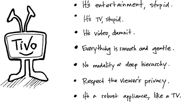
FIGURE 7.3
The design principles that were created for the digital video recorder Tivo.
FIGURE 7.4
These design principles are evident in a variety of touchpoints—from the simple and ergonomically satisfying Tivo remote, to the friendly logo, to the inviting and non-technical language of the viewer’s guide.
2–4 hours total
• 1–2 hours to create the principles
• 1–2 hours to share with the team and incorporate feedback
• You need a tool to ensure that your user experience is coherent and consistent.
• You’re not sure what the vision or personality for your product is.
1. Consider what makes your offering unique.
Think about what you’ve learned through whatever research you’ve done. Have you discovered any differentiators and special characteristics that are key to your product? Are there any assets in your content patterns that are important to feature? Have you uncovered any interesting opportunities via user research that your product is uniquely positioned to address well?
2. Create a list of principles.
From this information, make a list of statements about what, ideally, the finished product should be like. Try to write short, pithy statements in an informal, human voice. Here, you are trying to capture how you would like a real person to describe your product after using it.
3. Reduce your list.
If you come up with a lot of statements in your list (say, more than five), try to pare it down. Prioritize the statements that most directly give users what they need and create an offering that is differentiated from your competitors. You may be able to combine a few of your statements to come up with more nuanced, less generic statements that really speak to the experience that you’re trying to create for your product. Ultimately, you want to whittle down your list to about five statements.
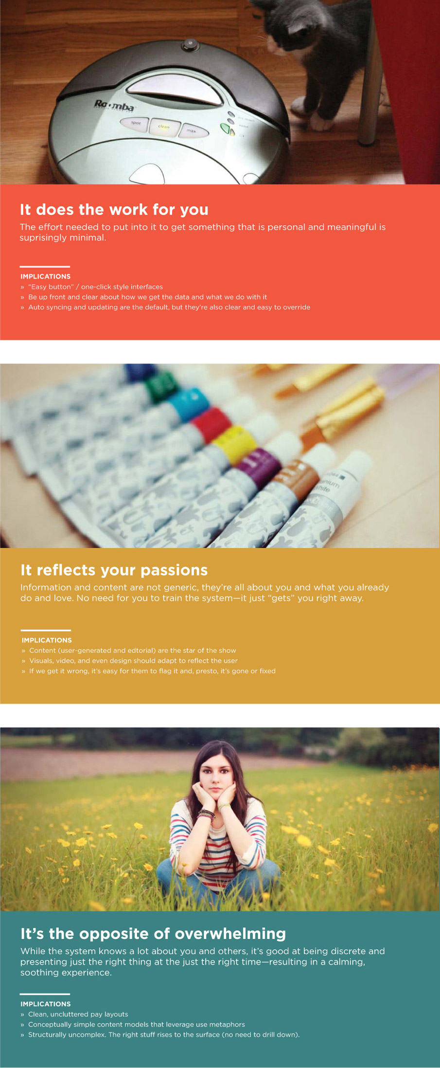
4. Add more color to each statement.
Select a photo (or a few of them) to illustrate the statements symbolically, as shown in Figures 7.5–7.7. Add additional notes about some potential implications for each principle. Think about how each principle might influence specific parts of the design.
5. Share and discuss.
Once you’re satisfied with your principles, share them with the whole team. Consider creating nicely formatted, poster-sized versions of each principle to give each one a sense of significance and inspire others.
6. Refer back to them regularly.
As you progress through design steps like sketching, wireframes, prototyping, and validation, continually refer back to your design principles and ask yourself, “Does what I’m designing feel like this principle?” If not, think about what changes you can make to bring the design more in line with the principle.
FIGURES 7.5–7.7
Here, three different design principles work together to convey the overall feeling that a product should have for its users.
• No generic statements. Design principles should help you make decisions in product design. This means they should be tangible and, to a certain extent, pointed. To test if a statement is specific and evocative enough, ask yourself if that statement could describe any of your competitors’ products. If it could, it probably needs more work.
• Go beyond easy. Resist the urge to include a principle about being user-friendly, easy to use, or simple. Those things are all good, but they are table stakes for good design. With rapidly evolving design standards, a simple experience is not necessarily a differentiated experience anymore.
• Make it a group activity. If you’d like to include your non-UX team members in the creation of design principles, start by creating a big list of potential statements as described earlier. Then hold a meeting or mini-workshop and invite the team to reduce the list and modify your draft principles to make them better. You can do this as a hands-on, lo-fi activity, creating design principles like the one shown in Figure 7.8. You can also invite the team to discuss what the implications might be for each principle as you apply it to product design.
FIGURE 7.8
Design principles don’t have to be highly polished, as long as they capture a distinct feeling.
• If you work remotely... Once you’ve gotten the team familiar with the design principles, ask someone who is located with the team to print them (ideally as posters or attractive large-format documents) and hang the design principles someplace where your colleagues can regularly encounter them. This keeps them top-of-mind for the whole team. In any case, be sure to refer back to them regularly as you progress through the design process. Design principles are like a north star to help you sail the ship of design.
What are some different forms the product design could take?
Sketching is an activity that should be familiar to pretty much all of humanity. It’s when you sit down with pen and paper and allow yourself to start drawing out your ideas. However, in user experience design, sketching has added significance. It refers to the point in the process when you begin to explore different potential forms that the ultimate design could take. This is an important step before beginning detailed designs.
Sketches are a vital design tool because:
• They’re cheap. Sketching is a fast and inexpensive way to iterate and refine your ideas before transitioning to a higher-fidelity and more painstaking medium like wireframes. While you are in the sketching phase, if you discover that a certain idea won’t work, you can quickly evolve or revise the idea. All it takes is another sketch.
• They help you explore. In user experience design, there are usually a variety of directions a design could take. Sketching is a thinking tool that you can use to pinpoint an idea and then adjust and adjust again. It can also be used to generate a range of potential solutions to a particular problem. This makes sketching an excellent tool for exploring constraints and trade-offs, and thinking through the implications of one design over another.
• They forestall perfectionism. Because sketching helps you explore multiple directions, it’s a natural deterrent to becoming too wedded to one particular idea too early. Sketching enables you to entertain a variety of ideas all at the same time, and even merge them together and evolve them into something greater than any one individual concept.
• They invite conceptual feedback. Sketches are messy. No one could confuse them with finished designs. Consequently, if you share a sketch with someone (for instance, a team member), they’re more likely to give feedback on the core concept than to give you detailed feedback on layouts, fonts, colors, and so on. Early in the design process, feedback on the concept is the right level of feedback. Conversely, if you show a more polished looking design while you’re still working on the basic idea, people may focus on surface aesthetics and feel that it’s too late to give feedback that might change and even improve the overall conceptual direction.
• They engage others. Perhaps most valuable for a team of one (whose success often depends on getting support from non-UX peers), sketching gives you a way to translate abstract ideas into a tangible, visual language that you can share with others. You can use this to confirm with the team what you’re thinking and incorporate their feedback before investing days of work into higher fidelity design.
• Anyone can do it. You don’t have to be the only one sketching. In fact, inviting your cross-functional team to express their ideas on pen and paper gets them engaged, leads to great new ideas, and is fun!
For all these reasons, sketching is an essential tool in the UX team of one’s toolkit, and one that everyone should be able to use with a degree of confidence.
As much or as little time as you need. For example, 30 minutes of focused sketching time can make all the difference.
• You’re starting to explore design ideas.
• You want to engage the team in a constructive and tangible discussion of possible design directions.
• You’re not really sure what direction the designs could go in, and you need a tool to spur your creative thought process.
1. Start with the right equipment: paper and pen.
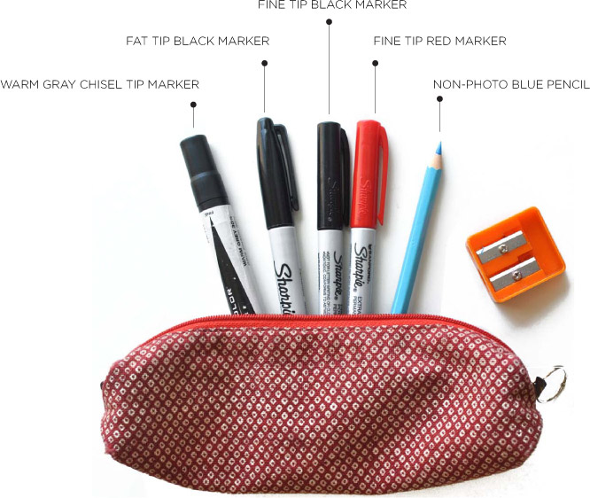
You can sketch with tools as simple as an old pencil stub and a scrap of paper. However, having pens of varying weight and color, and blank paper (or better yet, a special notebook for sketching) can imbue the sketching process with an air of thoughtful intention, and can also make your sketches clearer to other people. Consider assembling a little sketching kit for yourself, as shown in Figure 7.9. Then stock this minimal set of sketching instruments in your pen case at all times:
• Fine-tip black pen or marker—for roughing out a sketch.
• Fine-tip red pen or marker—for annotations and notes.
• Fat-tip black pen or marker—for creating thicker lines to draw attention to the more important or structural parts of a sketch.
• Non–photo blue pencil—for creating a first draft of a sketch, before inking it in. Especially useful if you are drawing hard things like hands or people. It’s called a “non-photo” pencil because it’s (mostly) invisible to cameras and scanners, which makes it a good way to rough out an idea and then go over it again later in black ink.
• Warm gray chisel tip marker—for creating drop shadows or inking in parts of the sketch that should be treated as the background.
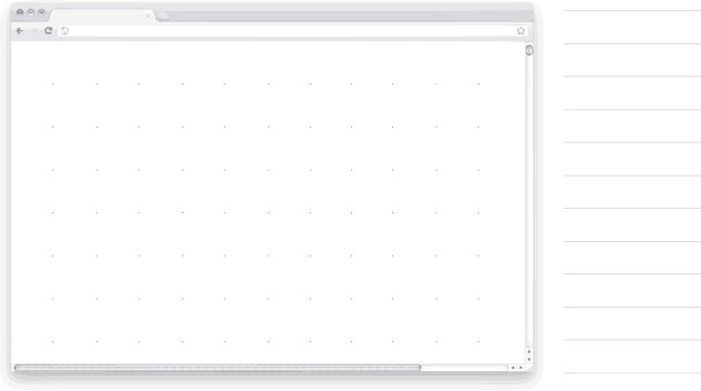
• For sketching paper, basic copier paper works well. Or, if you are sketching screens for a specific type of device or screen resolution, it can be helpful to sketch on templates like those shown in Figures 7.10–7.13, which include a stencil or outline with an accurate sizing and aspect ratio for the target screen. Paradoxically, if your paper is too nice, it can make you more hesitant to sketch. Use fancy pens but unfancy paper.
FIGURE 7.10
A sketching template for a Web browser.
FIGURE 7.11
A sketching template for a mobile phone.
FIGURE 7.12
A sketching template for a tablet.
FIGURE 7.13
A sketch on a browser template.
2. Block off some time.
When you’re ready to sit down and start sketching, consider giving yourself a time constraint. For example “I will sketch ideas for the next 30 minutes.” The time constraint is useful because it helps you move quickly rather than deliberating over an idea until it’s perfect. Perfect doesn’t matter when you’re sketching. That comes later in the process. Here, it’s about generating a lot of ideas for what’s possible.
3. Sketch your first ideas for key parts of the experience.
Start by asking yourself, what are the most interesting moments in this product? If I’m the user, what point am I trying to get to? What screen, state, or configuration of data will be most compelling and most likely to impress me or give me the most value? What part of the experience is most likely to “wow” me? Pick one of the key moments, and start to sketch some potential screen layouts for them.
4. Sketch alternatives.
After you’ve sketched one or two ideas for a particular state or screen, try to force yourself to sketch at least a few additional ways you could design that part of the product. For example, if the first sketch was a text-heavy design, how about a very visual way that you could present the same information? Continue this exploratory, experimental way of thinking as you drum up at least a few ideas for each screen that you’re sketching. You can use a “six up” template, shown in Figures 7.14 and 7.15, to help yourself sketch six quick, thumbnail-sized sketches for how you might design a specific page or moment of the experience. This may sound like extra work, but challenging yourself to continue and push past your first few good ideas inspires interesting new thinking. It’s a way for UX teams of one to bring the same kind of rigorous, exploratory, generative thinking that a team of designers brings to a design problem.
5. Pick the best ideas.
Once you’re satisfied that you’ve done rigorous exploration, identify which directions or ideas seem most promising to develop further. Only then should you fire up your computer and commence detailed design. You may find yourself mixing and matching some ideas from your initial sketches. That’s great! Your sketches should help you arrive at design solutions that are bigger than any one particular idea.

FIGURE 7.14
By forcing yourself to explore six different alternative approaches, you push past your first one or two good ideas.
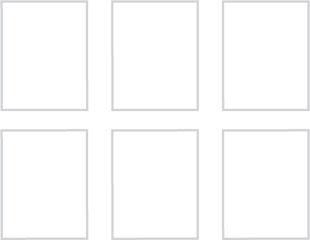
FIGURE 7.15
Templates like this one aren’t required, but can help you remember to sketch multiple options before settling on just one.
• Clarity before beauty. You don’t have to be a great artist to be a great sketcher. When sketching, aesthetics are low priority. You do, however, want to try to make sketches that someone else could look at and possibly make sense of—or that you yourself could make sense of if you pulled them out of a drawer two or three months later. To make your sketches clear, add annotations, or use the pens as described earlier to add visual clarity. Often, a short note and an arrow pointing to some part of the sketch are all it takes to clarify what makes a bunch of squiggles a solid gold idea. Also, focus on drawing basic shapes. The sketches in Figure 7.16 were created by designer Rachel Glaves at Adaptive Path. Rachel shows that most user interface elements can easily be sketched using a few basic elements: lines, boxes, and arrows.
• Sketching hacks. If you are unhappy with the look of your sketches, there are tools that can help. Balsamiq is an online wireframing software with a sketchy appearance that you can use to put together sketch-like designs.
• Sketch in words. If you feel uninspired as you sketch, try to describe an idea in words before you attempt to draw it in pictures. Some people are naturally “word” people, and this sketching-in-text approach can be an equally valid way to explore the possibilities.

FIGURE 7.16
Focus on drawing simple shapes.
• Carry your kit. Keep your sketching kit handy so you can sketch on the fly, in meetings, or in ad hoc conversations. When a conversation seems to drag on, with participants going back and forth about what they believe should happen to the product design, grabbing a pen and drawing what you or others have in mind can be very powerful. It can help turn a purely speculative conversation into something more tangible. The person who sketches directs the conversation, which is a very strong position to be in. Likewise, handing a pen to a colleague and asking her to “sketch it out” can give you a clearer picture of what she has in mind.
• Frame the sketches for their audience. To get people who are used to reviewing higher fidelity designs to engage with sketches, it can be helpful to spend a little extra time (but not too much time) to frame the sketches within a more polished deliverable. Scan your sketches and place them into a presentation or document that presents the sketches as visual examples to support a written overview of the conceptual directions being presented.
• If you work remotely... Even if you can’t be there in person, you can still make sure that reviews happen as though you were there in person, which means setting up time and structures to enable the team to see your sketches, make their own, and have a highly detailed discussion around a collection of sketches. To do this remotely, schedule several larger blocks of time for an online working session with the cross-functional team. During this time:
• Either block off a larger than average amount of time for the meeting (say, two hours), or explicitly give the working session a very narrow scope so you can be sure that you’ll get through all the designs in the time available.
• Ensure that the technology is set up for an optimal sharing experience. This usually means having a dedicated conference line for everyone to call in and conference software where everyone can see each other’s faces and share documents. You can use software such as Adobe Connect, GoToMeeting, join.me, or even Skype. Or tools like ConceptShare, ProofHQ, and Cozimo are designed for visual collaboration online, and can be useful for sharing and annotating sketches, wireframes, and other visual artifacts.
• In meetings like these, it’s critical to have a clear agenda and a clear process for how content will be shared that everyone understands ahead of time. When technology issues derail a meeting, even if it’s nobody’s fault, it makes everyone annoyed (not the open, friendly, participatory vibe you’re trying to create).
• If the meeting is focused on sharing (or co-creating sketches), you can make sketches ahead of time, scan them, and then send them around by email so people can refer to them during the meeting. Or, if you have a tablet (such as a Wacom tablet, or even an iPad with a good sketching tool like the app Paper), you may be able to sketch real time during the meeting as you discuss ideas. If you’re asking your colleagues to sketch and they’re not similarly equipped, you can just ask them to sketch with pen and paper and ask them to hold their sketches up to their cameras or snap a quick photo with their phone and email it to the group. (Or scribblar.com is a collaborative white-boarding tool that you can use.)
What might the overall system or product look like, and what range of ideas is possible at each point in the process?
A sketchboard is a way to display the sketches that you and the team have created and facilitate a group conversation around them. You can think of a sketchboard as a big poster that you create by assembling your sketches and initial ideas for the design of the system. Sketchboards also help you look beyond individual screens and envision how someone will move among multiple parts of a product or system. The intended purpose of a sketchboard is to help you think across the broader design of the system, and to make sure that you’re pushing yourself to make quality, creative designs. But sketchboards have lots of side benefits as well:
• They are interesting to look at, which makes people curious and draws them into your process.
• They’re cheap and quick to assemble, so you can easily put one together whenever you need to think about the breadth or flow of a product.
• They’re a good canvas for layering on new ideas, and even recording notes, questions, clarifications, priorities, etc. As such, they create a vivid and visual record of a whole team’s input into the user experience design.
3–4 hours total
• 1 hour to assemble a sketchboard (provided sketches have already been done)
• 1–2 hours to review with a team
• About 1 hour to go over notes and new sketches after the review and determine the next steps
You’ve done a bunch of initial sketches, or when you’re ready to narrow down your ideas and need input from the team to move further into detailed design. This way of working settles design decisions. By doing the design thinking together and having a critical conversation about the benefits and drawbacks of certain approaches, the strong ideas become self-evident. Rather than requiring you to preach or appeal to your colleagues’ user-centered virtues, they can come to the same conclusions on their own by participating in the process.
1. Assemble your supplies.
After you’ve sketched some preliminary ideas for the product (or part of the product) that you are designing, gather your supplies and prepare to assemble your sketchboard. You will need:
• Paper. A large sheet of paper, approximately 3’ × 6’, or 1 m × 2 m. Brown paper creates an especially nice work surface because it contrasts sharply with the sketches, which are usually on white paper. Brown paper also seems like a less formal canvas, which has the subtle psychological effect of making you less hesitant to write all over it (see Figure 7.17). Plus, it’s usually cheaper than white paper.
FIGURE 7.17
Consider buying a roll of butcher or craft paper to cut off pieces as you need them.
• Tape. The tape should be sticky, but not too sticky (see Figure 7.18). Painters tape works well or drafting dots. Drafting dots are single-serving bits of round tape, often used by architects and drafters to hang blueprints and schematics on the wall. The key is to find tape that’s strong enough to hold a big piece of paper on the wall without ruining the paint, but it should also enable you to affix paper to paper (your sketches to the sketchboard paper) and pull them off and reposition them in a new spot without tearing the paper underneath.

FIGURE 7.18
If you put all of your sketchboard supplies in a handy kit, you’ll be ready for impromptu sketching sessions whenever the opportunity presents itself.
• Post-it notes for labeling the sections of your sketchboard, which will correspond to the parts of the product that you are designing. Consider using color-coded Post-its. For example, green for positive comments and red for negative comments. This enables you to stand back and quickly spot the trends.
• Large markers to make big, clear labels and notes.
• Printouts of important information that influenced your design. You should tape these directly on your sketchboard, to connect the sketches to the user and business needs that inspired them. This will come in handy once you have other people looking at the sketchboard and talking through ideas. It will make it easier to discuss priorities, objectives, and trade-offs. Types of documents that you might include here: personas, use cases, user stories, design principles, marketing segment information, feature lists, and so on.
• Any sketches or designs that you’ve done so far. This can include high-fidelity design or back-of-the-napkin doodles. Whatever you’ve got can go on a sketchboard.
2. Assemble your sketchboard.
Now that you’ve got your supplies in order, begin to put together your sketchboard. Start with the structure. Think about all the screens or sections of the product that you are designing. This may just be the high-level sections of the product, or if you are thinking about a specific flow or scenario, it may be sequential parts of that flow. (See the “Task Flows” method in this chapter for more guidance on creating flows.) Put sticky notes along the top of the paper for each of these parts or sections. In addition, reserve a spot on your large sketchboard paper for the “input” documents that you printed and label that section as well—something like “requirements” or “inputs” or even just “docs” (whatever works for you). In that spot, tape up the documents that served as inspiration for you as you were working on your initial design ideas.
3. Put up your sketches.
Next, tape up all of your initial designs or sketches within each of the sections that you have labeled, as shown in Figure 7.19. If you find you have a section without any designs taped up, it probably means you need to sketch some more. Similarly, if you find you have a section with one or two potential ideas but there’s still room for more that also means you probably need to sketch some more. A sketchboard helps you quickly see where your thinking so far has been heavy and where it’s been a little light. Aim to have a handful of different ideas for how you could tackle the design at each part of the product workflow that you’re working on.
FIGURE 7.19
On this sketchboard, reference documents are posted on the left, and sketches are posted on the right.
4. Schedule a review session.
Now comes the most important part. Assemble a group of fellow team members, coworkers, or even just friends, and use the sketchboard to explain your ideas and get feedback. Start by explaining the inputs that informed your thinking. And then talk through your initial ideas for what the design solution might look like. While you’re explaining your ideas, encourage people to ask questions and give their honest, off-the-cuff feedback. This is all valuable information about how the design is likely to impress people in the wild. As the group gives its feedback, write notes next to your sketches. You can write them directly on the brown paper or on sticky-notes that you place next to the relevant sketches. If you start talking about an alternate way you could treat a particular sketch (which is often triggered by your preliminary sketches), do new sketches right there in the middle of the discussion and add them to the sketchboard. If some sketches are clear winners, put a big star next to them and make a note that you should develop these further. Keep in mind that you can also rearrange the sketches and change the overall process flow if you realize as a group that the structure simply needs to change.
5. Review the best ideas.
Your goal by the end of the sketchboard session is to come away with some sense of which ideas are promising enough to turn into higher fidelity designs. Those higher fidelity designs may just be more sketches, but they can also be wireframes, interactive prototypes, or even working code—whatever makes sense for the product development process that you’re working with.
• Get people on their feet. One reason that sketchboards work well is because they turn the traditional process of presenting and seeking approval for design on its head. Instead, they get people out of their seats and working together in an active, participatory, animated fashion. Sketchboards turn people into contributors to the design process, rather than the recipients of it. They also provide extra quality assurance for the UX team of one to help you make sure that you’re designing a product that isn’t just the first idea that pops into your head, but rather the result of a rigorous and creative exploration. To make it work, have a “no butts in seats” rule when you’re in the middle of a sketchboard session to make sure that you are truly keeping people active and engaged.
• Know your altitude. Sketchboards can be applied to design problems of varying specificity. You can use a sketchboard at the start of a project to explore what major components or sections of the product you want to address, and to begin to develop preliminary ideas for what each could look like. Alternately, you can use a sketchboard later in the process to figure out the details of a specific area or workflow. You could even have a sketchboard that focuses on one screen or moment, using the sketchboard to dig into all the permutations that one view might take, depending on the data the user has provided, what route they took to get there, if they are signed in or not, and so on. The important thing is to know the altitude of the problem you’re trying to solve before you start your sketchboard. The process can become hard to manage if you think you’re doing a 30,000-foot, system-wide sketchboard and then end up focusing all your ideas instead on a 5-foot view of a single state. Pick a scope for your sketchboard and stick with it.
• Review with a focus. Sketchboards can be an excellent tool for critiquing specific aspects of the product design. Instead of one sketchboard working session, consider having multiple review sessions with different types of people who will be focusing on different considerations, to ensure that you’re thinking through all aspects of the product. For example, schedule a session with the engineering team to do a technical feasibility review and another session with the content folks to discuss whether the CMS can support these designs and how much of this content would need to be created or purchased.
• If you work remotely... Sketchboard sessions are very animated and physical. In general, that makes that makes them hard to do from afar. However, sketchboards are highly portable (as you can see in Figure 7.20) and can easily travel with you to where the rest of your team is located. If being there in person is simply not an option and you’d still like to try this, follow the same tips for remote workers described for the “Sketching” method in this chapter.
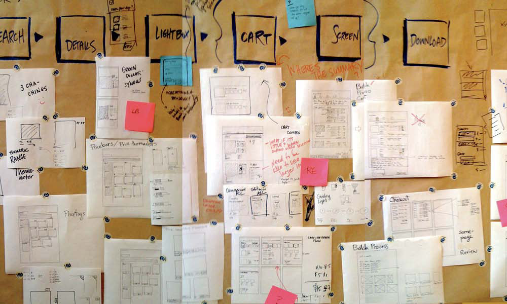
FIGURE 7.20
You can tell by the annotations and copious notes in between sketches that this sketchboard has been through a review session.
How will the experience unfold over time?
People don’t experience digital products page-by-page or screen-by-screen. They pop in the back door, jump erratically from one part to another, break your forms, and trick your logic. A task flow gets you thinking about how people really use your product. What are the most likely scenarios and sequences that users will follow? And what are some potential side doors that they may use to end up in the same place? Often, the user experience breaks down most at the “moments in between,” when someone moves from one step or screen to another (no matter how carefully each step has been designed). A task flow helps you design an experience that flows smoothly even through the transition points.
You can make a task flow in any software program that’s good for diagramming. (Any of the programs described under the “Wireframes” method in this chapter will work.) Or you can simply draw it out on paper, as shown here in Figure 7.21. In fact, if you don’t have a lot of time, paper and pen may be preferable because they enable you to add additional details easily without needing to “design” the flow document, which can be its own task.

FIGURE 7.21
A low-fidelity task flow.
1–2 hours to think through and document a specific task flow.
You need a complete picture of how the broader user experience hangs together for yourself and for your team.
1. Figure out your starting point.
You can do this in a top-down fashion or bottom-up.
• When you’re thinking top-down, ask yourself what should a user encounter first? What is the starting point? What are the major parts of the product? What comes first, and then what might happen as the user works his way deeper into the product?
• In the bottom-up approach, start with the most interesting steps in the process, or moments of truth, and ask yourself what comes before and after them? “Moments of truth” are the points in your product that represent key destinations or transition points for your users. They’re the reason they’re here. For example, the purchase and confirmation screens on an ecommerce site might be a moment of truth. Or the wall or activity feed on a social network site would be a moment of truth.
• Another alternative is to focus on scenario-based sketching, which is a bit of a blend of the top-down and bottom-up approaches. Rather than just focusing on the top layer or the interesting moments, explore how users might start at the top and eventually work their way to the interesting moments.
• Pick your approach, and then draw or depict the initial screen or step as a small, thumbnail-sized representation. (You don’t need to show the entire screen, but giving just enough detail to convey the essence of the screen will make it easier to recognize it in your task flow.)
2. Consider what comes next (or prior).
After you’ve picked your starting point, think about how your users would get to that point, and where they would go next. Repeat this process, either working your way from start to finish, or spreading out from the central moment you began with until you hit a reasonable start and end point.
3. Think about alternate entries and exits.
For each step in the flow ask yourself, is there another way that someone could get here? Or is there somewhere else they’re like to go from here (not necessarily the next step in the flow)? Also, consider what should happen if people abandon at this point. If they come back later, what should they see? Similarly, if they come back on a different device or computer, what should they see?
4. Add annotations.
Once you’ve captured all the key steps or screens for a particular task flow, go back through and add notes for how transitions should take place, or other important points to capture that are not selfevident from simply looking at the task flow.
• Keep it lightweight. To go even more lightweight, use Post-it notes on large paper to plot out your task flow. Each Post-it note represents one screen. Lay them out on the large sheet of paper to figure out their relationship to each other and draw connector lines, annotations, etc. directly on the paper. If the flow changes, simply rearrange or redraw the Post-it notes. (Thanks to UX designer James Goldsworthy for this tip.)
• Don’t boil the ocean. Instead of trying to create a massive task flow that encompasses an entire system, create discrete flows that focus on core scenarios. It’s less daunting, easier to think through, and can help you focus on getting distinct threads of the experience as tight and fluid as possible. Afterward, you can go back through and think about how individual task flows connect to each other.
• Use as a starting point for a clickable prototype. This can also be a useful first step in determining what screens to include in a prototype and when interactivity should occur.
• Think multichannel. If you find yourself working on a task flow that switches channels or has non-digital components, consider creating an experience blueprint like the one shown in Figure 7.22 instead. Experience blueprints come from the field of service design, but they serve a function that is similar to a task flow—envisioning how an experience unfolds over time. To learn more about experience blueprints or service design more generally, check out the book Service Design, by Andy Polaine, Lavrans Løvlie and Ben Reason ( Rosenfeldmedia.com).
• If you work remotely... Task flows are easy to put together wherever you are and may in fact benefit from the focused thinking time that being remote sometimes provides. However, your colleagues will be a useful resource for you in helping think about the edge cases and alternate paths that users sometimes take. (Engineers are especially good at thinking through this sort of thing.) So also set up some time for a phone call or remote review to talk through what you have so far and get your team’s thoughts and feedback. If you’re comfortable sketching or assembling a task flow on the fly, you could also do this as a remote facilitated activity, using screen sharing software.

FIGURE 7.22
This service blueprint from Brandon Schauer of Adaptive Path conveys the steps that a user moves through, key touchpoints that they interact with, and supporting processes that happen “behind the scenes.”
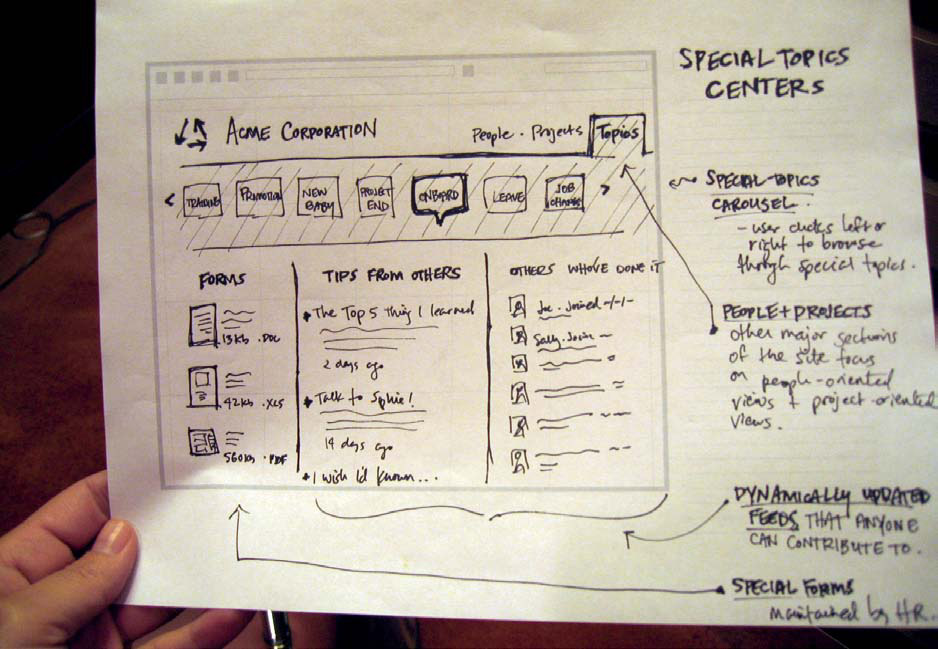
How will the product look and function in detail?
Wireframes are the meat and potatoes of user experience design. Many of the methods leading up to this point have all been geared toward enabling you to create smart, appropriate, relevant designs right here. A wireframe is a skeletal depiction of what a product should look like (see Figure 7.23). If that sounds simple, let’s not forget that a skeleton has an awful lot of bones. Like a skeleton, wireframes show you how the whole system hangs together to create a complete, interconnected structure that stands together as a whole.

FIGURE 7.23
An example of a finished wireframe.
Wireframes are typically black-and-white schematics or renderings of all the pieces and parts of the product or service. In a digital product, they depict the parts of the product screen-by-screen. In a service, they may illustrate touch points that customers have with the service (be they digital, paper, or human). Wireframes are (usually) black and white because they’re focused on just the basics: What is the information that should appear on a screen? How should it be laid out? What details appear there? What navigation is available (if this is a digital product) to help someone move from one part of the product to another? Wireframes gives some sense of how all the information and details relate to one another: How do you get from one step to the next, and what is the appropriate hierarchy of information?
In addition to black-and-white diagrams, wireframes usually include notes or annotations about how the product should behave. For example, what should happen when you press on a particular button? How should interactive elements change, given certain conditions? Those notes make wireframes an interesting bridge between a design document and technical specifications. Wireframes can often simply be handed over to engineers for implementation.
Hours, days, or weeks, depending on the scope of the system. When working on a digital product, a good rule of thumb is each screen takes 2–4 hours on average.
You’re ready to really nail down the details of the product design.
1. Pick your tool.
Start by deciding how you will create your wireframes. Usually, this means selecting a software program. For wireframes, pretty much any program that enables you to draw shapes will work. But there are some programs that are favorites for user experience professionals. Most of them feature easy drawing tools that allow you to easily approximate user interface elements in your diagrams. Many of these programs also feature libraries of standard user interface elements, so you can assemble your wireframes by simply dragging and dropping elements onto the page. Table 7.1 shows some of the most popular programs for wireframing.
Software |
Description |
Strengths |
Weaknesses |
Adobe Illustrator, Fireworks, Photoshop, or InDesign (otherwise known as the Adobe Creative Suite) |
The ultimate suite of creative tools, these products can be used to render high-quality designs, photorealistic art, and pretty much anything in between. Their drawing tools make it easy to create and stylize basic shapes, which means it’s a snap to render common interface elements or design interesting new ones. |
Highly interoperable. Can start a document in Illustrator for basic layout and then take it into Fireworks to create a clickable prototype, or take it into Photoshop to create high-fidelity, visual design comps. |
Expensive. Can be daunting to learn. |
Balsamiq or Axure |
These are listed together because they’re both the young upstarts in the wireframing software market, rapidly gaining popularity and giving old dogs like the Adobe Creative Suite a run for its money. Both let you assemble informal looking wireframes using built-in user interface element libraries. |
Wireframes can be turned into interactive clickable prototypes. It’s easy to give the wireframes a sketchy, hand-drawn appearance, which lends an “in progress” feel that encourages feedback on the right things (for example, the overall information layout and hierarchy, rather than the color of a button). |
Axure is relatively expensive. (Balsamiq, on the other hand, is quite inexpensive.) |
PowerPoint or Keynote |
You might not think of these two ubiquitous presentation programs as wireframing tools, but both have robust drawing and animation capabilities that make them surprisingly useful for quickly rendering a wireframe and then turning it into a clickable prototype. |
Since most people already have at least one of these programs installed on their computer, the barrier to entry is next to nil. Public user interface element libraries (including mobile UI elements) are available for Keynote and PowerPoint at Keynotopia.com. |
Can be harder to achieve a refined look and feel. |
Omnigraffle |
An inexpensive drawing and diagramming tool for the Mac. Omnigraffle comes with preinstalled user interface elements, referred to as stencils. Beyond the stencils that come pre-installed with the software, additional Omnigraffle stencils are freely available. |
Easy to learn. |
Mac only; difficult to export to PCs. |
Visio |
A Microsoft product for creating diagrams, schematics, and drawings. Visio also comes preinstalled with standard interface elements. |
Integrates well with the MS Office Suite. |
Preinstalled interface elements tend to look like, well, Microsoft UI elements. |
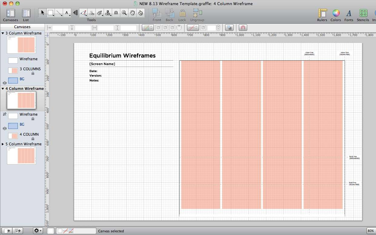
2. Create a template.
Once you’ve chosen your tool, your impulse may be to jump right into designing screens. Consider taking a moment first to lay out a template for your wireframes like the one in Figure 7.24—one that takes into account the device or form factor you are designing for. For example, are you designing for an iPhone?
FIGURE 7.24
This is a wireframe template being created in Omnigraffle. On the left side of the template is room for annotations. On the right is room for the wireframe. the orange boxes represent a four-column grid.
A 1024 × 768 Web page? An 8.5 × 11 printed page? Create a template that represents the aspect ratio and proportional measurements of the area that you are designing for. You may need to scale down your measurements a bit to fit on the canvas of the software you are using. On your template, include a spot for a name to identify the page, screen, or design exploration. Also add a spot for notes or annotations.
3. Create a wireframe inventory.
One final step before you start creating your wireframes: make a list of the wireframes that you think you’ll need to create and gather together any sketches that you’re planning to turn into wireframes. If there are any screens in your list that you don’t have ideas for yet, take the time to start sketching out the design before you start to create the digital wireframe. If you need to evolve any sketches further, do it on paper before you move into software. Once you go digital, it can be hard to separate the functional questions from the natural impulse to pretty up your wireframes, so try to have a basic plan before you get started. However, your wireframes don’t have to be a perfect copy of your sketches. In fact, it’s likely that you’ll go into more detail, and think more about subtle nuances of the design, as you work through the wireframes. Some things that work on paper don’t always work on screen, and that’s okay. That’s part of the process.
4. Get wireframing.
At last, you’re ready to start wireframing. Clear your calendar. Put on some good tunes. Pour yourself a nice cup of tea, and prepare to settle into the time-eclipsing flow of wireframing. As you work, rendering designs for each screen or part of the product, think about things like the following:
• Sequence and state: How will someone get here and where will they go from here? Does this step have multiple states, depending on which path the user takes to get there?
• Information density: What’s the main message or action from here? What should I notice first? Does that differ at all from what I am noticing first in the design that I’m creating?
• Grid: How clean, balanced, and orderly does the design feel?
• Design principles: Is this screen or piece of the product delivering on the experience expressed in that handful of statements that were created?
• Error messages and states: What does the user see when things don’t go exactly as planned?
Every once in a while, get up, take a walk, and then come back and try to see your wireframes with fresh eyes. When you do, ask yourself, how can I make it even simpler? Continue on this path until your wireframes are at a good stopping point to share with others.
5. Seek and listen to feedback.
Share your wireframes with the team (or even just anybody you can find). Get feedback on whether the designs make sense, if the flow matches how people would expect to move through or use the product, and if anything seems just plain funky. Ask people what they would expect to happen when interacting with certain parts of the design. Do their expectations match what you have planned? Accept this feedback for what it is—valuable and honest input that will help you make the user experience design even better.
• Show your work. Wireframing can be the most labor-intensive part of the process. This makes it an important but tricky piece of work for UX teams of one. How do you ensure that you are doing great design work but not spending all day, every day, pushing pixels around the screen? Taking time up front to do sketching and sketchboarding should help you balance the amount of time you spend working with others with the amount of time working on your own. Whatever you do, make sure that you don’t get too far along in the wireframing process before showing your work to other people. Never go too far down the rabbit hole of ideas without having some basic conversations with your colleagues to see if what you’re thinking is really viable. For a UX team of one, checking in and showing your work opens up the black box of design and helps your colleagues develop an understanding of the user-centered design process.
• Give it a grid. Within the wireframe template, consider adding a faint grid. Working with a grid gives you guides to create consistent, balanced, clean designs. A popular grid is 12 × 12, because it gives you the ability to subdivide designs and columns of 3 or 4 equally. However, different grid structures may be recommended for different types of devices. Pick up a good book on grid systems to learn more, such as Making and Breaking the Grid, by Timothy Samara (www.amazon.com/dp/1592531253/).
• Think about tool compatibility. As you are selecting your wireframing tool, think a bit about whom you’ll be sharing these documents with and how editable they’ll need to be. This may influence your choice of tool. If you are going to be handing wireframes off to graphic designers, integrating well with Photoshop may be a priority (which would argue for one of the Adobe products). If it’s okay to just PDF the wireframes and send them around, pretty much any tool will work. But if you’ll need to share ownership of the wireframes with other people and you’re the only Mac user while everyone else is on a PC, you may want a tool that “plays nice” with the PC (for example, not Omnigraffle).
• Consider novel techniques. Design collage is a method that is similar to wireframing but approaches things from a more inclusive and less technical angle. In design collage, rather than design a screen from scratch, you literally collage a screen together from common interface elements (see Figure 7.25). For example, print out sample widgets from sites or products that you like (or pattern libraries can also be a good source) and then, with scissors, blank paper, and tape, begin to piece together a design that seems to have the right kinds of elements. You may need to modify some widgets by sketching over them. You may also need to make some new ones. The basic idea is to use found inspiration as your starting point—a great way to circumvent the daunting feeling of starting with a blank page. For teams of one, design collage can also be a fun group exercise, if you want to bring non-UX folks into the wireframe process through an inviting, inclusive activity.
FIGURE 7.25
A Web page that has been assembled through design collage. The next step would be to turn this into a wireframe.
• If you work remotely... Design can be a tricky part of the process for remote workers. Some points require total heads-down focus (great for being remote). However, some points require quick iterations, lots of subtle feedback, and an astute reading of body language to understand how people really feel about it (better in person). There’s also a lot of talking and explaining that happens during this time, and doing it over the phone is definitely harder than doing it in person. There’s often a point somewhere about halfway through the design work ... when things finally seem to be taking shape and—surprise!—suddenly it all seems to go off the rails, and your colleagues start to express big concerns about the design direction. This is when it can be most difficult to be far from the rest of the team.
Often, this moment coincides with the point at which designs have moved out of the comfortably ambiguous sketching phase and are starting to take a definite (and definitely digital) form. It may be that finally seeing something definitive and tangible causes people to get worried about all the things that aren’t right yet. Fearing that they’re being locked into a direction that’s not all there yet, people sometimes freak out. I call this the design triage period. This is definitely a time to be with your team in a high-touch, face-to-face way, if you can. If possible, plan ahead and expect that there will be a design triage during the wireframe period, and expect to be onsite and in person with your team for a few days in the middle of it.