The Spoonflower printers can produce millions of colors, and there is no limit to the number of colors you can use in any single design.
LEARN ABOUT COLOR
At Spoonflower, we get a lot of questions. But the most common one is this: “How do I get the colors I see on my monitor to match the colors on my printed fabric or paper?” A color should just be a color, right? Well, the answer isn’t quite so simple.
On a screen, color is made from light. But when you print it out using ink or dye, the color is made from pigments. The color of the fabric or paper—and even the color of the light in the room—can influence what the color looks like to the eye.
Every device—a monitor, printer, scanner, camera, and even a .jpg file itself—has a set of colors that it can work with, called the color gamut. It’s like a crayon box. Your monitor might have the 64-color box; your printer might have the 24-color box. Each time you ask it to show a color, it pulls out a crayon from its box.
Of course, computers don’t name colors “Cornflower Blue” or “Yellow Orange” like crayon manufacturers. Instead, they label them with numbers. There are different ways to number or describe colors; these are called color modes, and you might recognize some of the abbreviations, like RGB, CMYK, LAB, or HSB.
The Spoonflower printers can produce millions of colors, and there is no limit to the number of colors you can use in any single design.
Each of the color modes uses its own system or language to describe a color. For example, RGB gives values for the amount of red, green, and blue light that make up a color. CMYK refers to the percentage of cyan, magenta, yellow, and key (black) used to build a color. HSB refers to hue, saturation, and brightness. LAB defines a color by the lightness (the “L” stands for light) and its position on an A and B axis of red-green and blue-yellow (that’s the “A” and “B”).
Whenever you are working in a program that lets you pick colors (such as Adobe Photoshop, Microsoft Word, or one of the free design programs available), you’ll be presented with a palette (a panel of functions) with color options. For example, you can look at the Color Picker tool in Photoshop (see Figure 1) and see how it displays each of the different color modes.
Color Profiles
The color gamut from your device (the “crayon box” of colors you have available) and the color mode (the way of describing those colors) create what is called a color space for that particular piece of equipment. Since your monitor and the Spoonflower printer don’t have the same color space, they need to have a way to communicate with one other. So, there is a translator (a set of rules) between the two called a color profile. It works something like this: “If I ask for Cornflower Blue and the printer doesn’t have that color in the box, then use Sky Blue instead.” Color profiles also take into account the ways of producing colors you have (i.e., pigments or dyes), and the kind of paper or fabric you are printing on.
There are lots of ways to write these rules for translating colors between devices. Manufacturers of digital cameras and photo printers build in color profiles that emphasize contrast (the difference between dark and light) and saturation (the intensity) of your colors overall, because that is very visually appealing (in other words, it makes your photos look better). Spoonflower uses a set of rules based on relative rendering, which changes as little as possible about your file, adjusting only the colors in your gamut that aren’t available in Spoonflower’s printers and leaving the rest of the colors as they are. This ensures that photographs and surface designs print as accurately as possible each time you order, and that colors will stay consistent when printing on the same fabric. All of these adjustments happen automatically when you upload your file; you don’t need to do anything.
FIGURE 1 This pretty light blue-green can be described in each color mode: RGB (R138 G199 B198) or its “shorthand” hexadecimal code #8ac7c6; LAB (75 -30 -9); and so on.
We haven’t forgotten about the original question, “How do I get the colors I see on my monitor to match the colors on my printed fabric or paper?” Here are two solutions.
FIRST, THE TECHNICAL SOLUTION, EXPLAINED AS SIMPLY AS WE CAN:
You can calibrate your monitor to show specific colors as accurately as possible. Using a tool called a colorimeter and some special software (which comes with the tool when you buy it), you can test your monitor and fine-tune it to be able to accurately show you specific colors. Once it is calibrated, you can then create a “soft proof” on your screen by downloading a color profile or set of rules for the printer you are going to use. When you turn on that color profile in a graphics software program like Photoshop, the software makes a mock-up of what the printed file will look like on the chosen printing surface when the printer has applied its color translation rules. It’s a complicated process, but essentially the software and color profile work together to show you a preview that is set exactly for the combination of printer, monitor, and surface you are working on.
NOW, FOR THE EASY SOLUTION:
Make a proof. The best way to see if you like the way the colors look is to order a swatch from Spoonflower and take a look. If that seems a little too unscientific, we have some tools to help.
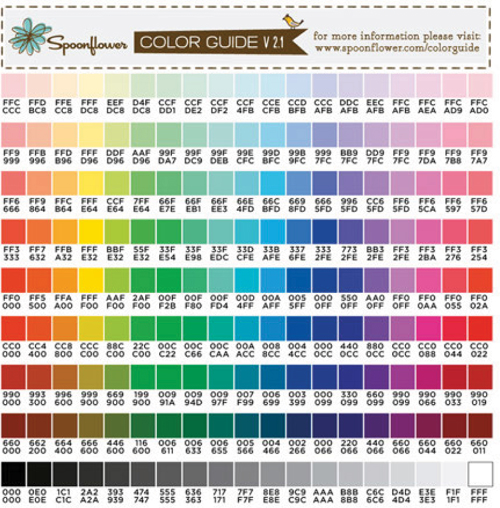
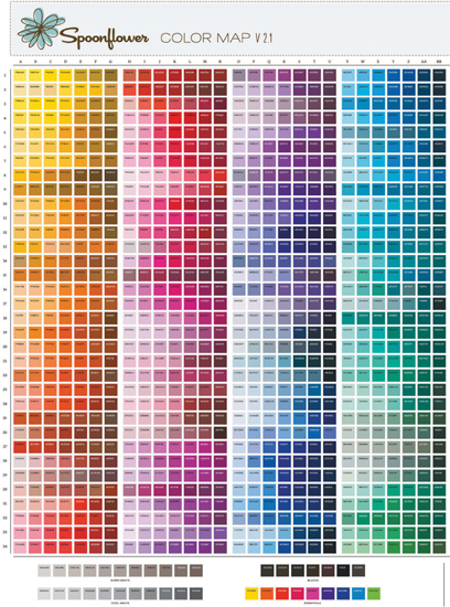
FIGURE 2 Our Color Guide features a selection of 171 colors chosen from our more extensive Color Map, which has more than 1,400 colors (this page).
Spoonflower has created two different color resources, one more basic than the other. Our Color Guide (Figure 2) is a chart to help show colors as they actually print. It is an 8 × 8 inch (20 × 20 cm) swatch of Kona® Cotton with 171 color chips, along with their RGB hexadecimal (hex) codes. (For best results with our printers, we recommend using the RGB color mode throughout your design process, but we can also work with CMYK and LAB color modes.) The colors on it were carefully chosen because they print very close to what you see on many monitors. The codes can also be used in conjunction with a design program and with our Change Colors tool (this page) to choose reliable color for your surfaces.
The Color Map (this page) shows a much larger number of samples, with more than 1,400 color chips all marked with their hex codes. You can order the Color Map printed on 1 yard (.9 m) of any of our fabrics or 4 feet (122 cm) of wallpaper, and it will show you exactly what the colors look like when printed on the surface of your choice. You can find these tools at: www.spoonflower.com/colorguide.
The COLOR MAP is a more advanced color tool than the Color Guide on this page. Although the Color Map does not display all the colors that can be printed by the Spoonflower printers, it is a representative selection.
There are several ways you can use the Color Map:
MATCHING COLORS. The Color Map can help you coordinate your design to another object. Imagine you are making curtains for your bedroom. Compare the color chips on the Map to your bedspread or the paint color on the wall to find a color that matches. When you make a new fabric design and type in the hex code to set the color, you will know exactly what to expect.
CHOOSING COORDINATING COLORS. When deciding on a colorway—a collection of colors—for your design, choose a set of colors from the Color Map to jump-start the process. Then try the colors in your design. This is also a great resource to help when designing a collection of coordinating prints. If you use the same color code in different designs, you know the colors will match.
REVISING COLORS. Use the Color Map to help you revise colors in your design. If when you look at a test swatch you think a color in your design should be lighter or darker, find the original color chip on the Map and use that as a reference to help you choose the new color.
Using the Color Codes with Spoonflower’s Color Map
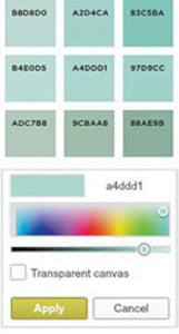
Every graphics program will have a way for you to choose colors from a set of swatches or slider controls, or provide a place to type in a code for the color you want—a color palette. (See each of these in Figure 3.) To use the Spoonflower Color Map in conjunction with these tools, you just need to find the color you want on the Map and then type the 6-digit hex code (a4ddd1 at right) into the Color Palette tool in your design program. No matter how it shows up on your monitor, you will know exactly what it will look like when you print it out.
While it can be as simple as finding the color you like the best, colors are influenced by the qualities of the surface you print them on and how they relate to one another. So it’s always a good idea to order a swatch to proof and confirm you like the color before you dive in to a large project, especially if you don’t have the Color Map printed on the surface of your choice.
FIGURE 3 The color palette in your graphics program allows you to identify color by hex code or to choose colors from swatches or sliders.
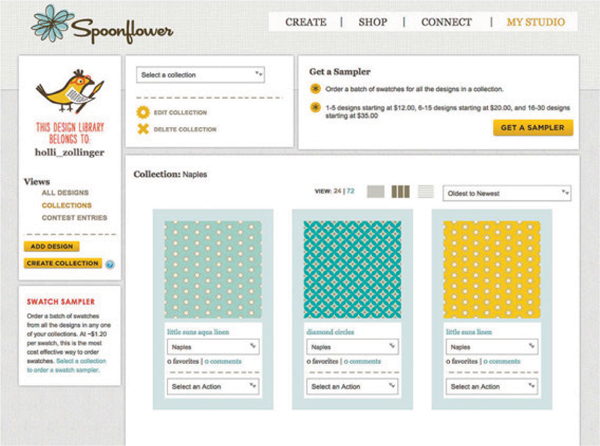
Using Spoonflower’s Collection Sampler
Spoonflower has a built-in feature to help you manage color and design decisions (Figure 4). If you are contemplating several colorways for a particular design (or several different designs), you can upload up to thirty variations and put them together into a Collection, then order a Sampler of all the designs printed together on one piece of fabric. To do this, go to your Design Library. Under “Views,” select “All Designs.” Click “Create a Collection,” then give the new Collection a name and a description. Click “Create.” Add designs to the Collection from the drop-down menu under each design’s name.
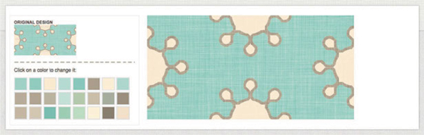
Using Spoonflower’s Change Colors Tool
Spoonflower has a simple color manipulation feature built into the site called the Change Colors tool (Figure 5) that corresponds to the colors on the Color Guide (this page). You can use it to switch colors in any design you have uploaded to Spoonflower, and you can keep both the new version of your design and the original.
First, the tool translates or simplifies the colors in your original and then displays a palette of color chips (up to twenty-four colors) that represent the colors in your design. It’s easy to use—simply click on the color you want to change, then click on the new color you want. The tool swaps out the new color for the old one every place it is present in the design.
The Change Colors tool can also help you create a colorway (a set of colors that make up your design) or develop additional colorways for an established design.
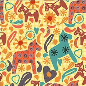
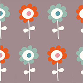
Fabric designers often create multiple colorways to experiment with color and contrast, and to explore how colors interact with one another. Here are examples from two Spoonflower designers.
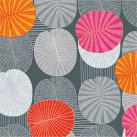
HOLLI ZOLLINGER (holli_zollinger), Diamond Circles in light and aqua colorways
Knowing how to put colors together and create surprising, striking, or pleasing combinations comes easily for some; for others, it takes practice and study. We asked one of Spoonflower’s most popular designers, Kristi Holmes of Queensland, Australia, to tell us about her approach to color. Her textile designs often feature color palettes that are inspired by nature. Kristi is known as kristopherk on our site.
SPOONFLOWER: What role does color play in your work?
KRISTOPHERK: Color is a primary focus in all my design decisions. The physiology of color and our emotional response to color has always been a fascinating field of study for me. For example, have you ever asked yourself why food is often wrapped in red or yellow? It’s probably no coincidence that the color red has been shown to increase your appetite and raise your pulse! Color influences our physiological state; it can help to excite, inspire, empower, warn, comfort, calm, or many other things.
SPOONFLOWER: What is your starting point for picking your colors?
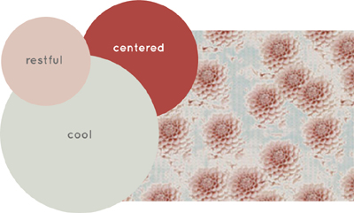
KRISTOPHERK: I am drawn to monochromatic and analogous color schemes, using color palettes that connect me to the earth. These are colors that could be described as balanced, calming, peaceful, quiet, tranquil, and untroubled: color palettes designed not for eliciting a violently emotional response, but for grounding one in nature, in comfort, and in peace. It’s colors like oatmeal, snow, toffee, cream, clay, charcoal, and smoke. Organic colors that work wonderfully together to create a calming and relaxing environment. The designs Winter Meadow and Daisy Wash (see below) are good examples of that.
Sometimes I start a new collection with nothing more than a series of words—or a bubble map—to describe my emotional objective within the design. I will then select a series of colors to represent (replace) the words.
If you try this, remember that the balance and placement of each word/color within a design is vital; the mood in the bubble map will change when the dominance of each word/color changes.
My Winter Meadow and Daisy Wash designs reflect my preference for calming, peaceful color combinations.
SPOONFLOWER: How do you achieve color balance?
KRISTOPHERK: Often I squint my eyes (to ensure my vision is out of focus) to see if any colors or design elements “jump” out at me. Working this way helps to ensure that I have balance and harmony within each new design.
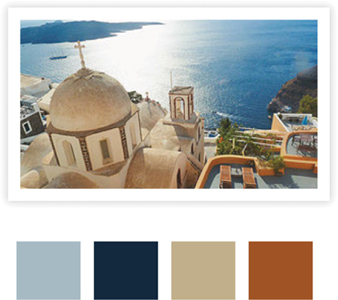
Another approach I like to take is to look directly to nature. Inspiration from the natural world is all around us. I like to document inspiring palettes whenever I can, simply by taking a photo to reference later on, or by recording the colors in a journal.
SPOONFLOWER: Any color tips for beginners?
KRISTOPHERK: Study the juxtaposition of colors in nature, at various times throughout the day.
For example, aqua-green leaves against a bold blue sky look quite different when viewed in the early morning light against a pale gray mist. You can see this in art: The series of artworks by Claude Monet featuring haystacks in the French countryside illustrates beautifully how changing light throughout the day changes colors—and in turn, influences our emotional response to the work.
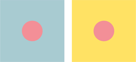
One simple tip to remember is colors change not only with light, but also in relation to other colors around them. For example, the orange dots in the squares below are the same color, but they appear different depending on whether the square is aqua or yellow.
When selecting color palettes for designs and collections, remember not to select colors in isolation.
Your colors need to work together to achieve the feeling you’re going for in the overall design. So, even what appears to be a simple color scheme of primary red and white can produce a different emotional response when it’s a slightly warmer tone versus a slightly cooler tone.
And finally, a great place to start learning about color theory is a color wheel that outlines primary, secondary, and tertiary colors, warm colors versus cool colors, together with an explanation of different color schemes (such as monochromatic, analogous, and complementary).
These two orange dots are the exact same color but appear different when placed in different colored squares.
SPOONFLOWER DESIGNERS TALK ABOUT COLOR
I work in a variety of ways when deciding on colors, but rarely make my choices before I have designed. All my ideas and patterns are drawn in black and then scanned in and manipulated in Photoshop in this way. When I am happy with my work, I then take a step back and think about the theme and what feeling I want to convey with the colors I choose. Then I begin to make decisions.
—LINDSAY BUCK (slumbermonkey)
I collect nice color combinations when I see them on the street, in books, nature, and everywhere around me. It’s like being a “creative sponge.” I try to remember what I see or take a picture. When designing, I often have one color in mind (with this design it was a warm grey) as a starting point. Designing digitally gives me a lot of freedom to play and change colors ‘til it just feels right: I love that!
—DEBORAH VAN DE LEIJGRAAF (bora)
My approach to color is simple: Let each color shine! I love pairing bold colors with neutral backgrounds for a fresh, contemporary feel. While my choices for color are mostly intuitive, I maintain a faithful relationship with what I call my “toolbox.” This is an invaluable resource of colors, artwork, and photographs I’ve collected from all of my digital wanderings. Also, I’ve spent countless valuable hours devouring websites like Kuler and Colourlovers to discover and create new and innovative color combinations. Pairing this practice with an understanding of color theory and trending can help you create stronger designs.
—HOLLI ZOLLINGER (holli_zollinger)
My approach to color has never been scientific. I mostly rely on my instinct and past experience. Even though you may not have experience, you can find color inspiration everywhere. We see color combinations, as well as patterns, in everyday life. Carry a camera for when you come across beautiful or striking imagery. Note how color is used in advertising and merchandise packaging when thumbing through magazines or walking through a store. Visit art museums or artists’ sites online. It helps in developing an eye for effective color combinations.
—MARIA FAITH GARCIA (mariafaithgarcia)
For a person who probably feels most comfortable wearing black and/or grey, it’s funny to think that I actually love a lot of color in my textile designs. I gravitate towards designing with an even balance of cold and warm tones together. I like fresh, saturated, lively colors and tend to cringe at sad, drab tones that feel like they were left to languish in someone’s attic.
—SAMARRA KHAJA (sammyk)
I take palette inspiration from everything. Vintage clothing, magazine pages, and flowers are my main sources, but I also get inspired by random visual moments in my life. For instance, sometimes I’m walking down the street and I see a pretty color combination formed by a hanging basket against a building wall. Once I see something inspirational, no matter how small or random it is, I log it in my brain for future use. I’m always keeping my designing eyes open, and my photographic memory is my most useful tool!
—GRACE NOEL (graceful)
I find combining colors a little challenging. I always start with a single color and then add more one by one. Often I stop with just two or three colors because I’m content with the result. Lately I’ve been paying attention to the palettes of everyday life, such as the colors I see on old stamps, a row of books on a shelf, or piles of fruit in the grocery store. I also like to pair colors that feel dissonant, or don’t exactly match. I recently crocheted a series of hats using three colors each and this was my formula: one bright color, one clashing medium hue, and one natural color. They came out really nice, so now I may try mixes like these on Spoonflower.
—ANDA CORRIE (anda)
Every designer has colors that they revisit and reuse. Think about the colors you enjoy having around you, and let your work be a natural expression of your own personal taste. So, I very much enjoy a tonal gray palette livened up with hot saturated colors, like red/orange/yellow/pink. I revisit this combination often because it pleases me! One tip I have for beginners: Try not to throw everything in. Overcomplicated color schemes can easily look muddy and dull. Keep it simple for sharp, striking, or subtle results.
—ALEX MORGAN (spellstone)
Picking colors does not come naturally to me; I never go with my first instinct. I always have a lot of designs drawn, just waiting for the right colors. When I see a color combination somewhere, in a picture or in something on the street, that I think fits with a design, I try it. For fabrics I design for other companies, I can’t use an endless number of colors—the maximum is about eight per design. It can be a sport to make a design work with fewer then eight. Sometimes I go to colourlovers.com to create palettes or be inspired.
—NANCY KERS (verycherry)