• • • •
Dimension reduction methods using principal components analysis (PCA) lead to visual ways of clustering things; but clustering methods have also been applied to understanding the genomics of human population structure. Jonathan Pritchard, Matthew Stephens, and Peter Donnell point out that there are two major approaches to clustering: distance-based and model-based methods. Distance-based methods first convert the raw DNA sequence data into distances (or similarities). Similarity is simply the flip side of distance, so the approaches to computing similarities are intimately connected to those used to compute distances. It doesn’t matter much which is used, but it is very important to be consistent and to know which one is being used when using coordinates or any distance/similarity approach.
One complication with using distances lies in the ways in which the raw data are manipulated into distances (or similarities). There are currently tens of ways in which such transformations can be made. And because not all are directly related or proportional to one another, significantly different results can be obtained depending on which distance transformation (similarity measure) is used. In all cases, though, once distances have been computed for all possible pairwise comparisons, some visual way of presenting them is selected. We have already discussed one way of displaying distances by using dendrograms, and we have pointed out the shortcomings of these tree-like figures as indicators of phylogeny. But dendrograms are a nonetheless a pretty good way to reduce dimensions and visualize distances, because a dendrogram produced from a distance matrix is easily inspected by eye for any suggestion of clustering.
A second approach to visualizing distances is principal coordinates analysis (PCoA), which proceeds in a manner broadly similar to PCA. Both approaches produce a two- or three-dimensional graph, with the items of interest appearing as points in the graph. The difference is that instead of using the raw data as in PCA, distances between the items of interest are computed. All pairwise distances among the items of interest in the analysis are used, and when genomic data is being used, those points of interest are genomes or individual people. Those distances are then projected onto a multidimensional space, and the PCoA analysis begins by placing the first item of interest at the origin of the space. The second item of interest is then placed on the second axis at its proper distance from the first point, the third item at its appropriate place along the third dimensional axis, and so on for as many dimensions as there are items to be analyzed. As in PCA, a dimension-reduction step is then necessary, and this is accomplished in the same way in both techniques. PCoA, also known as multidimensional scaling or nonmetric multidimensional scaling, is considered by many to be a preferable approach to clustering compared with PCA, and it is used extensively in ecological studies.
Distance-based approaches have the advantage of being visually appealing, probably because they oversimplify the complexity of the data. Since this can be done in various ways, the overall visual product is, as we have noted, highly contingent on the distance transformation and the way in which the graphical representation is implemented. Indeed, differences among methods may be so great that, as Pritchard and colleagues also point out, it is difficult to assess statistically how confident we can be concerning the clusters. In fact, these authors suggest that the distance-based approaches are best for simply exploring the data but not good at all for making statistical inferences. This is where model-based clustering approaches come in.
Model-based approaches to clustering start with the basic assumption that the clusters themselves are made up of observations that can be considered randomly drawn from a statistically definable distribution. The parameters of the actual clusters can then be inferred by implementing statistical methods that use descriptive models of those distributions. These statistical methods are taken from the likelihood and Bayesian approaches we discussed in chapter 3. Even though these model-based approaches take the statistical properties of the data into consideration, there remains the issue of visualizing complex data sets such as those presented by the human genome. And problems may arise when the analytical approach says one thing, while the visualization may be interpreted to say another. This is the case for a rather colorful model-based analytical approach called STRUCTURE.
STRUCTURE is a Bayesian approach developed by Pritchard and colleagues to handle the analysis of the burgeoning genome-level information becoming available for populations of organisms. Remember that Bayesian approaches do not directly search for answers or solutions, but rather seek to characterize and generate distributions from which probabilities can be calculated. STRUCTURE, then, seeks to generate a distribution of solutions for a likelihood model of population structure. Once that distribution is generated, statistical tests can be performed on various parameters of the model. One important set of parameters that can help characterize clusters concerns the frequencies of alleles or SNPs in particular populations. Another very important parameter is the number of populations in the model, its “population structure,” represented by the letter K. Once the statistics of these parameters are established, it is a simple matter to obtain a statistical statement about K, the number of clusters in the data set. Once the number and identity of the populations is known, each individual in the data set can be characterized by population. Other critical parameters of the model include allowing for admixture (interbreeding of populations) or not; and contrasting the results of these two opposite assumptions can give us a picture of the admixture of individuals in the populations. Such “assignment” can lead to simple inferences about the populations to which individuals belong.
For example, one individual might be assigned to a specific population X. Another individual might be assigned with a 100 percent probability to another population, Y. Since this is a statistical approach, a third individual might have a 0.3 probability of belonging to population X and a 0.7 probability of belonging to population Y. Graphical representations of these three individuals are given in figure 13.1. Since this step can be applied to each individual in the populations studied, and for all K clusters, the visual presentation of such analyses often uses shading and color extensively (see plates 11 through 13).
One problem with using structure is that it is clunky, and making inferences using this approach takes a lot of computer time. Hence David Alexander, John Novembre, and Kenneth Lange developed a fast algorithm that uses the likelihood model of STRUCTURE to make rapid estimates of K and the admixture of individuals in a data set. They call their approach ADMIXTURE, and its output looks pretty much identical to that of STRUCTURE (figure 13.1). And while speed of computation should never take primacy over accuracy in the choice of analytical tool, it does appear that ADMIXTURE does a pretty good job of rapidly analyzing high-density genome-level data.
Finally, some researchers have attempted to combine the distance-based approaches and the model-based approaches to make inferences about population structure. Specifically, Daniel Lawson and colleagues have created an algorithm called fineSTRUCTURE that attempts to focus on the information about population structure that is contained in how SNP variation is distributed along chromosomes. After all, the SNPs do come from specific regions of the chromosome, and including this information gives an analysis an added dimension. Specific patterns on chromosomes can be used as haplotypes that are viewed as coming from specified ancestors. The algorithm can then “paint” chromosomes with these ancestral haplotypes. Indeed, the process is called “chromosome painting,” and like STRUCTURE it gives a rather colorful summary of the data, as shown (in grayscale) in figure 13.2.

Figure 13.1 Bar plots for three individuals in a STRUCTURE analysis who have been assigned to two different populations (light shade is population X; dark shade is population Y).
The different chromosomal patterns can then be statistically dissected, and individuals can be compared to give what Lawson and colleagues call a “coancestry matrix.” The coancestry matrix can be used to accomplish PCA-like and STRUCTURE-like inferences. One of the shortcomings of STRUCTURE and ADMIXTURE analyses is that the estimation of K is most accurate when K < 10. fineSTRUCTURE, in contrast, can be used to dissect hundreds of clusters in high-density genomic data.
STRUCTURE has been cited in nearly twenty thousand publications since its first appearance in 2000. The ADMIXTURE algorithm has existed since 2009, and as of June 2017, it had been cited more than one thousand times. Many of these studies examined human population structure, and some have become notorious, because they were subsequently enlisted by people with political agendas as proof of genetic reality of race. So it is worthwhile to look at some of the more prominent among them here.
While the STRUCTURE algorithm was first used to examined a bird system (the Taita thrush), in their original paper in 2000, Pritchard and colleagues also examined human population structure. At that point in time, very limited whole-genome sequencing had been done on human populations, so the researchers used a small data set of thirty SNPs generated using the old-school method of restriction fragment length polymorphism (RFLP) that we described in chapter 7. The individuals in the study included 72 people of African ancestry and 90 of European ancestry. Pritchard and colleagues looked at the probabilities of K = 1 and K = 2, and determined that K = 2 was very significantly more probable than K = 1, indicating the existence of two distinct populations. But does the story finish there? Using the same approach, Pritchard and colleagues then showed that K = 3, K = 4, and K = 5 might all have higher probabilities than K = 2. And indeed, the second result appears to be a recurring theme in those studies where K is the focus of attention. That is, upon further examination, the Ks of various values are all shown to have probabilities close to the one with the highest probability. Another area of concern about this first study of human populations using STRUCTURE involves the rather paltry sample size and ascertainment of the genetic data used to do the analysis. All things considered, while some very specific interesting questions were addressed with this early data set, applying its results to understanding human population structure was something of a stretch.
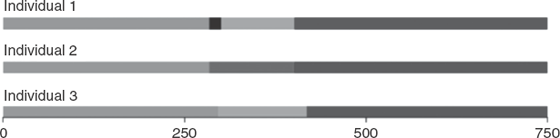
Figure 13.2 Chromosome painting showing three individuals whose chromosomes have been painted. The numbers at the bottom of the diagram indicate the chromosomal location of the painting. There are five different ancestral chromosomal “chunks” represented by different shades.
Two studies cited by the journalist Nicholas Wade in his 2015 book, A Troublesome Inheritance: Genes, Race and Human History, used the structure approach on more refined genomic information. The first of these was published in 2002 by Noah Rosenberg and several colleagues. They used 377 genetic markers, chosen to maximize the potential for discovering variability, on 1,056 individuals from 52 discrete populations. The results of their STRUCTURE analysis, shown in figure 13.3, led the authors to suggest that there are six human populations based on the statistics of the various K values examined.
Interestingly, five of the six populations coincide with geographic groupings of people, and this is what Wade focused on in his explanation of genetics and race. To shore up his thinking, Wade cited another paper by Rosenberg and colleagues (Ramachandran et al. 2005), in which they slightly reduced the sample size (down to 1,048 from 1,056) but tripled the number of genetic markers to 993. Not surprisingly (at least to us), the results were pretty much the same as with the 2002 data set, with K = 6 once again the statistically preferred value.
Figure 13.3 STRUCTURE analysis for K = 2 thru K = 6 from the Rosenberg et al. (2002) data set. K = 6 is statistically significantly better than all other Ks. Redrawn from Rosenberg et al. (2002). See plate 11.
These analyses led Wade to claim that five definable races of humans exist, a conclusion we will examine in detail in the next chapter. For now, we will just point out that the same sample size problem existed with the study published in 2005 by Rosenberg and colleagues as had marred their original study three years earlier. Merely piling on more loci that had been ascertained in the same way as the first 377 markers did not strengthen the inference at all. In a third study that has been cited as proof of six or seven “races” of humans, Junzhi Li and colleagues upped the ante of loci by several orders of magnitude in 2008. They examined over 600,000 SNPs (figure 13.4); and again, not surprisingly, they obtained K = 7 as the statistically preferred indicator of population structure.
Since 2008 many papers have been published using STRUCTURE, ADMIXTURE, and fineSTRUCTURE to address the burgeoning human whole-genome data of the last few years. It would be painfully redundant for us to go through all of them. Suffice it to say that the last five years have witnessed two major kinds of studies using these computer programs. The first are fine-grained studies that look at localized populations such Ashkenazi Jews, British people, Tibetan highlanders, and sub-Saharan Africans. The second category consists of studies that take a global look at all human population structure. Both kinds of study have had to deal with expanding sample sizes, rapidly enlarging upward from the 1,000 to 2,000 individuals in the 1000 Genomes Project and the HGDP. As you might imagine, computation times for these larger data sets has been a problem, and several tools have been developed to handle this issue. Prem Gopalan and coworkers call this “tera-sampling,” and have developed a tool called teraSTRUCTURE to handle the tera-data. In figure 13.5 we present results from their analysis of 1,718 people, at 1,854,622 SNPs. Note that, as the number of people included in the STRUCTURE analysis goes from 1,000 in 2008 to 1,700 in 2015, more and more of the solid colored blocks from the 2008 analysis start to bleed into colors from other blocks.
You can certainly look at the diagrams in figure 13.5 and see divisions; but to view them as indicators of “racial” separation is a bit of a leap. In addition, various studies over the past five years have shown that, as more people are added, K changes. Accordingly, Sarah Tishkoff and colleagues have shown that K leaped from 7 to 13 through the addition of a handful of African genomes (Bryc et al. 2010). Adding even more genomes will probably thoroughly bleach out many of the apparent divisions in human population structure.
Figure 13.4 Li and colleagues’ data set with 600,000 SNP loci and almost 1,000 human genomes. Only the statistically significant K = 7 is shown in this figure. Redrawn from Li et al. (2008). See plate 12.
Figure 13.5 teraSTRUCTURE analysis of the 1000 Genomes Project data set (also known as TGP). The data set has 1,718 genomes at 1,854,622 SNPs. The top diagram is for K = 7, the middle is for K = 8 and the bottom is for K = 9. Redrawn from Lawson et al. (2012). See plate 13.
Another problem with analyses like these, and a more serious one, is raised by John Novembre and Benjamin Peter’s statement about the visual appeal of these approaches. In their review of human population structure, these scientists cite an important caveat in the use of these tools in studying human population structure:
A final precaution, and one of broader societal relevance, is that a viewer can become misled about the depth of population structure when casually inspecting visualizations using methods such as PCA, ADMIXTURE, or fineSTRUCTURE. For example, untrained eyes may overinterpret population clusters in a PCA plot as a signature of deep, absolute levels of differentiation with relevance for phenotypic differentiation. (Novembre and Peter, 2016, p. 102).
This sage warning takes us back to J. C. Gower’s admonition that ‘‘the human mind distinguishes between different groups because there are correlated characters within the postulated groups’’ (Gower 1972, 11). It is to those correlated characters that we now turn.
The underlying correlation of data that Gower mentions evokes what A. W. F. Edwards called “Lewontin’s fallacy.” Recall that in the 1970s, based on genetic information, Richard Lewontin suggested that there is no hierarchy with respect to human populations. Indeed, he calculated that 85 percent of the variation in human genomes can be attributed to within-population variance, and only 15 percent to between-population variance. This between- and within-population variance pattern led Lewontin to state emphatically that between-population variance does not directly reflect separation of populations, or the strength of such separation.
Lewontin’s findings lead to the following question, as posed by Lynne Jorde and colleagues: “How often is a pair of individuals from one population genetically more dissimilar than two individuals chosen from two different populations?’’ (Witherspoon et al. 2007, 357). The answer, it turns out, depends on the number of loci (or SNPs) used. It can be as much as 30 percent for low numbers of loci and limited population sampling, but with large numbers of loci the percentage drops to zero. However, Jorde and colleagues also point out that as more and more people are added to the base populations, the percentage will not be zero. The number also depends on how the loci are ascertained and, specifically, on whether common or rare allele loci are used. Rare allele loci will result in high frequencies of between-population similarities compared with within-population similarities.
Lewontin’s observation of greater within-group variation is thus sustained. But what about Edwards’s claim that Lewontin’s conclusion ignores the correlation structure of data, and in so doing misses the fact that populations can be distinguished and delineated from one another using this underlying correlation structure? Well, modern phylogenetic systematics theory would not agree that a fallacy exists here. What Edwards is asking us to do is to ignore, or to “throw out,” some of the information in the overall data set. In fact, a great deal of it. Modern phylogenetic systematics would urge us to search for a signal not only in the information that has underlying correlation structure but in the rest of the data set as well. Using only the information with underlying correlation structure is more akin to “clique analysis” or “compatibility analysis” in systematics. Clique analysis uses correlated characters to strengthen phylogenetic hypotheses, but it has been shown to be an unsound approach when applied to basic phylogenetic reconstruction. We can, moreover, say the same thing for the visual STRUCTURE and PCA approaches, in which the visual discreteness of divisions becomes reduced as more and more data are added.
If the ontological constraints of systematic analysis imply that the underlying correlation structure can’t be used to extract systematic hierarchy or discreteness from human genomic data sets, what can it do for us? Well, context is everything here. Certainly, the underlying correlation structure is telling us something about ancestry. But whatever that may be, it is completely unlinked from our efforts to delineate the existence of populations within our species or to establish hierarchies of individuals. In the age of genomics, determining ancestry has become the identification of parts of the genome in two individuals that may be traced back to a common point in their histories. And while ancestry is a legitimate focus of studies using genome information about Homo sapiens on a large scale, such exploration of ancestry does not need to use phylogenetic trees, or clustering approaches. In fact, constructing trees and inferring clusters is downright illogical when the goal is to understand the ancestry of individual H. sapiens. A swivel toward ancestry, and away from hierarchy and clustering, would place the endeavor of human genome analysis on sounder philosophical grounds by eliminating the shaky assumption that predetermined population trees exist.


