
R has a very rich set of graphics facilities. The R home page (http://www.r-project.org/) has a few colorful examples, but to really appreciate R’s graphical power, browse through the R Graph Gallery at http://addictedtor.free.fr/graphiques.
In this chapter, we cover the basics of using R’s base, or traditional, graphics package. This will give you enough foundation to start working with graphics in R. If you’re interested in pursuing R graphics further, you may want to refer to the excellent books on the subject.[4]
To begin, we’ll look at the foundational function for creating graphs: plot(). Then we’ll explore how to build a graph, from adding lines and points to attaching a legend.
The plot() function forms the foundation for much of R’s base graphing operations, serving as the vehicle for producing many different kinds of graphs. As mentioned in Section 9.1.1, plot() is a generic function, or a placeholder for a family of functions. The function that is actually called depends on the class of the object on which it is called.
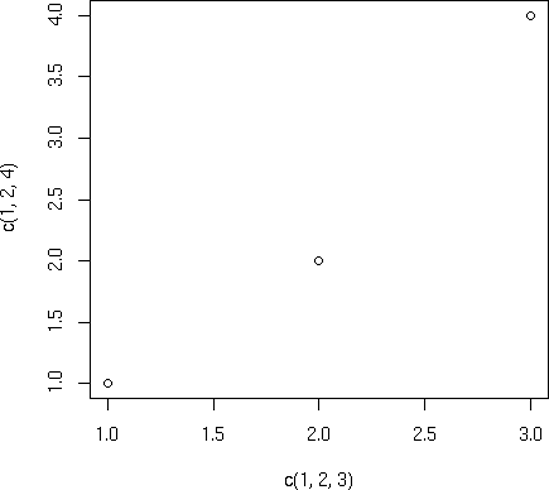
Let’s see what happens when we call plot() with an X vector and a Y vector, which are interpreted as a set of pairs in the (x,y) plane.
> plot(c(1,2,3), c(1,2,4))
This will cause a window to pop up, plotting the points (1,1), (2,2), and (3,4), as shown in Figure 12-1. As you can see, this is a very plain-Jane graph. We’ll discuss adding some of the fancy bells and whistles later in the chapter.
Note
The points in the graph in Figure 12-1 are denoted by empty circles. If you want to use a different character type, specify a value for the named argument pch (for point character).
The plot() function works in stages, which means you can build up a graph in stages by issuing a series of commands. For example, as a base, we might first draw an empty graph, with only axes, like this:
> plot(c(-3,3), c(-1,5), type = "n", xlab="x", ylab="y")
This draws axes labeled x and y. The horizontal (x) axis ranges from −3 to 3. The vertical (y) axis ranges from −1 to 5. The argument type="n" means that there is nothing in the graph itself.
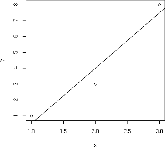
We now have an empty graph, ready for the next stage, which is adding a line:
> x <- c(1,2,3)
> y <- c(1,3,8)
> plot(x,y)
> lmout <- lm(y ˜ x)
> abline(lmout)
After the call to plot(), the graph will simply show the three points, along with the x- and y- axes with hash marks. The call to abline() then adds a line to the current graph. Now, which line is this?
As you learned in Section 1.5, the result of the call to the linear-regression function lm() is a class instance containing the slope and intercept of the fitted line, as well as various other quantities that don’t concern us here. We’ve assigned that class instance to lmout. The slope and intercept will now be in lmout$coefficients.
So, what happens when we call abline()? This function simply draws a straight line, with the function’s arguments treated as the intercept and slope of the line. For instance, the call abline(c(2,1)) draws this line on whatever graph you’ve built up so far:
| y = 2 + 1 . x |
But abline() is written to take special action if it is called on a regression object (though, surprisingly, it is not a generic function). Thus, it will pick up the slope and intercept it needs from lmout$coefficients and plot that line. It superimposes this line onto the current graph, the one that graphs the three points. In other words, the new graph will show both the points and the line, as in Figure 12-2.
You can add more lines using the lines() function. Though there are many options, the two basic arguments to lines() are a vector of x-values and a vector of y-values. These are interpreted as (x,y) pairs representing points to be added to the current graph, with lines connecting the points. For instance, if X and Y are the vectors (1.5,2.5) and (3,3), you could use this call to add a line from (1.5,3) to (2.5,3) to the present graph:
> lines(c(1.5,2.5),c(3,3))
If you want the lines to “connect the dots,” but don’t want the dots themselves, include type="l" in your call to lines() or to plot(), as follows:
> plot(x,y,type="l")
You can use the lty parameter in plot() to specify the type of line, such as solid or dashed. To see the types available and their codes, enter this command:
> help(par)
Each time you call plot(), directly or indirectly, the current graph window will be replaced by the new one. If you don’t want that to happen, use the command for your operating system:
On Linux systems, call
X11().On a Mac, call
macintosh().On Windows, call
windows().
For instance, suppose you wish to plot two histograms of vectors Xand Y and view them side by side. On a Linux system, you would type the following:
> hist(x)
> x11()
> hist(y)
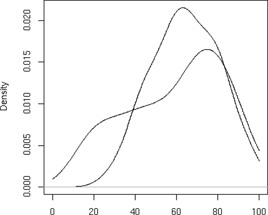
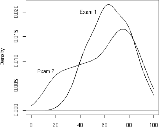
Let’s plot nonparametric density estimates (these are basically smoothed histograms) for two sets of examination scores in the same graph. We use the function density() to generate the estimates. Here are the commands we issue:
> d1 = density(testscores$Exam1,from=0,to=100)
> d2 = density(testscores$Exam2,from=0,to=100)
> plot(d1,main="",xlab="")
> lines(d2)
First, we compute nonparametric density estimates from the two variables, saving them in objects d1 and d2 for later use. We then call plot() to draw the curve for exam 1, at which point the plot looks like Figure 12-3. We then call lines() to add exam 2’s curve to the graph, producing Figure 12-4.
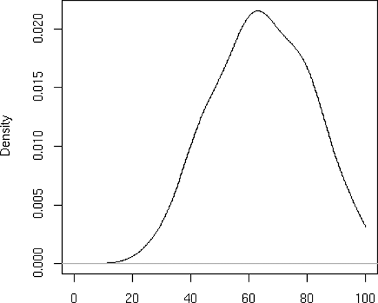
Note that we asked R to use blank labels for the figure as a whole and for the x-axis. Otherwise, R would have gotten such labels from d1, which would have been specific to exam 1.
Also note that we needed to plot exam 1 first. The scores there were less diverse, so the density estimate was narrower and taller. Had we plotted exam 2, with its shorter curve, first, exam 1’s curve would have been too tall for the plot window. Here, we first ran the two plots separately to see which was taller, but let’s consider a more general situation.
Say we wish to write a broadly usable function that will plot several density estimates on the same graph. For this, we would need to automate the process of determining which density estimate is tallest. To do so, we would use the fact that the estimated density values are contained in the y component of the return value from the call to density(). We would then call max() on each density estimate and use which.max() to determine which density estimate is the tallest.
The call to plot() both initiates the plot and draws the first curve. (Without specifying type="l", only the points would have been plotted.) The call to lines() then adds the second curve.
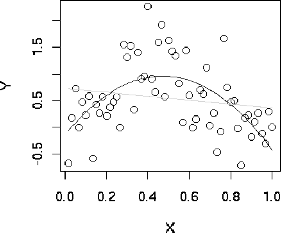
In Section 9.1.7, we defined a class "polyreg" that facilitates fitting polynomial regression models. Our code there included an implementation of the generic print() function. Let’s now add one for the generic plot() function:
1    # polyfit(x,maxdeg) fits all polynomials up to degree maxdeg; y is
2    # vector for response variable, x for predictor; creates an object of
3    # class "polyreg", consisting of outputs from the various regression
4    # models, plus the original data
5    polyfit <- function(y,x,maxdeg) {
6       pwrs <- powers(x,maxdeg)  # form powers of predictor variable
7       lmout <- list()  # start to build class
8       class(lmout) <- "polyreg"  # create a new class
9       for (i in 1:maxdeg) {
10          lmo <- lm(y ˜ pwrs[,1:i])
11          # extend the lm class here, with the cross-validated predictions
12          lmo$fitted.xvvalues <- lvoneout(y,pwrs[,1:i,drop=F])
13          lmout[[i]] <- lmo
14       }
15       lmout$x <- x
16       lmout$y <- y
17       return(lmout)
18    }
19
20    # generic print() for an object fits of class "polyreg":  print
21    # cross-validated mean-squared prediction errors
22    print.polyreg <- function(fits) {
23       maxdeg <- length(fits) - 2  # count lm() outputs only, not $x and $y
24       n <- length(fits$y)
25       tbl <- matrix(nrow=maxdeg,ncol=1)
26       cat("mean squared prediction errors, by degree\n")
27       colnames(tbl) <- "MSPE"
28       for (i in 1:maxdeg) {
29          fi <- fits[[i]]
30          errs <- fits$y - fi$fitted.xvvalues
31          spe <- sum(errs^2)
32          tbl[i,1] <- spe/n
33       }
34       print(tbl)
35    }
36
37    # generic plot(); plots fits against raw data
38    plot.polyreg <- function(fits) {
39       plot(fits$x,fits$y,xlab="X",ylab="Y")  # plot data points as background
40       maxdg <- length(fits) - 2
41       cols <- c("red","green","blue")
42       dg <- curvecount <- 1
43       while (dg < maxdg) {
44          prompt <- paste("RETURN for XV fit for degree",dg,"or type degree",
45             "or q for quit ")
46          rl <- readline(prompt)
47          dg <- if (rl == "") dg else if (rl != "q") as.integer(rl) else break
48          lines(fits$x,fits[[dg]]$fitted.values,col=cols[curvecount%%3 + 1])
49          dg <- dg + 1
50          curvecount <- curvecount + 1
51       }
52    }
53
54    # forms matrix of powers of the vector x, through degree dg
55    powers <- function(x,dg) {
56       pw <- matrix(x,nrow=length(x))
57       prod <- x
58       for (i in 2:dg) {
59          prod <- prod * x
60          pw <- cbind(pw,prod)
61       }
62       return(pw)
63    }
64
65    # finds cross-validated predicted values; could be made much faster via
66    # matrix-update methods
67    lvoneout <- function(y,xmat) {
68       n <- length(y)
69       predy <- vector(length=n)
70       for (i in 1:n) {
71          # regress, leaving out ith observation
72          lmo <- lm(y[-i] ˜ xmat[-i,])
73          betahat <- as.vector(lmo$coef)
74          # the 1 accommodates the constant term
75          predy[i] <- betahat %*% c(1,xmat[i,])
76       }
77       return(predy)
78    }
79
80    # polynomial function of x, coefficients cfs
81    poly <- function(x,cfs) {
82       val <- cfs[1]
83       prod <- 1
84       dg <- length(cfs) - 1
85       for (i in 1:dg) {
86          prod <- prod * x
87          val <- val + cfs[i+1] * prod
88       }
89    }
As noted, the only new code is plot.polyreg(). For convenience, the code is reproduced here:
# generic plot(); plots fits against raw data
plot.polyreg <- function(fits) {
   plot(fits$x,fits$y,xlab="X",ylab="Y")  # plot data points as background
   maxdg <- length(fits) - 2
   cols <- c("red","green","blue")
   dg <- curvecount <- 1
   while (dg < maxdg) {
      prompt <- paste("RETURN for XV fit for degree",dg,"or type degree",
         "or q for quit ")
      rl <- readline(prompt)
      dg <- if (rl == "") dg else if (rl != "q") as.integer(rl) else break
      lines(fits$x,fits[[dg]]$fitted.values,col=cols[curvecount%%3 + 1])
      dg <- dg + 1
      curvecount <- curvecount + 1
   }
}
As before, our implementation of the generic function takes the name of the class, which is plot.polyreg() here.
The while loop iterates through the various polynomial degrees. We cycle through three colors, by setting the vector cols; note the expression curvecount %%3 for this purpose.
The user can choose either to plot the next sequential degree or select a different one. The query, both user prompt and reading of the user’s reply, is done in this line:
rl <- readline(prompt)
We use the R string function paste() to assemble a prompt, offering the user a choice of plotting the next fitted polynomial, plotting one of a different degree, or quitting. The prompt appears in the interactive R window in which we issued the plot() call. For instance, after taking the default choice twice, the command window looks like this:
> plot(lmo)
RETURN for XV fit for degree 1 or type degree or q for quit
RETURN for XV fit for degree 2 or type degree or q for quit
RETURN for XV fit for degree 3 or type degree or q for quit
The plot window looks like Figure 12-5.
The points() function adds a set of (x,y) points, with labels for each, to the currently displayed graph. For instance, in our first example, suppose we entered this command:
points(testscores$Exam1,testscores$Exam3,pch="+")
The result would be to superimpose onto the current graph the points of the exam scores from that example, using plus signs (+) to mark them.
As with most of the other graphics functions, there are many options, such as point color and background color. For instance, if you want a yellow background, type this command:
> par(bg="yellow")
Now your graphs will have a yellow background, until you specify otherwise. As with other functions, to explore the myriad of options, type this:
> help(par)
The legend() function is used, not surprisingly, to add a legend to a multicurve graph. This could tell the viewer something like, “The green curve is for the men, and the red curve displays the data for the women.” Type the following to see some nice examples:
> example(legend)
Use the text() function to place some text anywhere in the current graph. Here’s an example:
text(2.5,4,"abc")
This writes the text “abc” at the point (2.5,4) in the graph. The center of the string, in this case “b,” would go at that point.
To see a more practical example, let’s add some labels to the curves in our exam scores graph, as follows:
> text(46.7,0.02,"Exam 1")
> text(12.3,0.008,"Exam 2")
The result is shown in Figure 12-6.
In order to get a certain string placed exactly where you want it, you may need to engage in some trial and error. Or you may find the locator() function to be a much quicker way to go, as detailed in the next section.
Placing text exactly where you wish can be tricky. You could repeatedly try different x- and y-coordinates until you find a good position, but the locator() function can save you a lot of trouble. You simply call the function and then click the mouse at the desired spot in the graph. The function returns the x- and y-coordinates of your click point. Specifically, typing the following will tell R that you will click in one place in the graph:
locator(1)
Once you click, R will tell you the exact coordinates of the point you clicked. Call locator(2) to get the locations of two places, and so on. (Warning: Make sure to include the argument.)
Here is a simple example:
> hist(c(12,5,13,25,16))
> locator(1)
$x
[1] 6.239237

$y
[1] 1.221038
This has R draw a histogram and then calls locator() with the argument 1, indicating we will click the mouse once. After the click, the function returns a list with components x and y, the x- and y-coordinates of the point where we clicked.
To use this information to place text, combine it with text():
> text(locator(1),"nv=75")
Here, text() was expecting an x-coordinate and a y-coordinate, specifying the point at which to draw the text “nv=75.” The return value of locator() supplied those coordinates.
R has no “undo” command. However, if you suspect you may need to undo your next step when building a graph, you can save it using recordPlot() and then later restore it with replayPlot().
Less formally but more conveniently, you can put all the commands you’re using to build up a graph in a file and then use source(), or cut and paste with the mouse, to execute them. If you change one command, you can redo the whole graph by sourcing or copying and pasting your file.
For our current graph, for instance, we could create file named examplot.R with the following contents:
d1 = density(testscores$Exam1,from=0,to=100)
d2 = density(testscores$Exam2,from=0,to=100)
plot(d1,main="",xlab="")
lines(d2)
text(46.7,0.02,"Exam 1")
text(12.3,0.008,"Exam 2")
If we decide that the label for exam 1 was a bit too far to the right, we can edit the file and then either do the copy-and-paste or execute the following:
> source("examplot.R")[4] These include Hadley Wickham, ggplot2: Elegant Graphics for Data Analysis (New York: Springer-Verlag, 2009); Dianne Cook and Deborah F. Swayne, Interactive and Dynamic Graphics for Data Analysis: With R and GGobi (New York: Springer-Verlag, 2007); Deepayan Sarkar, Lattice: Multivariate Data Visualization with R (New York: Springer-Verlag, 2008); and Paul Murrell, R Graphics (Boca Raton, FL: Chapman and Hall/CRC, 2011).