Chapter 3. Visualizing Data
I believe that visualization is one of the most powerful means of achieving personal goals.
Harvey Mackay
A fundamental part of the data scientist’s toolkit is data visualization. Although it is very easy to create visualizations, it’s much harder to produce good ones.
There are two primary uses for data visualization:
-
To explore data
-
To communicate data
In this chapter, we will concentrate on building the skills that you’ll need to start exploring your own data and to produce the visualizations we’ll be using throughout the rest of the book. Like most of our chapter topics, data visualization is a rich field of study that deserves its own book. Nonetheless, I’ll try to give you a sense of what makes for a good visualization and what doesn’t.
matplotlib
A wide variety of tools exist for visualizing data. We will be using the matplotlib library, which is widely used (although sort of showing its age). If you are interested in producing elaborate interactive visualizations for the web, it is likely not the right choice, but for simple bar charts, line charts, and scatterplots, it works pretty well.
As mentioned earlier, matplotlib is not part of the core Python library. With your virtual environment activated (to set one up, go back to “Virtual Environments” and follow the instructions), install it using this command:
python -m pip install matplotlib
We will be using the matplotlib.pyplot module. In its simplest use, pyplot maintains an internal state in which you build up a visualization step by step. Once you’re done, you can save it with savefig or display it with show.
For example, making simple plots (like Figure 3-1) is pretty simple:
frommatplotlibimportpyplotaspltyears=[1950,1960,1970,1980,1990,2000,2010]gdp=[300.2,543.3,1075.9,2862.5,5979.6,10289.7,14958.3]# create a line chart, years on x-axis, gdp on y-axisplt.plot(years,gdp,color='green',marker='o',linestyle='solid')# add a titleplt.title("Nominal GDP")# add a label to the y-axisplt.ylabel("Billions of $")plt.show()
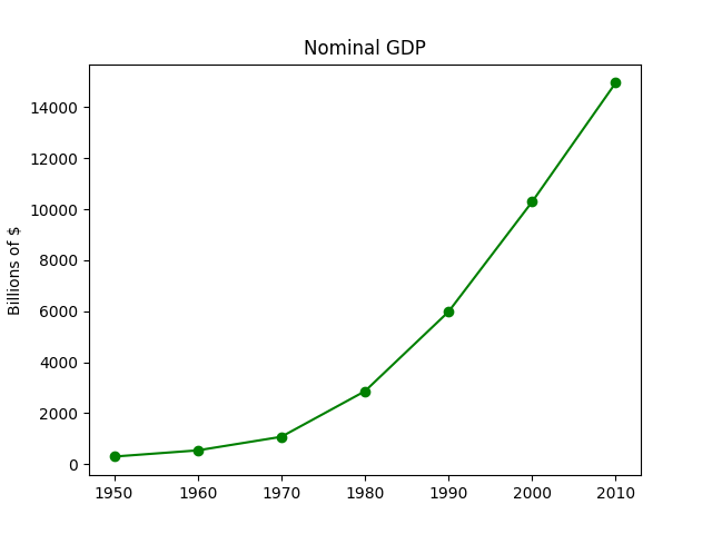
Figure 3-1. A simple line chart
Making plots that look publication-quality good is more complicated and beyond the scope of this chapter. There are many ways you can customize your charts with, for example, axis labels, line styles, and point markers. Rather than attempt a comprehensive treatment of these options, we’ll just use (and call attention to) some of them in our examples.
Note
Although we won’t be using much of this functionality, matplotlib is capable of producing complicated plots within plots, sophisticated formatting, and interactive visualizations. Check out its documentation if you want to go deeper than we do in this book.
Bar Charts
A bar chart is a good choice when you want to show how some quantity varies among some discrete set of items. For instance, Figure 3-2 shows how many Academy Awards were won by each of a variety of movies:
movies=["Annie Hall","Ben-Hur","Casablanca","Gandhi","West Side Story"]num_oscars=[5,11,3,8,10]# plot bars with left x-coordinates [0, 1, 2, 3, 4], heights [num_oscars]plt.bar(range(len(movies)),num_oscars)plt.title("My Favorite Movies")# add a titleplt.ylabel("# of Academy Awards")# label the y-axis# label x-axis with movie names at bar centersplt.xticks(range(len(movies)),movies)plt.show()
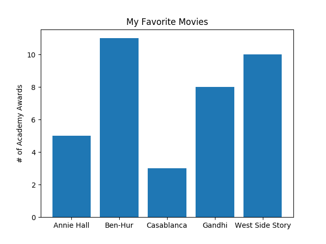
Figure 3-2. A simple bar chart
A bar chart can also be a good choice for plotting histograms of bucketed numeric values, as in Figure 3-3, in order to visually explore how the values are distributed:
fromcollectionsimportCountergrades=[83,95,91,87,70,0,85,82,100,67,73,77,0]# Bucket grades by decile, but put 100 in with the 90shistogram=Counter(min(grade//10*10,90)forgradeingrades)plt.bar([x+5forxinhistogram.keys()],# Shift bars right by 5histogram.values(),# Give each bar its correct height10,# Give each bar a width of 10edgecolor=(0,0,0))# Black edges for each barplt.axis([-5,105,0,5])# x-axis from -5 to 105,# y-axis from 0 to 5plt.xticks([10*iforiinrange(11)])# x-axis labels at 0, 10, ..., 100plt.xlabel("Decile")plt.ylabel("# of Students")plt.title("Distribution of Exam 1 Grades")plt.show()
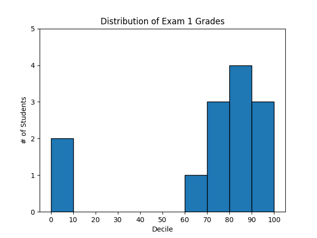
Figure 3-3. Using a bar chart for a histogram
The third argument to plt.bar specifies the bar width. Here we chose a width of 10, to fill the entire decile. We also shifted the bars right by 5, so that, for example, the “10” bar (which corresponds to the decile 10–20) would have its center at 15
and hence occupy the correct range. We also added a black edge to each bar to make them visually distinct.
The call to plt.axis indicates that we want the x-axis to range from –5 to 105 (just to leave a little space on the left and right), and that the y-axis should range from 0 to 5. And the call to plt.xticks puts x-axis labels at 0, 10, 20, …, 100.
Be judicious when using plt.axis. When creating bar charts it is considered especially bad form for your y-axis not to start at 0, since this is an easy way to mislead people (Figure 3-4):
mentions=[500,505]years=[2017,2018]plt.bar(years,mentions,0.8)plt.xticks(years)plt.ylabel("# of times I heard someone say 'data science'")# if you don't do this, matplotlib will label the x-axis 0, 1# and then add a +2.013e3 off in the corner (bad matplotlib!)plt.ticklabel_format(useOffset=False)# misleading y-axis only shows the part above 500plt.axis([2016.5,2018.5,499,506])plt.title("Look at the 'Huge' Increase!")plt.show()
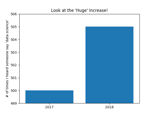
Figure 3-4. A chart with a misleading y-axis
In Figure 3-5, we use more sensible axes, and it looks far less impressive:
plt.axis([2016.5,2018.5,0,550])plt.title("Not So Huge Anymore")plt.show()
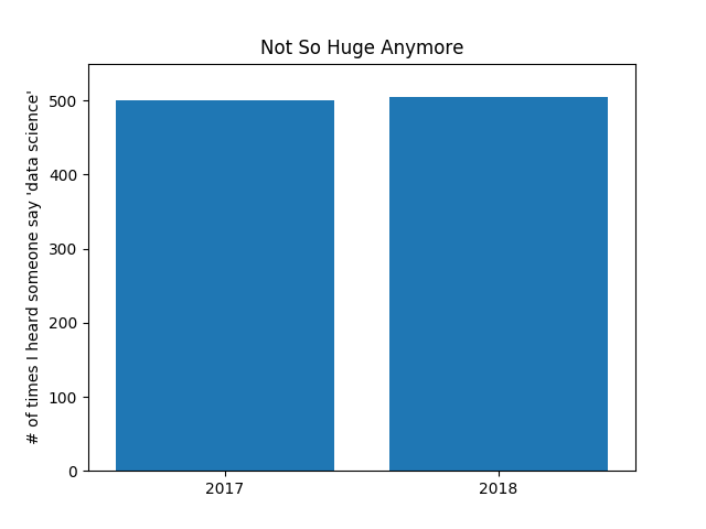
Figure 3-5. The same chart with a nonmisleading y-axis
Line Charts
As we saw already, we can make line charts using plt.plot. These are a good choice for showing trends, as illustrated in Figure 3-6:
variance=[1,2,4,8,16,32,64,128,256]bias_squared=[256,128,64,32,16,8,4,2,1]total_error=[x+yforx,yinzip(variance,bias_squared)]xs=[ifori,_inenumerate(variance)]# We can make multiple calls to plt.plot# to show multiple series on the same chartplt.plot(xs,variance,'g-',label='variance')# green solid lineplt.plot(xs,bias_squared,'r-.',label='bias^2')# red dot-dashed lineplt.plot(xs,total_error,'b:',label='total error')# blue dotted line# Because we've assigned labels to each series,# we can get a legend for free (loc=9 means "top center")plt.legend(loc=9)plt.xlabel("model complexity")plt.xticks([])plt.title("The Bias-Variance Tradeoff")plt.show()
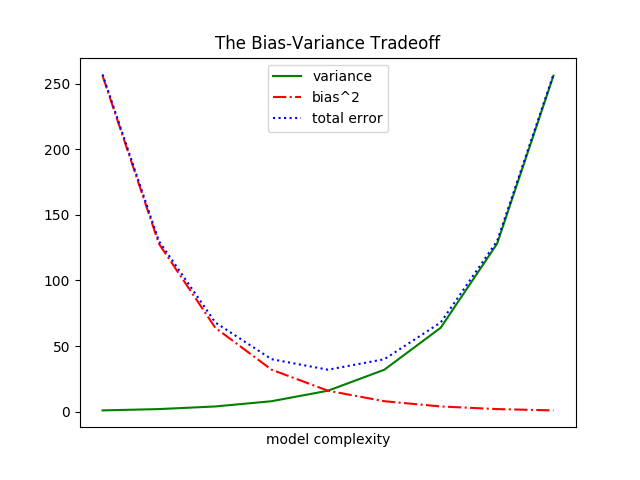
Figure 3-6. Several line charts with a legend
Scatterplots
A scatterplot is the right choice for visualizing the relationship between two paired sets of data. For example, Figure 3-7 illustrates the relationship between the number of friends your users have and the number of minutes they spend on the site every day:
friends=[70,65,72,63,71,64,60,64,67]minutes=[175,170,205,120,220,130,105,145,190]labels=['a','b','c','d','e','f','g','h','i']plt.scatter(friends,minutes)# label each pointforlabel,friend_count,minute_countinzip(labels,friends,minutes):plt.annotate(label,xy=(friend_count,minute_count),# Put the label with its pointxytext=(5,-5),# but slightly offsettextcoords='offset points')plt.title("Daily Minutes vs. Number of Friends")plt.xlabel("# of friends")plt.ylabel("daily minutes spent on the site")plt.show()
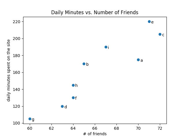
Figure 3-7. A scatterplot of friends and time on the site
If you’re scattering comparable variables, you might get a misleading picture if you let matplotlib choose the scale, as in Figure 3-8.
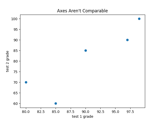
Figure 3-8. A scatterplot with uncomparable axes
test_1_grades=[99,90,85,97,80]test_2_grades=[100,85,60,90,70]plt.scatter(test_1_grades,test_2_grades)plt.title("Axes Aren't Comparable")plt.xlabel("test 1 grade")plt.ylabel("test 2 grade")plt.show()
If we include a call to plt.axis("equal"), the plot (Figure 3-9) more accurately shows that most of the variation occurs on test 2.
That’s enough to get you started doing visualization. We’ll learn much more about visualization throughout the book.
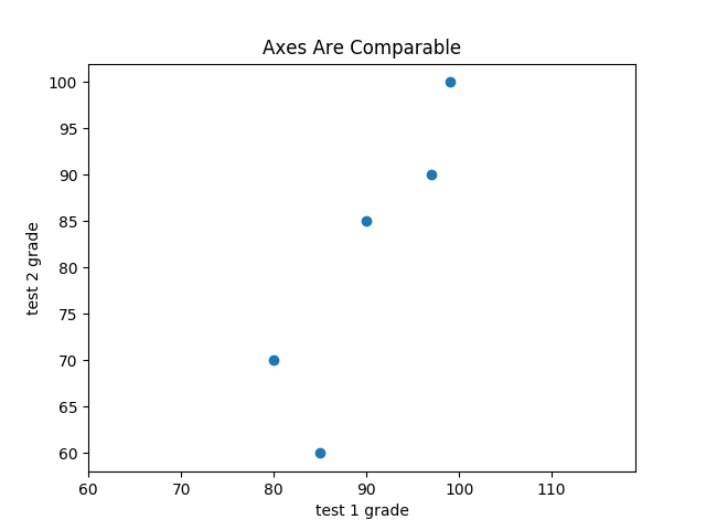
Figure 3-9. The same scatterplot with equal axes
For Further Exploration
-
The matplotlib Gallery will give you a good idea of the sorts of things you can do with matplotlib (and how to do them).
-
seaborn is built on top of matplotlib and allows you to easily produce prettier (and more complex) visualizations.
-
Altair is a newer Python library for creating declarative visualizations.
-
D3.js is a JavaScript library for producing sophisticated interactive visualizations for the web. Although it is not in Python, it is widely used, and it is well worth your while to be familiar with it.
-
Bokeh is a library that brings D3-style visualizations into Python.