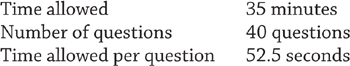
The science section of the ACT exam creates anxiety for a lot of students. Confronted with a vast range of topics and two dozen graphs and tables to analyze in 35 minutes, even experienced test takers may flounder. After all, the science section is unique to the ACT, and many students have never taken this kind of test before.
With an understanding of how ACT Science works, however, and with practice, success is within reach. Using the strategies outlined below, I improved my score by 6 points!
When I first read the description of ACT Science in the boxed material below, my heart sank. While I had taken chemistry and physics, I had just started biology and hadn’t thought about any of the Earth sciences since the middle of eighth grade. As I explored the ACT website, I became even more worried—especially when I stumbled on a list of 45 possible topics, ranging from photosynthesis to magnetism to weathering and erosion. I knew little about these topics, and I certainly wasn’t ready to be tested on them!
 Breaking down ACT Science
“The content of the Science Test includes biology, chemistry, physics, and the Earth/space sciences (for example, geology, astronomy, and meteorology). Advanced knowledge in these subjects is not required, but background knowledge acquired in general, introductory science courses is needed to answer some of the questions. The test emphasizes scientific reasoning skills over recall of scientific content, skill in mathematics, or reading ability.”
—ACT.org
When I took the ACT the first time, however, I learned that ACT Science doesn’t test your knowledge and understanding of science; in fact, it’s not a science test at all.
In reality, ACT Science tests how well—and how quickly—you can read tables and graphs. Notice the ACT’s description of the test: “background knowledge acquired in general, introductory science courses is needed to answer some of the questions.” In my experience (taking the test three times and researching it thoroughly), “some” means one question, or maybe two, out of forty. You could nearly ace the test without getting any “background knowledge” questions correct. Furthermore, the background knowledge required to answer these questions doesn’t exceed what most of us know after taking a single science class.
For example, here’s a “background knowledge” question, straight from an online ACT practice exam:
Scientist 2 explains that ice sublimes to water vapor and enters Europa’s atmosphere. If ultraviolet light then broke those water vapor molecules apart, which of the following gases would one most likely expect to find in Europa’s atmosphere as a result of this process?
A. Nitrogen
B. Methane
C. Chlorine
D. Oxygen
“Ice sublimes,” “ultraviolet light,” “water vapor molecules”? You might take one look at this question, decide there’s no way you could answer it, and skip to the next one. Instead, take a deep breath and read the question again. Do you know the molecular formula for water? If you’re like 99% of students taking the test, you know that H2O means water. Even if you know nothing about splitting molecules, what could result from breaking H2O apart? Glancing at the answer choices, you should be able to see that only one of them seems plausible—oxygen.
The background knowledge necessary to answer such a question is usually common knowledge among high school students. And remember: even if you don’t have the background knowledge, there are only one or two of these questions in the entire section.
The key to success in ACT Science? Come prepared to read graphs and tables quickly and efficiently.
There are three types of questions in the ACT Science section.
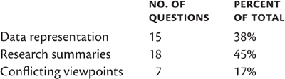
The test is divided into seven passages, with five to seven questions each. A “passage” consists of text, graphics, and questions with answer choices.
Six of the passages present graphs, tables, and summaries of experiments, then ask questions that test your comprehension of the material; the questions are a mix of data representation and research summaries. One of the passages presents two conflicting viewpoints on a particular subject, then asks questions that test how well you grasp each author’s argument and understand the similarities and differences between the arguments.
To conquer ACT Science, I’ve developed specific strategies for each type of question. Keep in mind that it takes time to improve your skills in reading graphs and interpreting data. Begin early and practice often.
Data-representation questions account for 38% of the ACT Science test. Here’s how the ACT describes these questions:
This format presents graphic and tabular material similar to that found in science journals and texts. The questions associated with this format measure skills such as graph reading, interpretation of scatterplots, and interpretation of information presented in tables, diagrams, and figures.
And here’s my translation: You’re going to be looking at a lot of graphs and tables, and you’ll be expected to recognize trends and patterns in the data they contain.
The questions ask you to draw conclusions or make predictions from the data in these graphs and tables. A question typically refers to only one graphic, but sometimes you’ll be asked to compare data in two or more graphics.
Every data-representation question requires only one thing: an understanding of the information in the graphic(s). No “background knowledge” or special scientific skill is necessary.
 Go straight to the questions in data representation
The first time I took the ACT, I read through all of the experiments carefully, taking the time to understand what each was testing and what the results were, before tackling the first question. At the five-minute warning, I was working on the fifth passage, and I barely had enough time to randomly bubble the answers for the last passage. I learned the hard way that I needed a different approach if I wanted to finish the test on time. Speed is one of the keys to success in ACT Science.
There are two reasons why this strategy—going straight to the questions—works:
1. Not all experiments and graphics are referred to in the questions.
2. You don’t have to thoroughly understand the experiments and graphics to answer the questions.
You can save a lot of time by going straight to the questions in order to figure out what you need to know, instead of wasting time reading and trying to understand experiments that may not even be asked about.
To appreciate how effective this strategy is, time yourself on a sample passage. Record how long it takes you to read and understand the passage, including the tables and graphs. It will probably take a minute to a minute and a half to read the passage, perhaps longer. If you have only 52.5 seconds to answer each question in the section, reading the passage will have consumed one or two questions’ worth of time. Repeat that for five more experiment-based passages, and it means losing time to answer between six and twelve questions!
Reset your stopwatch and start over with a different passage. Read the questions first, and observe how many of them direct you to specific elements of the passage and graphics. You won’t waste time trying to understand and interpret data trends that aren’t even asked about. Sometimes, entire graphics and paragraphs are completely useless for answering any of the questions.
Going straight to the questions is the No. 1 time-saver in ACT Science.
Look for trendsData in ACT graphs and tables usually follow easy-to-recognize trends. A trend is a pattern showing a simple and straightforward relationship among the data. To identify a data trend, try to compose a sentence that summarizes what is happening in the graphic. Here’s an example:
As VARIABLE 1 goes up / down, VARIABLE 2 goes up / down / up, then down / down, then up.
A word of caution, however: there might not be a trend. Most graphics have a trend, but some don’t. It’s important not to impose a trend on data where there isn’t one.
The speed with which you can identify trends impacts how quickly you’re able to understand a passage and answer the questions.
1. Both variables increase (direct variation)—for example, as caffeine intake increases, so does heart rate.
2. Both variables decrease (direct variation)—for example, as rainfall decreases, so does average plant height.
3. One variable increases, the other decreases (inverse variation)—for example, as volume increases, pressure decreases.
4. One variable increases, the other increases, then decreases—for example, as mean temperature increases, plant biomass increases, then decreases.
5. One variable increases, the other decreases, then increases—for example, as the grades in a class increase from F to A, teacher attention decreases, then increases.
6. One variable increases, the other increases, then plateaus—for example, as time increases, the number of bacteria in a culture increases, then levels off.
7. One variable increases, the other decreases, then plateaus—for example, as the frequency of drought conditions increases, the variety of plant life decreases, then levels off.
You don’t need to memorize this list of trends; it’s enough to be able to recognize these patterns in the tables and graphs on the ACT.
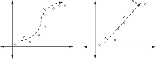
In the areas of biology and population growth, you may encounter two types of curves:
 Exponential growth Sometimes referred to as a “J curve,” exponential growth begins increasing slowly, then increases more and more quickly:
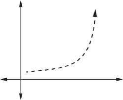
This type of curve is common in unchecked population growth—when a population is growing without restraints in food or habitat supply. Human population growth, for example, is roughly exponential.
Logistic growth Sometimes referred to as an “S curve,” logistic growth resembles exponential growth in the beginning, but then encounters limits to growth and levels off:

A colony of bacteria on a petri dish, for example, grows rapidly at first, but then runs out of food and the population levels off.
Other important data elements
The following elements are often useful in answering questions like “What was the maximum temperature of the sample in Experiment 1?” and “At what point did the temperature in Experiment 2 change from increasing to decreasing?”
Extremes (maximums and minimums)
Critical points (points of change)
Recognizing these elements can save a few seconds on almost every question in ACT Science; over the course of the section, these seconds add up.
Generalizing
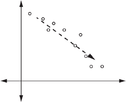
This important trend-recognition skill allows you to determine the overall pattern in the data, without being distracted by small discrepancies in the trend. Tiny variations from what otherwise would be a perfect trend shouldn’t distract you from the overall pattern. In the graphs below, note how the trendline fits the data, even though some data points fall above or below it:
Generalizing allows you to see the “big picture” without being sidetracked by small deviations and minor inconsistencies. In ACT Science, it’s the overall trend that counts. Being able to recognize the general relationship in a set of data points is an essential skill in this section of the exam.
Know your graphsThe ability to quickly identify the most important features of a graph can save a tremendous amount of time. These features include the following:
The type of graph
What the graph represents (what each axis stands for)
Patterns in the data
Common graph types
Line graph. A line graph typically shows the relationship between two variables, one on the x-axis (the bottom line) and one on the y -axis (the line at the left). The x-axis represents the independent variable, which the researcher purposefully changes, while the y-axis represents the dependent variable, which may be changed by the independent variable. A solid line is used to show the data.

Time is frequently represented on the x-axis. For many experiments, time is the independent variable; the other variable changes as time goes on.
Scatterplot. A scatterplot is similar to a line graph in terms of the axis and variables; the data, however, are not shown by a solid line, but as points scattered throughout the graph, with each point representing one trial in an experiment. Sometime, a “line of best fit” (shown as a dotted line in the graph below) is used to trace the general path of the data. This line doesn’t connect the points on the graph; in fact, it may not pass directly through any points.
Bar graph. While a bar graph uses the same axes and independent/dependent variables as a line graph, it portrays each trial with a bar.
Bar graphs are much less common on the ACT than line graphs and scatterplots.
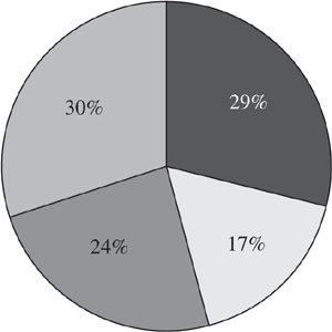
Pie chart. A pie chart is a circle divided into segments that show relative percentages of several elements. A pie chart doesn’t show variables; instead, it reflects the relative sizes of the components of a whole.
While a pie chart itself cannot show a trend, a series of pie charts can.
For scatterplots and line and bar graphs, the two axes indicate what the graph is depicting. For example, if the x -axis represents temperature and the y- axis represents pressure, the graph shows the relationship between temperature and pressure. For a pie chart, the whole and the segments are labeled so that they can be quickly identified.
Some ACT Science graphs use the same set of axes and variables to plot several sets of data. For example, a graph may plot four different gases with respect to temperature on one axis and pressure on the other; this graph displays four sets of data—four potential trends—instead of one.
Understanding variables is not only critical for solving science problems on the ACT, but also valuable in comprehending how science explores the natural world. Scientists often ask questions like “How does this work?” and “Where did that come from?” It’s difficult to answer such questions without breaking them down into smaller questions.
A grade-school scientist may want to explore what makes certain plants grow taller than others. To design an experiment, she first needs to select a single variable to test—say, the amount of water that each plant gets. The variable that the scientist chooses to change is the independent variable, and it usually varies in logical, progressive increments (for instance, 25 mL, 50 mL, and 100 mL of water daily).
The scientist could measure two variables: the effects of both water and fertilizer on the growth of plants. She could apply no water and no fertilizer to the first plant, a little water and a little fertilizer to the second plant, and a lot of water and a lot of fertilizer to the third plant. She may learn that the first plant dies, the second plant grows a little, and the third plant grows quite tall. For the first plant, how can she determine if it was the lack of water or the lack of fertilizer that killed the plant? She might guess that it was the lack of water, but she wouldn’t know for sure unless she isolated the variable—that is, tested only the effect of water while applying the same amount of fertilizer.
This hypothetical account demonstrates the importance of constants, or fixed values, in scientific experiments. In the plant experiment, constants could be the size of pot, the type and amount of soil in the pot, the light to which the plants are exposed, and the amount of fertilizer. By keeping these values constant, any differences observed in the height of the plants would be due to the different amounts of water the plants get, and not to another variable.
The dependent variable (plant growth, based on the height of the plants) measures the impact of the independent variable (the varying amount of water). The dependent variable, which is almost always plotted on the y- axis of a graph, is the variable that the scientist is unsure of: Will plant height increase with an increase in the amount of water applied?
For practice, identify the independent and dependent variables in the following hypothetical experiments:
1. John wants to see how the amount of food he gives his caterpillars will affect how long they become.
Independent variable ____________________________________
Dependent variable _____________________________________
2. Priyanka wants to explore whether there is a relationship between the grade a student receives in a certain class and the number of hours he spent studying.
Independent variable ____________________________________
Dependent variable _____________________________________
3. Timmy wants to see if the temperature of the water in the fish tank affects the heart rate of his fish.
Independent variable ____________________________________
Dependent variable _____________________________________
4. Allison wants to learn how the growth of a plant changes over its first 15 days.
Independent variable ____________________________________
Dependent variable _____________________________________
The answers are in the footnote on the following page.
There are many forms of data representation beyond the common graph types described above. You will probably encounter at least one unfamiliar type of diagram or model in the course of the ACT Science section. Don’t try to understand the entire graphic at once; read the question first, so that you can begin a targeted search for the necessary information. In this way, you’ll save time as well as mental energy.
A graphic may include multiple data sets, such as several lines on a graph or several columns in a table. In addition to understanding how two variables are related, you may need to determine how the data sets differ with regard to those variables. Here is a line graph in which several data sets are presented:
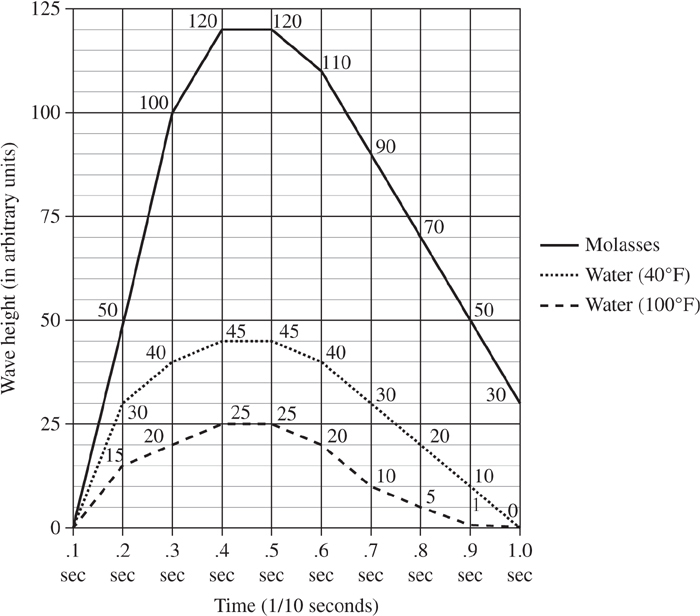
Each data set is represented by a different style of line. In general, the graph shows that as time goes on, wave height increases, then decreases. The wave height of molasses changes most drastically, the wave height of water at 40°F changes much less, and that of water at 100°F changes least. The key to understanding graphics with multiple data sets is to recognize not only the overall trends, but also the similarities and differences among the data sets themselves.
The following sample passage involves interpretation of a graphic:
Fossils found in a certain mountainous part of the Western United States have been uncovered at varying regions on hillsides. Fossils (imprints of ancient plants and animals made by being buried in sediment, mud, or other minerals and compacted for hundreds of thousands of years) are primarily found in the sedimentary limestone that is common in the area. The different parts of the hillsides where fossils have been found are marked on the following diagram.
The diagram shows the 3 regions of the hillside where fossils have been discovered. The regions are differentiated based on the percentage of floral ground cover (plants, shrubs, trees, etc.) that exists at that particular height. The mountainous region is highest, but has the lowest percentage of ground cover. In the middle is the slopeside region, which has a moderate amount of ground cover, and at the base of the hill is the slopeseat region, which has an abundance of ground cover.
1. A fossil found in the region discussed above has been found in an area with 27% ground cover. What region has it been found in?
A. The mountainous region
B. The slopeside region
C. The slopeseat region
D. Not enough information is given.
2. According to the graph above, what is the cutoff height between the mountainous region and the slopeside region?
F. +15 feet in height
G. 25 feet in height
H. 45 feet in height
J. Regions are defined by ground cover percentage, not height.
Don’t be intimidated by the irregular nature of the graphic; using the strategies described above, you will be able to extract data from the graphic quickly and efficiently. First, go straight to the questions. The first question asks you to identify a region with 27% ground cover. The slopeside region (25–45% ground cover) clearly meets this requirement, so the correct answer is B.
The second question asks you to determine the cutoff height between the mountainous and slopeside regions. Since the regions are defined by ground cover percentage, not by height in feet, you quickly decide that the correct answer is J.
As you can see from this example, unfamiliar types of graphics aren’t more difficult than the standard graphics. You can recognize the same variables, trends, and critical points, just in a different way.
Data-representation problems generally require nothing more than reading a piece of data in a graph or table and, perhaps, extrapolating or generalizing from that data.
Research-summary questions account for 45% of the ACT Science test. Here’s how the ACT describes these questions:
This format provides descriptions of one or more related experiments. The questions focus on the design of experiments and the interpretation of experimental results.
And here’s my translation: instead of analyzing graphs and tables as you did in data-representation questions, you’ll read short descriptions of experiments and determine what each one is trying to test and how it is similar to or different from the other experiments.
The key to success on research-summary questions is to understand what each experiment seeks to test and how it works. It’s important to understand the concept of independent and dependent variables, as well as how scientific inquiry uses experiments to test hypotheses about the relationships between the variables. These questions ask you to identify the variables that each experiment is testing, to identify similarities and differences between experiments, and to synthesize an overall conclusion, based on data from the experiments.
Since research-summary questions contribute to nearly half of the ACT Science score, it is critical to know and apply the best approach to answering these questions. The strategies described below, plus lots of practice, will improve your score. As with data-representation questions, no background knowledge is required to answer research-summary questions.
Go straight to the questions in research summariesLike data-representation questions, research-summary questions often ask you to examine only certain parts of a passage. Even if you eventually must sift through all of the experiments, you will be more efficient in pinpointing the object of your search if you have already read the questions. Furthermore, only certain aspects of an experiment may be of interest, and confining your focus to these will save you time.
It’s important to read—or at least scan—the answer choices as well as the questions. Having possible answers in mind can be helpful as you inspect a passage for your answer.
Look for keywords in research summariesAs you read a question and its answer choices, arm yourself with keywords to look for in the passage. These will help you spot the answer sooner than reading (and rereading) the entire passage. Important keywords focus on the following:
Variables (for example, temperature or distance)
Trends (for example, increasing or decreasing)
Keywords are homing signals in the passage: they will quickly draw you to the answer—and save you time.
Focus on similarities and differences in research summariesMany research-summary questions ask you to identify similarities and differences among the experiments presented. This is good news, because these questions are among the easiest and fastest to answer correctly.
Experiments can be different in two key areas:
Variables. Variables change from experiment to experiment, or rather, one variable changes while the other stays the same. For example, one experiment may test temperature vs. pressure, while another tests temperature vs. rate of diffusion.
Trends. When variables change among experiments, it is likely that data trends will change, too. For example, one experiment may show direct variation (as one variable increases, so does the other), another experiment may show inverse variation (as one variable increases, the other decreases), and still another experiment may show no trend at all.
It is crucial to be able to zero in on the similarities and differences among experiments. With this strategy in mind as you answer other types of questions, you will be better prepared to answer similarity/difference questions, perhaps without looking back at the passage.
Conflicting-viewpoint questions account for 17% of the ACT Science test. Here’s how the ACT describes these questions:
This format presents expressions of several hypotheses or views that, being based on differing premises or on incomplete data, are inconsistent with one another. The questions focus on the understanding, analysis, and comparison of alternative viewpoints or hypotheses.
And here’s my translation: You’ll read two paragraphs that present conflicting viewpoints on the same topic, then answer questions about the similarities, differences, and details of these arguments.
The conflicting-viewpoint passage is very different from the other six passages in ACT Science. Hopefully, you will save enough time in the other passages (by going straight to the questions, recognizing patterns, and using keywords) so that you have enough time to read both arguments and answer the questions.
That’s right. In the conflicting-viewpoint passage, don’t go straight to the questions. Instead, before you tackle the questions, read both arguments completely so that you understand their points of view.
Conflicting-viewpoint questions resemble reading-comprehension questions more than they do scientific-reasoning questions; it is for this reason that they’re separated from data-representation and research-summary questions. Consequently, you will approach this passage as you would approach a passage in ACT Reading. Don’t let the scientific jargon and complicated theories fool you—to answer these questions, you must understand the arguments, not the complex processes behind them.
Mark the passageBe an active reader—one who interacts with the material, making mental notes as you read. Or, as I recommend, physical notes. It’s not in your best interest to waste time writing notes in the margins of the Science test, but I suggest that you underline words and phrases that strike you as important. These highlights will serve to orient you when you refer to the passage for an answer to a question.
In the first practice exams you take, you may not underline all the words and phrases that pertain to the questions. As you continue to practice, however, you will become more familiar with the types of questions asked in this part of ACT Science. By the time you take the actual ACT exam, you’ll be able to quickly home in on each author’s most important points. One further advantage: You don’t waste time doing this. You’re reading the passage anyway, and it takes no extra time to underline important words and phrases.
Conflicting-viewpoint questions fall into three categories:
Specifics. These questions refer to an argument and ask about particular details. The first questions in this passage are of this type and are relatively straightforward.
Compare/contrast. These questions ask you to identify points on which the scientists agree and disagree.
Extension/prediction. These questions often take the form “Based on _________, predict/explain _________.” They ask you to use information in one or both of the arguments to predict a future event or to explain the reasons for a given occurrence. These questions are rare, and they can be quite challenging.
Keep these three question types in mind when marking the passage.
Look for keywords in conflicting viewpointsLooking for keywords is an important strategy for research-summary questions. The same principle applies here: keywords save time and help you reference the passage efficiently. You’ll be able to quickly home in on important words and phrases and find the answer without wasting time sifting through the entire passage. Here’s how the strategy works:
1. As you read a question and its answer choices, pick out one or two important words to look for in the passage.
2. Keep the word(s) in mind when you return to the passage.
Instead of having to reread the whole paragraph, you should be able to go straight to the part that answers the question.
Focus on similarities and differences in conflicting viewpointsThis strategy differs from the similarity/difference strategy in research summaries. Since the data aren’t presented in an accessible visual format, more work is required to determine where the arguments agree and diverge.
You should be on the lookout for similarities and differences even as you read the arguments the first time. As you read the second argument, circle parts that contradict the first argument. The ability to recognize similarities and differences improves with practice; you may reach the point where you don’t even find it necessary to mark them in the exam booklet.
Don’t be intimidatedThe arguments in the passage will probably contain jargon and sophisticated vocabulary and will refer to complex processes or phenomena. Just remember: you don’t have to understand either argument. It doesn’t matter if you have no idea how the Big Bang happened or what cosmic background radiation is. The questions test your understanding of and ability to compare different viewpoints, not your understanding of the science behind them.
Don’t waste time trying to make sense of parts of the passage that aren’t referenced in the questions. Instead, focus on the three other strategies (mark the passage, look for keywords, and focus on similarities and differences) to answer the questions that are being asked.
These 10 strategies should save you quite a lot of time, so that you will finish all seven passages and have a few minutes to review your answers.
Even with these strategies, however, the situation can quickly disintegrate if you spend more time on the first passages than you realize, and have a couple of passages left when the five-minute warning is given. This happened to me the first time I took the ACT.
To prevent this from happening to you, it is essential that you time your practice. In ACT Math, where the questions are unrelated, you have a sense of how long it should take to answer one question. ACT Science is different: it is divided into seven passages, in which the questions are often interrelated, and it isn’t possible to know how much time you should spend on a single question.
The solution is to practice individual passages. Since you have 35 minutes to complete the seven passages (and the conflicting-viewpoint passage usually takes longer than the other six), I suggest that you allow yourself five minutes to complete each passage. Set your stopwatch for five minutes and try to finish just one passage. You may only get partway through when the alert sounds—don’t worry, just complete the passage and try again. After some practice, you should be able to finish most passages in less than five minutes. Obviously, variation between passages means that some will take more time to complete and some less, but this practice will provide a sense of the pace required to finish the test on time.
At the end of this chapter, there are seven sample ACT Science passages. Try to work each of the passages in five minutes before tackling the science sections on practice exams. In this way, you’ll have a better sense of the pace at which you need to work through each passage. By tackling practice passages in five-minute sessions, you will also avoid frustration and exhaustion.
Don’t forget to guess! If, despite rigorous preparation, you find yourself running out of time, guess at the remaining questions. Guessing is not penalized on the ACT.
Quickly eliminate choices you know are wrong. This can save you time (you are looking for fewer keywords and trends), and your chance of guessing correctly improves.
Keep an eye on the clock. Skip questions that can’t be answered quickly, so that you can maintain the pace required. It’s better to return to difficult questions in the final few minutes than to fail to reach entire passages that may contain several questions that you could have answered easily.
If a question seems especially tricky and you have no idea how you would set about finding the answer, check to see if there’s an answer choice similar to “It is impossible to determine the answer from the data given.” If, after examining the data, you conclude that there is no way to determine the answer, select this option—there’s a reason that it’s offered. It is as important to know that you can’t draw a conclusion because of insufficient data as it is to know that you can draw a conclusion from adequate data.
Should you tackle the passages in order, or should you skip around? Since your goal is to answer all 40 questions in ACT Science, you probably should work straight through the passages, one through seven. If you encounter a passage whose topic is completely unfamiliar or whose graphics look exceptionally complicated, you may decide to skip to the next passage and return later. Decide quickly! If you run out of time before finishing the science section and you’ve skipped a difficult passage, it is likely that you wouldn’t have done particularly well on it anyway. A reminder: if you’ve skipped a passage, be sure to return to it if time permits.
Practice problem setACT Science
Work these seven passages in five-minute sessions. The solutions appear at the end of the chapter.
Passage I
Large vertical tunnels have recently been discovered on the surface of Mars. These tunnels lead hundreds of miles to massive underground chambers that scientists believe once housed millions of cubic kilometers of trapped gas. The scientists theorize that, for reasons yet unknown, the volumes of gas that have been collecting under Mars’ surface were suddenly released, spewing tons of rock and debris into the atmosphere and leaving these empty tunnels behind.
Study 1
A diagram of a gas-escape tube was created using a theoretical model and aided by surface maps of Mars. It is hypothesized that trapped gas, once released, escaped the tubes with such force that the tunnels were worn smooth by the intense blast. Upon reaching the surface of the planet, the gases expanded and dispersed into the atmosphere and out into space. Figure 1 details the smooth escape tube, the direction of gas escape, and the dispersal of the gas into the atmosphere.
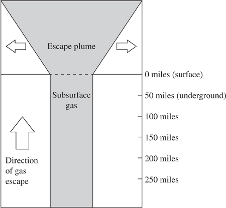
Figure 1
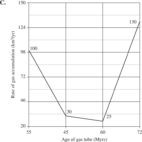
Four gas-escape tubes (A–D) were studied. The volume of gas held within each tube, the rate at which that gas accumulated, and the amount of time that it took for that gas to accumulate were all estimated and can be found in Table 1. Also listed is the approximate age at which the accumulated gas violently escaped each tube, or “erupted.”
Study 3
Scientists have found 3 cratered sites around certain gas-escape tubes that appear to have been formed by exceptionally violent escape-plume phenomena. The first site has a crater 5 miles in diameter and is roughly 70 million years old; the second site has a diameter of 3.5 miles and is thought to be 50 million years old; the third site has a crater that is 1.5 miles across and is thought to be 45 million years old. It is hypothesized that these craters were created by either (A) exceptionally large quantities of gas escaping over time or (B) gas escaping at an exceptionally fast rate.
(All listed dates have a dating error of ±5%.)
1. If the escape plume shown in Figure 1 is typical of all gas-escape tubes, scientists could generally say that, after emerging from underground, the gas plume:
A. stays the same size as it did while underground.
B. expands rapidly as it rises.
C. contracts rapidly as it rises.
D. slowly sinks back into the ground.
2. Based solely on the information found in Study 3, can you determine which of the two hypotheses found in Study 3 for explaining how the craters are formed is correct?
F. Yes: hypothesis A is correct.
G. Yes: hypothesis B is correct.
H. Yes: both hypotheses A and B are correct.
J. No: it is impossible to tell, based on the information found in Study 3.
3. Based on the information found in the table attached to Study 2, what trends can be inferred from the quantitative estimations and approximations of the 4 gas-escape tubes (A–D)?
A. A higher rate of gas accumulation seems necessary to form the largest-volume tubes.
B. A lower rate of gas accumulation seems necessary to form the largest-volume tubes.
C. There seems to be a direct correlation between volume and age.
D. The largest-volume tubes seem to form most quickly.
4. According to information found in Study 2, what is the relation between the ages of the tubes and their volumes?
F. The older the tube, the larger its volume.
G. The younger the tube, the larger its volume.
H. All tubes are the same age and have the same volume.
J. There seems to be no direct relation between age and volume.
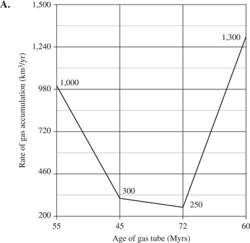
5. Which graph most accurately represents data found in the table in Study 2?

6. Considering information found in Studies 1 and 2, what hypothesis from Study 3 seems to be the most likely cause of the observed cratering?
F. The data suggest that more voluminous stores of gas caused the craters.
G. The data suggest that more violent explosions caused the craters.
H. The data suggest that craters have nothing to do with gas-escape phenomena.
J. Craters have been found in varying ages of tubes, and rates of gas escape are not given; there is not enough evidence to make a conclusive decision.
Were you able to finish the passage in five minutes? On the actual ACT exam, some passages take less time than others. If this passage took you six minutes to complete, there may be another that takes only four minutes. Still, it’s important to realize that the goal is to average no more than five minutes per passage.
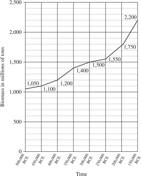
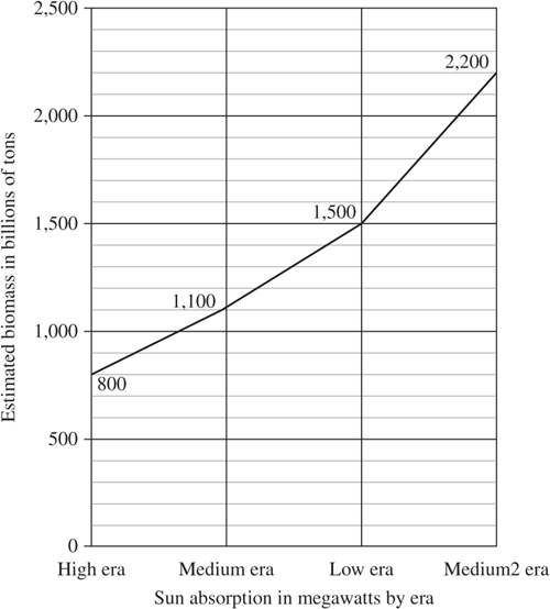
Figure 2
7. According to Figure 1, what was the estimated biomass of the high era?
A. 800 million tons
B. 800 billion tons
C. 1100 billion tons
D. 1500 billion tons
8. Based on the information found in Figures 1 and 2, what conclusions can the researchers make about the increase in biomass over time?
F. Biomass increased linearly (evenly) through all time periods and eras.
G. Biomass increased randomly, without regard to time frame or the solar era.
H. Biomass increased fastest between 200,000 and 150,000 BCE.
J. Biomass increased fastest during the high era.
9. According to Table 1, what type of flora is dominant in all 4 eras?
A. Grasses only
B. Shrubs only
C. Trees only
D. Shrubs and grasses only
10. According to Table 1, what types of flora were dominant during the high era?
F. Grasses only
G. Grasses and shrubs
H. Grasses and trees
J. Trees and shrubs
11. A student is asked what type of plant life is most likely to be dominant during the low era. Based on the information found in Table 1, what should her answer be?
A. Grasses are most likely to be dominant.
B. Shrubs are most likely to be dominant.
C. Grasses and shrubs are equally likely to be dominant.
D. Trees are most likely to be dominant.
12. Which of the following is NOT a key difference between Figure 1 and Figure 2?
F. Figure 2 has more data points.
G. Figure 1 ends at 100,000 BCE while Figure 2 ends at 150,000 BCE.
H. Figure 2 is a scatterplot, while Figure 1 is a line graph.
J. The range of data in the two figures is different.
This passage is probably easier than any you’ll encounter on the ACT. Hopefully, you were able to finish it in less than five minutes.
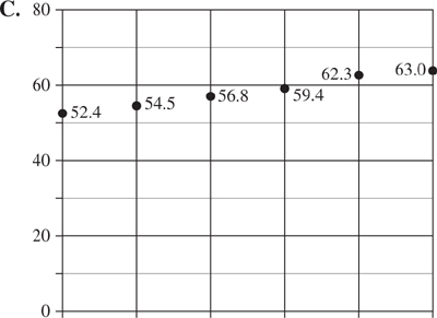
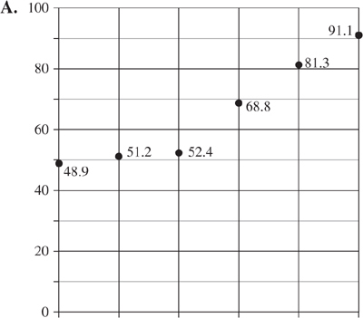
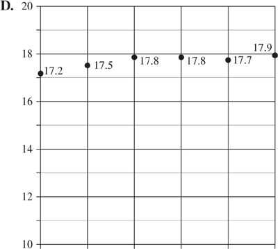
The following tables give the results of an experiment where 3 rows of sensors were continuously exposed to sunlight filtered through 3 different filters. Each row used the same filter for each of the 6 days the experiment ran, and the filters were not changed or swapped out. The changes in sunlight intensity recorded in Table 1 attest to how the filters performed, on average, throughout each of the 6 days of use. Table 2 records the average air temperature above the sensors in each row.
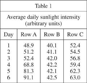
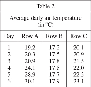
13. What was the highest average sunlight intensity during the 6 days of the study?
A. 91.1
B. 42.5
C. 63.0
D. 30.1
14. According to Table 2, the accuracy of the daily average air temperatures were recorded to the nearest:
F. 1°C.
G. 0.1°C.
H. 0.01°C.
J. 10°C.
15. Which of the following graphs most accurately depicts the average daily sunlight intensity for Row C?
16. Which of the following statements most accurately describes the temperature trend as recorded in Table 2?
F. Temperature rose in all 3 rows from Days 1 to 3 and fell from Days 4 to 6.
G. Temperature fell in all 3 rows from Days 1 to 3 and rose from Days 4 to 6.
H. Temperature fell in all 3 rows from Day 1 to Day 6.
J. Temperature rose in all 3 rows from Day 1 to Day 6.
17. Suppose that the average temperatures recorded in Table 2 were made by taking the average of temperature readings at 6 am, noon, and 6 pm every day. If temperature readings were taken at 6 am, 9 am, noon, 3 pm and 6 pm instead, which of the following statements would be true?
A. Average temperatures would be higher.
B. Average temperatures would be lower.
C. Average temperatures would stay the same.
D. There is no way to know with certainty if the new readings would give a different average than the old readings.
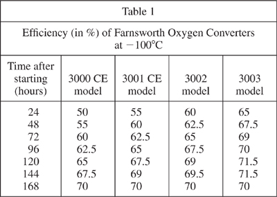
The following tables show the results of 2 different trials of 4 different models of Farnsworth Oxygen Converters, which are complex machines used to turn nonbreathable gases found on most nonhabitable planets in the solar system into a breathable oxygen mixture. In each trial, the converters are started and run continuously. Their efficiencies (measured in arbitrary units) are measured every 24 hours, as shown. Table 1 records the measurements of a trial undertaken at –100°C, while Table 2 records the same 4 converters operating at +100°C. Values are given in percentages (%).
Experiment 1
Experiment 2
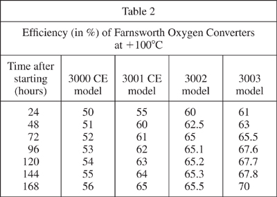
18. Based on the data found in Tables 1 and 2, do Farnsworth converters seem to work more efficiently in hotter or colder conditions?
F. All converters seem to work more efficiently in hotter conditions.
G. All converters seem to work more efficiently in colder conditions.
H. Most, but not all, converters seem to work more efficiently in colder conditions.
J. There is not enough information to answer this question accurately.
19. The planet Uranus needs a converter that reaches >70% conversion efficiency as soon as possible. Based on the information available in Tables 1 and 2, which converter should they use?
A. The 3000 CE model
B. The 3001 CE model
C. The 3002 model
D. The 3003 model
20. What factor varied between Experiments 1 and 2?
F. Time
G. Detection method
H. Temperature of operation
J. Models tested
21. Which model of converter reaches peak efficiency and then declines to subpeak efficiency within the time frame of the experiments, and under what conditions?
A. The 3003 model at –100°C
B. The 3003 model at +100°C
C. The 3000 CE model at –100°C
D. No model operates as described under any measured conditions.
22. What model converter would probably take the longest amount of time to reach an operating efficiency of 70% at +100°C, assuming that the average increase in efficiency vs. time found in Table 2 holds true indefinitely?
F. The 3000 CE model
G. The 3001 CE model
H. The 3002 model
J. The 3003 model
Nuclear radiation
There are three types of radiation typically associated with nuclear power, weapons, and other sources of high-energy interactions: alpha, beta, and gamma radiation. Different types of radiation have different properties, different uses, and different dangers. The following study explains each in more detail.
Study 1
Radiation can be stopped by solid objects via absorption, but some types of radiation penetrate more easily than others. Table 1 lists the amount of a particular material required to completely absorb a moderate amount of a given radiation.
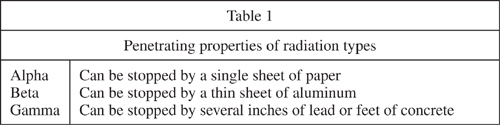
Table 2 presents some practical uses for the three types of radiation discussed.
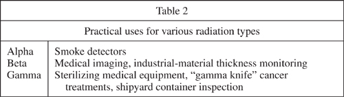
Table 3 lists some of the dangers of the various types of radiation discussed.
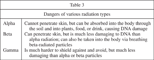
23. When you are given an X-ray in a dental office, you are required to wear a special protective apron made of lead. Assuming this apron is to protect you from one or more of the radiation types discussed above, what type(s) of radiation do you think the protective garment is meant to absorb?
A. Alpha radiation
B. Beta radiation
C. Gamma radiation
D. Alpha and beta radiation
24. What type of radiation exposure would pose the most serious risk to human life in the middle of a wheat field?
F. Alpha
G. Beta
H. Gamma
J. X-rays
25. What types of radiation could penetrate everyday clothing?
A. Only alpha and beta
B. Only beta and gamma
C. Only alpha and gamma
D. Only gamma
26. What type of radiation could be used to search for treasure buried under several feet of dirt?
F. Alpha
G. Beta
H. Gamma
J. None of the above
27. Why would a smoke detector using beta radiation instead of alpha be a bad choice?
A. Beta radiation would pass through the smoke and could make it radioactive.
B. Beta radiation would not have the range needed to detect smoke inside the home.
C. Beta radiation would pass through the concrete in the foundation and irradiate the groundwater.
D. It would not be a bad choice: beta radiation is used in smoke detectors.
Two students explain why water is a better medium than air for transporting heat away from the CPU (central processing unit) housed inside a modern computer and into the outside air. They also discuss how the use of a radiator (a series of winding pipes designed to optimize airflow over its surface to help cool the heated water within) and fan (a series of blades, attached to a central rotating hub, designed to push air) increases the efficiency of heat transfer from the CPU to the air.
Student 1
Water is a better medium for transporting heat than air because it has a much higher thermal conductivity than air does: 0.58 for water as opposed to 0.024 for air. (Thermal conductivity is the amount of heat transmitted through a given thickness of a given medium.) Because water is over 20× more thermally conductive than air, it can hold more than 20× the heat of air in exactly the same volume. This higher amount of conductivity means that water does not have to be circulated as often as air, because it takes longer to heat up.
A fan and radiator increase the efficiency of heat transport of a water-based cooling system by allowing heat to radiate from the water into the outside air without the complexities of exposing the heated water to air. Because the hot water stays within the radiator piping at all times, it is not exposed to pressure changes or influenced by outside current, and its flow can be regulated with ease.
Student 2
Water is a better medium for transporting heat than air because it has a much higher specific heat capacity than air. (Specific heat capacity is the amount of heat required to raise the temperature of 1 gram of a particular substance 1 degree Celsius.) Water has a specific heat capacity of 4.18, as opposed to a capacity of 1.0035 for air. What this means is that it will take more than 4× the amount of heat to increase 1 gram of water 1 degree Celsius than it would 1 gram of air.
A fan-and-radiator setup increases the efficiency of heat transport of a water-based cooling system by increasing the surface area of the hot water by running it through a radiator. Once in the radiator, the fan will push air over the surface of the hot radiator tubes, drawing out heat quickly (remember that air heats much faster than water) and expelling it outside the computer.
28. According to Student 1, why is a radiator helpful in dispersing heat?
F. The piping keeps the hot water flowing and is easily regulated.
G. The fan removes the heat by pushing air over the pipes.
H. Air heats faster than water.
J. Surface area is increased via the radiator.
29. Assume that instead of water, a much denser liquid was used that absorbed heat much more slowly than water, but was able to retain much more energy before becoming hotter. What would each student say would happen to the heat transportation efficiency if this denser liquid were used?
A. Student 1 would say that the efficiency would be lower; Student 2 would say that the efficiency would be higher.
B. Student 2 would say that the efficiency would be lower; Student 1 would say that the efficiency would be higher.
C. Both students would say that the efficiency would be lower.
D. Both students would say that the efficiency would be higher.
30. Which student(s) would claim that if air were used instead of water to transport heat, heat transportation would be more efficient?
F. Both students would say that it would be more efficient.
G. Neither student would say that it would be more efficient.
H. Student 1 would say that it would be more efficient.
J. Student 2 would say that it would be more efficient.
31. Suppose an unknown liquid was used instead of water to transport heat. The liquid seemed to be much more efficient than water. What would Student 1 assume was making the liquid more efficient?
A. A higher thermal conductivity in the liquid
B. A lower thermal conductivity in the liquid
C. A higher specific heat capacity in the liquid
D. A lower specific heat capacity in the liquid
32. According to Student 2, what would be a disadvantage of removing a fan from a radiator-and-fan setup?
F. There would be no disadvantage.
G. Water would no longer be pushed through the radiator.
H. Air would no longer be pushed over the outside of the radiator and draw heat away.
J. Air would get inside the radiator tubes and interrupt the flow of water.
33. What would Student 1 and Student 2 probably NOT agree on?
A. Water is a better medium for transporting heat than air.
B. Water’s thermal conductivity is what makes it better at transporting heat.
C. Fans and radiators increase the efficiency of heat transport.
D. Water is an important cooling agent in the CPUs of modern computers.
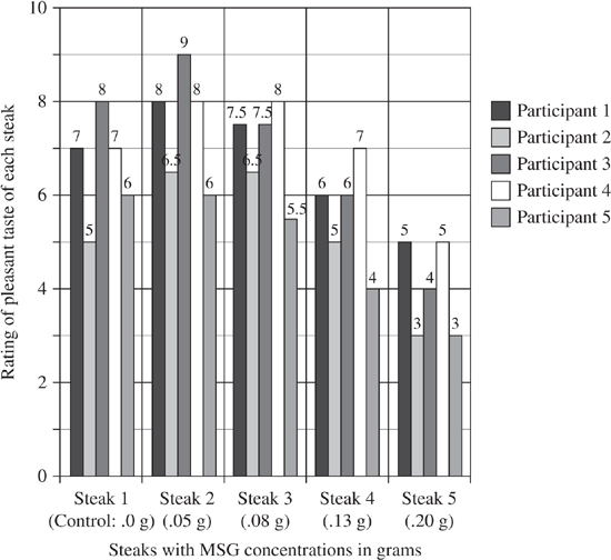
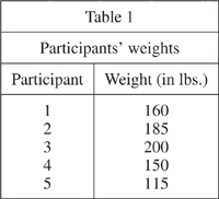
Monosodium glutamate (MSG) is a substance regularly added to food products as a flavor enhancer and/or salt substitute. Though MSG has been in commercial production and use for over 100 years, its use in food remains controversial. Students conducted a taste test using various MSG concentrations to estimate what concentration of MSG tasted best to the participants. Table 1 shows each participant’s weight for use in estimating dosage of MSG by body weight.
Experiment 1
Four solutions of MSG (diluted in water) were added to 3.5-ounce (100-gram) cooked steaks to determine how the MSG affected the participants’ perceptions of the taste of the steak. One steak, as a control, did not have an MSG solution applied to it. Each of the 5 participants tasted each of the 5 steaks. The results are reported in Figure 1.
34. How many participants rated the control steak (Steak 1) higher than the steak with the smallest application of MSG (Steak 2)?
F. 5
G. 4
H. 1
J. 0
35. What steak was rated highest?
A. Steak 1
B. Steak 2
C. Steak 3
D. Steak 4
36. What steak was rated lowest?
F. Steak 1
G. Steak 2
H. Steak 4
J. Steak 5
37. What is the highest concentration of MSG that resulted in a higher-rated steak than the control steak (Steak 1)?
A. .05 grams
B. .08 grams
C. .13 grams
D. .20 grams
38. Assume that Participant 3 eats only one meal with MSG per week and it is a steak identical to Steak 2. How much MSG per pound of body weight does he consume a week?
F. .025 grams per pound
G. .0025 grams per pound
H. .0050 grams per pound
J. .00025 grams per pound
39. The lethal dosage of MSG is 7.5 grams per pound. How many steaks identical to Steak 2 would Participant 3 have to eat in one sitting to achieve a lethal dose of MSG for his body weight?
A. 300 steaks
B. 3,000 steaks
C. 30,000 steaks
D. 30 steaks
40. Which of the following would NOT have been an important control to have in the experiment?
F. Constant appearance and temperature of steak
G. Portion size and texture of steak
H. Tenderness and freshness of steak
J. Person serving the steak
1. B. The arrows in Figure 1 indicate that as the gas rises from the escape tube, it expands. The large arrow indicates that the gas is traveling upward, while the two small arrows indicate that the plume is getting wider as it rises.
2. J. You may only consider the information in Study 3. There is no way to determine which of the hypotheses is correct, even if data from the other studies provided evidence (they don’t).
3. B. The key here is recognizing the trends. Even though the data aren’t presented in graphical form, where the pattern would be easy to recognize, you should notice that as the rate of gas accumulation increases, the volume of the tube decreases.
4. J. You’re seeking the relationship between age and volume. The table doesn’t reveal a pattern with regard to age and volume: from youngest to oldest, the volumes are 60,000,000 km3, 32,000,000 km3, 39,000,000 km3, and 61,000,000 km3. Since there is no pattern, the correct answer is J.
5. A. All of the graphs plot the rate of accumulation with respect to the age of the gas tubes, so these are the two variables you should look for in the table. The differences in the answer choices arise from what is displayed on each axis: the numbers 45, 55, 60, and 72 should be on the x-axis and a range from 250 to 1,300 km3/yr on the y-axis. You can immediately rule out choice B (the values on the y-axis are incorrect), choice C (the rates are incorrect by a factor of 10), and choice D (the lowest value is not 250). Thus, the correct answer is A.
6. J. The information in Studies 1 and 2 doesn’t indicate which hypothesis is correct. Sometimes, there just aren’t enough data to make a decision.
7. B. You can read the answer on the graph, being careful to note that the label for the y-axis means that it is 800billion tons, not 800 million tons.
8. H. Both graphs indicate that biomass increased fastest between the low and medium2 eras (roughly 200,000 BCE to 150,000 BCE).
9. A. The two species that were present in all four eras are grasses, as indicated by the “(G)” next to their name and the legend.
10. G. There are three dominant grasses and one dominant shrub.
11. C. Since there are four dominant grasses and four dominant shrubs, they are equally likely to be dominant.
12. H. Both are line graphs, and all of the other differences are valid.
13. A. The highest average in Table 1 was 91.1 for Row A on Day 6.
14. G. This question tests your knowledge of decimal places. Since all of the data in Table 2 is reported to one decimal place, this is equivalent to 0.1°C.
15. C. The data in Row C in Table 1 should be compared to the graphs. The only graph with a data range of 52.4 to 63.0 is that in answer choice C.
16. J. Although the temperature decreased from Day 3 to Day 5 in Row B, the general trend was that the temperature rose over the course of the experiment. Don’t let minor fluctuations distract you from the overall data trend in an experiment.
17. D. Since the values at those times of day aren’t given, it is impossible to know what the new averages would be.
18. G. All of the converters either have higher efficiencies at –100°C than at +100°C, or there is no difference (for the 3003 model at 168 hours after starting).
19. D. The 3003 model reaches 70% efficiency most quickly.
20. H. The difference in the two experiments is the temperature at which the converters were operated.
21. A. The 3003 model at –100°C reaches 71.5% efficiency before declining to 70% efficiency; it is the only model whose efficiency increases, then decreases.
22. F. The 3000CE model’s efficiency increases most slowly; if the trend continues, this model will take the longest amount of time to reach 70% efficiency.
23. C. Because you are required to wear a lead apron, you are being protected from gamma radiation. If you needed to be protected from alpha or beta radiation, a much simpler shield (paper or aluminum) would be required.
24. F. In a wheat field, the most serious concern would be alpha particles, which can’t penetrate skin but can be absorbed into the body via edible plants (like wheat).
25. B. Alpha particles can be absorbed by only a single sheet of paper, and clothing is thicker and denser than that. It would take aluminum or lead, however, to shield a person from beta or gamma particles.
26. H. Only gamma radiation could be used to search for treasure, because it would take several feet of concrete (which is much denser than dirt) to stop gamma radiation.
27. A. The process of elimination can be used to solve this problem. Answer choice B is ruled out, because the range of particles isn’t discussed in the passage. Choice C is ruled out, based on the information in Table 1. Choice D is ruled out, based on the information in Table 2. Choice A makes sense, because beta radiation would not be stopped by the smoke and can be damaging when inhaled (as it would be if it made the smoke radioactive in a fire).
28. F. In the second paragraph of Student 1’s explanation, it is stated that a radiator is helpful because it controls the hot-water flow and allows it to be regulated.
29. B. Because Student 2 believes specific heat capacity to be a critical factor in heat-transportation efficiency, the fact that the denser liquid took much longer to heat up would make it less efficient than water. Student 1, on the other hand, would think that the ability of the denser liquid to hold more heat (due to thermal conductivity) would make it more efficient than water.
30. G. Air has a lower thermal conductivity and a lower specific heat capacity than water, so neither of the students would think it would be more efficient at heat transportation.
31. A. Since Student 1 attributes the heat-transportation efficiency of water to its high thermal conductivity, Student 1 would assume that a liquid that transports heat even more efficiently than water would have a higher thermal conductivity.
32. H. Student 2 states that “the fan will push air over the surface of the hot radiator tubes, drawing out heat quickly.”
33. B. Student 1 believes that the thermal conductivity of water is the critical factor, while Student 2 believes that the specific heat capacity of water is the critical factor.
34. J. Everyone except Participant 5 rated Steak 1 lower than Steak 2, and Participant 5 rated the two steaks the same.
35. B. Steak 2 had the highest average rating.
36. J. Steak 5 had the lowest average rating.
37. B. Steak 3 had the highest concentration of MSG among steaks whose average rating was above that of the control.
38. J. Participant 3 weighs 200 pounds and consumes .05 grams of MSG per week (the amount in Steak 2). Divide .05 grams by 200 pounds; the result is .00025 grams per pound.
39. C. Since Participant 3 weighs 200 pounds, multiply 7.5 grams by 200; the result is 1,500 grams of MSG. Since Steak 2 has a concentration of .05 grams per pound, divide 1,500 by .05; the result is 30,000 steaks.
40. J. While all of the other factors may have had an impact on the perceived taste of the steak, the person serving a steak probably wouldn’t affect the rating given to it.