Pseudoclasses
There are a number of selectors and classes that are used only
within a style sheet and that do not have any matching tags or attributes
within HTML. Their task is to classify elements using characteristics
other than their names, attributes, or content—i.e., characteristics that
cannot be deduced from the document tree. These include pseudoclasses such
as first-line, first-child, and first-letter.
Pseudoclasses are separated from elements using a : (colon) character. For example, to create a
class called bigfirst for emphasizing
the first letter of an element, you would use a rule such as the
following:
.bigfirst:first-letter {
    font-size:400%;
    float    :left; }
When the bigfirst class is
applied to a text element the first letter will be displayed much
enlarged, with the remaining text shown at normal size neatly flowing
around it (due to the float property),
as if the first letter were an image or other object. Other pseudoclasses
include hover, link, active,
and visited. All of these are mostly
useful for applying to anchor elements, as in the following rules, which
set the default color of all links to blue, and that of links that have
already been visited to light blue:
a:link    { color:blue;      }
a:visited { color:lightblue; }
The following pair of rules is interesting in that they use the
hover pseudoclass so that they are
applied only when the mouse pointer is placed over the element. In this
example, they change the link to white text on a red background, providing
a dynamic effect you would normally expect only from using JavaScript
code:
a:hover {
    color     :white;
    background:red; }
Here I have used the background
property with a single argument, instead of the longer background-color property.
The active pseudoclass is also
dynamic in that it effects a change to a link during the time between the
mouse button being clicked and released, as with this rule, which changes
the link color to dark blue:
a:active { color:darkblue; }Another interesting dynamic pseudoclass is focus, which is applied only when an element is
given focus by the user selecting it with the keyboard or mouse. The
following rule uses the universal selector to always place a mid-gray,
dotted, 2-pixel border around the currently focused object:
*:focus { border:2px dotted #888888; }Example 18-5 displays two links and an input field, as shown in Figure 18-12. The first link shows up as gray since it has already been visited in this browser, but the second link has not and displays in blue. The Tab key has been pressed and the focus of input is now the input field, so its background has changed to yellow. When either of the links is clicked it will display in purple, and when hovered over it will show in red.
<!DOCTYPE html>
<html>
    <head>
        <title>Pseudo classes</title>
        <style>
            a:link    { color:blue;        }
            a:visited { color:gray;        }
            a:hover   { color:red;         }
            a:active  { color:purple;      }
            *:focus   { background:yellow; }
        </style>
    </head>
    <body>
        <a href='http://google.com'>Link to Google'</a><br />
        <a href='nowhere'>Link to nowhere'</a><br />
        <input type='text' />
    </body>
</html>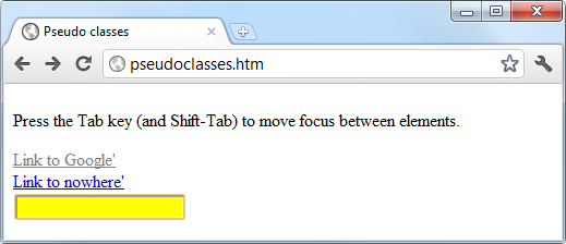
Other pseudoclasses are also available, and you can get more information on them at the following website: http://tinyurl.com/pseudoclasses.
Note
Be careful when applying the focus pseudoclass to the universal selector,
*, as shown in this example—Internet
Explorer takes an unfocussed document as actually having focus applied
to the entire web page, and (in this instance) the whole page will turn
yellow until the Tab key is pressed or focus is otherwise applied to one
of the page’s elements.