Multicolumn Layout
Multiple columns has long been one of the features most requested by web developers, and this has finally been realized in CSS3, with Internet Explorer 10 being the last major browser to adopt it.
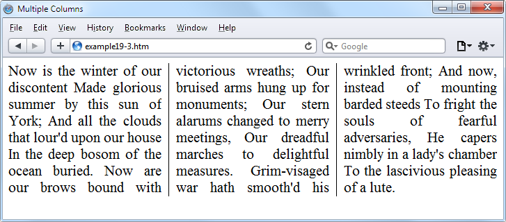
Now, flowing text over multiple columns is as easy as specifying the number of columns and then (optionally) choosing the spacing between them and the type of dividing line (if any), as shown in Figure 19-5 (created using the code in Example 19-3).
<!DOCTYPE html>
<html>
    <head>
        <title>Multiple Columns</title>
        <style>
            .columns {
                text-align          :justify;
                font-size           :16pt;
                -moz-column-count   :3;
                -moz-column-gap     :1em;
                -moz-column-rule    :1px solid black;
                -webkit-column-count:3;
                -webkit-column-gap  :1em;
                -webkit-column-rule :1px solid black;
                column-count        :3;
                column-gap          :1em;
                column-rule         :1px solid black; }
        </style>
    </head>
    <body>
        <div class='columns'>
            Now is the winter of our discontent
            Made glorious summer by this sun of York;
            And all the clouds that lour'd upon our house
            In the deep bosom of the ocean buried.
            Now are our brows bound with victorious wreaths;
            Our bruised arms hung up for monuments;
            Our stern alarums changed to merry meetings,
            Our dreadful marches to delightful measures.
            Grim-visaged war hath smooth'd his wrinkled front;
            And now, instead of mounting barded steeds
            To fright the souls of fearful adversaries,
            He capers nimbly in a lady's chamber
            To the lascivious pleasing of a lute.
        </div>
    </body>
</html>
Within the .columns class, the
first two lines simply tell the browser to right-justify the text and set
it to a font size of 16pt. These
declarations aren’t needed for multiple columns, but they improve the text
display. The remaining lines set up the element so that, within it, text
will flow over three columns, with a gap of 1em between the columns and a single-pixel
border down the middle of each gap.
