Text Effects
A number of new effects can now be applied to text with the help of CSS3, including text shadows, text overlapping, and word wrapping.
The text-shadow Property
This property is similar to the box-shadow property and takes the same set of
arguments: a horizontal and vertical offset, an amount for the blurring,
and the color to use. For example, the following declaration offsets the
shadow by 3 pixels both horizontally and vertically, and displays the
shadow in dark gray, with a blurring of 4 pixels:
text-shadow:3px 3px 4px #444;
The result of this declaration looks like Figure 19-6; it works in recent versions of all major browsers (but not IE9 or lower).

The text-overflow Property
When using any of the CSS overflow properties with a value of
hidden, you can also use the text-overflow property to place an ellipsis
(three dots) just before the cutoff to indicate that some text has been
truncated, like this:
text-overflow:ellipsis;
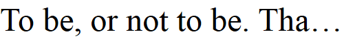
Without this property, when the text “To be, or not to be. That is the question.” is truncated, the result will look like Figure 19-7, but with the declaration applied the result is like Figure 19-8.

For this to work, three things are required:
The element should have an
overflowproperty that is not visible, such asoverflow:hidden.The element must have the
white-space:nowrapproperty set to constrain the text.The width of the element must be less than that of the text to truncate.
The word-wrap Property
When you have a really long word that is wider than the element
containing it, it will either overflow or be truncated. But as an
alternative to using the text-overflow property and truncating the
text, you can use the word-wrap
property with a value of break-word
to wrap long lines, like this:
word-wrap:break-word;
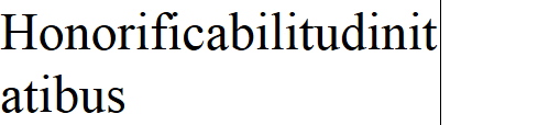
For example, in Figure 19-9 the word “Honorificabilitudinitatibus” is too wide for the containing box (whose righthand edge is shown as a solid vertical line between the letters t and a), and because no overflow properties have been applied, it has overflowed its bounds.

But in Figure 19-10
the word-wrap property of the element
has been assigned a value of break-word, and so the word has neatly wrapped
around to the next line.