Transformations
Using transformations you can skew, rotate, stretch, and squash
elements in any of up to three dimensions (yes, 3D is supported, but only
in WebKit-based browsers for now). This makes it easy to create great
effects by stepping out of the uniform rectangular layout of <div> and other elements, because now they
can be shown at a variety of angles and in many different forms.
To perform a transformation, use the transform property (which unfortunately has
browser-specific prefixes for Mozilla, WebKit, Opera, and Microsoft
browsers, so once again you’ll need to refer to the website http://caniuse.com).
You can apply various properties to the transform property, starting with the value
none, which resets an object to a
nontransformed state:
transform:none;
You can supply a variety of one or more of the following functions
to the transform property:
There are also single versions of many of these functions, such as
translateX, scaleY, and so on.
Note
WebKit-based browsers (such as Apple Safari, iOS, Google Chrome, and Android) support 3D transformations as well, but I will not cover those here because IE, Opera, and Mozilla-based browsers do not yet provide this feature—hopefully these browsers will catch up soon, though.
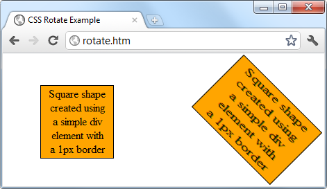
So, for example, to rotate an element clockwise by 45 degrees, you could apply this declaration to it:
transform:rotate(45deg);
At the same time, you could enlarge the same object, as in the following declaration, which enlarges its width by 1.5 times and its height by 2 times and then performs the rotation:
transform:scale(1.5, 2) rotate(45deg);
Figure 19-12 shows an object before the transformations are applied, and then afterwards.