If you ever visit London, after you enjoy the magnificent sights of Westminster Abbey, the Houses of Parliament, and Big Ben, cross the Westminster Bridge to the east and turn right to find St. Thomas’ Hospital. There, hemmed in between large buildings, you’ll find the tiny and lovely museum devoted to Florence Nightingale.
Nightingale is a beloved and debated figure in the history of public health, nursing, statistics, and chartmaking. Driven by a deep Unitarian faith, which emphasized deeds over creeds, and against the wishes of her wealthy family, Nightingale decided at an early age to devote her life to health care and to looking after the poor and needy. She also loved science. Her father had given her an excellent education in the liberal arts and mathematics. Some biographers claim that this influence helps explain why she later came to possess “one of the greatest analytical minds of her time.”1
If you take my advice and visit the Nightingale museum in London, spend some time poring over the many documents and books showcased. One chart in particular will catch your attention:
This is one of my favorite charts ever. Even if its design isn’t perfect, it exemplifies many tenets of good chart reading, so allow me to give you some historical context at length.
In October of 1853, the Ottoman Empire, centered in modern Turkey, declared war on the Russian Empire. Britain and France joined what would later be called the Crimean War (1853–1856) in March 1854, on the Turkish/Ottoman side. The reasons for this war are complex and based on the expansionist desires of the Russian Empire and on disputes over the protection of Christian minorities—Russian Orthodox and Roman Catholic—who lived in Palestine, which at the time was part of the Ottoman Empire.2
Hundreds of thousands of soldiers perished. Mortality rates were chilling: around one out of five soldiers sent to the Crimean War died, a crushing majority of them because of diseases such as dysentery and typhoid fever, not because of wounds received during battle. At that time, there weren’t effective treatments against infectious diseases—other than hydration, a good diet, and rest in a clean place—and the germ theory of disease was still two decades away.
The war was fought mostly on the Crimean Peninsula, on the northern coast of the Black Sea. British soldiers who were wounded or diagnosed with illnesses were transported to Turkey. Many died during the crossing of the Black Sea, and those who survived faced dire conditions in overcrowded, dirty, lice-ridden, and poorly supplied hospitals in Scutari (Üsküdar), part of modern Istanbul. According to researchers from Boston University, “the Scutari hospitals served more as so-called fever wards than true military hospitals and existed largely to segregate patients with fever from their healthy compatriots. Soldiers were not sent to Scutari to be healed so much as to die.”3
Florence Nightingale, who had experience in organizing hospital supplies, volunteered to work in the Barrack Hospital of Scutari, which received that name because it was an array of repurposed military barracks. Nightingale and a team of nurses arrived in November 1854. During the almost two years she worked in Scutari, and against some resistance from the army and surgical establishments, Nightingale pushed for reforms. She kept thorough records of all patients and activities, helped improve the facilities, reduced overcrowding, pushed for more supplies, and provided psychological support to patients.
Mortality rates first increased after Nightingale’s arrival, then dropped following the winter of 1854–1855, although not as fast as the legend that surrounds her often suggests. The reason, according to recent historians, is that even if Nightingale improved cleanliness, she didn’t pay enough attention to ventilation or sanitation. She focused much more on the hygiene of individual patients than on the hygiene of their environment.4
Worried about the terrible conditions of wounded and ill soldiers, and under pressure from the opinions of a public made aware of the appalling mortality problem thanks to the press, the British government dispatched several commissions to the war zone—one to deal with supplies and another with sanitation. The Sanitary Commission began its work in March 1855. Keep this date in mind.
The Sanitary Commission, which Nightingale supported, discovered that the Barrack Hospital at Scutari sat on a cesspool, as the sewers of the building were clogged; some pipes were blocked by animal carcasses. The commissioners ordered that the sewers be cleaned, ventilation be improved, and waste be systematically disposed of. Conditions improved in all the hospitals that the commission visited, thanks to this advice.5
During her work at Scutari, Nightingale wasn’t fully aware that the death rate at her Barrack Hospital was much higher than in other hospitals treating soldiers from the war. Some of her nurses were suspicious of the fact that amputation survival was more likely if conducted on the front than in the hospitals, but they attributed it to the fact that men on the field were “in the full vigour of life, and able to bear the pain and exhaustion, while those operated on in the hospital were worn out by suffering.”6
To her horror, Nightingale discovered the true causes of the enormous Crimean War mortality rates only after she returned to London and analyzed the effects of the Sanitary Commission in collaboration with statisticians such as William Farr, an expert on medical hygiene. The science of hygiene was a controversial topic within the medical establishment at the time; physicians feared that their profession would be undermined if it was somehow shown that sanitation and ventilation were more important than medical care. To their dismay, this was what Nightingale’s data suggested. Below you’ll see a stacked bar graph—the bars add up to a total—of all deaths in the war. Notice the drop after March 1855 in overall deaths and in deaths due to diseases:
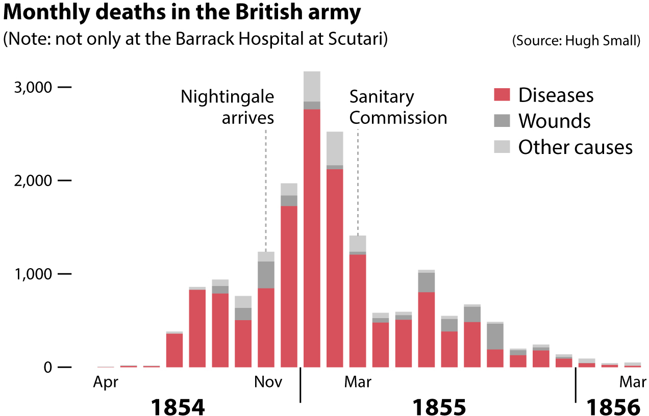
The sharp decrease in mortality can’t be attributed to the improvement in hospital sanitary conditions alone, but to Nightingale it was beyond a doubt that it was a major—if not the major—factor.7 Haunted by the lives that could have been saved had sanitation and ventilation been improved earlier, Nightingale devoted the remainder of her life, until she passed in 1910, to promoting the causes of nursing and public health.
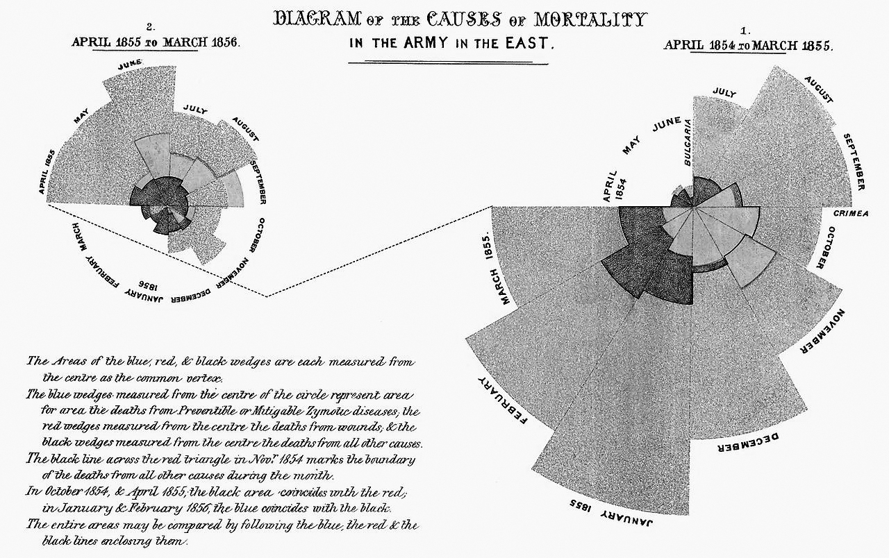
This leads us back to Nightingale’s chart, which she liked to call “the Wedges.” When she returned from the war, Nightingale used the immense fame she had acquired to push for reform in the administration of army hospitals. She believed that the British army neglected the health and well-being of foot soldiers. The army high command disagreed, denied any responsibility, and resisted change. They had the sympathies of Queen Victoria, although she approved a royal commission to investigate the disaster in Crimea and Turkey. Nightingale contributed to this commission.
To convince the army—and, ultimately, society in general—of the wisdom of William Farr’s sanitarian movement, which “urged the expenditure of public funds on flushed sewers, clean water and ventilation of dwellings,”8 Nightingale used words, numbers, and charts that appeared not only in commission reports but also in popular books and pamphlets. The Wedges is the most famous of Nightingale’s graphics. It displays the same data as the stacked bar graph, but in a much more striking and eye-catching manner.
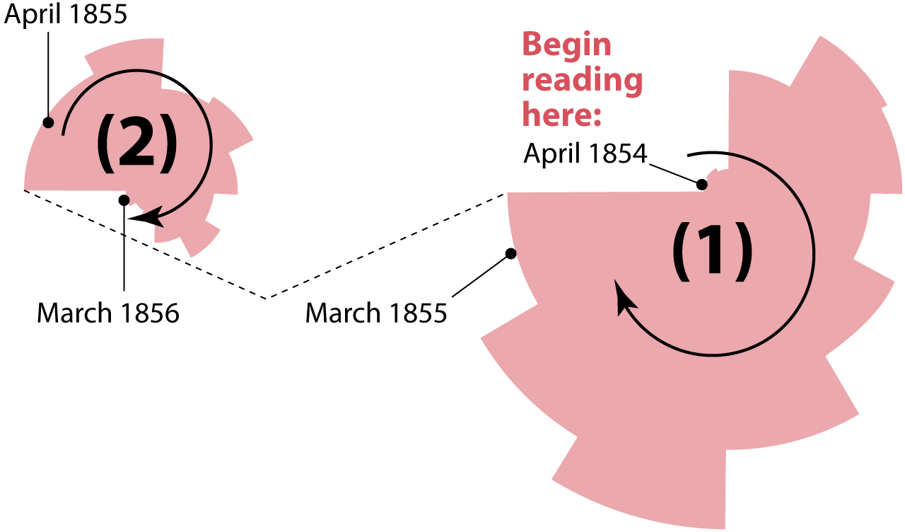
The Wedges chart consists of two circular shapes of different sizes that are read clockwise. These shapes are made of several wedges that correspond to months. The large shape (1), to the right in the diagram below, is the period between April 1854 and March 1855, the month when the Sanitary Commission was sent to the war zone. The second, smaller shape (2), to the left, goes from April 1855 to March 1856.
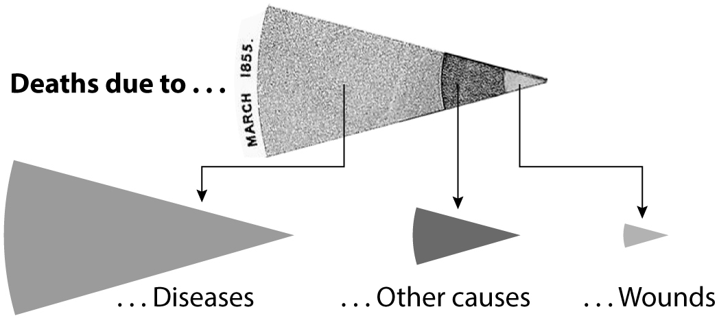
There are three wedges per month, partially overlapping—but not stacking on top of—each other. The area of each wedge, measured from the center of the circle, is proportional to the deaths due to diseases, wounds, or other causes, respectively. For instance, these are the segments corresponding to March 1855:
Why did Nightingale represent her data in such a fanciful way, and not as a simple stacked bar graph, or as a series of line charts, one per cause of death? Historian Hugh Small has pointed out that one of her targets was the government’s chief medical officer, John Simon, who claimed that deaths due to diseases and infections were unavoidable. Nightingale wanted to prove otherwise by emphasizing the before-and-after-the-Sanitary-Commission pattern through splitting the months into two circular shapes connected with a dotted line. The first shape, showing the total deaths before the Sanitary Commission arrived, is big; the second shape is much smaller.
I’d go even further and add my own guess: I believe her goal wasn’t just to inform but also to persuade with an intriguing, unusual, and beautiful picture. A bar graph conveys the same messages effectively, but it may not be as attractive to the eye.

The story that leads to Nightingale’s famous Wedges chart embodies principles that we should all hold dear. The first and most important one, as I explained in chapter 3, is:
For a chart to be trustworthy, it must be based on reliable data.
The data Nightingale used was the best that was available at the time. It took years to collect and analyze it before it was presented to the public.
The second principle that Nightingale’s Wedges exemplifies is that a chart can be a visual argument but it’s rarely sufficient on its own. Nightingale’s charts were always published in reports or books that explained the origins of the data and presented possible alternative interpretations before reaching a conclusion. As Karolinska Institute physician and public health statistician Hans Rosling used to say, “the world cannot be understood without numbers. And it cannot be understood with numbers alone.”9
This thoroughness in the presentation of information is what distinguishes information from propaganda. Propaganda is information presented in a simplistic manner with the intention of shaping public opinion, highlighting what the propagandist believes strengthens his or her case and omitting what may refute it. Nightingale and her collaborators made a forceful case for public health reform, but only after painstakingly building a long and evidence-driven argument. They tried to persuade through reason.
The third principle is that data and charts can save lives and change minds. Not only other people’s minds—after all, Nightingale’s charts were instruments for convincing her society to change its behavior—but your own. This is the most compelling reason why I admire Nightingale. She was consumed by guilt after the war because the data revealed that she hadn’t done enough to save the many thousands of soldiers who perished under her watch, and she acted in consequence, devoting her life to preventing future catastrophes due to the same mistakes she’d made.
The ability to change your mind in the face of evidence is, arguably, possessed by only the most honest and enlightened individuals, those who strive to use available information in the most ethical manner possible. We all ought to do our best to emulate them.
Charts can be instruments for either reasoning or rationalization. We humans are more inclined to the latter than to the former. We take the evidence that charts make visible and—particularly if we already have a belief about the topic the chart is about—we try to twist it to fit into our worldview, rather than pondering that evidence and using it to adjust our worldview accordingly.
Reasoning and rationalization rely on similar mental mechanisms. That’s why they can be easily confused. They’re both often based on making inferences. Inference consists of generating new information starting with available evidence or assumptions.
Inferences can be appropriate—when they correspond to reality—or not. In previous chapters, we saw a chart showing that cigarette consumption and life expectancy are positively related at a country-by-country level. We have multiple pieces of information here (“cigarette consumption, higher and lower” and “life expectancy, higher or lower”), and if we don’t know better or if we have a vested interest in justifying our own cigarette consumption, we may infer that smoking cigarettes helps us live longer. Imagine that I’m a heavy smoker and am repeatedly bugged by the media, friends, and family who insist that cigarettes can kill me. If I discover a chart that suggests otherwise, I may seize on it and use it to justify my behavior. That’s a rationalization.
Rationalization is the human brain’s default mode. The literature about it is abundant, with dozens of popular books explaining how our mental biases lead us astray. My favorite is Mistakes Were Made (but Not by Me), by Carol Tavris and Elliot Aronson. To explain how we form beliefs, justify them, and then become resistant to changing them, Tavris and Aronson talk about a metaphor they call “the pyramid of choice”; it is similar to a slippery slope.
Imagine two students with similarly mild opinions about cheating on exams. One day, during a test, both of them feel tempted to cheat. One does it, the other doesn’t. Tavris and Aronson suggest that if, after this event, we could ask both students their opinions about cheating, we’ll notice a significant change: the student who resisted cheating will express a much more self-righteous rejection of cheating, and the one who surrendered to the temptation will say that cheating isn’t that bad a transgression or that cheating was justified in this case because a scholarship was at stake. The authors add:
By the time the students are through with their increasingly intense levels of self-justification, two things have happened: one, they are now very far apart from one another; and two, they have internalized their beliefs and are convinced that they have always felt that way. It is as if they started off at the top of a pyramid, a millimeter apart; but by the time they have finished justifying their individual actions, they have slid to the bottom and now stand on opposite corners of its base.
Several dynamics are at work here. We humans hate dissonance. We hold ourselves in high regard and feel threatened by anything that may hurt our self-image (“I’m a good person, so it’s impossible that cheating is really that bad!”). Therefore, we try to minimize threatening dissonance by rationalizing our behavior (“Everybody cheats and, besides, cheating doesn’t harm anyone”).
Moreover, if we later find evidence that cheating does indeed harm other people—if the cheater got the scholarship, then that money didn’t go to a person who deserved it more—we’re less likely to accept it and change our minds than we are to refuse it or twist it in a way that fits our existing belief. We behave this way because of two related human traits: the confirmation bias and motivated reasoning. Psychologist Gary Marcus wrote that “whereas confirmation bias is an automatic tendency to notice data that fit with our beliefs, motivated reasoning is the complementary tendency to scrutinize ideas more carefully if we don’t like them than if we do.”10
The relationship among cognitive dissonance, confirmation bias, and motivated reasoning is explored in books such as The Righteous Mind by Jonathan Haidt and The Enigma of Reason by Hugo Mercier and Dan Sperber. These books say that an old-fashioned—and misleading—view of human reasoning is that of a mechanism that gathers information, processes and evaluates it, and then forms beliefs based on it.
Human reason, as described by these authors, works quite differently. Reasoning, when done alone or within groups that are culturally or ideologically aligned, can decay into rationalization: we first form beliefs—because members of our groups already hold them, or because we feel emotionally good about them—and then we use our thinking skills to justify those beliefs, persuade others of their merits, and defend ourselves against other people’s contradicting beliefs.
How do we move from rationalization to reasoning? Florence Nightingale’s life leading to her charts provides useful clues. When she came back from the Crimean War, she didn’t understand why so many soldiers had died under her care; she still blamed poor supplies, bureaucratic management, the poor health of the soldiers who arrived at her hospital, and so forth. She also had a reputation to maintain. Her portraits in newspapers, as a solitary nurse walking the long corridors of the Scutari hospital at night, carrying a lamp, looking after dying men, had transformed her into a popular, even mythical figure. It would have been understandable if she had succumbed to rationalizations to justify her actions during the war in Crimea.
Nightingale did the opposite: She studied her data carefully and partnered up with experts with whom she had long, heated, and honest dialogues, William Farr in particular. It was Farr who brought reams of data and evidence, and the techniques to analyze them, suggesting that improving sanitation in hospitals was the intervention that could save more lives. With Farr, Nightingale evaluated her alternative explanations for the high mortality of soldiers and weighed them against fresh numbers.
The lesson we can learn from Nightingale’s experience is that, as painful as it may sound, we humans are barely able to reason on our own or when surrounded by like-minded people. When we try to reason this way, we end up rationalizing because we use arguments as self-reinforcing virtue signals. And the worst news is that the more intelligent we are and the more information we have access to, the more successful our rationalizations are. This is in part because we’re more aware of what the members of the groups—political parties, churches, and others—that we belong to think, and we try to align with them. On the other hand, if you are exposed to an opinion and don’t know where the opinion comes from, you’re more likely to think about it on its merits.
Rationalization is a dialogue with ourselves or with like-minded brains. Reasoning, on the other hand, is an honest and open conversation in which we try to persuade interlocutors who don’t necessarily agree with us beforehand with arguments that are as universally valid, coherent, and detailed as possible, while opening ourselves to persuasion.
This dialogue doesn’t need to be face-to-face. Much dialogue in Nightingale’s time happened through correspondence. When you read a paper, article, or book paying close attention, you’re engaging in a dialogue with its author, the same way that if you write a book, you expect your audience to not just absorb it passively but to reflect on its contents, critique them constructively, or expand on them in the future. This is why it’s so crucial to have a balanced media diet, composed of carefully curated news publications (a recommendation I made in chapter 3). Just as we’re conscious of what we put inside our bodies when eating or drinking, we should exercise similar care with what we put inside our heads.
The arguments we use when we rationalize are rarely universally valid, coherent, and detailed. You can put yourself to the test. Try to explain to someone who disagrees with you on something why you believe what you believe. As much as you can, avoid arguments from authority (“This book, author, scientist, thinker—or TV anchor—said that . . .”) or appeals to your values (“I’m a leftist liberal, so . . .”).
Instead, lay out your case step by step, being careful to attach each link of your reasoning chain to the preceding and subsequent ones. You’ll soon realize how unstable the scaffolding sustaining even our deepest and dearest beliefs is. It’s a humbling experience, and it makes you realize that we should all lose our fear of admitting “I don’t know.” Most of the time, we really don’t.
This is also one of the strategies that experts in thinking suggest to convince people who are wrong about something.11 Don’t just throw evidence at them, as this may backfire, triggering the diabolical triad of cognitive dissonance, motivated reasoning, and confirmation bias. Instead, make people deliberate. Experiments have shown that when we put people of differing opinions together in the same room and we ask them to talk to each other as equals—without identifying them as part of any kind of group, as doing so may trigger in-group defense instincts—they become more moderate. If you argue with others, show genuine interest in what they believe, empathize, and ask for a detailed explanation. Doing so may help you and them become aware of knowledge gaps. The best antidote to a misguided belief is not just truthful information. Instead, it is doubt and uncertainty, cracks in the edifice of belief through which truthful information can later leak in.
Because of their clarity and persuasiveness, charts can be key in dialogues. In a 2017 paper, political science professors Brendan Nyhan and Jason Reifler described three experiments in which charts helped dispel misperceptions.12 The United States invaded Iraq in 2003, and in 2007 the George W. Bush administration announced a surge in the number of troops occupying the country, to deal with numerous insurgent attacks that killed both soldiers and civilians. Beginning in June that year, casualties began dropping.
Public opinion was divided about the effectiveness of the surge. According to Nyhan and Reifler, 70% of Republicans thought the surge was making the situation in Iraq better—which it was—but only 21% of Democrats agreed with them. More worrying may be the 31% of Democrats who thought that the surge was making matters even worse by helping increase violence and casualties.
Nyhan and Reifler divided the subjects in their experiments into three groups: those who wanted the U.S. to remain in Iraq, those who wanted a withdrawal, and those who didn’t have a strong opinion about it. They showed them this chart:
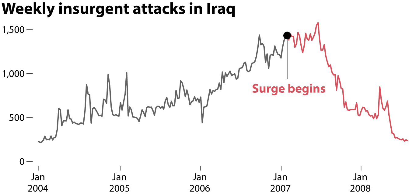
The chart reduced the proportion of people who believed that the surge had had no effect or had increased the number of attacks and victims. The effect was more visible among those who opposed the U.S. occupation of Iraq. The chart didn’t change everyone’s minds, but it did mitigate misperceptions in some people. Nyhan and Reifler conducted two other experiments with charts about the job market under President Obama (showing that many people, particularly Republicans, didn’t believe that unemployment had dropped rapidly during his tenure) and climate change. Charts reduced—but did not eliminate—misperceptions in both cases.
Nyhan and Reifler’s experiments bring me back to the main message of this book: charts can make us smarter and can enable fruitful conversations, but only if certain conditions are met. Some of them are related to the design of those charts; others, with the way we readers interpret them. The old saying, “There are three kinds of lies: lies, damned lies, and statistics,” commonly attributed to Benjamin Disraeli and Mark Twain, is sadly popular, but statistics lie only if we want them to lie or if we lack the knowledge to make them tell the truth. Dubious charts are far more often the result of sloppiness or ignorance than of maliciousness.
Another condition is that we, as readers, should approach charts as means to enhance conversations. Most charts aren’t conversation stoppers but conversation enablers. A good chart may help you answer a question (“Did the number of attacks increase or decrease after the surge?”), but charts are better at piquing our curiosity and prompting us to ask better questions (“But what about the number of victims?”). Think of Nightingale’s case again. Her famous chart was part of a very long argument laying out the evidence that led her and her collaborators to believe that sanitation had been neglected and that something had to be done about it. But the data and the chart themselves said nothing about what could be done.
This leads us to the next condition for a chart to make us smarter: we must stick to the principle that a chart shows only what it shows and therefore, we must strive not to read too much into it. Nyhan and Reifler’s chart shows that the number of attacks fell sharply after the surge, but it could be that each of these attacks was deadlier than each attack in the past and, as a result, that the number of victims increased. This wasn’t the case, but it’s a possibility, and it would be another piece of evidence we could look into to have a conversation about the consequences of the surge in Iraq.
There’s another lesson I’d argue we can learn from Nightingale: our purpose when using charts matters.
If there’s something that distinguishes the human species from other animals, it is our ability to devise technologies—both physical and conceptual—that extend our bodies and minds. We move faster thanks to wheels and wings; we see more and better thanks to glasses, telescopes, and microscopes; we enjoy deeper and more reliable memories thanks to print media and computers; we become stronger thanks to carts, cranes, and poles; and we communicate more effectively thanks to spoken and written language and the technologies intended to enable it and disseminate it. The list could go on and on, and it proves that we are a cyborg species. We can barely survive without the tools and prosthetics we imagine and realize.
Some technologies are brain prosthetics that expand our intelligence. Philosophy, logic, rhetoric, mathematics, art, and the methods of science garner our dreams, curiosity, and intuitions, channeling them in productive ways. They are conceptual tools. Charts are among them. A good chart widens our imagination and enhances our understanding by providing insights from numbers.
But tools don’t just expand our bodies or perceptions. They also have an ethical dimension. Tools aren’t neutral because both their design and their potential usages aren’t neutral either. Tool creators have a responsibility to think about the possible consequences of the innovations they devise and to tweak their creations if those consequences turn out to be negative; on the other hand, anyone who uses a tool should try to employ it ethically. Here’s a hammer:
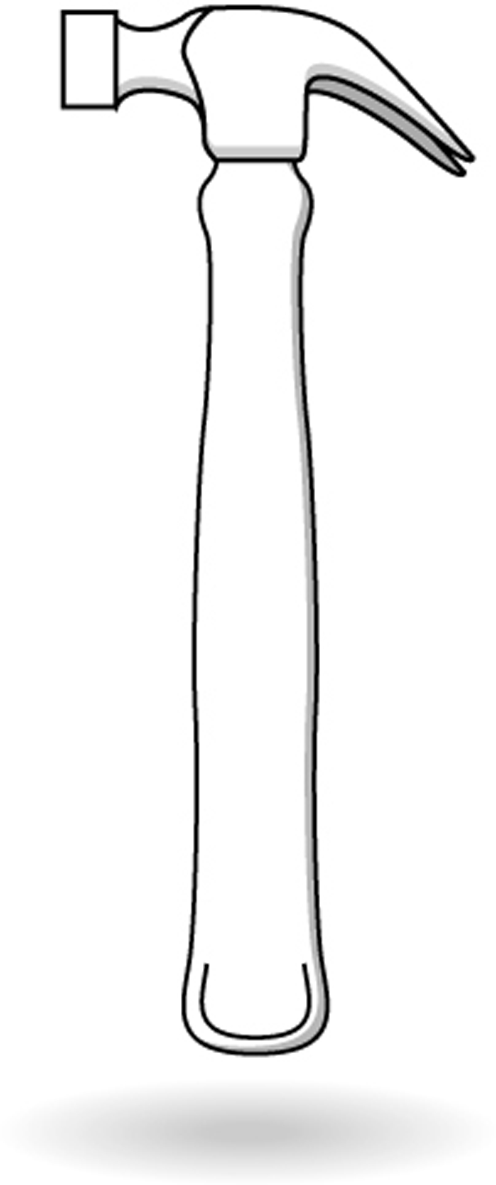
What is a hammer for? A hammer can be used to hit nails and build houses, shelters, barns, and walls that shield people, crops, and animals from the ravages of weather, thereby preventing misery and famine in the poorest regions of the world. In the same way, charts can be used to build understanding, communicate it to others, and inform conversations.
But the exact same hammer can be used for the opposite purpose: to destroy houses, shelters, barns, and walls, thereby condemning their owners to misery and famine. Or it can be used as a weapon of war. Similarly, charts—which are also a type of technology—can be employed to destroy understanding, mislead ourselves and others, and impede conversations.
The fight against disinformation is an endless arms race. Each generation has its new technologies and its own kind of propagandists taking advantage of them. Between the 1930s and the 1940s, the Nazis seized on technologies such as the printing press, as well as the radio and movies to promote fear, hatred, war, and genocide. If you have the opportunity, read one of the books about Nazi propaganda published by the United States Holocaust Memorial Museum,13 or search for examples on the internet. To our modern eyes, Nazi propaganda looks strident, crude, and unpersuasive. How could people be convinced by such malarkey?
The reason is that disinformation is always as sophisticated—or as unsophisticated—as the society that engenders it. While writing these lines, I learned about a terrifying set of new artificial intelligence–driven tools that let you manipulate audio and video files.14 You can record yourself reading a statement and then have the tool make you sound like, say, Barack Obama or Richard Nixon, given that you have recordings of their speeches that you can feed into the tool to train it. There are also technologies that can do something similar with video: record yourself making faces and then map your expressions onto another person’s face.
Data and charts aren’t new for scientists, mathematicians, statisticians, or engineers, but they are novel technologies in the eyes of many among the public at large, who see them as embodiments of truth. This opens the door to propagandists and liars, and the best defenses we have are education, attention, ethics, and conversations. We live in a time when data and charts are not only glorified but also ubiquitous because the means to spread them—online, particularly through social media—allow each one of us to reach dozens of people, if not hundreds, thousands, or millions.
Nearly 50,000 people follow me on Twitter. This is a sobering fact that has made me very wary of what I share on that platform. If I screw up and post something that is grossly misleading, it may rapidly be spread by many of my followers. It’s happened several times, and I rushed to correct myself and contact everyone who shared what I had published.15
We journalists say that ours is, first, a “discipline of verification.” We can always be better at adhering to that ideal, but most reporters and editors I know do take verification seriously. Perhaps it’s time for this principle of verification to stop being just a journalistic ethical mandate and become instead a civic responsibility—the responsibility to assess whether what we share publicly looks and sounds right, if only to preserve the quality of our information ecosystems and public discourse. We know intuitively that we ought to use hammers responsibly—to build, not to destroy. We ought to begin thinking about other technologies such as charts and social media in the same way so instead of being part of the misinformation and disinformation malady that currently ails us, we become part of society’s immune system.
In July 1982, famous evolutionary biologist and bestselling author Stephen Jay Gould was diagnosed with abdominal mesothelioma, an incurable and rare cancer caused by exposure to asbestos. His doctors informed him that the median survival time after detecting the disease was just eight months. In other words: half the patients who received diagnoses lived less than eight months, and the other half lived longer. In a marvelous essay about his experience, Gould wrote:
Attitude clearly matters in fighting cancer. We don’t know why . . . but match people with the same cancer for age, class, health, socioeconomic status, and, in general, those with positive attitudes, with a strong will and purpose for living . . . tend to live longer.16
But how do you develop a positive attitude when you’ve just discovered that people like you have, on average, just eight months to live? Perhaps you can do this by understanding that sometimes a little information is much worse than no information at all. The charts that Gould found in the medical literature probably looked similar to this fictional Kaplan-Meier chart:
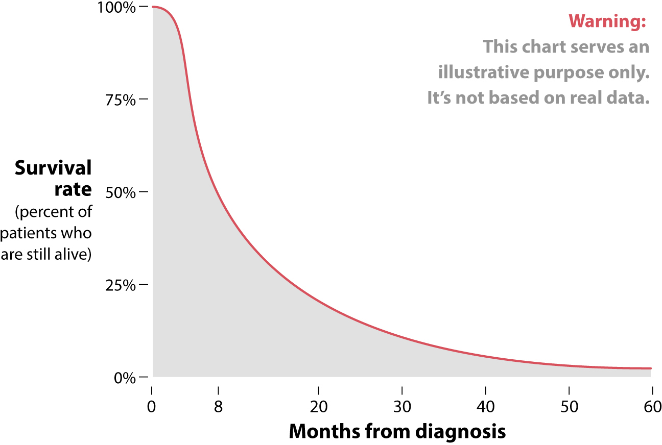
What Gould realized was that knowing that the median survival time of an abdominal mesothelioma patient was eight months didn’t mean that he would survive that long. Charts like the one above usually display a precipitous drop in survival rates first and then a very long tail to the right.
Gould thought that he’d be on that long tail. A person’s survival time after being diagnosed with any cancer depends on many factors, such as the age at which you got the bad news (Gould was relatively young), the stage of the cancer (the size of the tumor and whether it’s localized or has metastasized to other parts of your body), your overall health, whether you’re a smoker or not, the quality of the care and the type of treatment that you receive (Gould underwent aggressive experimental treatment), and probably your genes. Gould concluded that it was less likely that he’d be among the 50% of people who died within eight months after diagnosis than that he’d be part of the smaller percentage who went on to live for many years.
He was right. Gould was diagnosed with abdominal mesothelioma when he was 40 years old. He survived another 20 productive years that he devoted to teaching, writing dozens of popular-science articles and books, and producing a massive monograph that was published just a few months before he passed away, called The Structure of Evolutionary Theory.
Gould became happier, wiser, and more hopeful by meticulously assessing good numbers and charts. I dream of a future where everyone can do the same.