Goal: none, maximum, minimum, target, or range
Finding Your Sweet Spot for Multiple Responses
We make trade-offs in every solution, trying to minimize the pain and maximize efficiency, but never entirely ridding ourselves of the pain and never quite building the perfect system.
Michael F. Maddox
Computer programmer
Up until now, so as not to complicate matters, we’ve concentrated only on one response per experiment. However, any research done for practical purposes invariably focuses on multiple responses. We will now provide tools to deal with the inevitable tradeoffs that must be made when dealing with multiple responses from designed experiments.
“Less Filling” versus “Tastes Great!”: Always a Tradeoff
In the mid-1970s, Miller Brewing Company introduced its Lite beer brand with the advertising tagline “less filling/tastes great.” Whether they actually accomplished this difficult tradeoff may be a matter of debate, but it struck a chord with American beer drinkers. The Miller ads promoted the view that with proper technology, a sweet spot can be found where all customer needs are met.
HISTORY OF LIGHT BEER
By the late 1990s, light beers accounted for over one-third of all beers brewed in the United States. Miller, Budweiser, and Coors led the production in this market segment, which amounted to nearly 80 million barrels of beer. Dr. Joseph L. Owades, founder of The Center for Brewing Studies in Sonoma, California, came up with the idea for a low-calorie beer when he worked at Rheingold—a New York brewer. He investigated why some adults did not drink beer (many people don’t!). The answers he got were twofold
1. “I don’t like the way beer tastes”
2. “I’m afraid it will make me fat”
Owades couldn’t do anything about the taste of beer, but he did something about the calories by inventing a process that got rid of all the starch in beer, thus lowering the calories. The enzymes in barley malt only break down to about two-thirds of the starch to the point where yeast can digest it; so, one-third is left behind in the beer as a body. Owades came up with the idea that if you introduced a new enzyme, like people have in their stomachs, it would break down all the starch, convert it into alcohol, and leave a low-carbohydrate, high-alcohol beer. He didn’t just take a standard beer and dilute it because that would not taste the same.
Almost 40 years later, brewers do it a little differently. They simply use less malt, thus introducing less-fermentable sugars. The result is beer that has fewer calories, but also less body and malt flavor.
Does modern light beer taste as great as regular beer? You must be the judge.
Priscilla Estes
New Beverage, 1998 editorial at www.beveragebusiness.com
Making Use of the Desirability Function to Evaluate Multiple Responses
How does one accomplish a tradeoff such as beer that’s less filling while still tasting great? More likely in your case, the problem is how to develop a process that with maximum efficiency at minimum cost, achieves targeted quality attributes for the resulting product. In any case, to make optimization easy, the trick is to combine all the goals into one objective function. Economists do this via a theoretical utility function that produces consumer satisfaction. Reducing everything to monetary units makes an ideal objective function, but it can be difficult to do. We propose that you use desirability (Derringer, 1994) as the overall measure of success when you optimize multiple responses.
To determine the best combination of responses, we use an objective function, D(x), which involves the use of a multiplicative rather than an additive mean. Statisticians call this the geometric mean. For desirability, the equation is
The di, which ranges from 0 to 1 (least to most desirable, respectively), represents the desirability of each individual (i) response, and n is the number of responses being optimized. You will find this to be a common-sense approach that can be easily explained to your colleagues: convert all criteria into one scale of desirability (small d’s) so that they can be combined into one, easily optimized, value—the big D. This overall desirability D can be plotted with contours or in 3D using the same tools as those used for the RSM analysis for single responses. We will show these when we get to a more detailed case study later in this chapter.
By condensing all responses into one overall desirability, none of them need to be favored more than any other. Averaging multiplicatively causes an outcome of zero if any one response fails to achieve at least the tiniest bit of desirability. It’s all or nothing.
WHY NOT USE THE ADDITIVE MEAN FOR INDIVIDUAL DESIRABILITY?
When this question comes up in Stat-Ease workshops, we talk about desirability on the part of our students to study in a comfortable environment. It is often the case that the first thing in the morning of a day-long class, the temperatures are too cold, but with all the computers running and hot air emitted by the instructors (us!); by afternoon, things get uncomfortably hot. At this stage, as a joke, we express satisfaction that on average (the traditional additive mean), the students enjoyed a desirable room temperature (they never think that this is funny ☹). Similarly, your customers will not be happy if even one of their specifications does not get met. Thus, the geometric mean is the most appropriate for overall desirability (D).
П. Σ. (P. S.) In the equation for D, notice the symbol П (Greek letter pi, capitalized—equivalent to “p” in English) used as a mathematical operator of multiplication, versus the symbol Σ (capital sigma—or “s” in English) used for addition. To keep these symbols straight, think of “s” (Σ) for sum and “p” (П) for product.
Now, with the aid of numerical optimization tools (to be discussed in Appendix 6A), you can search for the greatest overall desirability (D) not only for responses but also for your factors. Factors normally will be left free to vary within their experimental range (or in the case of factorial-based designs, their plus/minus 1 coded levels), but for example, if time is an input, you may want to keep it to a minimum.
If all goes well, perhaps, you will achieve a D of 1, indicating that you satisfied all the goals. However, such an outcome may indicate that you’re being a slacker—that is, someone who does not demand much in the way of performance. At the other extreme, by being too demanding, you may get an overall desirability of zero. In this case, try slacking off a bit on the requirements or dropping out some of them altogether until you get a nonzero outcome. As a general rule, we advise that you start by imposing goals only on the most critical responses. Then, add the less-important responses, and finally, begin setting objectives for the factors. By sneaking up to the optimum in this manner, you may learn about the limiting responses and factors—those that create the bottlenecks on getting a desirable outcome.
The crucial phase of numerical optimization is the assignment of various parameters that define the application of individual desirabilities (di’s). The two most important are
Goal: none, maximum, minimum, target, or range
Limits: lower and upper
Here’s where subject matter expertise and knowledge of customer requirements becomes essential. Of lesser importance are the parameters:
Weight: 1–10 scale.
Importance: 5-point scale displayed + (1 plus) to +++++ (5 plus).
For now, leave these parameters at the default levels of 1 and +++ (3 plus), respectively. We will get to them later. It is best to start by keeping things as simple as possible. Then, after seeing what happens, impose further parameters such as the weight and/or importance on specific responses (or factors—do not forget that these can also be manipulated in the optimization). First, let’s work on defining desirability goals and limits.
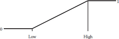
If your goal is to maximize the response, the desirability must be assigned as follows:
di = 0 if y (or x) falls below the lower limit
0 ≤ di ≤ 1 as y (or x) varies from low to high
di = 1 if y (or x) exceeds the higher-threshold limit
We say “limit,” but these are really thresholds because variables may fall outside these values—in this case, preferably above the higher limit. Figure 6.1 shows how desirability ramps up as you get closer to your goal at the upper threshold.
Hearkening back to the beer example, this is the proper goal for the “tastes great!” boast. Let’s say you establish a taste rating of 1 (low) to 10 (high) and ask drinkers what would be satisfactory. Obviously, they’d raise their mugs only to salute a rating of 10. In reality, you would almost certainly get somewhat lower ratings from an experiment aimed at better taste and less-filling beer. But in situations like this, if your clients desire the absolute maximum, set the high limit above what you actually observe to put a “stretch” in the objective. For example, an experiment on light beer might produce only a rating of 6 at the best (let’s be honest—taste does suffer in the process of cutting calories). In this case, we suggest putting in a high limit (or stretch target) of 10 nevertheless, because possibly, the actual result of 6 happened to be at the low end of the normal variability and therefore, more can be accomplished than you may think. Don’t rack your brain over this—just do it!
Figure 6.1 Goal is to maximize.
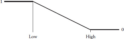
Figure 6.2 Goal is to minimize.
The desirability ramp shown in Figure 6.2 shows the opposite goal—minimize.
This is the objective for the “less filling” side of light beer. Notice that the ramp for the minimum is just flipped over from that shown for the maximum. We won’t elaborate on the calculations for the di because you can figure it out easily enough from the details we provided for the maximum goal. If you want the absolute minimum, set the low limit very low—below what you actually observed in your experimental results; for example, a zero-calorie beer.
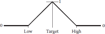
Quite often, the customer desires that you hit a specified target. To be reasonable, they must allow you some slack on either side of the goal as shown in Figure 6.3.
Notice how the desirability peaks at the goal. It is a conglomeration of the maximum and minimum ramps. We won’t elaborate on the calculations for the di—you get the picture. Getting back to the beer, consider what would be wanted in terms of the color. Presumably via feedback from focus groups in the test marketing of the new light variety, the product manager decided on a targeted level of measurable amber tint, which was not too clear (watered-down look) and not too thick (a heavy caloric appearance).
Figure 6.3 Goal is target (specification).
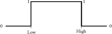
Figure 6.4 Goal is a range.
We mentioned earlier that you can establish goals for factors, but you may want to put this off until a second pass on the overall desirability function. However, unless you ran a rotatable CCD and went for Chapter 4’s “Reaching for the Stars” limits set to the standard error of the axial points, we advise you to constrain your factors within the ranges that were experimented upon. Do not extrapolate into poorly explored regions! Figure 6.4 illustrates such a range constraint in terms of individual desirability.
We advise that when running a standard CCD, you set the low and high limits at the minus/plus 1 (coded) factorial levels, even though their extreme values go outside this range. As discussed earlier, the idea behind CCDs is to stay inside the box when making predictions and seeking optimum values. Technical note: According to Derringer and Suich (1980), the goal of a range is simply considered to be a constraint; so, the di, although they get included in the product of the desirability function D, are not counted in determining n for D = (Πdi)1/n.
Now, we’ve got the basics of desirability covered; so, let’s put the icing on the cake by considering additional parameters—importance and weights.
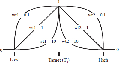
If you want to fine-tune your optimization, consider making use of a desirability parameter called “weight,” which affects the shapes of the ramps so that they more closely approximate what your customers want. The weight can vary from 0.1 to 10 for any individual desirability. Here’s how it affects the ramp
=1, the di go up or down on straight (linear) ramps this is the default
>1 (maximum 10), the di get pulled down into a concave curve that increases close to the goal
<1 (minimum 0.1), the curve goes to the opposite direction (convex) going up immediately after the threshold limit, well before reaching the goal
Think literally in terms of applying actual weights to flexible ramps of desirability. This is illustrated in Figure 6.5 showing the impact of varying weight on desirability over a targeted specification.
Figure 6.5 Goal is target (specification)—weights added.
Notice how the ramps are pulled down by the highest weights (10) and lifted up by the lower ones (weight of 0.1). Mathematically, this is expressed as
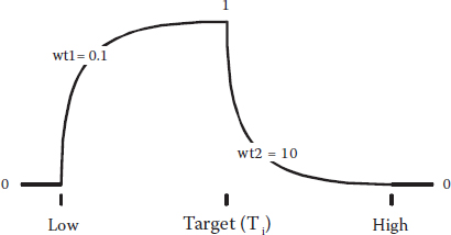
where T refers to the targeted value. Similar calculations can be done to apply weights to the goals of the minimum or maximum. Why you’d apply weights is a tougher question. This may be a stretch, but let’s say that consumers associate the color of light beer with its lightness in terms of calories. Perhaps then, if the color varied off the target to the higher side, it would cause a big drop in desirability, but on the lower end, it would take a big reduction for drinkers to be put off. In such a case, you’d want to put a high weight at the right (upper end) and a low weight at the left, thus creating the curve shown in Figure 6.6.
Now, we focus our attention on one more parameter for desirability—the importance rating. In the objective function D(x), each response can be assigned a relative importance (ri) that varies from 1 plus (+) at the least to 5 plus (+++++) at the most. If varying degrees of importance are assigned to the different responses, the objective function is
Figure 6.6 Goal is target (specification)—weights added in a peculiar manner.
where n is the number of variables (responses and/or factors) in D(x). When all the importance values remain the same, the simultaneous objective function reduces to the general equation shown earlier (without the ri exponents needed to account for importance). Change the relative importance ratings only if you believe that some individual desirabilities deserve more priority than others. For example, it seems likely that in the case of light beer, taste would be considered more critical to sales than the reduction in calories, with everything else being equal. Arguably, one could assign importance ratings as follows:
+ (1 plus) for calories
+++ (3 plus) for color
+++++ (5 plus) for taste
However, you’d better evaluate the impact of varying importance on the suggested optimum.
Numerical Search for the Optimum
Once you’ve condensed all your responses down to one univariate function via the desirability approach, optimization becomes relatively straightforward with any number of numerical methods. One unbiased and relatively robust approach involves a hill-climbing algorithm called “variable-sized simplex” (see Appendix 6A). Because more than one hill can exist in desirability space, the optimum found (the hill climbed) depends on where you initiate the search. To increase the chances of finding the global optimum, a number of optimization cycles, at least 100, should be done using different starting points chosen at random or on a grid. It’s safe to assume that you will find software with this tool for numerical optimization (e.g., the package accompanying this book) or an alternative approach. Let’s not belabor this point, but leave it to experts in computational methods to continue improving the accuracy and precision for consistently finding the global optimum in the least amount of time. This sounds like a multiple-response optimization problem, don’t you think?
The method we recommend for multiple-response optimization follows these steps:
1. Develop predictive models for each response of interest via statistically designed RSM experiments on the key factors.
2. Establish goals (minimize, maximize, target, etc.) and limits (based on customer specification) for each response, and perhaps also factors, to accurately determine their impact on individual desirability (di). Consider applying weights to shape the curves more precisely to suit the needs of your customers and applying varying importance ratings, if some variables must be favored over others.
3. Combine all responses into one overall desirability function (D) via a geometric mean of the di computed in step 2. Search for the local maxima on D and rank them as best to worst. Identify the factor settings for the chosen optimum.
4. Confirm the results by setting up your process according to the recommended setup. Do you get a reasonably good agreement with expected response values? (Use the prediction interval as a guide for assessing the success or failure to make the confirmation.)
If you measure many responses, the likelihood increases that your mission to get all of them within specification becomes impossible. Therefore, you might try optimizing only the vital few responses. If this proves to be successful, establish goals for the trivial many, but do this one by one so that you can determine which response closes the window of desirability—thus producing no solution.
Some of your responses, ideally not one of those that are most important, may be measured so poorly (e.g., a subjective rating on the appearance of a product) that nothing significant can be found in relation to the experimental factors. The best you can do for such responses will then be to take the average, or mean model (cruel!). Also, do not include any responses whose “adequate precision,” a measure of signal to noise defined in the Glossary, falls below 4, even if some model terms are significant.
Case Study with Multiple Responses: Making Microwave Popcorn
In DOE Simplified (Chapter 3), we introduced an experiment on microwave popcorn as a primer for two-level factorial design. Two responses were measured; so, this simple case is useful to illustrate how to establish individual desirability functions and then perform the overall optimization.
The popcorn DOE involved three factors, but one—the categorical brand of popcorn did not create a significant effect on any of the responses. That allows us to now concentrate on the other two factors: time and power—both numerical. We will fit factorial models to the multiple-response data shown in Table 6.1 and perform a multiple-response optimization.
To simplify tabulation of the response data, we show two results per row by a standard order for the original 23 design reported in DOE Simplified, but assume that these were run separately in random order. We made a few other changes in terminology from the previous report:
Time and power have been relabeled as “A” and “B”
The term “UPK” is brought in to better describe the second response, which is the weight of unpopped kernels of corn (previously labeled as “bullets”)
Table 6.1 Data for Microwave Popcorn
Std Order |
A: Time (minutes) |
B: Power (percent) |
y1: Taste (rating) |
y2: UPK (ounces) |
1, 2 |
4 (−) |
75 (−) |
74, 75 |
3.1, 3.5 |
3, 4 |
6 (+) |
75 (−) |
71, 80 |
1.6, 1.2 |
5, 6 |
4 (–) |
100 (+) |
81, 77 |
0.7, 0.7 |
7, 8 |
6 (+) |
100 (+) |
42, 32 |
0.5, 0.3 |
PRIMER ON MICROWAVE OVENS
Microwaves are high-frequency electromagnetic waves generated by a magnetron in consumer ovens. Manufacturers typically offer several power levels—more levels at the top of their product lines, which run upward from 1000 watts in total. The amount of power absorbed by popcorn and other foods depends on its dielectric and thermophysical properties. Water absorbs microwaves very efficiently so that moisture content is critical. Microwave energy generates steam pressure within popcorn kernels; so, higher moisture results in faster expansion, but weakens the skin too much (called the “pericarp”), which causes failure (Anantheswaran and Lin, 1988).
Conventional microwave ovens (MWOs) operate on only one power level; either on or off. For example, when set at 60% power, a conventional microwave cooks at full power 60% of the time, and remains idle for the rest of the time. Inverter technology for true multiple-power levels (steady state) was recently conceptualized and developed by Matsushita Electric Industrial Company Limited in Japan, the company that owns the Panasonic brand. On the basis of comparative tests, they claim the following advantages in nutritional retention:
Vitamin C (in cabbage)—72% versus 41%
Calcium (in cabbage)—79% versus 63%
Vitamin B1 (in pork)—73% versus 31%
Foods cooked in their inverter microwave over a conventional MWO, respectively. It would be interesting to see an unbiased, statistically designed, experiment conducted to confirm these findings.
Panasonic press release
“Now You’re Cooking—Revolutionary microwave technology from Panasonic”, May 2, 2002
The coded regression models that we obtained around this time are
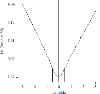
Figure 6.7 Box–Cox plot for UPK predicted via a linear model.
Notice that the base-ten logarithm is applied to the second response (UPK). This is a bit tricky to uncover, but it becomes obvious if you do a Box–Cox plot (see Figure 6.7) on the linear model (no interaction term).
The for this transformed model is 0.89 versus 0.93 for the alternative 2FI model in original units:
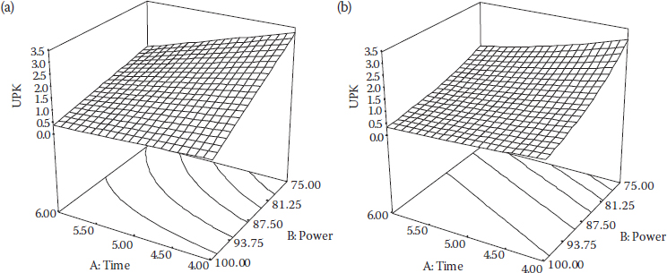
We used this when going over the same data in DOE Simplified. The models for UPK (y2)—actual (no transformation) 2FI versus linear in log scale (transformed)—look different, but they produce similar response surface graphs as you can see in Figure 6.8a and b.
As George Box says, “All models are wrong, but some are useful.” This is a common case, in which various models will do almost equally well for approximating the true response surface. As Box says, “Only God knows the true model,” so, we will arbitrarily use the log-linear model (pictured in Figure 6.8b) as the basis for predicting UPK in the multiple-response optimization, even though the 2FI model may make more sense.
The objectives are obviously to minimize percent UPK and maximize taste. However, just as obviously, it will be impossible to achieve 100% yield (zero UPK) of the product. (Maybe not impossible, but very likely you’d burn up the popcorn, the microwave, and possibly the entire building in the process!) We must build in some slack in both objectives in the form of minimally acceptable thresholds. Here’s what we propose for limits in the two responses measured for the popcorn experiment:
Figure 6.8 (a) UPK predicted by actual-2FI. (b) UPK predicted by a log-linear model.
1. Taste. Must be at least 65, but preferably maximized to the upper limit of 100. (Recall that the original taste scale went from 1 to 10, this being multiplied by 10 to make it easier to enter the averaged results without going to decimal places.)
2. UPK. Cannot exceed 1.2 ounces, but preferably minimized to the lower theoretical limit of 0.
CONSIDERATIONS FOR SETTING DESIRABILITY LIMITS
We made things easy by setting a stretch target of 100, the theoretical maximum, for the upper limit on taste. However, if this study were being done for commercial purposes, it would pay to invest in preference testing to avoid making completely arbitrary decisions for quantifying the thresholds. For example, sophisticated sensory evaluation may reveal that although experts can discern improvements beyond a certain level, the typical consumer cannot tell the difference. In such a case, perhaps 100 would represent the utmost rating of a highly trained taster, but the high limit would be set at 90, beyond which any further improvement would produce no commercial value—that is, increases in sales. Perhaps, a lessarbitrary example might be the measurement of clarity in a product such as beer. Very likely a laser turbidimeter might still register something in a beer that all humans would say is absolutely clear. In such a case, setting the low limit for clarity at zero on the turbidimeter would be overkill for that particular response. By backing off to the human limit of detection, you might create some slack that would be valuable for making tradeoffs on other responses (such as being less filling or tasting greater!).
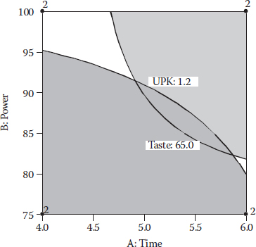
These thresholds of a minimum of 65 and a maximum of 1.2 are translated via the models for taste and UPK (using the 2FI alternative), respectively, to boundaries on the graphical optimization plot shown in Figure 6.9. This frames the sweet spots, within one of which we now hope to identify the most desirable combination of time (factor A) and power (factor B).
With only two factors, it’s easy to frame the sweet spots, because all factors can be shown on one plot. However, with three or more factors, all but two of them must be fixed, but at what level? This will be revealed via numerical desirability optimization; so, as a general rule, do this first and then finish up with graphical optimization. Otherwise, you will be looking for the proverbial needle in a haystack. We’re really simplifying things at this stage by restricting this case study to two factors and putting the graphical ahead of the numerical optimization.
Table 6.2 specifies two combinations of processing factors that meet the requirements for taste and UPK, which we uncovered with the aid of computer software (Design-Expert) that features desirability analysis for numerical optimization of multiple responses.
Figure 6.9 Sweet spots for making microwave popcorn.
Table 6.2 Best Settings for Microwave Popcorn
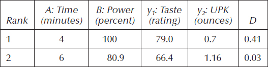
The last column shows the overall desirability D for each of the local optimums, the second of which is not easily found because it falls within a relatively small region (the unshaded one at the lower right of Figure 6.9).
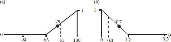
The number-one ranked result does fairly well in terms of individual desirability for both taste and UPK as illustrated in Figure 6.10a and b. The smaller numbers, 32–81 for taste and 0.3–3.5 for UPK, along the baselines are provided as reference points for the actual (observed) ranges of response.
The computations underlying D are
The second-ranked setup (time of 6 minutes at the power of 80.9%) produces barely desirable results:
Figure 6.10 (a) Desirability ramp for taste. (b) Desirability ramp for UPK.
Figure 6.11 3D view of overall desirability.
It’s amazing that this second optimum can be detected because it’s just a tiny dimple in the zero plane as you can see in the 3D rendering of the overall desirability (D) in Figure 6.11.
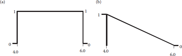
To add insult to injury, the inferior setup for making microwave popcorn requires a substantially longer cooking time, 6 minutes versus 4 for the topranked solution (Figure 6.12a). Why not establish an additional goal to minimize time as shown in Figure 6.12b?
When the delicious aroma of popcorn permeates the atmosphere, an extra 2 minutes seems like an eternity! More importantly, reducing the time lessens the amount of electricity consumed—MWOs requiring a lot of power compared to most other home appliances.
We could refine the optimization further by playing with the parameters of weights and importance, but let’s quit. When you start working with software offering these features for desirability analysis, feel free to do some trial-and-error experimentation on various parameters and see how this affects the outcome.
Figure 6.12 (a) Time kept within a range. (b) Time with the minimum goal.
PRECAUTIONS TO TAKE WHEN CONDUCTING MICROWAVE EXPERIMENTS
Experiments with microwave popcorn date back to 1945 when Percy Spencer, while working on a microwave radar system, noticed that the waves from the magnetron melted a candy bar in his pocket! (Do not try this at home.) He experimented further by placing a bag of uncooked popcorn in the path of the magnetron waves and it popped.
Nowadays, experiments can be safely conducted in MWOs, but be careful when heating objects not meant to be put in the microwave. For example, one of the authors (by now you should not be surprised that this was Mark) bought a roast-beef sandwich that the fast-food restaurant wrapped in a shiny, paper-like wrapper. Knowing that it probably would not be a good idea to microwave, but wanting to see what would happen, he put it in the oven for reheating. The lightning storm that ensued was quite entertaining, and fortunately it did not damage the machine.
If you teach physics and want to demonstrate the power of microwaves more safely, see the referenced article by Hosack et al. (2002).
PRACTICE PROBLEMS
6.1 From the website for the program associated with this book, open the software tutorial titled “*Multifactor RSM*”.pdf (* signifies other characters in the file name) and page forward to Part 2, which covers optimization. This is a direct follow-up to the tutorial we directed you to in Problem 4.1, so, be sure to do that one first. The second part of the RSM tutorial, which you should do now, demonstrates the use of software for optimization based on models created with RSM. The objectives are detailed in Table 6.3.
This tutorial exercises a number of features in the software; so, if you plan to make use of this powerful tool, do not bypass the optimization tutorial. However, even if you end up using different software, you will still benefit by poring over the details of optimization via numerical methods, making use of desirability as an objective function.
Table 6.3 Multiple-Response Optimization Criteria for a Chemical Process (Problem 4.1)
Response |
Goal |
Lower Limit |
Upper Limit |
Importance |
Conversion |
Maximize |
80 |
100 |
+++ |
Activity |
Target 63 |
60 |
66 |
+++ |
6.2 General Electric researchers (Stanard, 2002) present an inspirational application of multiple-response optimization to the manufacturing of plastic. The details are sketchy due to proprietary reasons; so, we’ve done our best to fill in gaps and make this into a case-study problem. It’s just an example; so, do not get hung up on the particulars. The important thing is that these tools of RSM do get used by world-class manufactures such as General Electric Company.
The GE experimenters manipulated the following five factors:
A. Size
B. Cross-linking
C. Loading
D. Molecular weight
E. Graft
They did this via a CCD with a half-fractional core (25−1), including six CPs. Assume that at each of the resulting 32 runs, two parts were produced and tested for
1. Melt index (a measure of flowability based on how many grams of material pass through a standard orifice at standard pressure over a 10-minute period)
2. Viscosity
3. Gloss
On the basis of the models published by GE (with one curve, literally, thrown at you on the index to make the problem more interesting), we simulated the results shown in Table 6.4.
Note that levels were reported by GE only in coded format—again for reasons of propriety. Analyze these data (file name: “6-2 Prob—GE plastic.*”) and apply numerical optimization to determine the optimum setup of factors in terms of overall desirability for the multiple responses. The criteria for individual desirabilities are spelled out in Table 6.5.
Table 6.4 Simulated Data for GE Plastic
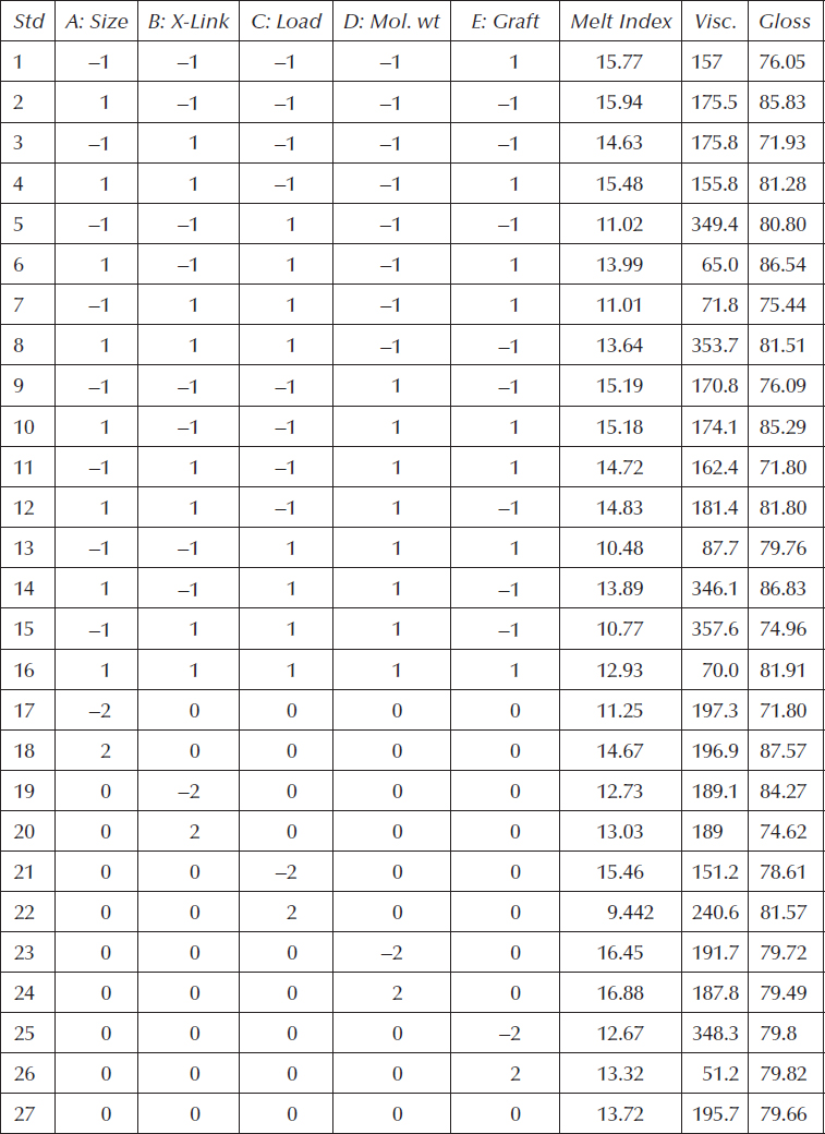
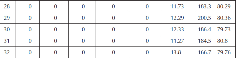
Table 6.5 Multiple-Response Optimization Criteria
Response |
Goal |
Lower Limit |
Upper Limit |
Importance |
Melt index |
Target 14 |
13 |
15 |
+++ |
Viscosity |
Target 160 |
120 |
190 |
+++ |
Gloss |
Minimize |
72 |
84 |
++ |
Appendix 6A: Simplex Optimization
Here, we provide some details on an algorithm called “simplex optimization,” enough to give you a picture of what happens inside the black box of computer-aided numerical optimization. This algorithm performs well in conjunction with desirability functions for dealing with multiple responses from RSM experiments. It is a relatively efficient approach that’s very robust to case variations.
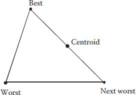
A simplex is a geometric figure having a number of vertices equal to one more than the number of independent factors. For two factors, the simplex forms a triangle as shown in Figure 6A.1.
Figure 6A.1 Simplex with the evaluation of response.
The labels describe hypothetical rankings of overall desirability in the 2D factor space. Here are the rules according to the originators of simplex optimization (Spendley et al., 1962):
1. Construct the first simplex about a random starting point. The size can vary, but a reasonable side length is 10% of the coded factor range.
2. Compute the desirability at each vertex.
3. Initially, reflect away from the worst vertex (W). Then, on all subsequent steps, move away from the next-to-worst vertex (N), from the previous simplex.
4. Continue until the change in desirability becomes very small. It requires only function evaluations, not derivatives.
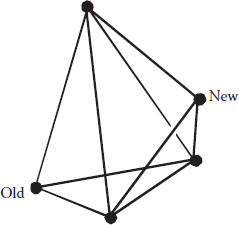
Figure 6A.2 may help a bit by picturing a move made from an initial simplex for three factors—called a “tetrahedron” in geometric parlance.
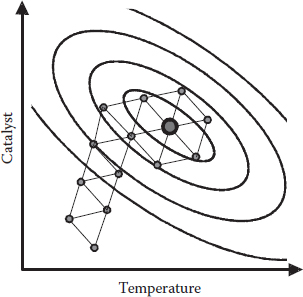
The use of next to worst (N) from the previous simplex ensures that you won’t get stuck in a flip-flop (i.e., imagine going down rapidly in a rubber raft and getting stuck in a trough). The last N becomes the new W, which might better be termed as a “wastebasket” because it may not be worst. If you’re a bit lost by all this, don’t worry—as you can see in Figure 6A.3, it works!
This hypothetical example with two factors, temperature and catalyst, shows how in a fairly small number of moves, the simplex optimization converges on the optimum point. It will continue going around and around the peak if you don’t stop it (never fear, the programmers won’t allow an infinite loop like this to happen!).
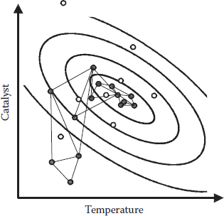
So far, we’ve shown simplexes of a fixed size, but it’s better to allow them to expand in favorable directions and, conversely, contract when things get worse instead of better. Another few lines of logic, which we won’t get into, accomplish this mission of making variable-sized simplexes (Nelder and Mead, 1965). Figure 6A.4 gives you a view of how this works for optimizing a response.
Figure 6A.2 Move made to a new simplex (tetrahedron) for a three-factor space.
Figure 6A.3 Simplex optimization at work.
Figure 6A.4 Variable-sized simplex optimization at work.
As you can see, the variable simplex feeds on gradients. Like a living organism, it grows up hills and shrinks around the peaks. It’s kind of a wild thing, but little harm can occur as long as it stays caged in the computer. On the other hand, the fixed-size simplex (shown earlier) plods robotically in appropriate vectors and then cartwheels around the peak. It’s better to use the variable-sized simplex for more precise results in a similar number of moves.