The design of the user interface that KanDoIT’s customers will use to access their account data should adhere to the existing corporate web style guidelines. Three new web pages are required to support the new customer account application:
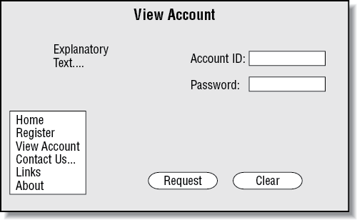
The View Account page (see Figure 8-2) design might be sketched out like this:
The standard navigation links for KanDoIT’s web site appear to the left. Two form fields marked Account ID and Password allow the user to enter required input parameters. The Request button is used to send the request to the web server and the Clear button can be used to reset the form fields.
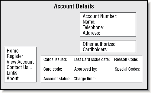
The KanDoIT web designers decide that the Account Details page should show the same information as the original COBOL application running in CICS (see Part V). The fields to display might be formatted as shown in Figure 8-3.
Again, the KanDoIT navigation links are placed to the left, and the remaining data fields organized into logical groups, such as customer details, authorized cardholders, and card details.
The error page uses the same basic structure. See Figure 8-4 for details.
How we go about converting these page designs into actual web browser compatible pages is described in detail in Chapter 9.