7 There’s No Such Thing as Normal
Always remember that you are absolutely unique. Just like everyone else.
—Dr. Margaret Mead, pioneer in cultural anthropology
How many different kinds of human beings are there in the world?
If we aim to create solutions that benefit millions, even billions of people, our solutions need to work across a wide range of human diversity. But that’s easier said than done. People can be highly unpredictable. How do we design for so much complexity?
A common exclusion habit is to oversimplify who uses or receives a solution. And then we forget to add human diversity back into our design process.
Designers use many techniques to envision masses of people. Many of them are plagued by one dangerous idea: the “normal” human.
Our notions of normal were heavily influenced by a 19th-century Belgian astronomer and mathematician, Adolphe Quetelet. Here’s a quick peek into that story, derived from Todd Rose’s exceptional book, The End of Average.1
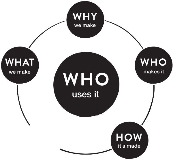
Designers and engineers often use their personal assumptions about people to simplify the ways they think about users.
Quetelet had ambitions to be as well-known as Isaac Newton. Newton’s laws of motion and thermodynamics had brought certainty to seemingly unpredictable phenomena in the universe. Probability and mathematical prediction grew in popularity, sparking new fields of science.
Quetelet turned his ambition toward a new pursuit: using mathematical methods to make sense of uncertainty in human society. He started measuring human beings and amassing that data into statistical models.
There was one mathematical model that dominated Quetelet’s approach: the Gaussian distribution. It’s more commonly known as the bell curve. Carl Friedrich Gauss, a German mathematician, developed the proof of a concept that had been introduced decades earlier by Abraham de Moivre, a French mathematician and contemporary of Newton’s.
Gauss proved that the probability of an event (like the positioning of an astronomical object, or the flipping of a coin) could be drawn as a normal curve and that the average, or vertical midline, of that curve gave the closest representation of the true nature of that event. The bell-like shape of a normal curve makes it easy to recognize.
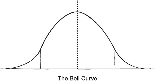
Normal distribution has had many names, such as the laws of error and the bell curve. The word “normal” was first used to describe mathematical elements of this curve that are perpendicular to each other. It did not imply “common” or “usual.” (E. T. Jaynes, Probability Theory: The Logic of Science [Cambridge: Cambridge University Press, 2003], ch. 7.)
Quetelet gathered data on human bodies, such as height-to-weight ratios and rates of growth, across thousands of people in Belgium and surrounding areas in Europe. He plotted that data and was astonished to find they mapped to bell curves.
Invigorated by his discovery, Quetelet started measuring many more aspects of human beings, creating physical, mental, behavioral, and moral categories of people. Everywhere he looked, he found bell curves. He became consumed with what he deemed the human ideal, the perfect average measurement across all those dimensions. Quetelet described the perfect face, height, intelligence, moral character, and beyond:
If the average man were completely determined, we might, as I have already observed, consider him a type of perfection; and everything differing from his proportions or condition, would constitute deformity and disease.2
When he published his Treatise on Man it was a revolutionary work. In its pages he held that individual people should be measured against that perfect average. From this comparison, one could calculate the innate degree of “abnormality” of an individual person. Diversity and variations in human beings were treated as degrees of error from perfection.
The idea was contagious and enduring.
The bell curve was used to revolutionize existing fields of study and sparked entirely new ones, especially in the social sciences. Normal-based methods of diagnosing illness led to advancements in public health. Quetelet’s body mass index (BMI) is still used in many areas of the world to advise individuals on their degree of obesity or fitness. Eugenics, and its horrific assertions about the superiority of select abilities, races, and classes of people, were born out of an idolization of Quetelet’s perfect average human.
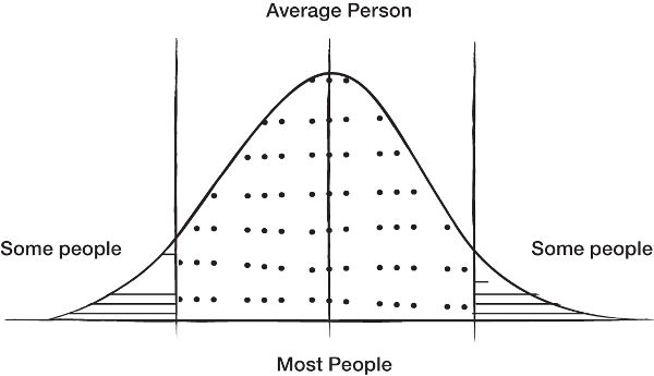
When a bell curve reflects a distribution of human beings, it incentivizes designers to target a mythical “average” human in an effort to reach the greatest number of people.
The conclusions that were derived from Quetelet’s approach were used to strengthen the power of some human beings and to dehumanize others.
The power of the bell curve still echoes through the design of our society, from classrooms to computers. Left-handed students are seated in desks made with the assumption that normal human beings are right-handed. Important features of smartphone applications are placed based on where the average user, also presumably right-handed, is likely to reach for them.
A common shorthand for this mindset is the “80/20 rule,” originally created by Italian economist Vilfredo Pareto, who demonstrated that 80% of the land in Italy was owned by 20% of the population. Joseph Juran, a pioneer in the field of quality management, translated Pareto’s insight into a rule for quality control, stating that 80% of problems come from 20% of causes. In essence, he was separating the “vital few” key sources to a problem from the “useful many” potential sources to a problem.3
Over time, many design teams have conflated the 80/20 rule with the bell curve. The common misconception is that the center of the curve represents an 80% majority of the population and 80% of the important product problems to solve. The presumption is that if we design a solution that fits the largest bulk of the curve, the middle average, our solution will work well for the majority of people.
This leads many teams to treat the remaining 20% as outliers or “edge cases,” a category of work that’s often deferred or neglected.
In fact, edge cases can be a useful starting point for creating better solutions. Many exclusion experts use solutions in ways that resemble edge cases. But an edge case implies the existence of a normal, average human. When it comes to design, what if this average human is simply a myth?
Everyone and No One
Rose provides a vivid example from the history of the United States Air Force (USAF).4 In the 1940s, the first fighter jets were designed to fit the average pilot. The USAF measured hundreds of bodily dimensions across thousands of pilots and used the averages of that data to design the instruments of the flight deck, or cockpit.
Every feature of that flight deck was fixed in place, without adjustability. The assumption was that any individual pilot could adjust himself to overcome the gap in reaching any element of the flight deck that wasn’t a perfect fit for him.
However, the Air Force was experiencing a high rate of crashes that couldn’t be attributed to mechanical failure or pilot error. A lieutenant and researcher, Gilbert Daniels, studied just ten of those human dimensions that were used in the design of the original flight deck. He measured four thousand pilots to confirm how many of them fit all ten dimensions.
The answer was zero.
Not a single pilot matched all ten dimensions. Everyone differed in at least one way. In essence the USAF had designed a flight deck for everyone, and no one.
This led to the development of new design principles based on individual fit. Innovations like adjustable seat belts, seat heights, and positioning of controls. Once the instruments of a flight deck could be modified by an individual pilot, their safety and performance improved. The adjustments also drastically increased the number, and diversity, of people who qualified to be fighter pilots.
These advancements have influenced the design of many more industrial products. Every time you ride in a car and move your seat, seatbelt, or mirrors into a position that works best for you, you’re benefitting from these original innovations in individual fit.
The fighter jet example underscores how designing for the average serves no one, whether the design is for the shape of a desk or a curriculum that emphasizes specific ways of learning. Many designs make people feel like those first pilots, adapting themselves in extreme ways in order to use a mismatched design.
The idea of a normal human being was constructed out of the ambitions of a 19th-century mathematician. It was used to make meaningful advancements in some areas of society, and used to great detriment in other areas. Most importantly, what if the idea simply wasn’t true?
All people are variable over the course of their lives. What if our minds and bodies are simply unpredictable? Which human, exactly, should be at the center of human-centered design?
Human-Led, beyond Human-Centered Design
Personas are a common tool that designers and marketers employ when thinking about who will use their product. A persona is a description of a mythical person, backed by large amounts of research data. The persona might join a name like “Janet” with an image of a woman on a poster next to a description that states, “I’m a soccer mom and freelance consultant who coordinates my family’s calendar and has limited time to learn about new technology.” Or the smiling face of a man sitting at a computer next to the words “I’m Jim. I’m the lone information technology professional at a startup and I always want to keep up with the latest gadgets.”
Like bell curves, personas aim to minimize the uncertainty that’s inherent in trying to understand a large group of people. Personas were created to remind designers and engineers that they’re building solutions for someone other than themselves. While well-intentioned, personas oversimplify people, without clear direction on how or when to add human diversity back into the design process.
Designers are also taught that the long tails of a bell curve are the edge cases of how people will use their solutions. The exceptional uses. Issues related to accessibility, in particular, are treated as part of that long tail. The bell-curved mindset mistakenly leads us to believe that the market opportunity for accessibility is minimal. Accessibility is treated as an extreme of otherwise “normal” design. In chapter 8 we will review examples that disprove this assumption.
If there is no normal user, there is also no extreme user. There is no such thing as people on the far reaches of the curve. There is no abnormal scenario. There is no edge case. Rather, we need new tools to represent human diversity and challenge entrenched habits of designing for the average.
When personal computers first rose to popularity, it made sense to design graphic interfaces for those computers based on wide-sweeping generalizations about people. Typically, they imagined one person, using one computer, in one environment, completing one or two tasks at a time.
In these early days of digital technology, the variability from one user to the next was also relatively low. Most people were novices at using computers to write an essay or create a spreadsheet. Therefore, it was somewhat easy to make general assumptions about who was using the computer, how they would be interacting with it, and their level of skill. Likely they would be seated in front of a screen and typing on a keyboard in a relatively quiet environment.
Using these assumptions, it made sense for computers to be visually and cognitively demanding, with arrays of icons on a desktop requiring people to hunt for tiny controls hidden in obscure locations.
Today, however, unpredictability in how people use technology is higher than ever. Interactions with technology have undergone an explosion of diversity. Nearly every industry is rethinking their business, products, and services through the lens of digital transformation. It’s a necessary consideration for many businesses that hope to remain competitive in the 21st century.
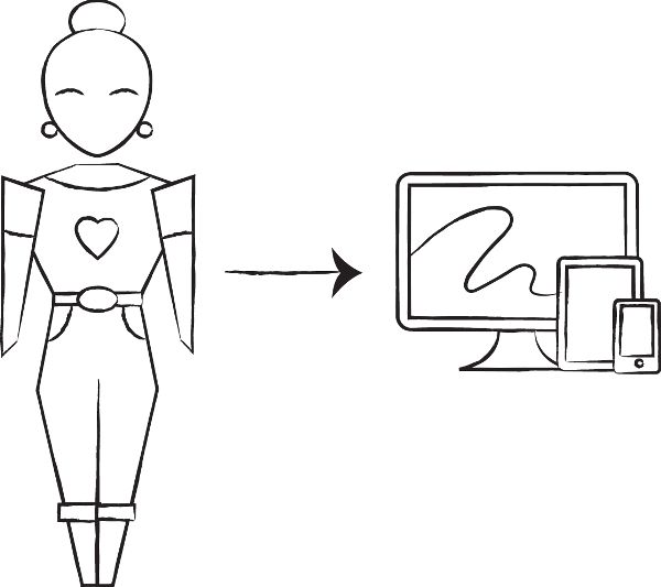
Early generations of personal computer interface design were based on a low degree of variability in how people used computers.
One person might have dozens of interactions with digital interfaces in the course of one day, and not just in using a smartphone. People interact with digital interfaces when they buy groceries, follow directions in a car, take a train, buy a cup of coffee, apply for a job, learn a lesson in school, or check out a book at the library.
They use computers in movie theaters, sun-filled parks, noisy cafés, in the rain, and to set bedtime music for their babies. Sometimes they want absolute silence so they can focus. Sometimes they want to be interrupted with an urgent notification from a loved one.
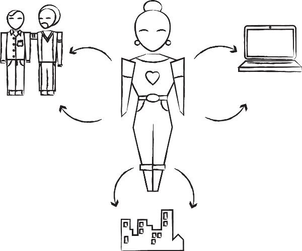
There is a dynamic diversity of interactions between people and society, especially as digital experiences facilitate our interactions with more aspects of society.
This means technology needs to be more than smart. It has to be appropriate to a given person for a specific time, place, and purpose.
It can be overwhelming to even think about such diversity. How can we design for so much uncertainty as people move between environments and devices?
We won’t get there on math alone. It’s indisputable that mathematical models are a cornerstone of technology design. It’s incredibly useful to determine patterns across large groups of people. But when is it appropriate to apply these models to individual human beings? Math has its limits. Describing human individuality is one of those limits. If our aim is to create solutions that are beneficial in people’s lives, there are potentially harmful consequences to trying to understand humans solely through math.
Technology has a lot to learn from humans. In particular, from humans who have a deep understanding of mismatched interactions. Their expertise guides better questions, as well as better solutions.
Learning from Human Expertise
Dr. Margaret Mead is often credited with transforming how we study human cultures. She brought attention to the role that culture plays in shaping individual personality. She helped popularize cultural anthropology and at the time of her death was one of the most famous anthropologists in the world. She called out inherent biases in intelligence tests at a time when many sociologists were churning out studies in attempts to prove racial and gender superiority.
While Quetelet-like methods inspired many academics to pursue bell-curved conclusions about humans, Mead conducted deep studies of cultures that were vastly different from her own. She spent extensive periods of time living with and observing the native cultures of Oceania, especially in Papua New Guinea.
An excerpt from the New York Times 1978 obituary of Dr. Mead reads:
Her conclusions were based on detailed observation, and if she did not conduct anthropometric tests or produce statistical surveys she did convey her subjects graphically.
Dr. Mead settled down with the people she was studying. She ate their wild boar, wild pigeon and dried fish; helped to care for ill children, and gained the confidence of her informants. At one time she built a wall-less house so she could observe everything around her. She possessed a trait unusual in anthropologists of her time, an ability to shed her Western preconceptions.5
Dr. Mead focused on participation as a way to reveal patterns and conclusions. As she learned, the people she studied were in the lead. They were the experts in being human.
When Quetelet gathered data on humans, he was consumed with quantifying the face, body, and full character of a singular ideal average man. His motivation was to fit all aspects of society to this average while dismissing any human who deviated from that norm as abnormal. This motivation has endured, whether implicit or explicit, through generations of his intellectual descendants, including many current designers, engineers, and marketers.
This matters more than ever as data science grows in prominence. All of us are feeding that growth by interacting with computers that record more information about our behaviors than ever before. But data is just data. It doesn’t provide answers. The art of drawing conclusions from data is knowing how to collect, organize, and make sense of it.
Taking time to qualify human depth and complexity, even with a relatively small number of people, can help balance the shortcomings of “big data.” “Thick data” is gathered information that explains human behavior and the context of that behavior. It was first described as “thick description” by anthropologist Clifford Geertz in his book The Interpretation of Cultures. Thick data is a way of understanding how people feel, think, and react and their underlying motivations.
Together, “big data” and “thick data” can give specific and measurable practices for reintroducing human diversity into the design process. For design, big data is like a heat map that can point out interesting areas to investigate. It sheds light on where patterns exist, especially when people use a solution in ways that don’t match a designer’s expectations.
In complementary ways, thick data can help us zoom in and understand what’s really going on. It helps reveal the underlying reasons why big data patterns exist. It helps us identify the human behaviors that contribute to large trends. Big and thick data can work together to help us understand areas of exclusion in products and environments.
It’s challenging, if harmful, to pursue one universal model to guide how we think about all humans. But it is possible to understand in great depth a particular problem worth solving for one person.
The Persona Spectrum
Earlier we examined the distinction between inclusive and universal design. The former emphasizes one-size-fits-one solutions, the latter emphasizes one-size-fits-all. The persona spectrum is an inclusive design method that solves for one person and then extends to many.
Consider the rise of television, a visual and audio medium.
Captioning was initially created in the early 1970s by the National Bureau of Standards and ABC to make television content accessible to Deaf and hard-of-hearing communities. In 1972, Julia Child’s The French Chef aired on PBS as the first television episode with captioning.
Today, roughly 360 million people in the world are deaf or have profound hearing loss. Thirty-two million of them are children.6 Nearly everyone, given a long enough life span, loses their hearing as they age.
Captioning and subtitles are essential tools for making information accessible to millions of people. And many more people benefit from these solutions. In noisy airports or crowded pubs, patrons rely on captioning to access sports and news. Captions are increasingly common in social media when we can’t turn up the volume on our smartphones. They also assist new readers or people who are learning a new language.
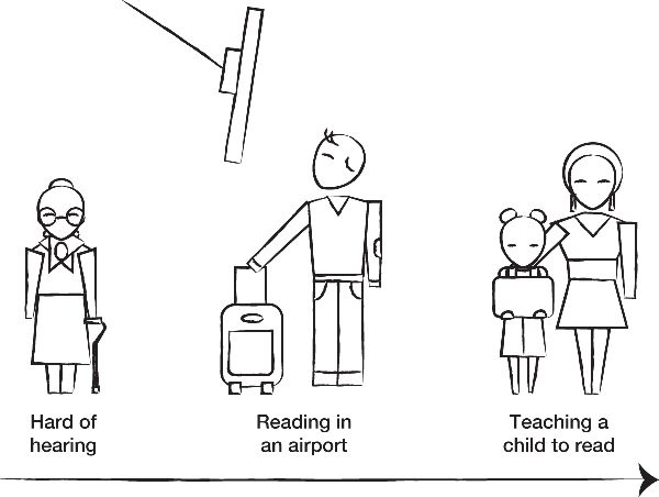
Closed captioning, originally designed for Deaf communities, is beneficial to many more people across a variety of environments and circumstances.
This solution initially addressed a mismatch between television audio and the Deaf community. It went on to benefit many more people with hearing loss because of age, injury, or environment.
The persona spectrum can help us create inclusive designs in repeatable ways. Here are four examples of persona spectra based on some physical human abilities. Similar spectra could be drawn for any dimension of human physical, cognitive, emotional, and societal abilities. It all depends on the problem you’re trying to solve and the ways that people might interact with that solution.
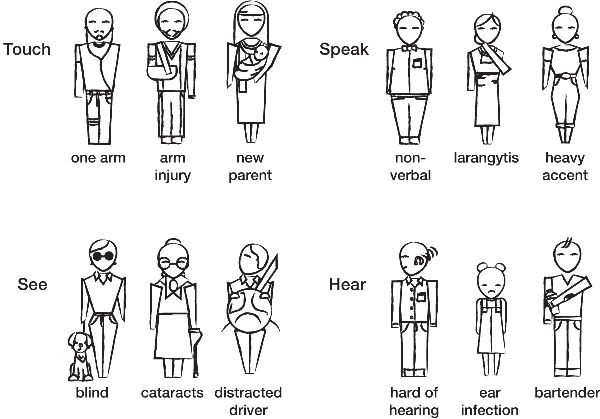
There’s a spectrum of permanent, temporary, and situational mismatches that people experience based on their abilities and disabilities.
The persona spectrum starts on the left, with the person who experiences the most mismatched interaction. For example, if you were designing a charging station for an electric vehicle, you would certainly need to consider how it would work for any driver who was born with one arm. There would be a lot to learn from talking with people about how well existing gasoline fuel pumps work.
But you could also learn a lot by spending time with someone who’s blind to understand how they navigate existing payment kiosks for buying groceries or bus tickets. This perspective is also important for a time when self-driving electric cars become mainstream and will need to work well for people who are blind.
A persona spectrum is more than just a continuum of ability. It’s about understanding why people across that spectrum want to access that solution.
An example of this important nuance is Hearing AI, a project initiated by a Microsoft developer, Swetha Machanavajhala. One day, her neighbor showed up at her front door, angry about the loud sound coming from Machanavajhala’s apartment. It was her carbon monoxide detector. Machanavajhala, who has profound hearing loss, hadn’t heard it.
The experience inspired her to build an application that could alert the user to sounds in their environment. Taking an inclusive design process, her team learned from a range of people who were deaf and hard of hearing. They learned about the importance of Deaf culture and participated in American Sign Language classes and events.7
An important theme emerged: no one was interested in a solution that attempted to “fix” or “replace” an ability to hear. The functionality of telling people what a sound was, like a crying baby or a honking horn, felt like an inappropriate attempt to fix a person’s deafness.
Rather, people were interested in the emotional information that would guide them to make their own conclusions about the nature of a sound. For example, knowing whether the inflection in a person’s voice meant that they were being sarcastic or being angry. As a result, Swetha and team built a solution that visualized the intensity of a sound and the direction it was coming from, so that a user could turn in that direction and determine what it was for themselves.
Tying back to the persona spectrum, it’s important to understand what motivates a person to use a solution. Rarely is it a purely functional reason, like knowing the identity of a sound. More often they are motivated by some universal human need, like an increased sense of independence or creating an emotional connection.
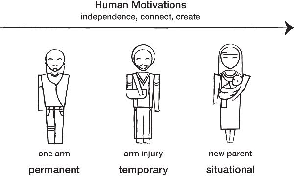
A shared human motivation guides how to extend the benefits of a design across a spectrum of people who are excluded on a temporary or situational basis.
These motivations are the glue that connects people across a persona spectrum. When we design for one person who experiences mismatches in using a solution, we can then extend the benefits of that design to more people by asking who else might want to participate but is excluded on a temporary or situational basis.
A persona spectrum can improve the inclusion of existing solutions, extend seemingly niche solutions to broader populations of people, and futureproof your design.
Cognitive, Sensory, and Societal Mismatches
These introductory persona spectra focus heavily on physical mismatches. Exclusive designs are equally prevalent in cognitive, sensory, and societal areas. Sometimes they can be more challenging to recognize: while a physical barrier often literally stands in your way, these other types of mismatches might be subtler. Here are a few thoughts on how we can extend the fundamentals of inclusive design beyond physical abilities.
With digital experiences, cognitive mismatches are especially important to understand. The human mind is being influenced in so many new ways by applications that constantly compete for our attention. Or augmented reality products that change how people perceive a combination of physical and virtual environments. Building a solution to fit how a person learns, remembers, focuses, uses language, or experiences sensations can be a complex design challenge.
The diversity of the human brain and body is far from being fully understood. Yet there are a growing number of examples of cognitively inclusive products, many of them focused on education and learning environments. Some of these are built with the participation of people with cognitive and sensory disabilities. Others are focused on types of cognitive diversity that aren’t disabilities.
Societally, technology is a gateway to accessing economic and social opportunities, especially as people around the world join the Internet for the first time. There are over 730 million people on the Internet in China, roughly twice the population of the United States.8 Ninety-five percent of Internet users in China access it using mobile devices.9
Many people are joining the Internet through voice-based computers, by talking to their devices as a primary mode of interaction. Augmented and virtual reality are quickly becoming primary ways to access the Internet for millions of people in China.
Global shifts in digital participation lead to interesting design challenges. In areas of the world where touchscreens dominate, most designers are focused on creating graphic user interfaces. These can be seen and touched. In areas of the world where voice-activated interfaces will dominate, designers are focused on speech commanding and conversational design.
Design for societal inclusion needs to consider the greater cultural context that surrounds a design. Complex challenges like language, politics, currency, Internet bandwidth, and social nuances are important factors in designing inclusive solutions.
At minimum, inclusion will depend on how well designers can work beyond the types of abilities and technologies that dominate their immediate environment.
Design for One, Design for 7 Billion
The more I learn about inclusive design, the more I’m convinced that there are 7.4 billion different types of people on the planet.
“Empathy” is a word that is often used in design. What does it mean to design with empathy for billions of people? As technologists grow more aware of the exclusion that their products might create, there’s a renewed focus on increasing empathy. This word, like the word “inclusion,” has many different interpretations.
Some design methods for empathy focus on simply talking to people. For example, introducing yourself to people on the street and asking them for feedback on an idea. Other approaches emphasize ways to question your own assumptions and abstractly consider how other people might feel about a problem. Some teams have extensive research departments where sociologists, anthropologists, and psychologists conduct studies with people. Most of these approaches don’t scale to the level of billions of people.
Various cultures describe the concept of empathy in different ways. In the context of designing technology, there are two Mandarin Chinese descriptions of empathy that are particularly useful, shown here next to an English translation of each individual character.
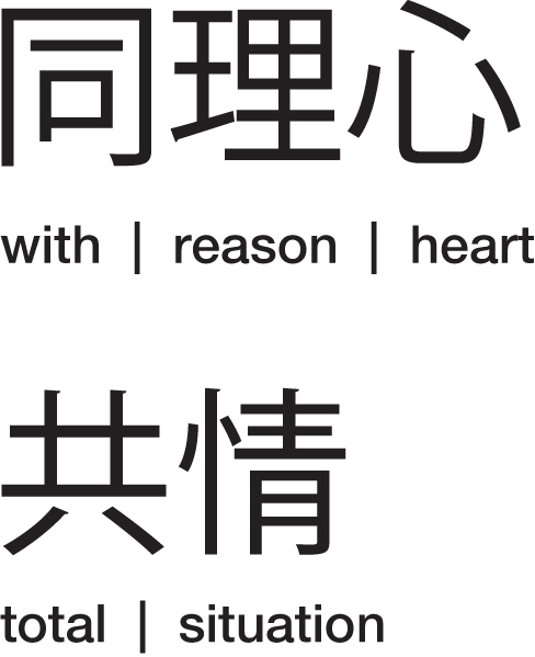
Two Mandarin descriptions of empathy.
Empathy, “to reason with the heart.” Empathy, to sense “the total situation.” Building solutions on a global scale requires designers to do both, equally well. It’s making sense through the greater context and the relationships that lie therein, incorporating both the breadth and depth of humanity. This is how empathy will evolve to meet the challenges of designing for 7.4 billion people.
Inclusion requires us to shift our assumptions about who receives the things we design. It starts with curiosity and observation. Analyzing massive amounts of data can amplify new categories of problems to solve. It can help us iterate through ideas and optimize our solutions more quickly. And when we craft those solutions we have a responsibility to make sure they work well for people, functionally and emotionally. These are nuances that come from real-life, human-to-human conversations.
Not everyone is an anthropologist. We aren’t all mathematicians. Not everyone is great at putting aside their cultural preconceptions. But we can all learn how to seek out excluded perspectives and let them supersede our own.
■ ■ ■
Takeaways: Testing Our Assumptions about Human Beings
Exclusion habits
- ■ Designing for a mythical average human that presumes 80% majority and 20% minority use cases.
- ■ Assuming that people will adapt themselves to make a solution work.
How to shift toward inclusion
- ■ Create a baseline assessment of how well your solution works for excluded communities, especially people with disabilities.
- ■ Create a persona spectrum that is specific to the problem you’re trying to solve.
- ■ Build thick data with the people who face the greatest mismatches in using your solutions. Learn from their expertise with thoughtful observation and inquiry.
- ■ Balance big data with thick data. Use big data as a heat map to reveal key mismatches between people and your solution. Use thick data to investigate the reasons behind these mismatches and gain insight into better solutions.
- ■ Build one-size-fits-one solutions to fit people who likely face the greatest mismatches when using your solutions. Extend the solution to people who face similar mismatches on a temporary and situational basis. Focus on the shared reasons why each of these groups wants to participate in your solution.