Chapter 7
Creating Pages Using Dynamic Drive
In This Chapter
 Developing pages using layouts
Adding menus to pages
Creating nice looking image compositions
Developing usable and friendly forms
Obtaining the free icons
Dynamic Drive (www.dynamicdrive.com/) is a library composed of many resources — only some of which appear in this chapter. This site provides more than an API and it offers selections in more than just CSS3 or JavaScript. Of course, for this book, what you're really interested in is CSS3 — along with perhaps a little JavaScript to perform some additional tasks. With this in mind, the chapter discusses:
 Layouts
Menus
Image management
Form management
Icon usage
When you get an opportunity, you should also check out the other resources this site provides (especially the tools). For example, the site provides access to seven different kinds of calendar widgets you can add to your application (as of this writing — there may be more by the time you read this). The tools are really interesting as well. For example, ::Email Riddler (www.dynamicdrive.com/emailriddler/) transforms your e-mail address into a series of incomprehensible numbers and letters — making it hard for spam harvesters to grab it. Yet the address is still usable by users of your site.
Each of the sections that follow will explore a different area of Dynamic Drive. Most focus exclusively on CSS3, which should amaze you because it turns out that CSS3 can do more than expected for a simple method of defining page style. Make sure you check the site relatively often for updates. The new items appear at www.dynamicdrive.com/new.htm.
Working with Layouts
The layout you use on a site determines its usability. Choose the wrong layout and the user will have a hard time interacting with your site. Frustrated users are always just a click away from the next site — one that uses a layout that works better with the information being presented. Dynamic Drive presents two basic kinds of layout: two-column and three-column. These two layouts can be further subdivided into fixed (the column size always remains the same) and liquid (the column size changes to match the amount of content displayed). A third layout type supports frames within pages.
This section provides a common set of instructions you can use to work with any of the layouts that Dynamic Drive provides. All of the layouts provide the same presentation, which makes them easy to review, compare, and use with your own code. After you create a page containing a layout, you’ll want to modify it. The “Modifying the layouts” section, later in this chapter, provides instructions for performing this task. The following sections describe these layouts and how to use them in detail.
Developing with fixed layouts
Some content requires that you provide specific positioning and maintain columns of a particular size. For example, forms require this kind of precision, because otherwise you can’t be sure that a user can even see which fields to fill out.
 A fixed column doesn’t change size with the browser. When the browser window becomes too small to hold the width of the columns, a horizontal scrollbar appears so that the user can scroll right and left within the content. Likewise, when the browser window becomes larger than the content width, the page displays blank areas to the right and left of the two columns.
Fixed columns are typically used when the presentation of the content requires it. For example, a site with pictures (such as my blog at http://blog.johnmuellerbooks.com/) may use a fixed column to ensure the pictures are always placed correctly on the page. You can find the Dynamic Drive fixed layouts at www.dynamicdrive.com/style/layouts/category/C12/.
Developing with liquid layouts
Liquid layouts, also called fluid layouts (the site uses both terms interchangeably), rely on content without particular dimensions. It doesn’t matter if news is printed in a wide format or a tall format. All that really matters is that the user can access all the words in a story in order to read the information.
A fluid column is one that automatically resizes to take advantage of the browser window size. This format works best when the content is mainly text-based or store sites, such as Amazon.com. Store sites especially want you to see as much content as possible (hoping to make additional sales). You can find the Dynamic Drive liquid layouts at www.dynamicdrive.com/style/layouts/category/C13/.
Using two-column layouts
A two-column layout is great for a site where you want to create a list of links on either the left or right side of the page and then have a wide area for content on the other side. For example, many blogs use this type of setup. The two-column layouts all appear at www.dynamicdrive.com/style/layouts/category/C9/. Figure 7-1 shows a typical view of the layouts on this page.
Each listing provides an overview of what you can expect as output from the layout. For example, the first entry is a two-column layout where both columns are fixed.

Figure 7-1: A listing of the two-column layouts on the Dynamic Drive site.
The second entry is a repeat of the first, but notice that the narrow column (the one that typically holds the links) is on the right rather than on the left. Many forums (such as http://stackoverflow.com/) use this format to present answers to questions. Placing the links on the right tends to put additional emphasis on the content because people look on the left side of the page first (for the most part).
Some of the entries in this list have fluid columns. In every case, the fluid column contains the content. All that happens, in this case, is that the content expands to fill the browser window so you can see more information without scrolling. The left or right pane remains the same size so that the links (or other content) continue to take up the same amount of space.
Working with layouts
To choose a particular layout, click its link. You see a page that contains a better presentation of the layout at the top as shown in Figure 7-2. The text contained in the layout is filler so that you can better judge how the layout will feel with content in it. You can try resizing the browser to see how the layout will look at different sizes.
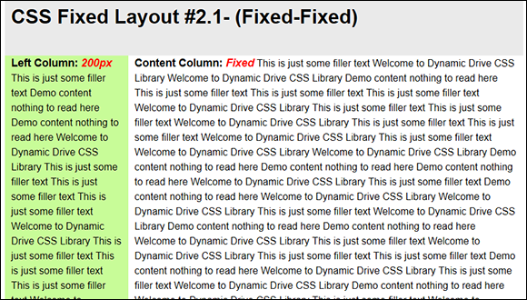
Figure 7-2: The upper half of a layout page contains a presentation of the layout.
At the bottom of the same page, you see the CSS used to create the page's appearance as shown in Figure 7-3. The code appears in an internal CSS <style> tag, but you can easily move it to an external CSS file if desired.
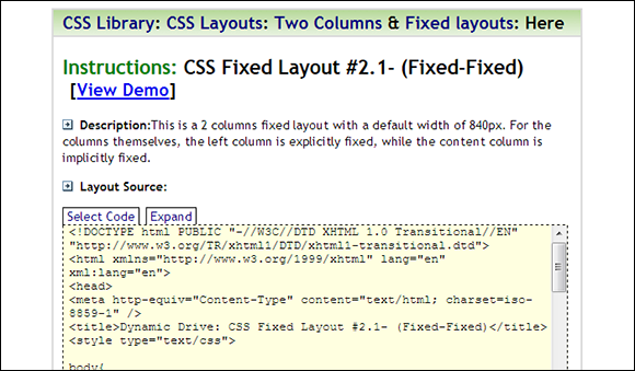
Figure 7-3: The lower half of a layout page contains the code used to create the layout.
The code provides an entire page you can use for testing. The following steps tell how to access the code.
1. Click Expand.
You see the code area of the page expand to show all of the code used to create the layout.
2. Click Select Code.
The page selects all of the code in the code area for you.
3. Right-click the highlighted code and choose Copy from the context menu.
The precise technique you use varies by browser and platform. For example, you can press Ctrl+C on Windows systems or Command+C on Mac systems to perform the same task. The idea is to get the code placed on the Clipboard.
4. Open your editor and paste the contents of the clipboard into a new file.
You see the same example that appeared on the Dynamic Drive site.
5. Save the new file.
Use a filename that represents the layout you selected.
6. Load the file into your browser.
You see the complete Dynamic Drive example for the layout.
To use the layout on your own page, simply copy the content of the <style> tag to the page you're creating. It's safe to ignore the script at the end of the <head> section — its only purpose is to fill the page with sample data. However, you should make note of the styles used with elements in the page layout. These styles and their associated <div> tags provide the actual layout you see onscreen.
Modifying the layouts
It pays to try a few of the layouts to see what you want to do with them before you begin creating a production project. Copy the source code from the example on the Dynamic Drive site and place it into files as you expect to use it. For the purposes of this example, you create an HTML5 file with the following content obtained from the HTML code shown with the example. (You can find complete code for this example in the \Chapter 07 folder of the downloadable code as TwoColumnLayout.HTML.)
<!DOCTYPE html>
<html>
<head>
<title>CSS Fixed Layout #2.1- (Fixed-Fixed)</title>
<link rel="stylesheet" href="TwoColumnLayout.CSS" />
</head>
<body>
<div id="maincontainer">
<div id="topsection">
<div class="innertube">
<h1>CSS Fixed Layout #2.1- (Fixed-Fixed)</h1>
<p><em>840px</em></p>
</div>
</div>
<div id="contentwrapper">
<div id="contentcolumn">
<div class="innertube">
<p><b>Content Column:
<em>640px</em></b></p>
</div>
</div>
</div>
<div id="leftcolumn">
<div class="innertube">
<p><b>Left Column: <em>200px</em></b></p>
</div>
</div>
<div id="footer">
<p>Footer</p>
</div>
</div>
</body>
</html>
 The example adds white space to the code provided on the Dynamic Drive site for the purposes of making it easier to read and also to show how the structure is created using the
 <div> tags. It's a good idea to do the same thing with any code you obtain from the site. You want to be sure that you understand how the layout works before you begin performing any required modifications.
The example removes the Dynamic Drive scripts because you don’t need them to fill the sections with random content. However, it does add notes showing the number of pixels used by default for each of the sections (the Dynamic Drive example only notes the size of the fixed left column). If you modify the CSS for this site, you should also change the notes you create about the fixed column sizes.
The example also uses an external CSS file. Notice the addition of a <link> tag in the <head>. The CSS for the external file is unchanged from the <style> tag for the example page as shown here.
body{
margin:0;
padding:0;
line-height: 1.5em;
}
b{font-size: 110%;}
em{color: red;}
#maincontainer{
width: 840px; /*Width of main container*/
margin: 0 auto; /*Center container on page*/
}
#topsection{
background: #EAEAEA;
height: 90px; /*Height of top section*/
}
#topsection h1{
margin: 0;
padding-top: 15px;
}
#contentwrapper{
float: left;
width: 100%;
}
#contentcolumn{
margin-left: 200px; /*Set left margin to LeftColumnWidth*/
}
#leftcolumn{
float: left;
width: 200px; /*Width of left column*/
margin-left: -840px; /*Set left margin to -(MainContainerWidth)*/
background: #C8FC98;
}
#footer{
clear: left;
width: 100%;
background: black;
color: #FFF;
text-align: center;
padding: 4px 0;
}
#footer a{
color: #FFFF80;
}
.innertube{
margin: 10px; /*Margins for inner DIV inside each column (to provide padding)*/
margin-top: 0;
}
At this point, you can load the page to start thinking about what you’d like to modify. Figure 7-4 shows the page as it appears without modification after copying it from the site and separating the HTML from the CSS.
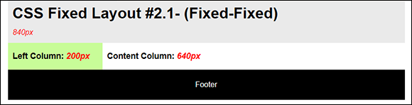
Figure 7-4: The two-column layout used to create an example page.
The first option you’ll want to change is the colors used for the various objects. Of course, the colors need to match the color scheme for your site. The templates use hexadecimal color representations. You should modify them to match those used by other templates on your site (if necessary).
Templates that rely on fixed column widths may require tweaking to work with the rest of your site. To change the overall width of the page, you modify the width property of the #maincontainer style. The left pane width is controlled by the width property of the #leftcolumn style. The content pane size is the difference between the #maincontainer style width and the #leftcolumn style width. Dynamic Drive tends to use consistent naming, so a layout that uses the right column for links would have a #rightcolumn style that you modify to change the width of that column. If you change the size of the #leftcolumn or #rightcolumn styles, then you also need to change the margin-left property of the #contentcolumn style to match.
The height of the top section is only 90px. This could cause a problem when working with a larger header. Change the height property of the #topsection style to make it compatible with other headers on your site. Likewise, the footer lacks an actual height, so you may need to modify it by adding a height property to the #footer style to ensure each page of your site looks the same.
 These templates also rely on both the
 <b> (bold) and <em> (emphasis) tags. Although both tags are still supported by HTML5, there's a strong warning with the <b> tag to use it only as a last resort. If you plan long term use of these templates, it would be a good idea to replace the <b> tag entries with the <strong> or <mark> tags, or better yet, just avoid using the <b> and <em> tags completely in favor of CSS formatting. These tags are leftovers from the days before CSS made it possible to add various forms of emphasis and bolding using the font-style and font-weight properties. The example shows the tags intact, but the recommendation is to remove them and use other kinds of formatting instead.
Using three column layouts
Three-column layouts are commonly used on sites that provide a list of generic links on one side of the page, content in the middle, and advertising or page-specific links on the other side. The Dynamic Drive layout pages show one use of this layout where you see a list of offerings in the left pane, the actual layouts in the content pane, and a list of sponsors in the right pane. There are variations on this theme. One example appears on the Electronic Frontier Foundation site at www.eff.org/about where you see site links in the left pane, information about EFF in the content pane, and news links in the right pane. You can see a list of the three column layouts at www.dynamicdrive.com/style/layouts/category/C10/. As with the two-column layouts, you find a mix of fixed and fluid layouts when working with the three-column layouts.
Of course, there are more types of three-column layouts than there are of two-column layouts because more permutations are possible. In some of the layouts, one of the side columns is fluid, as is the content column. There’s even a layout where all three columns are fluid, which means that the entire layout will resize itself to match the current browser window size.
 The one type of three-column layout missing from this site is one in which the two columns are aligned, one over the top of the other. This form is commonly used for online documentation, such as the Java 7 API at
 http://docs.oracle.com/javase/7/docs/api/ as shown in Figure 7-5.
One way around this problem is to use another product, such as the UI Layout plug-in for jQuery described in the “Defining the Basic Page Layout” section of Chapter 6. Another alternative is to modify the CSS Fixed Layout #3.3- (Fixed-Fixed-Fixed) layout shown in Figure 7-6.
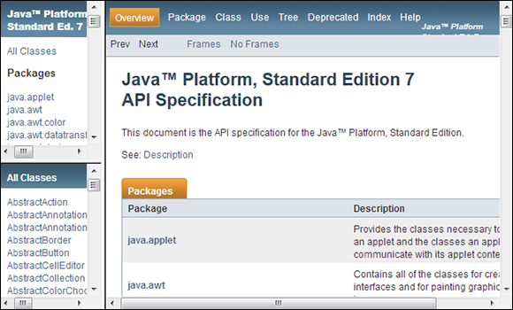
Figure 7-5: A three-column layout used for documentation purposes.
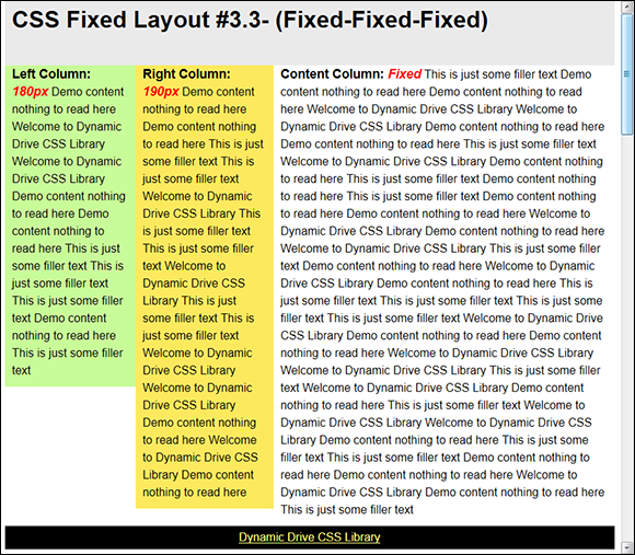
Figure 7-6: The three-column layout provides three fixed columns.
You don't need to make any changes to the HTML part of this example. The HTML5 version of the layout looks like this. (You can find complete code for this example in the \Chapter 07 folder of the downloadable code as ThreeColumnHelpLayout.HTML.)
<!DOCTYPE html>
<html>
<head>
<title>
CSS Fixed Layout #3.3- (Fixed-Fixed-Fixed)
</title>
<link rel="stylesheet"
href="ThreeColumnHelpLayout.CSS" />
</head>
<body>
<div id="maincontainer">
<div id="topsection">
<div class="innertube">
<h1>
CSS Fixed Layout #3.3- (Fixed-Fixed-Fixed)
</h1>
</div>
</div>
<div id="contentwrapper">
<div id="contentcolumn">
<div class="innertube">
<p>
<b>Content Column: <em>Fixed</em></b>
</p>
</div>
</div>
</div>
<div id="leftcolumn">
<div class="innertube">
<p><b>Left Column: <em>180px</em></b></p>
</div>
</div>
<div id="rightcolumn">
<div class="innertube">
<p><b>Right Column: <em>190px</em></b></p>
</div>
</div>
<div id="footer">
<p>Footer</p>
</div>
</div>
</body>
</html>
The CSS starts with the code supplied by the site. In order to modify this code to provide the format required for help documentation, you need to make a few small changes. The following procedure tells you how.
1. Change the margin-left property for the #rightcolumn style to -840px.
This change makes the right and left columns even.
2. Change the width property for the #rightcolumn style to 180px.
This change makes the right and left columns equal widths.
3. Add a height property value of 250px to both the #leftcolumn and #rightcolumn styles.
This change allows both columns to use half the available space for content.
4. Add a margin-top property value of 250px to the #rightcolumn style.
This change positions the right column below the left column.
5. Load the resulting page into your browser.
You see a three-column layout like the one shown in Figure 7-7.
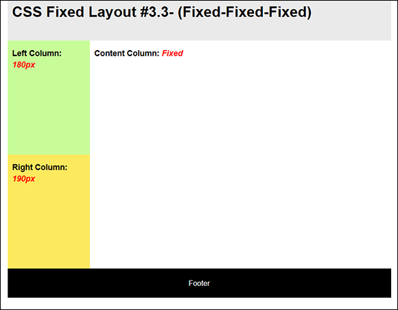
Figure 7-7: The modified three-column layout will serve well for a documentation site.
The Dynamic Drive templates are flexible and can often serve other purposes with a few small changes. The important thing is to start with a layout that looks close to what you want to use.
Employing CSS frames
Frame layouts are typically quite simple and are often provided for compatibility with mobile devices. A frame layout consists of one or more static (fixed) content areas that could contain controls and a fluid content area used to present information.
The main differentiation between a frame layout and a standard layout is that the frame layouts contain no header or footer. As a consequence, you can mash various frames together to create a composite page.
Developers also use frame layouts to hold other content. The frame becomes a container used to hold content from various sources. The Dynamic Drive frame layouts appear at www.dynamicdrive.com/style/layouts/category/C11/. You can find frames with one, two, three, or four static areas depending on the requirements of your site.
Unlike the other types of layout, frame layouts don't show you how they appear in the browser. You must copy the source and create the page locally to see them. However, you use the same technique as usual to copy and use the layout. Separating the CSS from the HTML will make working with the template easier. Figure 7-8 shows the appearance of a sample template. (You can find complete code for this example in the \Chapter 07 folder of the downloadable code as CSSFrameLayout.HTML.)
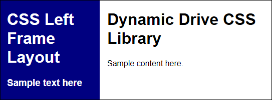
Figure 7-8: CSS frame layouts are incredibly simple and work well with mobile devices.
The CSS frame layouts are configured to hide the scrollbars. As a result, any content that doesn't fit in the frame is inaccessible. You can change this behavior by setting the overflow property of the #framecontent style to scroll. However, changing this setting could also reduce the usability of the layout with some types of smaller mobile devices.
Creating Menus
Most sites use a menu system of some kind. In at least some cases, the menu system uses image maps or some other technique that isn’t supported by Dynamic Drive. However, most sites rely on horizontal, vertical, or combination menus. Over the years, users have gotten used to working with menus, so using them on a site simply makes sense. A user understands how to use a menu intuitively, so there’s no learning curve. Of course, poorly defined or complex menu entries can still confuse users, but the mechanics of the menu itself are well understood.
Developing horizontal menus
Horizontal menus have selections that appear in a horizontal line. Normally these menus appear across the top of a content area, but menus can also appear at the bottom of the content area or any place between. The point is that a horizontal menu has a particular orientation. For most sites, the horizontal menu represents main site selections, such as going to a list of products or seeing the about page. Dynamic Drive provides seven pages of horizontal menu offerings (as of this writing) that provide various special effects. Figure 7-9 shows just part of the first page (which contains seven entries).

Figure 7-9: Horizontal menus are commonly used for site selections.
The menus all have a special effect. When you click a particular menu selection, you see a page with a demonstration such as the one shown in Figure 7-10. In order to see the special effect, you normally have to hover the mouse pointer over the characters or graphics supplied as part of the menu. For example, with the example menu, hovering the mouse pointer over one of the hearts makes the heart spin around to indicate that the heart has been selected as a menu option.
Notice that the top of the page also includes a description of the menu, along with a listing of compatible browsers. The description usually contains some technical notes as well. It’s important to read the technical notes after reviewing the code to ensure you understand how to implement the menu.
The bottom half of the page contains the code for the example. Unlike the layouts, the CSS and HTML are placed in separate windows as shown in Figure 7-11, which means you don't have to separate them manually. In addition, the HTML part doesn't provide a complete page — it's a fragment that you'll need to embed in your own page to test. (You can find this particular example as a full page in the \Chapter 07 folder of the downloadable code as HorizontalMenu.HTML.) However, you use the same technique as you do with the layouts to expand and copy the code when desired.
Notice the link after the code. The example provides one menu that relies on heart icons. You can click this link to download the icons if desired.
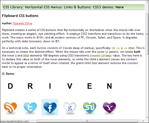
Figure 7-10: Most menus have some special effect that activates during a mouseover event.
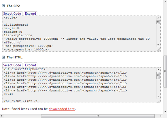
Figure 7-11: The HTML and CSS for the example appear in separate windows.
In some cases, these icons are provided by other sites. The other site may have made the icons inaccessible and you'll find that you won't be able to download them after all (such as the heart-shaped social media icons used for this example). A way around this problem is to download the icon directly from the Dynamic Drive site. For example, the RSS icon shown in the example appears at www.dynamicdrive.com/cssexamples/media/rss-heart.png.
Not all of the menus are a single layer. The Split Drop Down Menu (www.dynamicdrive.com/style/csslibrary/item/split_drop_down_menu/) provides two levels of selections A few of these menus rely on third-party products, such as jQuery. The jQuery Drop Line Menu example (www.dynamicdrive.com/style/csslibrary/item/jquery_drop_line_menu/) provides multiple menu levels (up to four levels are shown in the example). Because this isn't a pure CSS solution, however, you need to ensure that the users who access the site will have JavaScript support enabled in their browsers.
Developing vertical menus
Vertical menus can be used for site redirection. However, many sites use them for page-specific or topic-specific links. You find the vertical menu options at www.dynamicdrive.com/style/csslibrary/category/C2/. There aren't as many vertical menu options as there are horizontal menus (only three pages' worth). In addition, you might have a hard time finding compatible horizontal and vertical menu pairs (the CSS3 shadow menus come in both horizontal and vertical formats).
The vertical menus work the same as the horizontal menus do. The only difference is their orientation. The example pages contain the same types of content and you must insert the HTML code into an existing page, just as you do with the horizontal menus. The site doesn’t currently provide any multilevel vertical menus, so if you need more than one menu level, you must use a horizontal menu or locate a menu on another site.
Performing Image Magic
Graphic effects help sell site content and attract user attention to elements you want to emphasize. They add pizzazz and help keep the user from clicking the link for the next site on a list of similar sites. When used effectively, graphic effects can help you produce teaching aids and convey information in a way that text or a static image couldn't convey. However, implementing image magic in the form of graphic effects is well within the purview of graphic designers and many developers feel ill-equipped to add it to their sites. That's why the CSS image library that Dynamic Drive provides at www.dynamicdrive.com/style/csslibrary/category/C4/ is so important. None of these effects are earth-shattering, but some are quite dramatic.
As with spices used on food, a few graphics go a long way. Filling your site with special effects may sound like a great idea — the thinking goes that if a few effects double traffic, then more would be even better — but the reality is that too many graphic effects are a turnoff, and the images lose their magic. It’s best to go for a few well-defined graphics effects that make a specific point than to clutter your site with effects that boggle the user’s mind and draw attention away from areas of interest.
The graphic effects pages work just like the pages used for layouts and menus. The top of a selected effect shows the effect and provides both a description and some explanatory notes about it. The bottom half of the page contains the code required to implement the special effect. As with menus, the graphics effects provide separate CSS and HTML sections and the HTML code is provided as a snippet, rather than a full page.
There are currently two pages of graphic effects on the Dynamic Drive site. Many of these effects help users see selections. For example, when you use image bubbles (www.dynamicdrive.com/style/csslibrary/item/image_bubbles_using_css3_transform_and_transitions/) the image that the user points to with the mouse appears bigger than the other images — making it possible for the user to be sure of making the right selection. This type of graphic effect can be useful when implemented correctly — and when you take the needs of those with accessibility concerns into account.
One of the more interesting special effects is the Before and After (Peel Back) Image (www.dynamicdrive.com/style/csslibrary/item/before_and_after_peel_back_image/).You could easily use this particular effect for more than simply showing an interesting graphic effect. In this case, image magic could include a teaching aid. It's possible to provide a problem scenario. After coming up with an answer, the user hovers the mouse pointer over the problem to reveal the answer underneath. It would make for an interesting way to present answers during a teaching session.
Dressing Up Forms
Business runs on forms and it's likely that your business will require some forms on its site. The form content is determined by business need, of course, and most developers can come up with a functional form for just about any need. After all, developers spend a good deal of time creating forms for just about every other application need. However, the forms that Dynamic Drive provides at www.dynamicdrive.com/style/csslibrary/category/C6/ offer a bit more pizzazz.
There are only three formats provided, along with a few stylish Submit buttons you can use in place of the defaults. The form with the most pizzazz is the Responsive 2 Column Form (www.dynamicdrive.com/style/csslibrary/item/responsive_2_column_form/) as shown in Figure 7-12. It features shading and rounded corners to give the form that special look. The Submit button appears at the bottom of the page — it's relatively large and red, making it a lot easier for the user to see.
All of these samples focus on design and not on functionality. You need to consider accessibility requirements and security as part of creating a functional form. For example, it’s essential to define a method for checking user input to ensure the server receives usable data. These samples are a good starting point for a completed form, not the entire solution.
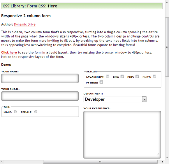
Figure 7-12: Use this two-column format to dress up your forms.
Using the Free Icons
Although most developers aren’t very good artists, they want their sites to look nice. To do this, hiring a graphic artist is the best solution for truly custom art. However, most sites need only two — or possibly three — pieces of custom art (normally a logo and some sort of heading art to uniquely identify the site). The rest of the art usually consists of screenshots, clipart, line art, and photographs. The screenshots are easy to grab and most developers have used products such as Visio to create line art. Even if the developer isn’t a good photographer, someone at the organization usually does possess the required skills, which leaves the clipart.
If you do some research, finding the clipart you need for your site can be relatively easy. For example, some of the example applications on Dynamic Drive include downloads for the graphics you see used with them. The “Developing horizontal menus” section, earlier in this chapter, discusses one such scenario. In this case, you see an array of heart-shaped social media icons. There are many other examples and you need to look for them as you try the examples.
Dynamic Drive isn't the only site that provides free graphics, but it does provide an interesting array of buttons and icons you can use for your site. You can view these graphics at www.dynamicdrive.com/style/graphics/. Figure 7-13 shows an example of the 48 × 48 large icons you can download (it's relatively easy to resize icons to make them smaller, but the results aren't always perfect).
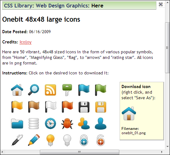
Figure 7-13: The Dynamic Drive site provides access to some commonly used graphics you need.