Chapter 14
Modifying the Dynamic Drive CSS
In This Chapter
 Defining the script categories
Finding the CSS you want to change
Making simple changes to Dynamic Drive
Using menus to your advantage
You first encountered Dynamic Drive (www.dynamicdrive.com/) in Chapter 11. Dynamic Drive is actually a set of tools and scripts that make it possible for you to add all sorts of special functionality to your application. Chapter 11 provides the highlights of the tools that appear on this site. This chapter focuses on the scripting examples and how you can modify them to meet your specific needs. It's important to realize that these scripting examples are designed along the same lines as extensions for APIs such as jQuery (http://jquery.com/) and jQuery UI (http://jqueryui.com/). Dynamic Drive doesn't provide a pure API environment for you to use.
This chapter doesn’t discuss all of the script categories in detail. For example, Dynamic Drive provides access to a number of game scripts. These scripts are interesting and fun, but a developer is unlikely to use such a script in an application, so this chapter doesn’t discuss that category in detail. Instead, you’ll find some general techniques you can use for any of the Dynamic Drive scripts, which make it easier to adapt any of the scripts to a particular need.
Some script categories do require special attention. For example, Dynamic Drive provides more than a few menu scripts you can modify to meet particular needs. This chapter provides details about making modifications to these special script categories so that you have a better idea of how you can use them in an application.
 In most cases, Dynamic Drive labels the source of their scripts. For example, if a script was submitted by a user, then the write-up about it tells you that it was user-submitted. When you see a script that doesn’t include source information, you can normally assume that it was provided directly by Dynamic Drive; you can verify that this is so by reviewing the source code. Always ensure that the scripts you use in an application come from a reliable source, especially when working with a script submitted by a user. Unfortunately, this often means going through user-submitted scripts line-by-line looking for potential sources of problems.
Understanding the Script Categories
The Dynamic Drive scripts appear in several categories. Each category contains a number of scripts that meet specific needs. For example, you may need a pop-up calendar, rather than one that sits statically on the page. Dynamic Drive provides the Calendars category, whose scripts address both needs.
 Each of the script entries provides you with the script name, the browser name and version it was tested under, whether the script was submitted by a user, and a short description of what the script does. The browser information uses abbreviations, such as FF1+ IE5+ Opr7+, to indicate (respectively) that the script will work on Firefox 1 and above, Internet Explorer 5 and above, and Opera 7 and above. Some scripts will also have an updated icon next to them to indicate that the script has changed or a new icon to indicate that the script has been added recently. The following list describes the kind of scripts that you can expect to find in each of the categories.
 Calendars: All of these scripts are user submitted. They include a number of basic, dynamic, and pop-up calendars. At least one entry is designed to make it easier for the user to input a date by typing it, rather than selecting it with a mouse.
Date & Time: Most of these scripts were created by Dynamic Drive. They include a number of digital and analog clock examples. A few of the digital examples also include date as part of the output, so that you can see days, hours, minutes, and seconds since a particular event occurred (as an example). At least one of the examples presents the date in text format.
Document Effects: Many of these scripts were created by Dynamic Drive. Each script provides a method for interaction with document content in a special way. For example, you can find numerous ways to present documents using a tabbed or list-selectable interface. However, some of the scripts actually present a special effect, such as adding snow or autumn leaves to a page. A few scripts are quite practical, such as the magnifying-glass script that makes it easy to zoom in on page content.
A few of the scripts in this category are marked with the wizard icon. What this means is that you make selections, submit the changes, and the page generates a script to perform the required task. In short, the page offers a kind of scripted tool that you can customize.
Dynamic Content: Most of these scripts were created by Dynamic Drive. The purpose of these scripts is to present page content in unique ways. For example, you can display longer page content as a slideshow so that the user can move from one topic to the next with ease. There are also scripts to display messages and ads of various sorts. You can even see an example of how to create a notepad application for storing textual information input by the user for later use. All of these techniques rely on some combination of Inline Frames (IFrames) and Asynchronous JavaScript and XML (AJAX) to perform their work.
Some of the examples include images that could be copyrighted. Dynamic Drive normally provides you with some level of assurance that an image is acceptable to use, but it’s always better to be safe than sorry. Use your own images for page content whenever possible, or obtain an image that you’re certain is acceptable to use.
Form Effects: Most of these scripts were created by Dynamic Drive. All of the scripts deal with forms in some way. You can find controls that provide hints, display the progress of a submission, and perform various kinds of validation. There are even examples of predefined content controls, such as one that asks the user to accept the terms of using a particular feature. A few of the scripts are form-specific versions of scripts that appear in other categories, such as a pop-up calendar used to input dates into forms.
Games: All of these scripts are user-submitted. The games are incredibly simple and do demonstrate some gaming theory (such as the use of statistics in deciding game actions), but really aren’t much fun. You can choose from old favorites like tic-tac-toe or newer-style games like Cross Browser Snake.
Image Effects: Many of these scripts were created by Dynamic Drive. You can find scripts to perform a variety of tasks, such as creating on-page effects such as flying planes. A few of the scripts perform special effects, such as displaying a reflected image of an original image. The most practical scripts perform tasks such as magnifying images so that viewers can see them with greater ease. The following subcategories provide access to additional scripts that perform special effects on images for the most part: Image Slideshows, Image Galleries and Viewers, and Mouseover Images.
Links & Tooltips: Most of these scripts were created by Dynamic Drive. In most cases, each of these scripts enhances the presentation of information through a tooltip of some sort. For example, you can hover the mouse cursor over a link and see both a picture and a description of where that link leads. Some scripts provide special effects, such as to change the color of a link dynamically when you hover the mouse cursor over it. A few of the scripts deal with other controls, such as buttons, making them easier to use or to present the user with additional information when the mouse cursor hovers over the control.
Menus & Navigation: Most of these scripts were created by Dynamic Drive. An essential part of most applications today is the capability to select features or to move to new locations. Menus and navigation features make it possible to turn a cumbersome page into one that’s easily used. For example, you can find scripts to present menu selections in an accordion format. The CSS Based subcategory provides you with access to menus and navigational aids that rely on CSS to perform all or most tasks. The Multi-level Menus subcategory provides access to menus that allow you to make multiple levels of selections (menus and submenus).
Mouse & Cursor: Most of these scripts were submitted by users. Each script changes the appearance of the mouse pointer or cursor in some way. Some of the more interesting scripts add colorful mouse trails to make it easier for someone using a mobile device to see the mouse cursor in bright light. Specialized cursors provide a cue to the user that the application mode has changed in some way.
Scrollers: Most of these scripts were created by Dynamic Drive. A scroller is a box or other control used to display some bit of text or a graphic out of a larger sampling of text or graphics. For example, you might see the latest headlines with just one headline presented at a time in the scroller box. Every few seconds a new headline will scroll into view. Scrollers are useful for ads, headlines, or other sorts of changeable text where you want to present the user with a random sampling of information.
Text Animations: Many of these scripts were created by Dynamic Drive. Each script seeks to provide a new manner in which you can display text onscreen. The goal of many of these animations is to emphasize the text in a specific manner so the user doesn't miss it. There's even a special effect that's based on the presentation of textual information in the movie The Matrix (see http://thematrix101.com/ for details).
User/System Preference: Most of these scripts were created by Dynamic Drive. In all cases, the script changes how the browser and application work or the manner in which they present information onscreen. For example, you can find style-sheet switchers that let a user choose from multiple style-sheet options. There are also scripts that disable certain browser features (such as the use of right-click), or that detect host system functionality, such as the characteristics of the display. The whole idea is to make it possible to control the application environment, either automatically or through user selections.
Window and Frames: Most of these scripts were created by Dynamic Drive. Both windows and frames act as containers for content. The manner in which you create and display a window or frame affects the user’s perception of the content that appears within that window or frame. These scripts perform tasks such as displaying modeless windows or using animated effects to present information onscreen.
XML and RSS: All of these scripts were created by Dynamic Drive. The basic purpose behind these scripts is to make it easier to display XML or Really Simple Syndication (RSS) information onscreen — generally within a small text box. The user then has the option of clicking a link (in most cases) to see additional information about the topic at hand.
Other: Most of these scripts were created by Dynamic Drive. These scripts generally perform some useful task that doesn’t fit within the other categories described in this list. For example, there’s a special script for playing sound effects; you’ll also find scripts that create interesting scrollbars. If you didn’t see a script you need in one of the other categories, this is the place to look.
Locating the CSS for a Particular Feature
Many of the scripts provided on the Dynamic Drive site work with jQuery and jQuery UI. They’re extensions of a sort that help you use these two APIs with greater efficiency. As a result, the tips and techniques described in Chapter 13 also apply to many of the Dynamic Drive scripts. The location of the jQuery and jQuery UI CSS doesn’t change.
Some of the scripts provide custom CSS files that you must download and place on your system in order to use the script, as shown in Figure 14-1. These links can be hard to see at times. In this case, you're looking for the anylinkcssmenu.css link in Step 1.
Dynamic Drive tends not to provide a hosted link that you can use to access either the CSS or associated script. You can choose to modify the custom CSS directly, or provide changes to the CSS with internal or inline CSS modifications as described in the “Adding Modifications” section, later in this chapter. The important thing to remember is that you need the downloaded file to make the script work properly.
 Make sure you look carefully at all of the materials for a particular Dynamic Drive script. In many cases, you see a
 Customization section like the one shown in Figure 14-2. This section provides insights on how you can customize the script to meet specific needs. In at least a few cases, you even see multiple examples of the effects that you can produce with the script by making a particular change. (You can see a better example of the customizations for the AnyLink CSS Menu v2.3 at www.dynamicdrive.com/dynamicindex1/anylinkcss.htm.)

Figure 14-1: Download any CSS files required to use the script.
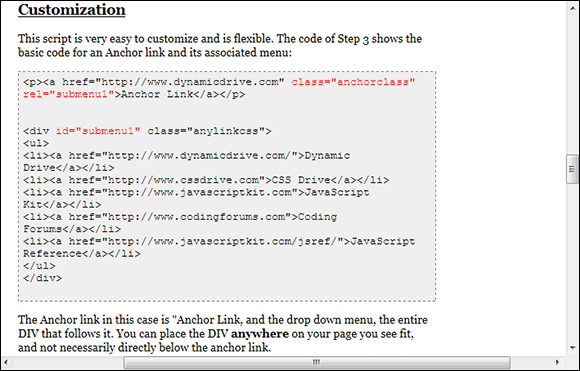
Figure 14-2: Make sure you read any customization materials provided with the script.
Adding Modifications
Most of the Dynamic Drive examples include a mix of CSS and JavaScript. In general, you change the CSS to obtain just the right appearance and add the JavaScript to modify the functionality in some way. Most developers use the example functionality as-is or with just minor changes, but the CSS is another matter. An example that presents a look similar to the one you want is a good place to start, but most people will want to customize the appearance of the output to match the specifics of their sites.
When working with Dynamic Drive examples that use jQuery or jQuery UI, make sure you check out the changes you can make in Chapter 13. These changes help you customize the output even further. The example in the sections that follow doesn’t rely on jQuery or jQuery UI; it works exclusively with a Dynamic Drive example so you can see how to make the modifications for Dynamic Drive more clearly.
In this case, you're working with the LCD Clock example that appears at www.dynamicdrive.com/dynamicindex6/lcdclock.htm. This example is designed to work with Firefox 1 and above, Internet Explorer 5 and above, and Opera 7 and above. However, testing shows that it also works just fine with newer versions of Chrome. (You can find complete code for this example in the \Chapter 14\LCDClock folder of the downloadable code as LCDClock.HTML.)
Obtaining the example
Before you can work with the example, you need to create it on your system. The Dynamic Drive site shows how the LCD clock will look and provides you with the code, but it doesn’t provide an actual example. In addition, you can modify the example in various ways to make it easier to work with. The following steps help you create the example so you can get started working with it.
1. Create a new HTML 5 page using your favorite text editor or IDE and save it as LCDClock.HTML.
2. Change the <title> tag as shown here:
<title>Modifying an LCD Clock</title>
3. Add an <h1> tag to the page body as shown here:
<h1>Modifying an LCD Clock</h1>
4. Click Select All in the Step 1 portion of the Dynamic Drive page.
You see the CSS code for the example highlighted.
5. Copy the highlighted text to the clipboard, and then paste it within the <head> section of the example page.
The editor adds to CSS code to the <head> section.
6. Click Select All in the Step 2 portion of the Dynamic Drive page.
You see the JavaScript code for the example highlighted.
7. Copy the highlighted text to the clipboard, and then paste it within the <body> section of the example page.
The editor adds the JavaScript code to the <body> section.
8. Save the modified LCDClock.HTML and load it in your browser.
You see the simple output shown in Figure 14-3.
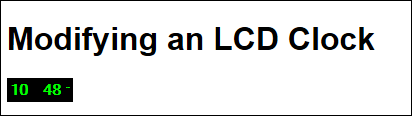
Figure 14-3: The LCD clock will accurately display the current time for you.
Making the example more flexible
The example works, but it’s definitely only an example — not something you’d use in a production environment. The example assumes that everything should appear within a single file. However, when working in a production environment, you may want to use the clock on each page that needs it, which means being able to access the code from a central location. The following steps help you convert the example into something you can use on multiple pages.
1. Create a new CSS file, using your favorite text editor or IDE, and save it as LCDClockSource.CSS.
2. Cut the .styling style from LCDClock.HTML and paste it into LCDClockSource.CSS.
The editor moves the code as requested.
3. Save LCDClockSource.CSS.
4. Remove the <style> tag and any remaining content from LCDClock.HTML.
5. Create a <link> tag in the <head> area of LCDClock.HTML as follows:
<link
rel="stylesheet"
href="LCDClockSource.CSS" />
This link tag creates a connection between LCDClock.HTML and LCDClockSource.CSS so that the LCD clock can use the required styles.
6. Create a new JavaScript file using your favorite text editor or IDE and save it as LCDClockSource.JS.
7. Cut all of the JavaScript code from the <body> section of LCDClock.HTML except for the window.onload=show statement and paste it into LCDClockSource.JS.
The editor moves the code as requested.
8. Modify the show() function name in LCDClockSource.JS to read showLCDClock().
A simple function name such as show() isn't very useful in a production environment because you might have multiple functions by that name. Using showLCDClock() reduces the chance of a duplicate function name.
9. Modify the call to setTimeout("show()",1000) to read setTimeout("showLCDClock()",1000).
This function call provides automatic updates of the time. If you find that the clock isn’t updating automatically, check this piece of code to ensure you made the correct change.
10. Save LCDClockSource.JS.
11. Modify the <script> tag that appears in the <body> of LCDClock.HTML so that it calls the correct function after the window loads, like this:
<script>
<!--
window.onload=showLCDClock();
//-->
</script>
12. Add a <script> tag to the <head> of LCDClock.HTML as follows:
<script
src="LCDClockSource.JS">
</script>
13. Save the modified LCDClock.HTML and load it in your browser.
You see the simple output shown in Figure 14-3.
The modified example works precisely the same as before. However, it now uses external files to perform tasks with less effort. Whenever you want to use the LCD clock on any page, you begin by adding the required <link> and <script> tags to the <head> of the file, like this:
<script
src="LCDClockSource.JS">
</script>
<link
rel="stylesheet"
href="LCDClockSource.CSS" />
These two tags provide connectivity to the resources needed to make the LCD clock work. You then need to add a <span> and a <script> tag to the <body> of the page, like this:
<span id="digitalclock" class="styling"></span>
<script>
<!--
window.onload=showLCDClock();
//-->
</script>
The <span> is used as a container for the clock. The <script> tells the browser to start the clock when the window loads.
Modifying the JavaScript
The clock currently displays hours and minutes, but not seconds. This section discusses what you need to do to modify the code in LCDClockSource.JS to provide a seconds output in the time display.
Modifying the JavaScript for any of the Dynamic Drive scripts is risky because it makes updating the scripts hard. Dynamic Drive does provide script updates occasionally, so make modifications with care. If you do perform an update, you’ll need to add your changes back into the updated source code and test it fully.
In order to make the desired change, you need to modify the output code for this example. The output code consists of several if statement levels as shown here (reformatted to make the script easier to read and to also make it fit easily in the book).
if (standardbrowser)
{
if (alternate==0)
document.tick.tock.value=
hours+" : "+minutes+" "+dn
else
document.tick.tock.value=
hours+" "+minutes+" "+dn
}
else
{
if (alternate==0)
clockobj.innerHTML=
hours+"<font color='lime'> : </font>"+
minutes+" "+"<sup style='font-size:1px'>"+
dn+"</sup>"
else
clockobj.innerHTML=
hours+"<font color='black'> : </font>"+
minutes+" "+"<sup style='font-size:1px'>"+
dn+"</sup>"
}
The first if statement tests whether the user has a standard browser — one that doesn't require any special formatting commands. When you view the example, you'll notice that the colon between the hours and minutes flashes on and off with each second. The alternate setting tests for this state and causes the code to alternate between two output settings (one with and one without the colon).
Adding the seconds to the output requires several steps. First, you must add a variable that contains the current number of seconds. You can add this code anywhere before the if statement, but it's best if you add it with the hours and minutes variables that already appear in the code, as shown here in bold.
var hours=Digital.getHours()
var minutes=Digital.getMinutes()
var seconds=Digital.getSeconds()
Second, you need to handle the situation where the seconds are a single digit. The example always uses a two-digit minutes and seconds output. You can add this if statement immediately after the if statement that handles the minutes, as shown here in bold.
if (minutes<=9)
minutes="0"+minutes
if (seconds<=9)
seconds="0"+seconds
Third, you need to modify the output code so that it displays the seconds. This means changing the if statements you saw earlier to include the seconds.
However, this example has two other problems that you need to fix. First, the AM/PM output is too small to see. It appears as a dash in Figure 14-3. Second, the code as written overrides the CSS so that you now need to make messy changes to the JavaScript in order to do something as simple as use a different color scheme. The changes that follow not only add the seconds, but also fix these two problems:
if (standardbrowser)
{
if (alternate==0)
document.tick.tock.value=
hours+" : "+minutes+" : "+seconds+" "+dn
else
document.tick.tock.value=
hours+" "+minutes+" "+seconds+" "+dn
}
else
{
if (alternate==0)
clockobj.innerHTML=
hours+" : "+
minutes+" : "+
seconds+" "+"<sup style='font-size:50%'>"+
dn+"</sup>"
else
clockobj.innerHTML=
hours+
"<span style='color:transparent'> : </span>"+
minutes+
"<span style='color:transparent'> : </span>"+
seconds+" "+"<sup style='font-size:50%'>"+
dn+"</sup>"
}
The main addition is the seconds variable you created earlier. With each tick of the clock, the display is updated so that you see the hours, minutes, and seconds.
The original code attempted to set the font color to match the background to hide the colon. Unfortunately, this approach works only when the background and the colon remain the same color. To make this example CSS-friendly, you still display the colon, but use transparent text to do it. Using transparent text lets the background show through so that the user doesn’t actually see the colon.
Instead of setting a specific font size for the AM/PM output, the example follows the original author’s intent by making the superscripted value half the size of the other text. No matter how you scale the text, the AM/PM output will scale with it. Save the LCDClockSource.JS file and reload the page. You’ll see the seconds displayed as shown in Figure 14-4.
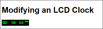
Figure 14-4: The LCD clock display includes the seconds now.
Modifying the CSS
The CSS for this example controls the appearance and size of the clock. Make sure you follow the techniques discussed in the previous “Modifying the JavaScript” section to fix some problems this example has that makes it CSS unfriendly before you read this section. Once you do have the script fixes in place, you can change the CSS as needed to make the clock appear any way you want. For example, try configuring the clock like this:
.styling
{
background-color:Beige;
color:DarkBlue;
font: bold 22px Arial;
padding: 4px;
border: double;
}
You get a completely different look. Figure 14-5 shows what you can expect as output in this case. Notice that the colons disappear every other cycle, as anticipated, even though the background color has changed.
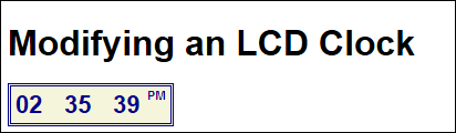
Figure 14-5: Change the CSS to modify the appearance of the clock.
Working with Menus
Dynamic Drive provides all sorts of different scripting examples (as described in the "Understanding the Script Categories" section, earlier in this chapter). However, one of the most commonly used features of any API is the menus. A developer needs to provide some means for people to get from one location to another on a site — to make it possible to review various resources that the site provides. With this in mind, the following sections discuss some of the things you can do using the Dynamic Drive menus found in the CSS-based Menu Scripts category (www.dynamicdrive.com/dynamicindex1/indexb.html). The techniques described in the following section will also work with scripts found in other categories, but the focus is on menus because everyone needs to create a menuing system for their sites at one point or another.
Defining a specialized menu
Split button menus offer one way to give your site a special look (as shown in Figure 14-6 later in this section). The split button tells viewers that the default menu selection is what they see at the moment, but that other selections are available. Simply clicking the split button takes the viewer to the default site. However, clicking the down arrow next to the button shows the other options and the viewer can easily select any of them as an alternative to a default.
This type of menu isn’t limited to just directing people to other locations. It can also act as a kind of input field for a form. The button shows the default selection for that field. However, you can also choose one of the alternatives if they work better. The point is that split button menus provide a specialized approach to menu development.
The example in this section relies on the Split Menu Buttons v1.2 example shown at www.dynamicdrive.com/dynamicindex1/splitmenubuttons.htm. The following steps get you started using this specialized menu and offer suggestions on modifications you might want to make to it. (You can find complete code for this example in the \Chapter 14\SplitButton folder of the downloadable code as SplitButton.HTML.)
1. Download the splitmenubuttons.js file found in the Step 1 section of the Dynamic Drive page, and then place it in the folder you want to use for your test page.
2. Download the splitmenubuttons.css file found in the Step 1 section of the Dynamic Drive page, and then place it in the folder you want to use for your test page.
3. Create a new HTML 5 page using your favorite text editor or IDE, and then save it as SplitButton.HTML.
4. Change the <title> tag as shown here:
<title>An Example of Using a Split Button Menu</title>
5. Click Select All in the Step 2 portion of the Dynamic Drive page.
You see the header code for the example highlighted.
6. Copy the highlighted text to the clipboard, and then paste it within the <head> section of the example page.
The editor adds the code to the <head> section. If you look carefully at this code, you find a link to splitmenubuttons.css and a script reference to splitmenubuttons.js. This example also relies on jQuery, so you find a script reference to jquery.min.js.
The code also includes a script for creating the split buttons that uses jQuery syntax. You won’t need to modify this script as long as you follow a few simple rules in creating your menu. The steps that follow discuss these rules.
7. Create links for each of the top menu entries in the <body> section of the page as follows:
<a href="SplitButton.HTML"
class="splitmenubutton"
data-showmenu="Home"
data-splitmenu="false"
data-menucolors="Brick,Brick">Home</a>
<a href="Products.HTML"
class="splitmenubutton"
data-showmenu="Products"
data-splitmenu="false"
data-menucolors="Indigo,Red">Products</a>
<a href="About.HTML"
class="splitmenubutton"
data-showmenu="About"
data-menucolors="Indigo,Red">About</a>
Each of these entries is a top-level menu button for the page. When the user displays the page, it shows Home, Products, and About as three buttons. Each of the buttons will go to a specific location when clicked. However, you can substitute # for the href attribute if you don't want a button to do anything when clicked.
The class must appear as splitmenubutton in every case. You can find the CSS for this class in the splitmenubuttons.css file.
The data-showmenu attribute defines which submenu to use. You must define a name, even if you don't intend to use a submenu with a particular button. In this example, the Home button won't include any submenus.
The data-splitmenu attribute specifies whether a button should show the down arrow as part of the button or as a separate button. This example shows both cases. The default setting is true, which means the arrow appears as a separate button.
You use the data-menucolors attribute to specify the colors used for the default background color and the selected color. The default color is DarkRed, but most developers will want to override the defaults to obtain a specific look.
8. Create a submenu for the Products menu, using the following code:
<ul id="Products" class="splitdropdown">
<li><a href="Products.HTML">Product 1</a></li>
<li><a href="Products.HTML">Product 2</a></li>
<li><a href="Products.HTML">Product 3</a></li>
<li><a href="Products.HTML">Product 4</a></li>
<li><a href="Products.HTML">Product 5</a></li>
</ul>
A submenu is simply an unordered list. Each of the list items contains an anchor that points to the location you want the viewer to go. The unordered list must have an id attribute value that matches the data-showmenu attribute value. In addition, the first level of unordered lists in a submenu must use the splitdropdown class.
9. Create a submenu for the About menu, using the following code:
<ul id="About" class="splitdropdown">
<li><a href="About.HTML">Our History</a></li>
<li class="separator">
<a href="About.HTML">Privacy Statement</a>
</li>
<li><a href="#">Contact Us</a>
<ul>
<li><a href="About.HTML">By Telephone</a></li>
<li><a href="About.HTML">By Mail</a></li>
<li><a href="#">By E-mail</a>
<ul>
<li><a href="About.HTML">Webmaster</a></li>
<li><a href="About.HTML">Support</a></li>
</ul>
</li>
</ul>
</li>
</ul>
This menu is a little more complex. If you want to create submenus of your submenus, simply place the corresponding unordered list within the list item as shown. The Contact Us submenu actually contains three levels of menu options.
Add the class="separator" attribute when you want to add a little extra space between menu items. Using this attribute makes it possible for users to see relations between menu items with greater ease.
10. Save the modified SplitButton.HTML and load it in your browser.
You see the simple output shown in Figure 14-6.
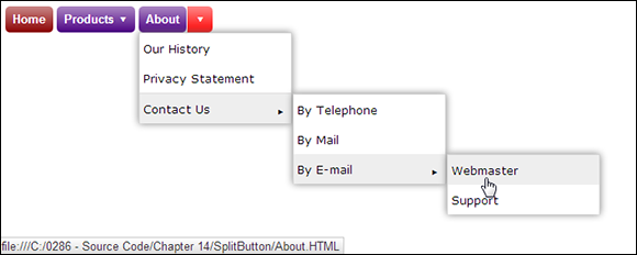
Figure 14-6: A split button menu can provide a nice appearance on a page.
Notice, in Figure 14-6, that the Home button appears like any other button, but it lacks a down arrow because it doesn’t have an associated menu. Clicking this button will take you to the home page.
As with any CSS-based menu, you can make a number of changes to the appearance of these menus. For example, it's possible to change the arrows to something other than the simple triangle shown. Of course, you need to know the values used to present various arrow types. You can see a list of typical Unicode arrows at www.ssec.wisc.edu/~tomw/java/unicode.html#x2190.
Developing menus with graphics
The split button setup described in the “Defining a specialized menu” section of the chapter uses two different styles for arrows:
The span.innerspan.downarrow::after style (note the two colons) is for arrows that appear as separate buttons.
The .splitmenubutton span.innerspan.downarrow:after style (note the single colon) is for arrows that appear as part of a single button.
You set the content attribute to the value of the Unicode arrow you want to use (or any other symbol for that matter). Here are examples of styles you can use with the example application.
<style type="text/css">
span.innerspan.downarrow::after
{
content: '\21D3';
}
.splitmenubutton span.innerspan.downarrow:after
{
content: '\21B3';
}
</style>
Reload the page after you make the changes. Figure 14-7 shows typical results. The Products button now uses a right-pointing down arrow — the About button uses a double downward arrow.
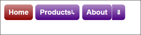
Figure 14-7: The menu you create is completely flexible, so you can change features like the arrows.
You can also change the right-pointing arrow used for submenus. Simply change the .rightarrow:after style to whatever Unicode character you want to use. For example, if you want to use a white right-pointing triangle, then you'd change the content attribute to '\25B9'. If you want to use a larger triangle, then use '\25B6' or '\25B7' instead.
Creating specialized menu effects
The menu created in the previous two sections is nice, but there are still some fit-and-finish changes you can make. One that's especially important is to define the title attribute for each of the menu entries. For example, you might simply use title="Go to the Home Page" for the Home button. Adding the title attribute provides the viewer with a tooltip when hovering the mouse cursor (as shown in Figure 14-8) and also provides input for people using screen readers.
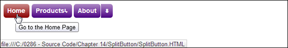
Figure 14-8: Adding tooltips make the menu even easier to use.
The menu doesn't provide a quick method for changing the text color or anything about the font used to display it. As with other examples in the book, you can use various kinds of CSS changes to affect the appearance of text in the menu. The buttons rely on the .splitmenubutton style to create the text appearance; the submenus rely on the ul.splitdropdown li a style. Try making these changes to the example styles and you'll see the interplay between the various split button menu elements.
.splitmenubutton
{
color: Yellow;
}
ul.splitdropdown li a
{
color: DarkOrchid;
background: Lavender;
}
It’s possible to modify the split button menu to meet any need you might have. The important thing to remember is to make as many changes as possible outside of the original files. Making changes to the files will cause you problems at some point because Dynamic Drive will likely make updates to the examples.