CHAPTER 5
The Applications
When the mind rests in the state of nothingness, the enigma can be understood; when the mind rests in the state of Reality, the bounds can be reached.
—Tao by Lao-tzu
In the previous chapters we have looked at the theory and philosophy underlying the development of AbleTrend. In this chapter we will look at the application of AbleTrend in actual trading, based on the concepts concerning trends that were presented in Chapter 2.
Here we will lay out everything, from theory to application, and see specifically how to use AbleTrend to trade the markets: how to enter and exit the trades, how to take buy, sell, and stop signals, where to place stops, how to evaluate trading systems, how to set up trading system parameters, how to identify and avoid a choppy market, and how to distinguish retracement and reversal.
When traders use AbleTrend, they have the option of selecting certain indicators, and at times settings for the indicators they choose to apply, based on the specific characteristics of the markets they’re trading. In understanding how these settings work, we not only get a sense of the power of AbleTrend, but we also come to understand more deeply the factors that underlie market movement. Therefore, even readers who do not have access to the AbleSys tools will derive much benefit from the information in this chapter.
WHAT IS THE “WINNING FRAMEWORK” FOR A TRADING SYSTEM?
“Winning framework” here means a mechanical trading system that can be proved to be winning by back-testing validation. You may or may not trade a system 100 percent mechanically. You may or may not wait for entry at bar close. But you do need to run back-testing to verify whether the trading system (or strategy) you’re using can win or not with the historical data set. If it does, we call it a winning framework. When you use discretionary trading methods, you must first have a winning framework to guide you.
To ensure more realistic back-testing performance results, traders must build in a sufficient cost per trade (commission plus slippage) according to the execution method used. If you ignore the cost per trade in the back-testing reports, you are fooling yourself.
We begin by examining three aspects of AbleTrend that place trades into a winning framework. These include real-time signal accuracy, choice of order-execution method, and setting trailing stops to exit the market.
What’s Real-Time Signal Accuracy?
A price bar, which is the basic unit of technical analysis, is defined by the length of time it represents, and four prices: Open (O), High (H), Low (L), and Close (C). In real time, before the bar closes, the last price of the last bar is live and keeps changing, moving up and down with every coming tick of streaming data. AbleTrend indicators are calculated based on the open, high, low, and close prices of the bars of the chart. Therefore, you may notice that indicators and trading-system signals for the last bar keep changing. Since the last bar’s high, low, and close prices are “live,” you may sometimes see the last bar’s color or dot signals appear and then disappear; or the color of the signal may change from blue to green (indicating neutral), or from green to red (indicating bear), or red to blue (indicating bull), before the bar closes.
Signals are live in real time. This is normal and what should be true of any indicator or trading system with live data. However, as time passes by, after the bar closes, all open, high, low, and close (OHLC) prices of the bar are fixed, and all the signals for the closed bars should not change anymore. Not just AbleTrend, but every signal of any indicator or trading system faces the same challenge of real-time signal accuracy if using live streaming data.
When using the AbleTrend system in real-time trading, you will notice some signals that appear and then disappear before the bar closes. Real-time signal accuracy (RTSA) is determined by calculating the ratio of bars that offer trade signals at the bar close, to the total number of bars that had signals triggered in real time. Essentially, RTSA measures how accurate the trading signals are in real time. Conversely, RTSA measures how many signals given in real time are unstable or false. For example, suppose that 20 signals popped up in real time, but some of them disappeared before the bar closed, leaving only 14 remaining signals after the bar closed. The RTSA was 70 percent (i.e., 14/20) for this example.
RTSA should not be confused with “system winning rate.” System winning rate is the ratio of winning trades to total trades. If there were 20 trades total and 14 of them were winning, the winning rate is 70 percent.
RTSA also should not to be confused with “signal change” due to “refresh” of a chart. A real-time bar chart is constructed by using two data sources: (1) historical data called HIST or TIC data and (2) real-time data called DM (Data Manager) data. HIST and TIC data are stored in central historical data servers. To save storage space, using filters, some nearby same-priced tick data are removed. Bad ticks with big strike prices that are out of the normal price range due to input errors are also removed. Therefore HIST or TIC data are more compact and more clean than the raw live DM data. The DM data are directly fed from trading floors of exchanges. Real-time charts are built from the raw DM data. When you refresh a chart, normally trading software will rebuild the chart by downloading HIST or TIC data again. Because that HIST or TIC data may or may not be exactly the same as raw DM data, sometimes you might see differences in the signals. This is also a part of real life we have to live with. Therefore, it is necessary to refresh the chart before acting on any trading signal since the HIST or TIC data are more clean. RTSA has nothing to do with these refresh issues.
As indicated earlier, because AbleTrend, like any indicator, uses real-time tick data, market conditions may dictate that a trading signal appears and then disappears before the bar closes. An unstable trading signal is one that is gone after the bar closes. If some traders don’t wait until the bar closes to take a trading signal, it is possible they will make trades according to an unstable signal. By waiting until the bar closes to take trading signals, it is possible to avoid unstable real-time signals, and the RTSA will be 100 percent.
Calculating RTSA is useful when selecting which execution method is appropriate for your trading style. A detailed look at execution methods follows.
Execution Methods
There are three different execution methods one can use with a mechanical trading system:
1. Entry at Bar Close (EBC).
2. Dynamic.
3. Hybrid method.
Only the first method, EBC, is 100 percent mechanical. The other two methods integrate elements of human discretion with the mechanical system.
EBC Execution Entry at bar close execution is the simplest approach to using a mechanical trading system. After you have chosen your input parameters, the system will generate buy, sell, stop, or exit signals based on your predetermined rules. By waiting until the bar closes to enter a trade, you will achieve 100 percent RTSA, and therefore, avoid trading unstable signals accordingly. You will take each trading signal precisely at the close of bars or the open of the next bar. Sometimes you may know the signals should be good before or far before the bar closes, for example, if a buy signal was triggered at bar open time, and it is now far above the open price. But based on the EBC rule, you have to wait until the bar closes to execute the buy order, which means that at times you might give up considerable profits. The EBC is simpler and less risky than any other execution method because you have back-tested and validated the system before. However, the downside of using the EBC execution method is that there is often a delay leading to large slippage and lower profits than executions made in real time when the signals have just appeared. Although the EBC execution method can be applied to charts using any time intervals, it has been found to be more effective when using 30-minute charts or longer for fully mechanical trading. Shorter time-interval charts (such as 2-minute or 5-minute charts) are not suggested for 100 percent mechanical trading. This is mainly because the input parameters frequently request changes. The settings work for today but may or may not work for tomorrow.
Trading with the EBC execution method removes all uncertainties about executing market orders using real-time trade signals. As already indicated, RTSA will be 100 percent when using the EBC execution method. When the bar closes and the close price is below the protection stop level, you know to exit long positions; when the close price is above the protection stop level, then you know to exit short positions. With this approach, traders avoid a lot of false hits caused by bad ticks or random strike prices. Successful AbleTrend users find this is one of the keys that help them succeed in real-time trading. Some traders prefer to enter trades when the next bar opens (EBO—Entry at Bar Open). Our back-testing shows that EBO has almost the same results as EBC in the long run. Good trading software programs should provide back-testing reports comparing results with or without the EBC order entries.
Dynamic Execution Dynamic execution allows you to enter trades based on the real-time trading signals (TS), i.e., it allows you to enter orders before the bar closes or near the bar close according to certain guidelines. If the trade signal is unstable (appearing and then disappearing several times), wait for the bar close to enter a trade. Take the trade if the TS is stable and 80 or 90 percent of the bar time has passed. Take the trade aggressively if it is a “sure” TS in the early stage of the bar formation or under the conditions of a fast market with momentum. Using this approach, the judgment of traders is required. The dynamic execution method will result in less delay or slippage, but it is riskier than the EBC execution method. You need to place a very tight protective stop of just a few points when you enter such trades. These tight stops will protect a position that has been filled before the bar closes. Cancel the stop order when the bar closes. If you use the AbleTrend stop as one of the exit rules, you need to place a Position Trailing Stop (PTS) according to the stop value of the previous bar. If you don’t use the AbleTrend stop exit rule, you don’t need to set any stop. You exit your position only when you get an exit signal or a reversal signal (e.g., a sell signal when you are in a long position). The dynamic execution method requires more attention and experience on the part of the trader than does the EBC execution method. A trader must have strong discipline to apply the dynamic execution method successfully.
TABLE 5.1 Comparisons of EBC and Hybrid Method
| EBC: 100% mechanical | Hybrid: executed in real time |
|---|
| Learning Curve | Short | Short |
| Real-Time Signal Accuracy | 100% | < 100% |
| Complexity | No | No |
| Judgment involved | No | Yes |
| Potential slippage | Large | Small |
| Profits | Same as back-testing | Better than back-testing |
In order to trade according to a reliable signal and retain as much profit as possible, RTSA should be set at 65 percent or higher if you decide to use this execution method.
Hybrid Execution “Hybrid” means a combination of a mechanical trading system and your own trading experiences with other indicators. The Hybrid Execution method requires the skills of an experienced trader. The trading signals generated by AbleTrend are used as a confirmation tool if you choose the Hybrid Execution method. Attention, time, trading skill, and experience are all important while using this method. AbleTrend and the other indicators confirm your trading decisions and entry and exit points. You have developed the freedom to treat trading as an art. Compared to the 100 percent mechanical EBC method, the hybrid trading method has some advantages that we summarize in
Table 5.1.
Based on the preceding three execution methods, we have developed the simplified trading method (STM). STM is a very powerful and time-tested trading method that is described in the next section.
Trailing Stop Exit
There is a lot of misleading information and misunderstanding with regard to the “Percent Trailing Stop” (i.e., keeping a protective stop a certain percentage of points away from the current price). For all trading systems using bar charts, back-testing reports normally show more profits than real trading results if the percent trailing stop exit rule is used. As we saw earlier, a price bar used in technical analysis is defined by time and OHLC prices. The information in each bar is over simplified, and we don’t know how the real-time ticks moved up and down during that bar formation.
There are two factors that determine how the percent trailing stops are applied. (1) Profit Target Level in Percentage (PTLP). For example, if the PTLP is set at 5 percent, it means that when the current position gain is above 5 percent, then breakeven or trailing stop exit rules will become active. If the PTLP is set below 5 percent, the exit rules will be ignored. (2) Trailing Percentage (TP). For example, if you set it at 80 percent, it means after the current position has reached its profit target price, the trailing algorithm is activated and it will risk 20 percent of the current position gain to capture even more profit in a quick moving market.
Trailing Stop Exit is usually a real-time feature depending on the options selected. It has the potential benefit of capturing more profit in a quick moving market by risking a small percentage of the position gain. The algorithm will be triggered once the PTLP has been reached. The real-time position gain is the difference between the latest Profit Peak and Enter Price. If you use this exit rule, an exit signal will be issued when the price retraces a certain percentage from the Profit Peak.
For example, if you buy a stock at $100 and PTLP is set at 4 percent, in this case the profit target price will be $104. When the market reaches a new Profit Peak at 110, the difference between the latest Profit Peak and Entry Price is $110 - $100 = $10. If the TP is set to 80 percent, the exit signal will be issued when the market pulls back 20 percent to $108 (110 - 10 × 0.2). This price ($108) is called Trailing Exit Price (TEP). If the TP is set as 100 percent, the signal will be issued right on profit target price, $104.
When we run a back-test, the default TP is 100 percent. The 100 percent trailing corresponds to a “profit target” exit. Only the profit target exit is truly 100 percent mechanical. And only 100 percent TP setting gives a reliable back-testing report. Any trailing less than 100 percent is not mechanical. Why? This is because the trailing algorithm is a real-time feature and the bar data do not have real-time price fluctuation information in historic data. Our bar charts only have information of each bar’s OHLC prices. When you run back-testing for a 70 percent or 80 percent trailing stop, there is no way to know how the last price actually moved up and down in real time. For example, in the preceding case where one buys a stock at $100, a back-testing report would indicate that the price went up to $110, and exits when it returns to $108. There is, however, the possibility that during the formation of the bar, the 80 percent trailing stop already got you out. For example, the price could have gone up to $105, and briefly back to $104, triggering the exit, before continuing upward.
You should exit your position in real time when you see the exit signal. Or you can place a limit order in advance with the PTLP value in order to avoid slippage.
We suggest using a 100 percent TP to run back-testing, which will give us the most conservative back-testing reports. The back-testing reports for non-100 percent trailing (such as 70 percent or 85 percent, etc.) are for reference only. Back-testing results with non-100 percent trailing are more likely to exceed the real results. This is true not just for AbleTrend, but for all trading systems. Be aware of this when you back-test or read other’s back-testing reports with percent trailing exit rules.
If you have to use a Percent Trailing Stop exit rule, and also use a 100 percent mechanical method, you may also choose the Exit at Bar Close (EBC) exit. Both 100 percent trailing and EBC exits are built into AbleTrend, and therefore you may back-test such rules.
STM METHOD—BUY ON BLUE AND SELL ON RED
If you are a trader, you already understand that you need to maximize profits and minimize risks. STM is designed to do just that.
What’s STM?
Among hybrid trading methods, AbleTrend’s “Buy on Blue and Sell on Red” is what we call a simplified trading method (STM). Here, blue indicates an uptrend, and red a downtrend. STM combines a mechanical trading system with your own trading experiences with other indicators to arrive at trading decisions. It is also a combination of scientific (mechanical) and artistic (discretionary) methods. The mechanical trading system is the foundation that provides a winning framework for this method. Back-tests should be performed to validate the mechanical method before you use the STM.
Why STM?
Trading ultimately is a kind of art. In many cases, our own eyes are the best instruments for seeing market actions—trends, choppiness, tops, and bottoms. When we have a mechanical trading system, we gradually forget we have the best tool possible—our eyes. The STM allows you to use your eyes to see again.
Discretionary methods are an art when you enter positions in real time. As we explained earlier, 100 percent mechanical methods allow only entry at bar close (EBC). However, our back-testing reports show that if you wait to enter until EBC, a mechanical system normally gives up too many profits. Waiting in real time for the EBC is a killer. This is the main reason why one should not sit and wait for bar close. This is why STM offers such an advantage. By using STM, sometimes even a losing system might become a winner.
Markets follow the “80-20” rule mentioned in Chapter 4. A large portion (80 percent) of the time, markets show regular price movements based on supply and demand. These can be quantified by scientific methods. However, a small portion (20 percent) of the time, price moves are irregular as they fall under random market forces. The “20 percent” random forces make 80 percent of your trades not work “scientifically” because these forces are not “concentrated” within a certain time, but are rather randomly distributed in most trades. This is why trading is so difficult. Therefore, in the real world, we should treat trading artistically and use discretionary methods most of the time. Mechanical signals play a major role in STM trading, but the intervention of the trader’s intelligence helps to improve the results of a mechanical trading system if you know how to do it properly. This is why we introduced the STM.
With most trading software, interpreting the charts—and deciding what to do about your findings—is up to you, the trader. But with AbleTrend’s STM, this job is made simple. You only watch three key bits of information using STM: (1) Trend—the market direction, (2) Where is the protection stop placed? If I’m in the market on the wrong side, where do I exit? (3) What’s a better or an optimal entry point?
A chart contains the basic price history for a market. AbleTrend or other indicators are applied to the chart in order to observe and read the mind of the market. You then decide how to trade this market.
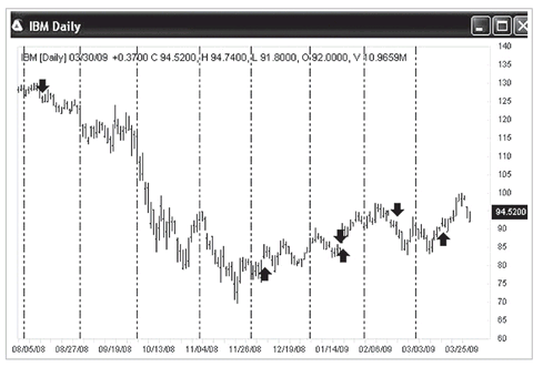
Take a look at
Figure 5.1 for an example. How should you trade this IBM stock? When do you buy, sell, or exit?
FIGURE 5.1 IBM daily chart without any indicator added. How do you trade it? When do you buy/sell/exit?
Unfortunately, interpreting chart formations is as much art as science. Ultimately, success in trading depends, to a large degree, on the trader’s subjective interpretation of whether a trend or signal is forming on the charts. And whenever decision making is subjective, you risk having your emotions get in the way of making the correct move.
That’s the defect in everyone’s trading that AbleTrend can help solve. . . .
AbleTrend charts are color-coded to show trends, resistance and support levels, and specific buy, sell, stop, and exit signals that tell traders exactly what to do so they can trade with greater confidence.
The software uses bright, color-coded buy and sell signals where blue indicates an uptrend and red indicates a downtrend. Adding the AbleTrend indicators to a chart:
• Helps you to see the market AS IT IS.
• Visually displays the market trend and key support and resistance. Removes guesswork from trading so it’s possible to make more objective and accurate trading decisions.
• Precisely times entry and exit points.
• Promotes trading with greater confidence and less uncertainty and anxiety. Allows traders to cut their losing trades early to minimize losses on trades that don’t go their way.
• Helps traders ride their winners longer for greater trading profits.
• Gives traders the steadiness to exit when it’s the right time to take profits and not let greed make them irrational.
Setup of STM
The Simplified Trading Method (STM) is one of the most frequently used ways to trade markets with AbleTrend software. STM is usually used with three indicators added to a chart with default settings: AbleTrend1 (Trend 1, T1), AbleTrend2 (Trend 2, T2), and Exponential Moving Average (EMA). The feature is simple.
Using all default settings of the indicators is a key of STM. Markets keep changing. How do you know what settings (inputs) of the indicators should be used? If we choose “scan” to get the optimal input settings, it may work for the historical data, but it may or may not work for the unknown future. Now, using default settings that have been proved to work for the past, we know they have a greater chance of working in the future. Markets change all the time, but the indicators used do not change.
In the following we add T1, T2, and EMA indicators to the IBM chart, one by one, and plot the charts in
Figures 5.2 to
5.4 respectively. This will let you see clearly which signals are from which indicator.
Again, for all the indicators used in STM, use their default input parameters. Users don’t need to scan each market to determine optimal parameters even though AbleTrend has such a function built in. If too many inputs keep changing, then how can you use it in the real world? The real future is unknown. Only after it has happened can you know if you should have used another set of settings. Therefore, STM uses unchanging, universal parameters within the constantly changing markets.
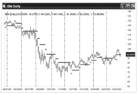
FIGURE 5.2 IBM daily chart with the T1 indicator added. Up-arrows indicate the beginning of uptrends, and down-arrows indicate the beginning of downtrends.
FIGURE 5.3 IBM daily chart with the T2 indicator added. Small crosses (x) below bars indicate an uptrend, and small dots above bars indicate a downtrend. Values of the crosses and dots are key support/resistance levels used as protection stops to exit the trade if the position proves to be wrong.
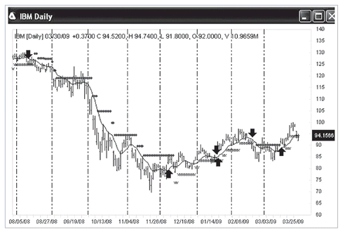
FIGURE 5.4 IBM daily chart with a line of Exponential Moving Average and T1 and T2 indicators added. All indicators are set up with default parameters.
Entry Rules of STM
There is only one entry rule: There must be agreement between the T1 and T2 indicators: If both are uptrends, then buy; if both are downtrends, then sell. This rule is mechanical. The trends of T1 and T2 are calculated independently.
Optional entry rule: For additional guidance, we look for an entry point close to the Exponential Moving Average (EMA) line. We try to avoid making an initial entry when the market price is far away from the EMA line. We also try to avoid trading when the market is moving sideways. (See the section of this chapter on choppy markets.)
Exit Rules of STM
Using STM, the exit rule is also simple: Follow the T2.
AbleTrend’s Trend2 indicator is a trend-stop indicator, and it is highly regarded by many traders. Many users say, “Don’t fight Trend2.” Using Trend2 as an exit strategy is almost entirely mechanical: (1) If the bar closes below T2, you need to exit a long position; if the bar closes above T2, you need to exit a short position. (2) Exit your position if two or three consecutive green bars close on the wrong side of the EMA line.
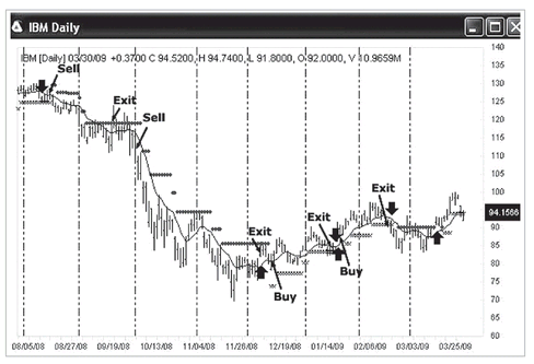
Also take a part of your profits if the market has had a big run and is now too far away from the EMA line, or it touches the STARC bands a few times. For example, if you are long two contracts, take profits by exiting one contract. STM Buy/Sell/Exit signals are shown in the example in
Figure 5.5.
FIGURE 5.5 Examples of STM trading signals for the IBM daily chart. Based on the entry and exit rules mentioned earlier, we have marked the Buy/Sell/Exit signals on this chart.
TABLE 5.2 Comparisons of EBC and STM Executions
As this book purchaser, you may go to a special web site,
www.wiley.com/abletrend, for a
FREE 80-minute video course about the simplified trading method (STM).
Comparisons of the features of the STM execution method with 100 percent EBC mechanical method are summarized in
Table 5.2. We give guidelines there for position trading, swing trading, and day trading in the table: time intervals suggested, guidance charts used, which execution method should be used, and compare their risk, signal accuracy, and possible profit factors, too.
EVALUATE A TRADING SYSTEM: BACK-TESTING
Why must a trading system have back-testing capability?
Only trade a system that has been validated. Back-testing is the first step to validate a trading system. Beware of indicator software programs (using colored lights/bars) that do not offer back-testing capability. Back-testing is the easiest way to validate the trading signals that we know. How can anyone trust colored bars or “lights” or any other indications if they have no back-testing capability? If you blindly follow unproven signals, you are just shooting in the dark, and it will be very costly. AbleTrend offers full back-testing capability. You can validate the signals and strategies before you risk any hard-earned money. Trading with proven strategies is the best way humanly possible to trade the markets.
Methods for evaluating a trading system include: (1) back-testing reports, (2) net profits, (3) winning rate, (4) win/loss ratio, (5) profit factors, (6) AbleSys index, (7) EXP index, (8) MDD, (9) reward/risk ratio, and (10) annualized percent return (APR). We now explain each of these items in greater detail.
Back-Testing Report
AbleTrend provides back-testing reports on the trading system performance. A typical back-testing report provides the following information (Typical Back-Testing Report of AbleTrend for Symbol xx-minute chart from mm/dd/yy to mm/dd/yy):
| Total Net Profit | Buy/Hold Net Profit |
| Total % Net Gain | Buy/Hold % Gain |
| Max Drawdown | Buy/Hold Max Drawdown |
| % Max Drawdown | % Buy/Hold Max Drawdown |
| Gross Profit | Total Trades |
| Gross Loss | Winning Trades |
| Win/Loss Ratio | Winning Rate |
| Profit Factor | AbleSys Index |
| Avg Winning Trade | Consecutive Winning Trades |
| Avg Losing Trade | Consecutive Losing Trades |
| Avg Trade | Avg Holding Bars |
| Largest Winning Trade | Avg Winning Bars |
| Largest Losing Trade | Avg Losing Bars |
When running a back-testing report, traders should include Cost per trade (the commission fees plus slippage cost per round-trip trade in dollar amount). If it costs $2.50 to trade one E-mini contract, then the round-trip commission is $5. If it costs $7.50 to trade 500 shares of a stock, then the round-trip commission is $15. Add to the commission the expected slippage for the round trip to come up with the cost per trade. If you expect the E-mini S&P to slip 0.3 point, that is 0.6 point or $30 per round trip. Add that to the commission and you have about $50 for the cost per trade. If you expect a stock to slip one-and-a-half cents, that is three cents per round trip, or $15 for 500 shares. Add that to the commission and you have $30 for the cost per trade for stocks. You must increase the cost per trade if you have higher commissions or higher slippage. Also, you may increase the cost per trade if you would like more conservative results in the back-testing.
Typically, the cost per trade for 500 shares of stocks is $30; for one contract of E-mini futures it is $50; for one full-size Forex contract it is $50 to $100, and so on. Beware of some back-testing reports that do not include the cost per trade. For example, if there were 200 trades in the report, without the cost per trade taken into account, it means the report is padded with an extra $20,000 in false net profits.
Net Profits
Net Profits = Gross Profit − Gross Loss
Here Cost Per Trade is deducted from the gross profit and added to gross loss.
Net Profits are our final goal in trading. However, it is not the reason why we select a trading system. For most traders who have failed in trading it was due to the MDD size or drawdown duration. Before they started making money, these traders quit the trading system. Therefore, you must select a trading system that meets your financial situation and your risk level. Three key factors of a trading system will help us to reach this goal:
1. Winning rate.
2. Win/loss ratio.
3. Profit factor.
Winning Rate
Almost every new trader would ask, what’s your winning rate? Winning rate is not important for whether a trading system wins or loses overall. A system with only a 10 percent winning rate can win big if you can keep the average losing trade small, and have a much bigger average winning trade. It’s also true that a system with a 90 percent winning rate can lose big if you have a smaller average winning trade, and a much bigger average losing trade.
For example, suppose a trading system has an 80 percent winning rate with 100 total trades for a period. If the average winning trade is $100 and the average losing trade is $500, this results in a net loss of $2,000. Here, gross profit was 80 × $100 = $8,000, and gross loss was 20 × $500 = $10,000.
Win/Loss Ratio
Win/Loss Ratio = Average Winning Trade / Average Losing Trade
If your winning rate is 50 percent, and the win/loss ratio is greater than 1, the system is a winning system. If the win/loss ratio is greater than 9, it means that a trading system still can win even if its winning rate is just 10 percent.
Profit Factor
Profit Factor = Gross Profit / Gross Loss
Among the three factors mentioned here, the profit factor is the most important. If the profit factor is greater than 1.0, it means that overall the trading system is a winning system. A profit factor greater than a 1.5 is a tradable system.
Using plain language, what does profit factor mean? The profit factor tells what your odds are in this game. For example, when you play blackjack at a casino, if you bet $1, and you win, the dealer will give you $1; if you lose, he will take your $1. The profit factor is about 1. What does it mean if the profit factor is 4? It means when you lose, the dealer takes your $1, but when you win, he has to give you $4.
Ablesys Index
Measuring Trading System Performance with the AbleSys Index Your goal in trading should be to maximize your total net profits. Three key factors also can tell how good a trading system you have. These factors are:
1. Winning rate = (Winning Trades / Total Trades) × 100%
2. Win/loss ratio = (Avg Winning Trade) / (Avg Losing Trade)
3. Profit factor = (Gross Profit) / (Gross Loss)
AbleSys Index is used to evaluate the overall performance of a trading system (a trading system is sometimes called a trading strategy). AbleSys Index equals the product of (a), (b), and (c), i.e.,
(5.1)
If AbleSys Index = 0.50, it means the trading system is just breakeven. AbleSys Index > 0.50 is a winning system. An AbleSys Index > 1.2 means a tradable system. However, with the AbleTrend system, typically, look for an AbleSys Index > 2.5 as your tradable system. Do not trade any symbol or chart with an AbleSys Index less than 2.5 even though the symbol or chart may be one of your favorites.
Expectation (EXP) Index
EXP Index is another overall factor used to evaluate a trading system. This index is designed especially for using Money Management. With Money Management, we want to increase trading size as much as we can. It requires a higher winning rate system and larger win/loss ratio, and a large number of trades.
(5.2)
EXP = 0 means the trading system breaks even. EXP > 0 means the trading system is winning. EXP > 0.5 means the trading system is tradable. The bigger the number, the better the performance. We suggest trading systems with EXP index > 1.0 to be used with Money Management.
Maximum Drawdown (MDD)
It is very important to be aware of the maximum drawdown (MDD). MDD means the deepest drawdown during the trading process. This number tells how much money you need to have to be prepared for the worst possible situation. Here are the tools that may be used to analyze MDD:
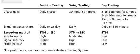
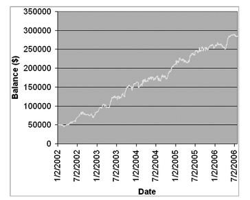
Equity Line The AbleSys Trend trading system can output the account equity line, which is a powerful tool for drawdown analysis. It not only tells you what the maximum drawdown (MDD) is, but it also tells you how long the drawdown lasted. You may plot the equity line chart with the AbleSys Trend software or plot it with Microsoft Excel software; see
Figure 5.6.
Interpreting the Equity Lines What do the “equity lines” tell us?
• MDD—tells us the worst case to prepare for in planning the account size
• Drawdown duration—tells the degree to which your confidence may be tested
• Average drawdown—indicates how smooth your path may be
Portfolio Equity Line When you test and output equity lines for a few markets, you may use Microsoft Excel to combine the equity lines to one portfolio equity line. The portfolio equity line is much smoother than each individual equity line. We explain more about this in Chapter 7.
FIGURE 5.6 Example of a portfolio equity line plotted by Microsoft’s Excel software. AbleTrend software can output equity line to a text file. Portfolio: AUD/USD, USD/CAD, USD/CHF, EUR/USD, GBP/USD, and USD/JPY daily chart 1/2/2002 to 7/2/2006. Initial account size: $50,000; net profits: $235,543.
Reward/Risk Ratio
Reward/Risk Ratio is also called the R/R in system evaluation.
R/R = (Net Profits / MDD) × 100%
This is useful in selecting a trading portfolio. Experienced traders normally don’t pay too much attention to the Net Profits alone. They are more likely looking for the higher R/R for a trading portfolio or a trading system.
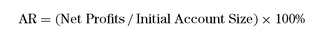
Annualized Percent Return (APR)
Annual Return (AR) to account is
(5.3)
This index is often used for evaluating the performance of a mutual fund or a trading system. For example, the initial account balance was $10,000, and at end of the year the account balance was $15,000. Then the AR = 50% in the year.
Annualized Percent Return (APR) is different from the Annual Return (AR). It is calculated compound annual return to the account. The relationship is this:
(5.4)
(5.5)
Here, the N means the Nth year (see
Table 5.3).
TABLE 5.3 A sample comparison of Annual Return (AR) and Annualized Percent Return (APR). Example results are compiled from an AbleTrend portfolio testing.
| Year (N) | AR | APR |
|---|
| 1 | 46.43% | 46.43% |
| 2 | 71.34% | 47.57% |
| 3 | 115.79% | 49.41% |
| 4 | 112.14% | 45.30% |
| 5 | 302.11% | 49.54% |
| 6 | 77.89% | 42.17% |
FOUR IMPORTANT ISSUES FOR PARAMETER SETTINGS
Earlier in this chapter, we applied the STM or other system to trading using fixed default settings. However, we often receive the following four questions: (1) What’s the best time interval? (2) How far back should we back-test? (3) What is the best frequency of calibration? and (4) When should we use fixed versus recalibrated settings?
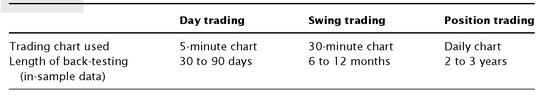
What’s the Best Time Interval?
One of the most common questions asked by traders is “What’s the best time interval chart I should use?” As we know, the longer the time chart used, the higher the signal accuracy. I always try to encourage clients to use daily charts or weekly charts. However, many traders go ahead and use intraday charts anyway. In fact, there is no easy answer to the question. It varies for day trading, swing trading or position trading; it also varies for markets: stocks, E-mini futures, commodities, and Forex, etc. There is a lot of homework involved before you should select one. In this section, we give only some guidelines.
Every trader should pick the chart time interval according to his/her own risk tolerance, reward expectation, available time, markets, instrument leverage, and so forth.
Typically, for day trading or swing trading, where the market instrument is heavily leveraged and you have a lower risk tolerance, you may select a relatively shorter time interval. You need to be able to follow the market in real time.
If you have a relatively higher risk tolerance, then swing or position trading might be good for you. You can use longer time interval charts. When you use daily or weekly charts for position trading, you may or may not follow the market in real time. Normally you may check your positions at night or near the market close time, or even check the positions weekly.
Normally, 2- to 5-minute charts are for day trading, 30- to 120-minute charts for swing trading, and daily or weekly charts for position trading. Based on AbleTrend STM, any time interval charts should be fine. Our suggestions here are only for your reference.
Comparisons of using different time interval charts are given in
Table 5.4. These are suggestions for day trading, swing trading, and position trading. We also compare under different time intervals, how the time intervals affect signal accuracy, trend duration, reward/risk, efficiency, trading intensity, time consumption, and who should use which intervals.
Two observations for time intervals:
1. The longer the time interval, the higher the signal accuracy. There is a lot of noise in the 2- to 5-minute charts. While using longer time intervals, the noise is about the same, but the price moves are on a much larger scale. This will diminish the influence of the market noise.
2. Pro and experienced traders tend to use longer time intervals, but new and novice traders use shorter intervals. It is said that “the time interval used is proportional to the years of your trading experience.”
TABLE 5.4 Longer Time Interval versus Shorter Time Interval
| Longer time interval | Shorter time interval |
|---|
| Day trading | No | 2- to 5-minute for E-mini futures |
| | 5- to 10-minute for stocks |
| | 15- to 30-minute for Forex, etc. |
| Swing trading | 30- to 120-minute charts | 30-minute charts or above |
| Position trading | Daily or weekly charts | No |
| Signal accuracy | Higher | Lower |
| Trend length | Longer | Shorter |
| Anticipated reward | Higher | Lower |
| Risk tolerance | Higher | Lower |
| Efficiency | Higher | Lower |
| Trading intensity | Lower | Higher |
| Time consuming | No | Yes |
| Who tends to use this? | Pro and experienced traders | New and novice traders |
How Far to Back-Test?
A data set containing selected historical data for back-testing is called an in-sample data set. A data set containing historical data not included in back-testing is called out-sample data set. Future data are out-sample data. When you run back-tests, how far (years or months) should be valid? If you have enough historical data, you may back-test as far as you can. Here, the “back-test” is different from the process to get optimal input parameters for the real near-future trading.
For that real near future trading, it varies for day trading, swing trading, or position trading. In general, it should be as much as you can,
but don’t overdo it. For example, if you use a daily chart, the market behavior in the last 2 years might be significantly different from the market 10 years ago. Since our back-testing is for trading near future, we don’t want to use two data sets that are too old. We summarize some suggestions in
Table 5.5 as a reference.
TABLE 5.5 Minimum Back-Testing for Near-Future Trading
What Is the Best Frequency of Calibration?
After running a back-testing report for a trading system, you may then obtain the optimal input settings, and apply the trading signals for the near future. A frequently asked question is how often do you run your optimization process? Or how long do the settings hold?
First, make sure you do not over optimize a trading system. You may easily check if the system was over optimized by manually changing the input parameters slightly. For example, there are two input parameters for AbleTrend2—Risk and MoneyRisk. You obtain the values for these parameters by running an AutoScan: for example, suppose you got Risk = 4, and MoneyRisk = 2 to get the best net profits for the last three years. Now you need to manually change the Risk to 2, 3, 4, 5, and 6 to compare results. If the trading system still provides positive net profits, that means you are using a good setting. However, if the system cannot hold, and only the Risk = 2 and 4 are winning settings, but others are losing, it clearly tells us that something is wrong here. Do the same for the MoneyRisk; manually change it to 1, 2, 3, etc., and see whether the trading system still can hold and provide positive net profits.
Frequency of calibration varies from market to market, as well as from day trading to swing trading to position trading, etc. A simple rule is to not run the calibration frequently. If something is working, don’t fix it!
In the year 2000, we built a software program to run “Historical Forward Test” (HFT). We go into more detail on the HFT in Chapter 7. Based on the results of our studies, the frequency should be about 1/6th of the in-sample data range. For example, if you run the input optimization with a daily chart of the last 3 years (i.e., 36 months), then every 6 months you may run an AutoScan recalibration. If you run the optimization with a 30-minute chart of the last 6 months, then every month you may run a recalibration. This is only a suggestion for the frequency, not an absolute rule. Our HFT showed it really varies from market to market, and from time to time. We wish trading would be like a science that can be exactly repeated. But it is NOT. We have to live with what real trading life is.
When Should We Use Fixed Versus Recalibrated Settings?
In the section 2 of this chapter that discusses STM, we use “fixed” default settings for our trading method. People may ask why the inputs are all fixed. And how do they compare with inputs used for optimization and recalibration?
Concept of Fixed versus Recalibrated Settings “Fixed” parameter or “universal” parameter settings: Generating trades with fixed parameters is based upon running the system input settings, which have been well back-tested over a longer period of time. Although such settings may not be considered “optimal” to run into every future time period in that conditions in the marketplace are bound to change, with patience such settings can prove to be profitable to run over many trades into the future. What fixed or universal settings might lack at times in the short run, they can make up for in consistency over the long haul.
Note of Interest: Unlike position trading with the daily charts for long-term or mid-term trends, swing trading short-term moves (e.g., with a 30-minute chart interval) offers two distinct advantages: There is generally a lower per-trade risk with an increased likelihood of capturing short-term movements provided for by smaller peaks and valleys that would probably go unnoticed when trading the daily chart.
“Recalibrating” or “Rescanning” the Market One of the most commonly asked questions from AbleTrend users is “How often should I perform an autoscan for the input parameters?” If you are trading with fixed settings, you would not perform a scan at all. However, should you wish to be more proactive by anticipating or recognizing a change in market price action, an autoscan or recalibration may prove to be an effective means of managing potential drawdown and increasing total profitability.
Comparisons of using fixed parameter settings and recalibrated settings are summarized in
Table 5.6. Basically, recalibrated settings are for experienced traders and a time-consuming process. When you just start, we suggest using fixed settings.
We strongly advise you to spend some time studying the markets you have selected to get a “qualitative sense” of the market’s nature. This will help you to determine how to effectively trade it and how often you may recalibrate settings should you wish to do so.
TABLE 5.6 Comparisons of “Fixed” and “Recalibrated” Settings
| Pros | Cons |
|---|
| Fixed Settings | Parameter settings are derived from back-testing long-term data (1 to 5 years). The results are more consistent and reliable. | Will not be optimal settings to trade with during all time periods. |
| Objective—not much related to traders. | Requires great discipline, patience, and foresight. |
| No recalibrating or rescanning required; system is based upon a fixed model. | Difficult when the system is showing drawdown. |
| Recalibrated Settings | Recalibrating or rescanning data can optimize trade results and hope to reduce drawdown. | Requires more experience to recognize or anticipate a change in market conditions. |
| Works well in a short time period. | Subjective—requires more judgment. |
| | Requires lengthy historical forward test—a time-consuming job! |
Pay attention to these questions: Is the market showing wide or relatively narrow swing patterns? What kind of range of movement are you witnessing for a daily chart, a weekly chart, or a monthly chart? Is it a better market to day, swing, or position trade? What time interval seems to work best with your chosen market in the long run? Always be cognizant of your chosen market’s environment and the resulting parameter settings/rules that will best fit its character. If you find the market to be choppy, or the trend is short-lived, or the trend changes too often, you may consider selecting another more trending market. You will find profitability as a result of your hard work. When you compare yourself with floor traders, or market makers, or specialists, or professional traders, remember that they are “pro” traders who trade and trade only one specific market. They are very familiar with the specific market, and hold all key support and resistance levels in their mind. Let’s do our homework as hard as they do.
Trend Trader’s Wisdom: Trading is a war composed of many, many battles. If you truly understand and respect the risks involved with your chosen trading methodology, and trade accordingly, your chances for success are great. Our goal is to survive the many smaller battles (losses due to choppy markets). In doing so, we are now in a position to win the bigger battles (gains due to capturing the trend). If we are effective in doing this then we will win the war. Think outside of the box! Think BIG!
ABLETREND2 STOPS
Some trading methods or newsletters do not offer stop values. As we have discussed in Chapter 4, they simply suggest buying a stock and using $500 or a 5 percent loss as protection stops. The software is actually useless if it does not offer stop values for risk management. Your risk in trading will be enormous. The market is live and dynamic, and it moves in its own way. How could a $500 or $5,000 fixed amount stop work? The market’s reverses or retracements are not easy to know. A fixed percentage or fixed dollar amount is not appropriate since market price actions will never follow those arbitrary numbers. You need a way to manage your “trade risk.” You must find a way to determine the amount of risk that would be proper in a trade.
Michael Marcus, who multiplied his company account by an incredible 2,500-fold over 10 years, commented on stops: “Do you always pick a point where you will get out before you get in? Yes. I have always done that. You have to” (Schwager 1989). This is why you should do it, too. The AbleTrend T2 stops are designed for that purpose.
Protection stop values should dynamically trail the trend movement. Stop values should be determined by the market’s price volatility and the nature of price actions, not arbitrary ideas. They should also be proven to be winning with back-testing before you can consider using them. Among the dynamic stops, AbleTrend2 (T2) stops are the best among those that we have studied. T2 values are determined according to market price actions and stops are offered in real time, tick by tick and bar by bar. They are proven to yield positive results with back-testing.
Back-Test the Stop Levels
AbleTrend trading algorithms are validated by a full decade of rigorous back-testing. These test charts validate that the signals generated by T2 have produced phenomenal performance.
Developers of trading software design algorithms that they think are the most accurate predictors of future prices, for market indices as well as individual equities and commodities, based on the best knowledge available today.
And there is no way to test whether the software will accurately predict the future because the future hasn’t happened yet. But the past has happened. And complete price histories are readily available in databases we can access. So, in back-testing, we take historical data and process it with the exact same algorithm we would use for analyzing today’s data.
The algorithm then generates buy and sell signals. However, since the buy and sell signals are for a price movement that has already taken place, we can check whether the price rose or fell as the algorithm predicted.
This in turn reveals whether we would have actually made a profit or loss on our trade by following the signals the system would have generated.
Since the T2 signals are precise and mechanical, telling you exactly when to buy and when to sell and where the key support and resistance levels are, and do not require interpretation by the trader, these back-testing results are more meaningful. Back-testing is an easy and reliable way to validate trading software algorithms.
Make sure the trading software you use has been thoroughly and rigorously back-tested to validate the accuracy of its buy/sell indicators. The T2 back-testing capability enables you to validate your signals and strategies before you risk your hard-earned money.
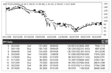
Figure 5.7 shows you a back-testing report for a SPY daily chart. This is a “tradeby-trade” report showing when and at what price each trade was entered and exited. It allows you to compare the results with the chart on a trade-by-trade basis.
FIGURE 5.7 AbleTrend2 is used as protection in this example of a trade-by-trade back-testing report.
The T2 stops are visually displayed as small dots on the chart; the dots appear below the bars for an uptrend, and above the bars for a downtrend. You may simply view the charts and see how accurate they were. T2 provides dynamic stops with back-testing capability. It removes guesswork from trading.
Using Bar Close Price and T2 to Determine the Exit Signals
AbleTrend users have found that in real time, if a trader holds a long position and a bar low touches the T2 stop, it is not a real exit signal. The same is true for short positions: if the bar high touches the T2 stop, it is not a real exit signal, either. Many indicators use bar close prices for their calculations, as does the AbleTrend2 indicator. With live real-time streaming data, sometimes you may see price strikes—creating a bar “high” or “low.” If such price strikes hit the T2 stops, it is not significant. The high or low prices of bars contain some random factors. But the “close” price is much more meaningful and reliable, especially a daily chart’s closing price. All market forces are settled down at the exchange close time for that price. This is why I trust the close price more. We normally exit long positions only if the bar close price is below the T2 stop, or exit short positions if the bar close price is above the T2 stop respectively.
With this method, the T2 stop accuracy is significantly improved. Following is an example comparing using the OHLC chart (
Figure 5.8) with the “Line on Close” chart (
Figure 5.9). The Line on Close means connecting close prices with a line, ignoring the highs and lows of the bars. You clearly see that the false hits of stops are significantly improved, and the T2 stops are much more accurate this way.
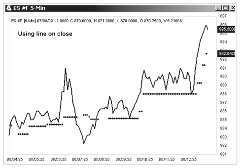
FIGURE 5.8 Using the OHLC bar chart with the T2 stops. There are many false hits of the T2 stops. If we exited long positions when the T2 stop was hit, we would be following too many false signals.
FIGURE 5.9 Using the “Line on Close” chart with the T2 stops. The price line connects close prices with a line, ignoring the highs and lows. There are not any false hits to the T2 stops. The line is above the T2 stops. This method significantly improves the accuracy of the T2 stops.
The back-testing of T2 can be as easy as a visual viewing in most cases. For example, plot an OHLC chart with 10-year historical daily data, then add the T2 indicator to the chart. You may quickly count the bars hit or not hit and obtain a rate of accuracy if T2 is used for stops. Also, you may with one click change the chart style to “Line on Close,” like the one in
Figure 5.9. Then count again. You may now have a very good idea how good or how bad it is if you use T2 as your key reference for support and resistance levels.
THE SWEET SPOT—GOLDEN REGION OF ENTRY
Using the STM, you may enter the market at any time when the T1 and T2 indicators agree with each other, and the T2 stop is within your risk tolerance. However, there are certain entry points that are the best or most favorable, which we call “sweet spots.” We first introduced this concept in Chapter 2. We will briefly summarize the rules of sweet spots here and give a few more examples to show the application of this concept in actual trading.
Sweet Spots
When you apply T1, T2, and EMA to a chart, the T2 signals provide “sweet spots”—optimum times to get into a trade. For an uptrend, after the initial buy signal is given, and the market tests T2’s protective stops and moves sideways for a while (as indicated by a few green bars), a first blue bar appears, and the bars nearby are above the T2 stops, indicating a resumption of the uptrend. This is the sweet spot for buy (SSb)—a low-risk entry point for the buy position.
For a downtrend, simply reverse the logic. After the initial sell signal is given, and the market tests T2’s protective stops and moves sideways for a while (as indicated by a few green bars), a first red bar appears, and the bars nearby are below the T2 stops, indicating a resumption of the downtrend. This is the sweet spot for sell (SSs)—a low-risk entry point for the sell position.
Examples
Here are a few examples of the Sweet Spots showed in
Figures 5.10 to
5.12. The big arrows were the initial buy or sell signals, and the small arrows marked the SSb and SSs spots.
DJIA Index 2008 to 2009
FIGURE 5.10 Sweet Spot buy/sell signals for the DJIA index daily chart 8/14/2008 to 6/30/2009. SSb means “sweet spot buy,” and SSs mean “sweet spot sell.” Both are marked with small arrows. They provide extra entry points after the initial buy/sell signals marked by big up- and down-arrows. Both SSb and SSs are near the T2 stops, but cannot break out beyond the T2 stops.
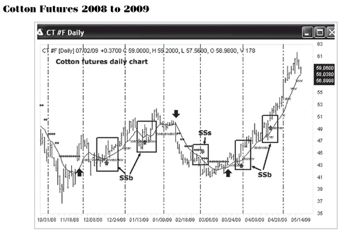
FIGURE 5.11 Sweet Spot buy/sell signals for the cotton futures daily chart 10/31/2008 to 5/14/2009. SSb means “sweet spot buy,” and SSs means “sweet spot sell.” Both are marked with small arrows. They provide extra entry points after the initial buy/sell signals marked by big up and down arrows.
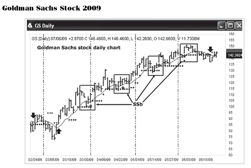
FIGURE 5.12 Sweet Spot buy signals for the Goldman Sachs stock daily chart 2/24/2009 to 6/18/2009. SSb are “sweet spot buy” signals, which are marked with small arrows. These provide extra entry points after the initial buy signals marked by big up arrows.
FINDING THE CHARACTER OF A PARTICULAR MARKET
In the STM section of this chapter, we suggested using default parameter settings for the simplified trading method. This is mainly for simplicity. However, in many cases, traders find that they may do better with specific optimal settings for specific markets.
We have designed into the AbleTrend software an “AutoScan” calibration routine of input parameters to help traders select the optimal parameters for the T1, T2, and EMA indicators. It’s easy to understand that S&P 500 index futures, or crude oil futures, or cotton futures, or IBM stock, or EUR/USD Forex market may not all use the same settings for their own best system performance. Each individual market has its own characteristics. The individuals who trade each market are different. Liquidity (trading volume), the margin requirement, and market volatility are also different. Therefore, using specific settings for a particular market is logical and reasonable.
Before going further, we need to recognize:
• Each market has its own character.
• We must understand the character of each market.
• We must determine how best to trade each individual market.
With AbleTrend concepts, fortunately there are only two inputs needed to characterize each market. They are (1) Risk and (2) MoneyRisk.
“RISK” means how sensitive we will set the system to be so that it can best determine a trend change. The RISK level of T1 and T2 can be changed from 1 to 20 or above, with “1” being the most sensitive with minimum delay and “20” or more being the least sensitive. With a larger RISK number, you would stay in a trade longer, and you would need higher risk tolerance. The default value of RISK is 8. Under normal conditions, the default setting should be your first choice. You may adjust the “Risk” level manually or let the AutoScan select it based on your choice for (1) best profits, or (2) best AbleSys index (tradable), or (3) best EXP index (tradable with MM).
“MoneyRisk” is another input for the T2 indicator. This option affects the trend-stop values only; it does not affect the trend determination. MoneyRisk determines how wide a “fence” is built around the current range of prices that will not easily be hit or broken through by market actions. A specific range unit for MoneyRisk is used here. This unit varies with the volatility of the markets and is defined by market movement. When you change this input value, you have the choice to enlarge or reduce the protection stops. The unit size of MoneyRisk varies for different markets. For example, MoneyRisk 1.0 for common stocks means $1.00 per share; MoneyRisk 1.0 for S&P 500 futures means $250 per contract; MoneyRisk 1.0 for Forex currencies means $100,000 per contract, and MoneyRisk 1.0 for T-Bonds means $1,000 per contract.
Why is it necessary to use this special unit? Because it simplifies the process by replacing individual “Symbol Universe Settings” with a more universal unit. There are over 25,000 market symbols in the United States alone. It is hard to check and set up each symbol universe accurately and individually. Furthermore, when you use third-party data, different data vendors use different symbol names and different units for the same security. Symbol universe settings become very complicated.
The MoneyRisk factor is applied to AbleTrend calculations only when a LONG or SHORT position has profits. When the profit accrued is greater than the set MoneyRisk unit, extra protection for the profit will be activated automatically. The T2 trend-stop will start to tighten the stops. This will also affect the calculations for the low-risk entry points. The default value of MoneyRisk is 2.0 for AbleTrend2. In another words, after the profit for the position becomes greater than 2.0 times the average market movement, AbleTrend will begin to tighten stops. MoneyRisk can be adjusted from 0.5 to 5.0. If you like to use the Fibonacci numbers, you may use them as inputs, such as: 0.382, 0.618, 1.000, 1.382, 1.618, 2.000, 2.382, 2.618.
If you do not want to use this option at all, simply input a very big number, such as 1,000,000. Under this 1,000,000 unit setting, AbleTrend2 will only follow the market’s own price actions to decide where to place stops.
If you want to use specific settings for a specific market, the first thing to do is to choose a longer time chart to run back-testing. This works well for daily charts or longer. The chart should go back two to five years. It is not suggested to do so for intraday charts. The accuracy for intraday charts seems not to hold for long. Therefore, it is better to simply use the defaults for those intraday charts.
With capabilities for back-testing reports, AutoScan parameters, and only two inputs required, the results of choosing settings for a market normally hold well for a long time. How frequently is it necessary to run recalibration? As we mentioned earlier, about one-sixth of the in-sample data range should be fine. For example, if the back-testing data range is three years, then every six months you need to run a recalibration for the input settings. For further discussion, refer to the section titled Four Important Issues for Parameter Settings, earlier in this chapter.
TREND TIME FRAMES
You may not have difficulty identifying the direction of a trend by looking at a chart. But one of the biggest issues in trading is the market term you will look at to find the trend—short-, mid-, or long-term. You may have experienced situations like this yourself: When you look at the 5-minute, 15-minute, or 30-minute charts for a market, the trend is clearly down, but on the longer-term daily and weekly charts, the trend is up. So, at this moment in time, should you buy or sell the market?
Of course, the longer the time interval used, the higher the accuracy of the signals. My own experience tells me not to fight the trends on daily charts. When I first started to trade, I was guided to very short-term trading by some pros. People said I would have higher profits and lower risk by using 1-minute, 2-minute, or even tick charts. This was extremely misleading. I found out that the real problem using very short-term charts to trade, in most cases, was that I was fighting against the big trends on the daily or weekly charts. It seems to traders that they are following the trends of 1-minute or 2-minute charts, but in fact they are trading against the long-term trends in many cases. Short-term charts also contain much more market noise relative to the bar-range scale. Traders who use very short-term charts may find themselves in a bad situation most of the time. Therefore, avoid trading against the longer time trends as much as you can. You may use short-term interval charts as your trading charts, but only trade the directions of the trends on daily or weekly charts.
Short-, Mid-, and Long-Term Trends
Let’s define our terms so we all have a common understanding of what each time frame generally means. For the purpose of illustrating the significance of the time factor, our following examples will fall into three basic time frames. The 2- to 3-week trend is what we will call the short-term trend; the 2- to 3-month trend is what we will call the mid-term trend; and the 2- to 3-year trend is what we will call the long-term trend. The precise duration of each trend time frame will vary for each trader, so remember that the following examples are merely guidelines.
If you use intraday charts, for example, 5-minute to 120-minute charts, you still need to know at least the short-term trend direction, which is the trend for the last 2 to 3 weeks. As an intraday trader, you can ignore the really big picture of the markets, as you might find yourself on the opposite side of the long-term market, which might make it hard to trade. But you should know the short-term trend direction. And if you cannot see a clear trend for the last 2 to 3 weeks, it means the market is very choppy at this time. You need to trade with extreme caution, or simply do not trade this market at all. There are over 10,000 stocks, futures, Forex, etc., to choose from. There must be some markets trending well at any time. We don’t have to limit ourselves to one specific market.
The Short-Term Trend (2 to 3 Weeks)
This is the shortest-term trend over the last 2 to 3 weeks on the daily chart, and it can be very useful in determining what direction to trade. Use discretion, however, because the short duration of this trend makes it the most volatile one. Be prepared to alter or even reverse your short-term bias, or opinion, of this trend frequently. If you have difficulty seeing a clear trend for the last two to three weeks, you may need to switch to a bigger picture by “zooming out” or by using a weekly chart. Also, drawing trendlines is one of the most efficient and easiest ways to determine the trend directions.
The Mid-Term Trend (2 to 3 Months)
This is the secondary trend of the daily chart over the last 2 to 3 months, or you may use weekly charts for this purpose. You will find yourself studying this trend more often than any other because this is the trend that gives many traders a clear picture of what direction to go in. It is less volatile than the short-term trend but does not require the long-term commitment of the next longer-term trend. Use your naked eye or draw a trendline to see the trend. This is the trend upon which you will base the majority of your trading decisions.
The Long-Term Trend (2 to 3 Years)
This is the long-term trend on the weekly chart over the last 2 to 3 years. We call this the primary trend because it reflects the general market direction over a longer period of time and on a larger scale than the others. You should not, however, be biased by this trend to place any buy or sell orders because it is too long. Consider this primary trend to be the backdrop behind the other two more tradable trends. It can be an invaluable map when you use it with the others. If you use daily charts for position trading, you definitely need the long-term trend as a guide to trade the primary trend direction.
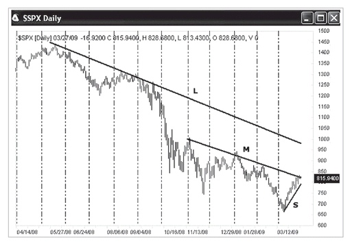
Market prices do not conform well to our thoughts; they tend to have a mind of their own. You may look at the sample chart in
Figure 5.13 and see that, for the last two years, prices have moved lower, but over the last two or three weeks they have climbed. It is entirely possible to witness a market where each trend time frame has a different direction. For most of us, short-term swing trading should be based first on the 2- to 3-week trend as a guide, and then we should use intraday charts, such as 5- to 30-minute charts, to trade the short-term direction.
FIGURE 5.13 Example of S&P 500 daily chart 2008 to 2009. Three trend time frames: L means long-term trend, M stands for mid-term trend, and S is for short-term trend. This is why different people trade in opposite directions. People see the markets as they are. This example also shows that the trendlines are one of the most efficient and easiest ways to determine the trend directions.
Ed Seykota, one of the “Market Wizards” interviewed by Jack Schwager, says one of his clients’ accounts were up from $5,000 to 2,500 times that over the period 1972 to 1988 (Schwager 1989); he commented on his trading method, “I am primarily a trend trader with touches of hunches based on about twenty years of experience. In order of importance to me are: (1) the long-term trend, (2) the current chart pattern, and (3) picking a good spot to buy or sell.”
Convert Seykota’s points to the terms we use in this book, and he’s saying to look for these conditions for an entry: (1) long-term trend, (2) short-term trend setup (breakout), and (3) sweet spots or golden region of entry.
AVOID CHOPPY MARKETS
You may have often heard: “The trend is your best friend in trading,” or “Don’t trade choppy markets.” But what is a choppy market? What is behind the choppy market? And how do you avoid it?
What Is Market Noise?
Intuition and common sense tell us that there is more noise associated with short-term movements or fluctuations within smaller time frames of data.
It is a fact of life that stocks or futures markets don’t move up and down in perfectly straight diagonal lines; see
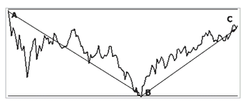
Figure 5.14. If this were true, we as trend-following traders would have a much easier time of it and we would be many times more profitable. In fact, the movement of a stock’s or market’s true direction can at times flip back and forth and be difficult to follow.
FIGURE 5.14 Ideal moves and market noise. Real moves of the market are from point A to point B, then from point B to point C. However, this general movement can be so confused by the up-and-down market noise along the way that we might lose our direction. Therefore, we need to sit back and see the big picture of where the market is going. By switching to longer time interval charts, you may see the big direction of the market moves. It is like viewing an oil painting: If we zoom in on a small spot, we may lose the sense of the entire picture.
Noise is most readily seen from the perspective of tick-to-tick movement of a particular market. To illustrate this point, if a trader wakes up one morning and decides that he wants to liquidate 1,000 shares of MSFT stock because he needs to use the money to purchase a house, is this considered significant in the overall direction of the stock’s true trend? No. In fact, there are many of these insignificant trades taking place for a variety of reasons, which in the short term creates noise in the marketplace.
Another example of market noise: Day traders who get in and out of positions many times throughout the day can create a lot of market noise. And noise is often generated by news—whether inside or published.
Noise is seen at every level of the trend (short, intermediate, and long term), with the most noise occurring in smaller time intervals (such as tick-by-tick or minute-to-minute charts). This noise, in effect, can make it difficult to stay in line with the true direction of a definable trend.
So how much price movement is considered to be significant in defining the start or change of a trend? And at what point does noise have the smallest influence for defining a trend?
The answer to this question is not an easy one.
We have determined that for swing trading, and in many cases, day trading, the stock indices, a 30-minute bar is a reasonable time interval to work with. In any case, following true or definable trend changes should involve a relatively few number of trades. To effectively capture every single tiny up or down move would be next to impossible because there is no real significance to such movement, which is composed primarily of market noise.
The core mathematics of the AbleTrend system purely and simply indicates trend changes based upon the character of the stock or market analyzed. The built-in AutoScan of the AbleTrend system is designed to capture the “core nature of the stock or market.” The system then determines how aggressively or not so aggressively it should move the trend stop levels based upon the scan and subsequent incoming real-time price data. The AbleTrend model is based upon fundamental mathematical probabilities (odds) that are determined by the scan.
Understand Choppy or “Whipsaw” Markets
Trading is a game in which each trader defines his or her rules. Therefore, we will trade only when we see the best trend setup conditions, and avoid the choppy market conditions as much as we can. In a trending market, traders see the direction clearly, and play big in volume. On the other hand, under choppy market conditions, traders are confused by markets moving back and forth. Traders normally play small in volume—because no one really knows what’s going on.
We will study more about the following issues.
• What is a choppy market?
• Who likes a choppy market?
• Why is trading volume thin?
• Why is trading volume thin?
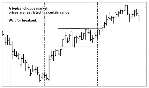
FIGURE 5.15 A typical choppy market. Prices are restricted in a certain range. Normally, it is hard to know when the choppiness started, but easy to know when it ends. There is always a delay in knowing when the choppy market started. After a while, the narrow range shows up, which informs us that the choppy market is happening. We may clearly know when the choppy market ends by the breakout of the narrow range.
What Is a Choppy Market? A choppy market is the opposite of a trending market; that is, the market has a very narrow range in which the price goes back and forth. See a typical example in
Figure 5.15. The market shows no clear direction. Quantitatively, AbleTrend defines a choppy market as one where four or more bars are within a certain range. Don’t trade choppy markets. Wait for a breakout of the range, and at that time you will see a trend formation in process.
Who Likes a Choppy Market? The floor traders (also called “pit traders” or “locals”) like a choppy market. Most floor traders do not use charts or technical analysis. They remember the key support and resistance levels very well. One S&P pit trader said, “My income is made by trading. The truth is, whatever analysis I did for the market was pretty irrelevant. Over 90 percent of my income doesn’t require charts or analysis. I’m just reacting to the order flow. That’s the bulk of the typical local’s income.”
Without charts or analysis, trading the market by watching the order flow, pit traders have their unique way to trade. One way they can count on is never to let the market go against them more than “50 points” (i.e., 0.50 is called 50 points at the floor, or $125 per contract) in S&P futures. They also hold positions for a very, very short time—about 30 to 60 seconds. Average locals trade 100 to 200 contracts a day in the S&P. They consider a 30-point (0.30) profit to be a very good trade. A typical fee for floor traders for a round-trip futures trade is about $0.25 to $0.50.
A famous T-Bonds pit trader trades over 10,000 contracts a day with an average of 4-ticks (∧4, or $125 per contract) profits per trade. The trading style of most pit traders is “quick in and out.” Therefore, a trending market will be their killer, but a choppy market will be their best friend!
A famous floor trader once told me a story about when he was a pit trader at CBOT in Chicago. He said that if the day was choppy, after trading hours on their way up in the elevators, pit traders were all talking and laughing about the trades they did. Most of them made good money on those days. If the day had a trending market, however, the market went all the way up or all the way down during the day. After the market closed, you could feel the air in elevators—all the pit traders were very, very quiet at that time. . . .You know the rest of the story.
Knowing these stories, what should we do as individual traders?
As individual traders, it usually takes us a few seconds or even longer to fill an order. We cannot feel the order flow or know who is trading what. And the expense for commissions is too high to just run a long series of “in and out” trades. We cannot trade the way floor traders do.
The floor traders soon will become obsolete since online electronic trading already shows the advantages over the floor trading. The scalping day traders act like the old floor traders, but they lack the information of the real pits.
However, we can learn from their ideas about how to cut losses as short as possible. We must improve our methods and learn from pit traders how to: (1) use our charts, (2) use our analysis tools, (3) stay in a trending market as long as possible—“let their panic be our profits,” and (4) avoid trading choppy markets.
Why Is Trading Volume Thin? In fact, no one knows what the market direction is during choppy market conditions. Everyone just tries or tests the water with a small position. No one is willing to play big. Experienced and pro traders only play big after they can clearly see the trend—the market direction. At the beginning, they only buy or sell with a small position. If the market goes against them, they exit the position. If they were in a long position and the market was going up, they would buy more; if the market was going up further, they would buy much more. This is called “buy-buy-buy,” and explains why the trading volume would be up if the trend were established. This is true for the short positions as well. We would see “sell-sell-sell” accompanied by high volume. But while the market movement is still choppy, trading volume will remain thin.
A very successful trader once said, “If the market goes up, I buy some. If it goes up some more, I buy some more. If it goes up some more, I buy some more. If the market goes down, I sell some. If it goes down some more, I sell some more. If it goes down some more, I sell some more.”
So once again, the conclusion is do not trade choppy markets. Choppy markets belong to floor traders. We must use AbleTrend to eliminate trading choppy markets as much as possible.
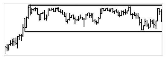
FIGURE 5.16 Example of a sideways channel (choppy market). Market price range is narrow and moves back and forth. Thin volume is associated with sideways markets. Not just you, but everyone during these times is uncertain about the market direction. Traders trade only small lots to test the market. No one dares to play big.
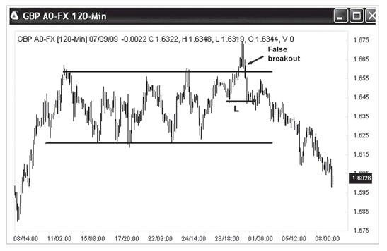
How to Identify Choppy Markets
Our experience tells us that it is easy to identify when a choppy market ends, but hard to know when the choppy market starts (see
Figure 5.16). When a market suddenly breaks a long-time narrow range or channel, you may identify the end of a choppy market. But how do you identify when the choppy market has started? In fact, you cannot identify it, because there is always a delay. From my experience, I find that if I have two consecutive losing trades, the first thing that comes to my mind is to check whether the market is choppy or not. Then I normally stop trading for a while. I wait and observe whether the market can break out of the previous range of the last two trades before I resume trading that market.
Sideways Channels and Consolidations (Choppy Markets) As with bull and bear markets, a sideways market will experience periods of acute price fluctuation. When the price action for a particular futures contract or stock is primarily moving sideways, we often call this a channel or consolidation. It is also known as a choppy market condition. A choppy market is the opposite of a trending market; that is, the market has a very narrow range in which the price goes back and forth. The market is not going in a clear direction.
Five Ways to Spot Sideways Markets with Abletrend
AbleTrend may help traders to spot sideways markets in many ways by marking them in color on price charts. Here are five of the ways:
Consecutive Green Bars T1 and T2 are two AbleTrend indicators that are applied to a chart to analyze trend action. Before adding these indicators to a chart, all bars on the chart are green. The T1 indicator paints the bars blue when it identifies an uptrend, and paints the bars red when it identifies a downtrend. The T2 indicator places a blue dot below the bar when it identifies an uptrend, and places a red dot above the bar when it identifies a downtrend. Since this book is printed in black-and-white, you will not see the colors. Therefore, in
Figure 5.17 we use two boxes to show where the green bar regions are. When you use the software, you will see the color of the bars.
FIGURE 5.17 Choppy areas with green bars, marked with rectangles, indicate a sideways market.
After adding these two AbleTrend indicators to a chart, an uptrend is confirmed when T1 and T2 both show the color blue; a downtrend is confirmed when T1 and T2 both show the color red. When the bars remain green, that means neither an uptrend (blue) nor a downtrend (red) is detected. Therefore, consecutive green bars on the chart confirm a sideways market.
T1 and T2 Showing Different Colors T1 and T2 are independently calculated indicators. When T1 and T2 show the same color, it means the two indicators agree with each other, confirming the trend. For example, if T1 shows blue bars and T2 shows blue dots, an uptrend is confirmed. If T1 shows red bars and T2 shows red dots, a downtrend is confirmed. When T1 and T2 show different colors, it means the two indicators do not agree with each other, and a sideways market is confirmed. Since this book is printed as black-and-white, you will not see the colors. Therefore, in
Figure 5.18 we use a box to show the conflicting color for the sideways region.
FIGURE 5.18 T1 and T2 bars and dots show opposite directions, indicating a sideways market. This is shown in the area marked by a rectangle.
Frequent Change in Color of T1 T1 paints the bar blue when it identifies an uptrend and paints the bar red when it identifies a downtrend. A market that is uncertain in its direction goes up and down rapidly, leading to frequent changes in the color of the indicator. Therefore, rapid color change of the AbleTrend 1 indicator confirms a sideways market. Since this book is printed in black and white, you will not see the color changes of the T1. Therefore, in
Figure 5.19 we use a box to show where the T1 color changes for the sideways region.
Frequent Change in Color of T2 T2 paints the dot blue when it identifies an uptrend and paints the dot red when it identifies a downtrend. A market that is uncertain in its direction goes up and down rapidly. Therefore, rapid color change of the AbleTrend 2 indicator confirms a sideways market. Also see the box in
Figure 5.19 for the sideways region.
Two Consecutive Wrong Signals AbleTrend is a trend-following program, which means the system is designed to spot trends early, and keep you in as long as the market is trending. By definition, the choppy markets are the opposite of trending markets. The best practice during this time is to avoid trading; however, we may not know it is a choppy market until after the fact. The quickest way to react to a choppy market is to stop trading after two incorrect signals. When the trend-following program is wrong twice, by definition, the market is no longer trending because it failed to make higher highs and higher lows. Look for breakouts as a signal that the market has returned to the trending condition. Recognizing long-term and short-term trends can still present opportunities if a long-term trend is not apparent; however, this is a more advanced and risky strategy.
After two consecutive losing trades on the opposite directions, stop trading for a while. Draw two lines on the bottom and top of that choppy range as support and resistance level. If you see prices were forming a consolidation triangle, draw the triangle as support and resistance level. Wait for the breakout of either side to start trading again. You may refer to
Figures 6.11 and
6.25 in the next chapter, as examples.
FIGURE 5.19 T1 bars and T2 dots frequently change colors, indicating a sideways market. This is shown in the area marked by a rectangle.
Identify False Breakout
As we mentioned before, when a market suddenly breaks the long-time narrow range or channel, you may identify the end of a choppy market. This is true most of the time. However, as a trader, you must remember there is never a sure thing in trading. There are always exceptions and surprises. For example, see the GBP/USD Forex 120-minute chart in
Figure 5.20. The market moved sideways within a range for one month. Suddenly, on June 29, 2009, the market broke the resistance level of the last month. People expected that prices would move higher and that the uptrend would continue. But this was a false breakout. If it had been a real breakout, it should not have pulled back and broken below the previous resistance level (which became support for the possible new uptrend). It also should not have broken below the previous low (marked as “L” on the chart). As soon as prices broke below that low, it confirmed that the uptrend had stopped.
FIGURE 5.20 Example of a false breakout. The GBP/USD 120-minute chart was in a sideways market, from 6/8/2009 to 7/8/2009. Then prices broke above the top of the channel. If it had been a real breakout, it should not have broken below the top of the channel, which was the previous resistance level that had become support for the possible new uptrend. It also should not have broken below the previous low (marked as “L” on the chart). As soon as the low was broken out too, it confirmed that the uptrend had stopped. It was a false breakout.
No Trade Zone (NTZ)
What’s NTZ and how can it be used to avoid a choppy market?
When does a trend-following trading system lose money? That’s right, losing trades happen when the market is choppy—trendless, moving sideways. Knowing this fact, we may design a “No Trade Zone” (NTZ) to avoid trading choppy markets. The NTZ is a powerful weapon to fight choppy markets.
The concept of trends can be applied to any chart. If we apply the trend concept to an account equity line chart (see
Figure 5.6), this would give us a very good idea of when to trade and when not to trade. If the trading system equity line keeps moving up, having higher highs and higher lows, the account equity line is under an uptrend. We should keep trading it. However, if the trading system equity line keeps moving down, having lower highs and lower lows, the account equity line is under a downtrend. At this time, we should stop trading. This is the basic principle of the “No Trade Zone” (NTZ).
Suppose you are long in a market. With the AbleTrend software, you apply the T1 or T2 indicator to the trading system equity line chart, and the equity line will become blue or red according to the T1 or T2. The blue equity line indicates an uptrend and that the market is in a trading zone. And the red equity line indicates a downtrend, and that the market is in the NTZ.
When in a long position, you do not trade when the NTZ line chart is in a downtrend. You do trade as the NTZ line direction is in an uptrend. Depending on market conditions, the NTZ filter may increase profits, but the main goal is to reduce MDD. The fact is, there is really no way to avoid losing trades, but we can avoid suffering big losses. I vividly remember an owner of a brokerage firm who once told me that if we’d had the NTZ sooner, his clients would not have lost 60 percent of the equity in their accounts.
BREAKOUT OR RETRACEMENT
In this section, we will summarize a few methods for differential breakout and retracement.
Trend-Defined Method
When you’re in a trade, and the market starts moving against your position, one of two things can be going on. The price action is either a retracement or a reversal of trend. And depending on which it is, your next best step will be very different. First, let’s define the difference between retracements and reversals, and then we’ll look at a trend-defined method for distinguishing between them.
Retracement A retracement occurs when a price tests support or resistance but doesn’t signal the end of a trend. During a trend, prices will often move against the overall trend toward the support or resistance level. If the movement is just a retracement, the price will bounce off the support or resistance, and then continue in the same direction as the original trend.
Reversal A reversal occurs when the price breaks through support or resistance and continues to move against the original trend. The price does not bounce off support or resistance but, rather, continues its new direction as it enters into a new trend. A reversal from an uptrend occurs, for example, when the price falls below support and continues to head lower.
Trend Let’s review the starting point and ending point of a trend mentioned in Chapter 2. Every trend starts with a “breakout” of a previous price pattern. And every trend also ends with a “breakout” of previous price action. If prices are in an uptrend, watch any breakout of a previous low as a sign of a reversal. If prices are in a downtrend, watch any breakout of a previous high as a sign of a reversal. This will give you an early hint of whether the current price action is a reversal or a retracement. If you don’t have any software to help you make the distinction, try this basic method. It works!
Observe Facts, Don’t Predict
Perhaps you’ve entered a market and are holding a long position. But now the market is moving against you. Is this current move a retracement or a reversal? If it’s a retracement, it is a temporary pullback, where prices will bounce off support and resume the up direction of the original trend. If it’s a reversal, prices will break through the support level and continue to move down against the original trend. As the market moves against them, traders might wonder:
• Shall I surrender and take the loss?
• If not, how much money am I willing to risk? Should I set a stop-loss based on a percentage or dollar loss? How do I choose a percentage or dollar loss that will work?
• What if I take the loss and then the market resumes the trend that I anticipated? Do I re-enter the market?
• How about sticking with my original strategy? Maybe I should hang in there no matter how much drawdown I experience.
• Is there a way that I can identify the support levels when I buy?
The last question is the most important! If you knew the market support levels, you could use them to test market strength. When a market tests the support level, if it cannot penetrate that level but instead resumes the anticipated trend, that movement more likely is just a retracement. If you wanted, you could even add to your position at that time. On the other hand, if the market penetrates the support level and closes beyond it, it is likely a reversal. You would do well to exit the position and cut your losses short. Identifying an objective support and resistance level is the key to determining if the current move is a retracement or a reversal. So now we ask, is there a way to identify objective support and resistance levels?
It is very important that you do not try to predict which direction the market will take; the market must be observed. It will tell you whether it wants to go up or down by its behavior at or near support and resistance levels. We have witnessed too many traders become discouraged because they insisted on predicting what direction the market would take, and found they were unable to, so we cannot stress this enough. The market must be read and not predicted!
You may not immediately see the opportunities that are presented to you once you realize that the market has only two choices when it encounters a support or resistance level, but we will show you precisely how valuable this is. We suggest that you trade near the support or resistance levels—the tops or bottoms; the trendlines; the AbleTrend2 stops. . . .Why? All these levels are “testing points.” You will know whether they are right or wrong in a very short time. The market has only two ways to go at the testing points. It either goes up or down. You may tell whether it is a real breakout or just a retracement in a very short time. This is why such testing points are very valuable to trading.
T2—Differentiate Retracements from Reversals
Let’s review how to identify support and resistance as we discussed in Chapter 2. Traders use trendlines, round numbers, moving averages, percentage retracements, or a previous significant high or low as support and resistance levels. All of the above are easy to say, but hard to apply in the real trading world.
Here we will introduce a powerful way to differentiate retracements from reversals by using AbleTrend2 (T2) stops as support and resistance levels. You may refer to
Figure 5.21 to see how the T2 works for this task.
AbleTrend T2 stops provide objective support levels by blue color dots placed below the price bars, so that well-defined support levels are at your fingertips. The T2 offers the following six advantages:
1. T2 stops are defined by the market’s own support levels and are therefore objective.
2. The scientific calculations behind T2 stops are universal, not curve-fitted.
FIGURE 5.21 A powerful way to differentiate retracements from reversals by using AbleTrend2 (T2) stops as support and resistance levels.
3. T2 stops can be back-tested to reveal the characteristics of individual markets.
4. T2 stops are live and updated with each new tick in real time.
5. T2 stops are proprietary, not shareware, and are for the exclusive use of software owners.
6. Successful AbleTrend users around the world have relied on T2. Their common conclusion: “Never fight T2 stops.”
The market is always changing, but the way T2 works remains unchanged. Once traders see it work time and time again, they know that they can rely on it and utilize it. That’s the value of the legendary T2 stops. The method is timeless. AbleTrend T2 stops can help traders thrive in today’s volatile markets.
When using AbleTrend stops as the key support and resistance levels, we have a better way to identify whether we are looking at a breakout or a retracement. As we know, it takes four prices to define a bar—open, high, low, and close prices. We always use close price for this test. We don’t pay too much attention to the intrabar activity. For an uptrend, if the bar closes below the Trend2 stops, it is considered a breakout. However, if the bar close price remains above the Trend2 stops, it is still a retracement. It is the same for the downtrend: if the bar closes above the Trend2 stops, it is considered a breakout. However, if the bar close price remains below the Trend2 stops, it is still a retracement.
Market Price Testing Support and Resistance
Market prices are always seeking and testing support and resistance levels. Think of the market as a ball, which bounces off these ceilings and floors. These support and resistance levels form the parameters within which prices oscillate.
Consider a retracement in a downtrend, where prices begin moving higher, but then reach a resistance level you have drawn. You watch closely and see that prices do not have enough strength to violate the resistance level, so they turn back and move lower, resuming the downtrend. They should continue to fall until they are met with the next level of support. They may hold at this support level or they may retrace again and go higher, and once again we watch to see if they break through resistance. This price action is an ongoing phenomenon. A market is always testing its support and resistance levels. All you have to do is identify them correctly!
Once a market has broken through a trendline or any other form of support or resistance, there is usually the tendency for the market to go back to the violated area and test it again. This is like a criminal returning to the scene of the crime. Look closely at almost any chart and you will see just how common this is. This phenomenon is called a return move.
This brings us to the next important lesson of support and resistance. Once a support level has been violated by a breakout, the old support level now becomes resistance. The same holds true for resistance; once it is violated by a breakout it becomes a future support level. This is very important to understand, and it is basically what the market is doing when it performs a return move. It has broken support, but it goes back and tests that same level, but this time, it is resistance.
TABLE 5.7 Comparisons of Day Trading and Swing Trading
| Day Trading | Swing Trading |
|---|
| Number of trades | 2,861 | 1,340 |
| Average trade | $230 | $893 |
| Profit factor | 1.257 | 1.675 |
| Net profits | $658,479 | $1,196,965 |
DAY TRADING VERSUS SWING TRADING
The often stated advantages of day trading are misleading. People say the advantages of day trading are: (1) low risk, smaller losing trades, and (2) low margin requirement. I hear that some traders have more than 100 trades a day, getting in and out of markets; however, they don’t make more profit this way. The ones who really benefit are the brokers who are making a living from the commissions on all these trades. When you search the Internet, it is easy to find reports that 90 percent of day traders lose money.
The major difference between the two trading styles of day trading and swing trading is that day traders must exit all positions before the market closes. They do not hold any positions overnight; swing traders will. The comparison presented in
Table 5.7 is from our back-testing reports conducted in 2002. This is an example of trading NASDAQ 100 futures, 4/12/1996 to 5/20/2002 (six years); $100 cost per trade was deducted from each trade.
From the comparisons in
Table 5.7, you may know why I prefer swing trading or position trading over day trading. I find that many trends continue overnight. Just imagine, if the DJIA index was up 100 points in a day, who would be panicking at night? That’s right, the sellers, not the buyers. What would they more likely be doing at night? They would be nervous and would possibly exit their positions. What’s the action when sellers exit the short positions? Yes, they will buy to exit their short positions. Those who are still holding their long positions will be relaxing. The reward of holding overnight is greater than the risk involved in most cases.
IN CONCLUSION: THE FIVE F’S OF DESIGNING A TRADING SYSTEM
The key elements in system development can be summarized in five F’s, which we designed AbleTrend to fulfill:
1.
Fundamental Is the market like a freeway system or like a wilderness? If it is a freeway system, you can go wherever you want to go if you have a road map. But the reality is that the market is more like a wilderness, and so we need what might be called a trading compass to help us navigate today’s challenging markets. A compass is an invaluable device that is constructed to respond to the earth’s magnetic pull. That pull keeps the compass pointing inevitably toward true north no matter where you put it. The critical implication here is that there is an objective reality to the concept of true north. There is something external to the compass itself that is real and affects the compass in a consistent way. As a result, when a man wanders through a wilderness, he can rely on his compass as something steady, dependable, and essentially changeless that can guide him in the right direction. It is the same when wandering through the trading wilderness. If you have a compass to keep you on track, you are not thrown off by change. On the contrary, you have the means to profit from change—and the more competitive the environment, the greater your advantage. As we discussed in Chapter 4, we need something basic and fundamental—a universal, simple, time-tested, trend-following method to meet the always fast-changing market. AbleTrend is the trader’s compass.
2.
Focused In the early 1990s, crucial market data was too expensive for the nonprofessional trader to obtain. And even if you could get it, the tools for analyzing such data were simply not available. But thanks to recent technological advances, financial data and the means to analyze it are easy to obtain, completely changing the possibilities for even the average trader. However, the way you collect, analyze, and process market information is a major factor in determining whether you succeed or fail in the markets. Some trading tools are overcomplicated. There are products on the market that provide users with 10 to 20 indicators to choose from, which makes it very difficult to arrive at trading decisions. It is essential not to clutter your mind by trying to pay attention to everything, but instead to develop the skill of focusing on the essential. A good system should be designed to do this for you. It should provide the two most essential elements that a trader really needs: trend direction and stop placement. It’s vitally important for a trader to have a properly directed focus. A good system provides a well-integrated flow of information at your fingertips at the right time. Therefore, you are alert to the most relevant market information and your system blocks out the information that isn’t important to you.
3.
Flexible A good system must have a built-in feedback loop enabling a trader to adapt quickly and constantly to change. The feedback loop must be in consideration of market direction, volatility, price range, and momentum. The old indicators are inflexible; let’s take Moving Average: They don’t try to tell what SHOULD happen. However, they are arbitrary, because you need to set the length of the time frames and they do not adapt dynamically to the market.
4.
Fast Time is of the essence in trading. A good system must provide early recognition of the meaningful market trend. A trend is not a trend unless it is on its way. The key is early recognition of an early stage of the trend. There is always a delay if using any indicator. The fastest way is the definition of trend itself. The information is from the market price, and the price action alone. As soon as you see the right breakout, you may identify a trend instantly.
5.
Friendly A good system must be easy to use, and it must be visual. Graphic user interfaces play a big role. We will say more about applications and trading software design as well in Chapter 7.