CHAPTER 6
Examples of Trend Analysis
When the best scholars hear of Truth, they forthwith sedulously practice. When the average men hear of Truth, they are unimpressed. When the low type of men hear of Truth, they greatly deride. If these men do not deride it, it is surely not the Truth.
—Tao by Lao-tzu
Educators say that the way people really learn a new concept is by repeating the same idea seven times through different presentations, applications, and examples. This chapter presents specific market examples, using charts to explain how the trend-following method works when applied to an assortment of common markets.
For each sample market, we will first look at how it is possible to use trend-trading concepts to identify and analyze market trends using the naked eye. Then we will apply the AbleTrend indicators to the chart so that you can see how precisely and how early in the trend AbleTrend reads price action as it unfolds. Using AbleTrend indicators, traders can get the full picture on any market almost instantaneously so that they can trade with confidence.
Our examples will cover a full range of trading alternatives, including stocks, commodities, E-mini index futures, Forex, and bonds.
STOCKS
Stock trading is the most popular in trading. Three examples of trend analysis along with AbleTrend are presented here. They are the GE daily chart, the AIG weekly chart, and the BAC 15-minute chart. We first use trend definition to pinpoint the trend starting and ending points on each chart, then compare and view the analysis by AbleTrend.
Case 1
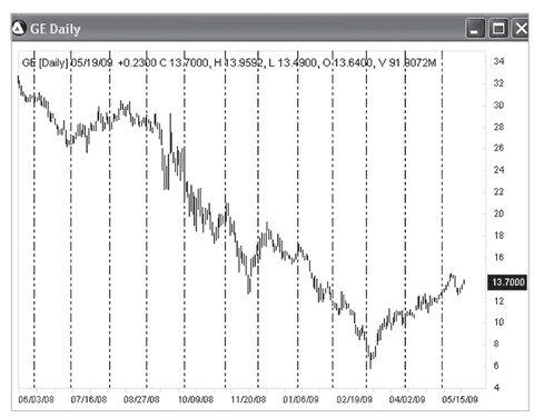
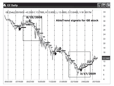
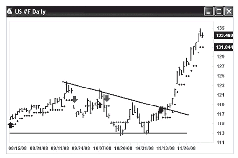
Let’s begin by reviewing one of the market’s most highly traded stocks—General Electric (symbol GE). GE is one of the 30 stocks included in the Dow Jones industrial average (DJIA) index. The daily charts that follow show GE from the years 2008 and 2009.
Summary: We are going to use the daily chart to analyze GE’s mid-term trend. First we will pinpoint when the downtrend and uptrend started using a traditional method. Then we will look at the trading signals that appear when we apply AbleTrend indicators to the chart.
Figure 6.1 is the GE daily chart from 5/19/2008 to 5/19/2009 (one year). Where do you think the major downtrend and uptrend started? Please mark these points on this chart.
Trend analysis will be completed using
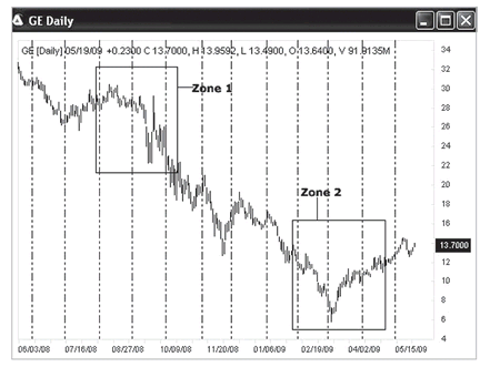
Figures 6.2 to
6.4. We focus on Zones 1 and 2 for the downtrend and uptrend.
In
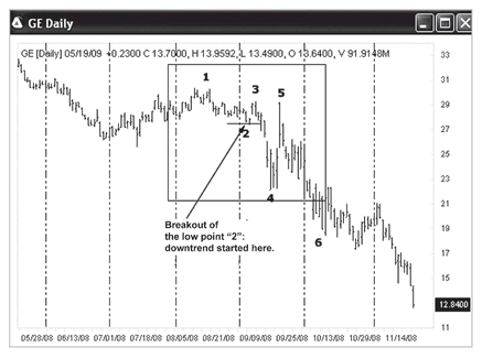
Figure 6.5 we look at the GE chart with the AbleTrend indicators applied. We see that the AbleTrend software presented a sell signal on 8/25/2008 and a buy signal on 3/17/2009, a few days ahead of the buy and sell points we determined by using classic trend analysis.
FIGURE 6.1 GE daily chart from 5/19/2008 to 5/19/2009.
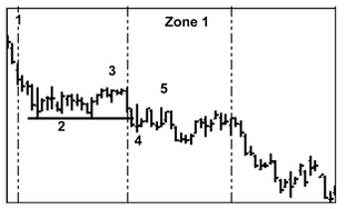
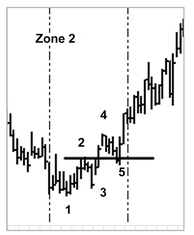
FIGURE 6.2 A step-by-step trend analysis based on the concepts of Chapter 2. Let’s focus on Zone 1 and Zone 2 marked above. A downtrend started in Zone 1, and an uptrend started in Zone 2. Can you mark the specific points at which these trends started?
FIGURE 6.3 Zone 1 trend analysis: Let’s ignore the small waves before and after point 1. We marked the low as point 2. After point 3, when prices broke below the low point 2, we saw lower highs and lower lows, which tells us the downtrend started from the breakout below point 2 on 9/11/2008. Points 5 and 6 show the continuation of the downtrend. When we do a trend analysis, we need to focus on the big picture and identify the big “waves” or “turning points.”
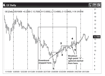
FIGURE 6.4 Zone 2 trend analysis: Now we’ll zoom in on Zone 2. First we see that after point 1, GE broke above its previous high, which means the previous downtrend stopped there. We marked the low as point 3. A few bars beyond point 3, we had higher highs and higher lows. The uptrend started from the formation of point 3. Then, when GE broke above point 2, we may say the uptrend was confirmed. So, the uptrend started at the end of March 2009. Points 4 and 5 show the continuation of the uptrend.
FIGURE 6.5 The GE chart with the AbleTrend indicators applied.
Case 2
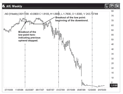
In trading, weekly charts are typically used to analyze long-term trends. AIG (American International Group) is one of the 30 stocks included in the Dow Jones industrial average (DJIA) index. It was a key symbol of the financial crisis in 2008 in the United States. The U.S. government laid out over $200 billion from 2008 to 2009 to save this company. Now, the U.S. government holds 90 percent of the stock shares of the company.
Summary: We are going to use the weekly chart to analyze AIG’s long-term trend. First we will use traditional methods to pinpoint when the downtrend started in 2007. Then we will see what trading signals appeared with the application of the AbleTrend indicators. Some people lost 99 percent of the value of their holdings by holding on to this stock. With our trend analysis, it might have been possible to avoid such losses.
Figure 6.6 is the weekly chart of AIG stock for the last three years (2006 to 2009). Let’s do a trend analysis for it. The price broke out below the previous low in early 2007, which was the first sign that the uptrend had stopped. Can you mark the specific point at which the downtrend started?
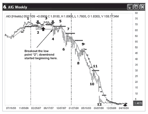
In
Figure 6.7, the AIG weekly chart showed a “1-2-3-4” downtrend formation in mid- 2007. As soon as the market broke out below the low point 2, the downtrend started and we marked it on the chart. The points 5 to 12 keep showing lower highs and lower lows as the downtrend proceeded. Note the AbleTrend buy and sell signals that have been plotted on this chart. Near point 5, an uptrend looked like it was trying to form. You may see the price went above the T2 stops. However, when prices broke down below the low, the uptrend formation failed, and the downtrend continued. This is a classical downtrend case.
FIGURE 6.6 AIG Weekly chart. Can you mark the specific point at which the downtrend started?
FIGURE 6.7 The AIG weekly chart showed a “1-2-3-4” downtrend formation in mid-2007.
The financial crisis started in September 2008. However, with the AbleTrend analysis shown here, we can see that the downtrend on the weekly chart actually started back in July 2007, one year ahead of its becoming manifest. Also, note the longer the time interval used, the more signal accuracy. Weekly charts normally can be used as guidance charts when trading daily charts.
Case 3
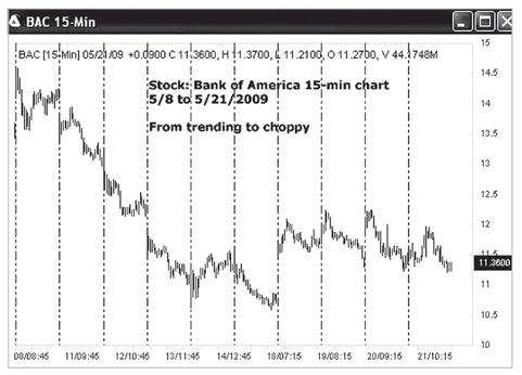
For short-term swing trading, we normally use 15-minute charts. Here is an example for the stock of Bank of America (symbol: BAC). BAC is one of the 30 stocks included in the Dow Jones industrial average (DJIA) index. Looking at the 15-minute charts of BAC, we will see how a trend changes into a choppy market.
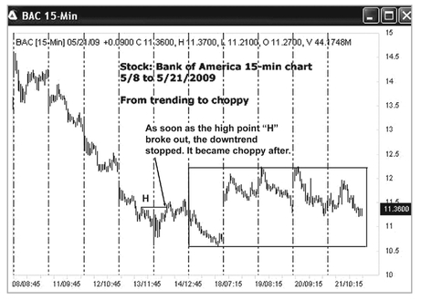
Summary: Now we will use 15-minute charts to analyze Bank of America stock for short-term trends. Using traditional methods, we will first pinpoint when the well-defined downtrend stopped. After two consecutive losing trades, the market turned choppy. Also we will see the trading signals that appeared with the application of AbleTrend indicators. This example illustrates why, after two consecutive losing trades, it is wise to stop trading for a while and watch whether the market is trending or choppy.
FIGURE 6.8 Bank of America (symbol: BAC) 15-minute chart. Here, the label “08/08:45” means date 5/8/2009, time 8:45 A.M.
Figure 6.8 is an example of the Bank of America (symbol: BAC) 15-minute chart. Can you mark on this chart where the downtrend stopped? Where did the choppy market start?
We will study how a trending market turns to choppy by analyzing charts in
Figures 6.9 to
6.11. We will focus on the right side of the chart to study the choppy conditions.
In
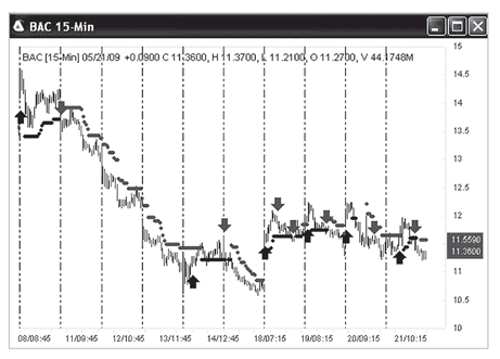
Figure 6.12 with the AbleTrend signals applied to the chart, trending and choppy market conditions are clearly indicated. Within very short time intervals (about 10 bars), we see up and down arrows with opposite colors, which tells us to stop trading for a while. If we can avoid choppy market conditions, then we may significantly improve our trading results. Also, if we have two consecutive losing trades, it may indicate a sideways market ahead. In these conditions it is better to stop trading, observe for a while, and wait for a breakout of the price range. If we have two consecutive losing trades that are on the opposite sides (one buy and one sell), we had better stop trading for a while because it is more likely a choppy market. Draw two lines for the market range, then wait for a breakout of the range to resume trading.
FIGURE 6.9 Downtrend started on 5/8/2009 and continued until 5/14/2009, when the high at point H was broken above, and the downtrend stopped. We don’t see any “lower highs” after that point. After that, the market tried to have higher highs and higher lows in order to start an uptrend. But it failed immediately by presenting a lower low. The market became choppy from the left edge of the box that we have drawn on the chart.
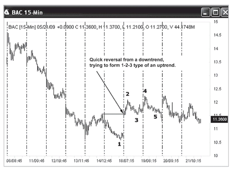
FIGURE 6.10 Quick trend reversal of a downtrend (see where we marked this on the chart). Prices broke the previous high, and we started to count point 1 as the low. After point 3, the uptrend started with a series of 1-2-3 points, and it was followed by a higher high (point 4). Point 5 would appear to be a good entry point for a long position. But the uptrend failed immediately after point 5. First, a downtrend failed, and then an uptrend failed. This gives us a big hint that the market has turned choppy.
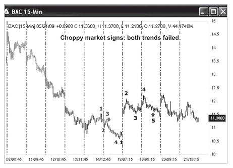
FIGURE 6.11 This chart offers two possible trades. The first is a sell on 5/14/2009, after the 1-2-3 downtrend formation. The second is a buy on 5/19/2009 at point 5 after the 1-2-3-4 uptrend. The fact that both trades were losing told us the market was choppy. We know we had better stop trading for a while after having two consecutive losing trades in opposite directions (one sell trade and another buy).
FIGURE 6.12 With the AbleTrend signals applied to the chart, trending and choppy market conditions are clearly indicated. In these conditions it is better to stop trading, observe for a while, and wait for a breakout of the price range.
COMMODITIES
Commodity trading is the most important hedge in trading. There are over 40 commonly traded commodities in the United States through CME, CBOT, NYMEX, ICE, COMEX exchanges, etc. Three examples of trend analysis along with AbleTrend are presented here. They are crude oil futures weekly chart, cotton futures daily chart, and gold futures 15-minute chart. We first use trend definition to pinpoint the trend starting and ending points on each chart, then compare and view the analysis by AbleTrend.
Case 4
For mid-term swing trading, we normally use daily or weekly charts. We will now look at an example for light sweet crude oil futures (symbol—CL at NYMEX) over the last three years. A mid-term trend is a trend that lasts two to three months or more. Let’s see how to analyze the crude oil chart, and learn how to recognize what the market is telling us along the way.
Summary: We will now use a weekly chart to analyze mid-term trends of crude oil futures. We will pinpoint when the well-defined uptrend started in 2007, when the downtrend started and ended from 2008 to 2009, and when a new uptrend started in early 2009.
With our knowledge of trend analysis, you may do better than most of the professional market analysts. See
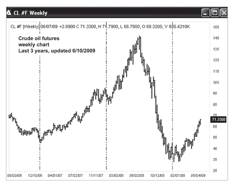
Figure 6.13. It is the weekly chart of crude oil futures from 6/10/2006 to 6/10/2009 (three years). When oil reached a price of $70 per barrel in October 2007, some top analysts predicted it would drop to $30 per barrel based on falling demands. And when oil reached a price of $100 per barrel in May 2008, some top analysts predicted it would shoot up to $200 per barrel in one year. How would you analyze this chart? Can you mark the specific points at which the uptrend or downtrend started or ended?
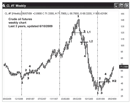
Here is our analysis for the crude oil futures. In
Figure 6.14, pay attention to when each trend started as we marked on the chart.
(1) In early 2007, an uptrend started in 1-2-3-4 fashion. As soon as the breakout of a high—point H1—occurred at $60 per barrel, we saw higher lows and higher highs, indicating the uptrend had started.
(2) In July 2008, when prices broke the low—point L1—at $125 per barrel, it indicated the previous uptrend stopped.
In October 2008, when prices broke the low—point L2—at $110 per barrel, we saw the 1-2-3 points that indicated the start of the downtrend.
(3) In March 2009, when prices were breaking $50 per barrel, we saw 1-2-3-4 points and the beginning of the uptrend. As soon as the breakout of the high point—point H2—occurred at $50 per barrel, we saw higher lows and higher highs, indicating that the uptrend had started.
Figure 6.15 shows the crude oil futures weekly chart with AbleTrend1 and AbleTrend 2 indicators applied. Up-arrows were buy signals of the T1 indicator, and down-arrows were sell signals of the T1 indicator. The small dots are protection stops of the T2 indicator. AbleTrend did a nice job: buy on 2/18/2007, sell on 8/10/2008, then buy on 3/29/2009. Here, oil 1.0 move corresponds to $1,000 per contract.
FIGURE 6.13 Weekly chart of crude oil futures from 6/10/2006 to 6/10/2009 (three years). Can you mark the specific points at which the uptrend or downtrend started?
FIGURE 6.15 Crude oil futures weekly chart with AbleTrend1 and AbleTrend2 indicators applied.
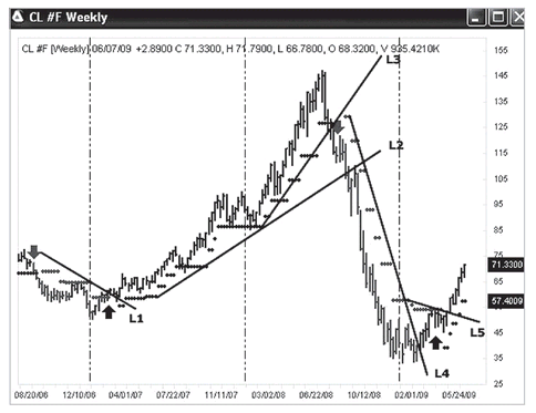
Figure 6.16 is the crude oil futures weekly chart with trendlines, from 6/10/2006 to 6/10/2009 (three years). This example shows how easy it is to draw trendlines with the guidance of AbleTrend2 stops. All the trendlines—L1, L2, L3, L4, and L5—were based on the T2 dot key levels of the last two to three months for the mid-term trendline. We connected the most significant T2 dots (the more dots line up, the more significant the trend).
Trendlines can quickly show us when a trend has ended. Here, L3 and L5 indicated the trendline changes based on the previous two months’ data. Using those trendlines, we can clearly identify when a trend has ended.
Case 5
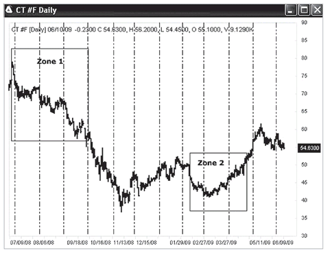
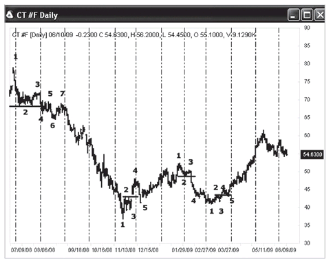
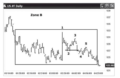
For short-term swing trading, we normally use daily charts. Here is an example for cotton #2 futures (symbol - CT, ICE exchange) of one year, from 2008 to 2009. The short-term trend covers the previous 2 to 3 weeks or more.
Summary: Here we will use a daily chart to analyze short-term trends in cotton futures. We will pinpoint when the uptrends and downtrends started and ended for the year from 6/10/2008 to 6/10/2009. Zones 1 and 2 are enlarged to show the details.
FIGURE 6.16 Crude oil futures weekly chart with trendlines from 6/10/2006 to 6/10/2009 (three years). This example shows how to draw trendlines.
Here is a trend analysis for cotton futures; see
Figure 6.17. This is the cotton futures daily chart from 6/10/2008 to 6/10/2009 (one year). The short-term trend is a trend of the previous two to three weeks. We will zoom in on Zone 1 and Zone 2 with more detailed charts below. How would you analyze this chart? Can you mark the specific points at which the uptrend or downtrend started?
•
Figure 6.18 Zone 1—July to September 2008, cotton futures. This was a “1-2-3-4” type of downtrend that started in early August 2008. As soon as the price was breaking the low level of point 2, the downtrend started. We saw a lower highs (point 3 vs. point 1) and a lower lows (point 4 vs. point 2).
•
Figure 6.19 Zone 2—February to March 2009, cotton futures. This was a “1-2-3-4” type of uptrend that started in March 2009. As soon as the price broke the high of point 2, the uptrend started. We saw higher lows (e.g., point 3 vs. point 1) and higher highs (e.g., point 4 vs. point 2).
For overall trend analysis for the cotton futures, see
Figure 6.20. Here again is the daily chart from 6/10/2008 to 6/10/2009 (one year). How would you analyze this chart? Pay attention to when each trend started.
(1) In July 2008, a downtrend started in 1-2-3-4 fashion. As soon as the breakout of the low at level 2, the downtrend started.
(2) In November 2008, when prices broke the high at level 2, we saw a “1-2-3-4” fashion start of the downtrend.
(3) In February 2009, a downtrend started in “1-2-3-4” fashion. As soon as the breakout of the low at level 2 occurred, the downtrend started.
(4) In March 2009, there was a “1-2-3-4” type of an uptrend. As soon as the price broke the high level of point 2, the uptrend started. We saw higher lows and higher highs.
FIGURE 6.17 Cotton futures daily chart from 6/10/2008 to 6/10/2009 (one year). Can you mark the specific points at which the uptrend or downtrend started?
FIGURE 6.18 Zone 1—July to September 2008, cotton futures.
FIGURE 6.19 Zone 2—February to March 2009, cotton futures.
FIGURE 6.20 Trend analysis for cotton futures daily chart from 6/10/2008 to 6/10/2009 (one year).
FIGURE 6.21 Cotton futures daily chart with AbleTrend1 and AbleTrend2 indicators applied. Up-arrows were buy signals of the T1, and down-arrows were sell signals of the T1. The small dots are protection stops of the T2.
Finally,
Figure 6.21 is the cotton futures daily chart with AbleTrend1 and AbleTrend2 indicators applied. Up-arrows were buy signals of the T1, and down-arrows were sell signals of the T1. The small dots are protection stops of the T2. Sell signal was on 8/4/2008, buy signal 11/26/2008, sell signal on 2/10/2009, and buy signal on 3/20/2009. AbleTrend did catch the big moves over the one year.
Case 6
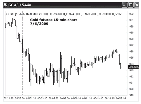
Now we will look at an example of the gold futures 15-minute chart for short-term swing trading, on 7/6/2009. When the U.S. government keeps issuing T-Bonds, people become really concerned about inflation in the future since the U.S. debt is reaching $10 trillion today. Gold cash and futures become very popular markets to trade. In the past, there was a price ratio of 15:1 for gold to crude oil. These days the ratio doesn’t work any more. This has made it very hard to trade gold futures over the past 2 or 3 years. Let’s see how our trend analysis and AbleTrend may help.
FIGURE 6.22 Gold futures 15-minute chart of 7/6/2009. Here, the label 06/01:30 means date 7/6/2009, time 1:30 A.M. (PST).
Summary: Using a 15-minute chart to analyze trends of gold futures, we will pinpoint when the downtrends ended, and when the uptrend started. Also, we will analyze a triangle consolidation and its breakout, and discuss how to handle the sideways market ahead.
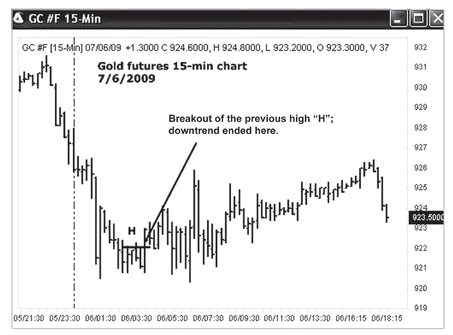
Figure 6.22 is an example of the gold futures 15-minute chart of 7/6/2009. When did the downtrend end? When did the uptrend start? And, when did prices break out of the triangle consolidation?
Figure 6.23 shows the gold futures 15-minute chart of 7/6/2009 with some points marked. When the price broke out of the previous high at point “H,” it indicated that the downtrend had ended from the breaking point. With this concept, our mind will be very alerted to the change of market directions.
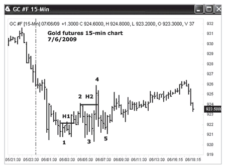
Figures 6.24 to
6.26 show how to analyze a market from trending to choppy. First,
Figure 6.24 is the gold futures 15-minute chart with additional critical points marked. The market formed a low at point 1, then a high at point 2. As soon as it broke out of the previous high at H1, and formed the low at point 3 and the high at point 4, the uptrend in the 15-minute chart started.
Figure 6.25 once more is the gold futures 15-minute chart. As we can see, after point 4
we saw higher lows, but lower highs, which meant that rather than entering an uptrend, prices were forming a consolidation triangle. Remember in Chapter 2, we talked about the seven confirmation rules for a trend. This triangle conflicts with the “higher lows and higher highs” confirmation of an uptrend. At the end of the triangle on the gold chart, the market broke out to the upside, and then soon broke down again. This kind of price action suggests a sideways market is ahead. It appears that a 15-minute interval chart might be too short to handle the market’s volatility, and it might be advisable to stop trading for a while. See the next chart (a 30-minute chart) in
Figure 6.26.
FIGURE 6.23 Gold futures 15-minute chart of 7/6/2009 with some points marked. When the price broke out of the previous high at point “H,” it indicated that the downtrend had ended from the breaking point.
FIGURE 6.24 Gold futures 15-minute chart of 7/6/2009 with additional critical points marked. The market formed a low at point 1, then a high at point 2. As soon as it broke out of the previous high at H1, and formed the low at point 3 and the high at point 4, the uptrend in the 15-minute chart started.
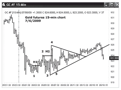
FIGURE 6.25 Gold futures 15-minute chart of 7/6/2009. As we can see, after point 4 we saw higher lows, but lower highs, which meant that rather than entering an uptrend, prices were forming a consolidation triangle.
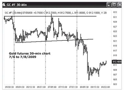
FIGURE 6.26 Gold futures 30-minute chart of 7/6/2009 to 7/8/2009. As we can see, the market was up and down—very choppy.
With a larger scale (
Figure 6.26), here’s the gold futures 30-minute chart of 7/6/2009 to 7/8/2009. As we can see, the market was up and down—very choppy—making it very hard to trade with the trend-following method. Near the end of the day, prices broke the support level of the previous two days, and a downtrend formed. We drew two lines on the chart for support and resistance lines. We should wait for prices to break out to resume trading.
In
Figure 6.27 we go back to the gold futures 15-minute chart of 7/6/2009, only this time we will look at it with buy/sell signals of the AbleTrend1 and AbleTrend2 indicators applied. It seems that AbleTrend did a good job clarifying the direction of the trend for such choppy market conditions.
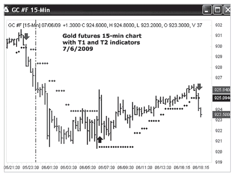
FIGURE 6.27 Gold futures 15-minute chart of 7/6/2009, with buy/sell signals of the AbleTrend1 and AbleTrend2 indicators applied. It seems that AbleTrend did a good job clarifying the direction of the trend for such choppy market conditions.
THE E-MINIS
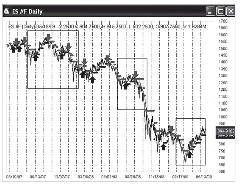
E-mini index futures are the most electronically traded futures markets in the United States. There are E-mini S&P 500, E-mini NASDAQ 100, E-mini Dow, E-mini Russell 2000 contracts, and many more. They are traded 24 hours through GLOBEX, CME, ECBOT, and ICE exchanges. Among those, the most popular is the E-mini S&P 500 futures (symbol root ES). Three examples of trend analysis along with AbleTrend are presented here. They are E-mini S&P 500 daily chart and 5-minute chart, and the E-mini Dow 3-minute chart. We first use trend definition to pinpoint the trend starting and ending points on each chart, and then compare and view the analysis by AbleTrend.
Case 7
Index futures is one of the most traded futures. The trading volume has been increasing many times in the past few years. Let’s review one of the most heavily traded E-mini futures markets, and one of the most widely electronically traded futures markets - the E-mini S&P 500 index futures (symbol root ES). The ES is the electronic trading futures contract for the S&P 500 Index. The following charts show the daily chart of ES futures from the year 2007 to 2009 (two years).
Summary: We will use the daily chart to analyze the ES mid-term trend. We will pinpoint when the downtrend and uptrend started. We will also see the trading signals that resulted from the application of the AbleTrend indicators.
This is a mid-term trend analysis.
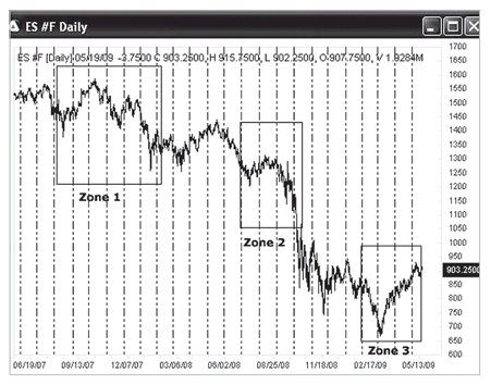
Figure 6.28 is the E-mini S&P 500 index futures daily chart from 5/19/2007 to 5/19/2009 (two years). This chart shows three zones of interest. We will zoom in and give a detailed analysis of each. How would you analyze this chart? Can you mark the specific points at which the uptrend or downtrend started?
Figures 6.29 to
6.34 present typical trend analysis for a daily chart.
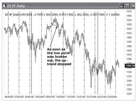
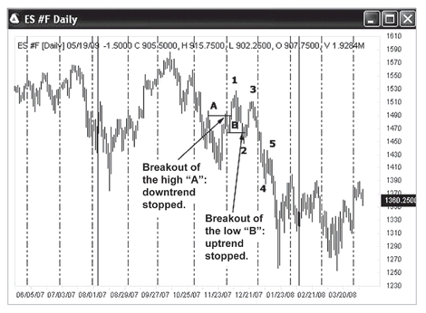
Figure 6.29 is Zone 1, 08/2007 to 02/2008. In October 2007, when the market broke down below the previous low of the market, the uptrend stopped.
When did the downtrend start?
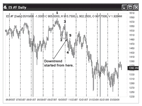
Figure 6.30 shows Zone 1, 08/2007 to 02/2008. Here we see a 1-2-3-type start of the downtrend. In November 2007, when the market’s high formed at point 3, we saw a lower low first, followed by a lower high, indicating the downtrend had started.
Figure 6.31, Zone 1, is a continuation of
Figure 6.29. This chart shows that there was a downtrend in October 2007. The market had a pullback, followed by a breakout of the previous high at point A, which is when the downtrend stopped. A few bars away from point 1, prices broke out below the low at point B, and stopped the short-lived uptrend. Then we see a “1-2-3-4” fashion downtrend, with lower highs and lower lows, indicating that a downtrend had started again in early January 2008.
FIGURE 6.28 E-mini S&P 500 futures daily chart from 5/19/2007 to 5/19/2009 (two years). This chart shows three zones of interest. We will zoom in and give a detailed analysis of each. How would you analyze this chart? Can you mark the specific points at which the uptrend or downtrend started?
FIGURE 6.29 Zone 1, 08/2007 to 02/2008. In October 2007, when the market broke down below the previous low marked above, the uptrend stopped.
FIGURE 6.30 Zone 1, 08/2007 to 02/2008. Here we see a 1-2-3-type start of the downtrend. In November 2007, when the market’s high formed at point 3, we saw a lower low first, followed by a lower high, indicating the downtrend had started.
FIGURE 6.31 Zone 1, Continuation of
Figure 6.29. We see a 1-2-3-4, with lower highs and lower lows, indicating that a downtrend had started again in early January 2008.
Figure 6.32 is
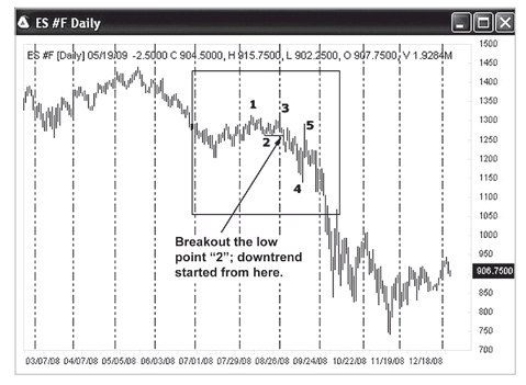
Zone 2, 07/2008 to 09/2008. We saw a lower high (point 3 vs. point 1), then a lower low (point 4 vs. point 2). This was a typical “1-2-3-4” type startup to a downtrend. When the market broke out below the low at point 2 in early September, 2008, this indicated that the downtrend had started. In fact the financial crisis of 2008 started at this time.
Figure 6.33 is
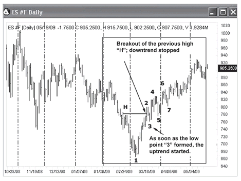
Zone 3, early 2009. In March 2009, the market quickly reversed and broke out above the previous high at point H, indicating that the previous downtrend had stopped. As soon as the low at point 3 formed, we saw a higher high first, and then the higher low, indicating that the uptrend had started in “1-2-3” fashion in March 2009. After point 3, there were well-defined higher highs and higher lows that confirmed the continuation of the uptrend.
Figure 6.34 shows
Zone 3, early 2009, with AbleTrend1 and AbleTrend2 indicators added, and buy/sell/stop signals are displayed.
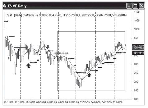
Figure 6.35 is the E-mini S&P 500 futures daily chart from 5/19/2007 to 5/19/2009 with AbleTrend1 and AbleTrend2 indicators added to the chart. Buy/sell/stop signals are displayed. The S&P 500 index dropped from the top about 1550 to near 650 during the time period, a 58 percent drop in value. Without having to perform detailed analyses on how each trend started or ended, traders can enjoy a quick solution by using the AbleTrend indicators. Up-arrows are the buy signals, and down-arrows the sell signals. AbleTrend did catch the major moves of the market.
FIGURE 6.32 Zone 2, 07/2008 to 09/2008. When the market broke out below the low at point 2 in early September 2008, this indicated that the downtrend had started.
FIGURE 6.33 Zone 3, early 2009. In March 2009, the market quickly reversed and broke out above the previous high at point H, indicating that the uptrend had started in 1-2-3 fashion in March 2009.
FIGURE 6.34 Zone 3, early 2009. AbleTrend1 and AbleTrend2 indicators are added and buy/ sell/stop signals are displayed.
FIGURE 6.35 E-mini S&P 500 futures daily chart, 5/19/2007 to 5/19/2009, with AbleTrend1 and AbleTrend2 indicators added. Buy/sell/stop signals are displayed.
Case 8
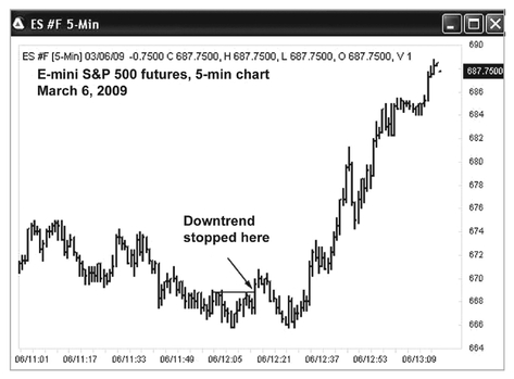
Now let’s review a 5-minute chart of E-mini S&P 500 futures. The 5-minute chart is commonly used for day trading. Pay attention to how this uptrend started. Typically, for day trading index futures, 2- to 5-minute charts are commonly used. It is trading very short-term trends.
Summary: We will now use a 5-minute chart of the E-mini S&P 500 futures to demonstrate how to pinpoint when an uptrend starts. We will look at what it means when prices break a few natural resistance levels within a short time. We will also see what is revealed when we add trading signals by applying the AbleTrend indicators.
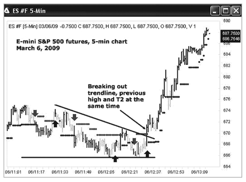
Figure 6.36 is the E-mini S&P 500 futures 5-minute chart of March 6, 2009. Let’s closely look at what happened at 12:20 P.M., when the ES futures price rallied and broke out above the previous highs. This price action told us the previous downtrend had ended. We needed to hold trading for a while, and watch to see whether a new uptrend had been set up or whether the previous downtrend would resume. Can you mark on this chart the spot where the downtrend stopped and the uptrend started?
See
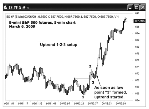
Figure 6.37 for our analysis. Now here’s the E-mini S&P 500 futures 5-minute chart on March 6, 2009, with further price action marked. After the price broke the previous high, the previous downtrend on the left side stopped. Soon, the low at point 1 formed; we see a double bottom. After the high at point 2 formed, we see a higher high. As soon as the low at point 3 formed, we could clearly spot the “1-2-3” type of uptrend formation from that point on.
FIGURE 6.36 E-mini S&P 500 futures 5-minute chart, March 6, 2009. Here, the label 06/11:01 means date 3/6/2009, time 11:01 A.M.
FIGURE 6.37 E-mini S&P 500 futures 5-minute chart, March 6, 2009. We could clearly spot the 1-2-3 type of uptrend formation from the point we marked on the chart.
FIGURE 6.38 E-mini S&P 500 futures 5-minute chart, March 6, 2009. Pay attention to the quick breakout of previous resistance levels marked as R1, R2, and R3.
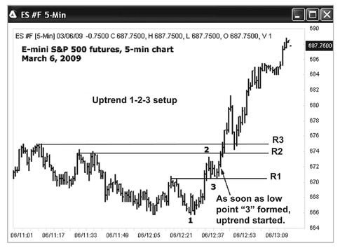
Let’s look more carefully at
Figure 6.38. Pay attention to the quick breakout of previous resistance levels marked as R1, R2, and R3. Those levels are natural resistance. When you see such fast breaking out, be alerted! This indicates the uptrend forces were very strong. If we see a pullback near R1, R2, or R3, we will buy after prices break through. The result is shown on the right side of the chart.
Take a look at what AbleTrend did for this chart.
Figure 6.39 is the same chart of the E-mini S&P 500 futures 5-minute chart on March 6, 2009, but with AbleTrend buy/sell/stop signals added. We saw the price quickly break out of the triangle’s down trendline, and at the same time the T2 stops (above the bars) appeared, indicating that the market could not wait. It just wanted to go up! The STM works well for this case. Also all the spots from green bars to blue bars, near the T2 stops places, are so-called sweet spots to buy.
Case 9
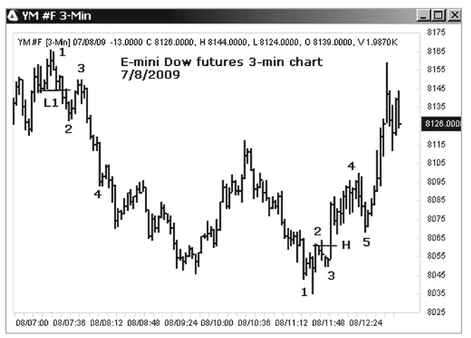
Let’s now examine day-trading the E-mini Dow futures (symbol root YM) with a 3-minute chart. The YM, which is the E-mini futures contract for the DJIA index, is one of the most heavily electronically traded futures markets. The following charts show a 3-minute chart of YM futures on July 8, 2009.
FIGURE 6.39 E-mini S&P 500 futures 5-minute chart, March 6, 2009, with AbleTrend buy/sell/stop signals applied. The market just wanted to go up!
Summary: We will use the 3-minute chart to analyze YM over a very short-term trend for day-trading purposes. We will pinpoint when the downtrend and uptrend started. We will also see the trading signals that were given with the application of the AbleTrend indicators.
Let’s examine a day-trading example.
Figure 6.40 is a 3-minute chart of YM E-mini futures on July 8, 2009. Under normal conditions, we would use 2- to 5-minute charts for day trading E-mini index futures. Here, the label 08/07:00 means date 7/8/2009, time 7 A.M. (PST). How would you analyze this chart? Can you mark the specific points at which the uptrend or downtrend started?
Here is our brief trend analysis. In
Figure 6.41, there were four trends: a downtrend on the left side, followed by an uptrend, then another downtrend, followed by an uptrend on the right side. We will perform trend analyses only for the first downtrend on the left side and the last uptrend on the right side.
The first downtrend started in a “1-2-3” fashion as marked on the chart. At 7:15 A.M., when the market broke the low at L1, the previous uptrend stopped. Around 8 A.M., when the market’s high at point 3 formed, we saw a lower low first, followed by a lower high (point 3 vs. point 1), and this is when the downtrend started.
The last uptrend started around 11:48 A.M. When the market broke the high (H) at point 2, and then formed a low at point 3, the uptrend started. We had a higher low and higher high at the same time. This is a “1-2-3-4” type of uptrend formation.
FIGURE 6.40 YM futures 3-minute chart, July 8, 2009. Here, the label 08/07:00 means date 7/8/2009, time 7 A.M. Can you mark the specific points at which the uptrend or downtrend started?
FIGURE 6.41 Four trends: a downtrend on the left side, followed by an uptrend, then another downtrend, followed by an uptrend on the right side. How do you analyze this chart?
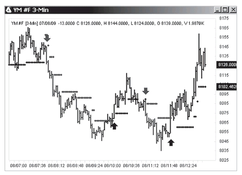
FIGURE 6.42 YM futures 3-minute chart, July 8, 2009, with AbleTrend buy/sell/stop signals applied. Up-arrows are the buy signals, and down-arrows are the sell signals.
With AbleTrend buy/sell/stop signals applied, the chart is shown in
Figure 6.42. Up-arrows are the buy signals, and down-arrows, the sell signals. AbleTrend clearly catches the major moves of the Dow futures on that day.
FOREX
Forex refers to foreign currency exchanges through inter-banks around the world. There is no specific “exchange” place as there is for stocks or futures. The trading amount of Forex exceeds $3 trillion per day, i.e., 25 times bigger than all stock markets combined around the world. The most popular Forex are exchanges of the U.S. dollar to six foreign currencies: EUR/USD, GBP/USD, AUD/USD, USD/JPY, USD/CHF, and USD/CAD. Forex charts have the best trend among all the markets. Two examples of trend analysis along with AbleTrend are presented here. They are AUD/USD daily chart and 30-minute GBP/USD chart. We first use trend definition to pinpoint the trend starting and ending points on each chart, then compare and view the analysis by AbleTrend.
Case 10
Forex is a common term for foreign currency exchanges. It is a 24-hour market through banks around the world. In August 2008, when the financial crisis started in the United States, and the U.S. Federal Reserve kept printing paper money to support its activities. It seemed logical to most analysts that the value of the U.S. dollar would drop. Therefore, it was expected that many traders would buy the Australian dollar, British pound, etc., and that therefore the exchange rate of the Australian dollar with regard to the U.S. dollar would go up. However, the market frequently fools most people and turns them into losers. Let’s review position trading for AUD/USD, which was in a big downtrend during the time in question. How would one spot the early entry point and stay on the trend?
Summary: “What is supposed to happen” can be far different from “what is actually happening.” Big moves give signs. Looking at the daily chart of AUD/USD, what sign alerts you to pay attention to this 3500 pips ($35,000 per contract) move? We will also look at the trading signals that appeared on the chart with the application of the AbleTrend indicators. In fact, if the market acts against common sense, we always view it as the best time to follow the market.
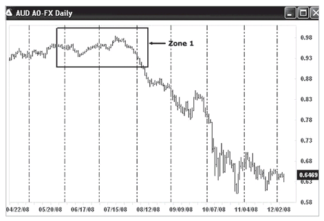
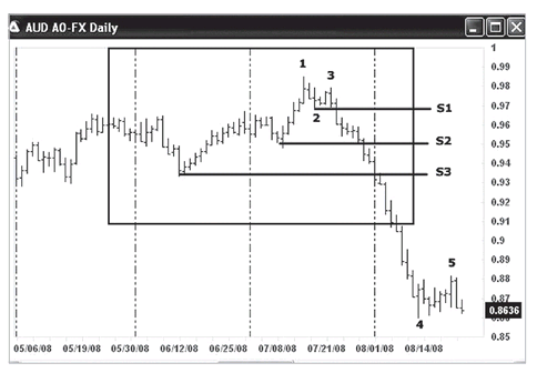
Figure 6.43 is a daily chart of AUD/USD Forex, 4/22/2008 to 12/2/2008. How would you analyze this chart? Can you mark the specific point at which the big downtrend started? Take a look at Zone 1.
Let’s see
Zone 1 in
Figure 6.44: Here is the daily chart of AUD/USD Forex, zoomed in on Zone 1, 6/1/2008 to 8/1/2008. First we see a lower high at point 3, as soon as the market breaks out below the low at point 2 and the support at level S1, we have a lower low. This means that the downtrend started on 7/23/2008. This is a “1-2-3-4” type of downtrend startup. Over the next six days, the market quickly broke below two natural support levels at S2 and S3. By showing such a big downward force within such a short period of time, this price action indicated that a big move might be ahead. When you see the market breaks a few natural support levels in a row, be alerted! The big moves are under way. We should get in the sell position quickly. If you see any pullback, that’s the sweet spot to sell or add positions.
FIGURE 6.43 AUD/USD Forex daily chart, 4/22/2008 to 12/2/2008. How would you analyze this chart? Can you mark the specific point at which the big downtrend started? Take a look at Zone 1.
FIGURE 6.44 AUD/USD Forex daily chart, zoomed in on Zone 1, 6/1/2008 to 8/1/2008.
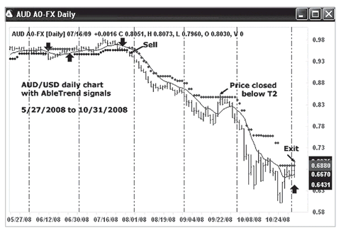
Figure 6.45 shows the daily chart of AUD/USD Forex from 5/27/2008 to 10/31/2008, with AbleTrend indicators applied. The T1, T2, and EMA added on the chart show the STM entry and exit points. You may note that on 9/22/2008, the high of that day touched the T2 dot, but the market closed below the T2 dot. A trader might or might not have exited on that day. As we have mentioned, many AbleTrend users only exit when the bar close price penetrates the T2 stop. Traders who exited could have entered again with STM—the T1 and T2 in agreement. For STM rules, refer to Chapter 5.
Case 11
Let’s review swing trading GBP/USD with a 30-minute chart. Swing trading typically lasts for a few days to two weeks. Commonly 30-, 60,- or 120-minute charts are used for swing trading. How do we spot the early entry point and stay on the trend? How do we deal with the choppy market condition on the right side of the chart?
FIGURE 6.45 AUD/USD Forex daily chart, 5/27/2008 to 10/31/2008, with AbleTrend indicators applied.
Summary: Here we will see how the market started an uptrend, then entered a downtrend, then resumed the uptrend within a few days. We will also see the trading signals that appeared with the application of the AbleTrend indicators.
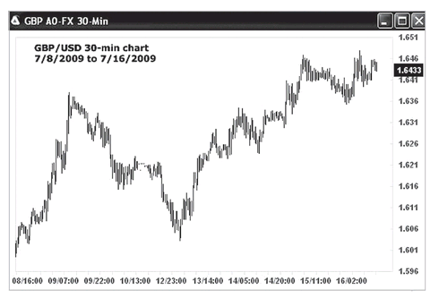
Figure 6.46 is the GBP/USD Forex 30-minute chart (7/8/2009 to 7/16/2009). Can you identify the early entry point? How would you stay on the trend? And how would you deal with the choppy market condition on the right side of the chart?
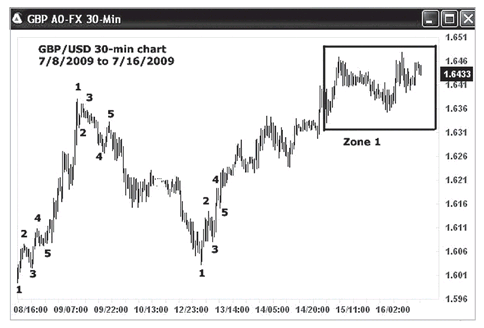
Let’s do a trend analysis for it (see
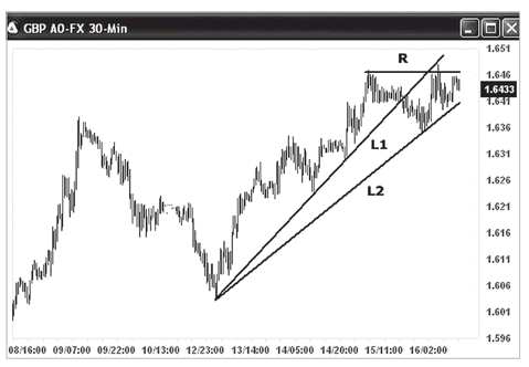
Figure 6.47). It is the GBP/USD Forex 30-minute chart (7/8/2009 to 7/16/2009) with critical points marked. The uptrend on the left side started up in “1-2-3-4” fashion. Then we saw a “1-2-3-4” type startup to a downtrend. This was followed by a quick “1-2-3” startup to an uptrend. Finally, prices exhibited the choppy market condition we see on the right side of the chart, and that we have highlighted in the Zone 1 box. In the next chart (
Figure 6.48); we will examine more details for Zone 1.)
In
Figure 6.48, we have zoomed in here on Zone 1. Looking at this choppy market, we see that prices broke below the trendline L1, but quickly rebounded from trendline L2, and then retracted from resistance R. All of these actions indicated that there was a choppy market ahead. Sometimes, staying away from such sideways markets is the best choice.
Let’s see what AbleTrend trading signals are for the preceding chart.
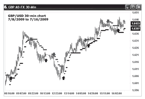
Figure 6.49 is the GBP/USD Forex 30-minute chart with AbleTrend buy/sell/stop signals applied (7/8/2009 to 7/16/2009). Up-arrows are the buy signals, and down-arrows are the sell signals. AbleTrend works well for trending markets such as the Forex markets.
FIGURE 6.46 GBP/USD Forex 30-minute chart (7/8/2009 to 7/16/2009). Can you identify the early entry point? Here, the label 08/16:00 means date 7/8/2009, time 16:00.
FIGURE 6.47 GBP/USD Forex 30-Minute Chart (7/8/2009 to 7/16/2009) with Critical Points Marked.
FIGURE 6.48 GBP/USD Forex 30-minute chart, zoomed in on Zone 1. Looking at this choppy market, we see that prices broke below the trendline L1, but quickly rebounded from trendline L2, and then retracted from resistance R. All of these actions indicated that there was a choppy market ahead. Sometimes, staying away from such markets is the best choice.
FIGURE 6.49 GBP/USD Forex 30-minute chart with AbleTrend buy/sell/stop signals applied (7/8/2009 to 7/16/2009). Up-arrows are the buy signals, and down-arrows are the sell signals.
BONDS
Fixed income is one of the huge markets. The U.S. bonds trading dollar amounts are many times bigger than the U.S. stock markets. T-Bonds and T-Notes futures are some of the best tradable or trending markets. One time, a client called and told me that by following the AbleTrend buy and sell signals, he had over 10 consecutive winning trades by trading the 10-year notes in one and a half years. See the following two cases—U.S. T-Bonds futures daily chart and U.S. 10-year Notes futures daily chart. Let’s make some trend analysis for the T-Bonds and Notes.
Case 12
Now we will review position trading for U.S. T-Bonds futures. Position trading normally lasts for two or three months. How do we spot the early entry points and stay on the trends?
Summary: This example shows that sometimes trading the markets is like dancing with a monster. However, AbleTrend can put the trader in harmony with the market. This will become apparent when we look at the same chart with the AbleTrend indicators for the U.S. T-Bonds futures applied.
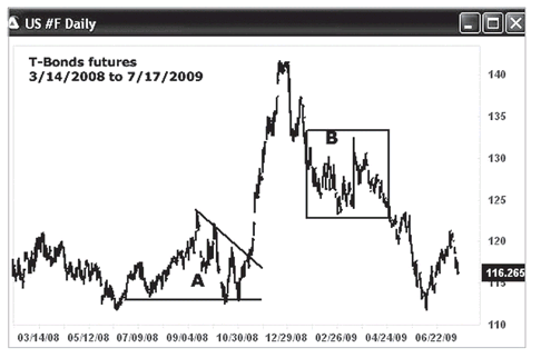
Figure 6.50 is the U.S. T-Bonds futures (US) daily chart (3/14/2008 to 7/17/2009). How would you analyze this chart and trade this market? Can you mark the specific points at which the uptrend or downtrend started? In the following two figures, we zoom in on Zones A and B.
FIGURE 6.50 U.S. T-Bonds Futures (US) daily chart (3/14/2008 to 7/17/2009). How would you analyze this chart and trade this market? Can you mark the specific points at which the uptrend or downtrend started? Pay attention to Zones A and B.
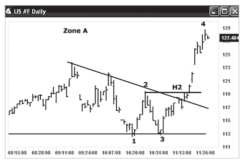
FIGURE 6.51 U.S. T-Bonds Futures (US) daily chart, Zone A. If you bought from the breakout, your initial stop would be placed below the down trendline at about 117.
Figure 6.51 Zone A: This is the U.S. T-Bonds futures (US) daily chart, zooming in on Zone A, which we marked in
Figure 6.50. Here, we see a “1-2-3-4” type startup to an uptrend. As soon as the two-month down trendline and the high level H2 were broken earlier, we would know that the uptrend had started. If you bought from the breakout, your initial stop would be placed below the down trendline at about 117.
How was AbleTrend doing? See
Figure 6.52 Zone A: Here is the same U.S. T-Bonds futures (US) daily chart zooming in on Zone A from
Figure 6.50, this time with the AbleTrend buy/sell/stop signals applied. The AbleTrend buy signal was given at the breakout of the down trendline. The STM buy signal was shown two bars later.
Let’s examine
Figure 6.53 Zone B: This is the U.S. T-Bonds futures (US) daily chart, zooming in on Zone B from
Figure 6.50. Here we see a “1-2-3-4” type startup to a downtrend. As soon as you saw prices breaking below the low at point 2, you would have known the downtrend had started. Look at point 5, which is a typical
Golden Region of Entry (sweet spot) for the short position. Refer back to
Figure 6.50 for the result.
Case 13
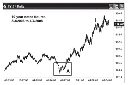
Now, for our last example, let’s review position trading for 10-year notes (TY) futures. How do we spot the early entry point and stay on the trend?
FIGURE 6.52 U.S. T-Bonds Futures (US) daily chart, zoomed in on Zone A from
Figure 6.50. This time the AbleTrend buy/sell/stop signals have been applied.
FIGURE 6.53 U.S. T-Bonds Futures (US) daily chart, zoomed in on Zone B. Pay attention to the “Golden Region of Entry” (sweet spot) near point 5 for the short position.
Summary: This example shows how a key turning point forms. With our trend definition, we can spot the specific point when a trend starts. Always pay attention to the major “waves” or turning points. We will also see the trading signals the AbleTrend indicators placed on the chart for the TY market.
This is an example of position trading.
Figure 6.54 shows the 10-year notes futures (TY) daily chart (8/3/2006 to 4/4/2008). How would you analyze this chart? Can you mark the specific points at which the uptrend or downtrend started? How would you trade this market? We will examine Zone A, and show the buy/sell/stop signals of AbleTrend in
Figure 6.55 and
6.56.
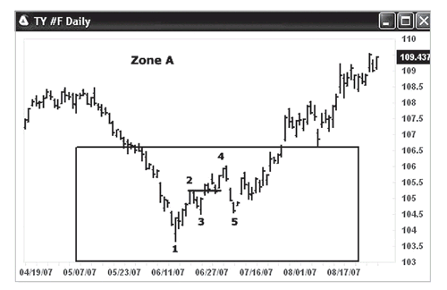
Let’s zoom in on Zone A; see
Figure 6.55: This is a 10-year notes futures (TY) daily chart. It shows that the uptrend had a “1-2-3-4” fashion start-up. As soon prices broke above the high at point 2, the uptrend began. In fact, after point 5, we had a “Golden Region of Entry” (sweet spot) for a long position.
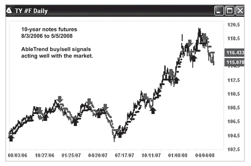
Figure 6.56 again is the 10-year notes futures (TY) daily chart (8/3/2006 to 5/5/2008). By adding AbleTrend indicators with default settings, we can get in harmony with the market. This chart shows the AbleTrend buy/sell/stop signals over a period of 21 months. Up-arrows are the buy signals, and down-arrows are the sell signals. You might have over 10 consecutive winning trades. T-Bonds and T-Notes markets are very good trending markets, and AbleTrend works well with such markets.
FIGURE 6.54 10-year notes futures (TY) daily chart (8/3/2006 to 4/4/2008). How would you analyze this chart? Can you mark the specific points at which the uptrend or downtrend started?
FIGURE 6.55 10-year notes futures (TY) daily chart, zoomed in on Zone A. The chart shows that the uptrend had a 1-2-3-4 type startup. As soon as prices broke above the high at point 2, the uptrend began. In fact, after point 5, we had a “Golden Region of Entry” (sweet spot) for a long position.
FIGURE 6.56 10-year notes futures (TY) daily chart (8/3/2006 to 4/4/2008) with AbleTrend indicators applied. By adding AbleTrend indicators with default settings, we can get in harmony with the market. You might have over 10 consecutive winning trades with the AbleTrend.
CONCLUSION
Back in Chapter 2 we learned how to define a trend and how to recognize when a trend has started or ended. This chapter has used many examples of market case studies to show the application of these powerful concepts.
As we have seen throughout these examples, whether you do or do not have AbleTrend software, you can use the price action alone to identify the trend in its early stage. It is a question of knowing how to understand the straightforward language that the market directly tells us. There is no delay in comprehending these signals; it is easy and simple if you know how to observe the charts. Don’t be fooled by the many complicated trading software programs or signals that are available. Learn the market’s own language, and you will have the power to identify, analyze, and trade the market trend.
Of course, AbleTrend offers extra help because it is developed from the same concepts, but it does all the translating for you, and presents its results with an easy-to-recognize visual display. With AbleTrend, it is possible to very quickly and accurately analyze multiple markets.