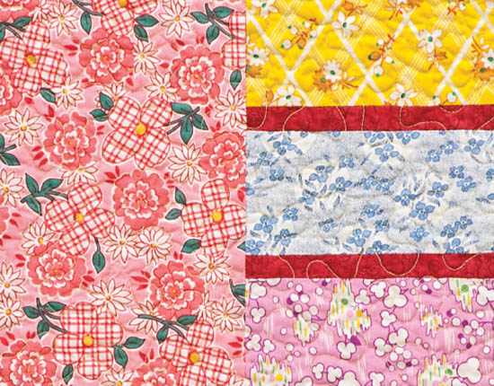
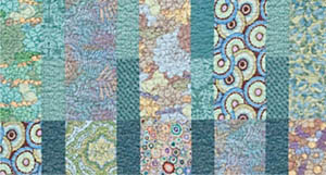
Regardless of your background in design, how well you draw, or whether you think of yourself as a creative type, you can learn to make good design decisions when making quilts. Although there are no formulas or recipes for good design, there are tools that can help you make better design decisions and get you unstuck when you can’t figure out how to fix a problem with the color or composition of your quilt. For each of the ten original patterns in this book, we have provided opportunities for you to make design decisions that will make each quilt your own.
This section of the book reviews the design principles that will help you make good design decisions, regardless of your design aesthetic. We will delve into color theory and concepts such as figure/ground later. For now, the most important aspect of design is having a vision or a source of inspiration. Sometimes that vision is what we refer to as “The Big Idea”—an idea, a memory, or a metaphor that serves as the inspiration for your quilt. In some instances, the vision is inspired by the feel or mood of a collection of fabrics. Sometimes the vision is highly intuitive and is difficult to articulate. Sometimes it is a person or place.
When we teach, we often find that students are in a hurry to choose fabrics and block patterns and rush through the vision part of the process. Sometimes it’s because they are just anxious to get sewing; other times it’s because getting the vision down can be hard. Editing ideas requires concentration and a mental stamina that almost everyone finds challenging. Both of us have master’s degrees in design and decades of design experience, yet we will sometimes spend days and days agonizing over fabric choices because we’re unsure if a fabric that we like will work or if it will make the whole vision fall apart. Having a vision for a quilt helps us answer these questions and make good decisions.
Like many things, putting time and effort into preparation means easier execution later on. So before you start planning your quilt, think about your vision. Write down a few words to describe the tone of the quilt you have in mind. Is it light and airy or strong and masculine? Sweet or bold? What memory or feeling do you want it to evoke? Is there one fabric that’s like the designer’s ashtray (see sidebar) that you want everything else to work around? What’s your vision? If you’re unsure about a fabric, ask yourself if it supports your vision. If it doesn’t, see if the palette improves when you take it out. If you remove the fabric and it doesn’t look as though anything is missing, then it probably doesn’t belong in that quilt.
HAVING A VISION
A designer who works for a manufacturer of home furnishings once recounted a story to us about working with a famous designer. In the first meeting to discuss a new line, the famous designer pulled out a vintage ashtray he had bought in Paris and said, “Design the whole line to work with this ashtray.” Rather than talk for hours trying to convey his vision, he suggested that the designers analyze the details and color of the ashtray and figure out how those details would transfer to other pieces in the collection. Intuitively he knew that the little ashtray would convey his whole vision to the designers working on his line.
It’s important to know and understand some color terminology so you can understand basic color theory.

Color wheels show the relationships between hues and values.
Each spoke of the color wheel represents a dierent hue. In this case violet has been highlighted.
Each spoke of the color wheel shows a single hue in a range of values. Here you can see how the violets would be perceived as shades of gray.
The color wheel
Hue is what is commonly referred to as “color.” Think red, blue, or green. Hue can also refer to a collection of colors, as in “red hues.” Each spoke of the color wheel represents a different hue.

Red is the hue of this fabric.
Orange is the hue of this fabric.
Yellow is the hue of this fabric.
Green is the hue of this fabric.
Value describes the lightness or darkness of a hue. Most paint swatch strips at the hardware store contain the same or similar hues in different values, ranging from light to dark.
Spokes of the color wheel have the lightest value of each hue at the center and the darkest value at the edge.
The swatches from the previous page are arranged by value from lightest to darkest.

Saturation refers to the intensity of the hue. Note that this is not the same as value. The soft yellow is less saturated than the darker yellow.
Light but soft yellow fabric
More saturated yet darker yellow fabric
You can have two pinks of the same hue and the same value, but one will be called shocking pink or hot pink because it contains more pigment or dye. Think about neon orange; it is different from the orange you would find in the fruit. That’s saturation.
Variations in hue, value, and saturation set the tone for a quilt, so take your time figuring out what tone you want to set.
Annotated color wheel
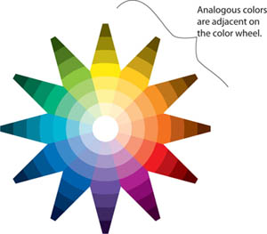
Analogous colors are hues that are adjacent to one another on the color wheel. They have very little contrast of hue.
Analogous colors
Annotated color wheel
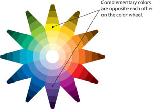
Complementary colors are two colors that are opposite each other on the color wheel. Complementary colors have the most contrast of hue.
Purple and yellow are complementary colors.

Green and red are complementary colors.
Over the years, we have noticed that some of our students get into palette ruts. “These are my colors,” they say, as if the colors that they work with were predetermined. They often show us quilt after quilt in the same palette. We try to figure out whether they are afraid to try something new or whether they have just banished some colors from their stash the way a former U.S. president once banished broccoli from the White House.
In an attempt to get quilters out of their ruts, we ask them to look through our scrap bins to find a swatch of fabric that they would normally never, ever use. We instruct them to focus on the fabric’s hue, not its print. Once they find their swatch, we have them pin it to their keychain for a week so they can look at it whenever they reach for their keys. We encourage them to take a second in the produce aisle at the grocery store, for example, to find fruits or vegetables that are either complementary or analogous to that swatch. “What color would you need to combine with the one you dislike to make it appealing?” we ask.
The goal of this exercise is more than just getting students to use new colors. It’s about getting them to realize that we all see colors in context. Many students choose a variation of mustard as the color they most despise. “Looks like baby poop” is a refrain we’ve heard many times. In a fabric store, next to a bright, clear floral, the mustard looks dull, and that’s the context in which many quilters think about mustard (although there may be some who really are reliving their diaper-changing days when they see that color!). But when we pull together a palette of eggplant purple, chocolate brown, olive green, and mustard, that same mustard shade starts to look more like a rich gold. Suddenly everyone is puzzled. They look at that swatch on their keychains and seem even more puzzled. It’s as if mustard has a glamorous, trendy life no one ever knew about.
More than once we’ve pointed out that the “yucky” color is the color that, when added, completes a quilt that has been perplexing to the maker. Without that color, the palette seems incomplete.
We can’t deny that there is the occasional student who comes back at the end of the week and says, “I didn’t like it then, and I don’t like it now. I’m going back to my favorite blues.” For the most part, however, students figure out that it’s all about the context in which they’re seeing a color and that an important step in growing as a designer is to re-evaluate preconceived notions about color.
Scale refers to the size of the pieces or motifs within a quilt. Large forms or pieces tend to look bolder, while smaller pieces create a finer visual effect. Scale is perceived within the context of the quilt’s overall size. A 4″ block may seem like a medium-sized block in a baby quilt, but in a king-sized bed quilt, that same block would seem small.
Engaging the edge is a design term used to describe a design element that continues off of the quilt’s edge. We don’t design from a rulebook full of absolutes; instead, we try to think about the effect of each design decision on the overall design intention. Sometimes it’s more visually compelling to have an element continue off the edge of the quilt, while other times, having elements appear to be contained within the quilt is more desirable. In general, engaging the edge can really anchor a design element, making it bolder. In contrast, having elements float without engaging the edge can give a lighter, more ethereal effect.
Some quilters believe that every quilt should have a border; we’d argue, however, that deciding whether a border is necessary depends on the quilt’s composition. Many quilts look better without a border because they engage the edge and do not feel constrained. Borders can also vie for attention, which can weaken the strength of the composition.
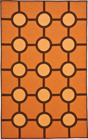
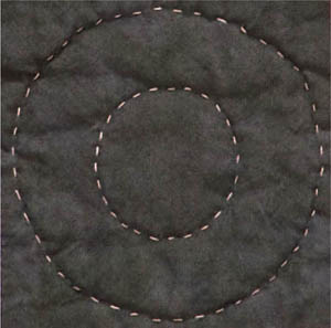
Here we show Big Dots (page 100) as it is, engaging the edge, and as it might appear with a border. Note how the border contains the circles, making them less dynamic.
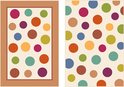
Quilt with border (left); same design engaging edge (right)
In this illustration of two joined rectangles it is clear, due to their contrast, that there are two separate pieces.

These are clearly separate rectangles.
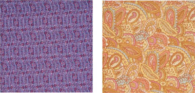
On the other hand, the following illustration reads as a single toile fabric at first glance.
Look closely and you’ll see the center “seam.”
Upon closer inspection we can see that it is two separate pieces, seamed in the center. They read as a single unit because of what designers refer to as their figure/ground relationship. In design terminology, the black illustrations would be called the figures, while the white field would be called the ground.
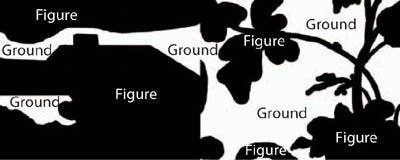
The figures and the grounds blend together.
This concept of figure/ground is especially important for quilters to understand because figure/ground problems frequently arise when large-scale fabrics are placed next to each other or next to similarly colored fabrics. Instead of reading as separate pieces, the forms of the figures can blend with other pieces. Imagine a traditional pinwheel or star block made of toiles such as these. The forms of the individual pieces would be lost, and the block itself would be extremely hard to make out.
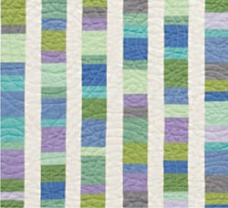
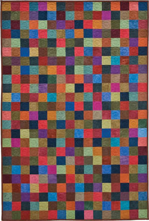
Many quilters forget to think about the proportion of colors in a quilt. It’s easy to see how this could happen: A quilter in a shop has just found a pattern and wants to buy fabric for it. The pattern calls for three yards total of six different fabrics. The sample quilt shows equal amounts of each color. Without thinking that maybe the proportions could be different, the quilter asks for half a yard of each fabric. Although some patterns do require equal amounts of all fabrics, there are many situations in which it is preferable to have more of one color than another. Unequal amounts of color can help create a more dynamic composition or add luminosity to the quilt. This is where having a vision is helpful. You may want to replicate the sample quilt exactly, but this might lead you to miss an opportunity to customize a pattern by changing the proportions of colors.
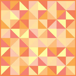
Broken Dishes pattern with equal proportions of color
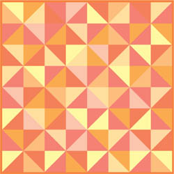
Broken Dishes pattern with varying proportions of each color
COLOR PROPORTION
In a beginning quiltmaking class, a young woman wanted to make an abstract portrait of her new puppy. She was new to sewing and was inexperienced at cutting fabric, so she wanted to use a simple checkerboard pattern with 3″ blocks. She chose brown fabrics that reminded her of the puppy’s fur. She told us that the puppy constantly nipped at her ankles and barked every time she walked in the door. She really wanted to capture that puppy’s energy, so she included a few dark pink squares among the brown squares at the bottom of the quilt to suggest the ankle nipping and barking.
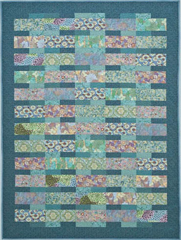
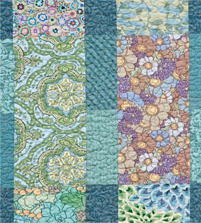
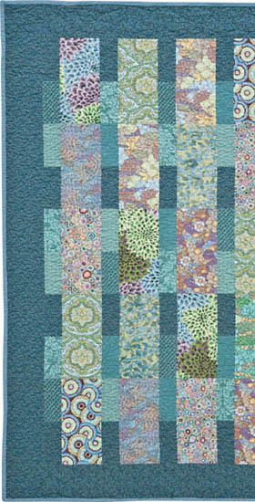
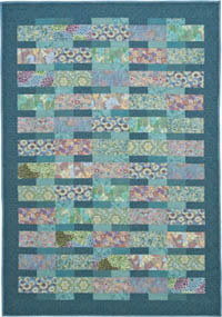
We typically think of quilts as being two-dimensional, but in truth it’s more complicated than that. In art history classes, students are taught to analyze the foreground, the middle ground, and the background of figurative paintings to understand the composition. Likewise, in quiltmaking, there may be many visual layers. Transparency (page 62) is an excellent example of a quilt with multiple design layers. The quilt was designed to appear as though several sheer layers of fabric had been laid on top of one another. The viewer can easily imagine three layers, but the quilting adds even another visual layer.
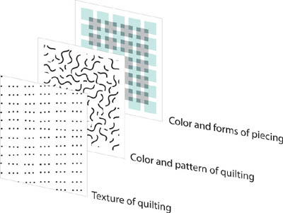
Layers of design
Quilting is an important layer of design, so it should be considered as carefully as the colors of the fabrics. Many quilters stitch in the ditch because they don’t want their stitching to show. In many cases, they confess that they are just tired of the quilt and want to finish it, so they don’t want to give much thought to the quilting or binding. We’d like to convince you that quilting is an important design layer that should be carefully considered. The shadows created by quilting and the thread colors will change the appearance of your quilt.
Other quilters think that fancy stitching patterns are inherently better than simple ones. They belong to a club that we refer to as the “More Is Better Club,” which believes the more pieces, the better; the more stitching, the better. In lectures we refer to Victorian crazy quilts as “More is not enough,” suggesting that these over-the-top quilts have so many layers of design that they are dizzying. The trick is figuring out where the line is between lush and overdone. The recent trend of quilt embellishing is a parallel situation—sometimes it’s breathtaking, and other times it leads us to use a favorite expression: “Just because you can doesn’t mean you should.” Knowing when to stop and how to edit may require thought, but it is well worth the energy.
When thinking about the quilting design, consider the role that the quilting will have in the quilt’s overall design. For example, when we chose the quilting for Double Dutch (page 70), which was made from feedsack reproduction fabrics, it was clear to us that it was already visually busy. The last thing that quilt needed was a lot of fussy quilting. Conversely we designed Small Change (page 108) with the intention of showing off the hand quilting. Realizing that quilting is an important layer of design will help you be more intentional about the way you quilt your quilt and will help you know when to stop. For more on the role of quilting, see page 44 and page 134.
When developing the palette for a quilt, the most obvious consideration is where the quilt is going to be used. Sometimes you want the colors of the quilt to work with other furnishings. Other times you will have flexibility in the color selection—a situation that might delight some quilters and confuse others. In either case, having a clear vision will help you eliminate colors or fabrics that you may love but that aren’t right for a particular project.
CELEBRATING HERITAGE THROUGH COLOR
Sometimes narrative is more important than the existing decor. In a beginning quiltmaking class, we had a student who was five months pregnant. She wanted to make a simple baby quilt in the traditional Broken Dishes pattern for the son she was expecting. At the beginning of the class, she showed us the swatches of beautiful sage green and grayish blue that she had chosen for the nursery. Within about 30 minutes of listening to our explanation of the power of color to evoke memory, however, she abandoned her original palette and came up with an unforgettable source of inspiration.
She decided to make her quilt using brown, white, and terra cotta–colored fabrics. She explained that she was the descendant of slaves who had worked in the cotton fields of Georgia. She wanted her baby to know his heritage and to remember all that his ancestors had endured. The white represented the cotton in the fields, the terra cotta fabrics reminded her of the iron-rich orange soil of Georgia, and the browns suggested the variety of skin colors of her ancestors working in the fields. The story of that baby quilt always reminds us of the power of color and how, by thoughtfully choosing the colors of a quilt, you can transform a stack of cotton into a family treasure.
When building a palette, you may have a piece of fabric or a collection of fabrics that you just love and that has no narrative; it’s just about a particular fabric or a particular collection of fabrics. Another quilter may have a bold print that she loves and will shy away from adding more bold prints because she worries that the quilt will be too busy or that the other prints will diminish the initial print. Many quilters tend to build their palettes around a feature print, a theme print, or a fashion fabric and then choose some more subdued fabrics, sometimes called companion prints, in the same hue to go with it.
We often compare developing a palette to planning a guest list for a party. If you have one loud guest with a number of more reserved guests, that loud guest will dominate the party. In contrast, if you have a room full of quiet guests or a room full of loud guests, no one person will dominate the others. Therefore, as contrary to logic as it may seem, sometimes adding a loud print to another loud print will make both prints seem less overbearing.
Look at all of the bold fabrics used in Fashion District (page 46). Many of those large-scale, high-contrast fabrics are very dominant when seen alone. However, when combined with other fabrics ranging from large-scale, high-contrast to small-scale, low-contrast, no one fabric takes over the show.
Detail of Fashion District (page 46)
When designing for someone else, it’s important to take clues from that person’s personality or home. Is she soft-spoken or the life of the party? Is he a modern minimalist, or does he love pattern and texture? If you choose a word or a memory to describe the look that you’re after or the person for whom you are making the quilt, it will be easier to assemble the palette once you’re in the fabric store. Even those of us who make quilts for a living can sometimes lose focus when an alluring print beckons us from the far side of the room. It’s just so easy to get distracted in a quilt shop!
You might also want to take the cue from a personal memory. Many people use old clothing to remember someone who passed away or baby clothes as a means of holding onto those precious childhood moments—but it needn’t be so literal. You can also assemble a palette of fabrics inspired by the colors in a recipient’s favorite shirt or the dress you always picture her wearing. The important thing is to think about the colors and to ensure that they are meaningful to the recipient. One of our students made a fabric portrait of her father from army fatigue fabrics and a novelty fabric with grapes on it. Her father had served in the army in World War II in Italy, where he met his future wife and began making his own wines. Although a stranger might not know the significance of these fabric choices, you could tell they were a special combination that would instantly be understood by her father.
THE ILL-FATED MAUVE QUILT
One note of caution: Even though we weren’t fond of the colors, we once made a rose, pink, and mauve quilt for a friend, because she had a dusty-rose sofa. It turned out that the sofa was a hand-me-down, and she hated the color and couldn’t wait to re-cover it. Months later, our well-intentioned quilt looked awful on the newly slip-covered emerald green sofa! Now we make a point of asking, in subtle ways, about any redecorating plans before we commit to a palette.
Although some quilters think of solids as old-fashioned or boring, we love their timelessness and flexibility. Solids can also be essential when you’re trying to achieve a graphic look, as in Beach Glass (page 76). It’s an added bonus that solids generally cost about 30 to 40 percent less than printed fabrics.
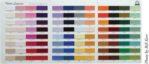
The main challenge when using solids is to find a retailer that carries a good selection and then to find the right hue. To complicate things further, different manufacturers use different base cottons, known as greige goods. One manufacturer may have a wide variety of hues, but its fabrics may tend to ravel every time you cut them because the greige goods are woven with thicker fibers than solids produced by other companies. Another manufacturer may have finer greige goods, but their dyeing process may be inconsistent, so the fabric may often look mottled. Yet another manufacturer may use nice greige goods, but its selection of hues may be more limited than we would like. Many manufacturers sell swatch cards so consumers can order solids online and be confident that they will be getting the color they want.
Swatch card of solid fabrics
Detail of Beach Glass (page 76)
Tone-on-tone prints are often found on the color wall at quilt shops. We think of these fabrics as workhorse fabrics, and they are often overlooked by quilters as being uninspiring. Quilts that are about interesting forms or elegant colorwork may not work with big, splashy prints. Tone-on-tone prints are ideal for quilt patterns that are graphic or that have subtle colorwork. Tone-on-tone fabrics, it could be argued, require more thought because you have to work at finding an interesting combination of colors. The beauty is that you can combine dozens of them, and no single fabric will take over the show.
Many quilters mistakenly believe that if they wouldn’t want a dress or shirt out of a fabric, then it’s not worth buying. We try to explain to our students that it’s not about whether you love it on the bolt. It’s about whether it fills a void in your quilt.
Tone-on-tone fabrics
The scale of motifs in fabric is limited by the technology available in the fabric printing process. Motifs are placed on fabric in repeats. Repeat refers to the distance between identical motifs. Traditional calico prints had small motifs because they were printed with older machinery that could only accommodate small repeats.
Traditional calico repeat
Advances in printing technology in the twentieth century enabled fabric manufacturers to print at much larger scales. Large motifs and wide repeats are visually bold but require extra care and planning in quilts. Modern quilt fabrics often have repeats as large as 18″ or 24″.
Large-scale repeat
Some people love the boldness of large prints and wide repeats when they see them on the bolt in the store. But those same people get lost when they bring the fabric home and look at it with the rest of their stash. We know this because we frequently are asked in workshops for advice on how to use large-scale prints—people love them, but often find them challenging.
When considering a large-scale print, first figure out if the motif is on a solid field or if it is collaged with other motifs. If the motif is on a solid field, then you’ll want to make sure that the pieces you’ll be using are big enough to accommodate the scale of the motif. Collaged motifs, even if they are in big repeats, are easier to use, because the motifs fill the piece, no matter how small. If you want to use large motifs on a field, just realize that you may have to fussy cut some of your pieces so they don’t create awkward shapes in the quilt.
Large-scale print with motif on solid field
Large-scale print with collaged motif
Awkward cutting problem with motifs on solid field
Similarly, the scale of motifs on a quilt and the size of the blocks should correspond to the size of the overall quilt. For example, a fabric with a ¼″ motif on a field with a ½″ repeat might look a little flat as the backing for a king-sized quilt. Conversely, we often see people trying to use fabrics with 20″ repeats in small or thin pieces. The spirit of the fabric often gets lost when it’s cut up too small; sometimes you can’t even tell what the motif was in the first place because the fabric has been cut up so much. Although this might work on occasion, such as in a watercolor quilt, usually the magic of the fabric will be lost.
Large-scale print cut into small pieces
To avoid this problem, create a viewfinder: Cut a piece from a sheet of paper the size of one of the pieces you’ll be using in your quilt. Then, take this sheet to the quilt shop and hold it up against the bolt in various places to see what the fabric will look like when cut that size.
Use viewfinder to preview how fabric will look cut to size.
In the past decade, fabric manufacturers have developed mass-production techniques to print fabrics that simulate hand-dyed fabrics. Although some quilters actually use fabrics that are hand-dyed, such as the Cherrywood fabrics in Roundabout (page 84), most of the fabrics sold commercially are mass-manufactured, rather than being dyed by hand. These fabrics have mottling that gives them a more irregular appearance than solid fabrics or fabrics that are printed motifs.
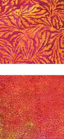
Batiks
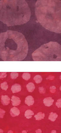
Hand-dyed fabrics
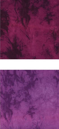
Simulated hand-dyes
Batiks and hand-dyed fabrics are best used in larger pieces and with patterns that aren’t overly complex, as this enables the viewer to see the fabric’s mottling and subtle color shifts. When cut into smaller pieces for use in complex blocks, however, the fabric’s mottling begins to compete with the form of the block, resulting in visual confusion. In contrast, batiks and hand-dyed fabrics can turn the simplest, most traditional blocks into abstract works of modern art. It’s all about pairing the right fabric with the right pattern. The mottling of hand-dyed fabric looks wonderful in Small Change (page 108), but it might compromise the clean lines of Roundabout (page 84).
Small Change
Roundabout
Even as authors of a book on color theory for quiltmaking, we still find ourselves occasionally stunned at how different a fabric looks in the quilt shop than it looks under the lights in our studio. Purchasing fabric online presents an even greater challenge, though in some instances this can be the best solution, especially when it comes to finding solids. We select fabrics for a quilt in the same way we purchase the ingredients for a special dinner, by following a list of ingredients. However, just as with grocery shopping, if we get to the store and find that there are some especially interesting fabrics that we hadn’t considered, we are open to changing the design on the fly.
For example, sometimes we’ve assembled a palette from our stash for a quilt, and we just need one more fabric to complete the palette. In this instance, it’s easy to focus on looking for that one fabric. But once in a blue moon, we go in a quilt shop and need to get everything for an entire quilt in one stop. This usually only happens when there are just three or four fabrics in the quilt.
In either case, before you head out to a fabric store, cut swatches of fabrics that you already have and plan to use. Once you see fabrics that you think might work, take the bolts to a nearby window or, if possible, go outside and look at them in daylight. Artificial lighting makes it difficult to see the relationship between fabrics, so you want to have the best light possible to make sure the fabrics look good together.
If you buy fabric online, you’ve probably already figured out that the color on every computer monitor is different, making it a challenge to figure out if the fabric you have in your hand will work with the fabric you’re seeing on the screen. Here’s our favorite trick for buying fabrics online: Find a fabric that you have in your stash, and see if the online retailer has it as well. If the site has the fabric, see if it also has a virtual design wall. (Some online retailers offer a virtual design wall that allows you to put several fabrics you are considering buying adjacent to one another on the screen.) Choose the fabric you already own, and place it on the virtual design wall along with the fabrics you are considering. Although you still won’t know the exact color of the fabrics you’re purchasing, you will be able to see the relationship among them. If one is too vivid next to the other, you’ll see that. If one looks too blue or too pale in relation to the other, you’ll see that too. We’ve used this technique successfully many times for online purchases, and we can usually tell before we click the “buy” button whether the combination of fabrics we have on that online design wall is going to work with what we have at home.
DEVELOPING
THE PALETTE FOR
FASHION DISTRICT
Most of our quilts include more than ten fabrics, which means it can be challenging to find everything we need in one place. When we went looking for the fabrics for Fashion District (page 46), we started off with a totally different palette in mind. But then we happened to see three fabrics grouped together that made us abandon the original palette and consider a new one. We decided to buy the three fabrics, gambling that we would be able to put together the rest of the palette from elsewhere.
Having not planned this palette ahead of time, we tried to remember what we had in our stash that might work with these new fabrics. We are usually pretty good about remembering what we have in our stash, though sometimes when we get home, we find that the colors are just a bit off from what we imagined. When we brought the fabrics home for this project, we were able to add some fabrics from our stash and then assessed what other fabrics we would need to find to complete the palette. For longer-term projects, such as this one, we may cut swatches of each fabric in the palette and keep them in our wallets in case we happen to be near a quilt shop unexpectedly and want to look for that last elusive fabric. In Fashion District, the most difficult fabrics to find were the tone-on-tone gray-blues. It was challenging to find a pairing that was different enough that you’d be able to differentiate the pieces but not so different that the effect was visually jarring.
All this is to say that even the most experienced quilters may have difficulty finding the right fabrics for their projects and knowing them when they see them. Our best advice is to familiarize yourself with as many resources and retailers as possible. Always be on the lookout for fabrics that work with fabrics you already have and like.
Fashion District (Project instructions start on page 46.)
Many quilters have a design wall where they pin up parts of quilts as they work. Our design wall is a 4′ × 8′ piece of Homasote wrapped in white flannel. Homasote is an environmentally friendly building material that has been in production for nearly 100 years, and that is made of compressed, recycled newsprint. Homasote can also be painted. Single quilt blocks cling to the flannel covering on our Homasote board. However, finished tops and finished quilts are too heavy, so we pin them to the board. If you want a less permanent alternative to a design wall, you can purchase a removable, reusable tacky wall sheet called a Block Butler.
A design wall will help you see your work from a distance. Fabrics look very different up close than they do when viewed from 10 feet away. Periodically take breaks from sewing and put your work on a design wall so you can see if it is visually pleasing from a distance as well as up close.
Another reason to have a design wall is that it will help you edit your fabric choices. When standing at a fabric store, it can be challenging to decide which fabrics will work and which won’t. Being surrounded by so much color and so many distractions can be visually overwhelming. Fluorescent lighting can also make colors look different in the store than they do at home.
Before you start cutting up all your fabric for a quilt, pin it up on the design wall to see if anything looks out of place. Pay particular attention to fabrics that have white in them. If you have multiple fabrics with white in them, such as the feedsack reproduction fabrics we used in Double Dutch (page 70), then you’ll be fine.
Detail of Double Dutch
Some quilters go into fabric stores, however, only looking for a specific shade—such as blue. They may not be paying attention to the fact that most of the fabrics they purchased have no white in them at all, while two have little bits of white. When combined with the no-white prints, the prints with small bits of white will visually pop. Sometimes the solution is to add more with white, and sometimes it is to eliminate those with white all together.
In the early 2000s, large-scale prints began gaining popularity among some quilters. These large, gregarious prints are cheerful and playful but can be challenging to use in large groupings. Some quilters get nervous combining these large-scale prints, so they just select one or two and then pair them with tone-on-tone prints, hoping that the quilt won’t get too busy. Others select a dozen or so large-scale prints and use them as they would smaller-scale prints—this strategy works best when the blocks are large and simple. If the blocks are more complex, the fabrics tend to blend into one another, making the piecing hard to see.
If you’re not happy with the way the fabrics are interacting, take a look at the scales you are using. In Fashion District (page 46), we intentionally used a variety of scales of fabric so the large-scale fabrics wouldn’t all blend together and create figure/ground problems. Using fabrics of the same palette but of different scales ensures that the edges of the pieces remain clean and visible.
Fashion District (detail) uses large-scale fabrics.
We’ve attended many guild meetings as guest lecturers. Often a guild member displays a quilt at show-and-tell and explains that she added a wide border because she either ran out of fabric for the blocks or “got tired of making so many blocks.” Other quilters tell us they’ve used borders to make the design better fit a specific bed or mattress size. If a border is not thoughtfully integrated into the design, however, the proportions of the quilt can become visually awkward. Sometimes the border is too narrow or, more commonly, too wide in relation to the size of the blocks. The sheer expanse of a wide border made of a busy fabric might overwhelm the beauty of an elaborately pieced center. That is not to say that borders are inherently bad. It’s just that you need to consider whether a border adds to the design or relates well to the other quilt elements.
There are no absolutes in getting the right design elements in a quilt, but having an awareness of design principles (pages 9–21)—especially of engaging the edge (page 17)—can go a long way in making better design decisions.
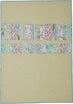
There are many factors to consider when choosing a backing fabric for a quilt. Often you’ll want a backing fabric that has a similar feel to the fabrics on the front. However, there may be times when a contrasting backing fabric adds a welcome surprise to a quilt. For example, a black-and-white quilt with a red backing fabric could be wonderfully graphic when turned down on a bed. Even a baby quilt done in pastels might be more interesting with a contrasting, yet still gentle, color on the back.
If the width of your quilt exceeds 42″ and you plan to use standard quilting fabric (which is about 42″ selvage to selvage), you will need to piece together a backing. Before you commit to a large-scale or high-contrast print for a backing, try to figure out how challenging it will be to seam it together. Trying to sew two pieces of fabric while matching a large repeat can be frustrating and will require extra fabric. Although 108″-wide backing fabrics are available from some manufacturers, the colors and prints available are limited.
Another factor to consider when choosing a backing fabric is the color of the quilting thread you’ll be using. Whether you choose a matching thread or a contrasting thread, you’ll want it to look good against the backing fabric. However, if your quilt is a wall-hanging—the back of which will rarely be seen—the quilting thread color on the back is less important. (We discuss thread color and the issue of “poke through” in more detail on page 42.)
Finally, if possible, decide on your binding when you choose the backing fabric. Sometimes not being able to find the right binding will necessitate changing the backing fabric. Making those decisions at the same time will prevent you from ending up with fabric you can’t use.
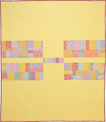
We had so much fun making the pieced backings for Fashion District (page 46) and Double Dutch (page 70). Pieced backs can serve a double purpose: Not only do they use up scraps from the front of the quilt, but they also can add playfulness to the quilt’s overall feel.
Double Dutch
Fashion District
Double Dutch backing
Fashion District backing
If you’ve never made a pieced backing for a quilt, plan ahead how the quilt will be quilted. The improvised bands on the pieced backing of Fashion District are a good example of a simple way to piece a backing. Because the bands were pieced improvisationally, we were able to trim down the front of the quilt without having to worry about how the back would look. Regardless of where we decided to cut along that improvised band, we knew it would look fine. The placement of the bands also accommodated slippage of an inch or two without creating a problem visually.
On the other hand, piecing a backing with square blocks that must line up precisely with the front is far more challenging. Whether you are quilting by hand, on a home machine, or on a longarm machine, quilt backs have a way of shifting during quilting. Even if the back only slips ½″ in any direction, you will need to trim the quilt, which means the blocks will get trimmed in an awkward place.
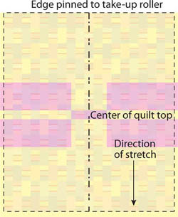
If you are quilting on a longarm machine, you are likely to have more slippage in the direction perpendicular to the machine’s rollers. In addition, the backing and top will always stretch differently under the slight tension from the rollers. For Double Dutch, we pinned the top, but not the sides, to the rollers of the longarm so that if the pieced backing slipped, it would slip vertically, not horizontally. Although it’s less efficient with the batting to pin it this way, if we had pinned the long edge onto the rollers and the backing had slipped, the layout on the back might have looked lopsided. It didn’t matter if it slipped vertically, but it would have looked odd if it hadn’t been vertically symmetrical.
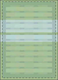
Fashion District top superimposed on pieced backing; front can be trimmed anywhere.
Double Dutch top superimposed on pieced backing; slippage or stretching isn’t problematic when quilt is pinned this way.

Double Dutch top superimposed on pieced backing; slippage or stretching is problematic when quilt is pinned this way.
Batting has come a long way since we first started quilting. That poofy, high-loft polyester batting was hard to quilt, and the fibers migrated through the holes created by the quilting. Even some of our hand-quilted pieces are constantly shedding unappealing white fibers years later.
“What kind of batting do you use?” is a question we are often asked. Presumably people ask because our quilts have so much texture. For most of the quilts in this book, we used Quilter’s Dream Request 100% cotton batting. Request is a low-loft cotton that drapes nicely and shrinks slightly in the dryer.
The texture in the quilts you see in this book is the result of combining a certain density in the quilting with this batting and shrinking in the dryer afterward. In the styled photographs, we took great pains with the photographer to make sure that he lit the quilts so you would be able to see this texture. Note that using the same batting we used will not necessarily produce the same results if your quilt is stitched too loosely or if the quilt isn’t machine dried (on low).
Some quilters prefer cotton/polyester blends for batting, because they offer the drape of cotton but don’t shrink as much as 100% cotton. If you want your quilt to be flat, batting with some polyester in it will help you achieve that effect.
Small Change (page 108) was hand quilted with a Quilters’ Dream washable wool batting, which we often use for quilts in our home. Although it has a higher loft than cotton, it is light, warm, and machine washable. Even on low, though, it will shrink a bit in the dryer.
For charity quilts, we often use polyester batting because it’s cheaper than cotton and because quilts quilted with polyester batting are lighter for shipping and dry faster in the dryer. The quilt tops don’t shrink with the polyester batting, so they have less texture; however, with the right amount of quilting, they will still have some texture.
Quilt batting manufacturers have also developed bamboo, bamboo/cotton blend, soy blend, and recycled polyester blend battings in an attempt to offer more sustainable selections. The distance between stitches necessary to maintain the integrity of the batting, as well as the respective lofts of these new types of battings, should be carefully considered before purchasing them. At least one brand of eco-friendly batting that is made from recycled plastic bottles has a light green tint that is problematic for light quilt tops but fine for darker tops.
We have had bad experiences with bleached cotton batting. In the same way that a white bra becomes very noticeable under a thin or lacy shirt, some bright white battings emphasize the double layer of fabric created by the seam allowance resting on the back of the quilt top. We have not had this problem with unbleached battings.
The decision about which batting to choose should be made with the following criteria in mind:
• How and where will the quilt be used?
• How often will it be washed?
• Do you want a crinkly texture (cotton) or a flatter appearance (polyester or polyester/cotton blend)?
• How densely do you plan to quilt it?
• Do you plan to quilt by hand, on your home machine, or on a longarm machine?
If you’re sending the quilt out to be quilted, consult with the machine quilter on the type of batting that will be used. Ask if you can supply your own batting to suit your needs. If the machine quilter is only willing to use one kind of batting and it’s not the one you want, you’d be wise to find another quilter. The choice of batting will greatly affect the appearance and wear of the finished quilt. Make sure you get the batting that is the most appropriate for the use of your quilt.
In our junior high home economics class, we were always taught to match the thread to the fabric when sewing. In quilting, it’s more complicated than that. Sometimes the design will suggest a light touch, as in Transparency (page 62). This quilt is all about soft colorwork that suggests transparency, so a thread that doesn’t call attention to itself was preferable. Small Change (page 108), on the other hand, is all about the hand quilting, so we chose an oatmeal-colored thread that is much lighter than the fabrics in the quilt.
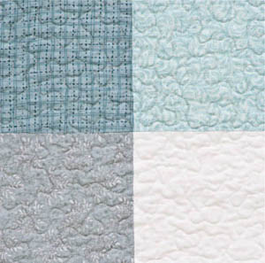
Transparency’s quilting thread blends with its fabric.
Small Change’s quilting thread contrasts with its fabric.
If you’re having difficulty deciding on thread value when your quilt top has lights, mediums, and darks in it, split the difference. Look at the lightest fabric in the quilt and then the darkest fabric. Select a thread that is neutral in hue but that is halfway between the lightest and darkest fabrics in value. If you go too light, the quilted areas with the dark fabrics may visually pop, while a thread that is too dark may appear black on the lightest fabrics. If in doubt, try the lighter value.
When choosing thread, quilt a test block with the thread you have in mind. In general, threads will tend to look darker once quilted because the recess created by the quilting and the loft of the batting creates a shadow that makes the thread appear darker.
When machine quiliting, sometimes we use different color threads on the front and the back of a quilt. If the colors are similar in hue and value, this can work. On the other hand, a dark thread on the back of a quilt with light thread on the front will sometimes result in what we refer to as “poke through.” We use this term to describe little dots of contrasting thread that can be seen on either side of the quilt if the tension isn’t perfect. If you are using contrasting threads for the front and back, do a quilting sample to see how much poke through you can expect.
Although a strand of thread may be small, the role of the thread in the quilt is big. Some quilters assume that a variegated thread is ideal because it will blend into a multicolored quilt. Although there may be situations in which a variegated thread is a good idea, most of the time it can be visually distracting. Variegated thread can also look very heavy and call unwanted attention to itself when a dark section of thread falls on a light section of the quilt. We have found, with astonishing frequency, that a mousy gray or medium taupe often disappears into multicolored quilts.
As you consider how you are going to quilt your quilt, think about the role of the quilting. If you want the quilting to disappear, you might want to quilt with one neutral thread over the entire top, so that no one element appears more important than another. Quilting in one color and pattern also flattens the quilt’s appearance. Double Dutch (page 70) is a visually busy quilt. Because it has a lot of colors and patterns in it, we decided to keep the quilting simple. We used one thread color and one quilting pattern to tone down the quilt and unify its blocks.
Single quilting thread color for Double Dutch unifies palette.
Changing threads can further differentiate elements in a quilt. In Birds on a Wire (page 114), we wanted the birds to appear in front of the sand-colored field. To accomplish this, we matched thread colors to the birds and the field.
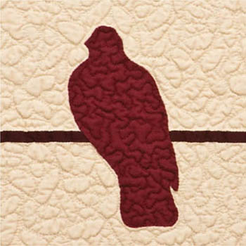
Quilting isolates birds from background.
In the same way that we think complex fabrics look best with simple block patterns and simple fabrics work well with complex blocks, we often pair simple quilting patterns with visually complex quilts. Similarly, minimalist quilts can support more complicated quilting.
Students often show us quilts that are perplexing them. They keep trying to add more visual interest to the quilt to make it “better.” But most of the time, all they need to do is remove competing elements or simplify the quilting that they had in mind. If you have a quilt with a lot of different design elements in it and dozens of prints, consider the simplest possible quilting option. If you aren’t sure how it will look, take a photo of the quilt top, print it out, and lightly sketch with a pencil the quilting pattern you have in mind.
We often suggest that students consider three totally different options for quilting before they decide on one. People often latch onto the first idea that pops into their heads and stop considering other options. If you try to come up with three different options, ranging from simple to complex, you might come up with something that works better than your original idea. If you’re going to go to the trouble of having complicated stitching, make sure it will be visible. Complex quilting is most visible on a quilt with simple piecing made of solid or tone-on-tone fabrics.
At the other end of the spectrum are quilters who can’t decide how a quilt should be quilted, so they just stipple everything, missing the opportunity to add another design layer to their quilts. Quilting a quilt in a single allover pattern is sometimes a good solution, but be sure to consider stitching patterns other than just stippling. At the right are some of the patterns we used when machine quilting the quilts in this book.
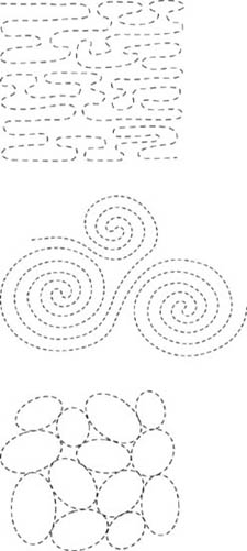
Allover quilting patterns used in our quilts
If you want certain design elements to stand out, you can quilt them in a color or pattern that is different from other elements. If you’re unsure about the quilting, opt for a simple quilting pattern with neutral thread. It’s better to have quilting that disappears than quilting that appears too heavy-handed or that is distracting.