Often, the civil engineer is faced with data and the need to use it to justify decisions or make designs. It is common that the amount of data is large and the engineer requires simple and fast understanding of the phenomenon at hand, whether it is water consumption for a municipality, population growth, trips of passengers, vehicle flows, infrastructure condition, collision on highways, etc.
Statistics plays a key role in providing meaningful and simple understanding of the data. The most famous element is the mean; it represents the average value observed: in a sense that it is like having all observations condensed into one that is at the midpoint among all of them. The mean is obtained by simply summing over all observations and dividing by their number; sometimes, we calculate an average for a sample and not for the entire population:
One problem of having all elements represented by the average (or the mean) is that we lose sight of the amount of variation. To counteract this, we could use the variance which measures the average variation between the mean and each observation:
The problem with the variance is that it could potentially go to zero when observations above (positive values) and below (negative values) could possibly cancel each other. The way to solve this issue is by obtaining the standard deviation (sd), which takes the variance and squares the values: this is one of two possible ways to remove the positive and negative values. The other one is by using the absolute value. The advantage of the standard deviation is that its units and magnitude are directly comparable to those of the original problem, once you square and apply the square root, obtaining an indication of the average amount of variation on the observations (Figure 4.1).
In several instances, it is useful to bin the data in ranges and plot this information using a histogram. The histogram must be constructed in a way that it provides quick visual understanding.
There are two other measures: kurtosis and skewness. Kurtosis is a measure of how much the distribution is flat or peaked and skewness of whether the distribution is asymmetric towards the right or left of the mean.
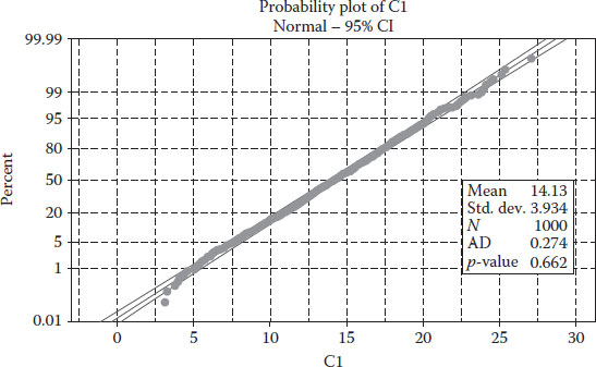
Having data that follow a normal distribution is important because it allows you to use the normal distribution to standardize variables for estimation and prediction analysis.
The most common application of a normality plot is to identify outliers that scape the normal behaviour: this is easily identified by the enveloping lines. Once the spread of observations scape such enveloping lines, one would cut such items from the set of observations, which is typically refered to as cutting off the tails of the data (Figure 4.2).
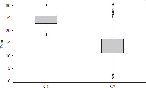
The next tool that is commonly used are boxplots. They represent several elements together in a graphical way. The midpoint of a boxplot corresponds to the mean, and the edges of the box represent equal percentiles; hence, an unbalance is an indication of skewness. Outliers are also represented as dots on the outer edge of each boxplot. Boxplots could be used to rapidly compare two data sets and conclude whether they are representative of the same population or not.
FIGURE 4.1
Sample histogram.
FIGURE 4.2
Normality test plot.
In the previous figure, one can see that both samples do not belong to the same population, the gross area does not match, the first sample has much less variation and the second sample not only has more variation but also many outlier values concentrated on the high values (between 25 and 30).
4.1.1 Statistics: A Simple Worked-Out Example
Suppose you have observed collisions and several possible causal factors related to vehicle collisions. For simplicity, we will have a very small database of four observations; in real life, you will have hundreds – if not thousands – of observations. Our four elements are the number of collisions: the speed of the vehicle at the time of the collision, the length of the road segment and the density of intersections (per kilometre) (Table 4.1 and Figure 4.3).
TABLE 4.1
Sample Data Deterioration
yobs |
v (km/h) |
L (km) |
I (/km) |
9 |
100 |
1 |
0.5 |
7 |
70 |
1 |
1 |
11 |
110 |
1 |
0.25 |
7 |
60 |
1 |
2 |
FIGURE 4.3
Boxplot of C1 and C2.
In the case of length, the mean is equal to the value of each and every observation, and the standard variation is zero. Avery rare scenario for real-life problems. However, as you will see, if this is the case and you are trying to estimate explanatory contribution of factors, you can simply ignore the length from your calculations.
For the number of collisions, we have an average of ((9+7+11+7)/4) = 8.5 collisions. The variance for this example and the standard deviation could be estimated for any amount, even the responses yobs for speed v (km/h) are estimated in Table 4.2.
As you can see, the use of the variance poses a problem, because it does not remove the negative signs; in this particular example, we observe a critical case in which the variance goes to zero, which could be interpreted as having no dispersion (variability) on the observed values of speed. This of course is not true. We can observe values as little as 60 and as high as 110.
The standard deviation correctly captures the dispersion in the same units as the original factor (km/h). Our standard deviation tells us that average variability or dispersion on speed is 20.62 km/h. If you combine this with the mean, you end up with a good grasp of what is going on; observed speed on average fluctuates from 64.38 (mean − std. dev. = 85 − 20.62) to 105.62 (mean + std. dev.).
TABLE 4.2
Variance and Standard Deviation (Std. Dev.)
yobs |
v (km/h) |
L (km) |
I (/km) |
Variance |
Std. Dev. |
9 |
100 |
1 |
0.5 |
15 |
225 |
7 |
70 |
1 |
1 |
−15 |
225 |
11 |
110 |
1 |
0.25 |
25 |
625 |
7 |
60 |
1 |
2 |
−25 |
625 |
Summation= |
85 |
0 |
20.62 |
As a matter of fact, if the values of speed follow a normal distribution, then there is a rule that can be implemented to measure with 95% confidence the dispersion using the mean and the standard deviation. The rule simply states that you add to the mean 1.96 standard deviations (for fast calculation, many authors round this to two times the standard deviation). Then you repeat the same but you subtract 1.96 standard deviations from the mean. These two values capture the spread of 95% of the data and we will use it later on in this book.
4.1.2 Statistics: A More Realistic Example
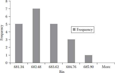
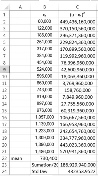
Let us take as an example the data for sanitary pipes (Table 4.3). This example will be useful for learning how to construct a histogram from scratch. I will also provide you with the sequence of steps to do this automatically using Excel. The reader should note that at the time I wrote this book, the latest version of Excel was 2013; in the future, the location of bottoms could change, but I am confident the sequence of steps will remain the same.
Let us produce a histogram. I will do it manually only this time, so that you understand what to get when you do it automatically. Let us do it for the rim elevation. This elevation tells the engineer the absolute value of elevation of the bottom of the manhole and is important when you need to do hydraulic calculations related to the flow of polluted water, passing-by manholes. Remember that manholes are used to change the direction of the flow, connecting two pipes. The slope could change as well.
First, we find the smallest (680.2) and the largest (685.9) values, and then you decide how many bins you wish to use. In my case, I decided to use five bins (I recommend the reader to repeat the calculations with seven bins); it is always advisable to have an impair number of bins wherever possible. Now let us find out the range for the bins: we take the span between smallest and largest (685.9 − 680.2 = 5.7) and divide it by the number of bins ((5):5.7/5 = 1.14). This latter amount is called the increment. Now take the smallest value and add the increment (680.2 + 1.14 = 681.34); this creates the first bin interval from 680.2 to 681.34. We take the high threshold of the previous interval and add the increment to obtain the next bin values 681.34 + 1.14 = 682.48, similarly the third bin goes up to 683.62 and the following bin to 684.76 and the last bin to 685.9. Now, we simply count how many items we observe per bin. The size of each bin will reflect the frequency of observations (count) that belong to it. Table 4.4 gives you a tally of values per bin.
With the counts and the values of intervals for the bins, we can proceed to create our histogram which is presented in Figure 4.4.
TABLE 4.3
Manhole Data
Source |
Year of Construction |
Rim Elevation |
(u − xi)2 |
|
a |
1950 |
684.39 |
3.2 |
|
a |
1951 |
684.2 |
2.55 |
|
a |
1952 |
685.9 |
10.87 |
|
a |
1953 |
682.45 |
0.02 |
|
a |
1953 |
682.31 |
0.09 |
|
a |
1954 |
681.05 |
2.41 |
|
a |
1954 |
680.77 |
3.36 |
|
a |
1954 |
680.56 |
4.17 |
|
a |
1955 |
680.2 |
5.77 |
|
a |
1955 |
680.42 |
4.76 |
|
a |
1956 |
682.12 |
0.23 |
|
b |
1957 |
682.07 |
0.28 |
|
b |
1958 |
681.42 |
1.40 |
|
b |
1958 |
682.13 |
0.22 |
|
b |
1959 |
683.90 |
1.68 |
|
b |
1959 |
683.70 |
1.20 |
|
b |
1959 |
683.6 |
1.00 |
|
b |
1960 |
684.10 |
2.24 |
|
b |
1960 |
684.15 |
2.40 |
|
b |
1961 |
682.36 |
0.06 |
|
b |
1962 |
682.85 |
0.06 |
|
Mean= |
682.60 |
1.55 |
= Std. dev. |
TABLE 4.4
Manhole Data
Low Bound |
High Bound |
Count |
680.2 |
681.34 |
5 |
681.34 |
682.48 |
7 |
682.48 |
683.62 |
5 |
683.62 |
684.76 |
3 |
684.76 |
685.9 |
1 |
If you want to do it in Excel automatically, you need first to install the add-in called Data Analysis. Follow this procedure:
1. Go to the FILE tab.
2. Select Options located at the very bottom of the left ribbon, and a new window will open.
FIGURE 4.4
Histogram.
3. Select Add-Ins.
4. Centred at the bottom you will see Manage: Excel Add-ins;hit on the Go… next to it.
5. A new window will open; you need to click a check next to Analysis ToolPak. I would also advise you to do the same for Solver Add-in as we will use later.
6. Hit OK.
The new add-ins can be found at the DATA tab. Click on Data Analysis, select Histogram, specify the Input range that contains the observations for which the histogram will be constructed, specify the range (you must have written this on Excel’s cells in column format) and hit OK; you will obtain a figure similar to that previously presented.
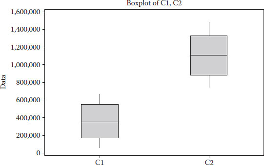
Let us concentrate our attention now on the construction of boxplots. Let us select the year as our variable of interest. Let us also presume that our data came from two separate sources (this has been identified in Table 4.3 with the name source on the first column). If you estimate the median (in Excel, use the command Median(range)) for the first and third quartiles (QUARTILE(range,1) and QUARTILE(range,3) along with the minimum value (MIN(range)) and maximum values (MAX(range)), then you would obtain all the information you need to produce boxplots. For our previous example and for source a and b, our calculations show the values shown in Table 4.5.
Producing a graph from Excel is not so straightforward; however, it is possible. Compute the distances between the mean and the third and first quartiles. This number will define the height of the two bars stacked on the boxplot. The first quartile will be the base reference level to plot each group and will help to compare them. The other element you need to compute is the whiskers; for this, subtract the max from the third quartile and the first quartile from the minimum. These calculations are shown in Table 4.6.
TABLE 4.5
Boxplots
Element |
Source a |
Source b |
Maximum |
1956 |
1962 |
Quartile 3 |
1954.5 |
1960 |
Median |
1954 |
1959 |
Quartile 1 |
1952.5 |
1958.25 |
Minimum |
1950 |
1957 |
TABLE 4.6
Boxplot Elements for Graph
Element |
Source a |
Source b |
Level |
1952.5 |
1958.25 |
Bottom |
1.5 |
0.75 |
Top |
0.50 |
1 |
Whisker top |
1.5 |
2 |
Whisker bottom |
2.5 |
1.25 |
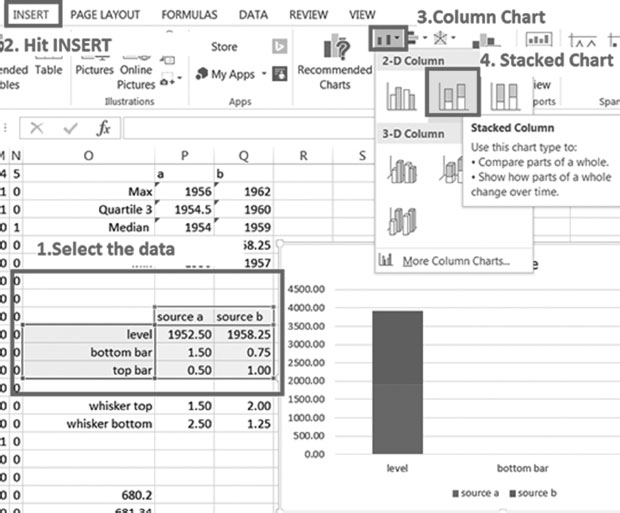
To do this in Excel, create Table 4.6 on your spreadsheet and then follow this procedure.
1. Select the level, bottom and top for both source a and source b.
2. Hit INSERT.
3. Hit Column Chart.
4. Hit stacked column.
Figure 4.5 illustrates steps 1–4.
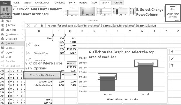
5. Select change row by column (Figure 4.6).
6. Click on the graph and select the top area of each bar.
7. Click on Add chart element and then select error lines.
8. Click on more error bars options.
Figure 4.6 illustrates steps 5–8.
FIGURE 4.5
Steps 1–4.
FIGURE 4.6
Steps 5–8.
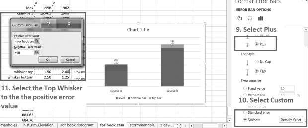
9. Select Plus from the right-side ribbon.
10. Select Custom from the right-side ribbon.
11. Select the Top Whisker to be the positive error value.
Figure 4.7 shows steps 9–11.
12. Repeat steps 7–11 for the bottom whisker. However, in step 9 choose Minus, and in step 11, select the Bottom Whisker to be the negative error value.
FIGURE 4.7
Steps 9–11.
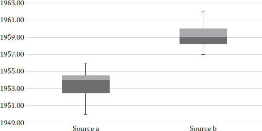
FIGURE 4.8
Final boxplots.
13. Choose again from the bar graph the bottom portion of the bar, click on the top tab called FORMAT and select Shape Fill to No fill. The final boxplots are produced after this. I have shown them in Figure 4.8.
Notice from this you can easily interpret that the two samples do not belong to the same population; it is clear from the comparison of both boxplots that they do not overlap in any way.
Probability refers to the likelihood of an event. The typical notation used for probability of an event is the letter P followed by a term inside a parenthesis that provides information regarding the elements whose probability is calculated, and whether such probability is dependent on other elements. Per instance P(x) reads as the probability associated to an event x; when such event is discrete (takes on a series of finite values), one can simply divide the number of times that x = a is observed by the total number of observations.
For example, if we are interested in the likelihood of observing the density of intersections I equal to 0.5, we can easily see that this happens in one out of the four observations and hence, the probability is 1/4 = 0.25. The likelihood of observing an event can be conditioned to observing values bigger or equal to a certain level; for instance, if the legal speed was 90 km/h, what would be the probability of observing values beyond the speed limit (P(v ≥ 90))? Such values would be the count of observations above the speed limit (2) over the total number of observations (4) so P(v ≥ 90) = 0.5 or 50%.
Typically, the observations that we have were collected beforehand, they represent the results from some experiments and their values could be conditioned by other elements that we can or cannot observe. For instance, the speed v could be conditioned by the age of the driver, younger drivers may tend to overspeed while older drivers would drive below the speed limit and adult drivers will likely drive around the legal speed; we could express a probability of driving above the legal speed conditioned on driver’s age a, and this would be expressed as P(v ≥ 90/a).
We would use conditional probabilities also when we want to know the likelihood of observing an outcome from a specific type of event. The civil engineer will face often the need to use machines to estimate properties of a structure or the soil which cannot be observable directly. The corrosion of re-bars inside a column, the strength of a pavement structure and the bearing capacity of the soil are some examples you will face in your professional life.
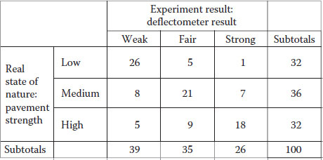
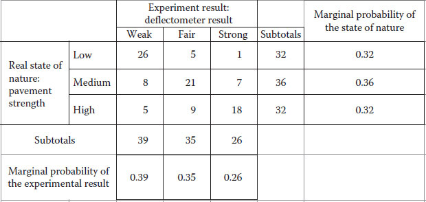
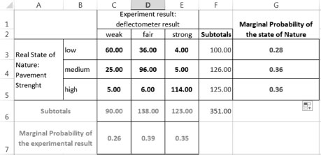
For instance, consider the case in which you have a machine that allows you to estimate the strength of a pavement structure. For instance, think of a deflectometer that reads the amount of deflection on the pavement when a given weight hits it. This aim of using this machine is to characterize the strength of the pavement structure, which is something that we cannot observe directly. The problem is that the machine has a rebound and sometimes the rebound bias the readings, so often the reading indicates a given value but the true value does not perfectly match. Consider, for instance, where we use this machine 100 times, and the results of how many times the machine identifies the correct level of strength are given in Figure 4.9.
For pavement with truly low bearing capacity, the machine has successfully identified the presence of a weak pavement 26 times, but mistakenly indicated a fair pavement strength on five occasions and 1 time a strong pavement. Similar results could be interpreted for medium and high pavement strength. The probabilities associated with the state of nature can be measured using the subtotals given at low, medium and high pavement strength as shown in Figure 4.10. Similarly, we could obtain marginal probabilities for the experiment with the deflectometer, which would tell you that the deflectometer detects 39% of the time a weak soil, 35% of the time a fair pavement and 26% of the time a strong pavement.
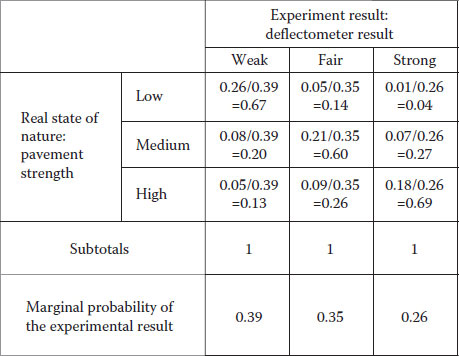
The problem is that we want to know how often the machine is right within each category. To solve this we use the marginal probabilities of the experiment to condition the probability values of each observation previously obtained. Figure 4.11 shows the calculations and results. These values can be expressed as conditional probabilities of observing each real phenomenon result given that the experiment is detecting a particular state.
The values obtained in Figure 4.11 reveal that 67% of the time the experiment correctly identifies a weak pavement, 20% of the time incorrectly labelled it as a medium (being really weak) and 13% of the time incorrectly labelled it as high, but actually it was weak. Similarly, for a pavement whose real strength lies in the medium range, 14% of the time the experiment results in awrong identification as low, 60% of the time correctly identifies it and 26% of the time the experiment labelled the pavement as high strength, but actually it was medium. A similar interpretation can be done for the experiment in its ability to identify a strong pavement. As you can see, the totals now add to 100% (or one in decimal base calculations).
FIGURE 4.9
Conditional probabilities.
FIGURE 4.10
Marginal probabilities.
FIGURE 4.11
Conditional probabilities.
This is a very common technique to find the relationship between a set of elements (independent variables) and a response (dependent variable). This technique is called linear regression and should not be confused with the ordinary least squares (presented in Chapter 5).
The idea behind linear regression is to find out a set of factors that have explanatory power over a given response. Think first of one factor alone, if every time such factor moves so does the response (and in the same direction), then the factor and the response are (positively) correlated and the factor could be though as influencing the response. Now presume the same factor moves but the response does not; in this case, it will be very difficult to give some explanatory power to such factor.
The problem becomes more challenging when we add more factors because all factors could potentially be influencing the response. Imagine you have a large database with several factors (consider per instance the one presented in Table 4.7) but some of them exhibit a repetitive nature.
TABLE 4.7
Sample Data Deterioration
y = Response |
x1 |
x2 |
x3 |
0.18 |
60,000 |
3.96 |
0.04 |
0.45 |
122,000 |
3.96 |
0.06 |
0.67 |
186,000 |
3.96 |
0.08 |
0.54 |
251,000 |
3.96 |
0.04 |
0.95 |
317,000 |
3.96 |
0.06 |
1.08 |
384,000 |
3.96 |
0.08 |
0.83 |
454,000 |
3.96 |
0.04 |
1.46 |
524,000 |
3.96 |
0.06 |
1.48 |
596,000 |
3.96 |
0.08 |
1.17 |
669,000 |
3.96 |
0.04 |
1.89 |
743,000 |
3.96 |
0.06 |
1.96 |
819,000 |
3.96 |
0.08 |
0.88 |
897,000 |
3.96 |
0.02 |
1.82 |
976,000 |
3.96 |
0.04 |
1.67 |
1,057,000 |
3.96 |
0.05 |
2.66 |
1,139,000 |
3.96 |
0.07 |
1.30 |
1,223,000 |
3.96 |
0.02 |
1.43 |
1,309,000 |
3.96 |
0.03 |
2.40 |
1,396,000 |
3.96 |
0.05 |
2.39 |
1,486,000 |
3.96 |
0.04 |
TABLE 4.8
Sample Data Deterioration
y = Response |
x1 |
x2 |
x3 |
0.18 |
60,000 |
3.96 |
0.04 |
0.54 |
251,000 |
3.96 |
0.04 |
0.83 |
454,000 |
3.96 |
0.04 |
1.17 |
669,000 |
3.96 |
0.04 |
1.82 |
976,000 |
3.96 |
0.04 |
2.39 |
1,486,000 |
3.96 |
0.04 |
Hence, estimating the influence of a given factor (say x1) on the response would be easy if we select from the database a subset of observations where all other factors (x2, x3, …, xn) have constant values. Per instance from Table 4.7 you can see that x2 is already constant at 3.96, we need somehow to held constant x3, if you look carefully you will discover a pattern of 0.04, 0.06 and 0.08, the pattern eventually breaks. Let us select from this data set a subset containing only those observations where x3 = 0.04. This subset is shown in Table 4.8.
At this stage, we have isolated changing values of x1 only while all other factors are being held constant, out of this we can estimate the explanatory power of x1 on y. In a similar fashion, we could take on values of x3 = 0.06, x3 = 0.08, etc. The problem with this is that if we are obtaining isolated measures of explanatory power for specific ranges of the other variables, how do we combine them?
Linear regression follows a similar principle without the issue of creating isolated data sets. It estimates the explanatory power of one variable on a given response by looking into how much this variable influences movement on the response. For this, it held all other variables constant, just as we did but without creating isolated groups.
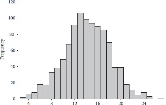
1. Obtain the mean and standard deviation for the response y of Table 4.7. Then prepare a histogram for the response.
2. Obtain the mean and standard deviation for the factor x1 of Table 4.7. Then imagine the first 10 elements belong to source a and the second half of the elements (from 11 to 20) belong to source b; prepare a boxplot for them.
3. A pressure disk can be used to learn soil-bearing capacity. Presume you have used in the past year this device and the reliability of the device is summarized by the numbers presented in Table 4.9.
Estimate the probability of correctly predicting low, medium and high capacity. Hint: Use the marginal probability of the experimental result, and notice the summation of observations does not add to 100.
TABLE 4.9
Measuring Soil-Bearing Capacity
Real/Measured |
Low |
Medium |
High |
Low |
60 |
36 |
4 |
Medium |
25 |
96 |
5 |
High |
5 |
6 |
114 |
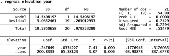
4. Linear regression. Estimate if there is any explanatory power for the year of construction on rim elevation (use the information contained in Table 4.3).
5. Linear regression. Estimate if there is any explanatory power for the year of construction on the bottom elevation of manholes for the data presented in Figure 4.12.
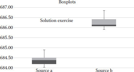
6. Now prepare boxplots for source a and b for the variable bottom of the manhole elevation. Estimate if the data came from the same population. (Answer: No it did not.)
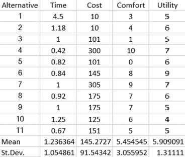
7. Table 4.10 shows several variables associated to alternatives:
a. Estimate mean and standard deviation for each variable (except the alternative).
b. Obtain a histogram for each variable (except the alternative).
c. Test normality on each variable (except the alternative).
Solutions
1. The following table shows the calculations for the standard deviation for the response y of Table 4.11.
Figure 4.13 shows the histogram; the values of the bins can be changed according to specific needs.
2. Figure 4.14 shows the steps and final results of the estimation of the mean and standard deviation for factor x1 in Table 4.7.
Figure 4.15 shows the boxplots for both samples. As you can see, they do not overlap in anyway and therefore are deemed as belonging from two different populations.
It is important to indicate that these numbers came from one single exercise, but the nature of the observations is not the same; this is why neither the average nor the variation around the median matches.
FIGURE 4.12
Exercise 4.5.
TABLE 4.10
Choice of Commute toWork
Alternative |
Time (Hours) |
Cost ($/Month) |
Comfort |
Utility |
1. Walk |
4.5 |
10 |
3 |
5 |
2. Bike |
1.18 |
10 |
4 |
6 |
3. Bus |
1 |
101 |
1 |
5 |
4. Car |
0.42 |
300 |
10 |
7 |
5. Walk–bus |
0.82 |
101 |
0 |
6 |
6. Car–metro(1) |
0.84 |
145 |
8 |
9 |
7. Car–metro(2) |
1 |
305 |
9 |
7 |
8. Car–train(1) |
0.92 |
175 |
7 |
6 |
9. Car–train(2) |
1 |
175 |
7 |
5 |
10. Walk–train |
1.25 |
125 |
6 |
4 |
11. Car–bus |
0.67 |
151 |
5 |
5 |
TABLE 4.11
Solution for Exercise 4.1
y = Response |
x1 |
x2 |
x3 |
0.18 |
1.3605 – 0.18 |
1.1805 |
1.3935 |
0.45 |
1.3605 – 0.45 |
0.9105 |
0.829 |
0.67 |
1.3605 – 0.67 |
0.6905 |
0.4768 |
0.54 |
1.3605 – 0.54 |
0.8205 |
0.6732 |
0.95 |
1.3605 – 0.95 |
0.4105 |
0.1685 |
1.08 |
1.3605 – 1.08 |
0.2805 |
0.0787 |
0.83 |
1.3605 – 0.83 |
0.5305 |
0.2814 |
1.46 |
1.3605 – 1.46 |
−0.0995 |
0.0099 |
1.48 |
1.3605 – 1.48 |
−0.1195 |
0.0143 |
1.17 |
1.3605 – 1.17 |
0.1905 |
0.0363 |
1.89 |
1.3605 – 1.89 |
−0.5295 |
0.2804 |
1.96 |
1.3605 – 1.96 |
−0.5995 |
0.3594 |
0.88 |
1.3605 – 0.88 |
0.4805 |
0.2309 |
1.82 |
1.3605 – 1.82 |
−0.4595 |
0.2111 |
1.67 |
1.3605 – 1.67 |
−0.3095 |
0.0958 |
2.66 |
1.3605 – 2.66 |
−1.2995 |
1.6887 |
1.30 |
1.3605 – 1.30 |
0.0605 |
0.0037 |
1.43 |
1.3605 – 1.43 |
0.0695 |
0.0048 |
2.40 |
1.3605 – 2.40 |
−1.0395 |
1.0805 |
2.39 |
1.3605 – 2.39 |
−1.0295 |
1.0599 |
1.3605 |
=Total |
Total= |
8.7459 |
/20= |
0.4373 |
||
Std. dev.= |
0.6613 |
FIGURE 4.13
Solution Exercise 4.6.
FIGURE 4.14
Solution Exercise 4.2 part (a) standard deviation.
3. Figure 4.16 shows the marginal and conditional probabilities.
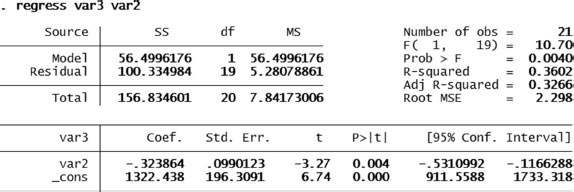
4. Figure 4.17 shows the regression coefficient and p-value for year of construction on elevation. As seen, there is a positive explanatory power: the higher the value in year of construction, the higher is the rim elevation.
5. Figure 4.18 shows the regression coefficient and p-value for year of construction on bottom of manhole elevation. As seen, there is a positive explanatory power, the coefficient is 0.2476 with a p-value of 0.000. Hence, the higher the value in year of construction, the higher is the value of bottom of manhole elevation.
FIGURE 4.15
Solution Exercise 4.2 part (b) boxplots.
FIGURE 4.16
Solution of Exercise 4.3 marginal and conditional probabilities.
FIGURE 4.17
Solution Exercise 4.4 regression: year of construction on rim elevation.
FIGURE 4.18
Solution Exercise 4.4 regression: year of construction on bottom elevation.
FIGURE 4.19
Solution Exercise 4.6.
FIGURE 4.20
Solution Exercise 4.7 part (a).
FIGURE 4.21
Solution Exercise 4.7 part (b).
6. Figure 4.19 shows the solution for Exercise 4.6.
As you can see, the two samples do not come from the same population: the sample of source b has more variability above the median, and the sample from source a has a more variability above the median.
7. Figure 4.20 shows the solution for parts a and b.
The histograms for time, cost comfort and utility are shown in Figure 4.21.