Chapter 3
Focusing on Chart Settings
IN THIS CHAPTER
 Introducing chart attributes
Picking overlays for the price panel
Placing indicators above and below the price panel
How you set up your chart enables you to get a clear picture of a stock’s trend. In this chapter we show you how to use the flexibility of charting to build a useable display using three key components: chart attributes, overlays, and indicators.
In Figure 3-1 from StockCharts.com, you can see that the place for setting parameters, known as the workbench, is below the chart. You can access this tool for setting up charts online at stockcharts.com/freecharts/ under SharpCharts. You can then work through the steps online as we describe the process.
Choosing Chart Attributes
Chart attributes give you the primary choices for how you want to set up your chart. Chart attributes define things like the size and shape, the type of price display and color, and the background. Because there are different price display types like candlesticks, bars, and lines, each chart has different display requirements and choices. To show you how this works, we take you through the steps of seting up a chart in this section.
Some important decisions you have to make are the amount of data to display and how you want to display that data. These choices include the time period for the chart, the number of periods you want to display, the setup for the bars, and the type of chart. You also choose the colors and other appearance attributes.
Starting with the time period, range, and spacing
The first group of settings includes the time period for each bar, the dates you would like to see, and the spacing.
Period
When it comes to charts, the most popular time period for investors and swing traders is daily. This means that price information will be for one day. You can see how to set the periods in Figure 3-2. Common time period choices include
- Monthly
- Weekly
- Daily (shown in Figure 3-2)
- 1 Hour
- 5 Minutes
- 1 Minute
For this book, we focus on daily charts. In Chapter 8, we discuss when other time periods should be considered.
Range
Range displays how many periods you want to display, which is an important choice depending on the information you seek. Stock charts show quickly, without a lot of description, where price has been for a particular period of time. When you set the range, you know the stock’s movement for that period of time.
Some default range settings are
- 1 day
- 5 days
- 10 days
- 1 month (roughly 22 trading days)
- 3 months (25 percent of a year, 63 trading days)
- 6 months (50 percent of a year, 129 trading days)
- 12 months (one year, 258 trading days)
- 3 years
- 5 years
- 10 years
- Year to Date
- Select Start/End Date
- Fill the Chart (as shown in Figure 3-2)
Traders or investors choose a time frame based on the type of decisions they want to make. For example:
- Short-term traders select a three-month time frame most often, because they plan to exit in the same day or within a few days. The three-month time frame gives them enough information to see the trend visually, but not too much information that can make it difficult to see an exit point. These charts can be intraday to describe what is happening for the day. Using a chart with five to ten days broken into one-hour candles can show a stock starting to improve or break down.
- Investors are less concerned with intraday movements and tend to select a one-year chart so they can catch longer trends. Because they will likely hold a stock for months or years, investors want to see how the stock has done over many years rather than just a few months. When they are trying to pick an entry or exit point, long-term investors will look to monthly charts.
- Institutional investors tend to use 20-year charts with monthly time frames, but they will look at many different time frames as they make decisions for their portfolios.
 The range selection has a relationship with the individual time period. Chart users will want to pair enough data to see the trend that gives them the ability to see the most recent information clearly.
Bar, gap, and extra bars
This area of the chart attributes changes automatically on StockCharts.com depending on which range you use. Set the range to Fill the Chart, so the software will calculate settings using three components. The software uses the width of each daily price bar, the space between the bars (gap), and the extra bars setting to pick the number of days to display. When you get more expertise, you may want to do your own fills, but that’s more complicated than you need to get right now. In Figure 3-2, the width of each bar is 5, and the space between the bars (the gap) is 1.
 The extra bars setting is a hidden gem. This setting allows white space on the right-hand side of the chart so the last price bar is not pushed up against the side of the chart. Typically, an extra bars setting may be 5 or 10 bars. You can set this manually by putting the number of extra bars in the Extra Bars box.
Defining the price display
Now take a look at the next area of chart attributes. Here you set the type, size, and color of price information (see Figure 3-3).
Type
Type refers to the type of display for the price information. Common display types are as follows (we discuss each type of chart and how best to use it in the chapters indicated):
Size
People read charts on many different types of devices, including desktops, laptops, tablets, or phones, so the size of the chart is a personal decision based on the device you’re using to view the chart.
With the huge variety of display surfaces, individuals will want to optimize the chart to fit on the display they have. For example, for mobile phones, smaller charts are better. It makes sense to have specific lists of charts set up to browse on the various devices you use. You can set up custom settings for each of your devices to improve the percentage of the screen that your charts cover. In Figure 3-3, the size of 1024 is typical for a laptop.
Color scheme
Everyone has personal favorite colors. You can choose the colors for your chart display. Background color is the first critical choice. This parameter personalizes the chart and allows you to control the overall mood of the display. Using black or dark backgrounds for a change from traditional white space on presentation charts can grab attention. For printing your charts, white backgrounds are best. Using white with gridlines helps for printing, but various color backdrops can help make your chart your own.
If you’re sharing charts on social media, black or dark backgrounds stand out in the scrolling but are harder to read. Lightly shaded backgrounds can improve the attractiveness of the chart while still providing uniqueness.
Accessibility options on the computer are very important, and many mainstream users find that some accessibility settings help them. The same is true in charting software. Depending on the quality of your vision, certain themes for the charts may be softer on the eyes. If you have specific vision issues, we recommend trying different backgrounds from the drop-down menu. For example, people with light sensitivity may want to use dark backgrounds, while people who need a lot of brightness on the charts may choose white or light colors for the background. You can also enhance the display choices of the data in front of the background to make the information stand out. When you change the background, it is very common to alter the price display so the two parts complement each other.
You may find the wide range of drop-down menus for setting colors daunting, so initially use the default settings to get you started (as shown in Figure 3-3). As you become more familiar with charting and your personal preferences, you can start playing with the colors of the price information to help you personalize your chart.
Up color and down color
Colors can also be used to show whether the stock is moving up or down. For example, you can use green for up and red for down, or you can set them to be the same. You may choose to use gold for both up and down on a chart displaying the price of gold. We go into the merits of using different colors as we discuss different decision-making strategies throughout this book. Figure 3-4 shows blue for the up color and orange for the down color.
Opacity
Opacity allows you to darken or lighten the price bars. A setting of 1.0 (as shown in Figure 3-4) means as bright as possible. An opacity of 0.0 makes the price invisible. The opacity tool is very nice for using area charts that you commonly see on TV. The opacity options are Auto, 0.9, 0.8, 0.7, 0.6, 0.5, 0.4 0.3, 0.2, 0.1, and 0.0. Note: This feature is available only for members.
Grid
Grid lines are easy to see on the screen. The grid setting allows you to adjust the look of the grid lines as well as the darkness of the lines. Your options are
- Off
- Normal (shown in Figure 3-4)
- Dashed
- Dense
- Normal (Dark)
- Dashed (Dark)
- Dense (Dark)
Note: This feature is available only for members.
Legends
This area controls how much information is shown in the legend. You can see the legend choices at the far right after the grid choices. The legend information is the amount of information about the stock(s) in the chart and is shown at the top left of the chart. Here are the options:
- None: Removes all information
- Minimal: Shows just the ticker symbol
- Default: Includes overlays and indicator names (this setting is shown in Figure 3-4)
- Verbose: Spells out the company name instead of the ticker symbol
Displaying volume and toggles
Volume, which measures the number of stock trades in a day, tends to be a supportive indicator. High volume at certain times can be critical for helping with price discovery. How volume is displayed is unique and not the same as other charting information.
Volume can be toggled on or off by using the volume drop-down menu shown in Figure 3-5 on the left side of the check-mark toggles. The options are
- Off: No volume is displayed.
- Overlay: The volume is displayed inside the price panel.
- Separate: The volume is displayed below the price panel.
In Figure 3-5, the volume is set in the overlay position. If price is in the bottom corner of the chart, seeing the price or the volume can be problematic because they overlap. Using the drop-down menu to choose Separate moves the volume bars below the price panel into a separate display.
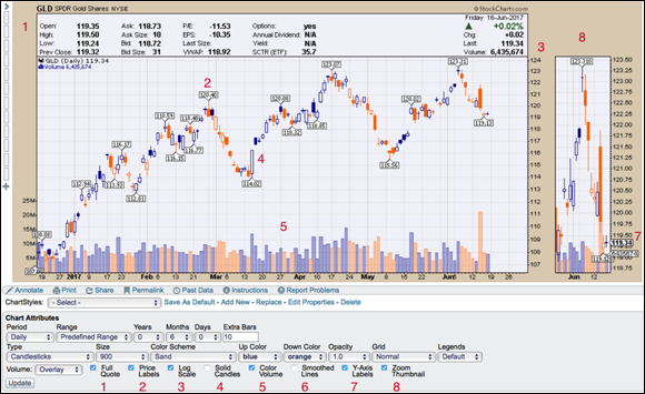
Eight toggles are listed across the bottom of the chart, as shown in Figure 3-5:
- Full Quote: Adds the Text panel on the top of the chart.
- Price Labels: Puts the price label on the price bars at highs and lows.
- Log Scale: Uses a percentage grid for long time periods where the price has moved substantially.
- Solid Candles: Fills in hollow candles like the big one next to the “4.” This is strictly a matter of user preference.
- Color Volume: Shades the up days different from the down days.
- Smoothed Lines: Makes the lines on line charts look smoother.
- Y-Axis Labels: Adds the current price label onto the vertical axis on the far-right edge of the chart.
- Zoom Thumbnail: Adds the box on the right with the last 18 price bars.
Setting Overlays
Overlays are display formats you add to a stock chart that help you understand price movement. You build overlays by clicking in the Overlays area below a chart. In the drop-down box where it says “None” (refer to Figure 3-1), you select a choice from the drop-down menu. The charting software automatically gives typical parameters. Each time you add an overlay, a new line below appears with “None” in the drop-down box so you can add another. We help you discover how to apply these overlays for making stock choices throughout this book.
The list of overlay choices is significant. Some of the common overlays are as follows:
- Moving averages: Helps you more easily spot a trend by smoothing out price action based on past prices
- Horizontal line: Enables you to more easily see the top and bottom of a trend
- Price channels: Helps you see the highest high and the lowest low on a chart
- Bollinger Bands: Shows the upper and lower limits of normal price movements
- Keltner channels: Shows the upper and lower limits for price movements based on an average of prices
- Moving average envelopes: Forms a channel using the simple moving averages
- Events: Marks important events such as dividends and stock splits
- Pivot points: Are used by short-term traders; the points at which the largest price movements are expected
Two other overlay choices that help you determine when to sell a stock are
- Chandelier exits: Helps you set stop-losses for selling a stock
- Parabolic SAR: Helps you see trend reversals
To give you an example of a common overlay, Figure 3-6 shows a simple moving average envelope on this chart of Apple Inc. (AAPL).
Plotting things that have similar prices with the same scale (Bond Yield %) uses an overlay called “Price (same scale).” Viewing two stocks on the same price panel does not entail the use of an overlay. For two stocks on the same panel, you use the Indicators drop-down menu with a different display option (see the next section for more on indicators).
The Reorder option allows you to indicate the order for the various overlays you choose. Style lets you pick one of the following:
- Auto
- Solid
- Solid (Thin)
- Solid (Thick)
- Dashed
- Dashed (Thin)
- Dashed (Thick)
- Area
- Dots
Opacity options are the same as those in the Chart Attributes area. Note: These features are available only to members.
Selecting Indicators
Indicators help you see price movement. These options are based on significant research done over the years by some very smart technicians to create indicators that help analyze price movement. Most of the indicators are derived from price, or price and volume. We help you figure out how to apply the indicators for making stock choices throughout this book.
Select an indicator by using the drop-down menu where the word “None” is in Figure 3-7. The MACD (Moving Average Convergence Divergence) is shown as the first indicator in the figure. This is a commonly used momentum indicator. The default parameters are put in, and when you click “Update,” this indicator appears below the chart.
Guests at StockCharts.com are able to add indicators but not alter the display. Notice the arrow on the left where we point to indicators. This feature expands for members to set additional display features. Figure 3-7 shows it expanded.
Common indicators
Fifty different indicators are available. Some of the more popular indicators are as follows:
- Relative Strength Indicator (RSI): Shows how strongly a stock is moving in its current direction, whether up or down
- Chaikin Money Flow (CMF): Combines price and volume to show the movement of money in and out of a stock
- On-Balance Volume (OBV): Combines price and volume to show how money is moving in and out of a stock
- Percent Price Oscillator (PPO): The percentage-based version of the MACD
- Percent Volume Oscillator (PVO): The PPO indicator applied to volume rather than price
- Force Index: Shows the movement of price and volume
- Price Momentum Oscillator (PMO): Tracks the stock’s rate of change
- Stochastics: Shows speed of stock price relative to past movements
- StockCharts Technical Ranking (SCTR): Ranking based on a stock’s technical strength
Volume and price as indicators
Two indicators need specific discussion (see Figure 3-8 to see the settings for these indicators):
Using the volume indicator setting rather than the volume setting under Chart Attributes allows you to calculate unique things like a moving average of volume. Because volume offers clues in technical analysis, it is used more widely. You can position the volume indicator above the stock data, below the stock data, or behind the price by choosing one of three options: above, below, or behind price.
The price indicator is useful when you want to display two stock prices on the same chart. An example might be the GLD ETF for gold and the GDX ETF, which is an ETF that tracks a group of gold miners. By choosing GLD for the main chart, you can plot the GDX price underneath using the price indicator and add GDX in the parameter box (you can see this setup in Figure 3-8).
If you change the position to “Behind Price,” the chart will display both GLD and GDX on the same panel. The scale for the indicator will be on the left.
An important note: If you’re looking at more than one stock, where two prices cross is irrelevant when they are on different scales. Changing the number of days of the chart can change where they cross. There is no information to be gained by looking at where things cross when two stocks have different scales, because the charting software expands/contracts the scale so all the data in the time period fits on the chart.