Chapter 7
Getting the Lay of the Land with Area Charts
IN THIS CHAPTER
 Distinguishing between area charts and line charts
Building an area chart and adding styles
Knowing the advantages of area charts
Area charts are similar to line charts (described in Chapter 6) but look dramatically different. To replicate this chart type, which you’ve probably seen frequently on TV, you need to understand the unique settings for an area chart type. Without tweaking the settings, they can look overpowering and bold.
In this chapter, you discover how area charts compare to line charts, how to create your own area charts, and the best times to use area charts.
Comparing Area Charts to Line Charts
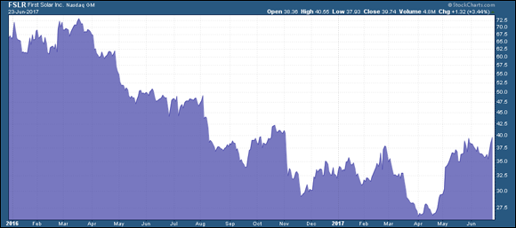
Area charts shade in the area below the line of closing prices, whereas line charts just connect the closing prices with a line. Area charts are also called mountain charts because they make a strong impression in the foreground against a backdrop, much like mountains against the sky. You can see an area chart in Figure 7-1.
 Charting a stock price shows you a picture of the stock’s history. The difficulty in chart type selection is getting the type of display to tell the story you want to read. The key difference when comparing area charts to line charts is visual impact. The area chart highlights the lows and the highs and makes them stand out more noticeably. You can see how the trend of lower lows and lower highs becomes quite prominent on the area chart in Figure 7-1.
Business news networks use area charts because they have more impact. Many mobile devices have stock-tracking software and typically these use area charts to show the price intraday and for one week, one month, six months, and one year. Area charts more strongly depict the impact of trends in a couple of ways:
- Finding consolidation: A stock that is consolidating sideways appears as a bumpy plateau on an area chart. A break above a plateau is excellent, and the dark shading helps that stand out. The shading under the move makes the price look strong at the new high. This helps the user because it’s more prominent than a thin line on a line chart or a single bar on a bar chart (see Chapter 5 for details on bar charts and Chapter 6 for the lowdown on line charts).
- Eying changes in stock behavior: Conversely, seeing the chart start to drop on the right-hand side helps the viewer understand the change in behavior as white space or background comes into the chart. Your eye can easily draw a subconscious line under the lows and compare them to the highs. A natural tendency of the eye to connect points in an image is valuable and a great reason to use area charts. With a candlestick chart (covered in Chapter 4), your eye is distracted by the candle colors and contrasts. Candlestick charts are rarely used on network television for this reason.
Making an Area Chart You Can Show Off
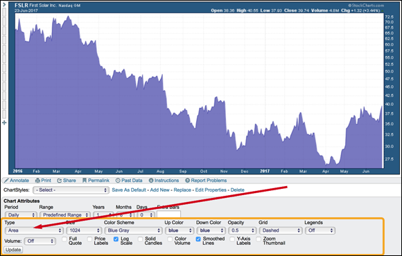
You can start a chart by going to www.stockcharts.com/freecharts/, typing a stock symbol under Create a SharpChart, and clicking Go. To create an area chart, locate the Chart Attributes area in the settings panel (see Figure 7-2). Using the Type drop-down menu, select Area from the list and click Update in the lower-left corner. This makes your area chart show up extremely bold, probably in black.
After you select an area chart, two key things you can control are the darkness of the area and the color you want the area to be. It’s simple and can have a strong impact on a TV screen or your computer screen. Legends and labels are also handy to include. (See Chapter 3 for the basics of chart settings.)
Strengthening or dimming the area display
If you would like to soften the darkness of the area, change the Opacity setting found to the right of the chart Type drop-down menu where you selected Area. Opacity affects the amount of the color applied to the chart. A low opacity has low color strength, while an opacity of 1.0 has high color strength. A setting of 0.0 will make the information invisible against the background. The opacity of the chart in Figure 7-2 is 0.5.
 If the area chart isn’t showing after you click the Update button, check your opacity setting. It may be too light.
Trying different colors
Charting doesn’t have to enable a Henry Ford quote. Henry Ford was proud of his car factory having only one color for the Model T. He said, “Any customer can have a car painted any color that he wants so long as it is black.”
While you are changing other settings, experiment with the Color Scheme drop-down menu and the Up Color drop-down menu. An area chart uses only one color, which you select in the Up Color drop-down menu.
Adding color lines to emphasize change
Area charts are better than candlestick and bar charts for looking at long-term trends. Some people prefer line charts to area charts. Seeing lines under the lows is a little easier in line charts (discussed in Chapter 6) than in area charts unless you use a bright contrasting line on the area chart. An example would be the gold line in front of a blue area chart on Figure 7-3. Charting software packages have annotation tools for drawing on the charts. We cover those tools in Chapter 17.
Looking at legends and labels
Legends are also helpful when you create an area chart because they detail what stock or stocks are being pictured. This setting box is found on the right-hand side of the Chart Attributes panel. The Default setting works well because it gives the key summary of all overlays and indicators used. We show the Verbose setting, which spells out the company name rather than just the ticker symbol, in Figure 7-3. The Minimal setting gives only the ticker symbol and price.
To see the exact level on the right-hand side of the chart display, a Y-axis label is nice. This label points an arrow at the exact price level of the last reading. If price breaks down hard in one day on a one-year chart, you may not see it as the line goes straight down. You can see this visually in Figure 7-3. BlackBerry had a bad day, and the drop was so steep it was not obvious. Turn on the Y-axis label by clicking on the toggle in the bottom row of the Chart Attributes. This creates the little price arrow with $9.71.
Adding a Personal Touch with Styles
A quick look at area stock charts being posted on Twitter shows a wide variety of styles. Play with the attributes to find a style that works best for you.
While color is helpful, not everyone sees color. If you experience any type of visual impairment, chart styles become more than just nice to have.
Setting up charts so they clearly show price movement against a backdrop is a personal choice. Area charts, for example, may need simple but effective alterations from the default settings to generate a contrast. Play with the settings under the chart. They can help you.
Some style ideas for your charts include the following:
- Ten percent of the population is red/green colorblind. Age also takes a toll on eyesight. The Monochrome setting under the Color Scheme drop-down menu can help all these conditions.
- Area charts can help if fine focus is an issue. Using the Price Labels toggle in the Chart Attributes area can help define highs and lows as well.
- Area charts can help if you need reduced white space on your screen. Changing the background can help as well on other chart types.
After a while you’ll find you have a few settings you really like. One of the reasons people sign up for stock charting software is for the ability it gives them to save chart styles. When you save a chart style, the software keeps the chart type, color choices, and size, to name a few.
When you come back another day, all your settings are maintained. When you enter a new ticker symbol for a company onto your saved chart style, it shows the new stock with all the settings you have previously chosen. The software also allows you to save more than one style. In Chapter 19 we discuss how to set up and save your styles for area charts.
Practice with different styles on the StockCharts.com platform. Use the 30-day free trial available on the home page to practice, and save charts that you have set up. This is one of the easiest ways to get comfortable with charting at no cost.
Knowing When Area Charts Matter
In later chapters, we discuss defining trends over different time horizons for investors. One of the keys to successful chart reading is recognizing downtrends and uptrends soon after the trend has started, and area charts make that easy. Area charts are very clean and simple to use. Filling the space below the price really highlights the trend for the stock.
The other advantage to area charts is the ability to see the big picture by extending the amount of history that is being shown. Much like the line chart, you don’t lose a lot of information by adding a longer time period for the chart.
An area chart is a great chart type for people new to charting. It highlights the price action without complicating it. Long-term money managers like to use clean charts such as area charts to demonstrate the trend. Television channels consider the area chart style one of the best types to work with for their audience.
One of the main problems when using charts is understanding what matters. Because area charts have very little detail, they are for big-picture trading rather than day trading, for example. Trend lines as well as horizontal support and resistance levels are easy to see.
Stocks that have been trending up for years don’t continue forever. BlackBerry phones are a great example of something being all the rage and then falling out of fashion. At one time the stock was over $145 per share. It lost half its value before the earnings per share started to decline. The changing trend in the long-term stock price almost always happens before the earnings decline.
Stocks don’t just grow to the moon and stay great forever. Stocks have growth phases, and then they normalize again. Some of these trends can last a long time, but eventually they stop. Investors want to catch the big moves up but need to sell to capture the gains when the stock stops rising. Area charts are a great way to see that big-picture change in trend.