Chapter 9
Throwing Statistics a Curve
IN THIS CHAPTER
 Understanding key terms used in statistics
Testing for central tendencies in a data sample
Analyzing deviation in a data sample
Looking for similarities in two data samples
Analyzing by bins and percentiles
Counting items in a data sample
Just pick up the newspaper, or turn on the television or the radio. We’re bombarded with interesting facts and figures that are the result of statistical work: There is a 60 percent chance of rain, the Dow Jones Industrial Average gained 2.8 percent, the Yankees are favored over the Red Sox 4-3, and so on.
Statistics are used to tell us facts about the world around us. Statistics are also used to tell us lies about our world. Statistics can be used to confuse or obscure information. Imagine that you try a new candy bar, and you like it. Well, then you can boast that 100 percent of the people who tried it liked it!
Sometimes, statistics produce odd conclusions — to say the least! Imagine this: Bill Gates helps at a homeless shelter. The average wealth of the 40 or so people in the room is $1 billion. Why? Because Bill's worth is counted in the average, thereby skewing the average past the point of making sense. How about this? You hear on the news that the price of gasoline dropped 6 percent. Hurray! Let’s go on a trip. But what is that 6 percent decrease based on? Is it a comparison with last week’s price, last month’s price, or last year’s price? Perhaps the price of gasoline dropped 6 percent compared with last month. But prices are still 20 percent higher than last year. Is this good news?
Statistics are traditionally divided into two types. Descriptive statistics, covered in this chapter, help you summarize and understand data. Inferential statistics, covered in Chapter 10, are used to draw conclusions about data comparisons.
Getting Stuck in the Middle with AVERAGE, MEDIAN, and MODE
Are you of average height? Do you earn an average income? Are your children getting above-average grades? There is more than a single way to determine the middle value from a group of values. There are three common statistical functions that describe the center value from a population of values. These are the mean, the median, and the mode.
 The term population refers to all possible measurements or data points, whereas the term sample refers to the measurements or data points that you actually have. For example, if you are conducting a survey of registered voters in New Jersey, the population is all registered voters in the state, and the sample is those voters who actually took the survey.
Technically, the term average refers to the mean value, but in common language, average can also be used to mean the median or the mode instead of the mean. This leads to all sorts of wonderful claims by advertisers and anyone else who wants to make a point.
 It's important to understand the difference between these terms:
- Mean: The mean is a calculated value. It’s the result of summing the values in a list or set of values and then dividing the sum by the number of values. For example, the average of the numbers 1, 2, and 3 equals 2. This is calculated as (1 + 2 + 3) ÷ 3 or 6 ÷ 3.
- Median: The median is the middle value in a sorted list of values. If there are an odd number of items in the list, the median is the actual middle value. In lists with an even number of items, there is no actual middle value. In this case, the median is the mean of the two values in the middle. For example, the median of 1, 2, 3, 4, 5 is 3 because the middle value is 3. The median of 1, 2, 3, 4, 5, 6 is 3.5 because the mean of the two middle values, 3 and 4, is 3.5.
- Mode: The mode is the value that has the highest occurrence in a list of values. It may not exist! In the list of values 1, 2, 3, 4, there is no mode because each number is present the same number of times. In the list of values 1, 2, 2, 3, 4, the mode is 2 because 2 is used twice and the other numbers are used once.
The mean, median, and mode are sometimes called measures of central tendency because they serve to summarize a data sample in a single statistic.
Let’s get started! These steps create three results in your worksheet, using the AVERAGE, MEDIAN, and MODE functions:
Enter a list of numerical values.
Any mix of numbers will do.
- Position the cursor in the cell where you want the mean to appear.
- Type =AVERAGE( to start the function.
- Drag the pointer over the list or enter the address of the range.
- Type a ) to end the AVERAGE function.
- Position the cursor in the cell where you want the median to appear.
- Type =MEDIAN( to start the function.
- Drag the pointer over the list or enter the address of the range.
- Type a ) to end the MEDIAN function.
- Position the cursor in the cell where you want the mode to appear.
- Type =MODE.SNGL( to start the function.
- Drag the pointer over the list or enter the address of the range.
- Type a ) to end the MODE function.
Depending on the numbers you entered, the three results may be the same (very unlikely!), about the same, or quite different. The MODE function will have returned #N/A if there were no repeating values in your data.
The mean is calculated by the AVERAGE function.
Imagine this: Three people use a new toothpaste for 6 months, and then all go to the dentist. Two have no cavities. Hey, this toothpaste is great! The third person has three cavities. Uh-oh!
Person |
Cavities |
A |
0 |
B |
0 |
C |
3 |
The average number of cavities for this group is 1 — that is, if you're using the mean as the average. This doesn’t sound like a good toothpaste if, on average, each person who used it got a cavity! On the other hand, both the median and the mode equal 0. The median equals 0 because that’s the middle value in the sorted list. The mode equals 0 because that’s the highest occurring value. As you can see, statistics prove that the new toothpaste gives 0 cavities, on average — sort of.
Look at another example. Figure 9-1 shows the results of a midterm test for a hypothetical class. The mean, median, and mode are shown for the distribution of grades.
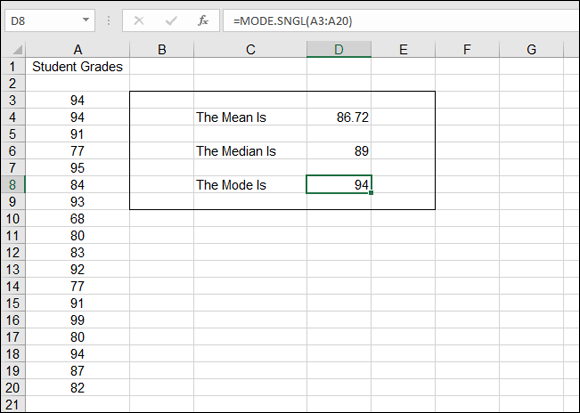
FIGURE 9-1: Defining central tendencies in a list of grades.
As almost always happens, the mean, the median, and the mode each return a different number. Strictly speaking, we should say that the average grade is 86.72, the mean value. But if the teacher or the school wants to make the impact on students look better, they could point out that the most frequently occurring score is 94. This is the mode, and sure enough, three students did receive a 94. But is this the best representation of the overall results? Probably not.
Working with the functions that return these measures of central tendencies — AVERAGE, MEDIAN, and MODE — can make for interesting and sometimes misleading results. Here is one more example of how these three functions can give widely different results for the same data. Here is data for six customers and what they spent with a company last year:
Customer |
Total Amount Spent Last Year |
A |
$300 |
B |
$90 |
C |
$2,600 |
D |
$850 |
E |
$28,400 |
F |
$300 |
The mean (using the AVERAGE function) is $5,423.33. The median is $575, and the mode is $300. These three amounts aren’t even close! Which one best represents the typical amount that a customer spent last year?
The issue with this set of data is that one value — $28,400 — is so much larger than the other values that it skews the mean. You may be led to believe that each customer spent about $5,423. But looking at the real values, only one customer spent a lot of money, relatively speaking. Customers A, B, C, D, and F spent nowhere near $5,423.33, so how can that “average” apply to them?
Figure 9-2 shows a situation in which one value is way out of league with the rest — sometimes called an outlier, which makes the average not too useful. Figure 9-2 also shows how much the mean changes if the one spendthrift customer is left out, but if you leave out any other customer, there is very little change in the mean.
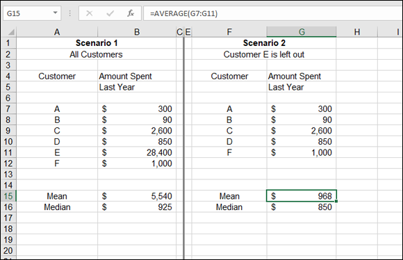
FIGURE 9-2: Deciding what to do with an unusual value.
In Scenario 2, Customer E is left out. The mean and the median are much closer together — $968 and $850, respectively. Either amount reasonably represents the mid value of what customers spent last year.
But can you just drop a customer like that (not to mention the biggest customer)? Yikes! Instead, you can consider a couple of creative averaging solutions. Either use the median or use a weighted average (a calculation of the mean in which the relevance of each value is taken into account). Figure 9-3 shows the result of each approach.
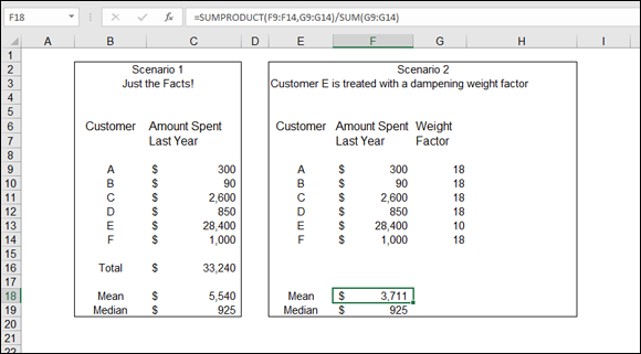
FIGURE 9-3: Calculating a creative mean.
Scenario 1 shows the mean and the median for the set of customer amounts. Here, using the median is a better representation of the central tendency of the group.
 When reporting results based on an atypical calculation, it’s good practice to add a footnote that explains how the answer was determined. If you were to report that the “average” expenditure was $925, a note should explain this is the median, not the mean.
Scenario 2 in Figure 9-3 is a little more complex. This involves making a weighted average, which is used to let individual values be more or less influential in the calculation of a mean. This is just what you need! Customer E needs to be less influential.
Weighted averages are the result of applying a weighting factor to each value that is used in calculating the mean. In this example, all the customers are given a weight factor of 18 except Customer E, who has a weight factor of 10. All customers except Customer E have been given increased weight, and Customer E has been given decreased weight because his sales value is so different from all the others. When weights are applied in an average, the sum of the weights must equal 100. If no weighting factor is applied, each customer effectively has a weight of 16.667 — the number of customers divided into 100. Applying a weight of 10 to Customer E and 18 to all the other customers keeps the sum of the weights at 100: 18 × 5 + 10. The values of 18 and 10 have been subjectively chosen. When you use weighting factors to calculate a weighted average, you must make that fact known when you present the results.
The mean in Scenario 2 is $3,711. This figure is still way above the median or even the mean of just the five customers without Customer E (refer to Figure 9-2). Even so, it’s less than the unweighted mean shown in Scenario 1 and is probably a more accurate reflection of the data.
By the way, the mean in Scenario 2 is not calculated with the AVERAGE function, which cannot handle weighted means. Instead, the SUMPRODUCT function is used. The actual formula in cell F18 looks like this:
=SUMPRODUCT(F9:F14,G9:G14)/SUM(G9:G14)
The amount that each customer spent last year is multiplied by that customer's weight, and a sum of those products is calculated with SUMPRODUCT. Finally, the sum of the products is divided by the sum of the weights.
Deviating from the Middle
Life is full of variety! Calculating the mean for a group will not reflect that variety. Suppose that you are doing a survey of salaries for different occupations and that occupation A has a mean salary of $75,000 a year and occupation B has the same mean of $75,000 a year. Does this mean that the two groups are the same? Not necessarily. Suppose that in group A, the salaries range from $65,000 to $85,000, but in group B, they range from $35,000 to $115,000. This difference — how much the values differ from the mean — is called variance. Excel provides functions that calculate and evaluate variance, and variance is an important part of many statistical presentations.
Measuring variance
Variance is a measure of how spread out a set of data is in relation to the mean. Variance is calculated by summing the squared deviations from the mean.
Mathematics that make you work
Specifically, variance is calculated as follows:
- Calculate the mean of the set of values.
- Calculate the difference from the mean for each value.
- Square each difference.
- Sum up the squares.
- Divide the sum of the squares by the number of items in the sample, minus 1.
A sample is a selected set of values taken from the population. A sample is easier to work with. For example, any statistical results found on 1,000 sales transactions probably would return the same, or close to the same, results if run on the entire population of 10,000 transactions.
Note that the last step differs depending on whether the VAR.S or VAR.P function is used. VAR.S uses the number of items, minus 1, as the denominator. VAR.P uses the number of items.
Figure 9-4 shows these steps in calculating a variance without using Excel's built-in function for the task. Column B has a handful of values. Column C shows the deviation of each figure from the mean of the values. The mean, which equals 7.8, is never actually shown. Instead, the mean is calculated within the formula that computes the difference. For example, cell C8 has this formula:
=B8-AVERAGE($B$4:$B$8)
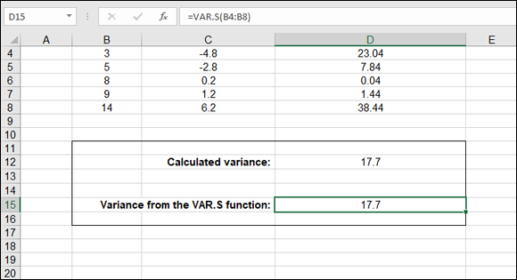
FIGURE 9-4: Calculating variance from the mean.
Column D squares the values in column C. This is an easy calculation. Here are the contents of cell D8: =C8^2. Finally, the sum of the squared deviations is divided by the number of items, less one item. The formula in cell D12 is =SUM(D4:D8)/(COUNT(B4:B8)-1).
Functions that do the work: VAR.S and VAR.P
Now that you know how to create a variance the textbook way, you can forget it all! Here, I show the mathematical steps so you can understand what happens, but Excel provides the VAR.S and VAR.P functions to do all the grunge work for you.
In Figure 9-4 earlier in this chapter, cell D15 shows the variance calculated directly with the VAR.S function: =VAR.S(B4:B8).
Try it yourself. Here's how:
Enter a list of numerical values.
Any mix of numbers will do.
- Position the cursor in the cell where you want the variance to appear.
- Type =VAR.S( to start the function.
- Drag the pointer over the list or enter the address of the range.
- Type a ) and press Enter.
Variance is calculated on a population of data or a sample of the population:
- The VAR.S function calculates variance on a sample of a population’s data.
- The VAR.P function calculates variance on the full population.
The calculation is slightly different in that the denominator for variance of a population is the number of items. The denominator for variance of a sample is the number of items less one. Figure 9-5 shows how VAR.S and VAR.P are used on a sample and the full population. Cells A4:A43 contain the number of hours spent watching TV daily by 40 individuals.
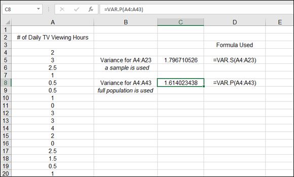
FIGURE 9-5: Calculating variance from the mean.
The VAR.S function calculates the variance of a sample of 20 values. The VAR.P function calculates the variance of the full population of 40 values. VAR.P is entered in the same fashion as VAR.S. Here’s how:
Enter a list of numerical values.
Any mix of numbers will do.
- Position the cursor in the cell where you want the variance to appear.
- Type =VAR.P( to start the function.
- Drag the pointer over the list or enter the address of the range.
- Type a ) and press Enter.
Analyzing deviations
Often, finding the mean is an adequate measure of a sample of data. Sometimes, the mean is not enough — you also want to know the average deviation from the mean. That is, you want to find the average of how far individual values differ from the mean of the sample. For example, you may need to know the average score on a test and how far the scores, on average, differ from the mean. Average deviation is another way to specify variance.
Here’s an example:
Score |
Deviation from 84.83 Mean |
78 |
6.83 |
92 |
7.17 |
97 |
12.17 |
80 |
4.83 |
72 |
12.83 |
90 |
5.17 |
The mean of this sample of values is 84.83. Use the AVERAGE function, if you want to double-check. Each individual value deviates somewhat from the mean. For example, 92 has a deviation value of 7.17 from the mean. A simple equation proves this: 92 – 84.83 = 7.17.
If you use the AVERAGE function to get the mean of the deviations, you have the average deviation. It’s even easier than that, though. Excel provides the AVEDEV function for this very purpose! AVEDEV calculates the mean and averages the deviations all in one step.
Here’s how to use the AVEDEV function:
- Enter a list of numerical values.
- Position the cursor in the cell where you want the average deviation to appear.
- Type =AVEDEV( to start the function.
- Drag the pointer over the list or enter the address of the range.
- Type a ) and press Enter.
The AVEDEV function averages the absolute deviations. In other words, negative deviations (where the data point is less than the mean) are converted to positive values for the calculation. For example, a value of 10 has a deviation of –40 from a mean of 50: 10 – 50 = –40. However, AVEDEV uses the absolute value of the deviation, 40, instead of –40.
The variance, explained earlier in the chapter, serves as the basis for a common statistical value called the standard deviation. Technically speaking, the standard deviation is the square root of the variance. Variance is calculated by squaring deviations from the mean.
The variance and the standard deviation are both valid measurements of deviation. However, the variance can be a confusing number to work with. In Figure 9-4 earlier in this chapter, the variance is calculated to be 17.7 for a group of values whose range is just 11 (14 – 3). How can a range that is only a size of 11 show a variance of 17.7? Well, it does, as shown in Figure 9-4.
This oddity is removed when you use the standard deviation. The reversing of the squaring brings the result back to the range of the data. The standard deviation value fits inside the range of the sample values. In addition, you'll find the standard deviation is more commonly used than the variance in statistical analyses. Excel has a standard deviation formula: STDEV.P. This is how you use it:
- Enter a list of numerical values.
- Position the cursor in the cell where you want the standard deviation to appear.
- Type =STDEV.P( to start the function.
- Drag the pointer over the list or enter the address of the range.
- Type a ) and press Enter.
Figure 9-6 takes the data and variance shown in Figure 9-4 and adds the standard deviation to the picture. The standard deviation is 3.762977544. This number fits inside the range of the sample data.
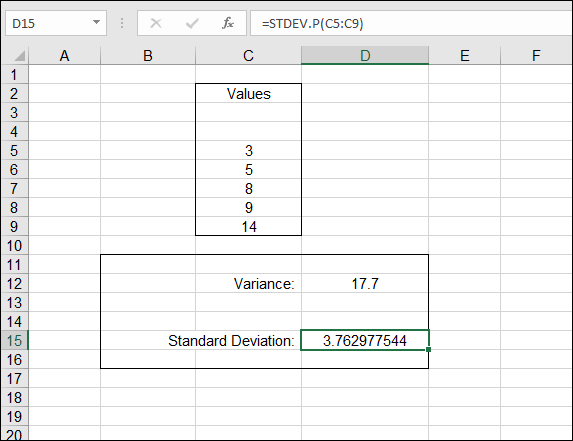
FIGURE 9-6: Calculating the standard deviation.
Looking for normal distribution
The standard deviation is one of the most widely used measures in statistical work. It’s often used to analyze deviation in a normal distribution. A distribution is the frequency of occurrences of values in a population or sample. A normal distribution often occurs in large data sets that have a natural, or random, attribute. For example, taking a measurement of the height of 1,000 10-year-old children will produce a normal distribution. Most of the measured heights center on and deviate somewhat from the mean. A few measured heights will be extreme — both considerably larger than the mean and considerably smaller than the mean.
Ringing the bell curve
A normal distribution is often visually represented as a graph in the shape of a bell — hence, the popular term bell curve. Figure 9-7 shows a normal distribution.
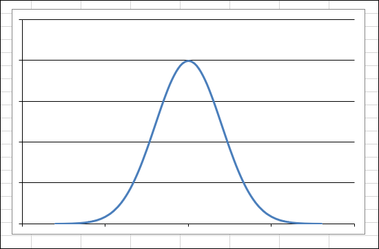
FIGURE 9-7: Displaying a normal distribution in a graph.
A normal distribution has some key characteristics:
- The curve is symmetrical around the mean. Half the measurements are greater than the mean, and half are less than the mean.
- The mean, median, and mode are the same.
- The highest point of the curve is the mean.
- The width and height are determined by the standard deviation. The larger the standard deviation, the wider and flatter the curve. You can have two normal distributions with the same mean and different standard deviations.
- 68.2 percent of the area under the curve is within one standard deviation of the mean (both to the left and the right), 95.44 percent of the area under the curve is within two standard deviations, and 99.72 percent of the area under the curve is within three standard deviations.
- The extreme left and right ends of the curve are called the tails. Extreme values are found in the tails. For example, in a distribution of height, very short heights are in the left tail, and very large heights are in the right tail.
Different sets of data almost always produce different means and standard deviations and, therefore, different-shaped bell curves. Figure 9-8 shows two superimposed normal distributions. Each is a perfectly valid normal distribution; however, each has its own mean and standard deviation, with the narrower curve having a smaller standard deviation.
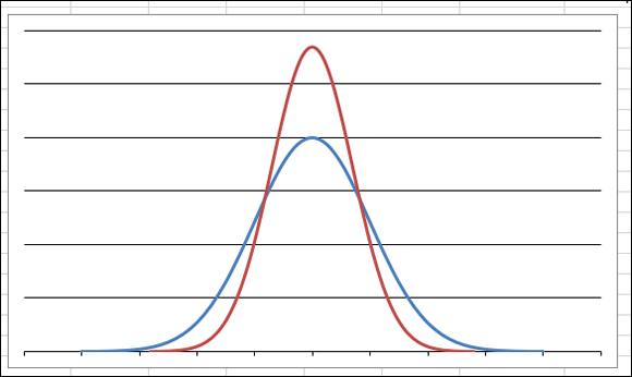
FIGURE 9-8: Normal distributions come in different heights and widths.
Analysis is often done with normal distributions to determine probabilities. For example, what is the probability that a 10-year-old child’s height is 54 inches? Somewhere along the curve is a discrete point that represents this height. Further computation (outside the scope of this discussion) returns the probability. What about finding the probability that a 10-year-old is 54 inches high or greater? Then the area under the curve is considered. These are the type of questions and answers determined with normal distributions.
A good amount of analysis of normal distributions involves the values in the tails: the areas to the extreme left and right of the normal distribution curve.
All normal distributions have a mean and a standard deviation. However, the standard normal distribution is characterized by having the mean equal 0 and the standard deviation equal 1.
A table of values serves as a lookup in determining probabilities for areas under the standard normal curve. This table is useful for working with data that has been modified to fit the standard normal distribution. This table is often found in the appendix section of statistics books and on the Internet as well. A search on the Internet for “areas under the normal standard curve” returns many useful results.
Using STANDARDIZE
To use this table of standard normal curve probabilities, you must standardize the data being analyzed. Excel provides the STANDARDIZE function for just this purpose. STANDARDIZE takes three arguments: the data point, the mean, and the standard deviation. The returned value is what the data point value is when the mean is 0 and the standard deviation is 1.
An individual value from a nonstandard normal distribution is referred to as x. An individual value from a standard normal distribution is referred to as z.
Figure 9-9 shows how the STANDARDIZE function changes raw values to standard values. The standard deviation of the raw data is 7.438637452, but the standard deviation of the standardized values is 1. The mean of the standardized values is 0.
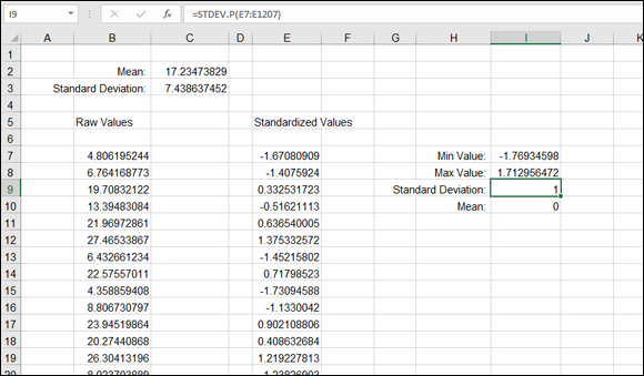
FIGURE 9-9: Standardizing a distribution of data.
Column B in Figure 9-9 has a long list of 1,200 random values. The mean is 17.23473829, as shown in cell C2. The standard deviation is 7.438637452, as shown in cell C3. For each data point in column B, the standardized value is displayed in column E. The list of values in column E are those returned with the STANDARDIZE function.
The STANDARDIZE function takes three arguments:
- Data point
- Mean of the distribution
- Standard deviation of the distribution
For example, this is the formula in cell E7:
=STANDARDIZE(B7,C$2,C$3)
Note that a few key properties of the distribution have changed after the values are standardized:
- The standard deviation is 1.
- The mean is 0.
- The standardized values fall within the range –1.77 to 1.72.
This third point is determined by using the MIN and MAX functions, respectively, in cells I7 and I8. Having values fall in the range –1.7 to 1.7 allows the values to be analyzed with the Areas Under the Standard Normal Curve table mentioned earlier. That is, it’s a property of standard normal curves to have all values fit into this range.
Here’s how to use the STANDARDIZE function:
Enter a list of numerical values in a column.
It makes sense if this list is a set of random observable data, such as heights, weights, or amounts of monthly rainfall.
Calculate the mean and standard deviation.
See “Getting Stuck in the Middle with AVERAGE, MEDIAN, and MODE” earlier in this chapter for more about the mean.
The STANDARDIZE function references these values. The mean is calculated with the AVERAGE function, and the standard deviation is calculated with the STDEV.P function. STDEV.P is used instead of STDEV.S because the whole data population is used.- Place the cursor in the cell adjacent to the first data point entered in Step 1.
- Type =STANDARDIZE( to start the function.
- Click the cell that has the first data point.
- Type a comma (,).
- Click the cell that has the mean.
- Type a comma (,).
- Click the cell that has the standard deviation.
Type a ) to end the function.
The formula with the STANDARDIZE function is now complete. However, you must edit it to fix the references to the mean and standard deviation. The references need to be made absolute so they won’t change when the formula is dragged down to other cells.
- Double-click the cell with the formula to enter the edit mode.
- Precede the column and row parts of the reference to the cell that contains the mean with a dollar sign (
$). - Precede the column and row parts of the reference to the cell that contains the standard deviation with a dollar sign (
$). - Press Enter or press the Tab key to end the editing.
- Use the fill handle to drag the formula down to the rest of the cells that are adjacent to the source data points.
It's important that the references to the mean and standard deviation are treated as absolute references so they won’t change when the formula is dragged to the other cells. Therefore, the formula should end up looking like this: =STANDARDIZE(B7,$C$2,$C$3). Note the $ signs.
Skewing from the norm
There is deviation in a distribution, but who says the deviation has to be uniform with deviation the same on both sides of the mean? Not all distributions are normal. Some are skewed, with more values clustered either below the mean or above it:
- When more values fall below the mean, the distribution is positively skewed.
- When more values fall above the mean, the distribution is negatively skewed.
The following minitable has a few examples:
Values |
Mean |
Comment |
1, 2, 3, 4, 5 |
3 |
There is no skew. An even number of values fall above and below the mean. |
1, 2, 3, 6, 8 |
4 |
The distribution is positively skewed. More values fall below the mean. |
1, 2, 8, 9, 10 |
6 |
The distribution is negatively skewed. More values fall above the mean. |
Figure 9-10 shows a distribution plot, where 1,000 values are in the distribution, ranging between 1 and 100. The values are summarized in a table of frequencies (discussed later in this chapter). The table of frequencies is the source of the chart.
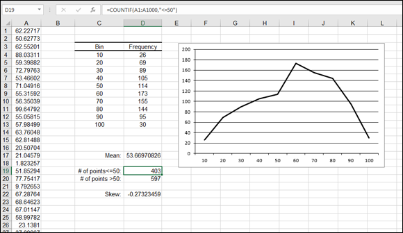
FIGURE 9-10: Working with skewed data.
The mean of the distribution is 53.669, shown in cell D17. Cells D19 and D20 show the number of values that fall above and below the mean. There are more values above the mean than below. The distribution, therefore, is negatively skewed.
The actual skew factor is –0.27323459. The formula in cell D22 is =SKEW(A1:A1000). The chart makes it easy to see the amount of skew. The plot is leaning to the right.
Finding out the amount of skew in a distribution can help identify bias in the data. If, for example, the data is expected to fall into a normal (unskewed) distribution (such as a random sampling of height for 10-year-old children) and the data is skewed, you have to wonder whether some bias got into the data. Perhaps some 14-year-old children were measured by mistake and those heights were mixed in with the data. Of course, being skewed is not itself an indication of bias. Some distributions are skewed by their very nature.
SKEW
Here's how to use the SKEW function to determine the skewness of a distribution:
- Enter a list of numerical values.
- Position the cursor in the cell where you want the amount of skew to appear.
- Type =SKEW( to start the function.
- Drag the pointer over the list or enter the address of the range.
- Type a ) and press Enter.
KURT
Another way that a distribution can differ from the normal distribution is kurtosis. This is a measure of the peakedness or flatness of a distribution compared with the normal distribution. It is also a measure of the size of the curves’ tails. You determine kurtosis with the KURT function, which returns a positive value if the distribution is relatively peaked with small tails compared with the normal distribution. A negative result means that the distribution is relatively flat with large tails.
Figure 9-11 shows the curves of two distributions. The one on the left has a negative kurtosis of –0.82096, indicating a somewhat flat distribution. The distribution on the right is above 1, which means that the distribution has a pronounced peak and relatively shorter tails.
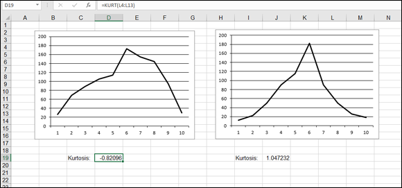
FIGURE 9-11: Measuring the kurtosis of two distributions.
This is how to use the KURT function:
- Enter a list of numerical values.
- Position the cursor in the cell where you want kurtosis to appear.
- Type =KURT( to start the function.
- Drag the pointer over the list or enter the address of the range.
- Type a ) and press Enter.
Comparing data sets
At times, you may need to compare two sets of data to see how they relate to each other. For example, how does the amount of snowfall affect the number of customers entering a store? Does the money spent on advertising increase the number of new customers? You answer these questions by determining whether the two data sets are correlated.
Excel provides two functions for this task: COVARIANCE.S (or COVARIANCE.P) and CORREL. These functions return the covariance and correlation coefficient results from comparing two sets of data.
COVARIANCE.S and COVARIANCE.P
Either COVARIANCE function takes two arrays as its arguments and returns a single value. The value can be positive or negative. A positive value means that the two arrays of data tend to move in the same direction: If data set A increases (or decreases), data set B also increases (or decreases). A negative value means that the two data sets tend to move in opposite directions: When A increases, B decreases, and vice versa. The covariance’s absolute value reflects the strength of the relationship.
When COVARIANCE.S or COVARIANCE.P returns 0, there is no relationship between the two sets of data.
Sales of bread will likely create sales of butter; they’re somewhat related. In other words, the amount of butter a store sells is likely to follow the amount of bread it sells: more bread, more butter.
Day |
Loaves of Bread Sold |
Tubs of Butter Sold |
Monday |
62 |
12 |
Tuesday |
77 |
15 |
Wednesday |
95 |
26 |
As bread sales increase, so do sales of butter. Therefore, sales of butter are expected to have a positive relation to sales of bread. These items complement each other. By contrast, bread and muffins compete against each other. As bread is purchased, the sales of muffins likely suffer because people will eat one or the other. Without even using any function, you can conclude that bread sales and butter sales move in the same direction and that bread sales and muffin sales move in differing directions. But by how much?
Figure 9-12 shows an example that measures snowfall and the number of customers coming into a store. Two covariance calculations are given: one for snowfall between 0 and 3 inches, and one for snowfall between 0 and 8 inches.
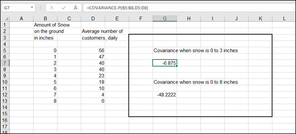
FIGURE 9-12: Using COVARIANCE to look for a relationship between two data sets.
In Figure 9-12, the first COVARIANCE measures the similarity of the amount of snowfall with the number of customers, but just for 0 to 3 inches of snow. The formula in cell G7 is =COVARIANCE.P(B5:B8,D5:D8). The answer is –6.875. This means that as snowfall increases, the number of customers decreases. The two sets of data go in opposite directions. As one goes up, the other goes down. This is confirmed by the result’s being negative.
The formula in cell G12 is =COVARIANCE.P(B5:B13,D5:D13). This examines all the values of the data sets, inclusive of 0 to 8 inches of snow. The covariance is –47.7778. This, too, confirms that as snowfall increases, the number of customers decreases.
However, note that the covariance of the first calculation, for 0 to 3 inches of snow, is not as severe as the second calculation for 0 to 8 inches. When there are just up to 3 inches of snow on the ground, some customers stay away — but not that many. On the other hand, when there are 8 inches of snow, no customers show up. The first covariance is comparably less than the second: –6.875 versus –48.2222. The former number is closer to 0 and tells you that a few inches of snow don't have much effect. The latter number is significantly distanced from 0, and sure enough, when up to 8 inches of snow is considered, customers stay home.
Note that the COVARIANCE.P function is used for the data in rows 5 through 8 because those data points are being considered as a population, not as a sample of a population.
Here’s how to use the COVARIANCE.P function:
Enter two lists of numbers.
The lists must be the same size.
- Position the cursor in the cell where you want covariance to appear.
- Type =COVARIANCE.P( to start the function.
- Drag the pointer over the first list or enter the address of the range.
- Type a comma (,).
- Drag the pointer over the second list or enter the address of the range.
- Type a ) and press Enter.
CORREL
The CORREL function works in the same manner as COVARIANCE, but the result is always between –1 and 1. The result is, in effect, set to a standard. Then the results of correlations can be compared.
A negative result means that there is an inverse correlation. As one set of data goes up, the other goes down. The actual negative value tells you to what degree the inverse correlation is. A value of –1 means the two sets of data move perfectly in opposite directions. A value of –0.5, for example, means that the two sets move in somewhat opposite directions.
The CORREL function returns a value between –1 and 1. A positive value means that the two data sets move in the same direction. A negative value means that the two sets of data move in opposite directions. A value of 0 means that there is no relation between the sets of data.
Figure 9-13 shows three correlation results. The correlations display how customers reacted (as a percentage increase in sales) with regard to three types of advertising. All three advertising campaigns show a positive correlation. As more money is spent on advertising, customer responsiveness increases (or at least doesn’t reverse its direction).
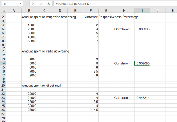
FIGURE 9-13: Comparing the results of advertising campaigns.
All three returned correlation values fall within the range of 0 to 1 and, therefore, are easy to compare. The evidence is clear: Direct mail is not as efficient as magazine or radio advertising. Both the magazine and radio advertising score high; the returned values are close to 1. However, direct mail returns a correlation of 0.4472. A positive correlation does exist — that is, direct-mail expenditures create an increase in customer responsiveness. But the correlation is not as strong as magazine or radio advertising. The money spent on direct mail would be better spent elsewhere.
Here’s how to use the CORREL function:
Enter two lists of numbers.
The lists must be the same size.
- Position the cursor in the cell where you want correlation to appear.
- Type =CORREL( to start the function.
- Drag the pointer over the first list or enter the address of the range.
- Type a comma (,).
- Drag the pointer over the second list or enter the address of the range.
- Type a ) and press Enter.
Analyzing Data with Percentiles and Bins
No, not with trash bins (although you may want to throw your data out at times)! The term bins refers to analyzing data by determining how many data points fall into specified ranges, or bins. Percentiles is a technique for analyzing data by determining where values relate, percentagewise, to the entire data set.
Imagine this: A pharmaceutical company is testing a new drug to lower cholesterol. The data is 500 cholesterol readings from the people in the sample. Of interest is how the data breaks up with regard to the 25 percent, the 50 percent, and the 75 percent marks. That is, what cholesterol reading is greater than 25 percent of the data (and, therefore, smaller than 75 percent of the data)? What value is at the 50 percent position? These measures are called quartiles because they divide the sample into four quarters.
QUARTILE.INC and QUARTILE.EXC
The QUARTILE function is designed specifically for this kind of analysis. The function takes two arguments. One argument is the range of the sample data, and the other indicates which quartile to return. The second argument can be 0, 1, 2, 3, or 4 when you’re using QUARTILE.INC; or 1, 2, or 3 when you’re using QUARTILE.EXC. QUARTILE.EXC is used when the minimum and maximum values are to be excluded. Therefore, that version of the function does not take 0 or 4 as the second argument:
Formula |
Result |
|
Minimum value in the data |
|
Value at the 25th percentile |
|
Value at the 50th percentile |
|
Value at the 75th percentile |
|
Maximum value in the data |
QUARTILE.INC (or QUARTILE.EXC) works on ordered data, but you don't have to do the sorting; the function takes care of that. In Figure 9-14, the quartiles have been calculated. The minimum and maximum values have been returned by using 0 and a 4, respectively, as the second argument.
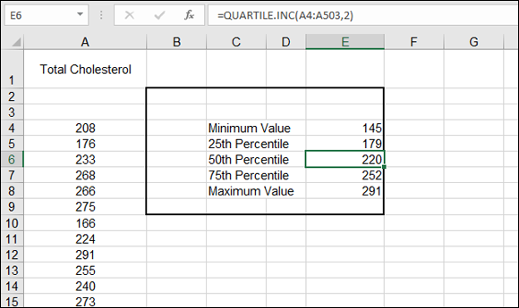
FIGURE 9-14: Finding out values at quarter percentiles.
Here’s how to use the QUARTILE function:
- Enter a list of numerical values.
- Position the cursor in the cell where you want a particular quartile to appear.
- Type =QUARTILE.INC( to start the function.
- Drag the pointer over the list or enter the address of the range.
- Type a comma (,).
- Enter a value between 0 and 4 for the second argument.
- Type a ) and press Enter.
PERCENTILE.INC and PERCENTILE.EXC
The PERCENTILE functions are similar to the QUARTILE functions except that you can specify which percentile to use when returning a value. You aren’t locked into fixed percentiles such as 25, 50, or 75.
PERCENTILE.INC (or PERCENTILE.EXC) takes two arguments:
- Range of the sample
- Value between 0 and 1
The value tells the function which percentile to use. For example, 0.1 is the 10th percentile, 0.2 is the 20th percentile, and so on.
Use the QUARTILE.INC function to analyze data at the fixed 25th, 50th, and 75th percentiles. Use the PERCENTILE.INC function to analyze data at any desired percentile. PERCENTILE.EXC is used when the second argument is exclusive of 0 and 1. In other words, the second argument can be any value between 0 and 1 but not 0 or 1.
Figure 9-15 shows a sample of test scores. Who scored at or above the 90th percentile? The highest-scoring students deserve some recognition. Bear in mind that scoring at the 90th percentile is not the same as getting a score of 90. Values at or above the 90th percentile are those that are in the top 10 percent of whatever scores are in the sample.
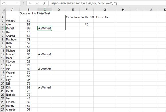
FIGURE 9-15: Using PERCENTILE to find high scorers.
It so happens that the score that is positioned at the 90th percentile is 80. Cell F4 has the formula =PERCENTILE.INC(B3:B27,0.9), which uses 0.9 as the second argument.
The cells in C3:C27 all have a formula that tests whether the cell to the left, in column B, is at or greater than the 90th percentile. For example, cell C3 has this formula: =IF(B3>=PERCENTILE.INC(B$3:B$27,0.9), "A Winner!","").
If the value in cell B3 is equal to or greater than the value at the 90th percentile, cell C3 displays the text "A Winner!". The value in cell B3 is 59, which doesn't make for a winner. On the other hand, the value in cell B5 is greater than 80, so cell C5 displays the message.
Here’s how to use the PERCENTILE.INC function:
- Enter a list of numerical values.
- Position the cursor in the cell where you want the result to appear.
- Type =PERCENTILE.INC( to start the function.
- Drag the pointer over the list or enter the address of the range.
- Type a comma (,).
Enter a value between 0 and 1 for the second argument.
This tells the function what percentile to seek.
- Type a ) and press Enter.
RANK
The RANK.EQ or RANK.AVG function tells you the rank of a particular number — in other words, where the value is positioned — within a distribution. In a sample of ten values, for example, a number could be the smallest (rank = 1), the largest (rank = 10), or somewhere in between. The function takes three arguments:
- The number being tested for rank: If this number isn’t found in the data, an error is returned.
- The range to look in: A reference to a range of cells goes here.
- A 0 or a 1, telling the function how to sort the distribution: A 0 (or if the argument is omitted) tells the function to sort the values in descending order. A 1 tells the function to sort in ascending order. The order of the sort makes a difference in how the result is interpreted. Is the value in question being compared to the top value of the data or the bottom value?
The difference between RANK.EQ and RANK.AVG is that if more than one value is at the same rank, RANK.EQ uses the larger value, whereas RANK.AVG uses the average of the values.
Figure 9-16 displays a list of employees and the bonuses they earned. Suppose that you’re the employee who earned $4,800. You want to know where you rank in the range of bonus payouts. Cell F4 contains a formula with the RANK.EQ function: =RANK.EQ(C9,C3:C20). The function returns an answer of 4. Note that the function was entered without the third argument. Leaving the third argument out tells the function to sort the distribution in descending order. This makes sense for determining how close to the top of the range a value is.
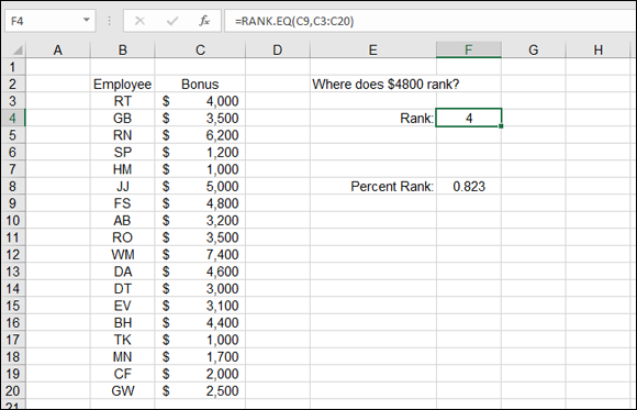
FIGURE 9-16: Determining the rank of a value.
Follow these steps to use the RANK function:
- Enter a list of numerical values.
- Position the cursor in the cell where you want the result to appear.
- Type =RANK.EQ( to start the function.
Click the cell that has the value you want to find the rank for or enter its address.
You can also just enter the actual value.
- Type a comma (,).
- Drag the pointer over the list of values or enter the address of the range.
If you want to have the number evaluated against the list in ascending order, enter a comma (,) and then enter a 1.
Descending order is the default and doesn’t require an argument to be entered.
- Type a ) and press Enter.
PERCENTRANK
The PERCENTRANK.INC or PERCENTRANK.EXC formula also returns the rank of a value but tells you where the value is as a percentage. In other words, the PERCENTRANK function may tell you that a value is positioned 20 percent into the ordered distribution. PERCENTRANK takes three arguments:
- The range of the sample.
- The number being evaluated against the sample.
- An indicator of how many decimal places to use in the returned answer. (This is an optional argument. If it’s left out, three decimal places are used.)
PERCENTRANK.EXC is used when a rank between 0 and 100 percent (between 0 and 1) is to be returned, but not 0 or 1. In Figure 9-16 earlier in this chapter, the percentage rank of the $4,800 value is calculated to be 82.3 percent (0.823). Therefore, $4,800 ranks at the 82.3 percent position in the sample. The formula in cell F8 is =PERCENTRANK.INC(C3:C20,C9).
In the RANK.EQ function, the value being evaluated is the first argument, and the range of the values is the second argument. In the PERCENTRANK.INC function, the order of these arguments is reversed.
Follow these steps to use the PERCENTRANK.INC function:
- Enter a list of numerical values.
- Position the cursor in the cell where you want the result to appear.
- Type =PERCENTRANK.INC( to start the function.
- Drag the pointer over the list of values or enter the address of the range.
- Type a comma (,).
Click the cell that has the value you want to find the rank for or enter its address.
You can also just enter the actual value.
- If you want to have more or less than three decimal places returned in the result, enter a comma (,) and then enter the number of desired decimal places.
- Type a closing ) to end the function.
FREQUENCY
The FREQUENCY function places the count of values in a sample in bins. A bin represents a range of values, such as 0–1 or 20–29. Typically, the bins used in an analysis are the same size and cover the entire range of values. For example, if the data values range from 1–100, you might create ten bins each, ten units wide. The first bin would be for values of 1 to 10, the second bin would be for values of 11 to 20, and so on.
Figure 9-17 illustrates this. There are 300 values in the range B3:B302. The values are random, between 1 and 100. Cells D3 through D12 have been set as bins that each cover a range of ten values. Note that for each bin, its number is the top of the range it's used for. For example, the 30 bin is used for holding the count of how many values fall between 21 and 30.
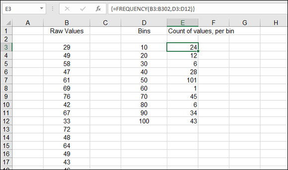
FIGURE 9-17: Setting up bins to use with the FREQUENCY function.
A bin holds the count of values within a numeric range — the number of values that fall into the range. The bin’s number is the top of its range.
FREQUENCY is an array function and requires specific steps to be used correctly. Here is how it’s done:
Enter a list of values.
This can be a lengthy list and likely represents some observed data, such as the age of people using the library or the number of miles driven on the job. Obviously, you can use many types of observable data.
Determine the high and low values of the data.
You can use the MAX and MIN functions for this.
Determine what your bins should be.
This is subjective. For example, if the data has values from 1 to 100, you can use 10 bins that each cover a range of 10 values. Or you can use 20 bins that each cover a range of 5 values. Or you can use 5 bins that each cover a range of 20 values.
- Create a list of the bins by entering the high number of each bin’s range, as shown in cells D3:D12 in Figure 9-17.
- Click the first cell where you want the output of FREQUENCY to be displayed.
Drag down to select the rest of the cells.
There should now be a range of selected cells. The size of this range should match the number of bins. Figure 9-18 shows what the worksheet should look like at this step.
- Type =FREQUENCY( to start the function.
- Drag the cursor over the sample data or enter the address of the range.
- Type a comma (,).
Drag the cursor over the list of bins or enter the address of that range.
Figure 9-19 shows what the worksheet should look like at this point.
Type a ).
Do not press Enter.
- Press Ctrl+Shift+Enter to end the function entry.
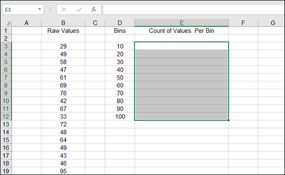
FIGURE 9-18: Preparing to enter the FREQUENCY function.
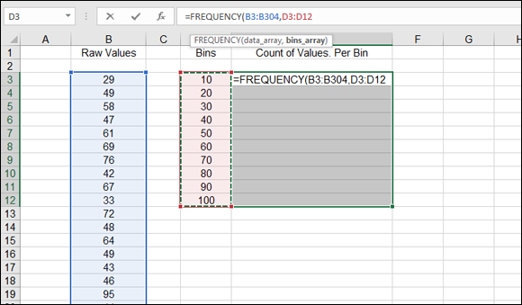
FIGURE 9-19: Completing the entry of the FREQUENCY function.
Hurray, you did it! You have entered an array function. All the cells in the range where FREQUENCY was entered have the same exact formula. The returned values in these cells are the count of values from the raw data that falls within the bins. This is called a frequency distribution.
Next, take this distribution and plot a curve from it:
Select the Count of Values per bin range data.
That’s E3:E12 in this example.
- Click the Insert tab on the Ribbon.
- In the Charts section, click the Column Chart item to display a selection of column chart styles (see Figure 9-20).
Select the desired chart style to create the chart.
Figure 9-21 shows the completed frequency distribution chart.
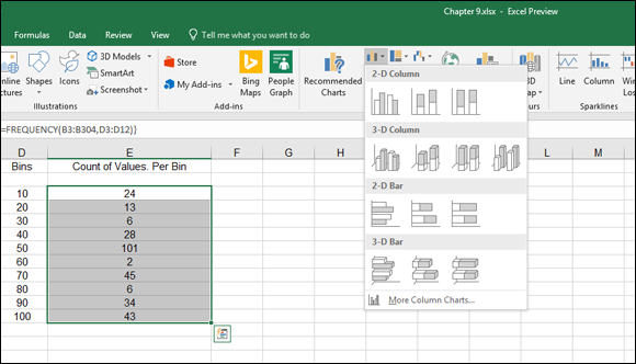
FIGURE 9-20: Preparing to plot the frequency distribution.
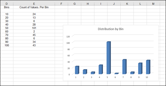
FIGURE 9-21: Displaying a frequency distribution as a column chart.
A frequency distribution is also known as a histogram.
MIN and MAX
Excel has two functions — MIN and MAX — that return the lowest and highest values in a set of data. These functions are simple to use. The functions take up to 255 arguments, which can be cells, ranges, or values.
Figure 9-22 shows a list of home sales. What are the highest and lowest values? Cell F4 displays the lowest price in the list of sales, with this formula: =MIN(C4:C1000). Cell F6 displays the highest price with this formula: =MAX(C4:C1000).
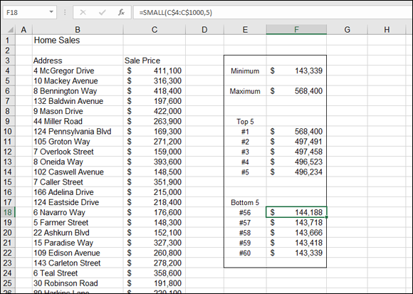
FIGURE 9-22: Finding high and low values.
Here's how to use the MIN or MAX function:
- Enter a list of numerical values.
- Position the cursor in the cell where you want the result to appear.
- Type either =MIN( or =MAX( to start the function.
- Drag the pointer over the list or enter the address of the range.
- Type a ) and press Enter.
MIN and MAX return the upper and lower values of the data. What if you need to know the value of the second-highest price? Or the third-highest price?
LARGE and SMALL
The LARGE and SMALL functions let you find out a value that is positioned at a certain point in the data. LARGE is used to find the value at a position that is offset from the highest value. SMALL is used to find the value at a position that is offset from the lowest value.
Figure 9-22 earlier in this chapter displays the top five home sales, as well as the bottom five. Both the LARGE and SMALL functions take two arguments: the range of the data in which to find the value, and the position relative to the top or bottom.
The top five home sales are found with LARGE. The highest sale, in cell F10, is returned with this formula: =LARGE(C$4:C$1000,1). Because the function used here is LARGE, and the second argument is 1, the function returns the value at the first position. By no coincidence, this value is also returned by the MAX function.
To find the second-highest home sales, the second argument to LARGE is 2. Cell F11 has this formula: =LARGE(C$4:C$1000,2). The third-, fourth-, and fifth-largest home sales are returned in the same fashion when 3, 4, and 5, respectively, are used as the second argument.
The bottom five sales are returned in the same fashion by the SMALL function. For example, cell F22 has this formula: =SMALL(C$4:C$1000,1). The returned value, $143,339, matches the value returned by the MIN function. The cell just above it, F21, has this formula: =SMALL(C$4:C$1000,2).
Hey, wait! You may have noticed that the functions are looking down to row 1000 for values, but the bottom listing is numbered as 60. An interesting thing to note in this example is that all the functions use row 1000 as the bottom row to look in, but this doesn't mean there are that many listings. This is intentional. There are only 60 listings for now. What happens when new sales are added to the bottom of the list? By giving the functions a considerably larger range than needed, you’ve built in the ability to handle a growing list.
The labels in cells E10:E14 (#1, #2, and so on) are entered as is. Clearly, any ranking that starts from the top would begin with # 1, proceed to # 2, and so on.
However, the labels in cells E18:E22 (#56, #57, and so on) were created with formulas. The COUNTA function is used to count the total number of listings. Even though the function looks down to row 1000, it finds only 60 listings, so that is the returned count. The #60 label is based on this count. The other labels (#59, #58, #57, and #56) are created by reducing the count by 1, 2, 3, and 4, respectively:
- The formula in cell E22 is
="# " & COUNTA(B$4:B$1000). - The formula in cell E21 is
="# " & COUNTA(B$4:B$1000)-1. - The formula in cell E20 is
="# " & COUNTA(B$4:B$1000)-2. - The formula in cell E19 is
="# " & COUNTA(B$4:B$1000)-3. - The formula in cell E18 is
="# " & COUNTA(B$4:B$1000)-4.
Here's how to use the LARGE and SMALL functions:
- Enter a list of numerical values.
- Position the cursor in the cell where you want the result to appear.
- Type =LARGE( or =SMALL( to start the function.
- Drag the pointer over the list or enter the address of the range.
- Type a comma (,).
- Enter a number indicating the position to return.
- Type a ) and press Enter.
Use LARGE to find a value’s position relative to the highest value. Use SMALL to find a value’s position relative to the smallest value.
Going for the Count
The COUNT, COUNTA, and COUNTIF functions return, well, a count. What else could it be with names like that?
COUNT and COUNTA
COUNT is straightforward. It counts how many items are in a range of values. There is a catch, though: Only numeric values and dates are counted. Text values are not counted; neither are blank cells.
COUNTA works the same way as COUNT, but it counts all cells that are not empty, including text cells.
To use the COUNT function, follow these steps:
- Enter a list of numerical values.
- Position the cursor in the cell where you want the result to appear.
- Type =COUNT( to start the function.
- Drag the pointer over the list or enter the address of the range.
- Type a ) and press Enter.
Figure 9-23 shows a list of popular movies along with the sales figure and the year for each movie. Cell F5 displays the count of movies, returned with the COUNT function. The formula in cell F5 is =COUNT(C5:C329).
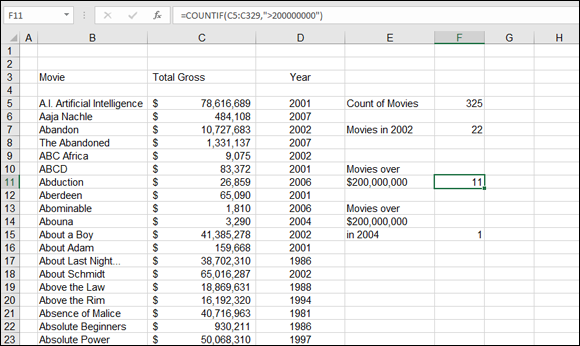
FIGURE 9-23: Counting with and without criteria.
Note that the range entered in the function looks at the sales figures for the movies. This is intentional. Sales figures are numeric. If COUNT used the range of movie titles, in column B, the count would be 0 because this column contains text data.
COUNTIF
The COUNTIF function is handy when you need to count how many items are in a list that meet a certain condition. In Figure 9-23 earlier in this chapter, cell F7 shows the count of movies made in 2002. The formula in cell F7 is =COUNTIF(D5:D329,2002).
The COUNTIF function takes two arguments:
- The range address of the list to be counted
- The criterion
Table 9-1 presents some examples of criteria for the COUNTIF function.
TABLE 9-1 Using Criteria with the COUNTIF Function
Example |
Comment |
|
Returns the count of movies made in 2002. |
|
Returns the count of movies made in 2002. Note that this is unique in that the criteria do not need to be in double quotes because the criterion is a simple equality. |
|
Returns the count of movies made before 2002. |
|
Returns the count of movies made in or after 2002. |
|
Returns the count of movies not made in 2002. |
The criteria can also be based on text. For example, COUNTIF can count all occurrences of Detroit in a list of business trips. You can use wildcards with COUNTIF. The asterisk (*) is used to represent any number of characters, and the question mark (?) is used to represent a single character.
As an example, using an asterisk after Batman returns the number of Batman movies listed in column B in Figure 9-23 earlier in this chapter. The formula that does this looks like this: =COUNTIF(B5:B329, "Batman*"). Notice the asterisk after Batman. This lets the function count Batman and Robin, Batman Returns, and Batman Forever along with just Batman.
Your criterion can be entered in a cell rather than directly in the COUNTIF function. Then just use the cell address in the function. For example, if you enter "Batman*" in cell C1, =COUNTIF(B5:B329,C1) would have the same result as the previous example. Cell F11 in Figure 9-23 returns the count of movies that have earned more than $200,000,000. The formula is =COUNTIF(C5:C329, ">200000000").
What if you need to determine the count of data items that match two conditions? Can do! The formula in cell F15 returns the count of movies that were made in 2004 and earned more than $200,000,000. However, COUNTIF is not useful for this type of multiple condition count. Instead, the SUMPRODUCT function is used. The formula in cell F15 follows:
=SUMPRODUCT((C5:C329>200000000)*(D5:D329=2004))
Believe it or not, this works. Although this formula looks like it’s multiplying the number of movies that earned at least $200,000,000 by the number of movies made in 2004, it’s really returning the count of movies that meet the two conditions. (Quick trivia: Which two 1998 movies earned at least $200,000,000? The answer [drum roll, please]: Armageddon and Saving Private Ryan.)
To use the COUNTIF function, follow along:
- Enter a list of numerical values.
- Position the cursor in the cell where you want the result to appear.
- Type =COUNTIF( to start the function.
- Drag the pointer over the list or enter the address of the range.
- Type a comma (,).
Enter a condition and enclose the condition in double quotes.
Use the following as needed:
- = (equal to)
- > (greater than)
- < (less than)
- * (wildcard)
- ? (wildcard)
- <> (not equal to)
Type a ) and press Enter.
The result is a count of cells that match the condition.
There is also a COUNTIFS function. This function allows using multiple ranges and criteria to return a count. COUNTIFS is quite similar to SUMIFS, discussed in Chapter 8.