Chapter 11
Rolling the Dice on Predictions and Probability
IN THIS CHAPTER
 Understanding linear and exponential models
Using SLOPE and INTERCEPT to describe linear data
Predicting future data from existing data
Working with normal and Poisson distributions
When you’re analyzing data, one of the most important steps is usually to determine what model fits the data. No, I'm not talking about a model car or model plane! This is a mathematical model or, put another way, a formula that describes the data. The question of a model is applicable to all data that comes in X-Y pairs, such as the following:
- Comparisons of weight and height measurements
- Data on salary versus educational level
- Number of fish feeding in a river by time of day
- Number of employees calling in sick as related to day of the week
Modeling
Suppose now that you plot all the data points on a chart — a scatter chart, in Excel terminology. What does the pattern look like? If the data is linear, the data points fall more or less along a straight line. If they fall along a curve rather than a straight line, they aren’t linear and are likely to be exponential. These two models — linear and exponential — are the two most commonly used models, and Excel provides functions for working with them.
Linear model
In a linear model, the mathematical formula that models the data is as follows:
Y = mX + b
 This formula tells you that for any X value, you calculate the Y value by multiplying X by a constant m and then adding another constant b. The value m is called the line’s slope, and b is the Y intercept (the value of Y when X = 0). This formula gives a perfectly straight line, and real-world data doesn’t fall exactly on such a line. The point is that the line, called the linear regression line, is the best fit for the data. The constants m and b are different for each data set.
Exponential model
In an exponential model, the following formula models the data:
Y = bmX
The values b and m are, again, constants. Many natural processes, including bacterial growth and temperature change, are modeled by exponential curves. Figure 11-1 shows an example of an exponential curve. This curve is the result of the preceding formula when b = 2 and m = 1.03.
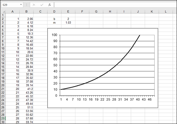
FIGURE 11-1: An exponential curve.
 Again, b and m are constants that are different for each data set.
Getting It Straight: Using SLOPE and INTERCEPT to Describe Linear Data
As I discuss earlier in this chapter, many data sets can be modeled by a straight line. In other words, the data is linear. The line that models the data, known as the linear regression line, is characterized by its slope and its Y intercept. Excel provides the SLOPE and INTERCEPT functions to calculate the slope and Y intercept of the linear regression line for a set of data pairs.
The SLOPE and INTERCEPT functions take the same two arguments:
- The first argument is a range or array containing the Y values of the data set.
- The second argument is a range or array containing the X values of the data set.
The two ranges must contain the same number of values; otherwise, an error occurs. Follow these steps to use either of these functions:
- In a blank worksheet cell, type =SLOPE( or =INTERCEPT( to start the function entry.
- Drag the mouse over the range containing the Y-data values or enter the range address.
- Type a comma (,).
- Drag the mouse over the range containing the X-data values or enter the range address.
- Type a ) and press Enter.
 When you know the slope and Y intercept of a linear regression line, you can calculate predicted values of Y for any X by using the formula Y = mX + b where m is the slope and b is the Y intercept. But Excel’s FORECAST and TREND functions can do this for you.
Knowing the slope and intercept of a linear regression line is one thing, but what can you do with this information? One very useful thing is to actually draw the linear regression line along with the data points. This method of graphical presentation is commonly used; it lets the viewer see how well the data fits the model.
To see how this is done, look at the worksheet in Figure 11-2. Columns A and B contain the X and Y data, and the chart shows a scatter plot of this data. It seems clear that the data is linear and that you can validly use SLOPE and INTERCEPT with them.
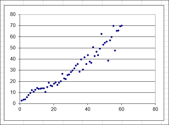
FIGURE 11-2: The scatter plot indicates that the X and Y data in this worksheet are linear.
The first step is to put these functions in the worksheet, as follows. (You can use any worksheet that has linear X-Y data in it.)
- Type the label Slope in an empty cell.
- In the cell to the right, type =SLOPE( to start the function entry.
- Drag the mouse over the range containing the Y-data values or enter the range address.
- Type a comma (,).
- Drag the mouse over the range containing the X-data values or enter the range address.
- Type a ).
- Press Enter to complete the formula.
- In the cell below the slope label, type the label Intercept.
- In the cell to the right, type =Intercept(.
- Drag the mouse over the range containing the Y-data values or enter the range address.
- Type a comma (,).
- Drag the mouse over the range containing the X-data values or enter the range address.
- Type a ) and press Enter to complete the formula.
At this point, the worksheet displays the slope and intercept of the linear regression line for your data. The next task is to display this line on the chart, as follows:
If necessary, add a new empty column to the worksheet to the right of the Y-value column.
To do this, click any cell in the column immediately to the right of the Y-value column, and then, on the Home tab on the Ribbon, click the Insert button and select Insert Sheet Columns.
- Place the cursor in this column in the same row as the first X value.
- Type an equal sign (=) to start a formula.
- Click the cell where the SLOPE function is located to enter its address in the formula.
Press F4 to convert the address to an absolute reference.
It displays with dollar signs.
- Enter the multiplication symbol (*).
- Click the cell containing the X value for that row.
- Enter the addition symbol (+).
- Click the cell containing the INTERCEPT function to enter its address in the formula.
Press F4 to convert the address to an absolute reference.
It displays with dollar signs.
- Press Enter to complete the formula.
- Make sure the cursor is in the cell where you just entered the formula.
- Press Ctrl+C to copy the formula to the Clipboard.
- Hold down the Shift key and press the ↓ key until the entire column is highlighted down to the row containing the last X value.
- Press Enter to copy the formula to all selected cells.
At this point, the column of data you just created contains the Y values for the linear regression line. The final step is to create a chart that displays both the actual data and the computed regression line. Follow these steps:
- Highlight all three columns of data: the X values, the actual Y values, and the computed Y values.
- Click the Insert tab on the Ribbon (shown in Figure 11-3).
- Click the Scatter Chart button.
- Select the basic Scatter Chart type.
Click the Finish button.
The chart displays, as shown in Figure 11-4. You can see two sets of points. The scattered points are the actual data, and the straight line is the linear regression line.
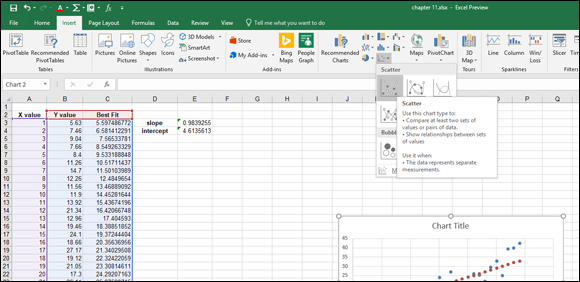
FIGURE 11-3: Creating a scatter chart.
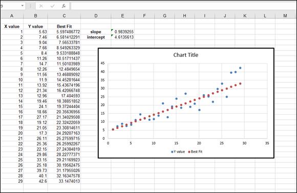
FIGURE 11-4: A data set displayed with its linear regression line.
What’s Ahead: Using FORECAST, TREND, and GROWTH to Make Predictions
The FORECAST function does just what its name suggests: forecasts an unknown data value based on existing, known data values. The function is based on a single important assumption: that the data is linear. Exactly what does this mean?
FORECAST
The data that FORECAST works with is in pairs; there’s an X value and a corresponding Y value in each pair. Perhaps you’re investigating the relationship between people’s heights and their weight. Each data pair would be one person’s height — the X value — and that person’s weight — the Y value. Many kinds of data are in this form — sales by month, for example, or income as a function of educational level.
You can use the CORREL function to determine the degree of linear relationship between two sets of data. See Chapter 9 to find out about the CORREL function.
To use the FORECAST function, you must have a set of X-Y data pairs. Then you provide a new X value, and the function returns the Y value that would be associated with that X value based on the known data. The function takes three arguments:
- The first argument is the X value for which you want a forecast.
- The second argument is a range containing the known Y values.
- The third argument is a range containing the known X values.
Note that the X and Y ranges must have the same number of values; otherwise, the function returns an error. The X and Y values in these ranges are assumed to be paired in order.
 Don’t use FORECAST with data that isn’t linear. Doing so produces inaccurate results.
Now you can work through an example of using FORECAST to make a prediction. Imagine that you’re the sales manager at a large corporation. You’ve noticed that the yearly sales results for each of your salespeople is related to the number of years of experience each has. You’ve hired a new salesperson with 16 years of experience. How much in sales can you expect this person to make?
Figure 11-5 shows the existing data for salespeople — their years of experience and annual sales last year. This worksheet also contains a scatter chart of the data to show that it’s linear. It’s clear that the data points fall fairly well along a straight line. Follow these steps to create the prediction:
In a blank cell, type =FORECAST( to start the function entry.
The blank cell is C24 in Figure 11-5.
- Type 16, the X value for which you want a prediction.
- Type a comma (,).
Drag the mouse over the Y range or enter the cell range.
C3:C17 is the cell range in the example.
- Type a comma (,).
Drag the mouse over the X range or enter the cell range.
B3:B17 is the cell range in the example.
- Type a ) and press Enter to complete the formula.
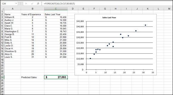
FIGURE 11-5: Forecasting sales.
After you format the cell as Currency, the result shown in Figure 11-5 displays the prediction that your new salesperson will make $27,093 in sales his first year. But remember: This is just a prediction, not a guarantee!
TREND
The preceding section shows how the FORECAST function can predict a Y value for a known X based on an existing set of linear X-Y data. What if you have more than one X value to predict? Have no fear; TREND is here! What FORECAST does for a single X value, TREND does for a whole array of X values.
Like FORECAST, the TREND function is intended for working with linear data. If you try to use it with nonlinear data, the results will be incorrect.
The TREND function takes up to four arguments:
- The first argument is a range containing the known Y values.
- The second argument is a range containing the known X values.
- The third argument is a range containing the X values for which you want predictions.
- The fourth argument is a logical value. It tells the function whether to force the constant b (the Y intercept) to 0. If the fourth argument is TRUE or omitted, the linear regression line (used to predict Y values) is calculated normally. If this argument is FALSE, the linear regression line is calculated to go through the origin (where both X and Y are 0).
Note that the ranges of known X and Y values must be the same size (contain the same number of values).
TREND returns an array of values, one predicted Y for each X value. In other words, it’s an array function and must be treated as such. (See Chapter 3 for help with array functions.) Specifically, this means selecting the range where you want the array formula results, typing the formula, and pressing Ctrl+Shift+Enter rather than pressing Enter alone to complete the formula.
When would you use the TREND function? Here’s an example: You’ve started a part-time business, and your income has grown steadily over the past 12 months. The growth seems to be linear, and you want to predict how much you will earn in the coming 6 months. The TREND function is ideal for this situation. Here’s how to do it:
- In a new worksheet, put the numbers 1 through 12, representing the past 12 months, in a column.
- In the adjacent cells, place the income figure for each of these months.
- Label this area Actual Data.
- In another section of the worksheet, enter the numbers 13 through 18 in a column to represent the upcoming 6 months.
- In the column adjacent to the projected month numbers, select the six adjacent cells (empty at present) by dragging over them.
- Type =TREND( to start the function entry.
Drag the mouse over the range of known Y values or enter the range address.
The known Y values are the income figures you entered in Step 2.
- Type a comma (,).
Drag the mouse over the range of known X values or enter the range address.
The known X values are the numbers 1 through 12 you entered in Step 1.
- Type a comma (,).
Drag the mouse over the list of month numbers for which you want projections (the numbers 13 through 18).
These are the new X values.
- Type a ).
- Press Ctrl+Shift+Enter to complete the formula.
When you’ve completed these steps, you see the projected income figures, calculated by the TREND function, displayed in the worksheet. An example is shown in Figure 11-6. There’s no assurance you’ll have this income — but it may be even higher! You can always hope for the best.

FIGURE 11-6: Using the TREND function to calculate predictions for an array.
GROWTH
The GROWTH function is like TREND in that it uses existing data to predict Y values for a set of X values. It’s different in that it’s designed for use with data that fits an exponential model. The function takes four arguments:
- The first argument is a range or array containing the known Y values.
- The second argument is a range or array containing the known X values.
- The third argument is a range or array containing the X values for which you want to calculate predicted Y values.
- The fourth value is omitted or TRUE if you want the constant b calculated normally. If this argument is FALSE, b is forced to 1. You won’t use FALSE except in special situations.
The number of known X and known Y values must be the same for the GROWTH function; otherwise, an error occurs. As you’d expect, GROWTH is an array formula and must be entered accordingly.
To use the GROWTH function, follow these steps:
(Note: These steps assume that you have a worksheet that already contains known X and Y values that fit the exponential model.)
- Enter the X values for which you want to predict Y values in a column of the worksheet.
Select a range of cells in a column that has the same number of rows as the X values you entered in Step 1.
Often, this range is in the column next to the X values, but it doesn’t have to be.
- Type =Growth( to start the function entry.
- Drag the mouse over the range containing the known Y values or enter the range address.
- Type a comma (,).
- Drag the mouse over the range containing the known X values or enter the range address.
- Type a comma (,).
- Drag the mouse over the range containing the X values for which you want to predict Y values or enter the range address.
- Type a ).
- Press Ctrl+Shift+Enter to complete the formula.
Figure 11-7 shows an example of using the GROWTH function to forecast exponential data. Columns A and B contain the known data, and the range D10:D19 contains the X values for which predictions are desired. The GROWTH array formula was entered in E10:E19. The chart shows a scatter plot of the actual data, up to X = 40, and the projected data, for X values above 40. You can see how the projected data continues the exponential curves that are fit by the actual data.
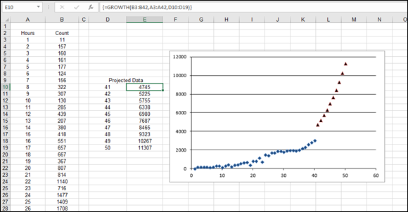
FIGURE 11-7: Demonstrating use of the GROWTH function to project exponential data.
Using NORM.DIST and POISSON.DIST to Determine Probabilities
You can get a good introduction to the normal distribution in Chapter 9. To define it briefly, a normal distribution is characterized by its mean (the value in the middle of the distribution) and by its standard deviation (the extent to which values spread out on either side of the mean). The normal distribution is a continuous distribution, which means that X values can be fractional and aren’t restricted to integers. The normal distribution has a lot of uses because so many processes, both natural and human, follow it.
NORM.DIST
The word normal in this context doesn’t mean “good” or “okay,” and a distribution that is not normal is not flawed in some way. Normal is used simply to mean “typical” or “common.”
Excel provides the NORM.DIST function for calculating probabilities from a normal distribution. The function takes four arguments:
- The first argument is the value for which you want to calculate a probability.
- The second argument is the mean of the normal distribution.
- The third argument is the standard deviation of the normal distribution.
- The fourth argument is TRUE if you want the cumulative probability and FALSE if you want the noncumulative probability.
A cumulative probability is the chance of getting any value between 0 and the specified value. A noncumulative probability is the chance of getting exactly the specified value.
Normal distributions come into play for a wide variety of measurements. Examples include blood pressure, atmospheric carbon-dioxide levels, wave height, leaf size, and oven temperature. If you know the mean and standard deviation of a distribution, you can use NORM.DIST to calculate related probabilities.
Here’s an example: Your firm manufactures hardware, and a customer wants to buy a large quantity of 50mm bolts. Due to the manufacturing process, the length of bolts varies slightly. The customer will place the order only if at least 95 percent of the bolts are between 49.9mm and 50.1mm. Measuring each one isn’t practical, but previous data show that the distribution of bolt lengths is a normal distribution with a mean of 50 and a standard deviation of 0.05. You can use Excel and the NORM.DIST function to answer the question. Here’s the plan:
- Use the NORM.DIST function to determine the cumulative probability of a bolt’s being at least 50.1mm long.
- Use the NORM.DIST function to determine the cumulative probability of a bolt’s being at least 49.9mm long.
- Subtract the second value from the first to get the probability that a bolt will be between 49.9mm and 50.1mm long.
Here are the steps to follow:
In a new worksheet, enter the values for the mean, standard deviation, upper limit, and lower limit in separate cells.
Optionally, add adjoining labels to identify the cells.
- In another cell, type =NORM.DIST( to start the function entry.
- Click the cell containing the lower limit value (49.9) or enter the cell address.
- Type a comma (,).
- Click the cell containing the mean or enter the cell address.
- Type a comma (,).
- Click the cell containing the standard deviation or enter the cell address.
- Type a comma (,).
- Type TRUE).
Press Enter to complete the function.
This cell displays the probability of a bolt’s being less than or equal to the lower limit.
- In another cell, type =NORMDIST( to start the function entry.
- Click the cell containing the upper-limit value (50.1) or enter the cell address.
Repeat steps 4–10.
This cell displays the probability of a bolt’s being less than or equal to the upper limit.
In another cell, enter a formula that subtracts the lower-limit probability from the upper-limit probability.
This cell displays the probability that a bolt will be within the specified limits.
Figure 11-8 shows a worksheet that was created to solve this problem. You can see from cell B8 that the answer is 0.9545. In other words, 95.45 percent of your bolts fall in the prescribed limits, and you can accept the customer’s order. Note in this worksheet that the formulas in cells B6:B8 are presented in the adjacent cells so you can see what they look like.
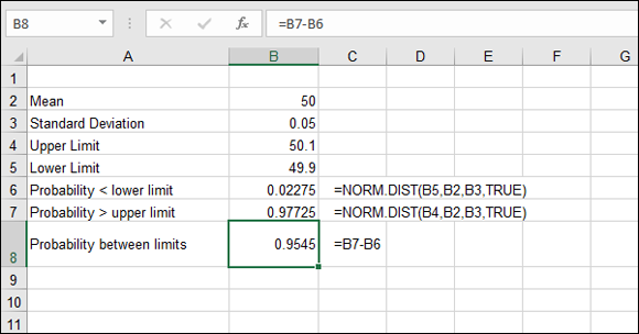
FIGURE 11-8: Using the NORM.DIST function to calculate probabilities.
POISSON.DIST
Poisson is another kind of distribution used in many areas of statistics. Its most common use is to model the number of events taking place in a specified time period. Suppose that you’re modeling the number of employees calling in sick each day or the number of defective items produced at your factory each week. In these cases, the Poisson distribution is appropriate.
The Poisson distribution is useful for analyzing rare events. What does rare mean? People calling in sick at work is hardly a rare event, but a specific number of people calling in sick is rare, at least statistically speaking. Situations to which Poisson is applicable include numbers of car accidents, counts of customers arriving, and manufacturing defects. One way to express it is that the events are individually rare, but there are many opportunities for them to happen.
The Poisson distribution is a discrete distribution. This means that the X values in the distribution can only take on specified, discrete values such as X = 1, 2, 3, 4, 5, and so on. This is different from the normal distribution, which is a continuous distribution in which X values can take any value (X = 0.034, 1.2365, and so on). The discrete nature of the Poisson distribution is suited to the kinds of data you use it with. For example, with employees calling in sick, you may have 1, 5, or 8 on a given day, but certainly not 1.45, 7.2, or 9.15!
Figure 11-9 shows a Poisson distribution that has a mean of 20. Values on the X axis are number of occurrences (of whatever you’re studying), and values on the Y axis are probabilities. You can use this distribution to determine the probability of a specific number of occurrences happening. For example, this chart tells you that the probability of having exactly 15 occurrences is approximately 0.05 (5 percent).
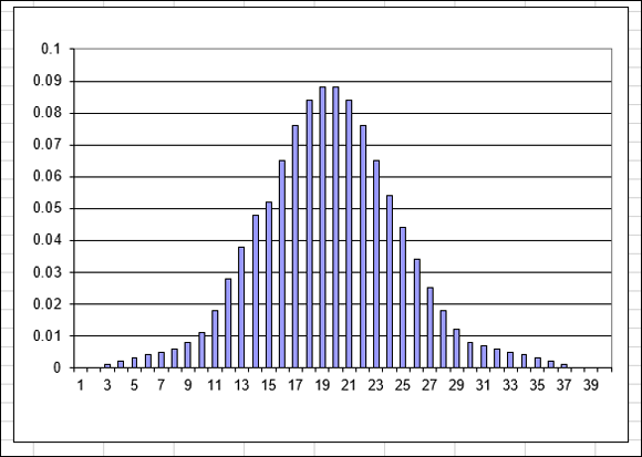
FIGURE 11-9: A Poisson distribution with a mean of 20.
The Poisson distribution is a discrete distribution and is used only with data that takes on discrete (integer) values, such as counting items.
A Poisson distribution is not always symmetrical, like the one shown in Figure 11-9. Negative X values make no sense in a Poisson distribution. After all, you can’t have fewer than zero people calling in sick! If the mean is a small value, the distribution will be skewed, as shown in Figure 11-10 for a Poisson distribution with a mean of 4.
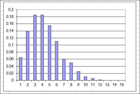
FIGURE 11-10: A Poisson distribution with a mean of 4.
Excel’s POISSON.DIST function lets you calculate the probability that a specified number of events will occur. All you need to know is the mean of the distribution. This function can calculate the probability two ways:
- Cumulative: The probability that between 0 and X events will occur
- Noncumulative: The probability that exactly X events will occur
The two Poisson graphs shown earlier in this chapter are for noncumulative probabilities. Figure 11-11 shows the cumulative Poisson distribution corresponding to Figure 11-9. You can see from this chart that the cumulative probability of 15 events — the probability that 15 or fewer events will occur — is about 0.15.
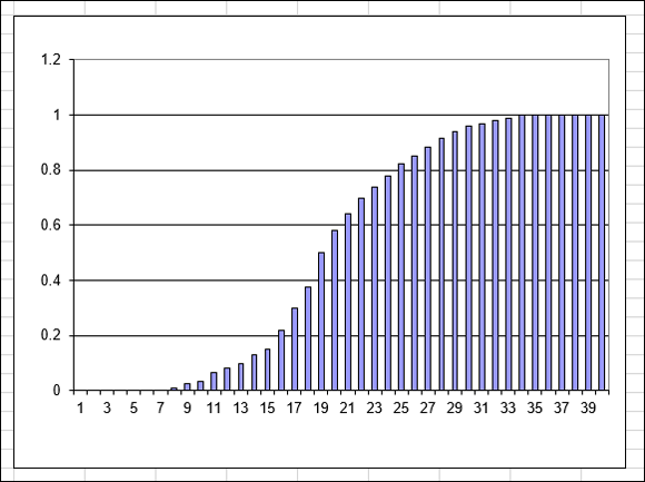
FIGURE 11-11: A cumulative Poisson distribution with a mean of 20.
What if you want to calculate the probability that more than X events will occur? Simple! Just calculate the cumulative probability for X and subtract the result from 1.
The POISSON.DIST function takes three arguments:
- The first argument is the number of events for which you want to calculate the probability. This must be an integer value greater than 0.
- The second argument is the mean of the Poisson distribution to use. This too must be an integer value greater than 0.
- The third argument is TRUE if you want the cumulative probability and FALSE if you want the noncumulative probability.
Suppose that you’re the manager of a factory that makes brake shoes. Your district manager has announced an incentive: You’ll receive a bonus for each day that the number of defective shoes is less than 20. How many days a month will you meet this goal, knowing that the average number of defective brake shoes is 25 per day? Here are the steps to follow:
In a new worksheet, enter the average number of defects per day (25) in a cell.
If desired, enter an adjacent label to identify the cell.
- In the cell below, type =POISSON.DIST( to start the function entry.
- Type the value 20.
- Enter a comma (,).
- Click the cell where you entered the average defects per day or enter its cell address.
- Enter a comma (,).
- Type TRUE).
- Press Enter to complete the formula.
- If desired, enter a label in an adjacent cell to identify this as the probability of 20 or fewer defects.
In the cell below, enter a formula that multiplies the number of working days per month (22) by the result just calculated with the POISSON.DIST function.
In your worksheet, this formula is
=22*B3, entered in cell B4.- If desired, enter a label in an adjacent cell to identify this as the number of days per month you can expect to have 20 or fewer defects.
The finished worksheet is shown in Figure 11-12. In this example, I have formatted cells B3:B4 with two decimal places. You can see that with an average of 25 defects per day, you can expect to earn a bonus 4 days a month.
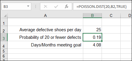
FIGURE 11-12: Using the POISSON.DIST function to calculate a cumulative probability.