As a raster image editor, GIMP loves to play with points of color, both individually and in blocks and blobs grouped together in selections. This makes the program perfect for working with photographs. Both your digital camera and GIMP work with pixels, so no data conversion is required. The days of scanning your photos are a thing of the past.
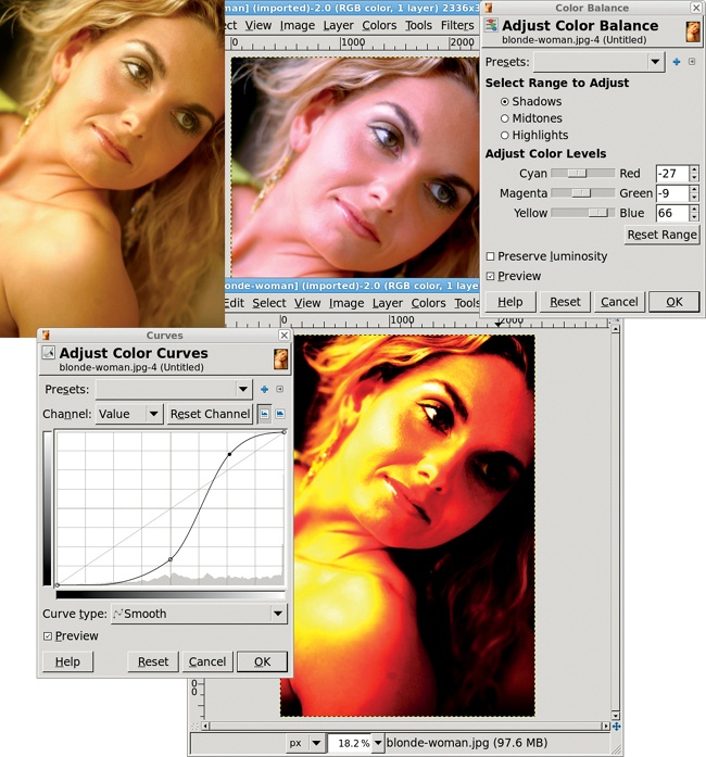
Now that your images are in digital format, there’s no end to the magic you can perform. Going from average photos to studio-quality productions requires just a few techniques that anyone can learn to use. Many techniques are based on simple color corrections like those provided by the Curves, Levels, and Color Balance tools.
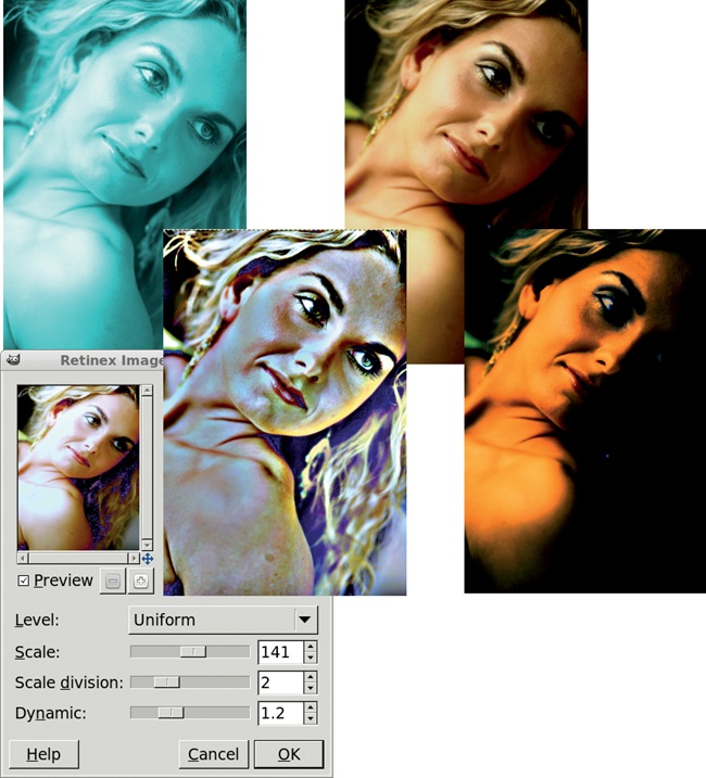
In addition, you can use various GIMP filters to enhance photographs. The Retinex tool (Colors▸Retinex), for example, normalizes colors in order to enhance focus. Originally produced by NASA’s Langley Research Center to enhance images taken through smoke and haze, this filter has interesting possibilities for portrait enhancement.
The following tutorials describe techniques that photographers will find useful. Along the way you’ll create vignettes, add focal blurs, adjust color, insert lighting, simulate depth of field and motion, and use cloning methods to clean up damaged photos. Unlike previous tutorials, these won’t start with a blank canvas at the default dimensions and walk you step-by-step through a repeatable process. Instead, I’ll start with a few basic images and apply standard processes that you can use with your own images.
We’re not all professional photographers or graphic artists. You may not have $5,000 digital cameras or fancy studios, but you do have access to many of the same digital effects professionals use: selections, blurs, masks, and layer modes. Taken by themselves these don’t seem like powerful tools. But when you apply them to your own photographic masterpieces, they become the tools of a new graphic artist—you.
The soft-focus technique has long been used to soften hard edges between shadows and light, allowing a foreground image to fade into the background. This is especially true for studio portraits, where backgrounds are often just painted canvas. Blending foreground and background can pull the eye toward the foreground, if done correctly.
In photography, the soft-focus effect originated as a result of flaws in camera lenses. Later, with the use of lens filters, the effect was often incorporated into glamour images because it smooths skin wrinkles. In the digital age, soft focus is a handy trick that can remove blemishes while adding charm to any image.
Fortunately for digital photographers, soft focus is a technique that raster-based programs like GIMP now provide, using common processes such as blurring. But it is also an effect that can be easily overused.
This tutorial will show you how to soften the focus of a studio portrait. Techniques like this require only modest experience with selections combined with colors tools and the Gaussian Blur filter.
The easiest way to perform this effect is with a high pass filter. A high pass filter lets high frequencies pass while blocking low frequencies. In an image, a high pass filter will enhance the areas of greatest contrast. You can use this knowledge to find blemishes, blur them out, and blend with the original image.
The stock GIMP distribution doesn’t provide a high pass filter, though one is available from the GIMP Plugin Registry. Fortunately, a high pass filter can be simulated very easily with just a couple of layers and some color adjustments, so there’s no need to download and install the filter from the registry.
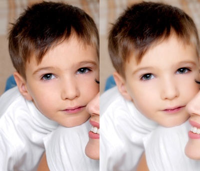
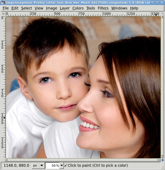
Start with a portrait. The portrait I’ve chosen looks fine as it is, but it could look even better—softer and more dreamy. Its best features are the boy’s eyes and the high contrast between the focal points (the faces) and the background and clothing. Be sure to find an image with similar contrast for your own experiment.
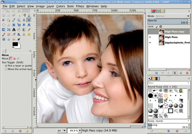
The high pass filter starts by blurring the top layer and changing its opacity so it blends with the next layer down.
If it’s not already selected, click the top layer in the Layers dialog to make it active.
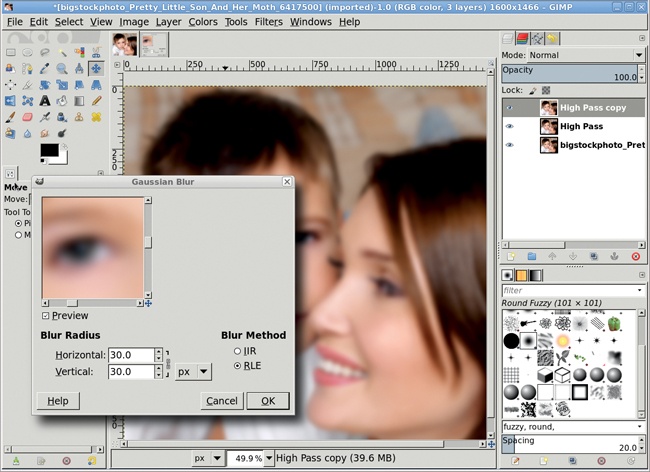
Open the Gaussian Blur filter (Filters▸Blur▸Gaussian Blur).
Set the Blur Radius, both Horizontal and Vertical, to 30 pixels. Keep the Blur Method set to RLE.
Click OK to apply the blur to the layer.
In the Layers dialog, set the Opacity slider to 50 percent.
This process will soften the high-contrast areas in preparation for blending with the original image. The blur radius for the Gaussian Blur can be increased or decreased as needed. Higher blurs will increase the softness of the final image. Beware, however, that too much blur will just result in a mess.
Blurring and transparency are just the first part of the simulated high pass. The next step is to invert the blur layer and blend it with the second layer, which is a copy of the original image.
The top layer should still be selected in the Layers dialog. If not, select it.
Invert (Colors▸Invert) the colors of this layer.
Merge (Layer▸Merge Down) the top layer with the layer below it.
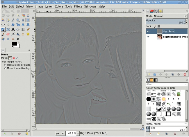
Note that the merged layer retains the name of the lower layer, in this case High Pass. When the top layer’s colors are inverted and merged down, the result is a mostly gray layer with high detail in the areas of interest (eyes and mouth, for example). You’ll exaggerate the high contrast areas with the next step.
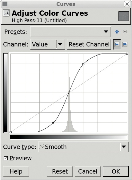
The High Pass layer is ready for color, or rather lightness, correction. To do this, the Curves dialog will be used, followed by the Brightness-Contrast dialog.
The High Pass layer should still be active in the Layers dialog.
Open the Curves dialog (Colors▸Curves).
Adjust the diagonal line so it has an S shape similar to the one shown here.
Click OK to apply the changes to the layer.
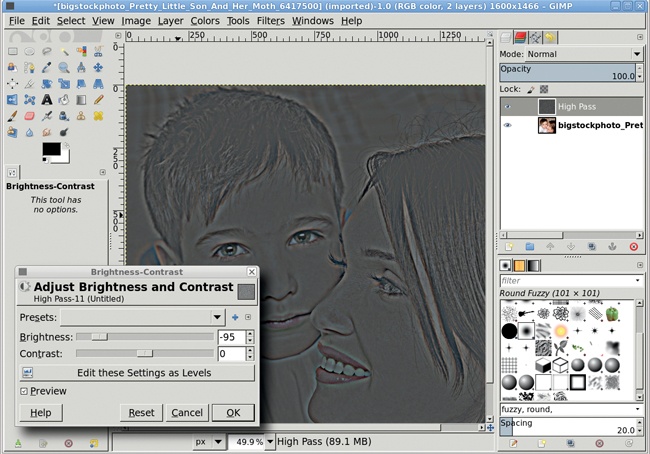
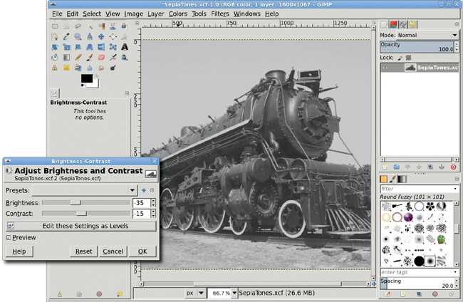
Open the Brightness-Contrast dialog (Colors▸Brightness-Contrast).
Set the Brightness slider to –95. Leave the Contrast slider at 0.
Click OK to apply the changes to the layer.
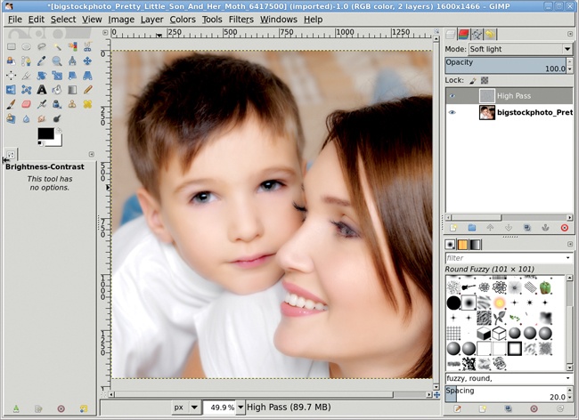
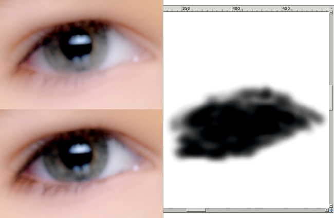
But the soft focus has taken away some of the important features of the portrait, namely the eyes and mouth. To get these back, a layer mask is added and filled with black where the High Pass layer should not be applied.
The High Pass layer should be active in the Layers dialog. If not, select it.
Type D in the image window to reset the foreground color to black.
Add a white layer mask (Layer▸Mask▸Add Layer Mask) to this layer.
Choose the Airbrush from the Toolbox.
Select a soft-edged brush, such as Round Fuzzy.
In the Tool Options dialog, adjust the size of the brush to fit the area to be masked, such as the eyes or lips.
In the image window, brush over the boy’s eyes and lips.
It’s not necessary to be exact using the airbrush in the mask. It won’t be immediately obvious that much is happening in the image window. Continue painting until the blur fades and the eyes and lips become distinct. Adjust the size of the brush for different eyes and lips, and then repeat.
The high pass layer in this tutorial (and the steps that created it) blurred the background, which also simulated a decreased depth of field. You’ll learn more about how to simulate this effect in 2.5 Changing Depth of Field. This method of edge detection is also used for selective sharpening.
This next technique is for all the would-be artists among us. What you can’t do with a pen and pencil, you can now do with a camera and GIMP. Although an inkjet print on textured paper isn’t quite the same as a fine hand-drawn sketch, it’s close enough for the digital crowd.
Converting a photo to a sketch basically means detecting the edges in an image and applying a slightly irregular line, one that looks like it might have been drawn by hand. This process isn’t exact—you might substitute a different edge-detect filter or use the Curves or Levels tools to adjust the desaturated layers before applying filters. But these basic steps will get you started.
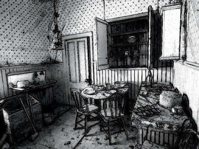
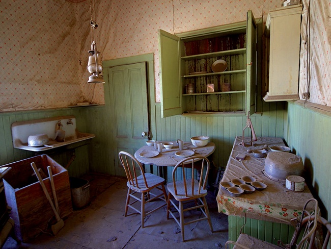
The original image you choose for this effect shouldn’t be too busy. Soft lines are useful, but intricate patterns such as paisley would be problematic. Although I chose a still-life image for this example, the trick also works well with formal portraits and other pictures of people.
First, desaturate the image (Colors▸Desaturate).
Duplicate the layer twice (Layer▸Duplicate Layer). Name the first duplicate Burn and the second duplicate Hard Light.
Turn off the visibility of the two duplicate layers by clicking the eye icon for each one in the Layers dialog. Then select the Background layer again.
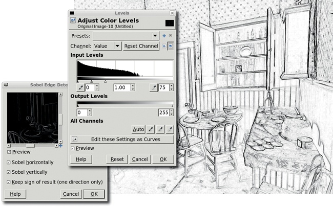
Open the Sobel filter (Filters▸Edge Detect▸Sobel). The Sobel filter is an edge-detect filter that looks for nearly horizontal and vertical lines in the layer and keeps those in the resulting image.
Keep the default settings and click OK to apply them to the Original Image layer. The default settings for this filter, as opposed to the other edge-detect filters available in GIMP, will work best with this image because they’ll produce more solid and distinct lines that appear hand-drawn. However, you may get better results using another edge-detect filter if your image doesn’t look right after applying the Sobel filter.
The white lines may need to be enhanced. Use the Levels dialog (Colors▸Levels) and pull the White Point slider to the left.
Invert the colors (Colors▸Invert) for this layer to produce black lines on a white background.
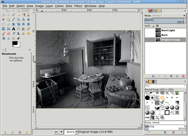
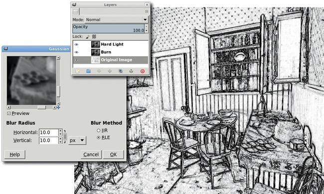
Click the Burn layer in the Layers dialog to make it active, and click its eye icon to make it visible once again.
Open the Gaussian Blur filter (Filters▸Blur▸Gaussian Blur).
Set the Horizontal and Vertical Blur Radius to 10 pixels and apply this filter to the layer.
Set the layer mode to Burn. This makes dark areas in the background even darker, so the hand-drawn appearance looks as though it was achieved with a dark pencil.
In the Layers dialog, click the Hard Light layer to make it active, and then click its eye icon to make it visible.
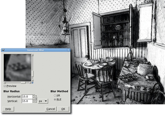
Again, open the Gaussian Blur filter (Filters▸Blur▸Gaussian Blur).
This time, set the Horizontal and Vertical Blur Radius to 15 pixels. Click OK to apply these settings to the layer.
Set the layer mode to Hard Light. This will simulate the smudged charcoal appearance you get when rubbing your finger over a pencil mark on paper.
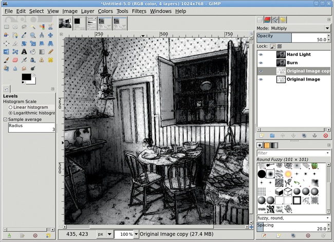
Let’s take this particular image a little further. Start by duplicating the Original Image layer (Layer▸Duplicate).
Set the layer mode of this duplicate layer to Multiply.
Set the Opacity to 50 percent. This brings out the image’s lines even more without making the drawing look artificial.
This simple technique has numerous variations, including hand-smudging the charcoal layer using the Smudge tool and manually tinting the strokes with the Colorize tool to simulate drawing with colored pencils. You can also use the Oilify filter (Filters▸Artistic▸Oilify) to produce impressionistic images, or you can use the Curves, Levels, or Posterize tools to produce images that look more like line drawings. When creating duplicates of the original image layer, make more than one for each type of edge-detect filter and try variations of the filter settings. Larger blurs can soften the pencil strokes.
Antique photos come in two flavors: black and white or tinted. Coloring black-and-white photos is easy with GIMP: you simply choose a color, pick a layer mode, and apply a Bucket Fill. There’s nothing to it. The tricky part is making it look right—adjusting the contrast in the grayscale image appropriately and then choosing the right layer mode.
Most people associate tinted pictures, rather than plain black-and-white ones, with antique photos. This may be because more old sepia-toned photos have survived. The processing chemistry for sepia prints converts the silver metal, which forms the image in black-and-white prints, into silver sulfide. Silver sulfide is more stable than silver metal. Thus, converting the silver to sulfide gives the photographs a much longer shelf life.
Sepia prints get their name from the range of brown tints produced by the development process, which resemble the ink of the cuttlefish (sepia in Latin). Re-creating true sepia tones digitally therefore limits us to a small set of dark brown colors, some with a slight tint of red. Similar processes could be applied using colors other than shades of brown, though the resulting images would not mimic true sepia prints.
In this tutorial you’ll try out some possible variations as you produce sepia-toned images using different combinations of colors, contrast, and layer modes.
This tutorial’s original image comes from an online image archive (available from BigStockPhoto.com) and has been desaturated using the Channel Mixer (Colors▸Components▸Channel Mixer). Alternatives to using the Channel Mixer dialog are using the Desaturate dialog or converting the image to grayscale (Image▸Mode▸Grayscale) and then back to RGB (Image▸Mode▸RGB). The primary difference between these latter two methods is that the Desaturate dialog only works on the current layer. If your image has more than one layer, the Desaturate dialog won’t convert all of those layers at once. For multiple layers, it would be more appropriate to convert the image to grayscale and then back to RGB.
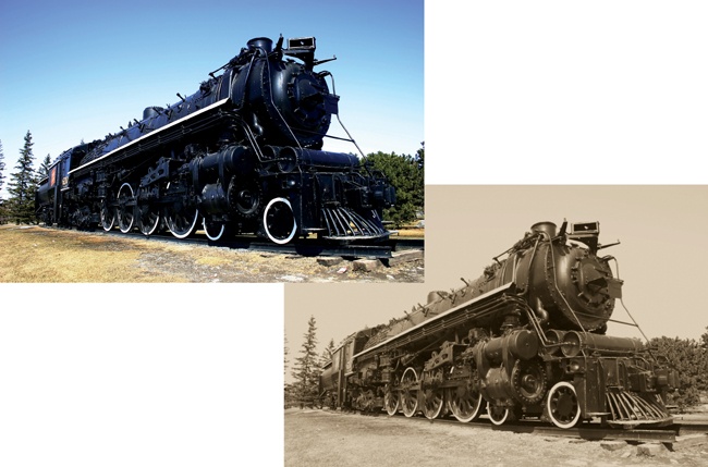
But the Channel Mixer is the best option for this tutorial. Old photographs often owe their appearance to the use of orthochromatic film. Orthochromatic emulsions cause blue tints to appear brighter and reds darker. The Channel Mixer provides a higher degree of control in setting these channels when converting from color to a monochromatic image.
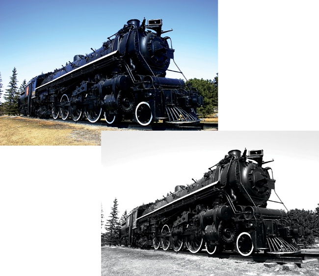
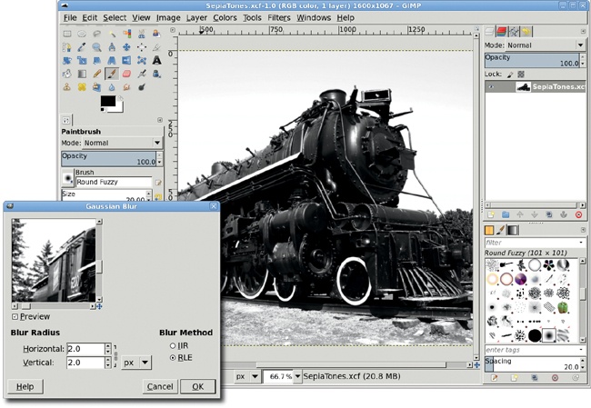
Since the original image is very crisp, and most old photos are not, a slight blur is applied next.
Open the Gaussian Blur filter (Filters▸Blur▸Gaussian Blur).
Set both the Horizontal and Vertical Blur Radius to 2.0 pixels. Only a small amount of blur is necessary, enough to remove bright reflections on the locomotive’s outer shell.
Apply this setting to the desaturated image.
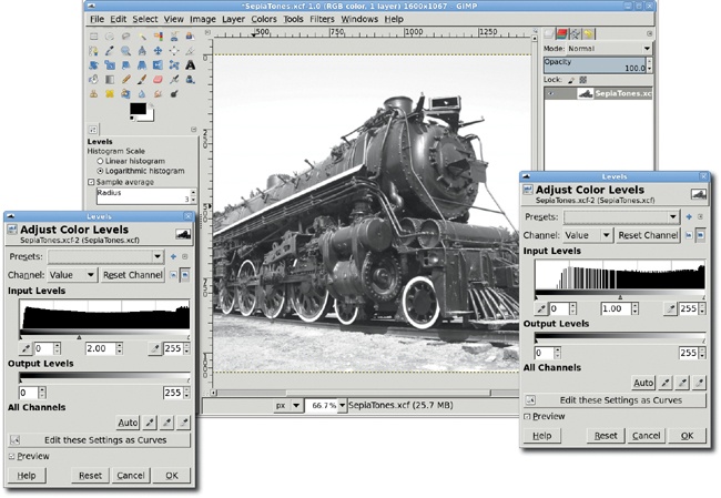
Sepia toning works primarily by colorizing the gray region of the desaturated image. Dark pixels are relatively unaffected, and lighter pixels just get a bit lighter. The locomotive in the image is very dark, so we’ll lighten it using the Levels tool to maximize the sepia tone’s effects.
The first step in getting more gray into the image is to adjust the Levels histogram (Colors▸Levels). There are two types of histograms available: Linear and Logarithmic (see the small icons to the right of the Reset Channel button). The Logarithmic histogram shows a greater number of dark (left side) and light (right side) pixels, and relatively fewer gray (middle) pixels.
To increase the amount of gray in the image, we lighten the darker pixels by sliding the middle (gray) slider under the histogram to the left.
Apply this change to the image by clicking the OK button in the Levels dialog.
Looking at the Levels histogram again shows that there are now gaps in the graph on the dark side and spikes on the light side. There are also small spikes in the center area. This shows us visually how darker pixels have been changed to lighter pixels.
As an additional measure, you can also reduce the contrast in the image (Colors▸Brightness-Contrast). Reducing the contrast simulates the fade that the years will have brought to an old photograph.
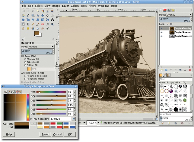
The image is now ready for a sepia tone. Sepia is a brown color with a slightly reddish tint, varying from light to dark shades. You can use many RGB value sets to achieve a sepia tone, and an Internet search will help you find them. For this image you’ll apply 135/96/40 to two separate layers. Each colored layer will be blended using a different layer mode.
Duplicate the original layer (Layer▸Duplicate Layer) and name the duplicate layer Sepia Screen.
Fill the new layer with the appropriate sepia tone. To do this, first click the foreground color box to open the Change Foreground Color dialog. Enter your RGB values in the appropriate fields, and then click OK. (In this example I used RGB values of 135/96/40 for the sepia tone.)
Select the Bucket Fill tool, and in the Tool Options dialog set the Mode to Multiply and the Affected Area to Fill Whole Selection. Click in the duplicate layer to colorize the layer with the sepia tone.
To combine this new layer with the original, set the mode for this colored layer to Screen.
Duplicate the Sepia Screen layer. Name the duplicate layer Sepia Overlay. Change the layer mode to Overlay.
Further aging of the image can be accomplished by adding a selective blur to the far end of the locomotive, adding a depth of field common in old photographs. Further blurring of the entire image can also help mimic a faded, aged photograph.
The sepia toning process lends itself well to experimentation. Use multiple layers with different tinting and layer modes applied, and then flash back and forth between them using the eye icon in the Layers dialog to compare the results.
Remember that layer modes and Tool Option blend modes can produce distinct results. Blend a solid-colored layer with the layer below using a layer mode from the Layers dialog. Then turn off the solid-colored layer visibility and colorize the lower layer using the Bucket Fill tool with its blend mode in the Tool Options dialog set to the same mode. Compare the results of both techniques and note the difference. Using the layer modes makes it easier to change the sepia tone without altering the original image, and the result may be truer to the faded colors in old photographs.
Photographers are often asked to change the color of one or more elements in an image. How easy this process is depends entirely on how easy it is to isolate the objects that need updating.
This tutorial looks at two examples of color swap. The first is an image in which the color change doesn’t require difficult selections. The second image requires a more delicate hand.
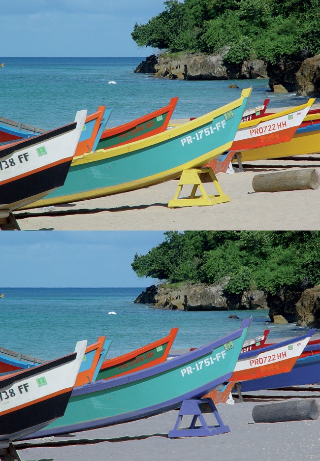
The first example is a collection of boats on a beach. There’s a plethora of color here. Let’s change the yellow trim on some of these boats to a light blue.
To change the color of only certain objects in an image, you’ll need to isolate those objects from objects of a similar color elsewhere in the image. It’s obvious that some of the boats are yellow. Yellow isn’t so apparent in the rocks and trees in the background, but it’s plentiful there too.
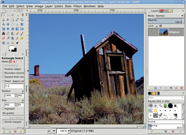
To isolate the boats, use the Rectangle Select tool to make a simple selection encompassing the majority of the boats.
Add smaller rectangular selections to squeeze in the highest prow without selecting the rocks around it. Here the unselected region is made darker so you can more easily see what’s selected.
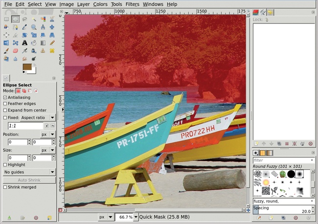
You don’t need to isolate the yellow elements from their immediate surroundings; you just need to isolate the lower half of the image (shown here with the Quick Mask enabled). If you include the upper half of the image, the yellow in the trees and rocks will be also be changed to blue when you swap colors.
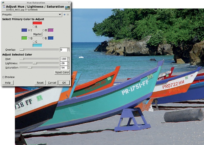
Open the Hue-Saturation dialog (Colors▸Hue-Saturation). You can use this dialog to edit multiple channels, including the familiar red, green, and blue channels and their counterparts in the world of digital printing: cyan, magenta, and yellow.
Choose the yellow channel and adjust the Hue, Lightness, and Saturation sliders until a soft blue replaces the yellow.
This process works because the color to be replaced—yellow—is not a major part of the other colors contained within the selection. An exact selection isn’t necessary to swap the color yellow with the color blue. The only places that might be problematic are the log and sand on the beach. Brown contains some yellow, so after the Hue-Saturation changes are applied, the log and sand have a blue tint. This is easily fixed by removing the log from the selection using any of the selection tools, including the Quick Mask. The sawhorse on the beach near the middle of the picture also has heavy yellow content and needs to be handled in a similar manner (unless you want it painted blue as well). Keeping the sand out of the selection requires a more complex process, such as the one in the following tutorial.
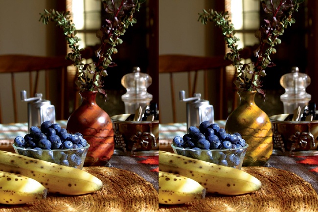
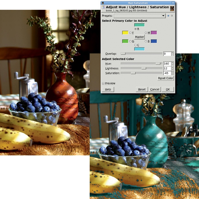
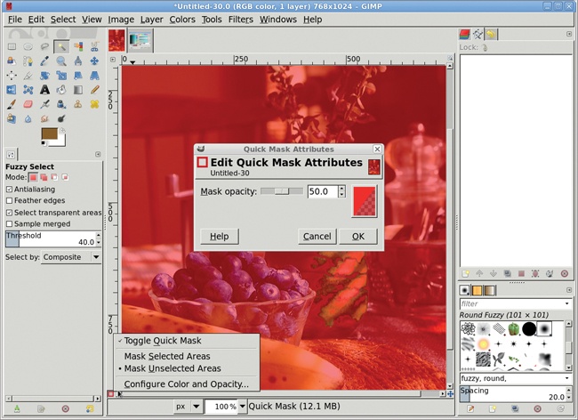
The same trick doesn’t work on the next image. Let’s say you want to change the color of the vase to a shade of yellow. The problem is that although the vase’s reddish-brown color contains a lot of red, red also appears throughout the rest of the image. In fact, if you made the same change to this image’s red channel as you did to the boat image’s yellow channel, you’d change the color of the background chair, the berries, and the table.
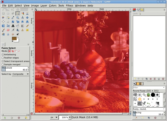
This image requires a complex selection. Start by using the Fuzzy Select tool with the Threshold set to 40. Clicking the middle right part of the vase creates an initial selection.
To finish off the selection, use the Quick Mask and some soft-edged brushes. The problem with using the default Quick Mask in this situation is that it uses a red tint to highlight what isn’t selected, but we’re trying to select objects that have lots of red in them. This makes the selections created with the Fuzzy Select tool difficult to see when converted to the Quick Mask.
This problem is easily fixed. Right-click the Quick Mask button in the lower-left corner of the canvas window. A menu opens.
Keeping the right mouse button held down, drag to the bottom of the menu to select Configure Color and Opacity.
In the Quick Mask Attributes dialog, click the preview window (it shows the color and transparency of the mask) to open the Edit Quick Mask Color dialog.
Here you can change the RGB values used for the Quick Mask as well as the opacity for the mask (by adjusting the A slider below the B slider). Choose a color for the Quick Mask that contrasts with the colors in the object to be selected. A higher opacity value makes it easier to see what’s been selected but also makes it harder to see what needs to be selected. Here I’ve chosen a cyan mask with an opacity of 70 percent instead of the default 50 percent. The result is that the selected parts of the vase are much easier to see, while the parts of the vase that need to be selected are still visible.
When you’re satisfied with the mask color, click OK in the dialogs to close them.
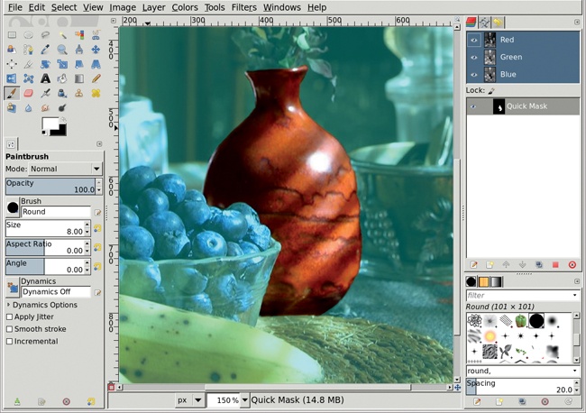
You learned in 1.4 Selections that using the Quick Mask is the most effective way to select oddly shaped objects. Here’s a chance to try it out.
Zoom in on the vase by pressing the + key.
Draw straight lines in the Quick Mask with the Paintbrush tool’s small, hard-edged brushes by clicking at one endpoint of the line, holding down the SHIFT key, and then clicking at the other end of the line. When painting (or drawing) with the Quick Mask, you must paint with black or white. Set the foreground color to white to paint over what should be included in the selection, and set the foreground color to black to paint over what shouldn’t be in the selection. When you’re finished, click the Quick Mask button again to convert the mask to a selection.
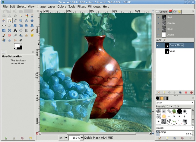
Grow the selection by 1 pixel (Select▸Grow), and then feather it by 2 pixels (Select▸Feather). Save the selection to a channel (Select▸Save to Channel) in case you later decide to undo your color change and edit the selection again.
Working in a duplicate layer saves you the headache of making mistakes in the original layer. If you don’t like your changes in the duplicate layer, just try again.
After saving your selection, click the original layer in the Layers dialog to make it active again.
Copy the selection and paste it as a new layer (Layer▸To New Layer). Name this layer Vase and make sure it’s active.
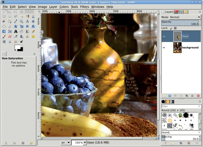
At this point you could use the Colorize tool (Colors▸Colorize) to change the color of the vase, but the vase has varying shades of red and yellow in it, and the Colorize tool will completely wash out those variations. Instead, use the Hue-Saturation tool again. Open the Hue-Saturation dialog (Colors▸Hue-Saturation).
Choose the red channel and move the Hue slider to the right to change the red content of the vase to a more yellow color. Then click the yellow channel and do the same. Be sure to make both changes before clicking OK. The results will be much greener if you adjust the red channel first, click OK, reopen the dialog, and then adjust the yellow channel.
Deselect all (Select▸None) when all color changes are completed.
Swapping the color of objects in stock photos is a very common practice. Objects that have colors not found in the rest of the image are the easiest to change, as we saw with the image of boats on a beach. Changing the color of a vase or shirt or some other oddly shaped subject requires complex selections created using the Fuzzy Select tool, the Quick Mask, and other GIMP selection tools. These selections are more difficult but not impossible.
Mastery of the Quick Mask tool will help in the next tutorial, in which you’ll use a set of complex selections to add depth to a photograph.
Take a look at any of your personal photos. If you’ve used a consumer-grade camera, you’ll notice that the photo has a deep depth of field. That is, if your subject is more than a few yards away, most of the photo is in focus. Changing the depth of field can alter the feeling an image conveys. If your intended subject is not centered in the frame or not completely obvious, a depth-of-field change can draw attention to the subject and expose the true meaning of the photo.
Making the depth of field shallow can also make a normal scene appear as if it was a miniature, as you’ll see in 2.11 Miniaturizing a Scene.
In reality, computer-aided depth-of-field trickery is no more than a selective blur. You’ve probably seen this trick used in automobile advertisements, where the car is in focus but the background is blurred beyond recognition. In this tutorial you’ll pull a building to the forefront of a photo using modest depth-of-field changes.
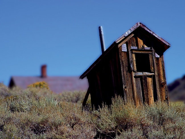
This tutorial begins with an image that has a relatively flat depth of field and is completely in focus. The solid blue sky will allow you to create selections of the buildings easily. You’ll still have to make some manual selections, but the solid blue sky will save some time.
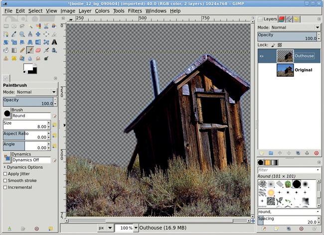
The original image is in focus and has an obvious foreground object—the outhouse. Start by creating a selection that includes the outhouse and some of the grasses in front of it. Here the unselected areas are tinted red to better show the selection.
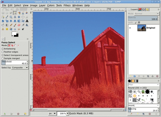
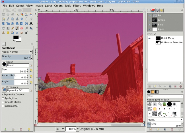
Choose the Fuzzy Select tool from the Toolbox. Click the blue sky to create an initial selection. If one click doesn’t select the entire sky, click somewhere in the unselected area while holding down the SHIFT key.
Invert the selection (Select▸Invert), and then click the Quick Mask button. As you’ve seen, unselected areas are tinted red when the default Quick Mask properties are in use (2.4 Color Swap showed you how to change the default color).
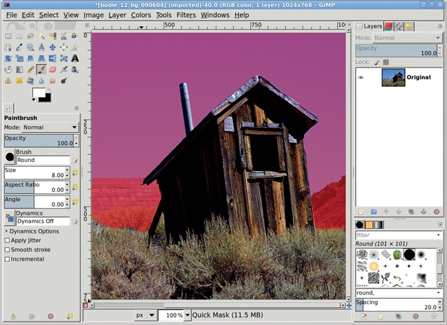
Select the Paintbrush tool and press D in the image window to reset the default foreground and background colors, making the foreground black.
Paint over the house on the left, some of the background grasses, and the rocky hill on the right. Use smaller brushes until the Quick Mask looks similar to that shown. Everything you paint over will be excluded from the selection.
Click the Quick Mask button again to convert the mask back into a selection.
Save the selection to a channel (Select▸Save to Channel). Then click the channel name in the Channels dialog and change the name to Outhouse Selection. Saving selections to a channel allows you to easily recall them for further editing should you decide the original selection wasn’t sufficient for your project. Later in this tutorial you’ll retrieve the saved selections and invert them for use with areas outside the original selection.
Select the original layer in the Layers dialog (Windows▸Dockable Dialogs▸Layers). Feather the selection by 10 pixels (Select▸Feather), and then copy (Edit▸Copy) the selection and paste it (Edit▸Paste) as a new layer (Layer▸To New Layer).
Click the new layer name and change it to Outhouse.
In the Channels dialog (Windows▸Dockable Dialogs▸Channels), click the Outhouse Selection channel, and then click the Channel to Selection button.
Select the Background layer in the Layers dialog to make that layer active. Invert the selection to select everything except the original outhouse and foreground landscape.
Click Select by Color in the toolbox. Adjust the Threshold level in the Tool Options dialog as necessary (I set it to 50 for this image).
Hold down the CTRL key and click in the blue sky to remove the sky from the selection, leaving just the background grasses, the house, and the hill. Use Quick Mask to remove the house and hill from the selection, leaving some of the grasses. Click the Quick Mask button once more to convert the mask to a selection. Save the selection to a channel named Grasses Selection (Select▸Save to Channel).
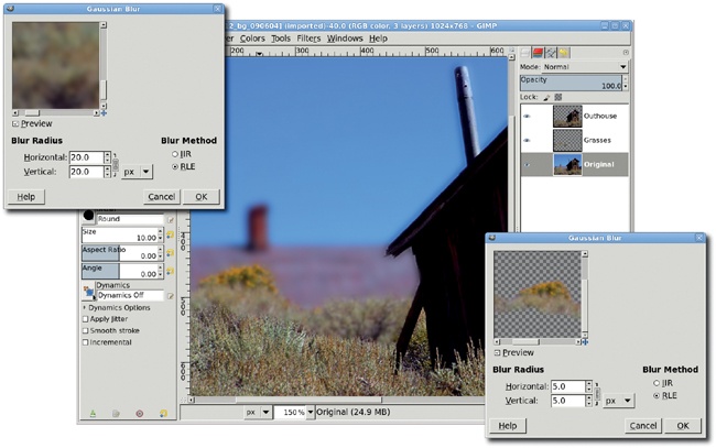
Select the Background layer to make it active again. Feather the selection by 10 pixels (Select▸Feather), and then copy and paste the selection as a new layer. Name this layer Grasses and move it below the Outhouse layer in the Layers dialog. The layer order should be, top to bottom: Outhouse, Grasses, Background.
This process has created a secondary focal point that is not in the foreground but not completely in the background.
Now let’s increase the depth of field. Select the Background layer.
Open the Gaussian Blur filter (Filters▸Blur▸Gaussian Blur). Apply a blur of 20 pixels to the Background layer. Then select the Grasses layer and apply a blur of 5 to 10 pixels.
Adjust the levels (Colors▸Levels) for the Grasses and Background layers to darken them slightly and add to the photo’s sense of depth.
This process works well on this image because making the initial selection was easy: the sky contrasts dramatically with the outhouse and grasses. This process is often applied to outdoor portraits, and those projects work just like this one, though selecting the foreground object (the bride in a wedding photo, for example) is more difficult. Again, the Quick Mask will be a big help. You can also try the Foreground Select tool, which is designed to make selecting irregularly shaped objects even easier.
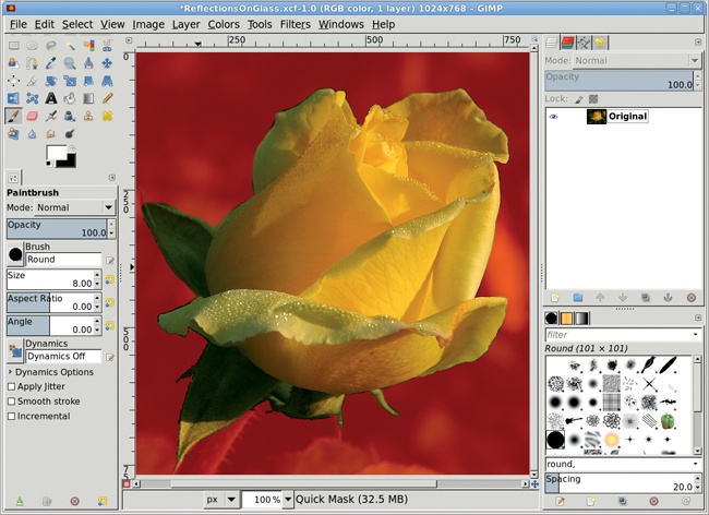
Simulating the reflection of an object on a glassy surface is actually pretty simple. In this example I’ll use a yellow rose. The vertical orientation of the rose—stem to flower—will make the reflection easier to see.
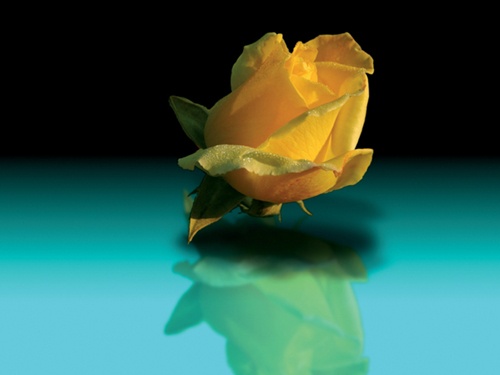
In the original image, a yellow rose is set against a garden background. This image offers high contrast around the edges. When you create reflections using images like this, it’s best to remove the darker edges and leave the lighter color of the object. This allows you to place the selection on just about any background.
Using the Fuzzy Select tool and the Quick Mask in combination, make a selection around the rose.
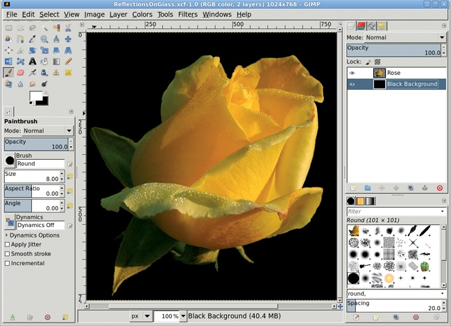
Feather the selection (Select▸Feather) by 3 pixels. Copy the selection, paste it to its own layer, and name the layer Rose. Delete the original layer (Layer▸Delete Layer).
Add a new layer (Layer▸New Layer) with a black background and call it Black Background. Move it below the Rose layer.
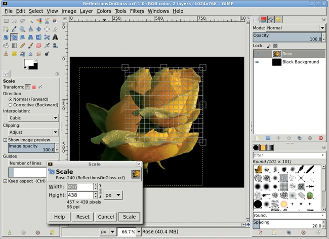
The rose doesn’t leave enough space on the canvas for a full reflection, so it needs to be scaled down. Select the Rose layer to make it active. Choose the Scale tool from the toolbox, select the Keep Aspect option in the Tool Options dialog, and then click the canvas. Drag in the canvas to scale the rose to about half its original size.
Using the Move tool, position the Rose layer in the upper half of the window.
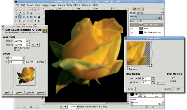
Duplicate the Rose layer (Layer▸Duplicate Layer) and name the duplicate layer Rose Reflection.
Enlarge the layer boundary (Layer▸Layer Boundary Size) by 20 percent—choose Percent from the drop-down menu next to the Current Height field—and click the Center button in the Layer Boundary Size dialog.
Make sure the Lock Alpha Channel box is unchecked for the Rose Reflection layer (the Lock Alpha Channel box is just below the Opacity slider in the Layers dialog).
Open the Gaussian Blur filter (Filters▸Blur▸Gaussian Blur) and blur the Rose Reflection layer by 8 to 10 pixels.
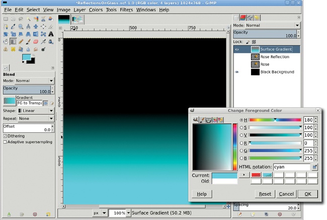
Next let’s add a visible surface. Add a new transparent layer (Layer▸New Layer) and name it Surface Gradient.
Press D and then X in the toolbox to set the background to black.
Double-click the foreground color box to open the Change Foreground Color dialog. For the cyan color shown here, type cyan in the HTML notation field and click OK. This color has aesthetic value, as well as contrasting with the color of the rose. Using a high-contrast color for the surface will emphasize the reflection even more.
To create the gradient effect shown, select the Blend tool from the toolbox. In the Tool Options dialog, set the Gradient to FG to Transparent and select the Reverse option. Then drag from the middle of the flower to three-fourths of the way down in the image window to apply the cyan gradient to the Surface Gradient layer. Move the Surface Gradient layer beneath the Rose layer, just above the Black Background layer.
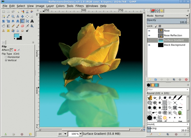
Click the Rose Reflection layer in the Layers dialog to make it active.
Select the Flip tool from the toolbox. In the Tool Options dialog select Vertical for the Flip Type, and then click the canvas to flip this layer.
Use the Move tool to position the reflection beneath the rose on the canvas. Press the CTRL key during the move to move straight down (or at any 45 degree angle).
Reduce the Opacity of the Rose Reflection layer to 50 percent and lower this layer between the Rose layer and the Surface Gradient layer.
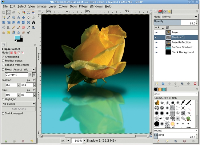
Because the rose would block any light shining directly overhead, you must add a shadow to the surface. And because light would shine in multiple directions above the rose, more than one shadow would be cast. Next you’ll create these shadows.
Add a transparent layer named Shadow 1.
Choose the Ellipse Select tool from the toolbox and create an oval selection just below the rose.
Feather the selection by 10 pixels (Select▸Feather) and fill it with black. Deselect the oval (Select▸None).
Open the Gaussian Blur filter (Filters▸Blur▸Gaussian Blur) and apply a blur of 45 pixels to the Shadow 1 layer, and then set the layer’s Opacity to 65 percent. Move this layer to just above the Rose Reflection layer.
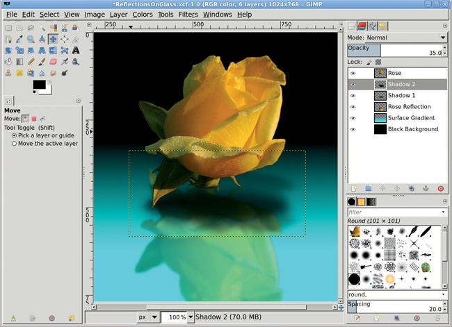
Duplicate the Rose layer, name the duplicate layer Shadow 2, and increase the layer boundary size by 10 percent (Layer▸Layer Boundary Size).
Create a selection of the rose (Layer▸Transparency▸Alpha to Selection), and then grow the selection by 2 pixels (Select▸Grow).
Press D in the canvas to reset the foreground color to black. Then fill the selection with black by dragging the foreground color box from the toolbox into the selection. Deselect all (CTRL-SHIFT-A).
Open the Gaussian Blur filter and apply a blur of 45 pixels to the Shadow 2 layer.
Use the Flip tool to flip the layer vertically, and then use the Scale tool to reduce the height of the layer by half.
Move the Shadow 2 layer beneath the Rose layer (Layer▸Stack▸Lower Layer), and then position it using the Move tool so the shadow appears below the yellow rose.
Reduce the Opacity of the Shadow 2 layer to 35 percent.
This technique for creating reflections on glassy surfaces can be extended to surfaces that aren’t quite as flat or reflective. You can also add texture to the surface to distort the reflected shape or change the direction, color, and lighting to make the reflection less distinct. In the next tutorial I’ll show you how to add waves to the surface of a reflection to create a lake effect.
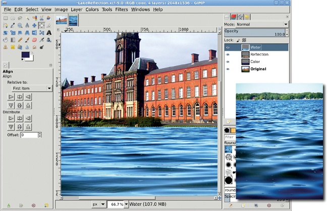
The previous tutorial showed you how to create reflections on glass, but much more can be done by expanding on the technique. That section’s tutorial made only slight modifications to the object being reflected (a rose). But what about adding texture to the reflective surface? How can we create a reflection on a surface—like water—that isn’t perfectly flat?
An easy way to add surface texture is to grab it from another image. A photo that shows the surface of a lake or ocean will work well for this tutorial. Once the sampled image is desaturated and blended with the reflection, it turns a glassy surface into a realistic reflection.
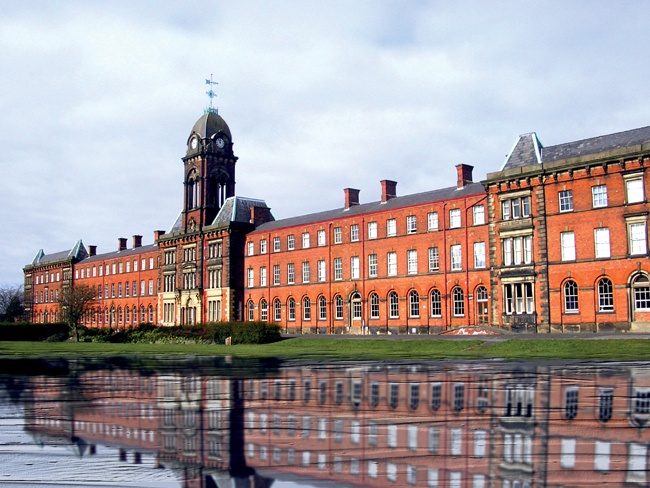
This tutorial turns a lawn into an undulating lake. In the real world, creating exactly the image you want usually requires the application of more than one effect, so let’s start by enhancing the colors in the original photo.
The image we’ll use in this tutorial is perfect for this kind of project. The building makes a dramatic focal point, and the grassy area in front is large enough to provide space for the lake. However, the color of the bricks could be more intense, so you’ll increase the color saturation before reflecting the image of the building. If the image you choose needs similar tweaks, it’s best to handle them now.
First, auto-adjust the Levels histogram. Open the Levels dialog (Colors▸Levels) and click the Auto button, and then click OK to close the dialog.
Next, open the Hue-Saturation dialog (Colors▸Hue-Saturation). Click the R button just below the red box at the top of the dialog so we only adjust the red colors in the image. Then increase the Saturation to 75 to bring out the details in the building.
Finally, open the Brightness-Contrast dialog (Colors▸Brightness-Contrast) and set the Brightness to 30 and the Contrast to 25.

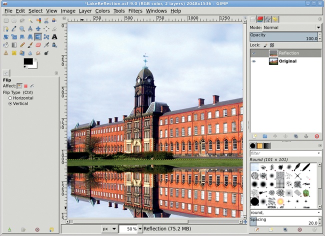
Make a square selection around the subject—in this case, the building. Also, include some of the grassy area in front of the building. The selection covers from the top of the image to just below where the grass lawn meets the building. Copy the selection and paste it into a new layer. Click the layer name and change it to Reflection.
Select the Flip tool from the toolbox. In the Tool Options dialog set the Flip Type to Vertical and click the canvas to flip the layer.
Use the Move tool to drag the Reflection layer down on the canvas. If the Reflection layer does not span the width of the canvas, select the Scale tool and then click the canvas to scale the layer manually.
To look realistic, the reflected image should be more blurred and less saturated than the original. Open the Hue-Saturation dialog (Colors▸Hue-Saturation) and click the Master button. Reduce the Saturation level to –45 for this image (your project may require different settings).
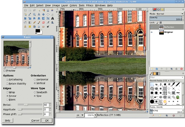
Open the Ripple filter (Filters▸Distorts▸Ripple). Set the Orientation to Vertical, the Edges to Smear, the Period to 60, and the Amplitude to 2, and then apply this filter to the Reflection layer. Repeat this process with the Ripple filter once more, this time setting the Orientation to Horizontal, the Period to 7, and the Amplitude to 5. Applying the Ripple filter twice applies ripples to ripples, just as waves in water cause interference patterns.
Open the Gaussian Blur filter (Filters▸Blur▸Gaussian Blur). Set both the Horizontal and Vertical Blur Radius to 10 pixels and apply the blur to the Reflection layer.
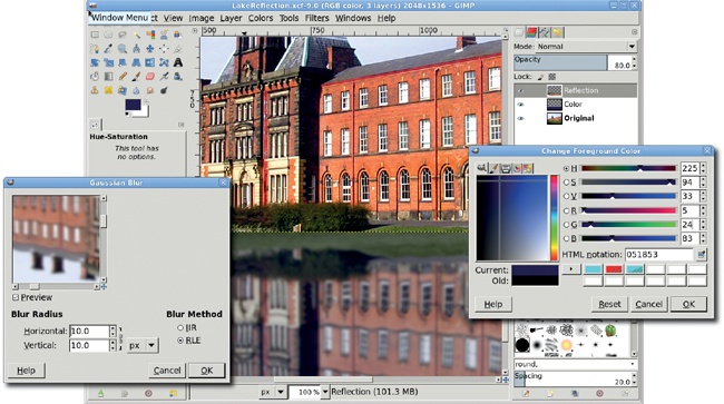
Duplicate the layer (Layer▸Duplicate Layer). Name the layer Color.
Click the foreground color box to open the Change Foreground Color dialog. For the dark blue shown here, set the RGB values to 5/24/83 and click OK. Then drag the foreground color into the layer. Finally, move the layer below the original Reflection layer and reduce the Opacity of the Reflection layer to 80 percent.
The Ripple filter makes the lake’s surface somewhat more realistic, but adding waves would improve the texture even more. To add waves, you can grab a selection from another photo.
Make a selection in a photo of real water waves, and then copy and paste it into a new layer named Water in the original project images. Use the Scale tool to scale the layer as necessary.
Desaturate the Water layer (Colors▸Desaturate).
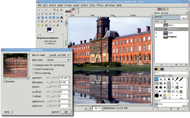
Open the Brightness-Contrast dialog (Colors▸Brightness-Contrast) and set both sliders to 70. This will enhance the waves for use as a bump map. Turn off the visibility of the Water layer in the Layers dialog.
Click on the Reflection layer in the Layers dialog to make it active.
Open the Bump Map filter (Filters▸Map▸Bump Map). Set Bump Map to the Water layer, the Azimuth to 145, the Elevation to 20, and the Depth to 3. Click OK to apply this to the Reflection layer.
This particular image lends itself well to further enhancement. The high contrast between the building and the sky allows you to make changes to the weather, perhaps even changing a sunny day into a starlit evening. Try converting this image to a nighttime scene. The Fuzzy Select tool can be used to capture most of the sky, and what is missed can be picked up easily using the Quick Mask. But be warned: the lake reflection will need to be changed too!
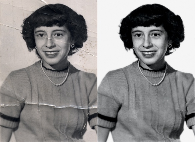
Photo restoration and retouching—the art of preserving and enhancing old photographs folded from misuse or cracked and faded with age—is a form of digital image manipulation that is often overlooked. As you’ll see in this tutorial, GIMP’s tools enable you to achieve high-quality photo restoration.
A number of tricks can be used to restore damaged photos, but the most common technique involves cloning similar areas to use in replacing damaged areas. GIMP’s Clone tool allows you to use brushstrokes of any shape on copied and pasted areas. However, this method is only appropriate for minor cleanup work such as removing specks of dust or hiding thin, short scratches. Cloning is also destructive because it occurs in the layer where the damage exists. If the patches are not to your liking, you may not be able to reverse them easily.
A better strategy for correcting larger blemishes is to make a selection, copy and paste the selection as a patch layer, and then blend this into the original layer using the Airbrush tool in a layer mask. This approach has the advantage of allowing additional changes to be made later, by either modifying the layer mask or replacing the patch layer completely. Of course, no matter which approach you take, you’ll want to preserve your original damaged art for experimentation. In this tutorial, we’ll look at the copy-and-paste method of fixing heavily damaged images. We’ll also discuss when to use large selections to patch large areas and when to divide a blemish into pieces and patch them individually.
This image was scanned from a 60-year-old photo that had been creased several times, with one crease actually leaving a slight tear along the subject’s midsection. There are several problems to fix here: correct the black-and-white points in the faded image, remove the creases, and clean up the background.
Your candidate for restoration is likely to have many of the same problems, but they may occur in different areas of the image, presenting different challenges. Scanning the original image at a high resolution, such as 250 dpi, will allow you to create a high-quality print once your image has been restored.
Let’s start with some basic image enhancement. To correct the black-and-white points, click the Auto button in the Levels dialog (Colors▸Levels). This automatically moves the left slider (black) to the first entry on that end of the histogram and moves the right slider (white) to the first entry on that end. This increases the image’s contrast so the darkest pixels become black and the lightest pixels become white, making the image clearer overall.
The image has also taken on a brown tint as it’s aged. Fix this by desaturating the image (Colors▸Desaturate).
As is the case with most scanned images, some sharpening is required (Filters▸Enhance▸Sharpen). The Unsharp Mask filter (Filters▸Enhance▸Unsharp Mask) could also be used, but isn’t best for this image because there are very few straight lines.

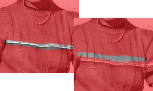
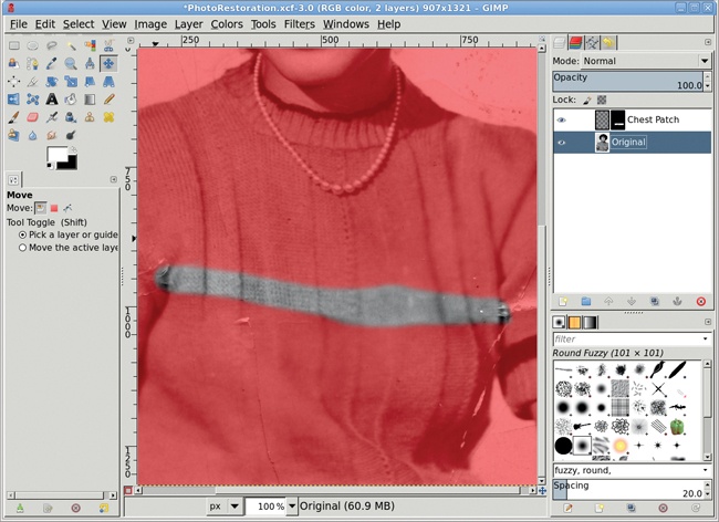
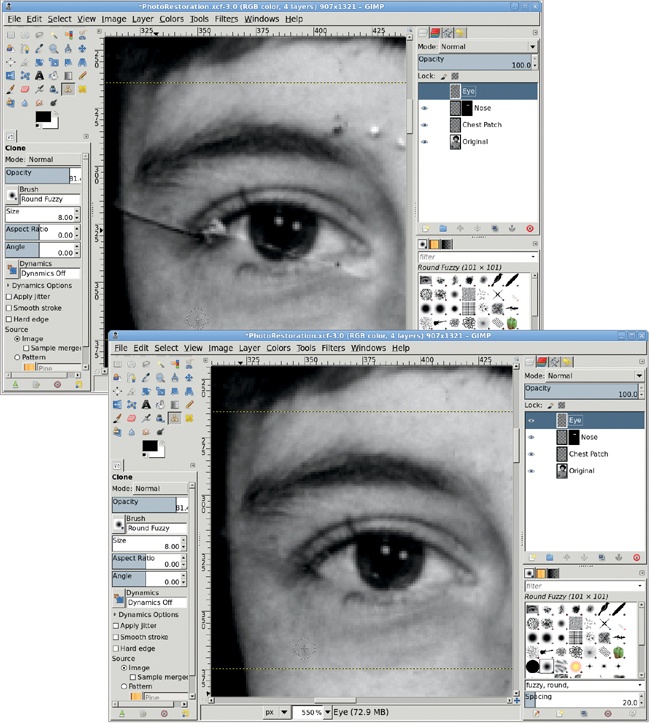
The big scratch across the woman’s sweater is an example of the kind of damage you can fix with a simple copy-and-paste correction that consists of a single patch. There is enough undamaged sweater in the photo to allow us to use this technique.
Choose the Free Select tool and draw an outline around part of the scratch that traverses the woman’s midsection, and then press ENTER to convert this to a selection. This will give you the size of the area that must be patched. Choose the Move tool from the Toolbox. In the Tool Options dialog, click on the Selection option for the Move setting.
Click inside the selection and drag the mouse to move the selection to an unblemished area near the scratch.
Feather the selection by 10 pixels (Selection▸Feather).
Copy the selection and paste it in a new layer (Layer▸To New Layer), and then position the new layer over the scratch. In this case, the sweater’s pleats help us align the patch, but your images will probably provide similar guides. (To show where the patch has been applied, the original image is tinted red.)
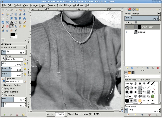
In this example, the pleats don’t align perfectly, but this can be fixed by using the Scale tool or the IWarp filter (Filters▸Distorts▸IWarp) to make minor adjustments. If the patch doesn’t align along its edges with the original layer, add a layer mask (Layer▸Add Layer Mask) and use the Airbrush tool to spray black in the mask along the edges of the patch.
If the patch’s tonal qualities don’t match those of the damaged area, you can use the Curves tool (Colors▸Curves). Make sure the patch layer (not its mask) is active by clicking the layer preview in the Layers dialog. To see if the patch lines up well with the original image, turn the layer visibility for the patch on and off quickly (using the eye icon in the Layers dialog). As you do this, it should appear that the pleats (or other guides) are in place and only the scratch is removed.
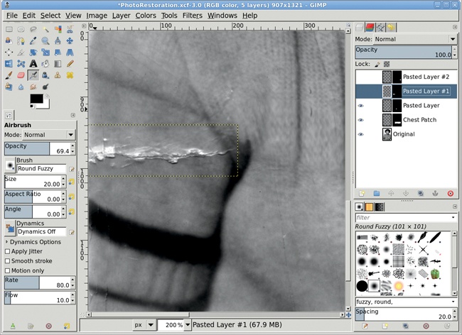
The scratches across both of the woman’s sleeves pose a more difficult problem. There’s no single unblemished area large enough to cover these scratches, so they require several smaller patches. Use multiple small patches to fix the scratch on the left sleeve, creating each small patch just as the previous large patch was created.
Use the Free Select tool from the Toolbox to select part of the scratch, move the selection over a nearby unblemished region, copy and paste the selection as a new layer (CTRL-C, CTRL-V, CTRL-SHIFT-N), and move that layer over the scratch. If necessary, use a layer mask (Layer▸Mask▸Add Layer Mask) on the patch to blend it with the surrounding areas.
In this photo, the dark area between the woman’s sleeve and midsection has a very complex pattern. The patch requires use of the Curves tool (Colors▸Curves) because the patch was taken from a region with different tonal qualities. A simple blend with a layer mask isn’t sufficient to meld the patch over the scratch. The Curves adjustment modifies the tonal qualities so the patch blends seamlessly when combined with the mask.
After all the sleeve patches are created and blended, merge them (Layer▸Merge Down) one at a time into a single patch.
Scratches on a subject’s face are more difficult to fix than those on clothing. It’s easier to spot differences between the patch and the surrounding face than it is to spot those between the sweater and its patches. Even so, facial scratches are best handled by using the Free Select tool, as we’ve done so far. The main difference is that you must make even smaller selections, bounded by high-contrast lines. Areas between the face and the hairline or between the bridge of the nose and the shadowed sides of the nose work especially well. The woman’s eye poses a particular challenge because that part of the image is so complex.
Make a selection of the eye, and copy and paste it to a new layer as a patch (Layer▸To New Layer).
Use the Clone tool to manually paint out the scratch. In this case it’s safe to use the Clone tool because we’re working on a copy of the original, blemished subject.
To use the Clone tool, first specify a clone source location by holding down the CTRL key and clicking the image. The click point indicates the region that will be copied from, so make sure it’s a reasonable match to the region you’re patching. Then, once the clone source is established, choose the clone destination. Click and drag the mouse over the scratch. The source is copied over the destination as you drag.
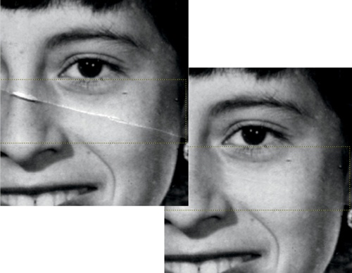
When you use the Clone tool, the length and direction of the line between the clone source and the initial clone destination (where you first click when you start to clone the image) always remains uniform. When you drag a line over the scratch, that same line is cloned, positioned to start at the clone source location. This means that if you drag far enough from the initial clone destination, you can cause the clone source to fall over another blemish. The trick is to keep your brush strokes small and reset your clone source point frequently.
It’s also possible to clone from another layer. In the Tool Options dialog, check the Sample Merged option. With this option you can clone from any layer that is being used to display the composite image.
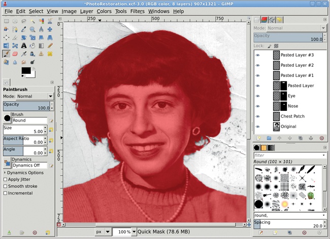
Cleaning up the background is a no-brainer.
Make a selection using the Quick Mask and an appropriate brush. Paint inside locks of hair where the background shows through. The painted areas (which are no longer tinted red) will become the selected area when you click the Quick Mask to Selection button in the lower-left corner of the canvas window.
Feather the selection by 15 pixels or more (Select▸Feather). In previous tutorials the feather values were only 1 or 2 pixels, but higher feather values should be used when your image resolution is higher, as it is when restoring a photograph.
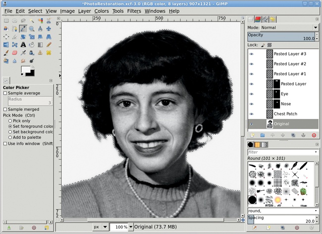
Use the Color Picker tool to select a color from the existing background inside the selection. Drag the foreground color into the selection to fill it with this color. This takes care of all problems in the background.
All the other large blemishes can be fixed with the same processes used for the sweater and face. In this case, the final results are dramatic. When the original image is scanned at a high resolution, an image restored using GIMP’s tools should produce a high-quality print. The results won’t always be so dramatic, but with practice some people are able to make a living doing this kind of work.
Professional image restoration depends upon proper use of selections and layer masks, but it also relies heavily upon other tools in GIMP’s arsenal, including the IWarp filter, Feather command, Curves tool, and Clone tool. As a process, image restoration doesn’t lend itself to automation, so designers who understand how to make the most of these techniques will always be in high demand.
Restoring old photographs is a time-consuming but rewarding process. In the next section, we’ll discuss a technique that requires far less time but is just as rewarding.
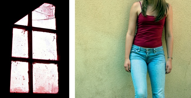
Adding a light source to a photograph can increase the photograph’s dramatic impact—especially when the light is shining through a paned window. But setting up a shot like the one shown here can be time consuming and usually requires a specific location. It would be easier if we could use software to add the light source to any image.
Fortunately, GIMP allows us to merge multiple shots to achieve this effect. Start with any stock photograph and use an image of a window as a stencil for the shadow. The process is so simple, you’ll probably have more trouble finding suitable stock images than you will producing the effect in GIMP.
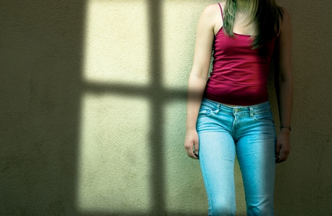
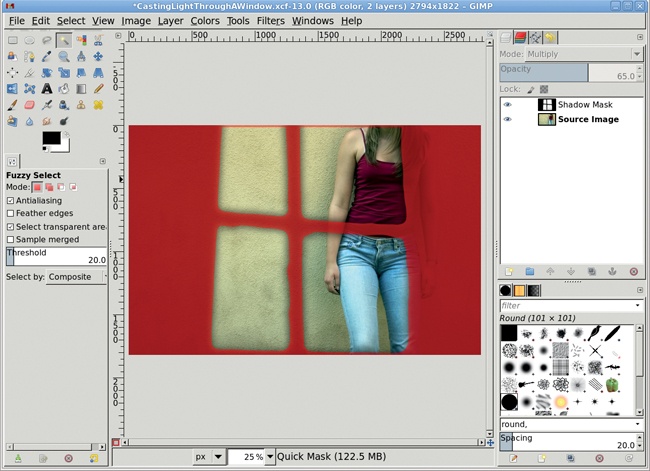
This shot was created from two stock photographs. The first photo shows a model posing against a wall. Let’s call this layer Source Image. The second image shows light shining through an oddly shaped window. Let’s call this layer Shadow Mask. You can certainly create a mask in whatever shape you like, but you’ll save time if you can find a suitable stock photo.
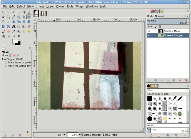
Start by opening up a source image and an image to use as the shadow mask, both from their respective stock image files. If only a portion of the shadow mask image is intended to cover the source image, make a selection around that part of the shadow mask image and paste it into the source image as a new layer. This example doesn’t require a selection, because we want to use the entire shadow mask image, so we can just copy and paste it into a new layer in the source image.
Copy the shadow mask image (Edit▸Copy) and paste (Edit▸Paste) it into the source image as a new layer (Layer▸To New Layer) as shown here.
Reduce the Opacity of the Shadow Mask layer to 65 percent, and then use the Move tool to position the window over the subject. The Shadow Mask was also scaled taller and wider with the Scale tool so only a single crosshair in the window is visible.
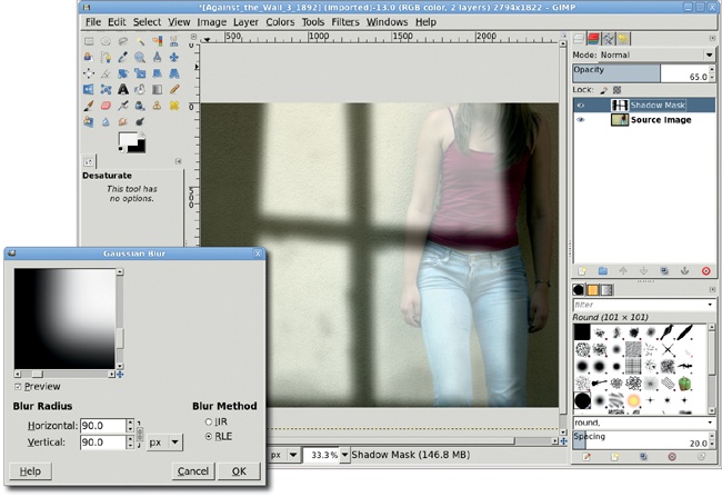
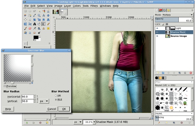
To make the window look more like a shadow, you’ll need to desaturate and blur it. Desaturate the Shadow Mask layer (Colors▸Desaturate), and then open the Gaussian Blur filter (Filters▸Blur▸Gaussian Blur). The Blur Radius should be set according to the image size. In this example, the Source Image is 2794 pixels wide, so the Blur Radius is set to 90 pixels. That gives roughly a 32:1 ratio, though you may find that a smaller ratio is more appropriate for smaller images.
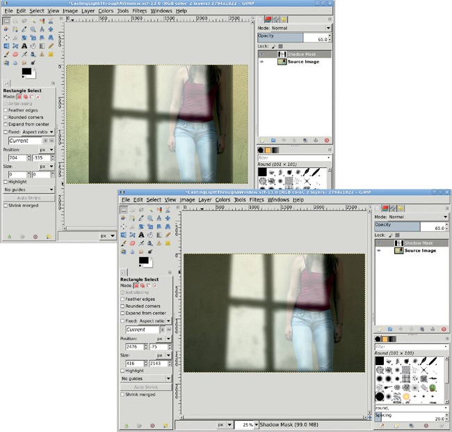
Expand the Shadow Mask layer to fit the full image (Layer▸Layer to Image Size). Make sure the Lock Alpha Channel box in the Layers dialog is not set.
Using the Fuzzy Select tool, click the transparent regions of the layer to the left and right of the window image. This may require multiple clicks with the SHIFT key held down.
Grow the selection (Select▸Grow) by 20 to 50 pixels.
With the canvas selected, press D to reset the foreground and background colors. Then drag the foreground color (black) into the selection to extend the shadow cast by the wall in which the window is set. If any lighter color lines are still visible along the edges of the selections, undo the drag (CTRL-Z) and grow the selection some more, and then drag from the foreground color again.
Deselect all (Select▸None).
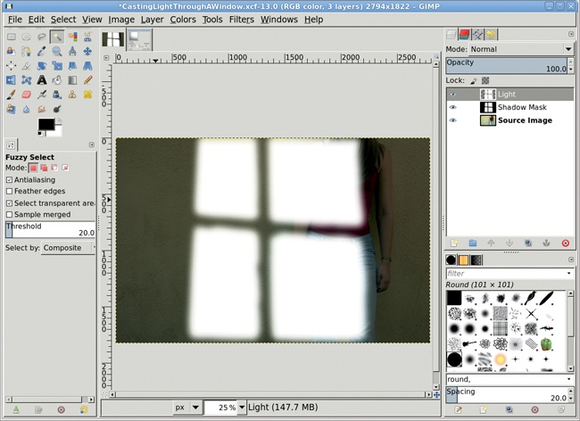
Set the Shadow Mask layer mode to Multiply. In this example, the result is good, but more contrast would help. Use the Fuzzy Select tool and click in the darker areas of the Shadow Mask. Invert this selection (Select▸Invert) to select just the windowpanes. Shrink (Select▸Shrink) the selection a bit.
Create a new transparent layer (Layer▸New Layer) and call it Light.
Drag the background color (white) into the selection.
Deselect all (Select▸None).
Open the Gaussian Blur filter (Filters▸Blur▸Gaussian Blur) and set the Blur Radius to 90 pixels.
Setting the Light layer’s mode to Overlay completes the effect. Adding a layer mask (Layer▸Mask▸Add Layer Mask) to the Light layer and applying a black-to-white gradient using the Blend tool softens the lower edge. It may also be necessary to apply a black-to-white gradient to the Shadow Mask layer, with the layer mode set to Multiply.
To take this tutorial further, you might add shadows that are cast by objects outside the window. Imagine a tree, for example. Its shadow would also be cast through the window and onto the source image. The process for adding the tree’s shadow would be similar, except that the tree would be farther away and cast a lighter, more blurred shadow.
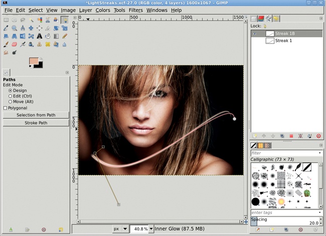
Lighting alters the mood of an image. So far you’ve added lighting to a project by casting light through an unseen window. Now you’ll combine that idea with artificial effects. This project will add flowing streaks of light to a stock photo. These will dramatically change the mood with only a modest amount of work.
There isn’t a great trick to this process; getting the best results is mostly a matter of trial and error. The process starts with a little understanding of how to create and stroke paths. Paths are distinct from image layers. This allows paths to be edited without affecting the composite image and to be applied multiple times to any number of image layers.
Note
This tutorial requires some knowledge of using both the Paths tool and the Paths dialog. If you aren’t comfortable with either, check out 1.5 Paths for a basic introduction.
The process starts with a stock photograph that’s dark enough that a streak of light will be a noticeable change. Creating an initial streak is a straightforward process with minimal edits of a single path.
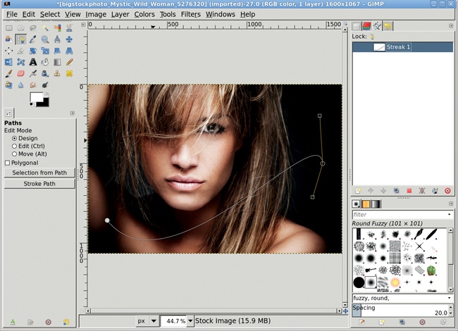
Open the stock image. Add a transparent layer (Layer▸New Layer) and name it Streak 1.
Choose the Paths tool from the Toolbox.
Click the lower left of the image to drop an anchor. Click the middle right side to drop the opposite end of the path. Click the path near each anchor and drag to bend the line and pull out handles from the anchors. Drag the handles to make a skewed S shape.
In the Paths dialog, click the Unnamed path and change the name to Streak 1.
Select the Paintbrush tool from the Toolbox. In the Tool Options dialog, choose the Calligraphic brush. Set the Size to 20, enable Basic Dynamics, set the Dynamics Options Fade length to 100, and set the Gradient to FG to Transparent. Enable a Smooth stroke of Quality 20 and Weight 50.
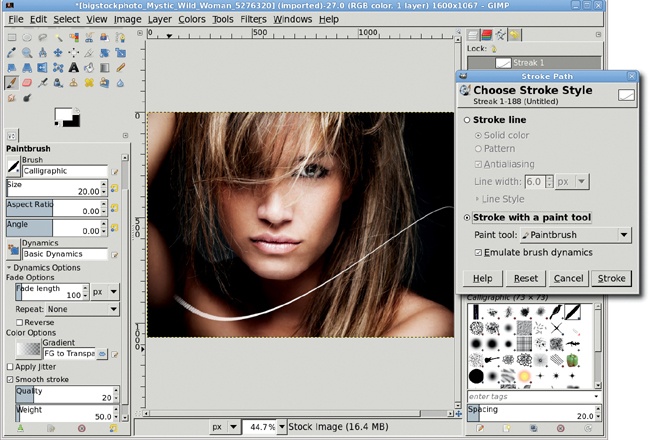
Type D, then X in the image window to set the foreground color to white.
To stroke the path, click the Paint Along Path icon (second from right) at the bottom of the Paths dialog. The Stroke Path dialog will open. Choose the Stroke with a Paint Tool option. Make sure the Paintbrush is selected and Emulate brush dynamics checkbox is checked. Then click the Stroke button.
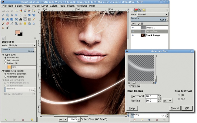
The initial streak is a nice touch, but it needs to glow a bit, reflecting some of the color from the stock image. The glow comes from duplicating, blurring, and then applying color to the streak.
GIMP doesn’t have an outer glow filter, so the process must be performed manually. Fortunately, an outer glow is a very simple effect.
Duplicate the Streak 1 layer. Name the duplicate layer Outer Glow.
Open the Gaussian Blur filter (Filters▸Blur▸Gaussian Blur). Set both Horizontal and Vertical Radius settings to 20.0 pixels and apply to the Outer Glow layer.
Duplicate this layer. Merge the duplicate (Layer▸Merge Down) onto the Outer Glow layer.
Choose the Color Picker tool from the Toolbox. Enable the Sample Merged option in the Tool Options dialog. Click on the model’s face to pick a tone to apply to the glow.
Choose the Bucket Fill tool from the Toolbox. Set the Mode to Multiply, Fill Type to FG color fill, and Affected Area to Fill whole selection in the Tool Options dialog.
Click the image window to apply the color to the Outer Glow layer. Move the Outer Glow layer below the Streak 1 layer in the Layers dialog.
GIMP doesn’t have an inner glow filter either, though several options exist in the Plugin Registry for those interested in using off-the-shelf solutions. Like the outer glow, however, the inner glow is very easy to produce manually in just a few short steps.
Duplicate the streak layer and name the duplicate layer Inner Glow.
Choose the Fuzzy Select tool from the toolbox. In the Tool Options dialog, enable the Select Transparent Areas option. Click anywhere in the image except on the streak to create a selection. Invert the selection (Select▸Invert) to select just the streak.
Drag the foreground color from the toolbox into the selection.
Shrink the selection (Select▸Shrink) by 3 pixels. Cut the selection (Edit▸Cut). This removes the selected area, leaving just a thin outline in the Inner Glow layer. Clear the selection (Select▸None).
Open the Gaussian Blur filter again. Apply a 5-pixel radius blur to this layer.
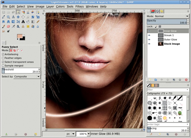
Selecting and then inverting the transparent area allows selecting the entire streak. If the streak itself had been selected with the Fuzzy Select tool, the semitransparent areas might not have been selected.
This single streak can be improved by adding similar streaks to it. The process used to create the original streak is repeated, except that the path used will be an edited duplicate of the original path.
Open the Paths dialog. Duplicate the Streak 1 path by clicking the fourth button from the bottom left. Name the new path Streak 1B. Click the eye icon in the Paths dialog so the eye is visible. This will make the path visible in the image window, but without the anchors or handles.
Choose the Paths tool from the Toolbox. Click the path in the image window to show the anchors and handles. Click the anchors to move them slightly. Click the handles to bend the curve a little more or a little less. The changes to the Streak 1B path should not be overly dramatic.
Add a transparent layer to the image and name it Streak 1B.
Repeat the stroke, outer glow, and inner glow steps from the first streak.
The ends of each streak can be adjusted using layer masks on streak layers. Variations in the lighting of the streaks can be produced by changing layer blend modes. More dramatic streaks can be applied by varying the size of the brush when stroking paths.
Blurs were used in this tutorial to simulate glows around the streaks. In the next tutorial you’ll see how blurs can be used to turn the grown-up world into a child’s toy.
An often underappreciated feature of GIMP is the blur filters. A small amount of blur can be used to soften the focus in a photograph, as was shown in 2.1 Soft Focus. 2.5 Changing Depth of Field demonstrated how varying amounts of blur can be used to move the background away from the foreground. And long blurs can apply streaks to an image that simulate high-speed flight.
This tutorial will use blurs to take the very big and make it appear very small. Even better, the process is very simple. This is yet another effect that gives a photo a shallow depth of field. Traditional photographers can achieve this effect with a technique called tilt-shifting. We’ll get similar results without the fancy equipment.
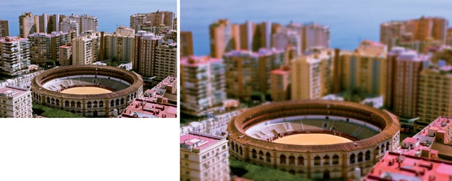
The best images for this effect are bird’s-eye views of a city. This particular image is perfect because the focal point of the effect is centered and easy to isolate. Also, miniatures often have highly saturated colors from hand painting with glossy paints. This process will increase the saturation of the stock photo, and then isolate areas outside the focal point of the image.
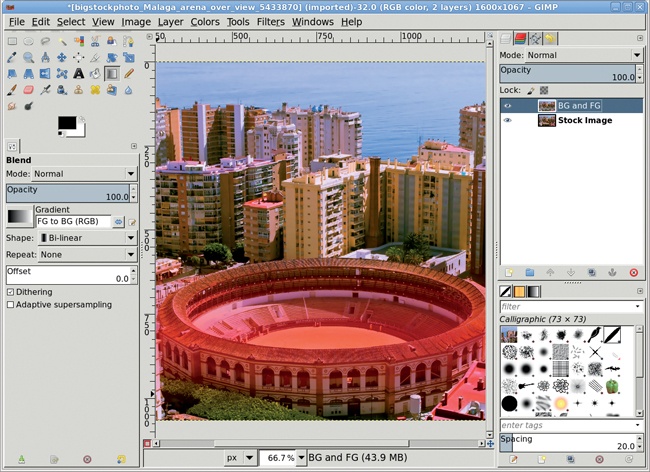
Open the stock image. Open the Hue-Saturation dialog (Colors▸Hue-Saturation) and increase the saturation. For this image the saturation was increased to its maximum setting of 100 percent. Apply this setting to the image.
Click the Quick Mask button in the lower left of the image window. This will tint the image red where no selection currently exists.
Type D in the canvas to reset the foreground and background colors.
Choose the Blend tool from the Toolbox. In the Tool Options dialog set the Shape to Bi-linear and the Gradient to FG to BG (RGB), and leave other options at their default settings. Use the Reset button at the bottom of the dialog if you need to reset defaults.
In the image window, click the floor of the stadium and drag up to just above the top of the stadium. Click the Quick Mask button again to convert this to a selection of the image’s upper and lower regions.
Copy and paste the selection as a new layer. Name the new layer BG and FG.
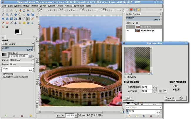
Using a copy of the original layer allows experimentation with the blur process without affecting the original image. If you mess up the copy, just make the selection of the original image layer again and copy and paste another new layer to continue experimentation.
Open the Gaussian Blur filter (Filters▸Blur▸Gaussian Blur). Apply a 20-pixel blur to the new layer.
If the first selection failed to select much of the foreground, make another selection with the Quick Mask and Blend tools, this time using a Linear Gradient instead. Drag from the stadium floor straight down to the bottom of the windows in the second floor of the stadium. Convert the Quick Mask to a selection, and then copy and paste as a new layer and blur again. Add a layer mask to this new layer and spray-paint black in it where the stadium and some of the greenery in front is out of focus.
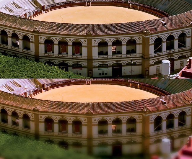
This stock photograph provided a perfect example of the miniaturization effect. Other images are not so well suited. In those cases the selection may require alternative methods. Try using a Radial Gradient with the Blend tool, or the Rectangle or Ellipse select tools with large amounts of feathering.
Now that you’ve practiced the basic techniques for working with photographs in GIMP, you’re probably eager to get started on your own photo projects. When you do, keep the following suggestions in mind.
You can autolevel all scanned and digital images using the Levels tool (Colors▸Levels). This flattens the color histogram and automatically makes the darkest pixels black and the lightest pixels white. But this isn’t absolutely required every time. If you don’t like the results, just undo it with CTRL-Z.
Nearly all scanned photos can benefit from a little sharpening. Digital photos don’t normally need to be sharpened, but scanned photos usually do. The Unsharp Mask filter (Filters▸Enhance▸Unsharp Mask) works best for photos, though you can also get good results using the Sharpen filter (Filters▸Enhance▸Sharpen).
Learn to love ’em (and make them effectively, as described in 1.4 Selections). When you’re working with photographs, you can’t do much without them.
Duplicate an image layer and set the new layer to Soft Light. Adjust the opacity to modify the contrast in the original layer.
Add mood to your photos. Fill layers with any color on the color wheel and blend them using the Soft Light or Overlay layer modes.
Sepia tones are shades of brown, and they can lend your images an antique quality. Try applying RGB value sets like 124/81/61, 140/89/51, or 181/145/124 to your photographs.
Are you using ordinary halogen lamps for indoor shoots? Lighting color is measured in degrees Kelvin, with the sun at sunrise being about 2,500 degrees and the sun at noon being about 5,000 degrees (a bright white). A typical halogen lamp might be around 3,000 degrees, making its light a bit more yellow. Many photographers add a color-correction gel—which can be ordered from various online sources—to change the color of halogen bulbs.
If you can’t fix a shot with proper lighting, you can try to digitally remove yellow tints from your photos using the Color Balance tool (Colors▸Color Balance) or the Hue-Saturation tool (Colors▸Hue-Saturation).
It can take a long time to make color adjustments to an entire image using tools from the toolbox. To experiment first, select a small part of the image and preview the color adjustments on that selection. When you’ve decided on the optimal values, undo the operation and adjust the entire image. Alternatively, try duplicating the image, scaling it down, and then experimenting with color adjustments on the smaller image.