Chapter 3 A Colorful Magazine Cover Design
Chapter Objectives
Chapter Learning Objectives
Set up a new document.
Select a workspace.
Apply fill and stroke attributes to text and objects.
Kern text.
Apply effects to text and objects.
Use paragraph styles.
Draw a freeform frame with the Pen tool.
Paste a graphic into a frame.
Apply a text frame inset.
Use groups.
Use the Polygon tool.
Preflight a document.
Chapter ACA Objectives
For full descriptions of the objectives, see the table on pages 270–276.
DOMAIN 1.0
WORKING IN THE DESIGN INDUSTRY
1.1
DOMAIN 2.0
PROJECT SETUP AND INTERFACE
2.1, 2.2, 2.3, 2.4, 2.5, 2.6
DOMAIN 3.0
ORGANIZATION OF DOCUMENTS
3.1
DOMAIN 4.0
CREATE AND MODIFY VISUAL ELEMENTS
4.1, 4.4, 4.5, 4.6,
DOMAIN 5.0
PUBLISHING DIGITAL MEDIA
5.1
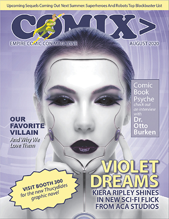
The project for this chapter is a magazine cover design. You’ll learn new techniques for applying and creating colors and gradients, and you’ll work with creative effects. Plus, you will be introduced to new text-formatting options and amazing transparency effects that can make your designs pop (Figure 3.1).
Before submitting files to the printer, you always need to perform a preflight check that flags any errors in the InDesign document. This chapter will walk you through that process and teach you how to fix the most commonly encountered errors.
Introducing the Magazine Cover Project
![]() ACA Objective 1.1
ACA Objective 1.1
![]() Video 3.1
Video 3.1
Introducing the Magazine Cover Project
Take a look at the project that you’ll work on. It’s a magazine cover, and three versions are provided in the files for this lesson.
Open the three versions of the magazine cover and compare them (Figure 3.2):
In the project03_sample1_magazine_cover folder, open the file project03_magazine_cover-final.indd.
In the project03_sample2_magazine_cover folder, open the file project03_magazine_cover.indd.
In the project03_sample3_magazine_cover folder, open the file project03_magazine_cover.indd.
Click the Arrange Documents icon in the application bar, and choose 3-up.

Figure 3.2 Three variations on the COMIX magazine cover
The rest of this chapter focuses on using InDesign to create aspects of the image with the light purple background. But take a look at what all three covers have in common: layout elements such as the yellow bar across the top, the look of the masthead (the magazine title text), and the typography and layout of the teasers (the blurbs describing features in the magazine).
As you can see, while a magazine should have a consistent and recognizable look, there’s nothing wrong with introducing creative variations on the overall theme from issue to issue.
When you’re finished examining the three sample covers, close all the documents.
Starting a Magazine Cover Design
![]() ACA Objective 1.1
ACA Objective 1.1
![]() ACA Objective 2.1
ACA Objective 2.1
![]() Video 3.2
Video 3.2
Setting Up the Cover Design
A magazine cover has a different mission than do the pages inside the magazine. The cover must communicate what’s inside the magazine, and just as importantly, it must be appealing enough to stand out among other publications that may be displayed around it. This magazine cover features a striking cover image, a bold and clear title, and “teaser” text written to draw the intended audience to the magazine.
Setting Up the New Document Dialog
Note
This chapter supports the project created in Video Project 3. Go to the Project 3 page in the book’s Web Edition to watch the entire lesson from beginning to end.
As you’ve seen in previous projects, each design project starts with some questions that require answering. What questions would you ask and answer when designing a magazine cover? To begin, you might ask:
Is this cover design going to be used for a print edition of the magazine? Or will it be used for a digital version?
What unit of measure will be used?
What is the trimmed size of the magazine?
Does the design require a bleed?
Will the design use a grid based on columns?
Answering these questions helps you set up the document in the New Document dialog. For this document, the answers to these questions are:
This is for a printed edition of the magazine to be distributed to convention attendees.
The unit of measure is inches.
The trimmed size is Letter, 8.5 inches by 11 inches.
The design requires a 0.25-inch bleed.
The design is based on a 5-column grid.
With those questions answered, create the magazine cover document:
In the Start workspace, click the Create New button (or choose File > New Document).
Click the Print intent at the top of the New Document dialog (Figure 3.3).

Figure 3.3 Setting up the New Document dialog for the magazine cover Click the Letter icon to set the page size, and make sure the Orientation icon is set to portrait (tall).
Choose Inches from the Units pop-up menu.
Deselect the Facing Pages check box, because this document will involve only the cover page of the magazine.
Leave both Pages and Start # set to 1.
Deselect Primary Text Frame.
For Columns, enter 5.
For Column Gutter, enter 0.125 inches.
For Margins, set all values to 0.5 inches.
Note
In the previous project you entered the filename in the New Document dialog, but it’s okay to set the filename later when you first save the document.
For Bleed, set all values to 0.25 inches. Leave the Slug section as it is.
If you want to see how the New Document settings affect the document that’s about to be created, select Preview.
Click Create to close the New Document dialog. When it closes, InDesign creates the new document with the settings you applied (Figure 3.4).
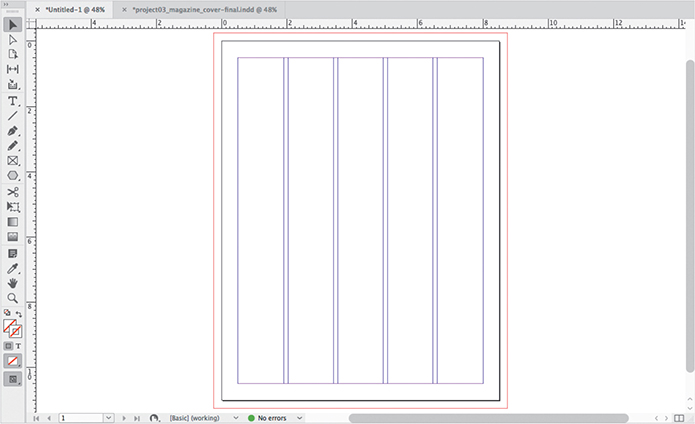
Figure 3.4 The new document with the settings for the cover. (The other tab is the finished version of the cover, open for reference.)
Setting Up Layers
The object stacking order of this cover design will be organized using layers.
Using the skills you learned in Chapter 2, set up the Layers panel with layers using the following names and stacking order (Figure 3.5):
Top elements
Coverlines
Shapes
Masthead
Background

Figure 3.5 Layers panel set up for the magazine cover
The layer colors don’t have to match the video and the project03_magazine_cover-final.indd sample file, but you may want to make the layer colors match to be consistent with them. The layer names will match the sample file if you name them from the bottom up. For example, the default Layer 1 has a light blue layer color, and you can name that Background. Create another new layer with the default layer color red, and you can name that Masthead, the name of the second layer from the bottom.
Tip
To open the New Layer dialog as you create a new layer (so you can name it right away), Alt-click (Windows) or Option-click (macOS) the Create New Layer button in the Layers panel.
Switching Workspaces
If you created the Learn workspace that was demonstrated in Video 1.7, and if it isn’t already active, switch to it now.
If you did not create the Learn workspace, that’s okay; you can do one of the following:
Switch to the Typography workspace and simply open any other panels that you need to produce this project.
Watch Video 1.7 again and follow the demonstration to build and save the Learn workspace.
Saving the Document
The document hasn’t been saved yet, so this is a good time to save the work you’ve done so far.
Choose File > Save.
Navigate to the project03_sample1_magazine_cover folder.
Name the document project03_sample1_magazine_cover.
Click Save.
 ACA Objective 2.4 ACA Objective 2.5
Placing the Featured Image on the Cover
![]() Video 3.3
Video 3.3
Placing an Image as the Background
To kick off the magazine cover, you’ll create a graphics frame and then add the cover image to it. You’ll also create a new color swatch based on a color in the cover image.
As you work through the projects from this point on, remember to zoom and scroll the document view as needed to clearly see the part of the document you’re editing.
Adding the Cover Image
To add the cover image:
In the Layers panel, make sure the Background layer is selected.
Because you’ll be adding the big image that goes behind everything else on the page, making the Background layer the active layer ensures that the next object you add will stay behind objects on all other layers.
Using the Rectangle Frame tool, draw a graphics frame that goes to the edge of the bleed area for all sides of the page.
The cover image is intended to be a full-bleed (borderless) image, so it has to extend past the page border into the bleed area. Therefore, the placeholder graphics frame you’re creating for the image must also extend into the bleed area.
With the Selection tool, select the graphics frame.
Choose File > Place, navigate to the Lesson Files folder, open the Project03-Magazine Cover folder, open the project03_sample1_magazine_cover folder, open the Links (images) folder, select proj3_scifi-female.jpg, and click Open.
The image fills the selected graphics frame (Figure 3.6). It may be larger than needed, in that the top of the head may be cut off at the page edge.

Figure 3.6 Cover image filling the graphics frame drawn for it With the Direct Selection tool, click the image.
The image becomes selected instead of the graphics frame, and the image’s bounding box may extend well beyond the graphics frame. That’s why it’s too big.
Also, note that clicking the image with the Direct Selection tool is one way to select the content inside a frame. Earlier, you selected the content of a frame by clicking a frame’s Content Grabber (the concentric circle indicator) with the Selection tool; that’s a shortcut you can use instead of having to switch to the Direct Selection tool.
In the Control panel, click the Fill Frame Proportionally icon (Figure 3.7). (If the icon is not visible in the Control panel, choose Object > Fitting > Fill Frame Proportionally. When the InDesign application frame or your display is not wide enough, some icons on the right side of the Control panel may not be shown.)
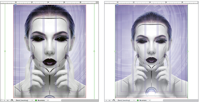
Figure 3.7 Before and after applying the Fill Frame Proportionally option Tip
You can control which items are shown or hidden in the Control panel by clicking the gear icon at the upper-right corner of the Control panel.
The image should now be scaled so that it fills the graphics frame as much as it can without leaving any gaps and while maintaining the original proportions of the image. If you zoom out you will see that the image extends well beyond the top and bottom of the graphics frame, but that’s unavoidable—if the image were scaled down any further, gaps would appear at the left and right sides of the graphics frame.
There’s only one way that content can fit inside a graphics frame perfectly without gaps or areas outside the frame and without distorting the content: The content and the frame must have exactly the same dimensions.
Switch to Preview mode, using any of the techniques you have already learned.
Preview mode shows that the areas of the image cropped out by the graphics frame are not a problem here, because all the important content will be visible after the page is trimmed.
If you think the image needs to slide up or down a little, select the content inside the graphics frame and press the Up Arrow key or Down Arrow key to nudge it vertically. Leave room for the masthead (magazine title) that will be added later, and don’t cut out too much of the medallion at the bottom.
Remember that you can use the finished cover document you opened earlier as a guide; you can refer to it in case you’re not sure if you need to leave room on the cover for an element that’s planned to be part of the design.
Choose Edit > Deselect All and save the document.
Creating a Swatch Based on a Color in the Image
Note
If the Eyedropper tool doesn’t pick up a color, make sure nothing is selected (choose Edit > Deselect All) and try again.
Tip
To clear the contents of the Eyedropper tool and pick up attributes from another object, Alt-click (Windows) or Option-click (macOS) the other object.
To create color harmony in a design, a popular practice is to take a color from an image and use it in other elements on the page. You did this earlier in the poster project, when you sampled colors from a superhero graphic and applied it to text. This cover design will use a purple color from the image for some elements you’ll add later.
Open the Swatches panel.
With the Eyedropper tool, click a dark purple area of the cover image.
Remember that the Eyedropper tool may not be immediately visible in the Tools panel because it’s grouped with the Color Theme tool and Measure tool. And don’t confuse the Eyedropper tool with the similar-looking Color Theme tool.
Choose New Color Swatch from the Swatches panel menu, make sure Color Type is set to Process, and make sure Color Mode is set to CMYK.
In the New Color Swatch dialog, deselect Name with Color Value.
For Swatch Name, enter Purple.
The sampled color can be a starting point for the color you’d actually like to use; in the New Color Swatch dialog, you can adjust the color values that define the swatch.
Enter the following color values (Figure 3.8):
Cyan: 87%
Magenta: 87%
Yellow: 40%
Black: 17%
Deselect Add to CC Library, and click OK.

Figure 3.8 Editing the sampled color swatch
With the cover image in place, and a new color swatch based on the image, you’ve laid a great foundation for the design work to come.
Adding Teaser Text
![]() ACA Objective 2.5
ACA Objective 2.5
![]() ACA Objective 4.2
ACA Objective 4.2
![]() Video 3.4
Video 3.4
Adding a Teaser
It’s time to add a line of teaser text to the top of the cover (sometimes called a skyline), but first you’ll add more color swatches that you’ll need for the text.
Creating Color Swatches for the Text
Video 3.4 demonstrates two ways to create a 45% lighter version of the existing yellow swatch in the Swatches panel. You can create a light version of the existing yellow swatch by using the New Tint Swatch command or by duplicating the existing yellow swatch and editing it to be lighter.
It’s important to understand that the consequences of each method depend on the Color Type setting:
For a job that will be printed with only process colors, such as this magazine cover, you can use either method. Either way, four printing plates will be used (for cyan, magenta, yellow, and black).
For a job that will be printed with spot colors, it’s better to use the tint method because it creates the lighter version by screening the base color. For example, a 45% tint of yellow may be printed using a halftone screen on the yellow printing plate. Using the swatch duplication method is not a good idea for a job printed with spot colors, because every additional color swatch (that is not a tint) specifies one more ink to mix, which adds one more printing plate, and that may increase the cost of printing the job.
Tip
When a swatch uses multiple color values, you can quickly lighten or darken it by holding down Shift as you drag any of the color value sliders.
It’s important to note that for the light yellow example, the only reason it’s just as easy to create the lighter version by duplicating the swatch is that you have to change only one color value: yellow. But if a swatch has multiple color values, making a lighter version without altering the hue is not as simple, so using the tint method can be more straightforward.
To create a lighter version of a swatch by tinting it:
Select the yellow swatch, and choose New Tint Swatch from the Swatches panel menu.
Edit the Tint value to 45% (Figure 3.9).

Figure 3.9 Creating a tint with the New Tint Swatch dialog The rest of the dialog is not editable because a true tint only screens back an existing swatch; it doesn’t otherwise alter its color type, mode, or mix. The amount of the tint is added to the end of the swatch name in the Swatches panel.
To create a lighter version of a swatch by duplicating it:
Select the yellow swatch and click the New Swatch button at the bottom of the Swatches panel (Figure 3.10).

Figure 3.10 Creating a lighter color swatch by duplicating and editing an existing swatch When a swatch is selected, the New Swatch button duplicates the selected swatch so that you can use it as a starting point.
Double-click the swatch to open the Swatch Options dialog, set the Yellow value to 45%, and click OK.
If you want to rename the new swatch, be aware of the naming differences between tint swatches and color swatches:
You can’t give a tint a custom name that’s different from its parent swatch. The name of a tint swatch is always the name of its parent swatch with the tint percentage after it—for example,
C=0 M=0 Y=0 K=0 45%
Renaming a tint swatch also renames its parent swatch, because a true tint is always a derivative of a color swatch. Changing the color values of a tint will update the color values of its parent to match, so edit only the Tint slider in most cases.
If you created the light yellow by tinting the existing yellow, use the swatch C=0 M=0 Y=0 K=0 45% when the cover design calls for light yellow.
If you created a new light yellow swatch by duplicating, you can name it without affecting any other swatches. You can name it Light Yellow and use this swatch when the cover design calls for light yellow.
Adding the Teaser Text Across the Top
Tip
To set a fill or stroke to None using the keyboard, make sure the fill or stroke indicator is active, and press the slash key (/). If the wrong indicator is active, press the X key to swap which one is active and then press the / key.
If you refer to the finished sample version of this job, you’ll see that although most of the teaser text sits over the cover image, the teaser line across the top is on a yellow rectangle.
To draw the yellow rectangle:
In the Layers panel, make sure the Background layer is selected.
Set the fill color to the Light Yellow swatch you created, using any of the methods you’ve learned so far, such as clicking the fill swatch in the Tools panel, the Control panel, or the Swatches panel. Set the stroke color to None.
With the Rectangle tool, draw a rectangle that extends across the top of the page, with the top, left, and right edges at the bleed edges, and the bottom edge at the top page margin.
You can check your work by switching to Preview mode. The top, left, and right edges should be trimmed to the page edge, as they would be after printing. Remember to switch back to Normal mode for further editing.
In the Layers panel, select the Coverlines layer to make it the default layer for objects you create.
With the Type tool, drag to create a new text frame with the upper-left corner touching the top page edge and the left page margin, and the lower-right corner touching the top margin edge and the right page margin.
In the Character panel, set up the type specifications for the top teaser. Video 3.4 uses Myriad Pro Regular, 15 points.
Type to enter the text that goes into the top teaser, such as Upcoming sequels coming out next summer: superheroes and robots top blockbuster list.
The top teaser should be just one line. If the type wraps to a second line, make it fit on one line using any of the following methods, depending on which one you think looks the best:
With the text selected, adjust the font size in the Character panel.
With the text selected, adjust the tracking value in the Character panel.
With the Selection tool, drag handles on the text frame bounding box to make it wider, but make sure the text is not too close to the top or sides of the page edge.
The teaser might look better if each word were capitalized. The Change Case submenu provides a quick way to change the capitalization of words in a sentence.
Select the text and choose Type > Change Case > Title Case.
With the text selected, apply Purple as the text fill color.
With the Selection tool, select the text frame and double-click the bottom middle handle so that the frame shrinks to fit the text, removing unused space in the text frame.
Center the text in the yellow rectangle (Figure 3.11). If the Selection tool is active, you can nudge the text frame by pressing the arrow keys.

Figure 3.11 The completed teaser text in place Make sure you are centering the text between the top page edge (not the top bleed edge) and the top page margin. As always, the quick way to verify this is by switching into Preview mode.
Check your work by switching into Preview mode and zooming out to fit the page in the document window. Make any adjustments that you think are needed.
Save the document.
ACA Objective 4.2 ACA Objective 4.6
Creating the Title Masthead
![]() Video 3.5
Video 3.5
Creating the Title Masthead
The cover image and the masthead for the magazine title are the two most prominent features of the magazine cover. You’ve done the cover image, and now you’ll add the masthead.
Adding the Masthead
Although the title masthead is a major element, it’s really just another text frame, so you’ll create it the same way that you’ve done before: by dragging to create a text frame with the Type tool.
To create the masthead:
Make sure you’re in Normal mode so that you can see the margins.
In the Layers panel, make sure the Masthead layer is selected.
With the Type tool, drag to create a text frame near the top of the page from the left page margin to the right page margin, with the top edge just below the yellow rectangle and the bottom edge roughly where the hairline in the cover image ends at the forehead.
In the Character panel, set up the type specifications for the masthead. Video 3.5 uses Cooper Black, 143 points.
Type the magazine title, Comix.
Select the Comix text, and in the Control panel, click the All Caps icon (Figure 3.12).

Figure 3.12 Making the Comix text all capital letters with the All Caps button Although you could have typed the text in all capital letters, the All Caps option lets you convert characters to all capital letters no matter how the text was entered, and you don’t have to remember to use the Shift or Caps Lock keys.
With the text still selected, in the Paragraph panel, click the Align Center button.
With the Selection tool, select the COMIX text frame, and double-click the bottom middle handle of the frame to fit it to the text, removing the extra space.
Adjusting Masthead Kerning
When text is displayed at a large size, the spacing between letters can often appear less effective than at smaller sizes. You can tune the spacing between individual letter pairs; this is called kerning.
Click the Type tool between the O and the M in the COMIX text.
In the Character panel, lower the kerning value to tighten up the space between the O and the M (Figure 3.13).
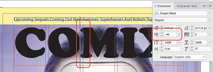
Figure 3.13 Kerning manually between a pair of characters The goal is not to eliminate all empty space, but to make the spaces between character pairs consistent in a way that will make the title appear more like a single graphic unit.
Select the text.
From the Kerning menu in the Character panel, select Optical. (You can also find the Kerning menu in the Control panel.)
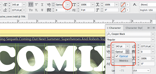
Figure 3.14 Applying optical kerning from the Character panel; the same control is in the Control panel when text is selected.
Adding a Line Under the Title
Many magazine titles have an additional short line of text that helps describe what the magazine is about. In this case, a line under the title indicates that the magazine is published by the convention organization.
To add the line under the title:
With the Type tool, drag to create a text frame about 0.3 inches high, starting at the left page margin under the COMIX title and ending halfway across the page.
To ensure that you have stopped halfway across the page, watch for a magenta Smart Guide to temporarily appear halfway across the page as you drag. Or you can first drag a vertical guide at that location, as demonstrated in Video 3.5.
In the Character panel, set up the type specifications for the text. Video 3.5 uses Myriad Pro Regular, 18 points.
Type the text Empire Comic Con Magazine.
Select the text you just typed, and in the Control panel, click the All Caps icon.
Switch to Preview mode and review where the masthead sits relative to the other parts of the cover. If the composition could be improved, continue to the next step; if it looks fine, skip the next step.
With the Selection tool, select the COMIX text frame, the text below the masthead, or both, and reposition them relative to the head and yellow rectangle until the composition appears balanced (Figure 3.15).
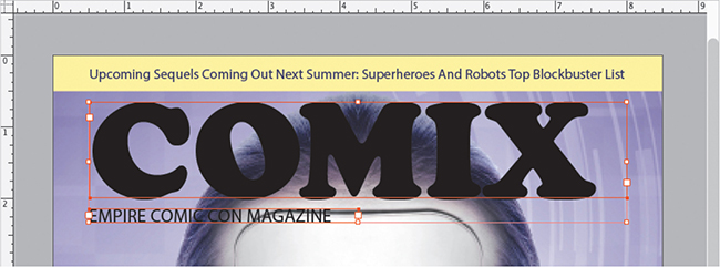
Figure 3.15 Adjusting the position of the masthead and the line below it
Applying Colors to the Masthead Text
The masthead is so large and bold that it does its basic job on a magazine cover, but it could do better. You’ll apply separate colors to the fill and stroke of the masthead text to make it more visually appealing than just flat black text.
To apply colors and effects to the masthead:
With the Type tool, select the COMIX masthead text.
In the Swatches panel, apply Purple as the text fill color.
In the Swatches panel, apply Paper as the text stroke color.
With the Selection tool, select the COMIX masthead text and apply Purple as the text fill color.
If the text frame fill color changes instead, choose Edit > Undo and try again, but this time make sure that the Formatting Affects Text icon is selected. The Formatting Affects Text icon is automatically applied when you select text using the Type tool, but when you select a text frame with the Selection tool, as you did in step 4, Formatting Affects Text is not selected, so the fill and stroke colors affect the frame instead of the text inside. If you want to affect text but are not selecting with the Type tool, remember to make sure the Formatting Affects Text icon is selected.
Apply Paper as the stroke color, and apply a stroke width of 2 points (Figure 3.16).

Figure 3.16 Applying a stroke width to selected text with the Stroke panel Select the line below the masthead and apply Purple as the text fill color.
Deselect the text.
Adding a Date Line to the Cover
A magazine cover typically includes a line of text called the date line that indicates the issue’s date of publication. In this cover, the date line will be like the existing text under the title but on the right side. It will be formatted almost identically, so a quick way to create it is to simply duplicate the existing text frame.
To add a date line:
If the document window isn’t already in Normal screen mode, switch to it.
With the Selection tool, Alt-drag (Windows) or Option-drag (macOS) the text under the title to the right until it snaps to the right page margin.
Because you held down the Alt or Option key, dragging created a duplicate. It’s the duplicate that you align with the right page margin.
To make sure the copy stays aligned to the existing text as you drag, you can do any of the following:
Keep the copy aligned to the Smart Guides that appear as you drag.
Add the Shift key to the other key you hold down as you drag.
Add a horizontal guide that lines up with the existing text, as demonstrated in Video 3.5, and keep the copy aligned to that guide as you drag.
With the Type tool, select the text in the copy and type August 2020 to replace the original text.
Select the text or the text frame of the copy, and click the Align Right icon in the Paragraph panel or Control panel (Figure 3.17).
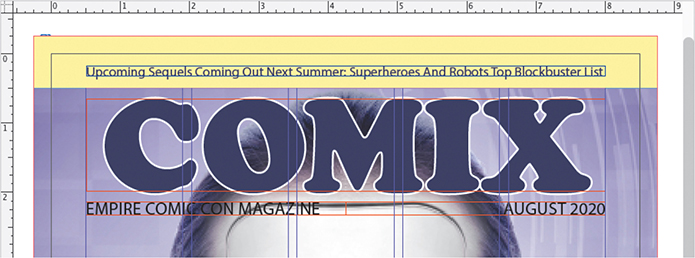
Figure 3.17 The completed date line The text in the copy is now aligned to its right edge, so it should now mirror the original text on the other side of the page. But the purple text isn’t standing out enough against the cover image, so you’ll apply a glow effect.
With the Selection tool, select both of the text frames under the title (click one and Shift-click the other), and choose Object > Effects > Outer Glow.
In the Effects dialog, notice that only Outer Glow is selected in the list of effects along the left side of the dialog.
Make sure Preview is selected so that you can see changes as you make them, and edit the following options (Figure 3.18):
For Mode, make sure that Normal is selected and that the color is Paper.
For Opacity, enter 84%.
Leave Technique set to Softer, Noise set to 0%, and Size set to 0.0972 in, but change Spread to 28%.

Figure 3.18 Applying the Outer Glow effect to text Click OK.
The Outer Glow effect helps increase the contrast of the type against the background by surrounding its edge with a very light background. You can experiment with other effects and settings in the Effects dialog to try other ways of improving type legibility on complex backgrounds; for example, later in this chapter you’ll apply a drop shadow effect to text.
Adding to the Title Masthead
![]() ACA Objective 4.1
ACA Objective 4.1
![]() ACA Objective 4.4
ACA Objective 4.4
![]() Video 3.6
Video 3.6
Adding to the Title Masthead
Many magazine covers create more visual interest by having the masthead interact with the cover image. For this cover, you’ll make the woman’s head appear in front of the masthead. The challenge is that the woman and the background are a single photo, so you have to find a way to put the masthead behind the woman’s head. InDesign provides a way to do this.
Drawing a Freeform Frame with the Pen Tool
To make the masthead appear to be behind part of a cover photo, it’s common to cut out part of the cover photo and bring that in front of the masthead. In InDesign, you can use a drawing tool to create a frame that’s an outline of the top of the woman’s head, paste a copy of the cover photo into that frame, and then restack that frame in front of the masthead. This technique relies on the fact that a frame can be any shape.
To draw a frame for the top of the woman’s head:
In the Layers panel hide the Masthead layer, and then select the Background layer because you’ll want the next object to appear on it.
Select the Pen tool
 .
.Note
Don’t be concerned if your shape has different fill and stroke colors than are shown in Video 3.6. What’s important for this exercise is that you can see the path as you draw it. Feel free to change the fill and stroke settings to those that let you see the path more clearly.
The Pen tool works a little differently than a real pen because it’s designed to create more precise corners and curves than most people can draw freehand. With the Pen tool, you click to create corners and you drag to create curves, resulting in a line called a path (see the sidebar “About Shapes”). For beginners, the way the Pen tool works is not immediately intuitive and takes time to master, but for this exercise you can keep it simple: Always click the Pen tool; don’t drag it.
Position the Pen tool at the left side of the woman’s head, at about the same level as the line that goes across her forehead, and click.
Clicking creates an anchor point. An anchor point defines the beginning and end of a path, and also defines each significant change in the direction of a path.
Look up along the woman’s hair outline to where there’s a significant change in direction, and click to create another anchor point there. Click more anchor points at each change in direction (Figure 3.19). Focus on the overall hairline; don’t pay attention to individual hairs.
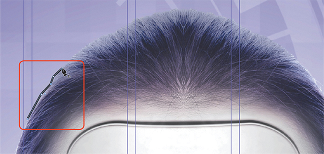
Figure 3.19 Clicking anchor points where the path changes direction Continue along the hair outline as demonstrated in Video 3.6, doing any of the following as needed while the Pen tool is selected:
Note
If you see two lines extend from a point, you dragged the Pen tool instead of clicking, creating a curve point. If the path looks okay leave it alone; you can also choose Edit > Undo and click the Pen tool again.
To reposition an anchor point without changing tools, hold down the Ctrl key (Windows) or the Command key (macOS) and drag the point.
As you draw with the Pen tool, the last point you clicked is selected (appears solid); to delete the selected anchor point, press the Delete key.
The next Pen tool click continues the existing path as long as the last point is still selected. If the path accidentally becomes deselected, click the last point with the Pen tool so that it becomes selected and now you can continue clicking new anchor points connected to the existing path.
When the path you draw reaches the opposite side of the head at the same vertical position, it’s time to close the path. Position the Pen tool over the first anchor point you drew, and when you see a small circle appear below the Pen tool (Figure 3.20), click to close the path.
If you see any points you want to reposition, drag them with the Direct Selection tool.

Figure 3.20 When you position the Pen tool over a point and see a small loop next to the pen, clicking will complete the path.

A Anchor point
B Straight path segment
C Selected corner anchor point
D Curved path segment
E Selected curve anchor point
F Direction line and point
Pasting a Copy of the Cover Image into the Frame
Next you’ll fill the frame you just drew with a copy of the cover image, completing the object that will interact with the masthead. The effect depends on the cover image being pasted into the frame at exactly the same position as the original cover image so that they appear to be a single image.
To paste a copy of the cover image into the frame:
Make sure the frame you just drew is still selected; if it isn’t, select it with the Direct Selection tool.
Set the frame’s fill color and stroke color to None (Figure 3.22).
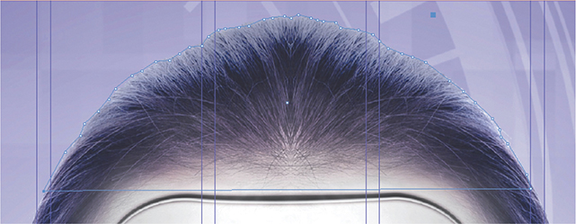
Figure 3.22 The new path’s fill and stroke set to None With the Direct Selection tool, select the cover image.
Choose Edit > Copy (or press its keyboard shortcut, Ctrl+C in Windows or Command+C in macOS).
In the Layers panel, expand the Background layer, and select the frame you drew by clicking the selection dot for the object named <polygon> (Figure 3.23).
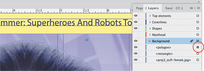
Figure 3.23 Selecting the new path by clicking its selection dot in the Layers panel You can also select the frame using the Selection tool or Direct Selection tool, but because its fill and stroke colors are both set to None, it is not visible, so you may not know where to click on the page. This is an example of when it can be easier to select an object in the Layers panel: If it’s in the document, it’s listed in the Layers panel, even if you can’t see it on the page.
Note
If you don’t see a <polygon> object in the Layers panel but you do see a <path> object, that’s the frame you drew, but it was not fully closed (there’s a gap). This exercise still works with an open path, so you can simply continue, or you can go back and close the path before continuing.
Choose Edit > Paste Into (or press its keyboard shortcut, Alt+Ctrl+V in Windows or Option+Command+V in macOS).
You may not see any difference after the Paste Into command, because the cover image was pasted into the selected frame without changing its position, so the copy inside the frame is perfectly aligned with the original.
Note that in the Layers panel, the name of the frame has changed to match the filename of its contents, <proj3_scifi-female.jpg>. The original cover image is also listed that way in the Layers panel, so remember that the upper instance in the Layers panel is the newer one.
To get a better view of what you’ve accomplished, hide the lower <proj3_scifi-female.jpg> object on the Background layer in the Layers panel (Figure 3.24).

Figure 3.24 Temporarily hiding the original cover image lets you see more clearly the new path with the cover image pasted into it. You’ll see the frame you drew, filled with the copy of the cover image. Essentially, the frame is masking the copy of the cover image, because if you moved anchor points on the shape you drew, you’d reveal or hide different areas of the cover image. The only difference between this frame and other frames you’ve created is that this one is not a rectangle.
In the Layers panel, make the lower <proj3_scifi-female.jpg> object of the Background layer visible again.
Stacking the Masthead Behind the Drawn Frame
The document is now set up for you to finish the effect that you’ve been working toward.
To stack the masthead behind the drawn frame:
In the Layers panel, click the eye icon for the Masthead layer to make it visible.
In the Layers panel, drag the upper object named <proj3_scifi-female.jpg> up and drop it in the Top Elements layer (Figure 3.25).

Figure 3.25 The top of the head stacked in front of the masthead The masthead now appears behind the top of the woman’s head. But the edge appears abrupt and harsh because the image is clipped by the path you drew. You can soften the transition by feathering, or slightly blurring, the edge.
With the <proj3_scifi-female.jpg> object selected on the Top Elements layer, choose Object > Effects > Basic Feather.
In the Effects dialog, specify a Feather Width of 0.05 in, and leave the other settings as they are: Choke at 0%, Corners set to Diffused, and Noise at 0% (Figure 3.26).

Figure 3.26 Applying the Basic Feather effect to soften the hair edge Click OK.
With the masthead now behind the top of the head, the head appears to come forward, adding depth to the design.
Grouping and Stacking the Text Below the Masthead
To enhance the 3D-like look of the cover, you can bring the text that’s under the title forward of the woman’s head. By now you should probably be able to guess that this will involve using the Layers panel.
To stack the text under the title in front of the head:
In the Layers panel, expand the Masthead layer so you can see the objects on that layer.
With the Selection tool, select both text frames under the title. If you find it easier to Shift-select the two items in the Layers panel, go ahead and do it that way instead.
In the Layers panel, notice that the selection dots for those objects light up.
Choose Object > Group (or press its keyboard shortcut, Ctrl+G in Windows or Command+G in macOS).
In the Layers panel, notice that the two objects have now been replaced by one object named <group>. You can expand the <group> object to show the objects that are part of that group.
The Group command works much like the Group command in many graphics applications: It treats multiple objects as a unit so that you can move or edit them together. Grouped objects must be on the same layer.
In the Layers panel, drag the <group> object up and drop it at the top of the Top Elements layer (Figure 3.27).

Figure 3.27 The two text frames below the masthead are now grouped and stacked in front of the woman’s head. The text under the title now appears in front of the woman’s head.
Save the document.
Finishing the Title Masthead
![]() ACA Objective 4.1
ACA Objective 4.1
![]() ACA Objective 4.2
ACA Objective 4.2
![]() Video 3.7
Video 3.7
Finishing the Title Masthead
There are some final adjustments to be made before the masthead is finished. The masthead legibility is challenged by the top of the head that’s now in front of it, and a superhero graphic needs to be added to the masthead.
Altering the Masthead for Better Legibility
When you play around with the stacking order of the masthead, one potential challenge is that the masthead may become less readable. At this point in this project, the head obscures the M in the masthead enough that it may not be read as an M by someone unfamiliar with the magazine. One potential solution is to alter the masthead to move the M away from the center so that it’s more legible.
You can try your own solutions, but if you’d like to try the solution in Video 3.7, simply reduce the size of the masthead text, add a character after the masthead text, and use Baseline Shift (Figure 3.28) to adjust the vertical positioning of the character.

Adding the Superhero Graphic
There’s a small graphic of a superhero that appears over the O in the COMIX masthead text; you can see this in the finished sample document of this magazine cover. This is a good time to add it.
To add the superhero graphic:
In the Layers panel, make sure the Top Elements layer is selected.
With the Rectangle Frame tool, drag a frame around the letter O in the COMIX text.
With the graphics frame selected, choose File > Place, navigate to the Lesson Files folder, open the Project03-Magazine Cover folder, open the project03_sample1_magazine_cover folder, open the Links (images) folder, and select proj3_superhero-2020.eps.
The graphic places much too large within the frame, but you’ve learned that you can automatically fit contents inside frames, so you’ll do that next.
With the Direct Selection tool, select the graphic inside the frame.
In the Control panel, click the Fit Content Proportionally icon. (If the icon is not visible in the Control Panel because of the size of the InDesign application frame or your display, choose Object > Fitting > Fit Content Proportionally.)
As needed, adjust the size and positioning of the superhero graphic (Figure 3.29) using any of the methods you’ve learned so far, such as editing its dimensions in the Control panel.

Figure 3.29 Fitting the superhero graphic into its frame while preserving its proportions
Adding a Coverline
![]() ACA Objective 2.6
ACA Objective 2.6
![]() ACA Objective 4.6
ACA Objective 4.6
![]() Video 3.8
Video 3.8
Adding Teaser Text
Like many magazine covers, this design uses a number of coverline text items to attract potential readers and hopefully motivate them to pick up the magazine and read it.
To add the first teaser item:
Drag a guide out of the vertical ruler, and drop it 2.5 inches from the left side of the page edge.
In the Layers panel, make sure the Coverlines layer is selected.
With the Type tool, drag a text frame, starting about 6 inches down at the left margin and ending about 8 inches down at the guide you just drew.
In the Control panel, select the All Caps icon.
Type the text Our Favorite Villain; the All Caps setting should format it in all capital letters for you (Figure 3.30).

Figure 3.30 The left coverline added to the page
The text isn’t completely formatted yet, but you’ll do that next.
Creating and Applying a Paragraph Style
You’ll apply a paragraph style to the text. A paragraph style can remember a set of specific type settings for you. It can include character settings such as font, size, leading, and color, as well as paragraph settings such as alignment, margins, and indents. Using a paragraph style saves you the trouble of having to remember to set all those options the same way across all paragraphs in a document. It’s also quick and easy to update a style across all paragraphs in a document. For example, if you decide to reduce Space After for all headings in a document, if all headings use the same paragraph style, all you have to do is edit the style and all those paragraphs will update. The benefits and time savings of styles increase dramatically when you work with long documents.
It’s common to define a paragraph style for each significant typographical format that’s used in a document, such as body text (normal paragraphs), headings, number lists, bullet lists, and captions. For this magazine cover, you’ll create a style for teaser text.
Select the text you just typed.
In the Character panel or Control panel, change the following character settings:
Font: Arial Black Regular
Font Size: 23
Fill color: Purple
Choose New Paragraph Style from the Paragraph Styles panel menu (Figure 3.31).
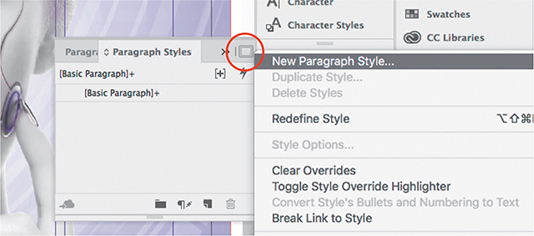
Figure 3.31 Choosing the New Paragraph Style command Note
A paragraph style formats an entire paragraph. If you want to create a style that affects just a range of selected text, that’s a character style, which you manage in the Character Styles panel.
When text is selected as you create a new paragraph style, the formatting of the selected text becomes part of the style definition. You can see this in the Style Settings section.
The New Paragraph Style dialog has a list of options along the left side. You can click each of these options to see what attributes can become part of a paragraph style. You can see that a paragraph style can contain a very wide range of attributes. You need to change only the settings you’re interested in; settings you don’t change are not altered by applying a paragraph style.
In the list on the left, click Hyphenation, and deselect the Hyphenate option.
It’s useful to have hyphenation disabled for this paragraph style, because teaser text doesn’t look good if it’s hyphenated. Now, any teaser text with this style applied will not be hyphenated.
In the list on the left, click General.
The disabled hyphenation setting is now part of the style description in the Style Settings section (Figure 3.32).

Figure 3.32 Setting up the new paragraph style For Style Name, enter Purple Coverline.
Make sure Add to CC Library is unselected, and then click OK.
With the text selected, click Purple Coverline in the Paragraph Styles panel. This is how you apply a paragraph style to text.
In the Character panel or Control panel, change the leading of the selected text to 24pt.
This leading change was made to text that has a paragraph style applied to it. Because the change was not applied by editing the style, it’s in addition to the style. This is called a style override because although a paragraph style is applied, the 24pt leading setting is not part of the style and is not present in other paragraphs using this style. When the selected text has a style override, InDesign lets you know by adding a plus sign (+) to the end of the style name in the Paragraph Styles panel (Figure 3.33).

If a paragraph has style overrides and you want to make it conform to its applied paragraph style, you can select it and click the Clear Overrides in Selection button in the Paragraph Styles panel, but you don’t have to do that here.
Creating a Paragraph Style Not Based on Selected Text
The coverlines are multiple lines of text with different formatting, so a different paragraph style will be needed for the next line of text, which you’ll enter in a separate text frame. The previous paragraph style took its initial settings from the text that was selected when the style was created, but you’ll define the next paragraph style from the ground up and then apply it.
To add another coverline:
With the Selection tool, double-click the middle bottom handle of the OUR FAVORITE VILLAIN coverline to fit the frame height to the content.
With the Type tool, drag to create another text frame below the previous one.
Enter the text and why we love them.
Choose New Paragraph Style from the Paragraph Styles panel menu.
In the New Paragraph Style dialog, click Basic Character Formats in the list on the left, and change the following settings:
Font Family: Myriad Pro
Font Style: Italic
Font Size: 21
In the list on the left, click Hyphenation, and deselect the Hyphenate option.
In the list on the left, click Character Color (Figure 3.34), and set the fill color to Paper.

Figure 3.34 Defining another paragraph style At the top of the New Paragraph Style dialog, for Style Name enter White coverline.
Click OK.
Select the text “and why we love them” and click White Coverline in the Paragraph Styles panel to apply the style to the text.
There are a couple of more formatting changes to apply that aren’t part of the paragraph style.
With the text frame or the text selected, choose Type > Change Case > Title Case.
In the Character panel or Control panel, change the leading of the selected text to 21pt.
With the Selection tool, double-click the middle bottom handle of the text frame to fit the frame height to the content (Figure 3.35).

Figure 3.35 The left coverline completed
The advantage of defining paragraph styles is not immediately apparent from creating one magazine cover. But if you were to do the magazine cover every month, having paragraph styles means that instead of entering numerous type specifications every time you create this coverline, you could apply all the formatting with one click of a paragraph style name. Paragraph styles also save a large amount of time on the pages inside the magazine, where a set of type specifications for a heading or a paragraph might need to be applied hundreds of times.
Adding a Drop Shadow to the Coverline
As with the text under the title, small or light-colored text can be difficult to see on a background that isn’t solid. To improve contrast and readability, you can add a drop shadow to this text. A drop shadow is an effect built into InDesign, so this will be similar to when you applied the Outer Glow and Basic Feather effects earlier.
With the text frame or the text selected, choose Object > Effects > Drop Shadow.
In the Drop Shadow panel of the Effects dialog, change the settings so that the shadow is effective at setting off the white text (Figure 3.36). You can use the values specified in Video 3.8:
For Distance, enter 0.0424 inches.
For X Offset, Y Offset, and Size, enter 0.03 inches.
For Spread, enter 12%.

Figure 3.36 Adding a drop shadow for the light-colored text Leave the other settings as they are, and click OK.
Save your work.
Adding the Main Coverline
![]() ACA Objective 4.2
ACA Objective 4.2
![]() ACA Objective 4.6
ACA Objective 4.6
![]() Video 3.9
Video 3.9
Adding the Main Coverline
The main coverline is near the lower-right corner of the page; you can see it in the sample finished cover page document. The process of creating this coverline is similar to that of the other coverline you created.
Creating the First Part of the Main Coverline
To create the main coverline:
In the Layers panel, make sure the Coverlines layer is selected.
With the Type tool, drag a text frame starting just below the woman’s lips, at the center of the page, and ending about 10 inches down at the right page margin.
In the Control panel, set up the type specifications for the coverline: Myriad Pro Bold, 66 points, All Caps on.
Enter the text VIOLET DREAMS.
Select the text, and then use the Control panel or the Character panel along with your own judgment to improve the typographical appearance of the coverline by making adjustments such as the following suggested values:
Tighten the spacing between lines: For leading, enter 53 pt.
Tighten the spacing between all characters: For tracking, enter –20.
Make spacing across individual character pairs more consistent by clicking between characters and adjusting the kerning values.
Apply a fill color of Light Yellow and a stroke color of Purple for additional edge contrast against the background.
In the Control panel or Paragraph panel, click the Align Right icon to align the paragraph along the right edge of the text frame (Figure 3.37).

Figure 3.37 The Align Right icon in the Paragraph panel applied to the main coverline text With the Selection tool, double-click the middle bottom handle of the text frame to fit the frame height to the content.
Creating the Second Part of the Main Coverline
As with the first coverline you created, this one has additional text, formatted differently, that will be added in a separate text frame:
With the Type tool, drag a text frame starting just below the previous coverline at the right page margin and ending where the bottom page margin meets the center of the page.
In the Control panel, set up the type specifications for the coverline: Myriad Pro Semibold, 26 points tall on 25 points of leading, All Caps on, and tracking of –10.
Enter the text KIERA RIPLEY SHINES IN NEW SCI-FI FLICK FROM ACA STUDIOS.
If the end of the text disappears and a red plus sign appears near the lower-right corner of the text frame, the text is overset because it overflows the text frame at its current settings. You can make it fit by selecting the text frame (with the Selection tool) or all of the text (with the Type tool) and reducing character settings you’ve edited before, such as font size and leading.
Apply a fill color of Purple to the new coverline (Figure 3.38).

Figure 3.38 The second part of the main coverline formatted
Tip
To quickly adjust the height of an overset text frame, double-click the top-middle or bottom-middle handle of the text frame bounding box.
Adding Effects for Readability
As with the previous coverline, you can add effects to these two text frames to improve readability against the background:
Select the VIOLET DREAMS coverline and choose Object > Effects > Drop Shadow.
Because you’re going to edit all the text uniformly, you can either select the text frame with the Selection tool or select all the text characters with the Type tool.
In the Drop Shadow panel of the Effects dialog, change the settings so that the shadow is effective at setting off the yellow text. You can use the values specified in Video 3.9:
Make sure the Mode is Multiply, the color is Purple, and the Opacity is 75%.
For Distance, enter 0.0628 inches.
For X Offset and Y Offset, enter 0.444 inches.
For Size, enter 0.0556.
Tip
Typically, you don’t need to enter inch values to more than two or three decimal places. When you see long decimal values in InDesign, the fractional results are often a result of converting between units of measure. For example, 2 points is 0.0278 inches.
Leave the other settings as they are, and click OK.
Select the KEIRA RIPLEY… coverline and choose Object > Effects > Outer Glow.
In the Outer Glow panel of the Effects dialog, change the settings so that the shadow is effective at setting off the purple text. You can use the values specified in Video 3.9:
Make sure the Mode is Screen, the color is Paper, and the Opacity is 75%.
For Size, enter 0.1875.
For Spread, enter 27%.
Leave the other settings as they are and click OK.
Check your work (Figure 3.39) by switching into Preview mode and zooming out to fit the page in the document window. Make any adjustments that you think are needed.

Figure 3.39 A drop shadow applied to the coverline text Save your work.
You may have noticed that one effect used the Multiply blending mode and the other effect used the Screen blending mode. Blending modes affect how overlapping colors combine. They can lighten, darken, or alter the contrast between tones and colors. Multiply is a mode that darkens underlying colors, so it’s useful for the purple drop shadow around the light text. Screen is a mode that lightens underlying colors, so it’s useful for the white drop shadow around the dark text.
Applying an Inset to a Text Frame
![]() ACA Objective 4.2
ACA Objective 4.2
![]() Video 3.10
Video 3.10
Working with Text Frame Options
You’ll use some options you haven’t used yet to create another coverline with additional formatting.
To create the third coverline:
Make sure the document window is displaying in Normal mode.
With the Type tool, drag a text frame that spans the last set of column guides, starting about 4 inches down at the left guide of the last column and ending about 7 inches down at the right page margin.
With the Selection tool, select the new text frame, and then apply a fill color of Purple.
The Purple swatch is too dark, so you’ll create a tint of it.
Choose New Tint Swatch from the Swatches panel menu, enter 30% for Tint (Figure 3.40), and click OK.
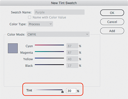
Figure 3.40 Creating a tint swatch A new tint swatch named Purple 30% is added to the Swatches panel.
Apply a stroke color of Purple, and set the stroke weight to 1 pt.
With the Type tool, click an insertion point in the text frame and type the following:
Comic Book Psyche check out an interview with Dr. Otto Burken
The text is right up against the edges of the text frame. This is not very readable, but there’s an easy way to move away from all edges of the frame.
With the text frame still selected, choose Object > Text Frame Options.
For the Top option in the Inset Spacing section, enter .125 in (Figure 3.41) and click OK.

Figure 3.41 Before and after adding inset spacing to the text frame As you saw earlier, if the link icon in that options group is enabled, when you change the value of any side, all four sides will change to the same value.
With the Type tool, select all the text inside the text frame and change its font to Myriad Pro Regular.
Select the text Comic Book Psyche. For font size enter 26 pt, and for leading enter 25 pt.
Select the text “check out an interview with.” Change its font style to Italic. For font size enter 16 pt, and for leading enter 17 pt.
Select the text Dr. Otto Burken. Change its font style to Semibold. For font size enter 26 pt, and for leading enter 23 pt.
With the Type tool, click a text insertion point after the word “with” and press Shift+Enter (Windows) or Shift+Return (macOS) so that the Dr. Otto Burken text goes to the next line.
Shift+Enter/Shift+Return is the keyboard shortcut for the command Type > Insert Break Character > Forced Line Break.
Why not just press Enter or Return? When you press Enter or Return, you create a new paragraph, which could apply paragraph spacing and other attributes you don’t want. A forced line break pushes text to the next line without starting a new paragraph.
If the text is overset at this point, select the text frame with the Selection tool and pull down the bottom-middle bounding box handle until all the text is revealed.
Apply a fill color of Paper to all the text in the frame.
Check your work (Figure 3.42) by switching into Preview mode and zooming out to fit the page in the document window. Make any adjustments that you think are needed.

Figure 3.42 The magazine cover so far Save your work.
Adding a Starburst
![]() ACA Objective 4.1
ACA Objective 4.1
![]() Video 3.11
Video 3.11
Adding a Starburst
The cover design calls for one coverline to be inside a starburst shape. There’s more than one way to create a starburst shape in InDesign. You could create it by clicking with the Pen tool, but it’s probably faster to create a shape that already contains multiple star points and modify that.
Creating a Starburst
The Polygon tool can create regular polygons, such as a hexagon, but it has settings you can use to create star points.
To create a starburst with the Polygon tool:
In the Layers panel, make sure the Shapes layer is selected.
Select the Polygon tool
 , which is grouped with the Rectangle and Ellipse tools (Figure 3.43).
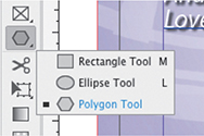
Figure 3.43 In the Tools panel, you’ll find the Polygon tool grouped with the Rectangle and Ellipse tools. You’ll probably need to click and hold the Rectangle or Ellipse tool (whichever is visible in the Tools panel) to see and select the Polygon tool.
Click the Polygon tool in the lower-left area of the cover page.
In the Polygon dialog that appears, do the following and then click OK (Figure 3.44):
For Polygon Width, enter 3.6 in.
For Polygon Height, enter 2 in.
For Number of Sides, enter 20.
For Star Inset, enter 10%.
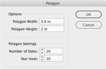
Figure 3.44 The Polygon dialog appears when you click the Polygon tool on the layout. With the starburst shape selected, apply the following settings (Figure 3.45):
Apply a fill color of Yellow.
Apply a stroke color of Purple.
For stroke weight, enter 3 pt.

Figure 3.45 The starburst after applying graphics attributes If you like, use the Direct Selection tool to customize the shape by dragging individual anchor points on the starburst.
To be able to select individual anchor points, you may need to first deselect the starburst and then select it with the Direct Selection tool. An anchor point is selected when it appears solid.
Deselect the starburst.
Tip
To edit the settings for a polygon, double-click the polygon frame or the Polygon tool when a polygon frame is selected. You can even convert a nonpolygon or star-shaped frame into a polygon shape this way.
Adding a Coverline in Front of the Starburst
You can now add the coverline that’s supposed to appear inside the starburst.
To add the text frame:
In the Layers panel, make sure the Coverlines layer is selected.
With the Type tool, drag to create a text frame within the starburst.
In the Character panel, change the following settings:
Font Family: Myriad Pro
Font Style: Bold
Font Size and Leading: 19
Enter the text visit booth 300 for the new Thucydides graphic novel.
With the Type tool, select the “visit booth 300” text and apply the All Caps button in the Control panel.
With the Type tool, click a text insertion point after the word “300” and press Shift+Enter (Windows) or Shift+Return (macOS) to add a forced line break.
Select the text after the forced line break and change its font style to Italic.
Select all the text in the frame, and click the Align Center button in the Control panel or Paragraph panel.
Select all the text and apply a fill color of Purple (Figure 3.46).

Figure 3.46 The formatted coverline over the starburst Make any other adjustments you think are necessary to make the starburst and its coverline look like a graphic unit, such as repositioning the text over the starburst.
With the Selection tool, select both the starburst and its coverline (click one and Shift-click the other), and choose Object > Group.
Rotate the selected starburst coverline group about 18 degrees, using either of the following methods:
In the Control panel, enter 13 into the Rotation Angle field, and press Enter or Return.
Position the Selection tool pointer just outside any corner of the bounding box until the pointer becomes a rotation icon (Figure 3.47), and drag until the object reaches the rotation angle you want.
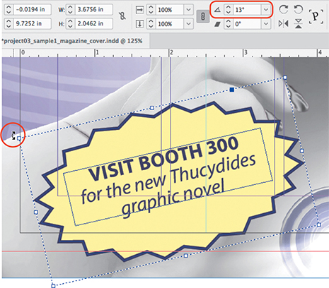
Figure 3.47 Rotating the starburst using the group bounding handle, with the Control panel Rotation value also highlighted
Check your work (Figure 3.48) by switching into Preview mode and zooming out to fit the page in the document window. Make any adjustments that you think are needed.

Figure 3.48 The completed magazine cover Save your work.
Tip
The Direct Selection tool also allows you to select individual items within a group and edit them without ungrouping the group first.
Preflighting the Document
![]() ACA Objective 5.1
ACA Objective 5.1
![]() Video 3.12
Video 3.12
Prefllghting the Document
No one wants to see mistakes in a commercial printing job, because a big print job is expensive—think of a magazine that needs tens of thousands of copies printed. At worst, the job may need to be printed again at great expense. For this reason, InDesign provides ways to spot potential problems before they become costly printing mistakes. The process of reviewing a document for output issues is called preflighting, named after the preflight checklist that airplane pilots use to make sure the airplane is safe to fly.
To preflight a document:
Open the Preflight panel (Window > Output > Preflight) (Figure 3.49).
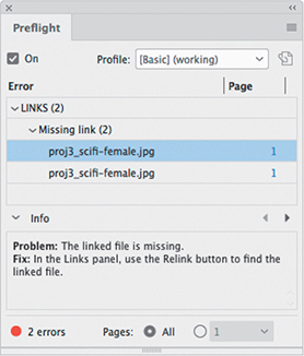
Figure 3.49 The Preflight panel showing errors If everything is okay, the bottom of the Preflight panel will show a green light and say No Errors, and the Error list will be empty.
If there is a problem, the bottom of the Preflight panel will show a red light, and the Error list will show all the errors that were found.
If there aren’t any errors, you’re ready to package the document for output, as you did in Chapter 2.
If there are errors, you can resolve them from the Error list. Click the page number on the error line to go to the object with the error so that you can resolve the problem.
The Preflight panel can alert you to many problems, including the following:
Missing linked files. Files you placed may no longer be in the folder from which they were originally placed, or the filename may have changed. You can resolve this by restoring missing files or changed filenames back to what was recorded in the document. You can also use options in the Links panel to point InDesign to the missing files’ current locations and filenames; this has not yet been covered in this book.
Missing fonts. Fonts applied earlier may have become disabled or missing over time, or a document may have been moved to a different computer with different fonts available. You resolve this by making the necessary fonts available, by replacing the fonts with ones that are available, or by using Adobe Typekit to download matching fonts from the cloud.
Overset text. You have seen that overset text appears cut off and missing from the end of a text frame. You resolve this by editing the text or its type attributes so that it fits within the available space in a text frame.
If you have built the cover image correctly, it will probably pass the preflight check with no errors. If you get this result but you would like to see what an error would look like, do the following:
With the Selection tool, click the cover image.
Right-click (Windows) or Control-click (macOS) the cover image and choose Graphics > Reveal in Explorer (Windows) or Reveal in Finder (macOS).
The computer switches to the desktop, and the desktop folder containing the linked graphic opens, with the graphic selected.
Change the name of the graphic slightly (for example, add an x to the end) or move the graphic to a different folder.
Switch back to InDesign and look at the Preflight panel.
Tip
A quick way to preflight as you work is to look at the preflight area at the bottom of the document window. The green or red Preflight light appears there, and you can open the Preflight panel by clicking the arrow next to the status area and choosing the Preflight panel.
There should now be “missing link” errors, because the current name or location of the linked file does not match the name or location recorded in the InDesign document when you placed it.
Switch to the desktop, and reverse the change you made.
If you restored the file’s name or location to its exact state before you changed it, there should no longer be errors in the Preflight panel in InDesign.
Challenge
Create your own magazine cover image based on one of your own favorite subjects, such as sports, school or neighborhood news, science, fashion, music, or entertainment. Come up with a title and find a strong image for the cover. Write some coverlines, and then integrate all those elements into a strong layout. Explore ways to keep text legible over a busy photograph, such as the effects that you applied to coverlines in this chapter.
As a bonus, come up with a cover layout grid, paragraph styles, and color swatches designed to work with a wide range of cover photos across a number of issues. Test your ideas with different cover photo images and coverlines. Produce a set of samples like the three sample COMIX covers you saw at the beginning of the chapter.