Modern abstract art was predicated on two major advances: the liberation of form and the liberation of color. The Cubists, led by Georges Braque and Pablo Picasso, liberated form. Since then, modern art has often represented the artist’s subjective vision and state of mind rather than a naturalistic illusion of form based on the outside world. In the modern era it was largely Henri Matisse who liberated color, freeing it from form and thereby demonstrating that colors and color combinations can exert unexpectedly profound emotional effects.
Once color was no longer determined by form, a color that might have seemed “wrong” in a particular figurative context would actually be right, because it was used to convey the artist’s inner vision, not to represent a particular object. Moreover, the separation of color from form is consistent with what we know about the anatomy and physiology of the primate visual system: that is, form, color, movement, and depth are analyzed separately in the cerebral cortex. Indeed, as Livingstone and Hubel (1988) point out, people who have had a stroke suffer surprisingly specific losses of color, form, movement, or depth.
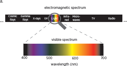
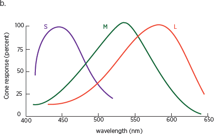
Color vision, as we have seen, depends on cones, a class of light-sensitive cells that are concentrated in the center of the retina. Information processed by the cones, like that processed by the rods, is encoded in the cortex. Our eyes have three different types of cones. Each contains a different photo pigment, a molecule that converts information about light into neural signals, and each is sensitive to a particular range of wavelengths on the visible light spectrum (
fig. 10.1). Our vision captures the relatively narrow band of wavelengths where the sunlight reaching Earth is most intense. It is also the band of wavelengths allowed in through the Earth’s atmosphere, which absorbs shorter and longer wavelengths. So our visual system—and color vision—is another remarkable example of how we have evolved to make the best use of what is available to us in the environment.
Wavelengths in the visible light spectrum range from 380 nanometers, which we perceive as purple, to 780 nanometers, which we perceive as dark red. Because the three types of cones are sensitive to overlapping wavelengths of light, our visual system needs only three values—red, green, and blue—to represent the colors in the visible light spectrum: that is, the colors reflected by the simple structures typical of natural objects.
Color vision is essential for basic visual discrimination. It enables us to detect patterns that would otherwise go unnoticed and, together with variations in brightness, sharpens the contrast between the components of an image. But with color alone, without any variation in brightness, human vision is surprisingly poor at detecting spatial details.
Our brain processes different colors as having distinct emotional characteristics, but our reaction to the colors varies, depending upon the context in which we see them and our mood. Thus, unlike spoken language, which often has an emotional significance regardless of context, color is open to a great deal more top-down processing. As a result, the same color can mean different things to different people and to the same person in different contexts. In general, we prefer pure, bright colors to mixed, dull colors. Artists, particularly modernist painters, have used exaggerated colors as a way to generate emotional effects, but the value of that emotion depends on the viewer and the context. This ambiguity with respect to color may be another reason why a single painting can elicit such different responses from different viewers or from the same viewer at different times.


10.1 (a) The only light human eyes have evolved to see is called the visible spectrum (bottom spectrum), which takes up only a small fraction of the entire electromagnetic spectrum (top spectrum). (b) Overlapping sensitivity of the three types of cones.
The development of emotive color by the Impressionists and Post-Impressionists was made possible by two technological breakthroughs in the mid-nineteenth century. The first was the introduction of a series of synthetic pigments that enabled artists to use a large range of vibrant, previously unavailable colors. The second was the availability of oil paints, already mixed, in tubes. Previously, artists had had to grind dry pigments by hand, then mix them carefully with a binding oil. With paints in tubes, artists could use a greater number of colors in their palettes, and they could paint outdoors, since the tubes were resealable and portable.
Given the impact that the color-field painters’ works have on our emotions and imagination, it is not surprising that colors are as important to our brain as faces are. This is thought to be one of the reasons the brain processes color separately from light and from form. As we learned in
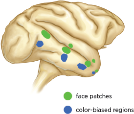
chapter 3, the brain has six face patches in the inferior temporal cortex, each of which is specialized for processing specific information about faces. Recent studies have revealed that our brain has similar regions, located farther along the what pathway, that are thought to process information about color and about form (Lafer-Sousa and Conway 2013) (
fig. 10.2).
Like face patches, the color-biased regions have an interactive, hierarchical arrangement, with each region processing progressively more selective information about color (Lafer-Sousa and Conway 2013,
fig. 3.1). Although, as Livingstone and Hubel first showed, color is processed separately from form in the primary visual cortex, the color-biased regions in the inferior temporal cortex typically lie below the face patches and are connected to them (
fig. 10.2). Color-biased regions and face patches generally do not overlap, however; they process information through networks that are interconnected but function largely independently of each other (Lafer-Sousa and Conway 2013; Tanaka et al. 1991; Kemp et al. 1996). Each network represents a complete functional representation of the object being viewed.
10.2 Location of face patches and color-biased regions in the macaque brain.
The biological basis of the profound effect that color has on our emotional response to a work of art lies in the visual system’s connections to other systems of the brain. The inferior temporal cortex, which houses the color-biased regions and face patches, has a direct connection to the hippocampus, which is concerned with memory, and to the amygdala, which orchestrates emotion.
The amygdala sends information to several regions of the visual cortex (Freese and Amaral 2005; Pessoa 2010), thereby influencing perception, including the perception of color. Daniel Salzman, Richard Axel, and their colleagues have found that certain cells in the amygdala respond selectively to pleasurable stimuli, whereas other cells respond selectively to frightening stimuli (Gore et al. 2015). Moreover, when a neutral stimulus is applied at the same time as a pleasurable stimulus to a cell that intrinsically responds to pleasurable stimuli, the neutral stimulus will become associated with the pleasurable one and produce a pleasure response. In other words, the same cells that respond instinctively to pleasurable stimuli also become associated, through pairing, with learned pleasurable stimuli—and thus might influence perception by way of top-down processing. It is likely that some of these cells respond positively to certain colors or color combinations. If so, other images that we perceive or thoughts that those colors evoke will elicit a conditioned positive response. This phenomenon could be mediated by the same kind of mechanism of associative learning found in
Aplysia (
chapter 4).
The inferior temporal cortex connects to four additional regions of the brain: the nucleus accumbens, the medial temporal cortex, the orbitofrontal cortex, and the ventral lateral prefrontal cortex. These connections may contribute to the important role that faces and colors play in influencing behavior, their importance in our positive and negative emotional reactions, their ability to elicit pleasure, and our ability to recognize and categorize objects (Lafer-Sousa and Conway 2013).
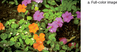
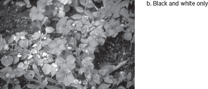
While color is an important component of objects, it is not an isolated attribute. It is inextricably bound up with other attributes, such as brightness, form, and movement. As a result, color vision serves two distinct functions: together with brightness, color helps establish border ownership, and it disambiguates shadows and the elements in a group of objects. Thus, color enables us to find a given flower in a bouquet (
fig. 10.3). Look, for example, at the purple and orange flowers in the top image. When color information is removed (middle image), the two different flowers are indistinguishable. In addition, color helps us identify surface attributes that we use to recognize objects (whether the flower is fresh or wilted).
In a larger sense, our brain needs to acquire knowledge about the permanent, essential properties of objects and surfaces in a world that is constantly changing (Meulders 2012). To do this, the brain must somehow discount all changes that are superfluous to an object. Our perception of color is an example of how the brain achieves this.
10.3 a. A normal full-color image of flowers contains information about variations in brightness and color. b. A black-and-white image captures variations in brightness, making it easy to discern spatial detail. c. A purely chromatic image contains no information about variations in brightness, only information about hue and saturation, making spatial detail hard to discern.
The light reflected off an object enters the eye and activates particular cones in the retina. Our brain unconsciously determines the wavelength composition of that light by taking into account both the surface reflectance of the object and the wavelength composition of the light illuminating the scene. Surface reflectance is the total quantity of visible light reflected by an object in all directions and at all wavelengths when illuminated by a light source—that is, the object’s permanent, essential property. The brain infers the wavelength composition of the surrounding light from its effects on other features in the visual scene—that is, from the context. The brain then throws away, or discounts, information about illumination and extracts information about actual reflectance.
Reflectance is never constant, however; it changes continuously, depending upon the light illuminating the scene. Thus we view and recognize objects, such as a green leaf, under different conditions of illumination on a cloudy or a sunny day, sometimes at dawn, sometimes at midday, and sometimes at dusk. If we were to measure the wavelengths of the light reflected from that green leaf under these different conditions, we might find that the leaf at dawn is reflecting mostly red light, because mostly red light is around at that time of day. Yet we still see the leaf as green. Our brain’s ability to maintain the essential color of the leaf is called color constancy. Indeed, if the green color of the leaf changed with every change in the wavelengths of light reflected from it, the leaf would no longer be recognizable by its color. Our brain would have to recognize it by some other attribute, and color would lose its significance as a biological signaling mechanism.
The environment surrounding an object also plays a critical role in determining its color. We see this in Rothko’s
#36 Black Stripe of 1958 (
fig. 9.5), where the light reflected off the black stripe affects our perception of the reddish colors that surround it. Thus, even though color is dependent on the physical reality of wavelengths in the visible light spectrum, it, like other aspects of perception, is a property of the brain, not of the world outside.
A
fascinating example of color ambiguity appeared on February 26, 2015. It all began when a woman shared with her daughter and future son-in-law a photo of the dress she planned to wear to their wedding (Macknik and Martinez-Conde 2015). The daughter saw the dress as white with gold stripes, but the future son-in-law saw it as blue with black stripes. A friend of the bride posted the image of the dress on the Internet and asked the world at large what color it was (
fig. 10.4). The ensuing debate dominated conversation in the social media and elsewhere for several days afterward. The two perceptions of the dress completely polarized viewers. People who saw the dress as white and gold refused to acknowledge the possibility that it was blue and black, and vice versa. How could people see the same dress so differently? The answer lies in the difference in lighting—and in the brain. It illustrates that lighting can override the usual, contextual definition of color.
Since color is mediated by cones, one explanation put forth for the difference in perception was that people have different ratios of red, green, and blue cones in their retinas. But as Cedar Riener of Randolph-Macon College has pointed out, even large differences in these ratios don’t affect color sensitivity. We perceive color on the basis of luminance, the quantity of light that comes into our retina. Different people have different prior experiences (and thus different expectations) about the illumination in
figure 10.4—not just its intensity but also its wavelength composition. Thus, just as we have different personal experiences and beliefs that we bring to bear on our perception of a work of art, or of a dress, so different personal histories and memories of them affect our color-processing mechanisms.
The appearance of an object also depends to a great extent on the contrast between the image and its surroundings. Thus, for example, even though the gray rings in
figure 10.5 are of identical brightness, they appear to be different because their backgrounds produce different contrasts.
Our brain is always making decisions about the quantity of light coming into our retinas, discounting information about illumination and extracting information about surface reflectance. But in the case of the dress, visual perception is changing even though the context is not. Some people subtract out blue and see the dress as white and gold. Other people subtract out gold and see the dress as blue and black.
10.4 a. Is the dress white and gold? b. Is the dress blue and black?
10.5 The appearance of an object depends principally on the contrast between the object and its background. The two gray rings above are identical in brightness, but they appear to be different because their backgrounds produce different contrasts.
The illumination in
figure 10.4 creates an unusual degree of ambiguity (Witzel 2015). It is hard to tell how the dress is lit. Is the light in the room bright or dim? Is the light yellow or blue? This ambiguity, combined with the fact that our brain unconsciously makes order out of noise in forming a particular perceptual decision, accounts for the different conclusions viewers reach regarding the color of the dress.
In reality, the stripes of the dress have known (and measurable) spectral content. The dress is in fact blue and black. But if we focus on the colors of background objects in the photos, we can see that there is too much light in
figure 10.4a, which means that it is overexposed; therefore, the dress must be darker than it seems in that photo. People whose brains unconsciously reach this decision see the dress as blue. However, other people’s brains make a different assumption regarding the lighting. Objects that are in shadow (and thus illuminated by reflected light from the blue sky, not by the sun itself) are in fact reflecting a fair bit of blue light. People whose brains unconsciously decide to ignore that reflected blue light see the dress as white.
Purves put all this in a perspective we now understand when he wrote: “People are wedded to the idea that colors are properties of objects, when they are in fact made up by the brain” (Hughes 2015). As the dress clearly illustrates, our perception of color is greatly influenced by top-down processes. The artist takes advantage of this fact, as well as the fact that colors often convey emotions, such as red representing love, courage, or blood and green representing spring or growth. But in every case it is the beholder who assigns meaning to the color, just as the beholder does to lines and textures.
