Chapter 12. Color Management
Photoshop 5.0 was justifiably praised as a ground-breaking upgrade when it was released in the summer of 1998, although the changes made to the color management setup were less well received in some quarters. This was because the revised system was perceived to be complex and unnecessary. Bruce Fraser once said of the Photoshop 5.0 color management system ‘it's push-button simple, as long as you know which of the 60 or so buttons to push!’ Attitudes have changed since then (as has the interface) and it is fair to say that most people working today in the pre-press industry are now using ICC color profile managed workflows. The aim of this chapter is to introduce the basic concepts of color management before looking at the color management interface in Photoshop and the various color management settings.
The need for color management
An advertising agency art buyer was once invited to address a meeting of photographers. The chair, Mike Laye, suggested we could ask him anything we wanted, except ‘Would you like to see my book?’ And if he had already seen your book, we couldn't ask him why he hadn't called it back in again. And if he had called it in again we were not allowed to ask why we didn't get the job. And finally, if we did get the job we were absolutely forbidden to ask why the color in the printed ad looked nothing like the original photograph!
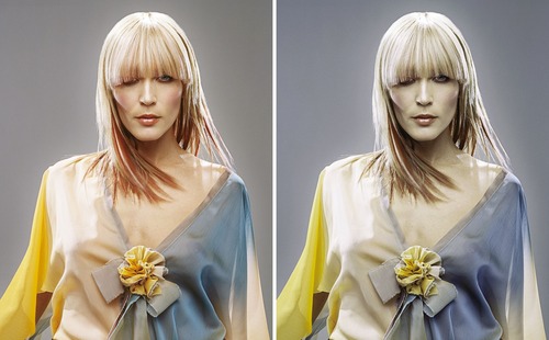
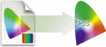
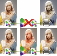
That in a nutshell is a problem which has bugged many of us throughout our working lives, and it is one which will be familiar to anyone who has ever experienced the difficulty of matching colors on a computer display with the original or a printed output. Figure 12.1 shows two versions of the same photograph. One shows how the Photoshop image looks previewed on the display and the other is an example of how a printer might interpret and reproduce those same colors if no attempt is made to color manage the image.
So why can there sometimes be such a marked difference between what is seen on the display and the actual printed result? Well, digital images are nothing more than just bunches of numbers, and good color management is all about making sense of those numbers and translating them into meaningful colors at the various stages of the image making process.
The way things were
Sixteen or more years ago, most photographers only used their computers to do basic administration work and there were absolutely no digital imaging devices to be found in a photographer's studio (unless you counted the photocopier). If you needed a color print made from a chrome transparency, you gave the original to the printer at a photographic lab and they matched the print visually to your original. Professional photographers would also supply chrome transparencies or prints to the client, and the photographs then went to the printer to be digitized using a high-end drum scanner, which would be configured to produce a CMYK file ready to insert in a specific publication. That was probably about the limit of the photographer's responsibilities, and if color corrections were required, the scanner operators would carry this out themselves working directly on the output file.
These days a significant number of photographers, illustrators and artists are now originating their own files from digital cameras, desktop scanners or directly within Photoshop. This has effectively removed the repro expert who previously did all the scanning and matching of the colors on the press. Therefore, there is no getting away from the fact that if you supply digital images to a printer, you will be deemed responsible should any problems occur in the printing. This may seem like a daunting task, but with Photoshop it really isn't that hard to color manage your images with confidence.
If your main area of business revolves around the preparation of CMYK separations for print, then I do recommend you invest in a training course or book that deals with CMYK repro issues. I highly recommend the following books:
Real World Color Management by Bruce Fraser, Chris Murphy and Fred Bunting;
Color Management for Photographers by Andrew Rodney; and
Getting Colour Right, The Complete Guide to Digital Colour Correction by Neil Barstow and Michael Walker.
RGB devices
Successful color management relies on the use of profiles to describe the characteristics of each device, such as a scanner or a printer, and using a color management system to translate the profile data between each device in the chain. Consider for a moment the scale of such a task. We wish to capture a full color original subject, digitize it with a scanner or digital camera, examine the resulting image via a computer display and finally reproduce it in print. It is possible with today's technology to simulate the expected print output of a digitized image on a computer display with remarkable accuracy. Nevertheless, one should not underestimate the huge difference between the mechanics of all the various bits of equipment used in the above production process. Most digital devices are RGB devices and just like musical instruments, they all possess unique color tonal properties, such that no two devices are always identical or able to reproduce color exactly the same way as another device. Nor is it always possible to match in print all the colors which are visible to the human eye, and converting light into electrical signals via a device such as a CCD chip is not the same as illuminating the pixels on an LCD display or reproducing a photograph with colored ink on paper.
Why not all RGB spaces are the same
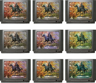
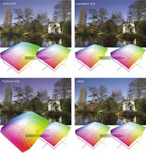
Go into any TV showroom and you will probably see rows of televisions all tuned to the same broadcast source, but each displaying the picture quite differently (Figure 12.2). This is a known problem that affects all digital imaging devices, be they digital cameras, scanners, monitors or printers. Each digital imaging device has its own unique characteristics, and unless you are able to quantify what those individual device characteristics are, you won't be able to communicate effectively with other device components and programs in your own computer setup, let alone anyone working outside your own system color loop.
 |
| Figure 12.2 |
Some computer displays have manual controls that allow you to adjust the brightness and contrast (and in some cases the RGB color as well) and the printer driver will also allow you to make color balance adjustments, but is this really enough? Plus, if you are able to get the display and your printer to match, will the colors you see on your display appear the same on another person's display?
They say that seeing is believing, but nothing could be further from the truth, since there are many interesting quirks and surprises in the way we humans perceive vision. There is an interesting book on this subject titled
Why We See What We Do, by Dale Purves and R. Beau Lotto (Sinauer Associates, Inc). There is also a website at www.purveslab.net where you can have a lot of fun playing with the interactive visual tests, to discover how easily our eyes can be deceived. What you learn from studies like this is that color can never be properly described in absolute mathematical terms. How we perceive a color can also be greatly influenced by the other colors that surround it. This is a factor that designers use when designing a product or a page layout. You also do this every time you evaluate a photograph, often without even being aware of it.
The versatility of RGB
A major advantage of working in RGB is that you can access all the bells and whistles of Photoshop which would otherwise be hidden or grayed out in CMYK mode, and if you use Adobe RGB or ProPhoto RGB, you will have a larger color gamut to work with. These days there is also no telling how a final image may end up being reproduced. A photograph may get used in a variety of ways, with multiple CMYK separations made to suit several types of publications, each requiring a slightly different CMYK conversion (because CMYK is not a ‘one size fits all’ color space). For example, high-end retouching for advertising usage is usually done in, RGB mode and the CMYK conversions and film separations are produced working directly from the digital files to suit the various media usages.
Photographers are mainly involved in the RGB capture end of the business. The proliferation of Photoshop, plus the advent of high quality desktop scanners and digital cameras, means that more images than ever before are starting out in, and staying in, RGB color. This is an important factor that makes color management so necessary and also one of the reasons why I devote so much attention to the management of RGB color, here and elsewhere in the book. So, if professional photographers are more likely to supply a digital file at the end of a job, how will this fit in with existing repro press workflows that are based on the use of CMYK color? Although digital capture has clearly taken off, the RGB to CMYK issue still has to be resolved. If the work you create is intended for print, the conversion of RGB to CMYK must be addressed at some point, and so for this important reason, we shall also be looking at CMYK color conversions in detail later on in this chapter.
There are other types of output to consider, not just CMYK. Hexachrome is a sixcolor ink printing process that can extend the printing color gamut beyond the conventional limitations of CMYK. This advanced printing process is currently available only through specialist print shops and is suitable for high quality design print jobs. Millions have been invested in the four-color presses currently used to print magazines and brochures, so expect four-color printing to still be around for a long time to come, but Hexachrome will open the way for improved color reproduction from RGB originals. Photoshop supports six-color channel output conversions from RGB, but you will need to buy a separate plug-in utility like HexWrench. Multimedia publishing is able to take advantage of the full depth of the sRGB color range (which is probably about the limit of most LCD displays). If you are working in a screen-based environment for CD, DVD and web publishing, RGB is ideal. And with today's web browsers, color management can sometimes be turned on to take full advantage of the enhanced color control these programs can now offer.
Output-centric color management
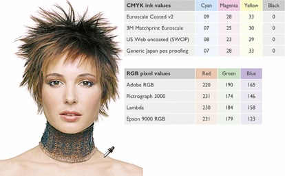
Printers who work in the repro industry naturally tend to have an ‘output-centric’ view of color management. Their main concern is getting the CMYK color to look right on a CMYK press and printers can color correct a CMYK image ‘by the numbers’ if they wish. Take a look at the photograph of the young model in Figure 12.3. Her Caucasian flesh tones should contain equal amounts of magenta and yellow ink, with maybe a slightly greater amount of yellow, while the cyan ink should be a quarter to a third of the magenta. This rule will hold true for most CMYK press conditions and the accompanying table compares the CMYK and RGB space measurements of a flesh tone color. However, you will notice there are no similar formulae that can be used to describe the RGB pixel values of a flesh tone. If you were to write down the flesh tone numbers for every RGB device color space, you could in theory build an RGB color space reference table. From this you could feasibly construct a system that would assign meaning to these RGB numbers for any given RGB space. This is basically what an ICC profile does except an ICC profile may contain several hundred color reference points. These can then be read and interpreted automatically by the Photoshop software and give meaning to the color numbers.
Profiled color management
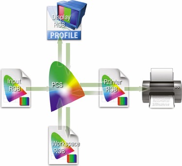
The objective of profiled color management is to use the measured characteristics of everything involved in the image editing workflow, from capture through to print, to reliably translate the color at each stage of the process. In a normal Photoshop workflow, the color management begins with reading the profiled RGB color data from the incoming file and, if necessary, converting it to the current Photoshop RGB workspace. While an RGB image is being edited in Photoshop the workspace image data is converted on-the-fly to the profiled display space and sent to the computer display, so that the colors are viewed correctly. When the image is finally output as a print, the RGB workspace data is converted to the profile space of the printer. Or, you might carry out an RGB to CMYK conversion to the CMYK profile of a known proof printer.
A workspace profile is therefore a useful piece of information that can be embedded in an image file. When a profile is read by Photoshop and color management is switched on, Photoshop is automatically able to find out everything it needs to know in order to manage the color correctly from there on. Note that this will also be dependent on you calibrating your display, but essentially all you have to do apart from that is to open the Photoshop Color Settings from the Edit menu and select a suitable preset such as the US Prepress Default setting. Do this and you are all set to start working in an ICC color managed workflow.
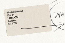
Think of a profile as being like a postcode (or ZIP code) for images. For example, the address label shown in Figure 12.4 was rather optimistically sent to me at ‘Flat 14, London’, but thanks to the postcode it arrived safely! Some labs and printers have been known to argue that profiles cause color management problems. This I am afraid is like a courier company explaining that the late arrival of your package was due to you including a ZIP code in the delivery address. A profile can be read or it can be ignored. What is harmful in these circumstances is an operator who refuses to use an ICC workflow. If you feel you are getting the runaround treatment, it may be time to change labs.
One way to comprehend the importance of giving meaning to the numbers in a digital file is to make a comparison with what happens when language loses its meaning. There is an excellent book by Lynne Truss called
Eats, Shoots & Leaves: The Zero Tolerance Approach to Punctuation. It is partly a rant against poor punctuation, but also stresses the importance of using punctuation to assign exact meaning to the words we read. Remove the punctuation and words can soon lose their true intended meaning. Another good example is the way words can have different meanings in other languages. So a word viewed out of context can be meaningless unless you know the language that it belongs to. For example, the word ‘cane’ in English means ‘dog’ in Italian.
Color Management Modules
The International Color Consortium (ICC) is an industry body that represents the leading manufacturers of imaging hardware and software. The ICC grew out of the original Color Consortium that was established in 1993 and has been responsible for extending and developing the original ColorSync architecture to produce the standardized ICC format, which enables profiles created by different vendors to work together. All ICC systems are basically able to translate the color gamut of a source space via a reference space (the Profile Connection Space) and accurately convert these colors to the gamut of the destination space. At the heart of any ICC system is the Color Management Module, or CMM, which carries out the profile conversion processing. Although the ICC format specification is standardized, this is one area where there are some subtle differences in the way each CMM handles the data. In Photoshop you have a choice of three CMMs: Adobe Color Engine (ACE), Apple ColorSync or Apple CMM. There are other brands of CMM that you can use as well, but this really need not concern most Photoshop users, as I recommend you use the default Adobe (ACE) CMM in Photoshop.
The Profile Connection Space
If the CMM is the engine that drives color management, then the Profile Connection Space (PCS) is at the hub of any color management system. The PCS is the translator that can interpret the colors from a profiled space and define them using either a CIE XYZ or CIE LAB color space. The Profile Connection Space is an interim space. It uses unambiguous numerical values to describe color values using a color model that matches the way we humans observe color (see Figure 12.5). You can think of the PCS as being like the color management equivalent of a multilingual dictionary that can translate one language into any other language.
 |
| Figure 12.5 |
If an ICC profile is embedded in the file, Photoshop will recognize this and know how to correctly interpret the color data. The same thing applies to profiled CMYK files. Photoshop uses the computer display profile information to render a color correct preview on the computer display. It helps to understand here that in an ICC color managed workflow in Photoshop, what you see on the display is always a color corrected preview and you are not viewing the actual file data. So when the RGB image you are editing is in an RGB workspace, such as Adobe RGB, and color management is switched on, what you see on the display is an RGB preview that has been converted from Adobe RGB to your profiled display RGB via the PCS (see Figure 12.6). The same thing happens when Photoshop previews CMYK data on the display. The Photoshop color management system calculates a conversion from the file CMYK space to the display space. Photoshop therefore carries out all its color calculations in a virtual color space. So in a sense, it does not really matter which RGB workspace you edit with. It does not have to be exactly the same as the workspace set on another user's Photoshop system. If you are both viewing the same file, and your displays are correctly calibrated and profiled, a color image should look near enough the same on both.
If you select an RGB workspace that is the same size as the display space, you are not using Photoshop to its full potential and more importantly you are probably clipping parts of the CMYK gamut (see Figure 12.7). For many years I would have advised you to choose Adobe RGB as your workspace, because it appeared to offer the best compromise between encompassing most of the CMYK gamut but without being so large as to be unwieldy. However, a few years ago I was in conversation with the late Bruce Fraser and he convinced me that cautionary warnings against ProPhoto RGB were perhaps a little overstated (even if you are going to end up converting a file from 16-bit to 8-bit RGB). So following Bruce's advice I mostly now use ProPhoto RGB as my principal RGB workspace, although I would still strongly advise making the big tone edits in 16-bit before converting to 8-bit. The only other thing I would caution you about is to never supply clients with ProPhoto RGB master files. If I am sending a file to someone who I believe is ICC color management savvy, I'll send them a profiled Adobe RGB version. If I am sending a file by email or to someone who may not understand color management, I always play safe and send them an sRGB version instead.
 |
| Figure 12.7 A CMYK color space is mostly smaller than the computer display RGB color space and not all CMYK colors can be displayed accurately due to the physical display limitations of the average computer display. This screen shot shows a continuous spectrum going through shades of cyan, magenta and yellow. The image was then deliberately posterized in Photoshop and then screen captured from the computer display. Notice how the posterized steps grow wider in the yellow and cyan portions of the spectrum. This simple exercise helps pin-point the areas of the CMYK spectrum which fall outside the gamut of a typical display. Most LCD displays have a color gamut that is not much bigger than sRGB, while the more advanced displays I mentioned in Chapter 2 are capable of handling an Adobe RGB color gamut. |
Choosing an ideal RGB workspace
Although I highly recommended that you should switch on the color management settings in Photoshop, you cannot assume that everyone else will be doing the same. There are many other Photoshop users and color labs operating from the Jurassic era, who are running outputs from files with Photoshop color management switched off and who are not bothering to calibrate their displays properly either.
If you are using Photoshop 6.0 or later it does not matter so much which RGB color space you choose in the RGB setup, as long as you stick to using the same space for all your work. RGB to RGB conversions are not as destructive as RGB to CMYK conversions, but the space you plump for does matter. Once chosen you should not really change it. Plus whichever color workspace you select in the RGB color settings, you will have to be conscious of how your profiled Photoshop RGB files may appear on a non- ICC savvy Photoshop system. What follows is a guide to the listed RGB choices.
Apple RGB
This is the old Apple 13" monitor standard. In the early days of Photoshop, Apple RGB was used as the default RGB editing space where the editing space was the same as the monitor space. If you have legacy images created in Photoshop on a Macintosh computer using a gamma of 1.8, you can assume Apple RGB to be the missing profile space.
sRGB IEC-61966-2.1
sRGB was conceived as a multipurpose color space standard that consumer digital devices could all standardize to. It is essentially a compromise color space that provides a uniform color space which all digital cameras and inkjet printers and displays are able to match (since sRGB aims to match the color gamut of a typical 2.2 gamma PC display). Therefore, if you are opening a file from a consumer digital camera or scanner and there is no profile embedded, you can assume that the missing profile should be sRGB. It is an ideal color space for Web design but unsuitable for photography or serious print work. This is mainly because the sRGB space clips the CMYK gamut quite severely and you will never achieve more than 75–85% cyan in your CMYK separations.
ColorMatch RGB
ColorMatch is an open-standard RGB display space that was once implemented by Radius, who used to make displays and graphics cards for the Macintosh computer market. ColorMatch has a gamma of 1.8 and is still favored by some Macintosh users as their preferred RGB working space. Although not much larger than the gamut of a typical display space, it is at least a known standard and more compatible with legacy 1.8 gamma Macintosh files. The problem with selecting a small gamut space like this is illustrated in Figure 12.7, where, as you can see, the constraints of a ‘displayoriented’ RGB edit space can mean you end up losing tonal separation in colors that may be important, such as when carrying out an RGB to CMYK conversion.
Adobe RGB (1998)
Adobe RGB (1998) has become established as a recommended RGB editing space for RGB files that are destined to be converted to CMYK. For example, the Photoshop prepress color settings all use Adobe RGB as the default RGB working space. Adobe RGB was initially labeled as SMPTE-240M, which was a color gamut once proposed for HDTV production. As it happens, the coordinates Adobe used did not exactly match the actual SMPTE- 240M specification. Nevertheless, it proved popular as an editing space for repro work and soon became known as Adobe RGB (1998). I have in the past used Adobe RGB as my preferred RGB working space, since it is well suited for RGB to CMYK color conversions.
ProPhoto RGB
This is a large gamut RGB space that has the advantage of preserving the full gamut of raw capture files when converting the raw data to RGB. It is also suited for image editing that is intended for output to photographic materials such as transparency emulsion or a photo quality inkjet printer. This is because the gamut of ProPhoto RGB extends more into the shadow areas compared with most other RGB spaces, resulting in better tonal separation in the shadow tones.
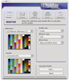
Profiling the display
To get color management to work in Photoshop you have to calibrate and profile the computer display. This is by far the most important and essential first link in the color management chain. You can live without scanner profiling and it is not the end of the world if you can't profile every printer/paper combination. But you simply must have a well-calibrated and profiled display. It is after all the instrument you rely upon most when you make your color editing decisions.
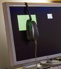
If you don't have a display calibration device you can always build a profile for your display using a visual calibration method. You could, for example, use the Display Calibration Assistant that comes with the Mac OS X system. However, the problem with relying on visual calibration is that because our eyes are so good at adapting to light, our eyes are poor instruments to use when calibrating a device like a computer display. In Chapter 2 I mentioned some of the equipment and software options that you can buy these days and showed a quick run-through of how to calibrate a computer display with a calibration device. I would strongly urge you to purchase a proper measuring instrument and use this to calibrate the display on a regular basis. A hardware calibration device combined with a dedicated software utility is the only way that you can guarantee getting good color from your system, as this will enable you to precisely calibrate your display and build an accurate display profile. At the time of writing, I have found four basic display profiling packages, which include a colorimeter and basic software program, all for under $300. Highly recommended is the basICColor Display and Squid combination. Then there is the X-Rite Eye-One Display 2 that comes with Eye-One Match 2 software, the Monaco Optix XR system and lastly the ColorVision Monitor Spyder and Spyder2 Pro Studio. Of these I would probably recommend the X-Rite Eye-One Display 2, since I am very familiar with the (more expensive) Eye-One spectrophotometer system, which I use to calibrate and profile the display in my office (Figure 12.8). It is also an emissive spectrophotometer so I can use it to build custom printer profiles as well. The other units I have listed here are all colorimeters so these can only be used for building monitor profiles, but they are usually regarded as being equally as good as the more expensive spectrophotometers for this type of task.
 |
| Figure 12.8 |
Calibration and profiling
Profile measuring devices can be attached to the display by hanging the device over the edge of an LCD display using a counter weight that gently rests the calibrator against the surface of the screen. Whatever you do, don't use a calibrating device with suckers on an LCD as this can easily damage the delicate surface.
The software packages used will vary in appearance but they essentially all do the same thing. Before you build a profile there are several option settings you have to decide upon. First there is the gamma space which I recommend should be 2.2 (even if it says somewhere that Macintosh users should use 1.8), although for LCD screens you should probably use the ‘native gamma’. The white point should be set to 6500 K, or with LCD displays you can use the native white point. If given the option, save a small profile size for CRT profiles and a large profile size for LCD profiles. The first stage is to calibrate the display to optimize the contrast and brightness: 120–140 candelas m2 is ideal for a desktop LCD display and 100–110 CD m2 is the ideal luminance for laptops. Once this has been done you will want to lock down the hardware controls so they cannot be accidentally adjusted. This should be done before performing the calibration in which a series of colors are sent to the display and the measurements used to adjust the video card settings, which will fine-tune the display to achieve optimum neutralization.
The second part is the profiling process. Once the display has been calibrated a longer sequence of color patches are sent to the display and measured to build a profile describing how the neutralized screen displays these known colors. This data is collected together to build the profile. At the end you will be asked to name the profile and it should be automatically saved to the correct folder location and assigned as the new default display profile. On the Macintosh, the profile should automatically be saved in the Library/ColorSync/Profiles/Displays folder. On a PC, it should be saved to the Windows/System32/Spool/Drivers/ Color folder. Do remember that the performance of the display will fluctuate over time, so it is therefore important to check and calibrate the display at regular intervals.
As was explained in Chapter 3, Camera Raw uses data accumulated from two sets of profiles which have been produced using daylight balanced and tungsten balanced lighting. This method of profiling works really well with most normal color temperature settings, but the data gathered is based on a small sample of cameras (sometimes just one!) and cannot be regarded as offering absolute accuracy. It may be helpful to follow the calibration procedure (described in the same chapter) to obtain the most accurate colors.
Profiling the input
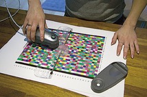
Input profiling is possible, but it's easier to do with a scanner than it is with a digital camera. To profile a scanner you'll need to scan a film or print target and use profile creation software such as X-Rite's ProfileMaker Pro™ program to read the data and build a custom profile based on readings taken from the scanned target (Figure 12.9). The target measurements are then used to build a profile that describes the characteristics of the scanner. This profile should be saved to the Macintosh Library/ColorSync/Profiles folder, or, on a PC, saved to the Windows/System32/Spool/Drivers/ Color folder. It can then be incorporated into your color managed workflow to describe the image data coming into Photoshop (refer back to Figure 12.6). This can be done by selecting the profile in the scanner software or by assigning the profile in Photoshop as the file is opened.
Camera profiling is a lot trickier to do and few photographers feel this is something worth bothering with. This is because the camera sensor will respond differently under different lighting conditions and you would therefore need to build a new profile every time the light changed. This is not necessarily a problem if you are using a digital camera in a studio setup with a consistent strobe lighting setup. In these circumstances it is probably very desirable that you photograph a color checker chart and take measurements that can be used to create a custom input profile for the camera. For example, the X-Rite Eye-One Photo system offers a camera profiling option.
Overall, I would not stress too much about input profiles unless it is critical to your workflow that you have absolute color control from start to finish. For example, a museum photographer who is charged with photographing important works of art would absolutely want to profile their camera, but is it always necessary or desirable? In Figure 12.10 I suggest that the correct white balance and input profiling is sometimes irrelevant, as it is more important to trust what you see on your monitor display and obtain good color management between the image seen on the computer display and what you see in the print.
Profiling the output
Successful color management also relies on having accurate profiles for each type of media paper that's used with your printer. The printer you buy should come with a driver on a CD (or you can easily download one) and the installation procedure should install a set of canned profiles that will work when using the proprietary inks designed to be used with the printer and for a limited range of branded papers. The canned profiles that ship with the latest Epson printers, for their Epson papers, tend to be of a very high quality and these are all you really need for professional print results. However, it is recommended that you carry out custom profiling to build profiles for other types of print/paper combinations. This can be done by printing out a test target like the one shown in Figure 12.11 without color managing it. Once the test print has been allowed to stabilize, it can be measured the following day with a device like the X-Rite Eye-One spectrophotometer (Figure 12.12). The patch measurement results can then be used to build a color profile for the printer. The other alternative is to take advantage of Neil Barstow's remote profiling service special offer which is available to readers (see the back of the book). If you wish to use custom printer profiles, you'll need one to be built for each printer/media combination. You can use a profiled printer to achieve good CMYK proofing, even from a modestly priced printer, which comes close to matching the quality of a recognized contract proof printer.
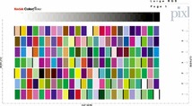 |
| Figure 12.11 This Kodak™ color target can be used to construct a color ICC profile. A profile service company will normally supply you with instructions on how to print it out. When they receive your prints, they can measure these and email the custom ICC profile back to you. For example, Neil Barstow of www.colourmanagement.net is offering a special discount rate to readers of this book (see the back of the book for more details). |
Photoshop color management interface
By now you should be acquainted with the basic principles of Photoshop ICC color management (see Figure 12.13). It is relatively easy to configure the Photoshop system and at the simplest level all you have to do is calibrate and profile your display and then go to the Photoshop Color Settings (Figure 12.14) and select an appropriate prepress setting (don't use the default). A prepress setting will correctly enable the Photoshop color management policies and should be enough to get you up and running in a color managed workflow. But if you want to discover more about how color management works, then do read on.
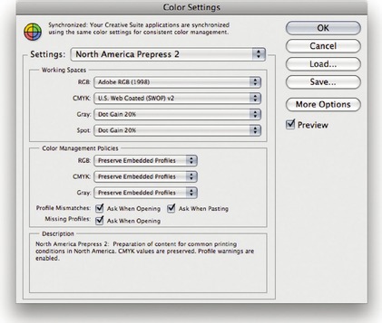 |
| Figure 12.14 All the Photoshop color settings can be managed from within the Photoshop Color Settings dialog. Photoshop conveniently ships with various preset settings that are suited to different Photoshop work flows. Unfortunately, the default setting is not an ideal choice for a color managed workflow, so use the Settings menu shown in Figure 12.15 to switch to a prepress setting such as the one shown here. As you move the cursor pointer around the Color Settings dialog, help messages are provided in the Description box area below – these provide useful information which will help you learn more about the Photoshop color management settings and the different color space options. |
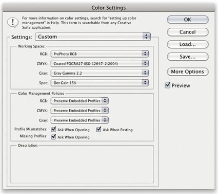
The Color Settings
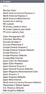
The Color Settings are located in the Edit menu. The first item you will come across is the Settings pop-up menu (Figure 12.15). Photoshop provides a range of preset configurations for the color management system and these can be edited to meet your own specific requirements. In Basic mode, the default setting will be some sort of General Purpose setting and the exact naming and subsequent settings list will vary depending on the region where you live.
 |
| Figure 12.15 |
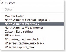
I would recommend that you follow the advice in Figure 12.15 and change this default to one of the prepress settings. So if Photoshop was installed on a European computer, you would select the ‘Europe Prepress Defaults’ setting from this or the ‘More Options’ list shown in Figure 12.16. If a preset color setting says ‘prepress’, this will be the ideal starting point for any type of color managed workflow, especially if you are a photographer. That is all you need to concern yourself with initially, but if you wish to make customized adjustments, then you can make custom changes in the Working Spaces section. For help selecting an ideal RGB workspace, refer back to the section on RGB spaces on pages 640– 641 (where I recommend using ProPhoto RGB). I'll be covering the CMYK and Grayscale settings later.
Color management policies
The first thing Photoshop does when a document is opened is check to see if an ICC profile is present. The default policy is to preserve the embedded profile information. So whether the document has originated in sRGB, Adobe RGB or ColorMatch RGB, it will open in that RGB color space and after editing be saved as such. This means you can have several files open at once and each can be in an entirely different color space. A good tip here is to set the Status box to show ‘Document profile’ (on the Mac this is at the bottom left of the image window; on a PC it is at the bottom of the system screen). Or, you can configure the Info panel to provide such information. This allows you to see each individual document's color space profile.
Preserve embedded profiles
The default policy of ‘Preserve Embedded Profiles’ allows you to use the ICC color management system straight away, without too much difficulty. So long as there is a profile tag embedded in any file you open, Photoshop gives you the option to open that file without converting it. So if you are given an sRGB file to open, the default option is to open it in sRGB and save it using the same sRGB color space. This is despite the fact that your default RGB workspace might be ProPhoto RGB or some other RGB color space. The same policy rules apply to CMYK and grayscale files. Whenever ‘Preserve Embedded Profiles’ is selected, Photoshop reads the CMYK or Grayscale profile, preserves the numeric data and does not convert the colors, and the image remains in the tagged color space. This is always going to be the preferred option when editing incoming CMYK files because a CMYK file may already be targeted for a specific press output and you don't really want to alter the numbers for those color values.
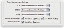
Profile mismatches and missing profiles
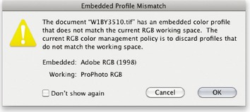
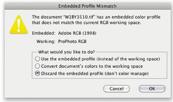
The default prepress color management policy setting is set to ‘Ask When Opening’ if there is a profile mismatch (Figure 12.17). This means you will see the warning dialog shown in Figure 12.18 whenever the profile of a file you are opening does not match the current workspace. This offers you a chance to use the embedded profile (which is recommended), convert the document colors to the current workspace or discard the profile.
 |
| Figure 12.17 |
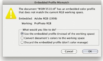 |
| Figure 12.18 If the ‘Preserve Embedded Profiles’ color management policy is selected and the ‘Ask When Opening’ box is checked in the Profile Mismatches section (Figure 12.17), you will see the dialog shown here whenever there is a profile mismatch between the image you are opening and the current working space. You can then open using the embedded profile, override the policy and convert to the working space, or discard the embedded profile. Whatever you do, select one of these options and click OK, because if you click ‘Cancel’ you'll cancel opening the file completely. I usually prefer to use Preserve Embedded Profiles and deselect ‘Ask When Opening’, so that I am not constantly shown this dialog. |
A newcomer does not necessarily have to fully understand how Photoshop color management works in order to use it successfully. When ‘Preserve Embedded Profiles’ is selected this makes the Photoshop color management system quite foolproof and the color management system is adaptable enough to suit the needs of all Photoshop users, regardless of their skill levels. Whichever option you select – convert or don't convert – the saved file will always be correctly tagged.
Convert to Working space
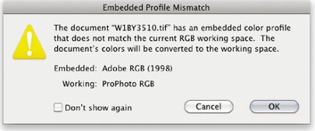
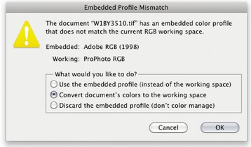
If you select the Convert to Working space policy, Photoshop automatically converts everything to your current RGB or CMYK workspace. If the incoming profile does not match the workspace, then the default option is to carry out a profile conversion from the embedded profile space to the current workspace, as shown in Figure 12.19 (when the incoming profile matches the current RGB, CMYK or grayscale workspace, there is of course no need to convert the colors). Or, you will see the dialog shown in Figure 12.20, if the ‘Ask When Opening’ box is checked in the Profile Mismatches section. Convert to Working space can be a useful option for RGB mode because you may wish to convert all your RGB images to your working space (but not the CMYK files). For batch processing work I sometimes prefer to temporarily use the Convert to Working space RGB setting because this allows me to apply a batch operation to a mixture of files in which all the images end up in the current RGB workspace.
Color Management Off
The other option is to choose ‘Off’. When this option is selected Photoshop appears not to color manage incoming documents and it will assume the default RGB or CMYK workspace to be the source. If there is no profile embedded, then the document stays that way. If there is a profile mismatch between the source and the workspace, the dialog shown in Figure 12.21 points out that if you click OK the embedded profile will be deleted. Or, you will see the dialog shown on Figure 12.22, if the ‘Ask When Opening’ box is checked in the Profile Mismatches section. If the source profile matches the workspace, there is no need to remove the profile. In this instance the profile tag will not be removed (even so, you can still remove the ICC profile at the saving stage). Therefore, Photoshop is still able to color manage certain files and strictly speaking is not completely ‘off’. Turning the color management off is not recommended for general Photoshop work, so do check the Color Settings to make sure Photoshop's color management hasn't been disabled, especially if working on an unfamiliar computer.
 |
| Figure 12.22 |
Sometimes it is desirable to discard a profile. For example, you may be aware that the image you are about to open has an incorrect profile and it is therefore a good thing to discard it and assign the correct profile later in Photoshop. I still would not recommend choosing ‘Off’ as the default setting though. Just make sure you have the Color Management Policies set to ‘Ask When Opening’ and you can easily intervene and discard the profile when using the ‘Preserve Embedded Profiles’ or ‘Convert to Working RGB’ color management policies settings.
Profile conversions
As you gain more experience you will soon be able to create your own customized color settings. The minimum you need to know is ‘which of the listed color settings are appropriate for the work you are doing’. To help in this decision making, you can read the text descriptions that appear in the Description box at the bottom of the Color Settings dialog. The section that's now coming up deals with how to make profile conversions once files have been opened in Photoshop, as well as how to assign different profiles where it is necessary to do so.
A Convert to Profile is just like any other image mode change in Photoshop, such as converting from RGB to Grayscale mode, and it is much safer to use than the old Profile to Profile command in Photoshop 5.0. However, be careful if you use Convert to Profile to produce targeted RGB outputs that overwrite the original RGB master. Any version of Photoshop since version 6.0 will have no problem reading the embedded profiles and displaying the image correctly; and will recognize any profile mismatch (and know how to convert back to the original workspace). As always, customized RGB files such as this may easily confuse other non-ICC savvy Photoshop users. Not everyone is using Photoshop, nor does everyone have their color management configured correctly. Some RGB to RGB conversions can produce RGB images that look fine on a correctly configured system, but look very odd on one that is not (see page 658).
Convert to Profile
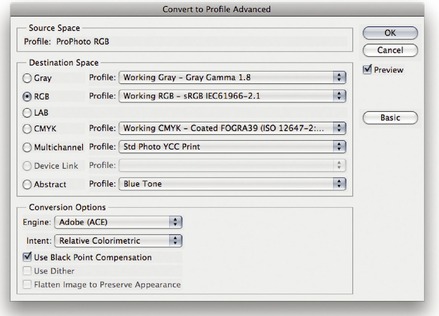
Even if you choose to preserve the embedded profile on opening, it can be useful to convert non-workspace files to your current workspace after opening. This is where the Convert to Profile command comes in, because you can use it to carry out a profile conversion at any time, such as at the end of a retouch session, just before saving. Let's suppose you want to open an RGB image that is in Adobe RGB and the current working space is sRGB. If the ‘Preserve Embedded Profile’ option is selected then the default behavior would be to open the file and keep it in Adobe RGB without converting. You could carry on editing the image in the Adobe RGB color space up until the point where it is desirable to carry out a conversion to another color space. To make a profile conversion, go to the Edit menu and choose ‘Convert to Profile…’. The Source space shows the current profile space and in ‘Basic’ mode, there will be a single Destination Space menu that will most likely default to ‘Working RGB’ (which in this case would be sRGB). This menu lists all of the available profiles on your computer system (see Figure 12.24). However, if you click on the Advanced button, you will see the Convert to Profile Advanced dialog (Figure 12.23) where the Destination Space options are broken down into color mode types, such as: Gray, RGB, Lab and CMYK, plus other more esoteric options such as Multichannel and Abstract profile modes. Because the color modes are segmented in this way, this makes it easier for you to access specific types of profiles when carrying out a conversion.
The Convert to Profile command is also useful when you wish to create an output file to send to a printer for which you have a custom-built profile but the print driver does not recognize ICC profiles. For example, one of the printers I used to use was the Fuji Pictrograph. I had built a custom profile for this printer, but unfortunately there was no facility within the File Export driver to utilize the output profile. Therefore, I used the Convert to Profile command to convert the color data to match the space of the output device just prior to sending the image data to the printer.
Whenever you make a profile conversion the image data will end up in a different color space and you might see a slight change in the on-screen color appearance. This is because the profile space you are converting to may have a smaller gamut than the one you are converting from. If an opened image is not in the current working color space, or has been converted to one that is not, Photoshop appends a warning asterisk (*) to the color mode in the title bar (Mac) or status bar (PC) to indicate this.
Assign Profile
When an image is missing its profile or has the wrong profile information embedded, the color numbers become meaningless. The Assign Profile command (Figure 12.25) can be used to correct mistakes as it allows you to assign correct meaning to what the colors in the image should be. So, for example, if you know the profile of an opened file to be wrong, you can use the Edit
 Assign Profile command to rectify this situation. Let's suppose you have opened an untagged RGB file and for some reason decided not to color manage the file when opening. The colors don't look right and you have reason to believe that the file had originated from the sRGB color space. Yet, it is being edited in your current ProPhoto RGB workspace as if it were a ProPhoto RGB image. By assigning an sRGB profile, you can tell Photoshop that this is not a ProPhoto RGB image and that these colors should be considered as being in the sRGB color space. Most of the time, assigning sRGB will bring the colors back to life and if that doesn't work, then try one of the other commonly used RGB workspaces such as Adobe RGB or Colormatch.
Assign Profile command to rectify this situation. Let's suppose you have opened an untagged RGB file and for some reason decided not to color manage the file when opening. The colors don't look right and you have reason to believe that the file had originated from the sRGB color space. Yet, it is being edited in your current ProPhoto RGB workspace as if it were a ProPhoto RGB image. By assigning an sRGB profile, you can tell Photoshop that this is not a ProPhoto RGB image and that these colors should be considered as being in the sRGB color space. Most of the time, assigning sRGB will bring the colors back to life and if that doesn't work, then try one of the other commonly used RGB workspaces such as Adobe RGB or Colormatch.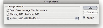 |
| Figure 12.25 |
You can also use Assign Profile to remove a profile by clicking on the Don't Color Manage This Document button, which allows you to strip a file of its profile. However, you can also do this by choosing File
Save As… and deselect the Embed Profile checkbox in the Save options.
Save As… and deselect the Embed Profile checkbox in the Save options.Some digital cameras won't embed a profile in the JPEG capture files or worse still, embed a wrong profile, yet the EXIF metadata will misleadingly say the file is in sRGB color mode. The danger here is that while you may select Adobe RGB as the RGB space for your camera, when shooting in JPEG mode the camera may inadvertently omit to alter the EXIF tag which stubbornly reads sRGB.
This can be resolved by going to the Photoshop menu and choosing: Preferences
File Handling… If you check the ‘Ignore EXIF Profile tag’ option, Photoshop always ignores the specified camera profile in the EXIF metadata and only relies on the actual profile (where present) when determining the color space the data should be in.
File Handling… If you check the ‘Ignore EXIF Profile tag’ option, Photoshop always ignores the specified camera profile in the EXIF metadata and only relies on the actual profile (where present) when determining the color space the data should be in.Profile mismatches when pasting
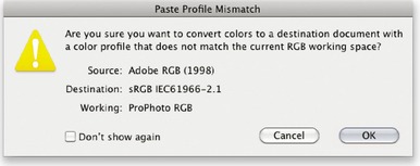
One problem with having images in multiple color spaces open at once concerns the copying and pasting of color data from one file to another. Whenever you copy and paste image data, or drag copy an image with the move tool, it is possible that a profile mismatch may occur; although this will very much depend on how you have the Color Management policies configured in the Color Settings (see Figure 12.26). If the Profile Mismatches: Ask When Pasting box is unchecked in the Color Settings and a profile mismatch occurs, you will see the dialog shown in Figure 12.27. This asks if you wish to convert the color data to preserve the color appearance when it is pasted into the new destination document. If the Profile Mismatches: Ask When Pasting box is checked in the Color Settings, then you will see instead the dialog box shown in Figure 12.28. This dialog offers you the choice to convert or not convert the data. If you select ‘Convert’, the appearance of the colors will be maintained when you paste the data and if you choose ‘Don't Convert’ the color appearance will change but the numbers will be preserved.
 |
| Figure 12.26 |
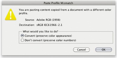 |
| Figure 12.28 If the Profile Mismatches: Ask When Pasting box is checked in the Color Settings dialog and you attempt to paste image data from a document whose color space does not match the destination space, this dialog warning gives you the option to ‘Convert’ the colors (as in Figure 12.27 above), or ‘Don't Convert’ and preserve the numbers instead. |
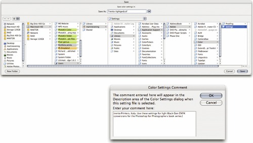
Saving a Color Setting
If you have configured the settings to suit a particular workflow, you can click on the Save… button to save these as a custom setting that will appear in the Color Settings menu the next time you open this dialog. When you save a setting you can enter any relevant comments or notes about the setting you are saving in the text box (see Figure 12.29). This information will then appear in the Color Settings dialog text box at the bottom. You might name a setting something like ‘Client annual report settings’ and write a short descriptive note to accompany it, reminding you of situations where you would need to use this particular custom setting.
Reducing the opportunities for error
When you adopt an RGB space such as ProPhoto RGB as the preferred workspace for all your image editing, you must take into account how this might cause confusion when exchanging RGB files between your computer (which is operating in a color managed workflow) and that of someone who is using Photoshop with the color management switched off. When sending image files to other Photoshop users, the presence of a profile can help them read the image data correctly, so long as they have the Photoshop color settings configured to preserve embedded profiles (or convert to the working space) and their computer display is calibrated correctly. They will then see your photographs on their system almost exactly the way you intended them to be seen. The only variables will be the accuracy of their display calibration and profile, the color gamut limitations of the display and the environment in which it is being viewed. Configuring the Color Settings is not so difficult to do, but the recipient does have to be as conscientious as you are about ensuring their display is set up correctly. The situation has not been helped either by the way the default color settings have shifted about over the last nine versions of the program. The default settings in Photoshop CS5 use Preserve Embedded Profiles, but prior to that we had settings like ‘Web Graphics’ in which color management was switched off. Consequently, there are a lot of Photoshop users out there who have unwittingly been using sRGB as their default RGB workspace and with color management switched off. Even where people do have the color management switched on, the displays they are using may not have been profiled in months or are being viewed in a brightly lit room!
How you deliver your files will very much depend on who you are supplying them to. I often get emails from readers who have been given the runaround by their color lab. One typically finds that the lab may be using a photo printer such as the Fuji Frontier™ which does not read incoming profiles and is simply calibrated to expect sRGB files. So far so good. As long as you send an sRGB file, you shouldn't have any problems. But if the color lab operator has Photoshop color management switched off, they will not know how to handle anything other than an incoming file that is in sRGB. If you then supply them with an Adobe RGB file they may not read the profile. The colors will end up looking different in the final print and then they blame the customer!
It helps to do a little detective work to ascertain the skill level of the recipient. The first thing you need to know is what color settings are they using? This will help you determine which RGB space they are using and whether the color management is switched on or off. The other thing to ask is ‘do you have your computer display calibrated and profiled?’ And if the answer is yes, then ask how often they calibrate and profile their display. The answers to these questions will tell you quite a bit about the other person's system, how you should supply your files and also how accurate their computer display is at displaying colors. Basically, if you have any doubts, the safest option is to convert to sRGB before sending.
It is important to be aware of these potential problems because it is all too easy for the color management to fail once an image file has left your hands and been passed on to another Photoshop user. With this in mind, here are some useful tips to help avoid misunderstandings over color. The most obvious way to communicate what the colors are supposed to look like is to supply a printed output. In fact this is considered routine when supplying images to a printer. If you are sending a file for CMYK repro printing, it is sensible to also supply a CMYK targeted print output. Supplying a print is an unambiguous visual reference, which if done properly can form the basis of a contract between yourself, the client and the printer.
If the person you are supplying the file to is in the same building or you are in regular contact with them, then you probably have a clear idea of how their system is set up. If they have Photoshop color management switched on, they can read any file you send them in any color space and it will be color managed successfully. However, you cannot always make too many assumptions about who you are sending image files to and it is for this reason that you should sometimes adopt a more cautious approach. I am often asked to supply RGB files as large JPEGs for initial approval by the client before making a finished print. In these situations I find it safer to supply a profiled sRGB image. I do this by choosing Edit
Convert to Profile… and select sRGB as the destination space. If the recipient is color management savvy, then the version of Photoshop they are working with should be able to read the sRGB profile and handle the colors correctly. If the recipient has not bothered to configure their color management settings then one can be almost certain that they are using sRGB as their default RGB workspace. So in these instances, converting to sRGB means they stand a better chance of seeing the colors correctly regardless of whether they have the color management on or off.
Convert to Profile… and select sRGB as the destination space. If the recipient is color management savvy, then the version of Photoshop they are working with should be able to read the sRGB profile and handle the colors correctly. If the recipient has not bothered to configure their color management settings then one can be almost certain that they are using sRGB as their default RGB workspace. So in these instances, converting to sRGB means they stand a better chance of seeing the colors correctly regardless of whether they have the color management on or off.Figure 12.30 shows a comparison of how a photo that was edited using different RGB workspaces would look on a Photoshop system configured using a Color Management ‘Off’ setting and where the person receiving the file ignores the embedded profile. If the photo was delivered as an Adobe RGB file, the gamma would match, but because Adobe RGB has a larger gamut than sRGB the colors would appear slightly desaturated. If supplied as a ColorMatch RGB file, sRGB would interpret this as a darker image because ColorMatch has a lower gamma of 1.8. If supplied using ProPhoto RGB, the colors would appear even more muted when brought into sRGB without any color management. This is because ProPhoto RGB has a much larger color gamut. The bottom right example shows how the photo would look if the supplied image was in sRGB and opened in Photoshop with color management switched off, but with sRGB as the default RGB workspace. In this instance this is the most correct version. Of course, I am certainly not advocating you use sRGB as your standard RGB workspace, because it is still a poor space to use for photographic work, but it can be a useful ‘dumbed down’ space to convert to when communicating with unknown users.
 |
| Figure 12.30 |
If you are using the Epson Advanced B&W options to print grayscale images, it is best to make sure that the Gray working space matches the gamma of the RGB working space. If this is the case, use the following Gray gamma settings:
Colormatch RGB: 1.8 gamma
Adobe RGB: 2.2 gamma
sRGB: 2.2 gamma
ProPhoto RGB: 1.8 gamma
If you intend creating grayscale images to be seen on the Internet or in multimedia presentations, I suggest you choose the ‘Default Web Graphics’ color setting. The Grayscale workspace will then be set to a 2.2 gamma space, which is the same gamma that's used by the majority of PC and Mac computer displays. The truth is, you can never be 100% sure how anybody who views your work will have their display calibrated, but you can at least assume that the majority of Internet users will have a display set to a 2.2 gamma. The Macintosh 1.8 gamma setting should really be relegated to ancient history. The reason it exists at all is because in the very early days of the Macintosh computer (and before ICC color management) a 1.8 gamma monitor space most closely matched the dot gain of the Apple monochrome laser printer.
Working with Grayscale
Grayscale image files can also be managed via the Color Settings dialog. The color management policy can be set to either ‘Preserve Embedded Profiles’ or ‘Convert to Working Gray’. If the profile of the incoming grayscale file does not match the current Gray workspace (and the Ask When Opening box is checked), you will be asked whether you wish to use the tagged grayscale space profile, or convert to the current Gray workspace.
If you examine the Gray workspace options, you will see a list of dot gain percentages and display gamma values. For prepress work you should select the dot gain percentage that most closely matches the anticipated dot gain of the press. It is important to note that the Gray workspace setting is independent of the CMYK workspace. If you want the Gray workspace dot gain value to match the black plate of the current CMYK setting, then mouse down on the Gray setting and choose ‘Load Gray…’. Now go to the Profiles folder, which will be in the Library/Application Support/ Adobe/Color/Settings folder on a Mac and in the Program Files/ Common Files/Adobe/Color/Settings folder on a PC. Select the same CMYK space as you are using for the CMYK color separations and click the Load… button. This loads the black plate dot gain value and sets it as the new Gray workspace setting. This means that when you convert images to the current Gray workspace, they will do so using the correct black plate dot gain setting to match the current CMYK setting.
If you are using grayscale mode to make prints via the Advanced B&W print options for an Epson printer, you should make sure that the Grayscale workspace uses a gamma setting that matches the gamma of your current RGB workspace. This ensures there is no gamma compensation when you convert from RGB to Grayscale (see sidebar: Matching grayscale gamma)
If you are preparing grayscale images for screen display use, such as on a website or in a multimedia presentation, then you will want to select ‘Gray Gamma 2.2’ (see the sidebar: Grayscale for screen display). If you want to know what existing prepress grayscale images will look like on the Web in grayscale mode, I suggest you select the View
Proof Setup and choose Windows RGB or Macintosh RGB. You can then select Image
Adjust
Levels and adjust the Gamma slider accordingly to obtain the right brightness for a typical PC or Mac display (to be honest, most Mac users these days are using the same display gamma as PC users).
Proof Setup and choose Windows RGB or Macintosh RGB. You can then select Image
Adjust
Levels and adjust the Gamma slider accordingly to obtain the right brightness for a typical PC or Mac display (to be honest, most Mac users these days are using the same display gamma as PC users).Advanced Color Settings
The advanced settings are normally hidden, but if you click on the More Options button, you'll see the expanded Color Settings dialog shown in Figure 12.31. These advanced settings unleash full control over the Photoshop color management system. However, don't attempt to adjust any of these expert settings until you have fully understood the intricacies of customizing the RGB, CMYK, Gray and Spot color spaces. I suggest you read through the remaining section of this chapter first before you consider customizing any of these settings.
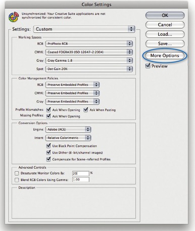
Photoshop CS4 and CS5 contain a new advanced preference called ‘Compensate for Scene-referred Profiles’. This isn't of any real significance for photographers. It is switched on by default and designed to automatically apply video contrast when converting between scene and outputreferred profiles. This basically matches the default color management workflow for After Effects CS4 or later.
Conversion options and rendering intents
You have a choice of three Color Management Modules (CMMs): Adobe Color Engine (ACE), Apple ColorSync or Apple CMM. The Adobe color engine is reckoned to be superior for all RGB to CMYK conversions because the Adobe engine uses 20-bit per channel bit-depth calculations to calculate its color space conversions.
The rendering intent influences the way the data is translated from the source to the destination space. The rendering intent is like a rule that describes the way the conversion is calculated and we will be looking at rendering intents later on pages 670–673.
Black Point Compensation
This maps the darkest neutral color of the source RGB color space to the darkest neutrals of the destination color space. Black Point Compensation plays a vital role in translating the blacks in your images so that they reproduce as black when printed. As was explained in Chapter 3, there is no need to get hung up on setting the shadow point to anything other than zero RGB values. It is not necessary to apply any shadow compensation at the image editing stage, because the color management will automatically take care of this for you and apply a black point compensation obtained from the output profile used in the mode or profile conversion. If you disable Black Point Compensation you may obtain deep blacks, but you will get truer (compensated) blacks if you leave it switched on.
You will want to use Black Point Compensation when separating an RGB image to a press CMYK color space. However, in the case of a conversion from a CMYK proofing space to an inkjet profile space, we must preserve the (grayish) black of the press and not scale the image (because this would improve the blacks). For this reason Black Point Compensation is disabled in the Print dialog when making a proof print to simulate black ink.
Use Dither (8-bit per channel images)
Banding may occasionally occur when you separate to CMYK, particularly where there is a gentle tonal gradation in bright saturated areas. Any banding which appears on the display won't necessarily always show in print and much will depend on the coarseness of the screen that's eventually used in the printing process. However, the Dither option can help reduce the risk of banding when converting between color spaces.
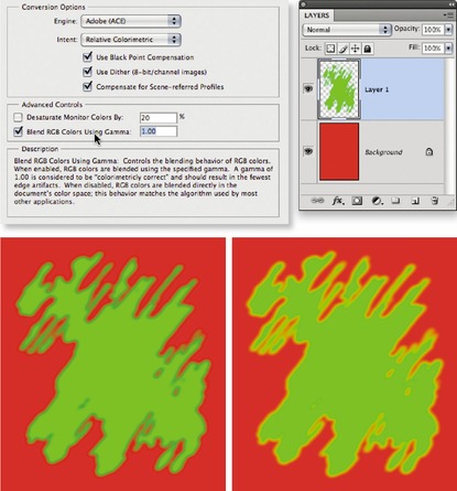
Blend RGB colors using gamma
This option allows you to override the default color blending behavior. There used to be an option in Photoshop 2.5 for applying blend color gamma compensation. This allowed you to blend colors with a gamma of 1.0, which some experts argued was a purer way of doing things, because at higher gamma values than this you might see edge darkening occur between contrasting colors. Some users found the phenomenon of these edge artifacts to have a desirable trapping effect. However, many Photoshop users complained that they noticed light halos appearing around objects when blending colors at a gamma of 1.0. Consequently, gamma-compensated blending was removed at the time of the version 2.5.1 update. If you understand the implications of adjusting this particular gamma setting, you can switch it back on if you wish. Figure 12.32 illustrates the difference between blending colors at a gamma of 2.2 and 1.0.
The ‘Desaturate Monitor Colors By’ option helps you to visualize and make comparisons between color gamut spaces where one or more gamut space is larger than the monitor RGB space. Color spaces such as ProPhoto RGB have a gamut that is much larger than the computer display is able to show. So turning down the monitor colors saturation allows you to make a comparative evaluation between these two different color spaces. It is in essence a ‘hurt me’ button, because if you don't understand how to use this feature, you might inadvertently leave it on and end up assuming all your images are desaturated.
Custom RGB and workspace gamma
Expert users may wish to use an alternative custom RGB workspace in place of one of the listed RGB spaces. If you know what you are doing and wish to create a customized RGB color space, you can go to the Custom… option in the pop-up menu and enter the information for the White Point, Gamma and color primaries coordinates (Figure 12.33). My advice is to leave these expert settings well alone. Avoid falling into the trap of thinking that the RGB workspace gamma should be the same as the monitor display gamma setting. The RGB workspace is
not a display space.
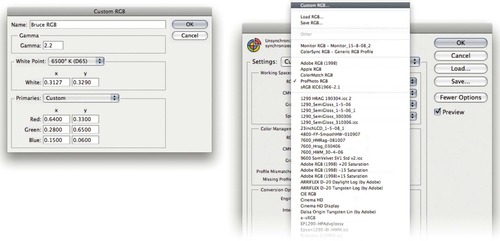 |
| Figure 12.33 |
Adobe RGB is considered a good choice as an RGB workspace because its 2.2 gamma provides a more balanced, even distribution of tones between the shadows and highlights, while others, like myself prefer the 1.8 gamma ProPhoto RGB space for its wide color gamut. Remember, you do not actually ‘see’ Adobe RGB or ProPhoto RGB and the RGB workspace gamma has no impact on how the colors are displayed on the screen (so long as Photoshop ICC color management is switched on). In any case, these advanced custom color space settings are safely tucked away in Photoshop and you are less likely to be confused by any apparent discrepancies between the display gamma and the RGB workspace gamma.
RGB to CMYK
Digital scans and captures all originate in RGB but professional images are nearly always reproduced in CMYK. Since the conversion from RGB to CMYK has to happen at some stage, the question is: at what point should this take place and who should be responsible for the conversion? If you have decided to take on this responsibility yourself then you need to understand more about the CMYK settings. When it comes to four-color print reproduction, it is important to know as much as possible about the intended press conditions that will be used at the printing stage and use this information to create a customized CMYK setup.
There are some people who will tell you that in their ‘expert opinion’, Photoshop does a poor job of separating to CMYK. I bet if you ask them how they know this to be the case, they will be stumped to provide you with a coherent answer. Don't let anyone try to convince you otherwise, because Professional quality CMYK separations can be achieved in Photoshop. You can avoid gamut clipping and you can customize a separation to meet the demands of any type of press output. The fact is that Photoshop will make lousy CMYK separations if the Photoshop operator who is carrying out the conversion has a limited knowledge of how to configure the Photoshop CMYK settings. For example, a wider gamut RGB space such as Adobe RGB or ProPhoto RGB is better able to encompass the gamut of CMYK and yield CMYK separations that do not suffer from gamut clipping. This is one big strike in favor of the Photoshop color management system. Remember, CMYK is not a one-size-fits-all color space and CMYK conversions do need to be tailor-made for each and every job.
CMYK setup
If you examine the US prepress default setting, the CMYK space says ‘U.S. Web Coated (SWOP) v2’. This setting is by no means a precise setting for every US prepress SWOP coated print job, because there can be many flavors of SWOP, but it does at least bring you a little closer to the type of specification a printer in the US might require for printing on coated paper with a Web press setup. If you mouse down on the CMYK setup pop-up list, you will see there are also US options for Web uncoated and Sheetfed press setups. Under the European prepress default setting, there is a choice between coated and uncoated paper stocks, plus the latest ISO coated FOGRA39 setting. Then there is also Custom CMYK… where you can create and save custom CMYK profile settings.
There is not a lot you can do with the standard CMYK settings: you can make a choice from a handful of generic CMYK profile settings or choose ‘Custom CMYK…’. If you check the More options box, you'll be able to select from a more comprehensive list of CMYK profile settings in the extended menu (depending on what profiles are already in your ColorSync folder).
Creating a custom CMYK setting
Figure 12.34 shows the Custom CMYK dialog, which is better known as the familiar ‘classic’ Photoshop CMYK setup. Here, you can enter all the relevant CMYK separation information for a specific print job. Ideally you will want to save each purpose-built CMYK configuration as a separate color setting for future use and label it with a description of the print job it was built for.
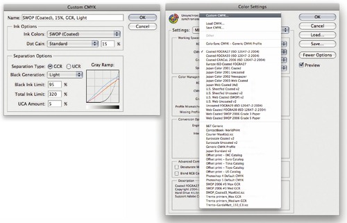
Once you have configured a new CMYK workspace setting, this becomes the new default CMYK workspace that is used when you convert an image to CMYK mode. Note that altering the CMYK setup settings has no effect on the on-screen appearance of an already-converted CMYK file (unless there is no profile embedded). This is because the CMYK separation setup settings must be established first before you carry out the conversion.
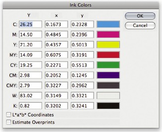
Ink Colors
If you click on the Ink Colors menu, you can select one of the preset Ink Colors settings that are suggested for different types of printing. For example, European Photoshop users can choose from Eurostandard (coated), (uncoated), or (newsprint). These are just generic ink sets. If your printer can supply you with a custom ink color setting, then select ‘Custom…’ from the Ink Colors menu. This opens the dialog shown in Figure 12.35.
Dot gain
Dot gain refers to an accumulation of factors during the repro process that will make a dot printed on the page appear darker than expected. Among other things, dot gain is dependent on the type of press and the paper stock that's being used. The dot gain value entered in the CMYK setup determines how light or dark the separation needs to be. If a high dot gain is encountered, the separated CMYK films will need to be less dense so that the plates produced lay down less ink on the paper and produce the correctsized printed halftone dot for that particular type of press setup. You can see for yourself how this works by converting an image to CMYK using two different dot gain values and comparing the appearance of the individual CMYK channels. Although the dot gain value affects the lightness of the individual channels, the composite CMYK channel image is always displayed correctly on the screen, showing how the final printed image should look.
If you select the ‘Dot Gain Curves’ option, you can enter custom settings for the composite or individual color plates. In the preparation of this book I was provided with precise dot gain information for the 40% and 80% ink values (these are shown on the previous page in Figure 12.36).
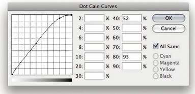 |
| Figure 12.36 If you select ‘Dot Gain: Curves…’ from the CMYK setup shown in Figure 12.34, this opens the Custom Dot Gain Curves dialog. If your printer is able to provide dot gain values at certain percentages, then you can enter these here. You can make the dot gain curves the same for all channels, but since the dot gain may vary on each ink plate, you can enter dot gain values for each plate individually. Note that when you select ‘Custom Dot Gain…’ from the Grayscale workspace menu, a similar dialog appears. If you are preparing to save a color setting designed for separating prepress CMYK and grayscale files, you will want to check that the black plate dot gain setting is consistent. |
Gray Component Replacement (GCR)
The default Photoshop setting is GCR, Black Generation: Medium, Black Ink Limit 100%, Total Ink Limit 300%, UCA Amount 0%. If you ask your printer what separation settings they use and they quote you these figures, you'll know they are just reading the default settings from an unconfigured Photoshop setup. They either don't know or don't want to give you an answer. The black ink limit should typically be around 95% for most separation jobs, but in the region of 85–95% for newsprint. The total ink limit should roughly be in the region of 300–350% for Sheetfed coated and Web press coated jobs, 260–300% for Sheetfed uncoated and Web uncoated jobs, and 260–280% for newsprint. If you prefer, you can just stick to using the prepress CMYK setting that most closely matches the output (such as US Sheetfed/Web Coated/Uncoated, or one of the European FOGRA settings).
Black generation
This determines how much black ink is used to produce the black and gray tonal information. A light or medium black generation setting will work best for most photographic images. I would therefore advise leaving this set to ‘Medium’ and only change the black generation if you know what you are doing.
You may be interested to know that I specifically used a maximum black generation setting to separate all the dialog boxes that appear in this book. Figure 12.37 shows a view of the Channels panel after I had separated the screen grab shown in Figure 12.35 using a Maximum black generation CMYK separation. With this separation method only the black plate is used to render the neutral gray colors. Consequently, this means that any color shift at the printing stage has no impact whatsoever on the neutrality of the gray content. I cheekily suggest you inspect other Photoshop books and judge if their panel and dialog box screen shots have reproduced as well as the ones shown in this book!
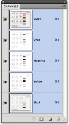 |
| Figure 12.37 Here is a view of the Channels panel showing the four CMYK channels after I had separated the screen grab shown in Figure 12.35 using a Maximum black generation CMYK separation. Notice how all the neutral gray information is contained in the Black channel only. This is a good separation method to use for screen grabs, but not so good for other types of images. |
Undercolor Addition (UCA)
Low key subjects and high quality print jobs are more suited to the use of GCR (Gray Component Replacement) with a small amount of UCA (Undercolor Addition). GCR separations remove more of the cyan, magenta and yellow ink where all three inks are used to produce a color, replacing the overlapping color with black ink. By dialing in some UCA one can add a small amount of color back into the shadows. This can be particularly useful where the shadow detail would otherwise look too flat and lifeless. The percentage of black ink used is determined by the black generation setting. When making conversions, you are usually better off sticking with the default GCR, using a light to medium black generation with 5–10% UCA. This will produce a longer black curve with improved image contrast.
Undercolor Removal (UCR)
The UCR (Undercolor Removal) separation method replaces the cyan, magenta and yellow ink with black ink in just the neutral areas. The UCR setting is also favored as a means of keeping the total ink percentage down on high-speed presses, although it is not necessarily suited for every type of print job.
Choosing a suitable RGB workspace
The RGB space you choose to edit with can certainly influence the outcome of your CMYK conversions, which is why you should choose your RGB workspace carefully. The default sRGB color space is widely regarded as an unsuitable space for photographic work because the color gamut of sRGB is actually smaller than the color gamut of CMYK (and that of most inkjet printers). If you choose a color space like Adobe RGB or ProPhoto RGB, you'll be working with a color space that can adequately convert from RGB to CMYK without significantly clipping the CMYK colors. Adobe RGB has long been a favoured space for professional photographers and you should really notice the difference here if you are able to view the photos you are editing on a decent display like the high-end Eizo or NEC displays I mentioned earlier in Chapter 2. These are capable of displaying something like 98% of the Adobe RGB gamut and therefore just about all the gamut of a typical CMYK space. It can make a big difference if you can use such a display to accurately preview the colors you are editing and soft proof them for print (see Chapter 13).
If you are converting photographic images from one color space to another, then you should mostly use the Relative Colorimetric or Perceptual rendering intents. Relative Colorimetric has always been the default Photoshop rendering intent and is still the best choice for most image conversions. However, if you are converting an image where it is important to preserve the shadow colors, then Perceptual will often work better. For these reasons, I recommend that you use the Soft proofing method described in the following chapter to preview the outcome of any profile conversion and check to see whether a Relative Colorimetric or Perceptual rendering will produce the best results.
Rendering intents
Whenever you make a profile conversion, such as when converting from RGB to CMYK, not all of the colors in the original source space will have a direct equivalent in the destination space. RGB spaces are mostly bigger than CMYK and therefore those RGB colors that are regarded as being ‘out of gamut’ will have to be translated to their nearest equivalent color in the destination CMYK space. The way this translation is calculated is determined by the rendering intent. In the Color Settings dialog you can choose which rendering intent you would like to use as the default method for all color mode conversions (Figure 12.38), but you can also override this setting and choose a different rendering intent whenever you use the Edit
Convert to Profile command (Figure 12.39), or soft proof an image using View
Proof Setup
Custom (Figure 12.40). I have provided here a guide to the four main rendering intents you'll find in Photoshop and their suggested uses.
Convert to Profile command (Figure 12.39), or soft proof an image using View
Proof Setup
Custom (Figure 12.40). I have provided here a guide to the four main rendering intents you'll find in Photoshop and their suggested uses.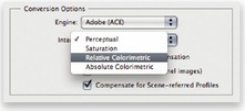 |
| Figure 12.38 |
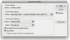 |
| Figure 12.39 |
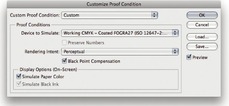 |
| Figure 12.40 |
Perceptual
Perceptual (Images) rendering is an all-round rendering method that is sometimes suitable for certain types of images. Perceptual rendering compresses the out-of-gamut colors into the gamut of the target space in a rather generalized way (so that they don't become clipped), while preserving the visual relationship between those colors. More compression occurs with the out-of-gamut colors, smoothly ramping to no compression for the in-gamut colors. Perceptual rendering provides a best guess method for converting out-of-gamut colors where it is important to preserve tonal separation (such as in the shadow detail areas), but it is less suitable for images that happen to have fewer out-of-gamut colors.
Saturation (Graphics)
The Saturation rendering intent preserves the saturation of the out-of-gamut colors at the expense of hue and lightness. Saturation rendering preserves the saturation of colors making them appear as vivid as possible after the conversion. This rendering intent is best suited to the conversion of business graphic presentations where retaining bright bold colors is of prime importance.
Relative Colorimetric
Relative Colorimetric is the default rendering intent utilized in the Photoshop color settings. Relative Colorimetric rendering maps the colors that are out of gamut in the source color space (relative to the target space) to the nearest ‘in-gamut’ equivalent in the target space. When doing an RGB to CMYK conversion, an out-of-gamut blue will be rendered the same CMYK value as a ‘just-in-gamut’ blue and out-of-gamut RGB colors are therefore clipped (see the example over the page in Figure 12.41). This can be a problem when attempting to convert the more extreme out-of-gamut RGB colors to CMYK color, but if you are using View
Proof Setup
Custom (Figure 12.40) to call up the Customize Proof Condition dialog you can check to see if this potential gamut clipping will cause the loss of any important image detail when converting to CMYK with a Relative Colorimetric conversion.
Proof Setup
Custom (Figure 12.40) to call up the Customize Proof Condition dialog you can check to see if this potential gamut clipping will cause the loss of any important image detail when converting to CMYK with a Relative Colorimetric conversion.
Absolute Colorimetric
Absolute Colorimetric maps in-gamut colors exactly from one space to another with no adjustment made to the white and black points. This rendering intent can be used when you convert specific ‘signature colors’ and need to preserve the exact hue, saturation and brightness (such as the colors in a commercial logo design). This rendering intent is seemingly more relevant to the working needs of designers than photographers. However, you can use the Absolute Colorimetric rendering intent as a means of simulating a target CMYK output on a proofing device. Let's say you make a conversion from RGB to CMYK using either the Relative Colorimetric or Perceptual CMM and the target CMYK output is a newspaper color supplement printed on uncoated paper. If you use the Absolute Colorimetric rendering intent to convert these ‘targeted’ CMYK colors to the color space of the proofing device, the proof printer can reproduce a simulation of what the printed output on that stock will look like. Note that when you select the ‘Proof’ option in the Photoshop print dialog, the rendering intent menu appears grayed out. This is because an Absolute Colorimetric rendering is selected automatically (although the Print dialog doesn't actually show you this) in order to produce a simulated proof print.
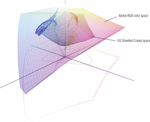 |
You should be aware that some repro companies operate what is known as a ‘closed-loop system’ where they edit files in CMYK and do not necessarily use a profiled workflow. This is something that may only affect high-end repro users of Photoshop and if this is the case, you may need to target the shadows manually according to the conditions of the printing press. The same is also true if you are editing a grayscale file in Photoshop that is going to print.
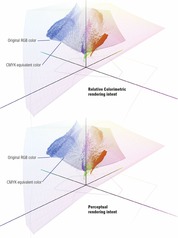 |
Fine-tuning the CMYK end points
You can use the black point and white point tools in the Levels or Curves adjustment dialogs to assign specific pixel values to the shadows and the highlights. Normally you can rely on an image mode conversion to adjust the shadow points for you, but there are certain situations where it may be desirable to fine-tune the endpoints manually, such as when you are working on grayscale images that are destined to be printed in a book, magazine or newspaper. It may also be necessary if the image is already in CMYK mode but is missing an embedded profile, but you know what the press output should be. Instead of relying on the profile conversion to assign the end points, you can assign these manually. The eyedropper tools can also be used to color correct an image and remove color casts from the shadows or highlights, plus the gray point tool can be used to assign a target gray color to the midtones (this was covered earlier in Chapter 5).
Let's now run through the basic steps for assigning the end points via the shadow point and highlight point tools. Before you do anything else, I suggest you select the eyedropper tool in the Tools panel and go to the eyedropper Options panel and set the Sample Size to 3 × 3 Average (or perhaps higher, such as 5 × 5 Average). Now open the Levels or Curves dialog. The default values for the shadow point and highlight point tools are 0% and 100%, but if you want to set the shadows and highlights in a grayscale or CMYK image for repro output, you will need to set these differently. The shadow point should obviously be higher than 0% (in order to take into account the dot gain) and may typically need to be set to 4%, while the highlight point for the non-specular highlights should be slightly darker than 100% (this ensures that the highlight detail will hold on the press) and should be set to around 96% or lower. This method of assigning the end points allows you to decide exactly where the highlight and shadow points should be. Bear in mind here that when setting the highlight clipping point it is only important to set the highlight clipping point to the value suggested here for the non-specular highlight areas, as was discussed earlier in Chapter 3 on pages 180–183. In the case of specular highlights, such as highlight reflections off metal surfaces, there is no need to worry about these being clipped to pure white.
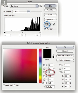
CMYK to CMYK
It is not ideal for CMYK files to be converted to RGB and then converted back to CMYK, as this is a sure-fire way to lose data fast. I always prefer to keep an RGB master of each image and convert to CMYK using a custom conversion to suit each individual print output. Converting from one CMYK space to another is not really recommended either, but in the absence of an RGB master, this will be the only option you have available: just specify the CMYK profile you wish to convert to in the Convert to Profile dialog box. Remember, the Preserve Embedded Profiles policy ensures that tagged incoming CMYK files can always be opened without converting them to your default CMYK space (because that would be a bad thing to do). This means that the color numbers in the incoming CMYK files are always preserved, while providing you with an accurate display of the colors on the computer display.
Lab color
The Lab color mode is available as a color mode to convert to via the Image
Mode menu and the Convert to Profile command, but note that the Lab color space does not use embedded profiles since it is assumed to be a universally understood color space. It is argued by some that converting to Lab mode is one way to surmount all the problems of mismatched RGB color spaces. You could make this work, so long as you didn't actually do anything to edit the image while it was in Lab mode, but I wouldn't really advise this. In fact, these days I see less and less reason to use the Lab color mode in Photoshop. Now, a few people have taken me to task over not covering Lab mode image editing in this book, so let me clarify why I don't see editing in Lab mode as being so useful now for high-end image editing. In the early days of Photoshop I would sometimes use the Lab color mode to carry out certain tasks, such as sharpening the Lightness channel separately. This was before the introduction of layers and blending modes, where I soon learnt that you could use the Luminosity and Color blend modes to neatly target the luminosity or the color values in an image without having to convert to Lab mode and back to RGB again. While it is true that Luminosity blend mode sharpening is not exactly the same as sharpening the Lightness channel, such arguments have been further superseded by the latest improvements to Camera Raw sharpening, where it is now possible to filter the luminance sharpening using the Detail and Masking sliders (see Chapter 4).
Mode menu and the Convert to Profile command, but note that the Lab color space does not use embedded profiles since it is assumed to be a universally understood color space. It is argued by some that converting to Lab mode is one way to surmount all the problems of mismatched RGB color spaces. You could make this work, so long as you didn't actually do anything to edit the image while it was in Lab mode, but I wouldn't really advise this. In fact, these days I see less and less reason to use the Lab color mode in Photoshop. Now, a few people have taken me to task over not covering Lab mode image editing in this book, so let me clarify why I don't see editing in Lab mode as being so useful now for high-end image editing. In the early days of Photoshop I would sometimes use the Lab color mode to carry out certain tasks, such as sharpening the Lightness channel separately. This was before the introduction of layers and blending modes, where I soon learnt that you could use the Luminosity and Color blend modes to neatly target the luminosity or the color values in an image without having to convert to Lab mode and back to RGB again. While it is true that Luminosity blend mode sharpening is not exactly the same as sharpening the Lightness channel, such arguments have been further superseded by the latest improvements to Camera Raw sharpening, where it is now possible to filter the luminance sharpening using the Detail and Masking sliders (see Chapter 4).Let's just say that there are no right or wrong answers here. If you can produce good-looking prints using whatever methods work best for you, and you are happy with the results, well who can argue with that? However, I would hope by now that having learnt about optimizing tones and colors in Camera Raw, followed by what can be achieved using Photoshop, you'll realize that these are all the tools you'll ever need to process a photograph all the way through to the finished print stage. My response to the Lab color argument is that it is simply adding complexity where none is needed. There are good reasons why in recent years the Adobe engineering teams have devoted considerable effort to enhancing the Camera Raw image editing for Photoshop and Lightroom. Their aim has been to make photographic image editing more versatile, less destructive and above all, simpler to work with.
Info panel
Given the deficiencies of typical computer color displays, such as their limited dynamic range and inability to reproduce certain colors like pure yellow, color professionals may sometimes rely on the numeric information to assess an image. Certainly, when it comes to getting the correct output of neutral tones, it is possible to predict with greater accuracy the neutrality of a gray tone by measuring the color values with the eyedropper tool. If you use the eyedropper tool to measure the colors in an image that's in a standard RGB space, such as sRGB, Adobe RGB or ProPhoto RGB, and the RGB numbers are all equal, it is unquestionably a gray color (see Figure 12.42). Interpreting the CMYK ink values is not so straightforward. This is because a neutral CMYK gray is not made up of an equal amount of cyan, yellow and magenta. If you compare the Color readout values between the RGB and CMYK Info panel readouts, there will always be more cyan ink used in the neutral tones, compared with the yellow and magenta inks. This is because a greater proportion of cyan ink is required to balance out the magenta and yellow inks to produce a neutral gray color in print (if the CMY values were equal, you would see a color cast). This is due to the fact that the process cyan ink is less able to absorb its complementary color – red – compared with the way magenta and yellow absorb their complementary colors. This also explains why a CMY black will tend to look reddish/brown, without the help of the black plate being present to add depth and neutrality.
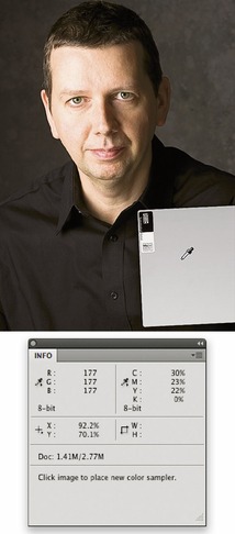
When you are retouching a portrait (such as in Figure 12.43), you can use the Info panel CMYK readout numbers to help judge if the skin tones are the right color. Set the panel options to display RGB and CMYK readouts. Then use the eyedropper to measure the skin tone values. Caucasian skin tones should have roughly a third or a quarter as much cyan as magenta and slightly more yellow than magenta. Black skin tones should be denser, have the same proportion of cyan to magenta, but usually a higher amount of yellow than magenta and also some black.

Keeping it simple
Congratulations on making it through to the end of this chapter. Your head may be reeling from all this information about Photoshop's color management system, but successful color management doesn't have to be complex. Firstly, you need to set the Color Settings to the prepress setting for your geographic region. This single step configures the color management system with the best defaults for photographic work. The other thing you must do of course is to calibrate and profile the display. As I have said before, if you want to do this right, you owe it to yourself to purchase a decent colorimeter device and ensure the computer display is profiled regularly. Do just these few things and you are well on your way to achieving a reliable color management workflow.