Chapter 2. Configuring Photoshop
In order to get the best performance out of Photoshop, you need to ensure that your computer system has been optimized for image editing work. When I first began writing the ‘Photoshop for Photographers’ series of books, it was always necessary to guide readers on how to buy the most suitable computer for Photoshop work and what hardware specifications to look for. These days I would suggest that almost any computer you buy is now capable of running Photoshop and can be upgraded later to run Photoshop faster. As always, I try to avoid making distinctions between the superiority of the Macintosh or PC systems. If you are an experienced computer user, you know what works best for you and I see no reason to evangelize my preference for using a Mac. All I'll say on this subject is that throughout my computer career, the Mac is what I have grown up with and it feels like home. The same argument would apply if I had always been a Windows PC user. This shouldn't be a big deal. Apart from anything else, once you have bought a bunch of programs, you are kind of locked into using that particular system and, if you switch, you face the prospect of having to buy most of your favorite software packages all over again.
It is well worth installing as much RAM memory as possible in your computer, as the RAM figures quoted here are the minimum recommended amounts. Personally, I would advise installing at least 4
GB RAM if you can. If you are working with a 32-bit operating system you can only install a 32-bit version of Photoshop CS5 and allocate up to 4
GB (less whatever the operating system frameworks take up, so effectively up to around 3.5
GB). However, 64-bit processing is now the new standard for the latest computer hardware and if you are running a 64-bit operating system, you can install a 64-bit version of Photoshop CS5, which offers the key benefit of letting you take advantage of having more than 4
GB of RAM memory installed in your computer. This has the potential to boost the speed for some operations (like the time it takes to open large documents).
For more information on this subject, check out Scott Byer's Adobe blog: http://tiny.cc/qDSRS, as well as John Nack's coverage of this topic at: http://tiny.cc/aNqcP.
What you will need
Today's entry level computers contain everything you need to get started running Photoshop, but here is a guide to the minimum system requirements for Macintosh and Windows system computers.
Macintosh
Photoshop CS5 can only be run on the latest Intel-based Macs running Mac OS 10.5 or later including Snow Leopard® (10.6). The minimum RAM requirement is 1
GB (but more RAM memory is recommended), plus Photoshop CS5 requires an estimated 2
GB of free hard disk space to install the program. You will also need a computer display with at least a 1024 × 768 pixel resolution driven by a 16-bit (or greater) graphics card with at least 256
MB video RAM, plus you will also need a DVD drive. All the current range of Apple Macintosh computers are capable of meeting these requirements, although with some of the older Intel Mac computers you may need to upgrade the video graphics card.
Windows
Photoshop CS5 can run on Intel Xeon, Xeon Dual, Centrino or Pentium 4 processors running Windows® XP with Service Pack 3 or higher, as well as Windows® Vista with Service Pack 1, Windows® Vista® 64-bit and Windows® 7. The minimum RAM requirement is 1
GB (but more is recommended) and Photoshop CS5 requires an estimated 1
GB of free hard disk space to install the program. You will also need a computer display with at least 1024 × 768 pixel resolution driven by a 16-bit (or greater) graphics card with at least 256
MB video RAM, plus you will also need a DVD drive. Almost any new PC system you buy should have no trouble meeting these requirements, but if you have an older computer system, do check that you have enough RAM memory and a powerful enough graphics card.
The ideal computer setup
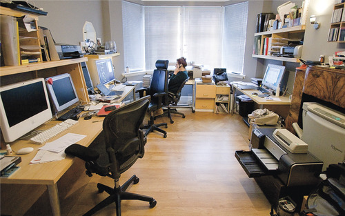
Your computer working environment is important. Even if space is limited there is much you can do to make your work area an efficient place to work in. Figure 2.1 shows a general view of the office area from where I run my photography business and do all my Photoshop work and, as you can see, it allows three operators to work simultaneously. The desk unit was custom built to provide a large continuous worktop area with good cable management in order to minimize the number of stray leads hanging all over the place. The walls are painted neutral gray with paint I was able to get from a local hardware store, which when measured with a spectrophotometer is almost a perfect neutral color. The under shelf lighting uses cool fluorescent strips that bounce off behind the displays to avoid any light hitting the screens directly. The window is north east facing, so I never have too many problems with direct sunlight entering the room and what daylight does enter the office can be controlled using the venetian blinds. It is also important to choose operator chairs that are comfortable, ideally one with arm rests and adjustable seating positions so that your wrists can rest comfortably on the table top, and the monitor should be level with your line of view or slightly lower.
Microchip processing speed is expressed in megahertz, but performance speed also depends on the chip type. A 2
GHz Pentium class 4 chip is not as fast as a 2
GHz Intel Core Duo processor. Speed comparisons in terms of the number of megahertz are only valid between chips of the same series. Many of the latest computers are also enabled with twin processors or more, although having extra cores is mainly beneficial when running certain types of filter operations. Another crucial factor is the bus speed, which refers to the speed of data transfer from RAM memory to the CPU (the central processing unit, i.e. the chip). CPU performance can be restricted by slow system bus speeds, so faster is definitely better, especially for Photoshop work where large chunks of data are being processed.
Once you start building an imaging workstation, you will soon end up with lots of electrical devices. While these in themselves may not consume a huge amount of power, do take precautions against too many power leads trailing from a single power point. To prevent damage or loss of data from a sudden power cut, I suggest you place an uninterruptible power supply unit (UPS) between your computer and the mains source. These devices can also smooth out any voltage spikes or surges in the electricity supply.
Choosing a display
The display is one of the most important components in your computer setup. It is what you will spend all your time looking at as you work in Photoshop and you really don't want to economize by buying a cheap display that is unsuited for graphics use. The only ones you can buy these days are liquid crystal displays (LCDs), which range in size from the small screens used on laptop computers to the big 30″ desktop displays. An LCD display contains a translucent film of fixed-size liquid crystal elements that individually filter the color of a backlit, fluorescent light source. Therefore, the only hardware adjustment you can usually make is to adjust the brightness of the backlit screen. The contrast of an LCD is also fixed, but LCDs are generally more contrasty than CRT monitors ever were, which is not a bad thing when doing Photoshop work for print output.
Eizo have established themselves as offering the finest quality LCD displays for graphics use. The ColorEdge CG301 is the flagship model in the range. With a 30″ wide screen, it is capable of providing uniform screen display from edge to edge, encompasses the Adobe RGB gamut, and comes with ColorNavigator calibration software that can be used with X-Rite calibration devices. This display is more expensive than most, but is highly prized for its color fidelity.
Because LCDs are digital devices they tend to produce a more consistent color output, but they do still need to be calibrated and profiled of course. Once profiled though, the display's performance should remain fairly consistent over a long period of time. On the other hand, with some displays there may be some variance in the image appearance depending on the angle from which you view the display, which means that the color output of an LCD may only appear correct when the display is viewed front on. This very much depends on the design of the LCD display and the worst examples of this can be seen with ultra-thin laptop screens. However, the evenness of output from high quality desktop LCD screens is certainly a lot more consistent. The higher grade LCD screens do feature relatively good viewing angle consistency, are not too far off from providing a neutral color at a D65 white balance, and won't fluctuate much in performance. As with everything else in life, you get what you pay for.
The NEC LCD3090 30″ display has won a lot of praise from industry color gurus and is what I use as my main display. This display is a huge improvement upon the old, 30″ Apple Cinema display which I now use as the secondary monitor. Meanwhile, Apple's passion for glossy displays means that their newer displays are actually worse than the old ones. I have found it impossible to calibrate the new iMac displays and make them useable for Photoshop image editing. The only viable solution has been to run a secondary display off the iMac I take on location, which kind of defeats the reason for having an iMac in the first place!
Wide dynamic range displays
It is interesting to speculate what computer displays will be like in the future. Dolby recently acquired BrightSide Technologies who developed an LCD display that uses a matrix of LED lights instead of a fluorescent light source to pass light through the LCD film (Figure 2.2). These displays have an incredible dynamic range and are capable of displaying a 16-bit per channel image with an illumination range that makes an ordinary 8-bit display look dull and flat by comparison. We may one day even see display technologies that can get closer to simulating the dynamic range of natural light. These will be great for viewing computer games and video, but for Photoshop print work we will want the display we are looking at to match our expectations of what can be reproduced on a print.
Video cards
The graphics card in your computer is what drives the display. It processes all the pixel information and converts it to draw the color image that's seen on the display. An accelerated graphics card enables you to do several things. It allows you to run your display at higher screen resolutions and hold more image display view data in memory, and it uses the display profile information to finely adjust the color appearance. When more of the off-screen image data remains in video memory the image scrolling is enhanced and this generally provides faster display refreshes. In the old days, computers would be sold with a limited amount of video memory and if you were lucky you could just about manage to run a small display in millions of colors. When you buy a computer today the chances are that it will already be equipped with a good, high performance graphics card that is easily capable of meeting all your needs. A video card will probably have at least 256
MB of dedicated memory, which is enough to satisfy the minimum requirements for Photoshop CS5. However, with the advent of the latest OpenGL features, it is now worth considering video cards that were previously considered only necessary for gaming and 3D work. Check the Adobe Help site to find out which cards are designated as being compatible for Photoshop CS5 and OpenGL.
If you do want to take advantage of what OpenGL can offer in Photoshop, it might be necessary for you to purchase a new video card. At the time of writing, there is a long list of the video cards that are capable of providing OpenGL support in Photoshop CS5 for Mac OS X 10.5 (or later), Windows Vista and limited support for Windows XP and Windows 7. Adobe do list the GPU cards that are recommended for Photoshop use, but it is difficult though to point to any one group of cards and say these are best. This is because the OpenGL performance in Photoshop is down to not just the card, but also the computer platform and operating system used. For example, a great many Mac Pro users such as myself will have been using NVIDIA GeForce 7300 GT video cards to drive their displays. These were the default cards Apple installed for a while. Although the 7300 GT is regarded as being compatible with Photoshop CS4 and CS5, they happen to perform OpenGL tasks rather poorly. Therefore, the impression gained by a lot of Mac users has been that OpenGL isn't particularly fast. Fortunately, the later Mac Pro computers now offer a better choice of video cards. As a general rule you can assume that more on-board memory indicates better graphics processing power, but you might also want to check out anecdotal evidence of what other Photoshop users find works best for them with their particular computers and operating systems.
Display calibration and profiling
We now need to focus on what is the most important aspect of any Photoshop system: getting the display to show your images in Photoshop correctly and ensuring that the display colors can be relied upon to match the print output. This basic advice should be self-evident, because we all want our images in Photoshop to be consistent from session to session and match in appearance when they are viewed on another user's system.
The initial calibration process should get your display close to an idealized state. The next step is to build a display profile that describes how well the display actually performs after it has been calibrated, which at a minimum describes the white point and chosen gamma. The more advanced LCD displays such as the Eizo ColorEdge and NEC LCD3090 do provide hardware calibration for a more consistent and standardized output, but the only adjustment you can make on most LCD displays is to adjust the brightness.
Calibration hardware
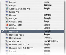
Let's now look at the practical steps for calibrating your display. First, get rid of any distracting background colors or patterns on the computer desktop. Consider choosing a neutral color theme for your operating system (the Mac OS X system has a graphite appearance setting especially for Photoshop users!) If you are using a PC, go to Control Panels
 Appearance
Themes, choose Display and click the Appearance tab (Figure 2.3). Click on the active and inactive window samples and choose a gray color for both. If you are using Windows XP, try choosing the silver color scheme. This is all very subjective of course, but personally I think these adjustments improve the look of both operating systems.
Appearance
Themes, choose Display and click the Appearance tab (Figure 2.3). Click on the active and inactive window samples and choose a gray color for both. If you are using Windows XP, try choosing the silver color scheme. This is all very subjective of course, but personally I think these adjustments improve the look of both operating systems.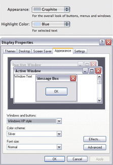 |
| Figure 2.3 |
The only reliable way to calibrate and profile your display is by using a hardware calibration system. Some displays, such as the LaCie range, can be bought with a bundled hardware calibrator, but there are many other types of stand-alone calibration packages to consider. The ColorVision Monitor Spyder and Spyder2Pro Studio are affordable and are sold either with PhotoCal or the more advanced OptiCal software. Colorimeter devices can only be used to measure the output from a display. Unlike the more expensive spectraphotometers, you can't use them to measure print targets, but when it comes to profiling a display they are just as good.
 |
| 1. |
| An uncalibrated and unprofiled display cannot be relied on to provide an accurate indication of how colors should look.
|
 |
| 2. |
| The calibration process simply aims to optimize the display for brightness and get the luminance within a desired range.
|
 |
| 3. |
| The profiling process takes into account the target white balance and gamma. The profiling process also measures how a broad range of colors are displayed.
|
The X-Rite product range includes the i1 system which is available in several different packages. The i1 Photo (Figure 2.4) is an emissive spectrophotometer that can measure all types of displays and build printer profiles too when used in conjunction with the ProfileMaker 5 or i1 Match software, while the EZ Color is a low cost colorimeter device bundled with the i1 Display 2 software. The newest product in their range is the ColorMunki Photo, which is an integrated calibration/profiling device that can work with everything, including LCD beamer projectors.
 |
| Figure 2.4 |
If all you are interested in is calibrating and profiling a computer display, there is no great advantage in choosing a spectrophotometer over the more economically priced colorimeter devices. Whatever you do, I certainly advise you to include a calibrator/software package with any display purchase.
The calibration/profiling procedure
Over the next few pages I have shown how to use the i1Match 3.6.2 software with an X-Rite monitor calibration device and described the steps that would be used for an advanced display calibration. Other calibration software packages will differ of course, but the basic principles should be similar to other software programs. The first step is to select the type of device you want to calibrate (in this instance, an LCD display) and then select the Basic or Advanced options.
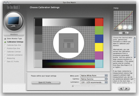
White point
The white point information tells the video card how to display a pure white on the screen so that it matches a specific color temperature. Unlike the old CRT displays, it is not possible to physically adjust the white point of an LCD screen. For this reason, it is usually better to select the native white point option when calibrating an LCD display (as shown in Figure 2.5), rather than calibrate to a prescribed white point value. Remember that all colors are seen relative to what is perceived to be the whitest white in a scene and the eye will naturally compensate from the white point seen on the display to the white point used by an alternative viewing light source (see accompanying sidebar on the white point setup).
 |
| Figure 2.5 |
There is a lot of seemingly conflicting advice out there on how to set the white point in a calibration setup. In the days when CRT displays were popular there was a choice to be made between a 5000K and a 6500K white point for print work. My advice then was to use 6500K, since most CRT displays would run naturally at a white point of 6500K, although some people regarded 5000K as being the correct value to use for CMYK proofing work. In reality though, the whites on your display would appear far too yellow at this setting. 6500K may have been cooler than the assumed 5000K standard, but 6500K proved to be much better for image editing viewing. These days, most LCD displays have a native color temperature that is around 6000–7000K and it is now considered best to choose the native white point when calibrating and profiling an LCD display.
The main thing to remember here is that your eyes adjust quite naturally to the white point color of any display, in the same way as your eyes constantly adjust to the fluctuations in color temperature of everyday lighting conditions. Therefore, your eyes will judge all colors relative to the color of the whitest white, so the apparent disparity of using a white point for the display that is not exactly the same as that of a calibrated viewing lightbox is not something you should worry about. As I say, when it comes to comparing colors, your eyes will naturally adapt as they move from the screen to the viewing lightbox.
Gamma
The gamma setting tells the video card how much to adjust the midtone levels compensation. You typically have three options to choose from here: 1.8, 2.2 or Native Gamma. Quite often you are told that PC users should use 2.2 gamma and Macintosh users should use 1.8 gamma. But 2.2 can be considered the ideal gamma setting to use regardless of whether you are on a Mac or a PC. You can build a correct display profile using a 1.8 gamma option, but 2.2 is closer to the native gamma of most displays. However, in Figure 2.5 you can see that I actually selected the ‘Native Gamma’ option. Most LCD screens have a native gamma that is fairly close to 2.2 anyway, and if you choose ‘Native’ rather than 2.2 you can create a satisfactory display profile without forcing the video card to stretch the display levels any more than is necessary.
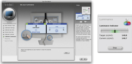
Luminance
You need to make sure that the brightness of the LCD display is within an acceptable luminance range. The target luminance will vary according to which type of display you are using and a typical modern LCD display will have a luminance of 250 candelas m
2 or more at its maximum luminance setting, which is way too bright for image editing work in subdued office lighting conditions. A target of around 120–140 candelas m
2 is ideal for a desktop LCD display and for laptops the ideal luminance to aim for is around 100–110 CD m
2.
Note that the gamma you choose when creating a display profile does not affect how light or dark an image will be displayed in Photoshop. This is because the display profile gamma only affects how the midtone levels are distributed. Whether you use a Mac or PC computer, you should ideally choose the Native Gamma or a gamma of 2.2.
It is important to note that as displays get older they do tend to lose brightness, which is one of the reasons why you will need to use a calibration device like the X-Rite i1 Photo shown in Figure 2.4, to recalibrate from time to time. There may also come a point where the display becomes so dim that it can no longer be successfully calibrated or considered reliable enough for Photoshop image editing.
The link between 1.8 gamma and the Macintosh system dates back to the early days of Macintosh computing when the only printer you could use with the Mac was an Apple black and white laser printer. At the time, it was suggested that the best way to match the screen appearance to the printer was to set the monitor gamma to 1.8. I once asked an engineer who designs display calibration software why they still included 1.8 gamma as an option and he replied that it's only there to comfort Mac users who have traditionally been taught to use 1.8. So now you know.
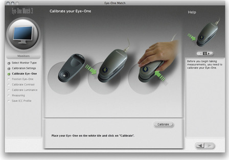
Device calibration and measurement
With the i1Match software you will be asked to calibrate the device (Figure 2.6) before proceeding to measure the brightness of the display (Figure 2.7). It is at this stage that the Luminance indicator appears and you can tweak the display brightness until the target luminance is reached.
 |
| Figure 2.6 |
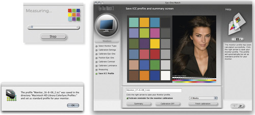
The profiling process
When you click on the forward arrow button in Figure 2.7, i1Match will start flashing a series of colors on the screen, while the calibration device measures them. Once it has completed doing this, it generates a display profile named with today's date. All you have to do then is click OK to establish this as the new display profile to use so that it replaces the previous display profile. You might also want to set a reminder for when the next monitor profile should be made. With LCD displays, regular calibration is not quite so critical and it will probably be enough for you to profile the display just once a month or so. Also, do you really need to hang on to old display profiles? I recommend that you purge the Colorsync Profiles folder on your system of older display profiles to avoid confusion. All you really need is one good up-to-date profile for each display.
These days, some LCD displays can be way too bright for digital imaging work. I recently tried to calibrate one of the new glossy Apple displays and measured a brightness of 250 candelas m
2 at the minimum brightness setting. Brand new LCD displays do lose their brightness after 100 hours or so of use, which may make them become more useable. However, some of the new glossy displays appear to be incapable of revealing detail in the extreme highlight range. The thing is, these types of displays may look great for playing video games and watching TV, but they are not ideal for image editing work. This isn't just a problem with Apple, there are lots of unsuitable displays out there, which is why I now recommend purchasing a display that is specifically designed with digital image editing in mind.
Do you want good color or just OK color?
Let me summarize in a few paragraphs why you should pay special attention to how your images are displayed in Photoshop and why good color management is essential.
These days the only real option is to buy a good quality LCD display that is designed for graphic use. Once you have chosen a good display you need to consider how you are going to calibrate and profile it. This is crucial and if done right it means you can trust the colors you see on the display when determining what the print output will look like. In the long run you are going to save yourself an awful lot of time and frustration if you calibrate and profile the display properly right from the start. Not so long ago the price of a large display, plus a decent video card, would have cost a small fortune and display calibrators were considered specialist items. These days, a basic display calibration and profiling device can cost about the same as a medium-sized external hard drive, so I would urge anyone setting up a computer system for Photoshop to put a display calibrator and accompanying software package high on their spending list.
All the display calibrator products I have tested will automatically place the generated display profile in the correct system folder so that you are ready to start working straight away in Photoshop, with your display properly calibrated and with the knowledge that Photoshop automatically knows how to read the profile you have just created.
Another option is to use a non-device calibration method, such as the Display Calibration Assistant that is part of the Mac OS X operating system. This is better than doing nothing, but is still not a proper substitute for proper hardware calibration and profiling. If you don't invest in a calibration/measuring device, your only other option is to load a canned profile for the display and keep your fingers crossed. This approach is better than doing nothing, but rarely all that successful, so I would still urge you to consider buying a proper calibration device and software package.
Color management settings
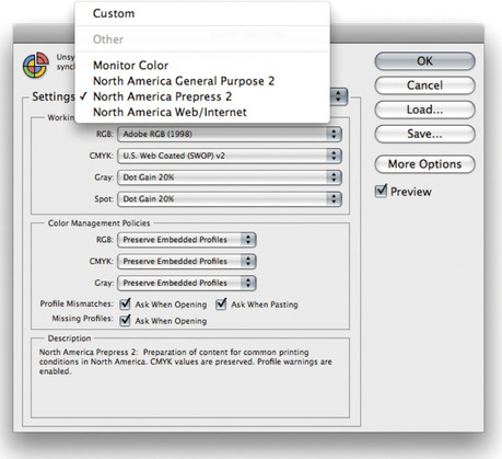
One of the very first things you should do after installing Photoshop is to adjust the color management settings. The default Photoshop Color Settings are configured using a general setting for the region you live in, which will be: North America, Europe or Japan. If you are using Photoshop for design work or photography, you will want to change this to a regional ‘prepress’ setting. Go to the Edit menu and select Color Settings, which opens the dialog shown in Figure 2.9. Next, go to the Settings menu and select one of the prepress settings. The individual prepress settings only differ in the default RGB to CMYK conversions that are used, and these will depend on the geographical area you are working in (I also suggest you check out pages 647–648 for instructions on how to check if you are using the right settings for a photography setup). So if you live and work in the US, choose North America Prepress 2 and you will mostly be fine with that setting. Please note that choosing a prepress setting changes the RGB working space from sRGB to Adobe RGB. This is a good thing to do if you intend editing RGB photographs in Photoshop (although I would personally recommend using ProPhoto RGB). The prepress settings also adjust the policy settings so as to preserve embedded profiles and alert you whenever there is a profile mismatch. I would also suggest you turn off the ‘Ask When Opening’ option in the Profile Mismatches section. This minimizes the number of times you are shown the profile mismatch warning dialog when working with image files that are in different color spaces. When you customize the color settings presets in this way, the preset menu will say ‘Custom’. I suggest that you then save and name this preset so that these settings are easy to access in future.
 |
| Figure 2.9 The Photoshop Color Settings. All the Photoshop color settings can be managed from within this single dialog (
 ) and shared with other Creative Suite applications (see Figure 2.10). ) and shared with other Creative Suite applications (see Figure 2.10). |
This leaves the question of how to profile the print output? Getting custom profiles built for your printer is a good idea, and it is a topic that I'll be covering in some detail in Chapter 12. However, calibrating and building a profile for your display is by far the most important first step in the whole color management process. Get this right and the canned profiles that came with your printer should work just fine. Follow these instructions and you should get a much closer match between what you see on the display and what you see coming out of your printer. Although without doubt, a custom print profile will help you get even better results.
Once this is done, the Color Settings will remain set until you change them. After that, all you need to worry about is making sure that the calibration and profile for your display are kept up-to-date. You don't need to worry too much more about the ins and outs of Photoshop color management just yet, but as your Photoshop knowledge increases you will definitely want to read in more detail about the color management system in Chapter 12 as well as Chapter 13 on print output. Color management does not have to be intimidatingly complex, nor does it have to be expensive. So the question is, do you want good color or simply OK color? Or, to put it another way, can you afford not to?
Synchronizing the Color Settings
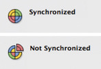
If you are using other programs that are part of the Adobe Creative Suite, such as Illustrator and InDesign, it is a good idea to keep the Color Settings synchronized across all of these programs (see Figure 2.10). Once you have selected a desired color setting in Photoshop, I suggest you open Bridge and synchronize the Color Settings there too. This ensures that the same color settings are used throughout all the other programs in the Creative Suite.
Extras
An internal 16× or faster DVD/CD drive is usually fitted as standard in most computers. Devices such as a graphics tablet, external hard drive and other peripheral devices can be connected using one of the following interface connection methods.
USB is a universal interface connection for Mac and PC. The older USB 1 connection was regarded as being very slow, but the newer USB 2 interface connection is more universal and faster, especially for those working on a PC system. You can have up to 127 USB devices linked to a single computer and you can plug and unplug a USB device while the machine is switched on. FireWire also has the potential to provide fast data transfer rates of 49
MB per second (and is faster still using FireWire 800) and is popular with Macintosh users.
I highly recommend you get a digitizing graphics tablet like the one shown in Figure 2.11. This is a pressure responsive device which makes drawing easier and can be used alongside the mouse as an input device. Bigger is not necessarily better though. Some people like using the A4 sized tablets, while others find it easier to work with an A5 or A6 tablet. You don't have to move the pen around so much with smaller pads and these are therefore easier to use for painting and drawing. Once you have experienced working with a pen, using the mouse is like trying to draw while wearing boxing gloves! The latest Wacom Intuos™ range now features a cordless mouse with switchable pens, and the Wacom Cintiq™ device is a combination of LCD monitor and digitizing pen pad. This radical new design will potentially introduce a whole new concept to the way we interact with the on-screen image. I don't know if it is going to be generally seen as the ideal way of working with photographs, but there are those who reckon it makes painting and drawing a more fluid experience.

Backing up your image data
The Mac and PC operating systems encourage you to place all your image files in the users ‘Pictures’ or ‘My Pictures’ folder. This might work fine if all you are shooting are JPEG snaps, but it is unlikely to suffice once you start capturing lots of raw images. So your first consideration should be to store your image files on hard drives that have plenty enough capacity to anticipate your image storage needs for at least the next year or two. The next thing you need to consider is how accessible is your image data? Suppose a power supply unit failure or some other glitch prevented you from turning on the computer? For this reason I find it is helpful to store important image data on drives that can easily be accessed and removed. One solution is to store your data on separate internal hard drives where the drive caddies can easily be swapped over to the internal bay of another computer. Or, you can store the data on external hard drive units that can simply be plugged in to another computer.
The next thing is to implement a backup strategy for your images and other important data files. For each main hard drive you should have at least one matching sized external hard drive that you can regularly back up the data to. These hard drives should be kept somewhere safe so that in case of a fire or theft you have access to recently backed up versions of all your essential data. One suggestion is to have two external backup drives for each main drive. That way you can swap over the backup drives and continually have a secondary backup version stored permanently off-site or kept in a fireproof safe.
For more detailed information on how to back up your files, please refer to Chapter 11 on image management.
In the lifetime of the Photoshop program we have seen many different storage systems come and go: floppy disks, Syquests, Magneto Opticals… the list goes on. Although you can still obtain devices that are capable of reading these media formats, the question is, for how long? What will you do in the future if a specific hardware device fails to work? The introduction of recordable CD/DVD media has provided a reasonably consistent means of storage and for the last 14 years nearly all computers have been able to read CD and DVD discs. DVD drives have also evolved to provide much faster read/write speeds and DVD media may be able to offer increased storage space in the future. We are already seeing bigger disc media storage systems such as Blu-ray Disc make an impact. So how long will CD and DVD media remain popular and be supported by future computer hardware devices? More to the point, how long will the media discs themselves last? It is estimated that aluminium and gold CD discs could last up to 30 years, or longer, if stored carefully in the right conditions, such as at the right temperature and away from direct sunlight, while DVD discs that use vegetable dyes may have a shorter lifespan. I wouldn't bet on DVD or Blu-ray media providing a long-term archive solution, but even so, I reckon it is worth keeping extra backups of your data on such media. The one advantage write-once media has over hard drive storage is that your data is protected from the prospect of any virus attacks. If a virus were to infect your computer and damage your data files, a backup procedure might simply copy the damage over to the backup disks.
Photoshop preferences
The Photoshop preferences are located in the Edit menu in Windows and the Photoshop menu in OS X; these let you customize the various Photoshop functions. A new preference file is generated each time you exit Photoshop, and deleting or removing this file will force Photoshop to reset all of its preference settings. The preference file is stored along with other program settings in the system level Preferences folder (Mac) or C:/Documents and Settings/Current User/Application Data/Adobe/Photoshop/11.0/Adobe Photoshop CS5 Settings (PC).
General preferences
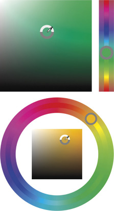
When you open the preferences you will first be shown the General preferences (Figure 2.13). I suggest you leave the Color Picker set to ‘Adobe’ (unless you have a strong attachment to the system Color Picker). Photoshop CS5 now features new HUD (Heads Up Display) Color Picker options for selecting new colors when working with the eyedropper or paint tools (Figure 2.12). Note that the HUD Color Picker is only accessible when OpenGL drawing is enabled (see page 110). In the Image Interpolation options I suggest you leave this set to ‘Bicubic’. If you need to override this setting then you can always do so in the Image
Image Size dialog.
Image Size dialog.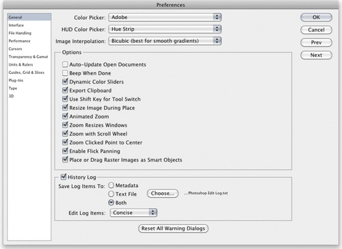


After configuring the preference settings I suggest you make a duplicate of the Photoshop preference file and store it somewhere safe. Having ready access to a clean preference file can speed up resetting the Photoshop settings should the working preference file become corrupted.
In the main Options section, ‘Auto-Update Open Documents’ can be used if you know you are likely to share files that are open in Photoshop but have been updated by another application. It used to be important when ImageReady was provided as a separate Web editing program to accompany Photoshop, but has less relevance now and can be left switched off. Only check the Beep When Done box if you want Photoshop to signal a sound alert each time a task is completed. The ‘Dynamic Color Sliders’ option ensures that the colors change in the Color panel as you drag the sliders, so keep this selected. If you need to be able to paste the Photoshop clipboard contents to another program after you exit Photoshop, then leave the Export Clipboard box checked. Otherwise, I suggest you switch this off. The ‘Use Shift Key for Tool Switch’ option answers the needs of those users who wish to disable using the
 key modifier for switching tools in the Tools panel with repeated keystrokes (see page 30). The ‘Resize Image During Place’ is useful if you want placed items to be automatically scaled to match the size of the image you are pasting/placing them in (see sidebar). The ‘Animated Zoom’ option is another OpenGL only option, which is intended to provide smoother transitions on screen when using the
 or
or
 keys to zoom in or out. Also, check the ‘Zoom Resizes Windows’ option if you want the image window to shrink to fit whenever you use a keyboard zoom shortcut such as
or
. Then there is the ‘Zoom with Scroll Wheel’ option which enables you to zoom in and out using the scroll wheel on a mouse (when this option is selected, holding down the
key makes the zoom operate quicker). Instead of selecting this option you can also hold down the
keys to zoom in or out. Also, check the ‘Zoom Resizes Windows’ option if you want the image window to shrink to fit whenever you use a keyboard zoom shortcut such as
or
. Then there is the ‘Zoom with Scroll Wheel’ option which enables you to zoom in and out using the scroll wheel on a mouse (when this option is selected, holding down the
key makes the zoom operate quicker). Instead of selecting this option you can also hold down the
 key to temporarily access the zoom wheel behavior. When the ‘Zoom Clicked Point to Center’ option is checked, the image zooms in centered around the point where you click; the best way to understand the distinction between having this option on or off is to see what happens when you click to zoom in on the corner of a photo. When checked, the corner point of the photo will keep recentering as you zoom in. I discussed the ‘Flick panning’ option earlier in Chapter 1, on page 57. This again is dependent on OpenGL being enabled for this option to take effect. ‘Place or Drag Raster Images as Smart Objects’ is new to Photoshop CS5 and does what it says. It allows you to drag a Photoshop compatible file directly from the Finder/Explorer or from Bridge to place it as a new layer in an open document.
key modifier for switching tools in the Tools panel with repeated keystrokes (see page 30). The ‘Resize Image During Place’ is useful if you want placed items to be automatically scaled to match the size of the image you are pasting/placing them in (see sidebar). The ‘Animated Zoom’ option is another OpenGL only option, which is intended to provide smoother transitions on screen when using the
or
keys to zoom in or out. Also, check the ‘Zoom Resizes Windows’ option if you want the image window to shrink to fit whenever you use a keyboard zoom shortcut such as
or
. Then there is the ‘Zoom with Scroll Wheel’ option which enables you to zoom in and out using the scroll wheel on a mouse (when this option is selected, holding down the
key makes the zoom operate quicker). Instead of selecting this option you can also hold down the
key to temporarily access the zoom wheel behavior. When the ‘Zoom Clicked Point to Center’ option is checked, the image zooms in centered around the point where you click; the best way to understand the distinction between having this option on or off is to see what happens when you click to zoom in on the corner of a photo. When checked, the corner point of the photo will keep recentering as you zoom in. I discussed the ‘Flick panning’ option earlier in Chapter 1, on page 57. This again is dependent on OpenGL being enabled for this option to take effect. ‘Place or Drag Raster Images as Smart Objects’ is new to Photoshop CS5 and does what it says. It allows you to drag a Photoshop compatible file directly from the Finder/Explorer or from Bridge to place it as a new layer in an open document.When the ‘Resize Image During Place’ preference item is checked, if you use File
Place… to place a photo in a document that is smaller than the placed image, the placed file is placed in a bounding box scaled to the dimensions of the target image. This can help speed up your workflow when pasting lots of documents, especially now that Photoshop CS5 allows you to drag and drop Photoshop compatible files to place them in an image.
Place… to place a photo in a document that is smaller than the placed image, the placed file is placed in a bounding box scaled to the dimensions of the target image. This can help speed up your workflow when pasting lots of documents, especially now that Photoshop CS5 allows you to drag and drop Photoshop compatible files to place them in an image.A history log is useful if you wish to keep track of everything that has been done to an image and the History Log options let you save the history log directly in the image file metadata, to a saved text file stored in a pre-configured folder location, or both. The edit log items can be recorded in three modes: ‘Sessions’ records which files are opened and closed and when. The ‘Concise’ mode records an abbreviated list of which tools or commands were applied (also recording times). Both these modes can provide basic feedback that could be useful in a studio environment to monitor the time spent on a particular project and to help calculate billing. The ‘Detailed’ mode records everything, such as the coordinates used to make a crop. This mode can be useful, for example, in forensic work.
You will often come across warning dialogs in Photoshop that contain a ‘Don't Warn Me Again’ checkbox. If you have at some stage clicked in these boxes to prevent a warning dialog appearing again you can undo this by clicking on the ‘Reset All Warning Dialogs’ button in the General preferences.
Interface preferences
If you refer to the screen view modes shown on page 60, you will see examples of two of the three main screen modes that are available in Photoshop. The outer canvas areas can be customized by selecting alternative colors via the Interface preferences (Figure 2.14). You can also adjust the border, which can be shown as a drop shadow, thin black line, or with the border style set to ‘None’. There is also another way you can set the canvas color, which has been around for a while (see sidebar: Canvas color and the paint bucket). The useful thing to know here is you can use these interface preference items as a way to quickly reset the default canvas and borders.
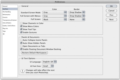
An alterative way to alter the color of the outer canvas area is to select the paint bucket tool, choose a new foreground color and hold down the
key as you click with the paint bucket in the canvas area. This replaces the existing canvas with the current foreground color.
key as you click with the paint bucket in the canvas area. This replaces the existing canvas with the current foreground color.The ‘Show Channels in Color’ option is a somewhat redundant feature as it does not really help you visualize the channels any better. If anything it is a distraction and best left unchecked.
LCD computer displays are getting bigger all the time and are only really designed to operate at their best when using the finest resolution setting. This can be great for viewing photographs, but the downside is that the application menu items are getting smaller and smaller. The ‘UI (user interface) Font Size’ option allows you to customize the size of the smaller font menu items in Photoshop so that you don't have to strain your eyes too hard to read them. For example, when using a large LCD screen, the ‘Medium’ font size option may make it easier to read the smaller font menu items from a distance.
Photoshop allows you to create custom menu settings and use colors to highlight favorite items, but this particular feature can be disabled by unchecking the ‘Show Menu Colors’ option. When ‘Show Tool Tips’ is checked a tool tips box will appear for a few seconds after you roll over various items in the Photoshop interface. Tool tips are an excellent learning tool, but they can become irritating after a while, so you can use this checkbox to turn them on or off as desired. The ‘Enable Gestures’ option is relevant to some laptop users, where the trackpad can be set to respond to specific finger gestures. This can be both a good or a bad thing: some users have found it rather distracting when carrying out Photoshop work and prefer to switch this option off.
In the Panels & Documents section, the ‘Auto-Collapse Iconic Panels’ option allows you to open panels from icon mode and auto-collapse them back to icon mode again as soon as you start editing an image, while ‘Auto-Show Hidden Panels’ reveals hidden panels on rollover.
When the ‘Open Documents as Tabs’ option is checked, new documents will always open as tabbed documents, docked to a single document window in the Photoshop workspace. Uncheck this if you wish to restore the previous Photoshop document opening behavior. When the ‘Enable Floating Document Window Docking’ option is checked, this allows you to drag one window to another as a tabbed document (see page 12).
The UI in the ‘UI Text Options’ stands for ‘user interface’ and these settings allow you to choose an alternative UI language (if available) and UI text size. The default setting is ‘Small’, which most users will find plenty big enough (especially now the panel headers kind of scream at you with the all caps lettering). For those fortunate to have very large, high resolution displays it can be helpful to increase the UI text size (see sidebar).
File Handling preferences
In the File Handling preferences (Figure 2.15) you will normally want to include image previews when you save a file. It is certainly useful to have image thumbnail previews that are viewable in the system dialog boxes, although the Bridge program is capable of generating large thumbnails regardless of whether a preview is present or not. You can also choose to save a Windows and Macintosh thumbnail with your file to enable better cross-platform compatibility. Appending a file with a file extension is handy for knowing which format a document was saved in and is absolutely necessary when saving JPEG and GIF web graphics that need to be recognized in an HTML page. If you are exporting for the Web, you may want to check the ‘Use Lower Case’ option for appending files. However, instances of where servers trip up on upper case naming are fairly rare these days. The ‘Save As to Original Folder’ option is useful if you want this to be the default option. It makes sure that you are always able to save new versions of an image to the same folder that the original file came from. If this option is left unchecked, Photoshop shows you the last used folder location when you choose File
Save As…
Save As…Adobe Version Cue® is a workgroup file management option that is included with the Creative Suite. Version Cue caters for those working in a networked environment, where two or more operators have shared network access to files that they will be working on using different programs within the Creative Suite. When a user ‘checks out’ a file, only he or she can edit it. The other users who have shared access to the files will only be able to make edit changes after the file has been checked back in. This precautionary file management system means that other users cannot overwrite a file while it is being edited. Version Cue now consists of two elements: the Version Cue Server and Adobe Drive. The Version Cue Server can be installed locally or on a dedicated computer and used to host Version Cue projects. Adobe Drive connects to the Version Cue servers, where the connected server appears as a hard drive in the Finder/Explorer as well as in the Open and Save As dialog boxes.
File compatibility
Photoshop CS3 allowed JPEG and TIFF images to open via Camera Raw, for the first time, as if they were raw files. A number of people had misgivings about this, partly because of the potential confusion it might cause, but also because of the way it was implemented in Photoshop CS3. For example, you had the Photoshop File Handling preferences doing one thing, plus another setting in the Bridge preferences, and there was no simple way to summarize how these should be configured in order to get JPEG or TIFF images to open up via Camera Raw the way you would expect. In fact, even fellow Photoshop experts were just as confused as everyone else as to how to manage the preference settings in these two different locations. To be honest, it was a bit of a mess, but things have been improved somewhat since then.
The ‘Prefer Adobe Camera Raw for Supported Raw Files’ option always launches Adobe Camera Raw as your favored raw processor when opening a proprietary raw file. Some cameras may embed an sRGB profile tag in the EXIF metadata of a JPEG capture file (where the profile used isn't a correct sRGB profile anyway). If you check the ‘Ignore EXIF profile tag’ option, Photoshop ignores this particular part of the metadata and reads from the (correct) embedded profile data instead.
Camera Raw preferences
You can click on the Camera Raw Preferences… button to open the dialog shown in Figure 2.16. At the bottom are the JPEG and TIFF Handling preferences where you have three options with which to decide how JPEG and TIFF images should be opened in Photoshop. These are now fairly easy to understand and predictable in their behavior. If ‘Disable JPEG (or TIFF) support’ is selected this safely takes you back to the way things were before, where all JPEG or TIFF files open in Photoshop directly. If ‘Automatically open all supported JPEGs (or TIFFs)’ is selected, this causes all supported JPEGs (or TIFFs) to always open via Camera Raw. However, if ‘Automatically open JPEGs (or TIFFs) with settings’ is selected, Photoshop only opens JPEG or TIFF images via Camera Raw
if they have previously been edited via Camera Raw. When this option is selected you have the option in Bridge to use a double-click to open a JPEG directly into Photoshop, or use
 to force JPEGs to open via Camera Raw. Note that when you edit a JPEG or TIFF in Camera Raw in this way, the next time you use a double-click to open, the file will now default to opening via Camera Raw.
to force JPEGs to open via Camera Raw. Note that when you edit a JPEG or TIFF in Camera Raw in this way, the next time you use a double-click to open, the file will now default to opening via Camera Raw.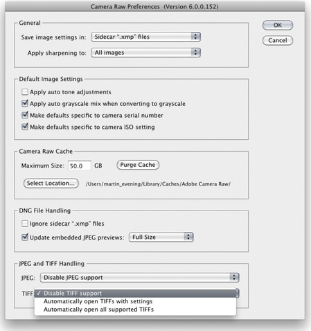
So why should you want to open JPEGs (or TIFFs for that matter) in Camera Raw? This is useful if you shoot in JPEG mode and wish to use Camera Raw to process the JPEG masters (as you would a raw capture image) without actually editing the master files. This is because Camera Raw records all the edits as separate instructions. The same argument applies to opening TIFF files via Camera Raw, but the important thing to note here is that Camera Raw can only open flattened TIFFs and cannot open TIFFs that contain saved layers. The main reason why it might be useful to use Camera Raw to open a TIFF image is if you want to process TIFF scan images via Camera Raw to take advantage of things like the capture sharpening controls in the Detail panel section.
Adobe InDesign allows you to place Photoshop format (PSD) files in a page layout, but, if you do so, the ‘Maximize PSD and PSB File Compatibility’ option must be checked in the File Handling preferences (in order to generate a flattened composite). If you use layered TIFF, PSD (or Photoshop PDF) files in your page layout workflow, you can modify the layers in Photoshop and the page design image preview will immediately be updated. This way you don't run the risk of losing synchronization between the master image that is used to make the Photoshop edits and a flattened version of the same image that is used solely for placing in the layout. If you want to ‘round trip’ your images this way, TIFF is the more universally recognized file format. The downside is that you may end up with bloated files and these can significantly increase the file transmission times. It so happens that a lot of the image files used in the production of this book have been placed as layered TIFF RGB files, which allows me to edit them easily in Photoshop. Keeping the files as layered RGBs is perfect at the text editing stage, but the final TIFF files that are used to go to press are all flattened CMYK TIFFs.
TIFF and PSD options
A TIFF format file saved in Photoshop 6.0 or later can contain all types of Photoshop layer information and a flattened composite is always saved in a TIFF. If you then place a layered TIFF image in a page layout, only the flattened composite will be read by the program when the page is finally converted to print. Some people argue that there are specific instances where a layered TIFF might trip up a print production workflow, so it might be safer to never save layers in a TIFF, but you know, there are a large number of Photoshop users who successfully use layered TIFFs when saving master images. My advice is not to be put off including layers. When the ‘Ask Before Saving Layered TIFF Files’ option (Figure 2.15) is checked, Photoshop presents you with an option to either flatten or preserve the layers when saving a layered image as a TIFF. If this is unchecked, then the layer information is saved regardless and you'll see no warning dialog.
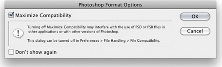
However, standard Photoshop PSD files created in Photoshop CS5 are not going to be 100% compatible if they are likely to be read by someone who is using an earlier version of Photoshop and this has always been the case with each upgrade of the program. Setting the Maximize PSD and PSB Compatibility to ‘Always’ allows you to do the same thing as when saving a flattened composite with a TIFF. This option ensures that a flattened version of the image is always included with the saved Photoshop file and the safe option is to keep this checked. For example, if you include a Smart Object layer, the Photoshop file will not be interpreted correctly when read by Photoshop CS or earlier unless you maximize the compatibility of the saved PSD. In these circumstances, if Photoshop is unable to interpret an image it will present an alert dialog. This will warn that certain elements cannot be read and offer the option to discard these and continue, or to read the composite image data. Discarding the unreadable data will allow another user to open your image, but when opened it will be missing all the elements you added and most likely look very different from the file you intended that person to receive. If on the other hand they click the Read Composite Data button and a composite was saved, the image will open using a flattened composite layer which looks the same as the image you created and saved. If no composite was created, they will just see a white picture and a multi-language message saying that no composite data was available.
To help evaluate the performance efficiency of your computer setup, here is a really useful weblink to a site hosted by a company called Retouchartists.com: retouchartists.com/pages/speedtest.html. From there you can download a test file which contains a sample image and a Photoshop action that was created by Alex Godden. All you have to do is time how long it takes for the action to complete to gauge and compare how fast your computer is running. You can then compare your speed test results with those of other Photoshop users.
Maximizing PSD compatibility lets images load quicker in Bridge; another crucial point is that Lightroom is only able to read layered PSD files that have this option turned on. If there is no saved composite, Lightroom won't be able to import it.
If you set the preference for the ‘Maximize PSD and PSB File Compatibility’ option in Figure 2.15 to ‘Ask’, Photoshop CS5 will show a ‘Don't show this message again’ message in the Maximize Compatibility warning dialog, which will appear after you choose to save an image using the PSD file format (See Figure 2.17). If the ‘Maximize Compatibility’ option is checked, the default from now on will be to ‘Always’ maximize compatibility. If the option is unchecked, it will be set to ‘Never’ from now on.
Some Photoshop preferences only take effect after you quit and restart the program. For example, the Scratch Disk preference settings in the Performance preferences (see page 110) only come into effect after a restart, while the OpenGL preferences only come into effect after you open or create a new window in Photoshop.
Recent File list
The Recent File list (Figure 2.15) refers to the number of image document locations that are remembered in the Photoshop File
Open Recent submenu. You might want to set this to the maximum limit allowed which is 30.
Open Recent submenu. You might want to set this to the maximum limit allowed which is 30.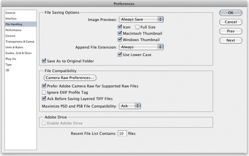
Performance preferences
The Performance preferences section (Figure 2.18) lets you configure all the things that influence how efficiently Photoshop is able to run on your computer. The memory usage can be set using a sliding percentage scale and you will notice how Photoshop provides a hint as to what the ideal range should be for your particular computer. The History & Cache section now includes a ‘Cache Tile Size’ option and buttons to help you configure the ideal settings here. In the Scratch Disks section you can drag to rearrange the currently available disk volumes in order of priority and, lastly, the GPU settings allow you to enable OpenGL drawing, if your video card allows it.
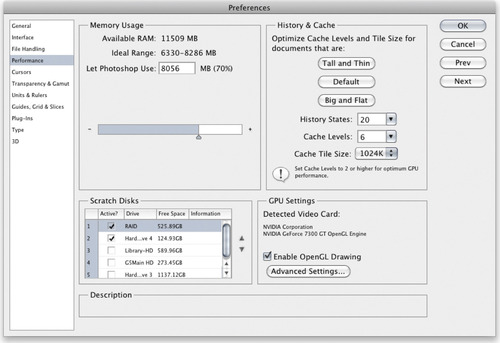
Memory usage
The amount of RAM memory you have installed determines how efficiently you can work in Photoshop. Each time you launch Photoshop a certain amount of RAM memory is set aside for use by the program. How much depends on the amount that is set in the Memory Usage section as a percentage of the total amount of RAM that is available for Photoshop to use. The figure you see in the Memory Usage section is the RAM reserved for Photoshop imaging use (although the RAM you set aside for Photoshop can be shared by other applications when it is not actively being used by Photoshop). Adobe recommend that you allocate a minimum of 1
GB RAM memory, which means that if you allow an additional 200
MB of RAM for the operating system, you will need to have at least 1.5
GB of RAM installed. If you also take into account the requirements of other programs and the likelihood that newer operating systems may need even more memory, it is safer to suggest you actually need a minimum of 2
GB RAM memory in total. Don't forget that you will also need to allow some RAM memory to run Adobe Bridge at the same time as Photoshop.
Most PCs and Macs use DIMMs (Dual In-line Memory Modules). The specific RAM memory chips may vary for each type of computer, so check carefully with the vendor that you are buying the right type for your particular machine. RAM memory used to cost a small fortune, but these days the price of RAM is almost inconsequential. If you have four RAM slots on your machine, you should easily be able to install 4 × 1
GB RAM or 4 × 2
GB RAM memory chips, which will give you 4 or 8
GB of installed RAM. A good suggestion is to install an absolute minimum of 1
GB of RAM per processing core on your computer, while the ideal balance is more like 2
GB of RAM per core. If you aim for 4
GB of RAM per core, you will see significant benefits with certain memory-intensive filter operations. For all other types of operations the speed benefits are not quite so dramatic.
The Memory Usage section therefore provides a guide for the ideal RAM setting for your computer and indicates what the ideal range should be. On a Windows system the default setting is 50% of the total available RAM and on a Mac it is 70% (the figure shown here is now more accurate in Photoshop CS5). Note that if the memory is set too high, Photoshop may end up competing with the operating system for memory and this can slow performance, although as I mentioned earlier, the memory assigned to Photoshop is freed up whenever Photoshop is not running. You can always try allocating 5% above the recommended upper limit, relaunch Photoshop and closely observe the efficiency status bar or Info panel Efficiency readout (Figure 2.19). Anything less than 100% indicates that Photoshop is running short of physical memory and having to make use of the scratch disk space. If you allocate too high a percentage, this can compromise Photoshop's efficiency. So the trick is to find the optimum percentage before you see a drop in performance. You may find the speed test described in the sidebar on page 109 is a useful tool for gauging Photoshop performance.
32-bit and 64-bit RAM limits
The amount of RAM that is available to Photoshop is obviously dependent on the total amount of RAM memory that's installed on your computer. If you run Photoshop on a computer with a 32-bit operating system that has 4
GB or more of RAM installed, a maximum of 2.6
GB of RAM (Mac) can be allocated to Photoshop and a maximum of 3
GB of RAM in the case of Windows systems. Even if you are hit by the 4
GB RAM limit on a 32-bit system and you have more than 4
GB memory installed, the RAM above 4
GB can also be used by the operating system as a cache for the Photoshop scratch data. So although you can't allocate this extra memory directly, installing extra memory can still help boost Photoshop's performance on a 32-bit system.

Photoshop CS4 saw 64-bit processing enabled for the PC platform and Photoshop CS5 now adds 64-bit support for Macintosh computers too. Providing you have the latest 64-bit enabled hardware and a 64-bit computer operating system, you can install or run Photoshop in 64-bit mode. The main advantage this brings is increased RAM memory access beyond the 4
GB physical limit. In terms of speed you won't necessarily find a 64-bit version of Photoshop to be that much faster than a 32-bit version, except for when you are working with very large files or carrying out memory-intensive operations.
There are certain types of Photoshop operations (such as a Radial Blur filter) that can make heavy demands on the computer hardware, utlilizing nearly all of your processors. If you raise the cache tile size in the Performance preferences to 1024 or 1028K this means the data to be processed is divided into bigger chunks, and this in turn can make a big improvement to batch processing times. The optimum choice of tile size here will depend on whether you are using an Intel or AMD processor (see page 113).
History & Cache
In the History & Cache section the default number of History States is 20. You can set this to any number you like from 1–1000, but remember that the number of histories you choose does have a bearing on the scratch disk usage.
The Cache Level settings affect the speed of the screen redraws. Whenever you are working with a large image, Photoshop uses a pyramid type structure of lower resolution cached versions of the full resolution picture. Each cached image is a quarter scale version of the previous cache level and is temporarily stored in memory to provide speedier screen previews. Basically, if you are viewing a large image on screen in ‘Fit to screen’ display mode, Photoshop uses a cache level that is closest to the fit to screen resolution to provide a screen refresh view of any edit changes you make at this viewing scale. The cached screen previews can therefore provide you with faster screen redraws and larger images can benefit from using a higher cache level, since a higher setting provides faster screen redraws but at the expense of sacrificing the quality of the preview. This is because a lower resolution cache preview is not as accurate as viewing an image at Actual Pixels.
The optimization buttons can help you set the cache levels to an appropriate value. If you mostly work on small images such as Web design layouts, which are small in pixel dimension size but may contain lots of complex layers, you'll gain better performance by clicking the Tall and Thin button to set the Cache Levels to 2. If you mostly work with large images, but not quite so many layers, you can click on the Big and Flat button to set the Cache Levels to 5, although you may wish to override this and set the cache levels even higher than this.
The Cache Tile Size can be adjusted according to what is the most appropriate setting for the type of work you do. There used to be an optional Bigger Tiles plug-in that you could install in order to boost Photoshop performance when editing large images. This has now been done away with and the tiling options are instead now incorporated into the Performance preferences. The Cache Tile Size can be set anywhere from 128K–1024K, and tests suggest the optimum settings to choose from are 128K/1024K for the newer Intel processors and 132K/1028K for AMD processors. For image editing work with large photo-sized documents where throughput, i.e. image size, is more of a consideration, it is better to choose a larger Cache Tile Size here.
Scratch disks
Photoshop can utilize the free hard disk space that's allocated in the Scratch Disks section as an extension of RAM memory. Photoshop always makes the most efficient use of the real RAM memory and tries to keep as much RAM as possible free for memory-intensive calculations. Low-level data, like the ‘last saved’ version of the image, is stored in the scratch disk memory giving priority to the current version and last undo versions being held in RAM. Normally, Photoshop uses all the available free RAM as buffer memory in which to perform real-time calculations and mirrors the RAM memory contents on the scratch disk. Photoshop does this whenever there is a convenient opportunity to do so. For example, after you open a new image you may notice some disk activity as Photoshop writes from the RAM memory buffer to the scratch disk. Photoshop then continually looks for ways to economize the use of RAM memory, writing to the hard disk in the background whenever there are periods of inactivity. Scratch disk data is also compressed when it is not in use (unless an optional plug-in extension that prevents this has been loaded at startup).
When Photoshop exhausts its reserves of RAM memory, it is forced to use the extra space on the scratch disk as a source of virtual memory and this is where you will start to see a major slowdown in efficiency. When the Efficiency indicator (Figure 2.19) drops below 100% this means that the RAM buffer is full and Photoshop is now relying exclusively on the hard disk scratch disk space as a memory reserve. This is because the Photoshop calculations are limited to the read/write speeds of the primary scratch disk, followed by the secondary disk, and so on. Should you experience a temporary slowdown in performance you might want to purge Photoshop of any excess data that's temporarily held in memory. To do this, choose Edit
Purge and select Undo, Clipboard, Histories or All.
Purge and select Undo, Clipboard, Histories or All.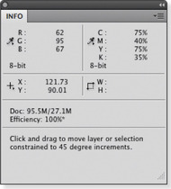 |
| Figure 2.19 |
The scratch disk usage will vary according to how many history states you have set in the History & Cache section and also how you use Photoshop. Generally speaking, Photoshop stores a version of each history state, but it does not always store a complete version of the image for each history state. As was explained in Chapter 1, the History feature only needs to save the changes made in each image tile. So if you carry out a series of brush strokes, the history only stores changes made to the altered image tiles. For this reason, although the scratch disk usage increases as you add more history steps, in practice the usage does not increase in such large chunks, unless you were to perform a series of global filter changes.
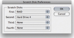
The primary scratch disk should ideally be one that is separate to the disk that's running the operating system and Photoshop. It is no good partitioning the main disk volume and designating an empty partition as the scratch disk, because the disk drive head will simply be switching back and forth between different sectors of the same disk as it tries to do the job of running the computer system and provide scratch disk space. For optimal image editing, you ideally want the scratch disk to be a fast, separate disk volume with a minimum of 20–40
GB of free space and as free as possible of any disk fragmentation. Note also the instructions in Figure 2.20 that describe how to alter the scratch disk settings during startup.
Scratch disk performance
With all this reliance on the scratch disk (or multiple scratch disks) to read/write data from the RAM memory buffer, the hard disk performance of the scratch disk plays an important role in maintaining Photoshop efficiency. There is provision in Photoshop for as many as four scratch disks. Each individual scratch file created by Photoshop can be a maximum of 2
GB and Photoshop can keep writing scratch files to a scratch disk volume until it becomes full. When the primary scratch disk runs out of room to accommodate all the scratch files during a Photoshop session, it then starts writing scratch files to the secondary scratch disk, and so on. This makes for more efficient and faster disk usage. Let's now look at the important factors that affect the speed of the scratch disk.
Interface connection
Most modern Macs and PCs have IDE, ATA or SATA drives as standard. A fast internal hard disk is adequate for getting started, but for better performance, you should really install a second internal or external hard drive and have this dedicated as the primary scratch disk (make this the number one scratch disk in the Performance preferences). Your computer will most likely have the choice of a USB or FireWire connector for linking external devices. USB 2 offers a much faster connection speed than the old USB 1, while FireWire (IEEE 1394) is regarded as being faster still. With USB or FireWire you can hot swap a drive between one computer and another. This is particularly useful when you wish to shuttle very large files around quickly. With the advent of FireWire 800 we are now seeing an appreciable improvement in data transfer speeds. FireWire drives basically use a Bridge Chipset to provide the FireWire connection and, since the Oxford Chipset came out, have been able to enhance the throughput closer to the theoretical limit. Note that it is the data transfer and not the data access time that is the measure of disk speed to look out for.
Hard drive speed
Most desktop computers use internal drives which run at 7200
rpm and you can easily find spare internal drives that run at this speed or faster. For example, there are drives that even run at 10,000 or 15,000
rpm, but these are hard to come by and are expensive, plus they are more limited in disk capacity. Laptop computers usually have slower hard drives fitted as standard (typically 5400
rpm). It may therefore be worth checking if you can select a faster speed hard drive as a build-to-order option. External SATA drives (eSATA) are now regarded as faster than FireWire 800 and are sometimes available as multiport drives like the LaCie d2 series. In theory these are better.
RAID setups
RAID stands for Redundant Array of Independent Disks, and a simple way to explain RAID is that it allows you to treat multiple drives as a single drive volume to provide either increased data integrity, capacity, transfer rates or fault-tolerance compared to a single volume. How it does this depends on the RAID level you choose. You need a minimum of two disks to configure a RAID system and most off-the-shelf RAID solutions are sold as a bay dock that can accommodate two or more drives with a built-in RAID controller. A RAID disk can be connected via internal SCSI or using an external FireWire 400/800 connection.
RAID 0 (striping)
A RAID 0 setup is an ideal choice for use as a Photoshop scratch disk. With a RAID 0 setup, two or more drives are striped together to create a single large volume drive. For example, if two 400
GB drives are striped using a RAID 0 setup you will end up with a single 800
MB volume. RAID 0 is useful where you require fast hard drive access speeds, because the drive access speed increases proportionally to the number of drives that are added. So, if you have a 2 × 400
GB drive RAID 0 system, the hard drive access speed should be two times that of a single 800
GB drive. A RAID 0 setup can offer faster speeds but will be less reliable, since if one drive fails, all the stored data is lost on the combined volume.
It used to be the case that software-created RAIDs such as the one included with the Mac OS X Disk Utilities program were a lot slower than a dedicated system. True, the read/write speeds from a software RAID will still be somewhat slower than a true dedicated RAID system since a software RAID will be stealing some of your computer processor cycles, but these days the speed loss is not so bad as it used to be. For example, a software-driven internal striped RAID 0 can bring about a 45% increase in disk access speed. Overall I recommend that if you do choose to go down the internal RAID route, you use a dedicated device with a RAID controller.
RAID 1 (mirroring)
A RAID 1 setup stores duplicate data across two drives. This means that if you have, say, two 400
GB drives configured in a RAID 1 setup, the data on one drive is mirrored on the other and the total drive capacity will be equal to that of a single drive (in this case, 400
GB). RAID 1 systems are used as a way to protect against sudden drive failure since if one drive fails, a mirror copy of that data can immediately be accessed from the other drive and if you replace the defunct drive with a new one, the RAID 1 system rebuilds a copy of the data on the new drive. A RAID 1 setup offers greater security but the downside is that RAID 1 read/write speeds are slower because the RAID 1 system has to constantly back up the data between one drive and the other.
Internal RAID
You can fit an internal RAID system with a do-it-yourself kit consisting of two internally mounted drives and a RAID controller card. This should not be too challenging to install yourself, but if you are in any doubt about whether you are capable of doing this then you should get a qualified computer specialist to install such a system on your computer. The advantage of an internal RAID is that it is always there whenever you turn the computer on, and is an economical solution compared with buying an external RAID drive setup. Most PC tower computer systems should have plenty of free hard drive bays, which will make it fairly easy for you to install internal RAID. An internal RAID setup will definitely speed up the time it takes Photoshop to read and write data to the scratch disk. However, if you have more hard drives running simultaneously this will mean more power consumption, which in turn can generate extra heat and possibly more noise too. Be warned that this heat may cause problems for the cooling system in your computer and put extra strain on the internal power supply unit.
External RAID
External RAID hard drive units (Figure 2.21) are not overly expensive and you can easily buy a ready assembled bay dock with a couple of drives and a built-in RAID controller that can be configured for RAID 0. The speed will be governed not just by the number of drives making up the RAID but also by the speed of the cable connection. Most RAID systems these days will connect to the computer via a FireWire 400/800 or SATA connection, which may again require a special card in order to connect to the computer (for now). At the time of writing it seems that computers in the future are more likely to support SATA as standard. My own personal experience has led me to be rather wary of relying on SATA. I have had two SATA RAID units fail or have problems maintaining a connection to the computer. For this reason I have chosen to stick with FireWire 800, and even this I find isn't completely reliable on the Mac OS X system.

GPU settings
Photoshop is able to detect the graphics card used by your computer and whether it has a built-in Graphics Processor Unit (GPU) capability. If so, you can then check the ‘Enable OpenGL Drawing’ option to make full use of the graphics processor memory on the GPU enabled graphics card. As was explained earlier, in Chapter 1, this preference setting affects images opened in Photoshop on a per-window document basis.
The main advantages of enabling OpenGL are: smooth views when using odd number viewing percentages, image rotation, flick panning, smooth animated zooms, the bird's-eye view zoom-out feature plus pixel grid display at view magnifications greater than 500%. Note that OpenGL is only available on later operating systems, which are basically the ones that are required anyway to run Photoshop CS5.
Clicking the Advanced Settings… button opens the OpenGL settings dialog shown in Figure 2.22. If you know what you are doing you can adjust these to gain the best performance from your particular OpenGL-enabled video card.
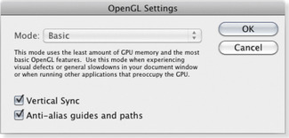
If you have OpenGL switched off, or your video card does not support OpenGL, you may sometimes notice how layered Photoshop images are not always displayed with complete accuracy at anything other than the 100% magnification. For example, if you have added a pixel layer that has a sharp edge, you might see a line appear along the edges when it is viewed at smaller viewing percentages. This is simply the image cache at work and nothing to worry about – it is speeding up the display preview at the expense of accuracy. If you have to work on an image (without OpenGL) at a less than 100% magnification, then do make sure the magnification is a wholly divisible number of 100%. In other words, it is better to work at 50%, 25% or 12.5% magnification, rather than at 66% or 33%. Note also that the number of cache levels will affect the structure of a TIFF file when the ‘Save Image Pyramid’ option is selected (see Figure 1.93 on page 73).
Cursors preferences
We now come to the Cursor preferences (Figure 2.24). The painting cursors can be displayed as a painting tool icon, a precise crosshair or with the default setting, which shows an outline of the brush shape at its ‘most opaque’ size in relation to the image magnification. You can also choose to display a Full Size Brush Tip, representing the entire outer edge reach of a soft-edged brush, although it is debatable whether this improves the appearance of the painting cursors or not (see Figure 2.23). When the Normal Brush Tip is selected, the brush cursor size represents the boundary of the brush shape up to where the brush opacity is 50% or denser in opacity, whereas the full size cursor represents the complete brush area size. The ‘Show Crosshair in Brush Tip’ option allows you to display a crosshair inside the brush size cursor. In the Other Cursors section, the Standard option represents all the other tools using a standard tool icon. I suggest you change this to the Precise setting, because this will make it easier for you to target the placement of certain tools such as the crop tool or clone stamp.
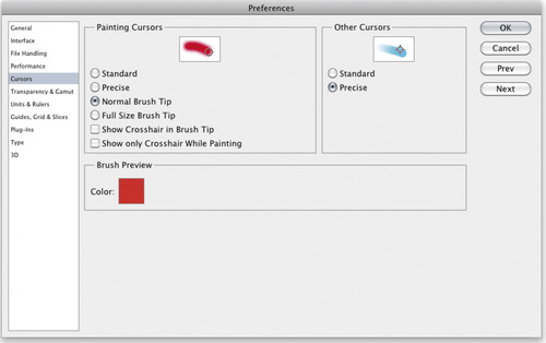
 |
| Figure 2.23 |
The
 key can be used to toggle the cursor display. When the Standard paint cursor is selected, the
toggles between a Standard and Precise cursor view. When the Precise or Brush Tip painting cursor option is selected, the
toggles between a Precise and a Brush Tip cursor view. When the Standard cursor mode is selected for all other cursors, the
toggles between the Standard and Precise cursor views.
key can be used to toggle the cursor display. When the Standard paint cursor is selected, the
toggles between a Standard and Precise cursor view. When the Precise or Brush Tip painting cursor option is selected, the
toggles between a Precise and a Brush Tip cursor view. When the Standard cursor mode is selected for all other cursors, the
toggles between the Standard and Precise cursor views.Transparency & Gamut
The Transparency settings (Figure 2.26) determine how the transparent areas in an image are represented on the screen. If a layer contains transparency and is viewed on its own with the background layer visibility switched off, the transparent areas are normally shown using a checkerboard pattern. These preferences let you decide how the checkerboard grid size and colors are displayed on the screen.
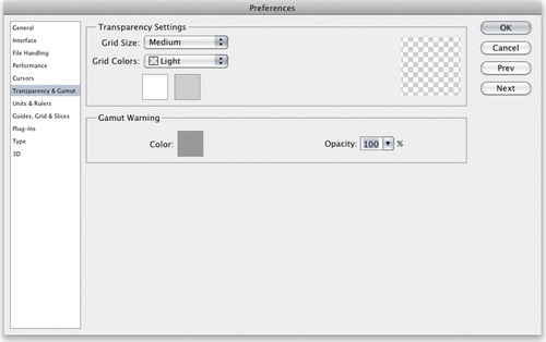
If you have the Photoshop Color Picker dialog open, you can choose View
Gamut Warning to apply a gamut warning overlay to the Color Picker colors (see Figure 2.25).
Gamut Warning to apply a gamut warning overlay to the Color Picker colors (see Figure 2.25).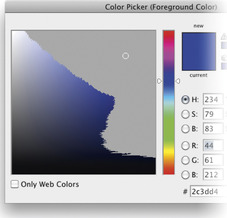
Color Picker gamut warning
The Gamut Warning is accessed via the View menu (
 ). This alerts you to any colors that will be out of gamut after a conversion is made from, say, RGB to CMYK, or whichever color space is currently loaded in the View
Proof Setup menu. The default overlay color is a neutral gray at 100% opacity, but I suggest reducing the opacity to make the gamut warning appear as a semi-transparent overlay.
). This alerts you to any colors that will be out of gamut after a conversion is made from, say, RGB to CMYK, or whichever color space is currently loaded in the View
Proof Setup menu. The default overlay color is a neutral gray at 100% opacity, but I suggest reducing the opacity to make the gamut warning appear as a semi-transparent overlay.If you have the Photoshop Color Picker dialog open, you can choose View
Gamut Warning to apply a gamut warning overlay to the Color Picker colors (see Figure 2.25).
Gamut Warning to apply a gamut warning overlay to the Color Picker colors (see Figure 2.25).So, if you are working on an image in RGB mode and you choose View
Gamut Warning, Photoshop highlights these out-of-gamut colors with a color overlay. The gamut warning is, in my view, a rather crude instrument for determining whether colors are in gamut or not, since a color that is only slightly out of gamut will be highlighted as strongly as a color that is hugely out of gamut. A good quality graphics display coupled with a custom proof setup view mode is a much more reliable guide.
Gamut Warning, Photoshop highlights these out-of-gamut colors with a color overlay. The gamut warning is, in my view, a rather crude instrument for determining whether colors are in gamut or not, since a color that is only slightly out of gamut will be highlighted as strongly as a color that is hugely out of gamut. A good quality graphics display coupled with a custom proof setup view mode is a much more reliable guide.Units & Rulers
You can use the Units & Rulers preferences section to set the ruler measurements (inches or centimeters, etc.) and the units used. Note that as well as using the preferences options shown here, the measurement units can also be changed via the Info panel submenu or by
 right mouse-clicking on a ruler to open the contextual menu (you can also double-click the ruler bar as a shortcut for opening the preference window shown in Figure 2.27).
right mouse-clicking on a ruler to open the contextual menu (you can also double-click the ruler bar as a shortcut for opening the preference window shown in Figure 2.27).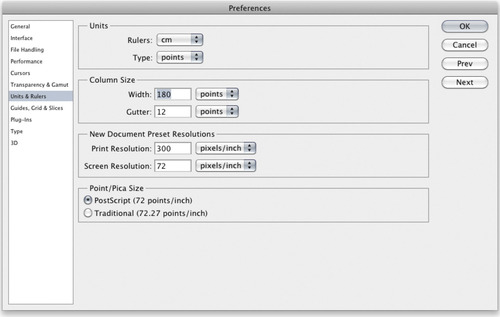
The ‘New Document Preset Resolution’ options allow you to decide what the default pixel resolution should be for print output or screen display work whenever you select a preset from the File
New Document dialog (Figure 2.28). The Screen Resolution has typically always been 72
ppi. But there is no real significance to the resolution that is set here if an image is only destined to appear in a Web page design. Web browser programs are only concerned with the physical number of pixels an image has and the resolution setting actually has no relevance. The Print Resolution setting is more useful as this does have an important bearing on what size an image will eventually print.
Guides, Grid & Slices
These preferences let you choose the colors for the Guides, Smart Guides and Grid (Figure 2.29). Both Grid and Guides can be displayed as solid or dashed lines, with the added option of dotted lines for the Grid. The number of Grid subdivisions can be adjusted to suit whatever project you are working on and the Slices options include a Line Color style and whether the Slice Numbers are displayed or not.
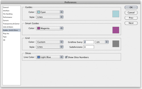
Plug-ins
The Plug-ins folder will automatically be recognized by Photoshop so long as it resides in the same application folder. Figure 2.31 shows how you can also choose an Additional Plug-ins Folder that may be located in another application folder such as Adobe Bridge so that these plug-ins can in effect be shared with Photoshop. To do this click on the Choose… button to locate the additional plug-ins folder.
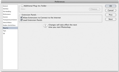
For various reasons, a number of plug-ins and extensions have been removed from the standard Photoshop install. If you happen to have a copy of Photoshop CS3 or older, you can copy certain items such as the Contact Sheet II and WebPhotoGallery plug-ins to the Photoshop CS5 Plug-ins/Automate folder (see pages 611 and 617). However, now that Photoshop can be enabled as a 64-bit program, these older 32-bit plug-ins will not work in a 64-bit version of Photoshop. If you desperately need them you'll need to switch to (or install) a 32-bit version of Photoshop CS5.
Photoshop can now install what are known as Extensions panels (such as the Configurator panel described on page 27). If the ‘Load Extensions Panels’ option is checked this will load all the installed panels on startup. Furthermore, if the ‘Allow Extensions to Connect to the Internet’ option is checked, this allows such panels to connect over the Internet, allowing them to access new content plus any important panel updates. This is particularly relevant with things like the Access CS Live panel that needs to be connected to the Internet in order for it to work.
Type preferences
Lastly, we come to the Type preferences (Figure 2.33), which are mainly of importance to graphics users rather than photographers. We could all do with smart quotes I guess, but the smart quotes referred to here is a preference for whether the text tool uses vertical quotation marks or rounded ones that are inverted at the beginning and end of a sentence. The ‘Show Asian Text Options’ is there for Asian users, to enable the Chinese, Japanese and Korean text options in the Character panel. The ‘Show Font Names in English’ option will be of more significance to non-English language users, as it allows them the option to display the font names in English, as an alternative to their own native language. The ‘Enable Missing Glyph Protection’ option will switch on automatic font substitution for any missing glyph fonts (those swirly graphic font characters).
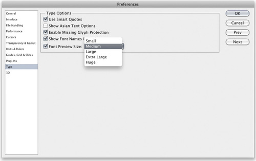
When you select the type tool for the first time during a Photoshop session, there will be a brief pause in which Photoshop initializes the type tool engine. If the type tool was selected when you last closed Photoshop, the initialization process will happen during the startup cycle.
The Type tool Options panel also provides a WYSIWYG menu listing of all the available fonts when you mouse down on the Font Family menu (see Figure 2.32). The Font Preview Size menu determines the font sizes used when displaying this list and shouldn't be confused with the UI Font Size preference that is in the General preferences section.