CHAPTER 2
Map design
LEARNING GOALS
- Symbolize maps using qualitative attributes and labels.
- Use definition queries to create a subset of map features.
- Symbolize maps using quantitative attributes.
- Learn about 3D maps.
- Symbolize maps using graduated and proportional point symbols.
- Create normalized maps with custom scales.
- Create density maps.
- Create group layers and layer packages.
Introduction
In this chapter, you’ll learn how to design and symbolize thematic maps. A thematic map strives to solve or investigate a problem, such as analyzing access to urgent health care facilities in a region, as you did in chapter 1. A thematic map consists of a subject layer or layers (the theme) placed in spatial context with other layers, such as streets and political boundaries.
Choosing map layers for a thematic map requires answering two straightforward questions:
- 1.What layer or layers are needed to represent the subject?
- 2.What spatial context layers are needed to orient the map reader to recognize locations and patterns of the subject features?
Quite often, the subjects of thematic maps are vector map layers (points, lines, or polygons), because such layers often have rich quantitative and qualitative attribute data that is essential for analysis. Of course, the subject can be a raster layer (in chapter 10, for example, you will create a risk-index raster map to identify poverty areas of a city, and poverty is the subject of the map). Spatial context layers can be vector, such as streets and political boundaries. These layers also can come in both raster or vector formats, including many basemap layers provided by Esri map services.
The major map design principle for thematic maps is to make the subject prominent while placing spatial context layers in the background. For example, if the subject is a map layer with points and you want to give them focus, you might give the point symbols a black boundary and bright color. These subject features are known as “figure” and are the main composition of the map. Everything that is not figure is known as “ground.” For example, if a context layer has polygons that are not the focus of the map, you might give the polygons a gray boundary and no color, thereby placing them in the background.
Symbolization is easy for vector maps because ArcGIS Pro can use attribute values to automate drawing. For example, ArcGIS Pro could draw all food pantry facilities in a city by using unique values with a square point symbol of a certain size and color. Continuing, the software could draw all soup kitchen facilities with a circle of a certain size and different color by using an attribute with type-of-facility code values (including “food pantry” and “soup kitchen”).
In this chapter, you will learn to use good cartographic (symbolization) principles as you build several vector-based thematic maps.
Tutorial 2-1: Choropleth maps for qualitative attributes
Placing objects of all kinds into meaningful classes or categories is a major goal of science. Classification in tabular data is accomplished using attributes with codes that have mutually exclusive and exhaustive qualitative values. For example, a code for size could have the values “low,” “medium,” and “high.” Any instance of the features with this code is displayed in only one of the classes (the values are mutually exclusive). Moreover, there are no more size classes (the values are exhaustive). In this tutorial, you learn how to symbolize mapped features—points, lines, and polygons—by class membership as available in code attributes.
Open the Tutorial 2-1 project
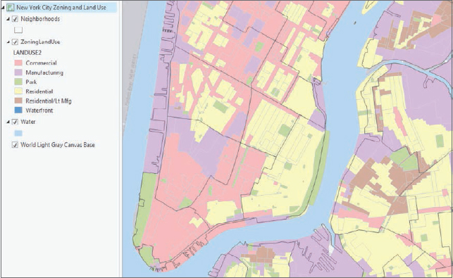
- 1.Open Tutorial2-1.aprx from Chapter2\Tutorials, and save the project as Tutorial2-1YourName.aprx. A New York City Zoning and Land Use map opens showing Neighborhoods and a light-gray raster basemap. Two other layers, ZoningLandUse and Water, are available but not visible yet. None of the vector layers is properly symbolized yet.

- 2.Use the Lower Manhattan bookmark. The subject of this map, zoning and land use, is best viewed and studied at approximately this zoomed scale or even closer, because the geographic zones are relatively small in area. You must get close enough to distinguish them from one another.
Display polygons using a single symbol
The Neighborhoods and Water polygon layers provide spatial context. Such layers should be displayed using outlines with no color fill, with water features being an exception and generally given a blue color and no outline. Context layers are easy to symbolize. You can start with Neighborhoods.
- 1.In the Contents pane, under Neighborhoods, click the white color box to modify the symbol.
- 2.In the Format Polygon Symbol pane, under Properties, change Color to No Color.
- 3.Change the Outline color to Gray (60 percent), and click Apply.
YOUR TURN
Turn on the Water layer and symbolize the layer with a blue polygon symbol. Hint: On the Gallery tab, search for Water and click one of the Water (area) symbols.
Display polygons using unique value symbols
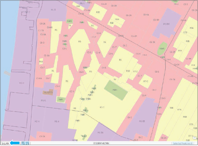
The last layer to symbolize, Zoning Land Use, is the subject of the map, displayed by Unique Values on primary land-use code. Land-use maps use muted colors, which you’ll create next.
- 1.Turn on ZoningLandUse, right-click the layer, and click Symbology.
- 2.In the Symbology pane, for Symbology, choose Unique Values.
- 3.In the Value field for Field 1, choose Landuse2. This step adds random colors for six land uses (your colors may be different from those shown in the figure).
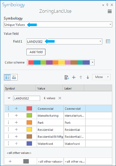
Next, you’ll assign colors used by the New York City Planning Department. You’ll start by changing the outlines of all polygons from black to light gray. When you view land-use polygons, their black outlines often take up too much of your map and attention, and also distract from the symbolized color. A gray color will soften this interference and still show boundaries.
- 4.In the Symbology pane, click More > Symbols > Format all symbols.
- 5.In the Format Polygon Symbols pane, click Properties, and change Outline Color to Gray 20 percent.
- 6.Click Apply and the back button
 to go back to the Symbology pane.
 - 7.For Landuse2, click the symbol for Commercial, and change the color to Rose Quartz (first row, second column).
- 8.Click Apply, the Back button, and apply these colors for the remaining land uses:
- Manufacturing: Lepidolite Lilac (first row, 11th column)
- Park: Apple Dust (seventh row, sixth column)
- Residential: Yucca Yellow (first row, fifth column)
- Residential/Lt Mfg.: Soapstone Dust (seventh row, third column)
- Waterfront: Atlantic Blue (ninth row, ninth column)
- 9.In the ZoningLandUse pane, click More, and clear Show all other values. All polygons have land-use code values, so this option is not needed. If left on, other values would be entered in the legend in the Contents pane and perhaps confuse the map reader.
- 10.Close the Symbology pane, and save your project. You can see all boundaries of primary land uses with their gray outlines.
Tutorial 2-2: Labels
Labels created from attributes such as neighborhood names are an important part of cartography and an integral and informative component of a map. You must specify the elements of font, size, color, placement, and visibility ranges to make labels easy to read.
Open the Tutorial 2-2 project
In this exercise, you will label all three layers of the map. Each layer will have its own label properties and label placements.
- 1.Open Tutorial2-2.aprx from Chapter2\Tutorials, and save the project as Tutorial2-2YourName.aprx.
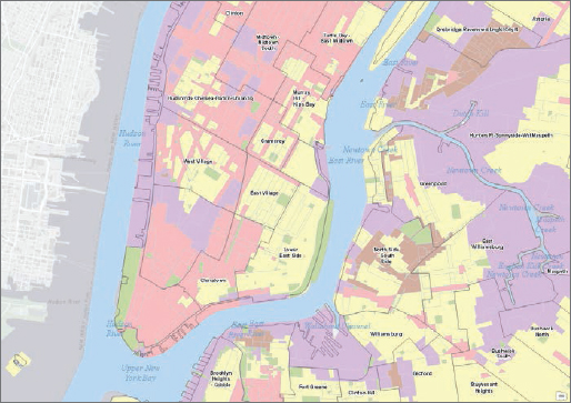
- 2.Use the West Village bookmark. To maintain visual clarity, labels for a detailed layer such as ZoningLandUse are most useful when zoomed into the neighborhood level or similar larger scale because of the number of small polygons.
Change label properties
- 1.In the Contents pane, click Zoning Land Use. The Feature Layer contextual tab appears on the ribbon with the tabs Appearance, Labeling, and Data highlighted.
- 2.On the Labeling tab in the Label Class group, click the Field named Zone.
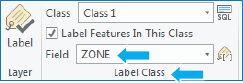
The field in this map has detailed zoning codes known by developers, planners, and other members of the user community.
- 3.In the Layer group, click Label
 . Wait for the labels to appear; when they appear, the labels will get defaults and should be customized to better suit the purpose of the map.
 - 4.Make these changes in the Text Symbol group:
- Text Symbol Font Size: Choose 8.
- Text Symbol Color: Choose Gray 50 percent.
- 5.In the Visibility Range group, for Out Beyond, choose <Current>. This step sets the visibility range for zoning labels so that they do not display when zoomed beyond the current scale. Your scale will not necessarily match the scale of the next figure, because scale varies with monitor resolution and how the application is arranged.
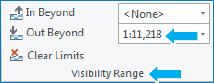
- 6.Zoom in and out to see that the labels are on only when zoomed in closer than the West Village bookmark. Note the map scale when the labels turn on or off.
YOUR TURN
Use the Lower Manhattan bookmark. Label the Neighborhoods layer using Name, Arial font, Bold, Size 7, and a white halo. Finally, on the ribbon, on the Labeling tab in the Label Placement group, click Label Placement > Land Parcel.
Label the Water layer using Landname. Use font Times New Roman, Italic, Size 12, and the color Atlantic Blue.
Set the Neighborhoods and Water labels to turn off when zoomed out beyond the Lower Manhattan bookmark. Try out the labels by zooming in and out and using bookmarks.
Remove duplicate labels
Labels for some water polygons might overlap with redundant and unnecessary labels. Removing duplicate labels will unclutter the map. You will do so using another menu option to set label properties.
- 1.In the Contents pane, right-click Water > Labeling Properties.
- 2.In the Label Class pane, click Position near the top of the pane, and then click the Conflict Resolution button
 .
. - 3.Expand Remove duplicate labels, and click Remove all.
- 4.Close the Label Class pane. The map will now show just one label for each water feature.
- 5.Save your project.
Tutorial 2-3: Definition queries
Often, a map layer has more features than you want to display. If so, you can use a definition query to display the desired subset of features from the larger collection, on the basis of values in the feature attribute table. For example, the point features in this tutorial start with point features for all facilities in New York City (food, health care, fire and police, schools, senior centers, and so on). You will want to display the features for food facilities only, including food pantries and soup kitchens. Query definitions allow you to select and display just these features. A definition query is different from the Select by Attributes in chapter 1. The definition query is used to filter the display of a layer rather than selecting a temporary subset of features to work with, even though they both use a similar SQL interface.
Open the Tutorial 2-3 project
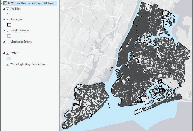
- 1.Open Tutorial2-3.aprx from Chapter2\Tutorials, and save the project as Tutorial2-3YourName.aprx. A NYC Food Pantries and Soup Kitchens map opens showing Boroughs, several other spatial context layers, and the many facilities operated by the city government.
- 2.Zoom to full extent.
Create a definition query
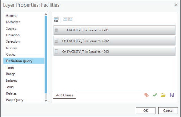
In this exercise, you will create a query to display a subset of more than 20,000 government and nonprofit facilities in New York City. Facilities is a point layer of locations for services that the city provides. The map needs only three out of more than 100 classes. Classes have both a numeric code (Facility_T) and a corresponding description (Factype_1), and the three needed facility classes are 4901 = Soup Kitchen, 4902 = Food Pantry, and 4903 = Joint Soup Kitchen and Food Pantry. Showing the location of these facilities could help the directors of New York City’s food banks determine whether they are well located relative to poverty areas of the city.
- 1.In the Contents pane, right-click Facilities > Properties.
- 2.In the Layer Properties: Facilities window, click Definition Query.
- 3.Click Add Clause, Facility_T as the field, Is Equal to as the logical operator, 4901 as the value, and click Add. Currently, the definition query contains a single logical condition. Only records that satisfy this condition will display.
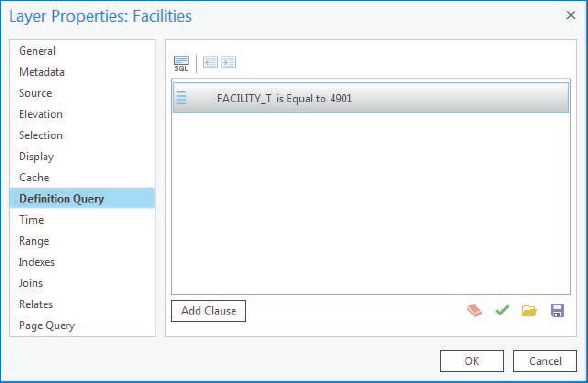
- 4.Click Add Clause, Or as the logical operator, Facility_T as the field, Is Equal to 4902, and click Add. Now you have two single conditions connected with an Or to make a compound condition. Any record satisfying one of the two simple conditions will be displayed. If you were to use the And connector here, no records would be selected. A facility cannot have both code values 4901 and 4902.
- 5.Repeat step 3 with Facility_T equal to 4903. The final compound condition displays a subset of the original table of facilities, which have one of the three included values. This example extends to any definition query for selecting subsets of a finite collection of objects classified by a code such as Facility_T. If you click the SQL button, you can see the SQL code that the definition query generates and is run by ArcGIS Pro: Facility_T = 4901 Or Facility_T = 4902 Or Facility_T = 4903. Because the three needed codes happen to be in numerical sequence, it’s also possible to generate an alternative, equivalent compound criterion, Facility_T > = 4901 And Facility_T < = 4903, but this is a special case.
- 6.Click OK. The resulting map is a subset (631) of the original 20,000-plus facilities showing just Food Pantries, Soup Kitchens, and joint Soup Kitchen and Food Pantries. You can verify this is true by opening the attribute table for Facilities.
Symbolize figure and ground features
The subject of the map, Food Facilities, is figure, and all other layers are ground. Figure features get accentuated with bright colors, and ground gets shades of gray.
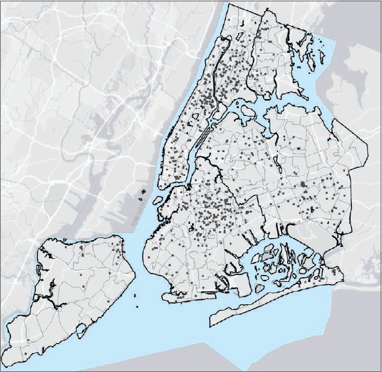
- 1.Use the Manhattan bookmark. Someone using this map would not study the map with so many point features at full extent but would zoom in, as shown with this bookmark.
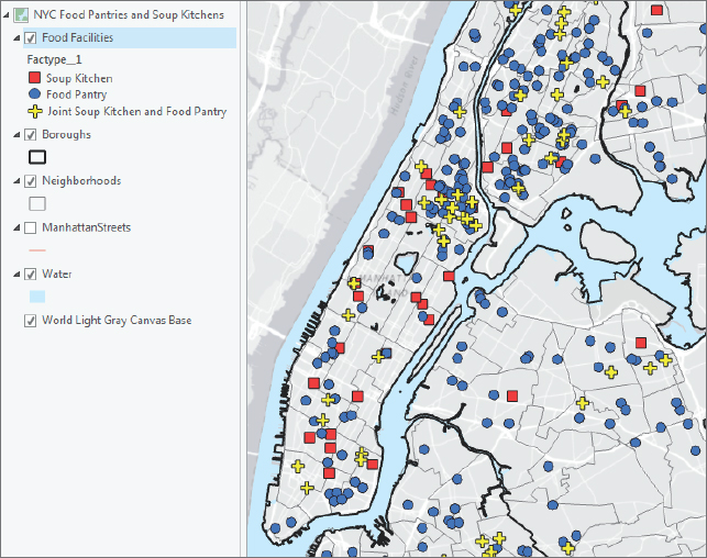
- 2.In the Contents pane, click Facilities, and type Food Facilities as the name.
- 3.In the Contents pane, right-click Food Facilities > Symbology.
- 4.In the Symbology pane, for Symbology, click Unique Values.
- 5.Click Factype_1 as the value field. This field provides descriptions for the facility codes.
- 6.Drag the Soup Kitchen value to the top, Food Pantry to the middle, and Joint Soup Kitchen and Food Pantry to the bottom. The legend in the Contents pane will then read Soup Kitchen, Food Pantry, and Joint Soup Kitchen and Food Pantry.
Next, you’ll symbolize the three types of facilities. In this example, varying shape and color for unique point symbols is good practice. Color-blind people can use shape to identify facility classes; also facilities will remain distinguishable in black-and-white photocopies of such symbolization. The majority of people who can see color get the full effect of shape and color for seeing patterns of food facilities.
- 7.Use the Symbology Gallery and Properties to change these symbols:
- Soup Kitchen: Square 3, Mars Red Color, Size 8 pt.
- Food Pantry: Circle 3, Cretan Blue Color, Size 8 pt.
- Joint Soup Kitchen and Food Pantry: Cross 3, Solar Yellow Color, Size 10 pt.
- 8.Click More, turn off Show all other values, and close the Symbology pane. Now the food facilities are sharply in figure with contrasting bright colors and shapes. For example, you can easily see that Manhattan has many more soup kitchens than the neighboring boroughs and that the northern part of Manhattan and the adjoining Bronx have a large cluster of food pantries.
YOUR TURN
A policy decision-maker might want to know the streets where food facilities are located and doesn’t want the details of a basemap. Turn off the World Light Gray basemap, and turn on Manhattan Streets. Display Manhattan Streets as a ground feature using gray (20 percent) with width 0.5 pt. Zoom to a few blocks in Manhattan and experiment with various label properties. Save your project.
Tutorial 2-4: Choropleth maps for quantitative attributes
Showing continuous variation in numerical attributes is not possible when you use the attributes to symbolize points or polygons on a map. The human eye simply cannot make distinctions unless there are relatively large changes in graphic elements. You must break a numeric attribute up into relatively few classes (roughly three to nine), similar to how you create a bar chart for a numeric attribute. Each class has minimum and maximum attribute values. The minimum value is included in the class, but the maximum goes in the next classification to the right. To symbolize map features, you need only the set of maximum values for classes, called “break points.”
Open the Tutorial 2-4 project
- 1.Open Tutorial2-4.aprx from Chapter2\Tutorials, and save the project as Tutorial2-4YourName.aprx. A NYC Food Stamps/SNAP Households by Neighborhood map opens showing boroughs, neighborhoods, and water features.
- 2.Zoom to full extent.
Create a choropleth map of households receiving food stamps
A choropleth map uses color in polygons to represent numeric attribute values. Generally, increasing color value (darkness of a color) in a color scheme represents increasing (higher) values. In this exercise, you will use US Census data aggregated to New York City neighborhoods to create choropleth maps for households with persons over age 60 receiving food stamps/SNAP (Supplemental Nutrition Assistance Program).
Choropleth maps use classification methods to display the data, and methods will vary depending on the data and intent of the map. The default classification method is Natural Breaks (Jenks). This method uses an algorithm to cluster values of the numeric attribute into groups, with the boundaries of the groups (break points) defining classes. The Natural Breaks method may be suited for some applications in the natural sciences. However, Quantile classification is often a better starting point, because the method is easily understood and provides information about the shape of a distribution. The Quantile method breaks a distribution into classes—each with the same percentage of data points. For example, each quartile (quantiles with four classes) has 25 percent of the data observations, with the middle break point being the median.
By studying quantile break points, you can determine whether a distribution is roughly uniform (has equally spaced quantiles) or is skewed to the right (has intervals defined by break points that become progressively larger with larger values). The former become good candidates for the Defined Interval method (uniform distribution with easily read numbers for break points) and the latter for the Geometric Interval method (for an increasing-width intervals distribution of break points). Many attributes have skewed distributions.
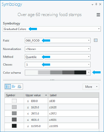
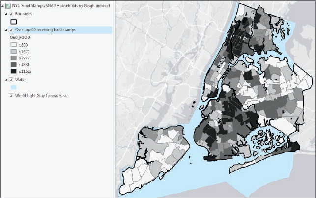
- 1.In the Contents pane, click Neighborhoods, and type Over age 60 receiving food stamps to rename the layer.
- 2.Open the Symbology pane for this layer, and use these guidelines to symbolize the layer:
- Symbology: Graduated Colors
- Field: O60_Food
- Method: Quantile
- Classes: 5
- Color scheme: Gray (5 classes)
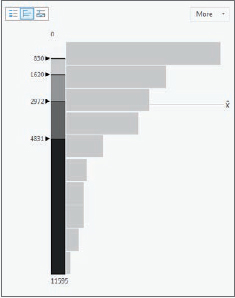
- 3.Click the Histogram view button
 . You can see that neighborhoods with the highest quintile (quantile with five classes) tend to cluster. The interval sizes generally increase in this case, so a geometric method is an alternative to the quantile method that you will test in Your Turn.
- 4.Close the Symbology pane. The map clearly shows neighborhoods with a high number of households with persons over age 60 who receive food stamps/SNAP.
YOUR TURN
Change the symbology method for the choropleth map from Quantile to Geometric Interval. The break points become larger to provide more detail for the long tail of the distribution. The break points for the quantile method were 830, 1620, 2970, 4831, and 11595. Those for the geometric method are 881, 2201, 4181, 7148, and 11595. Reselect the Gray (5 Classes) color scheme if necessary.
Try the Defined Interval method with an interval size of 2500. Although perhaps not the best method for this skewed data, this uniform distribution is easy to read, having “nice” numbers, multiples of 2500, with equal intervals.
Change the method back to five quantiles, close the Symbology pane, and save your project.
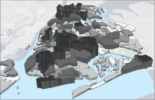
Extrude a 3D choropleth map
You will learn much more about 3D data and scenes in chapter 11, but you can easily convert a 2D choropleth map into a 3D scene to better visualize data. In particular, the map reader can get a better appreciation of extreme values relative to other values, which are not readily apparent by looking at only the color shading of choropleth maps. In 3D, features and layers are often physical features such as buildings, trees, topography, and so on, but you can display any numeric data as 3D. Here, you will learn how to convert a 2D map to a 3D scene and display neighborhood polygon features as 3D.
- 1.On the View tab, in the View group, click Convert
 . A 3D map automatically opens with categories for 3D and 2D layers.
 - 2.In the Contents pane, drag Over age 60 receiving food stamps directly under the 3D Layers category. Next, you will begin extruding neighborhood polygons to 3D features using the numeric attribute O60_FOOD as the “extrusion” height.
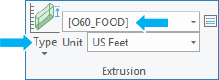
- 3.On the Feature Layer contextual tab, click the Appearance tab, and in the Extrusion group, click Type > Base Height. Clicking Base Height sets the base of the extruded polygons to zero. Next, you will set the extrusion height to the attribute O60_FOOD.
- 4.In the Extrusion group, for Extrusion Expression, choose [O60_Food].
Your features and food stamp recipient data are now displayed in 3D.
- 5.Drag the middle button on the mouse to tilt the view.
- 6.Zoom in to better see the extruded neighborhoods.
YOUR TURN
Zoom by scrolling the mouse wheel, and pan by dragging the map. You will learn much more about 3D map navigation in chapter 11. Save your project.
Tutorial 2-5: Map using graduated and proportional point symbols
Using ArcGIS Pro, you can display polygon data using point symbols in the center (centroid) of each polygon. In the next exercise, you will create a map showing the number of food pantries and soup kitchens in New York City neighborhoods as graduated size point symbols. The larger the symbol, the more food resources in each neighborhood. You can also display data as proportional symbols that are similar to graduated symbols but represent values as unclassified symbols whose size is based on a specific value.
Open the Tutorial 2-5 project
- 1.Open Tutorial2-5.aprx from Chapter2\Tutorials, and save the project as Tutorial2-5YourName.aprx. The map opens showing New York City neighborhoods, boroughs, and neighborhoods with households and persons over 60 receiving food stamps, which is already classified using quantiles.
- 2.Zoom to full extent.
Create a map of graduated size points
The map of this exercise uses two copies of the Neighborhoods polygon layer. One copy displays household data as a choropleth map. The other layer displays the number of facilities using graduated point symbols. Using two copies of the same layer is a way to show two attributes of a polygon layer in the same map.
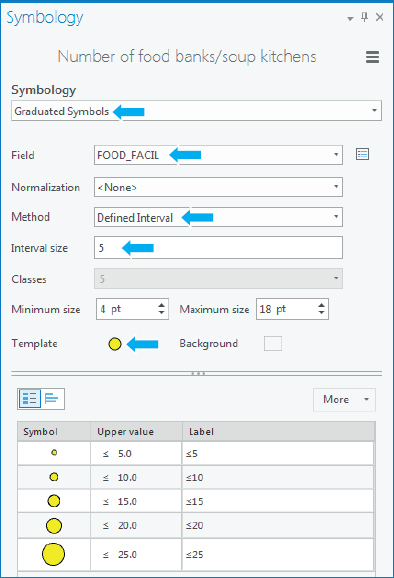
- 1.In the Contents pane, rename the first Neighborhoods layer as Number of food banks/soup kitchens.
- 2.In the Symbology pane, use these guidelines to symbolize the layer.
- Symbology: Graduated Symbols
- Field: Food_Facil
- Method: Quantile
- Classes: 5
Notice that the interval width is uniform, 2, except for the last class, so this attribute may be a good choice for the Defined Interval method (uniform distribution). An interval width of 5 is a good choice to include the maximum value of 25. Equal-width intervals are the easiest to read and are, of course, best suited for uniform distributions, but this distribution is not essential. Another possible method is defined interval, which allows you to use easily read numbers such as 1, 2, or 5 times 10 to a power (for example, 0.1, 1.0, and 10).
- 3.Change Method to Defined Interval. You may need to resize the Symbology pane to see the options.
- 4.Click the Template symbol (circle), and choose Solar Yellow as the color.
- 5.Click Apply and the Back button. Your symbology should match what is shown in the figure.
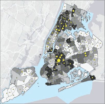
- 6.Close the Symbology window, and zoom to full extent. The finished map shows the number of food resources compared with the number of households with over age 60 receiving food stamps. The food pantries and soup kitchens appear concentrated in areas with poor populations, for the most part, as indicated by the map.
YOUR TURN
Turn on and rename the second Neighborhoods layer as Under 18 receiving food stamps. Use Proportional Symbols, U18_Food as the Field, a shade of purple as the color, 2 as the Minimum size, and 20 as the Maximum size. Use the Bronx and Brooklyn bookmarks to study the relationship of food banks, soup kitchens, and persons over 60 and under 18 receiving food stamps in one map. Save your project.
Tutorial 2-6: Normalized population map with custom scales
A choropleth map showing population, such as the number of persons receiving food stamps, is useful for studying needs, such as the demand for goods and services. For example, delivery of food services for the poor requires capacities to match populations, including budgets, facilities, materials, and labor.
Choropleth maps of normalized population data have different uses than choropleth maps of populations. Dividing (normalizing) a segment of the population by the total population provides information about the makeup of areas. For example, areas with high proportions of total population receiving food stamps may be better candidates for food pantries and soup kitchens than those with low proportions, because the high-proportion areas are likely poor in many ways, including having poor geographic access to grocery stores and urgent health care.
In this tutorial, you will normalize the number of female-headed households (single mothers) with children under the age of 18 receiving food stamps by the total number of households in each neighborhood. You will find the same information for male-headed households (single fathers) with children under the age of 18 receiving food stamps and compare the two populations using a custom scale.
Open the Tutorial 2-6 project
- 1.Open Tutorial2-6.aprx from Chapter2\Tutorials, and save the project as Tutorial2-6YourName.aprx. The map opens showing New York City neighborhoods (female-and male-headed households receiving food stamps), boroughs, and water features.
- 2.Zoom to full extent.
Create a choropleth map with normalized population and custom scale
You will create a custom classification, which often is easier to read than other classifications. The Geometric Interval method works well for representing the long tails of distributions skewed to the right, but the break points of this method do not follow a pattern that can be read easily. The custom classification of this exercise has intervals that double in width (and therefore forms a geometric progression), which is read easily.
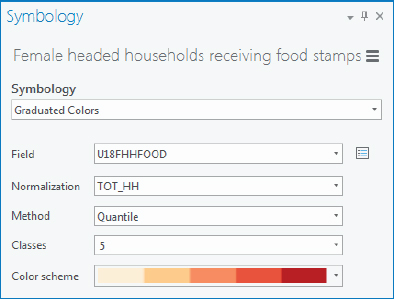
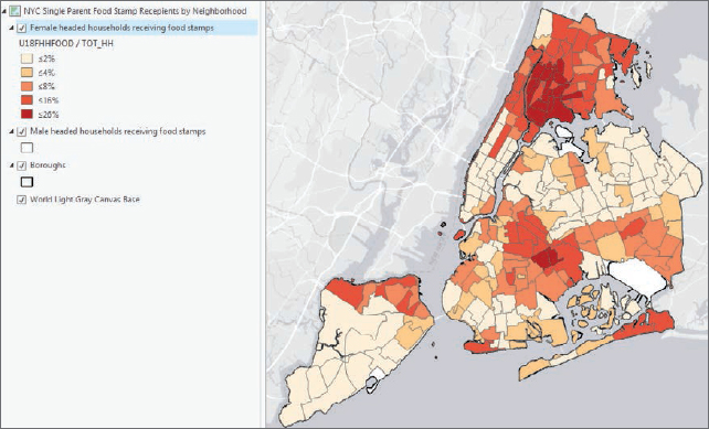
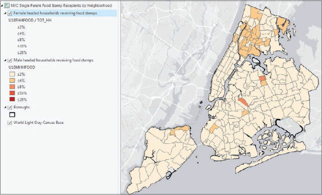
- 1.Symbolize Female headed households receiving food stamps using these guidelines:
- Symbology: Graduated Colors
- Field: U18FHHFood
- Normalization: TOT_HH
- Method: Quantile
- Classes: 5
- Color scheme: Orange-Red (5 classes)
These settings show the fraction of single mothers with children under 18 receiving food stamps. Next, you will show the values as a percentage.
- 2.Click the Symbology Options button
 > Advanced > expand Format labels.
 - 3.In the Category menu, choose Percentage.
- 4.For Percentage, click “Number represents a fraction…”, and for Rounding, choose 0 for Decimal places.
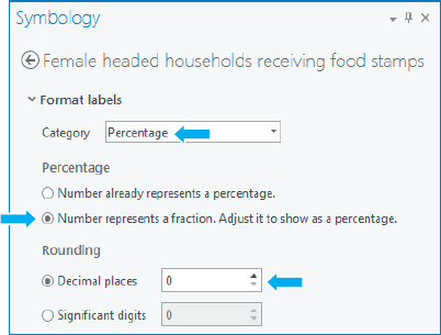
- 5.Click the Back button, and click the Histogram view button. The classification will now show the percentage of single mothers who receive food stamps. Expressed as percentages and rounded, the quantile break values are 1 percent, 2 percent, 6 percent, 10 percent, and 26 percent. Next, you will create custom classes using the mathematical progression 2 percent, 4 percent, 8 percent, 16 percent, and 26 percent, and the last value is the maximum.
- 6.Change the method to Manual Interval.
- 7.Click the Label View button
 .
. - 8.In the Class breaks panel, click the cell for the first Upper value, type 0.02, and press Enter. This makes the first class 2 percent.
- 9.Continue selecting break points, and enter 0.04, 0.08, 0.16, and 0.26 (the maximum value rounded to two decimal places).
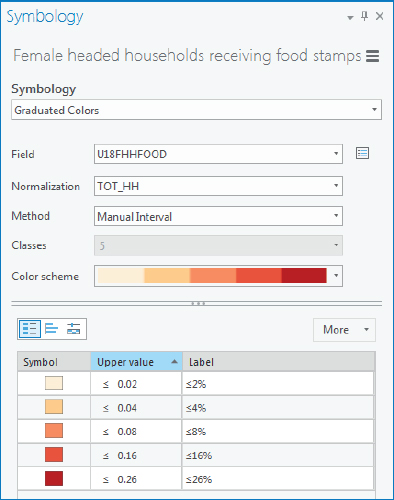
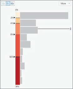
- 10.Click the Histogram view button. Notice that this set of break points has wider intervals for low values than quantiles, which allows an additional value (0.16) for high values, thereby providing more information about high values.
The numerical sequence of the custom break points has both increasing interval widths as desired for the long-tailed distribution and a recognized and easy set of values to read.
Import symbology and use swipe to compare features
To easily compare two maps, especially normalized segments of the same total population, you will use the same numerical and color scales for both maps. ArcGIS Pro allows you to easily import symbology. Next, you’ll import and reuse the symbology of the female-headed households for the male-headed households. You will see many fewer male-headed households receiving food stamps.
- 1.Open the Symbology pane for Male-headed households receiving food stamps, click the Options button
 > Import symbology.
 - 2.In the Geoprocessing pane, make the selection as shown:
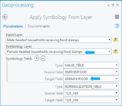
- 3.Click Run, and when it finishes, close the Geoprocessing and Symbology panes.
- 4.In the Contents pane, click Female headed households receiving food stamps.
- 5.On the Appearance tab under Effects, click Swipe, and drag the cursor vertically or horizontally to reveal the layer underneath. This step allows you to see the values of the male-headed household receiving food stamps layer without having to turn off the layer above it. You can see the same spatial patterns in both maps, but with much lower percentages for male-headed households receiving food stamps.
- 6.On the Map tab, click the Explore button to deactivate swipe.
- 7.Save your project.
Tutorial 2-7: Density maps
Density maps divide populations and other variables by their polygon areas, yielding a measure of spatial concentration. If you divide a population by its polygon areas, the resulting population density (for example, persons per square mile) can provide information related to congestion or how people are distributed across an area.
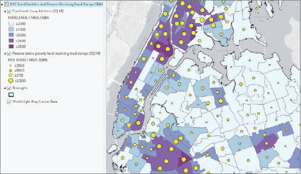
A neighborhood with a high density of households receiving food stamps but a low density of food banks and soup kitchens may help determine potential locations for new food banks or kitchens.
Open the Tutorial 2-7 project
- 1.Open Tutorial2-7.aprx from Chapter2\Tutorials, and save the project as Tutorial2-7YourName.aprx. The map opens with neighborhoods added but not yet classified.
- 2.Zoom to full extent.
Create the density map
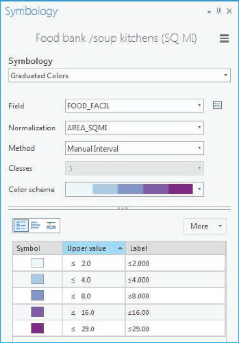
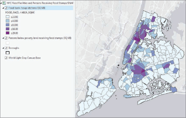
- 1.Using these guidelines, symbolize Food bank/soup kitchens (SQ MI):
- Symbology: Graduated Colors
- Field: Food_Facil
- Normalization: Area_SQMI
- Method: Manual Interval
- Classes: 5
- Color scheme: Blue-Purple (five classes)
- Break points: 2, 4, 8, 16, 29
- 2.Close the Symbology pane. You can readily see where there are high densities of food banks and soup kitchens.
YOUR TURN
Create a density map for “Persons below poverty level receiving food stamps (SQ MI)” using (POV_Food) normalized by Area_SQMI. Use Graduated Symbols; 4 classes, Manual Interval with upper values 300, 900, 2700, and 13000; circle 3 with Solar Yellow color; and a symbol size range from 4 to 12. Zoom and pan the map. Do you see any gaps with high population densities but low food facilities densities? Save your project.
Tutorial 2-8: Group layers and layer packages
You can place layers together into groups to manage them more easily. For example, you can change the visibility of an entire group layer with one click. You can also save a group layer (or any single layer) as a layer package (a file with an .lpkx extension). A layer package is one file with all data sources and symbology included. You can share this package with others, including in ArcGIS Online. In this tutorial, you will create group layers for populations and facilities in New York City by administrative and political features, including fire companies and police precincts. You will then create layer packages from layer groups.
Open the Tutorial 2-8 project
- 1.Open Tutorial2-8.aprx from Chapter2\Tutorials, and save the project as Tutorial2-8YourName.aprx. The map opens with the layers Boroughs, Police stations, Police precinct population per sq mile, Fire houses, and Fire company population per sq mile already symbolized.
- 2.Zoom to full extent.
Create police group layer
There are two ways to create group layers. The first way is to create an empty group layer, and then add layers to the group layer. The second way is to select existing layers in the Contents pane and create a group layer of the selection. You will use the first method to create a group layer for police.
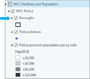
- 1.In the Contents pane, right-click the map NYC Facilities and Population, and click New Group Layer. A new layer, called New Group Layer, is created. Next, you will rename the layer.
- 2.Right-click New Group Layer > Properties.
- 3.In the Layer Properties window, on the General tab, for Name, type NYC Police.
- 4.On the Metadata tab, fill in the information:
- Title: NYC Police
- Tags: NYC, Police Stations, Precincts, Population
- Summary: NYC Police Stations and Precinct Populations
- Description: Same as Summary
- 5.Click OK.
- 6.In the Contents pane, drag the layer Boroughs just below the new layer group NYC Police.
- 7.Expand the layer group, and drag Police stations and Police precinct populations by sq mile below Boroughs.
- 8.Expand NYC Police to see the group layer’s member layers. These layers are indented below the layer group name NYC Police.
Create fire group layer
Here you use a shortcut to create a group layer using selected layers.
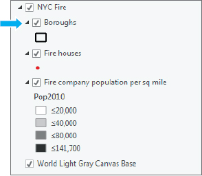
- 1.In the Contents pane, press and hold the Shift key, and select layers Fire houses and Fire company population per sq mile.
- 2.Right-click either layer, and click Group.
- 3.In the Layer Properties window, rename the new group NYC Fire.
- 4.On the Metadata tab, fill in the information and click OK:
- Title: NYC Fire
- Tags: NYC, Fire Houses, Companies, Population
- Summary: NYC Fire Houses and Company Populations
- Description: Same as Summary
- 5.Copy and paste the Boroughs layer from the NYC Police group layer to the NYC Fire group layer.
- 6.Rearrange the order of the layers in the group layer as shown.
- 7.In the Contents pane, click the NYC Police group layer.
- 8.On the Appearance tab, under Effects, drag the transparency from 0 to 100%. Drag the transparency back to 0. This is an alternative to swipe that is not available in a layer group. If transparency is set to 100 percent, it will be at 100 percent in the layer package, and the features won’t show up when the package is added to the new map until transparency is reduced.
- 9.Collapse both groups to one line each, NYC Police and NYC Fire, and expand both groups to show all layers.
Create and add a layer package
A layer package is a portable file with data and symbolization for all layers in a group or for a single layer that you can share or upload to ArcGIS Online. In addition to creating layer packages, you can also create and share individual layers as layer packages.
- 1.In the Contents pane, right-click NYC Police, and click Share As Layer Package.
- 2.Make selections or type as shown, saving the layer package file to Chapter2\Tutorials. Note that you cannot have spaces in the layer package name.
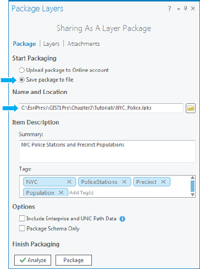
- 3.Click Analyze and then Package, and wait for the layer package to be prepared. You will see a message stating that the layer package was successfully created. Your new layer package can be used in another map, shared with another ArcGIS user, or uploaded to ArcGIS Online.
- 4.Insert a new map, and add NYC Police from Chapter2\Tutorials. The layers will appear as a group and be already classified.
YOUR TURN
Create and add a layer package for NYC Fire to a new map, and save your project.
Assignments
This chapter has four assignments to complete that you can download from this book’s resource web page, at esri.com/gist1arcgispro:
- Assignment 2-1: Analyze accessibility to charter schools in New York City.
- Assignment 2-2: Study K-12 population versus school type densities.
- Assignment 2-3: Analyze military sites for closures by congressional district.
- Assignment 2-4: Analyze US veteran unemployment status.