CHAPTER 5
Spatial data
LEARNING GOALS
- Work with world map projections.
- Work with US map projections.
- Work with projected coordinate systems (PCS).
- Learn about vector data formats.
- Download US Census map layers and tabular data.
- Explore, download, and process data from Living Atlas of the World.
- Explore sources of spatial data from government websites.
- Explore maps from a university’s web service.
Introduction
The most important information that maps and GIS provide is location. Where is an object or event positioned? Is the object on a major street with good access? Is there a barrier to accessing it, such as a river? Is it in a certain area? Where are similar things positioned? What or who is near it? These are some of the questions that maps can answer.
Where you sit right now has two unique numbers, latitude and longitude coordinates that pinpoint your location precisely on the surface of the earth. In this chapter, you will learn some useful facts about latitude and longitude coordinates and the geographic coordinate system (GCS) that they are comprised in.
You will learn about map projections, making flat maps from the nearly spherical earth. You can project maps in at least 100 ways. Sometimes, what projection you choose makes a big difference, so this chapter provides some guidelines to your choice of projection.
For the world map in tutorial 5-1, you’ll change the geographic coordinate system to a projected coordinate system by setting the map properties.
For the continental-level map in tutorial 5-2, you’ll change the projected coordinate system to a different projected coordinate system by setting the map properties.
In tutorial 5-3, you’ll set the projected coordinate system (state plane) for a local-level map by adding a first layer to the map, and then specifying the display units for the map. You’ll add a second layer, which has geographic coordinates, and see how it’s projected on the fly to the state plane coordinates. Finally, you’ll change the geographic coordinate system for a state-level map to use a projected coordinate system (UTM) by setting the map properties.
The key input of GIS is geospatial data—digital data that represents, and can be rendered into, maps on a computer. You may collect some original geospatial data yourself, but more likely, most if not all of your map data will come from external organizations. Who collects aerial imagery, roads, population, or other map data that you will use? The answer is that international organizations and federal, state, or local governments collect the data and will provide it to you at little or no cost, increasingly as a download or service from the Internet. The Living Atlas of the World, available in ArcGIS Online, is one of the foremost sites for obtaining such data. You will explore the Living Atlas and other US federal sites in this chapter.
Tutorial 5-1: World map projections
ArcGIS Pro has more than 5,200 projected coordinate systems (and almost 600 geographic coordinate systems) that use 100 map projections from which you may choose. Typically, though, you will need only a relatively few projections for most purposes. Geographic coordinate systems use latitude and longitude coordinates for locations on the surface of the earth, while projected coordinate systems use a mathematical transformation from an ellipsoid (spheroid) or a sphere to a flat surface and rectangular coordinates. Geographic coordinates are angles calculated from the intersection of the prime meridian (which runs north and south through Greenwich, England) and the equator. Longitude, which measures east–west, ranges from 0 degrees to 180 degrees east and the same to the west. Latitude, which measures north–south, ranges from 0 degrees to 90 degrees north and the same for south. Although you can view 2D maps in geographic coordinates on your flat computer screen, they will be greatly distorted because their coordinates are from a sphere. ArcGIS Pro can easily switch between coordinate systems and map projections on the fly. For world maps, you’ll change the geographic coordinate system to a projected coordinate system by setting the map properties.
Open the Tutorial 5-1 project
This exercise shows you the distortions caused by displaying a map in geographic, latitude/longitude coordinates.
- 1.Open Tutorial5-1.aprx from Chapter5\Tutorials, and save it as Tutorial5-1YourName.aprx.
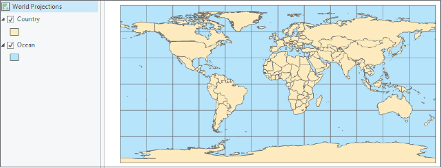
- 2.Zoom to full extent. The map has significant distortions. For example, the line running across the top and bottom of the map should be points, the North and South Poles. Also, Antarctica and Greenland are far larger proportionately than in reality. Although perhaps not evident, the lower 48 states of the United States are squashed in the vertical dimension, as are Europe and Asia.
Examine a world map in geographic coordinates
- 1.Place your pointer over the westernmost point of Africa, and read the coordinates on the bottom of the map window (appearing approximately at 17° W, 20° N). The network of lines on the map is called a graticule, and it has 30-degree intervals east–west and north–south.
Project the map on the fly to Hammer-Aitoff (world)
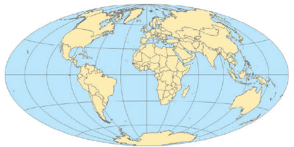
The projected coordinate system Hammer-Aitoff works well on a world map because it is an equal-area projection that preserves area. For example, if you want to map population densities (such as population per square mile), the densities will be correct.
- 1.In the Contents pane, right-click World Projections > Properties > Coordinate Systems. The current coordinate system is CGS WGS 1984.
- 2.Under XY Coordinate Systems Available, scroll down and click to expand Projected coordinate system > World, and click Hammer-Aitoff (world).

- 3.Click OK, and zoom to full extent. Note that the map displayed here has coordinates projected on the fly and that are not permanent changes to the feature class.
YOUR TURN
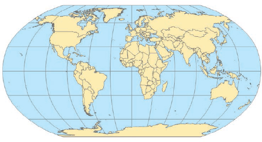
Repeat the steps of this exercise, but this time select the Robinson (world) projection in the second step. The Robinson projection is most accurate at the mid-latitudes in both the Northern and Southern Hemispheres where most people live, and overall it is appealing visually. This projected coordinate system minimizes some distortions but still has notable ones such as the lines at the top and bottom that in reality are points. As a general rule, though, use the Robinson projection for the entire world unless you have a specific need (such as mapping population densities, in which case use an equal-area projection). Save your project.
Tutorial 5-2: US map projections
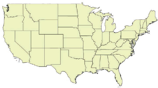
Next, you will gain experience with projections commonly used for maps of the continental United States. You can get accurate areas or accurate shapes and angles, but not both, when making a projected coordinate system. As a rule, use a projection that provides accurate areas (at the price of some shape and direction distortion), such as the Albers equal area or cylindrical equal area projection. Albers equal area is the standard projection of both the US Geological Survey and the US Census Bureau for US maps. For a continental-level map, you’ll change the projected coordinate system to a different projected coordinate system by setting the map properties.
Open the Tutorial 5-2 project
- 1.Open Tutorial5-2.aprx from Chapter5\Tutorials, and save it as Tutorial5-2YourName.aprx.
- 2.Use the Contiguous Lower 48 States bookmark. Initially, the map display is in projected coordinates using WGS 1984 Web Mercator (auxiliary sphere), which is the preferred PCS for maps to be published in ArcGIS Online.
Set projected coordinate systems for the United States
- 1.In the Contents pane, right-click US Projections > Properties > Coordinate System, and then scroll up and expand Projected coordinate system > Continental > North America.
- 2.Click USA Contiguous Albers Equal Area Conic, and then click OK.
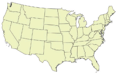
- 3.Zoom into the lower 48 states. Your map is now projected using the Albers Equal Area projection.
YOUR TURN
Experiment by applying a few other projections to the US map such as North America Equidistant Conic. As long as you stay in the correct group—Continental, North America—all the projections look similar. The conclusion is that the larger the part of the world that you need to project (small-scale maps), the more distortion. There remains much distortion at the scale of a continent, but much less so than for the entire world. By the time you get to a part of a state, such as Allegheny County, Pennsylvania, practically no distortion is left, as you will see next. Save your project.
Tutorial 5-3: Projected coordinate systems
For medium- and large-scale maps, you should use localized projected coordinate systems, tuned for the study area, that have little or minimal distortion. For this purpose, collections of projected coordinate systems are divided into zones. You must check a reference map to determine which zone your study area is in and select that PCS for your map. In these exercises, you’ll set the projected coordinate system (state plane) for a local-level map by adding a first layer to the map, and then specify the display units for the map. Then you’ll add a second layer that has geographic coordinates and see how that layer is projected on the fly to the state plane coordinates. Finally, you’ll change the geographic coordinate system for a state-level map to use a projected coordinate system (UTM) by setting the map properties.
Look up a zone in the state plane coordinate system
The state plane coordinate system is a set of coordinate systems dividing the 50 US states, Puerto Rico, and the US Virgin Islands, American Samoa, and Guam into 126 numbered zones, each composed of counties, and with its own finely tuned map projection. Used mostly by local government agencies such as counties, municipalities, and cities, the state plane coordinate system is for large-scale mapping in the United States. The US Coast and Geodetic Survey (now known as the National Geodetic Survey) developed this coordinate system in the 1930s to provide a common reference system for surveyors and mapmakers. Most states use NAD83, which stands for North American Datum of 1983, the datum used to describe the geodetic network in North American. That datum in turn was updated from the original North American Datum of 1927 when satellite geodesy and remote sensing technology became more precise and were made available for civilian applications. The first step in using the state plane coordinate system is to look up the correct zone for your area and consequently a specific PCS tailored to your study area.
- 1.Start a web browser, navigate to www.ngs.noaa.gov, and click Tools > State Plane Coordinates > Find Zone.
- 2.With By County selected, click Begin > Pennsylvania, and click Submit.
- 3.Click |003|Allegheny, and click Submit (leave the option button set to NAD83). Pennsylvania’s Allegheny County is in State Plane Zone 3702 (Lambert | Southern Zone). A few states changed the number of zones when the NAD83 set was defined. For instance, Montana went from three zones to a single zone.
- 4.Close your web browser. You can use the same website to find UTM zones that you will learn about in a later tutorial.
Open the Tutorial 5-3 project
ArcGIS Pro offers two options for setting the map’s coordinate system. One option is to allow the first map layer added to determine the coordinate system in each map according to its coordinate system. The other (default) option is to set a default coordinate system for all new maps in the project. In this exercise, you set the option to allow the first layer added to set the coordinate system for the project, in this case State Plane Pennsylvania South.
- 1.Open Tutorial5-3.aprx from Chapter5\Tutorials, and save it as Tutorial5-3YourName.aprx. The project opens with just a basemap and the default PCS, WSG 1984 Web Mercator (auxiliary sphere). You will change the option to have ArcGIS Pro set the coordinate system using the first layer added to the map—in this exercise, the state plane PCS.
Use state plane coordinates
- 1.On the Project tab, click Options > Map and Scene, expand Spatial Reference, click Use spatial reference of the first operational layer, and click OK. Note that here is where you can set the map’s projected coordinate system or geographic coordinate system, using the “Choose spatial reference” option regardless of what layers you add to it. Next, you will add a layer with a state plane coordinate system PCS and then a layer using a GCS.

- 2.Click the back button
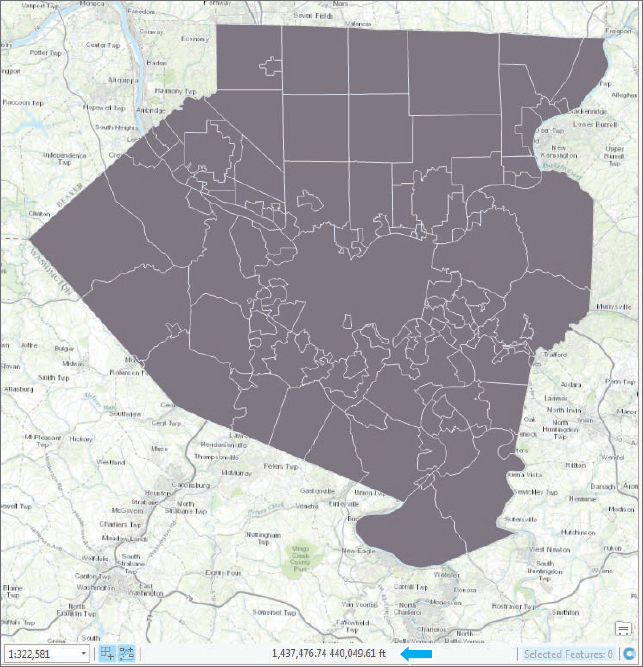
 , and on the Map tab in the Layer group, click Add Data, navigate to Chapter5.gdb, and add Municipalities. This map layer for Allegheny County, Pennsylvania, municipalities uses zone 3702 PA South State Plane coordinates, and the map unit is US survey feet. Next, you must change the display units to feet.
 - 3.In the Contents pane, right-click Allegheny County State Plane > Properties > General, select Feet as the display units, and click OK. The x,y coordinates at the bottom of the screen now display as State Plane feet.
Add a layer using geographic coordinates
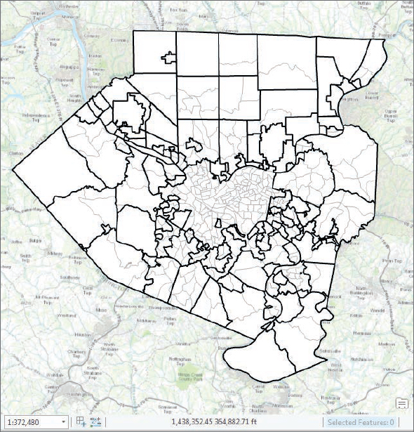
- 1.Add Tracts from Chapter5.gdb. This layer has geographic coordinates but is projected on the fly in the data frame to state plane coordinates because you added Municipalities first, which has state plane coordinates.
- 2.Change the symbology of Municipalities to No Color, Black outline width 1.5 and Tracts to Color White, Outline Color Gray 30%, and width 1 pt.
- 3.Move Municipalities above Tracts in the Contents pane.
Check a layer’s spatial reference
- 1.In the Contents pane, right-click Municipalities > Properties > Source, and expand Spatial Reference. The spatial reference for this layer is NAD 1983 StatePlane Pennsylvania South FIPS 3702 Feet, which uses the map projection Lambert Conformal Conic.
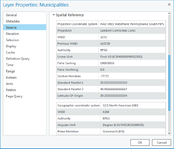
- 2.Repeat step 1 to check the spatial reference for Tracts. Its spatial reference is GCS North American 1983.
- 3.Save your project.
Use UTM coordinates
The US military developed the Universal Transverse Mercator (UTM) grid coordinate system in the late 1940s. It covers the world with 60 longitudinal zones defined by meridians (longitude lines) that are six degrees wide. ArcGIS has UTM zones available for the Northern and Southern Hemispheres. These zones, like state plane, are good for areas about the size of a state (or smaller).
Change a map’s coordinate system to UTM
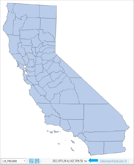
- 1.Close the Allegheny County state plane map, and open the California UTM map. Note that CACounties has geographic coordinates. You can look up UTM zones using the same website that you used for state plane.
- 2.In the Contents pane, right-click California UTM > Properties > Coordinate System.
- 3.Expand Projected coordinate system > UTM > NAD 1983, click NAD1983 UTM Zone 11N, and then click OK. The map coordinates will be degrees, minutes, and seconds. Next, you will change these coordinates to meters.
- 4.In the Contents pane, right-click California UTM > Properties > General, click Meters for Display Units, and click OK.
- 5.Use the California bookmark, and hover the mouse in the center of the state. The x,y coordinates at the bottom of the display will be UTM meters.
YOUR TURN
On the Project tab, click Options > Map and Scene > Spatial Reference. Click Choose spatial reference > Projected coordinate system > World > WGS 1984 Web Mercator (auxiliary sphere), and click OK. Insert a new map, add Counties, and then check the coordinate system of the map. It’s Web Mercator, the preferred format for ArcGIS Online. Save your project.

Tutorial 5-4: Vector data formats
This tutorial reviews file formats commonly found for vector spatial data, in addition to file geodatabases covered in chapter 4. Included are Esri shapefiles, x,y data, and Google KML files.
Examine a shapefile
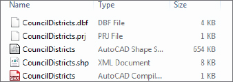
Many spatial data suppliers use the shapefile data format, an Esri legacy format from the early PC computer days, for vector map layers because it is so simple. A shapefile consists of at least three files with these extensions: .shp, .dbf, and .shx. Each file uses the shapefile’s name but with a different extension (for example, Cities.shp, Cities.dbf, and Cities.shx). The SHP file stores the geometry of the features, the DBF file stores the attribute table, and the SHX file stores an index of the spatial geometry to speed up processing. Next, you will examine a census tract shapefile in more detail.
- 1.Open a computer or File Explorer window, and navigate to Chapter5\Data\. CouncilDistricts is a shapefile for New York City Council Districts provided by the city’s Planning Department. Shapefiles have three to seven associated files, including the three mentioned previously (.shp, .shx, and .dbf) and also should have a PRJ file that contains the map layer’s coordinate system.
- 2.Close the computer window.
Import a shapefile into a file geodatabase and add to a map
You will use a conversion tool to import a shapefile into a file geodatabase, where it becomes a feature class.
- 1.Open Tutorial5-4.aprx from Chapter5\Tutorials, and save it as Tutorial5-4YourName.aprx. The project opens with a map zoomed to New York City with a PCS of NAD_1983_StatePlane_New_York_Long_Island_FIPS _3104_Feet.
- 2.On the Analysis tab, click the Tools button
 .
. - 3.In the Geoprocessing pane, click Toolboxes, expand Conversion Tools > To Geodatabase, and click Feature Class To Feature Class.
- 4.Complete the form as shown.
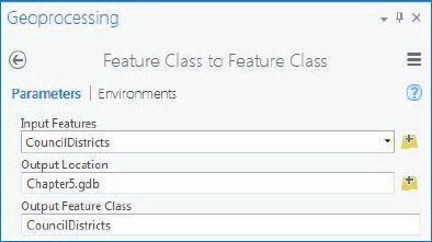
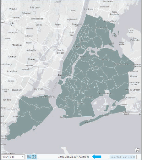
- 5.Run the tool and close it after it finishes. The shapefile will now be a polygon feature class in Chapter5.gdb and will automatically be added to the Contents pane. The council districts nicely overlay on the basemap. Note the state plane coordinates at the bottom of the map.
Add x,y data
GPS units and many databases provide spatial coordinates as x,y coordinates. These are easily added to a map as XY Event files. In this exercise, you use x- and y-values from a table to create a point feature class of public libraries in New York City.
- 1.On the Map tab, click Add Data, navigate to Chapter5\Data\ and add Libraries.dbf.
- 2.In the Contents pane, right-click Libraries > Open, and scroll to the right to see columns XCOORD and YCOORD. These coordinates are in state plane format for New York City. The x,y locations are often obtained using GPS units and are in longitude and latitude format. In these cases, x is the longitude and y is the latitude, and the spatial reference should be GCS WGS 1984 or a similar geographic coordinate system.

- 3.Close the table.
- 4.In the Contents pane, right-click Libraries > Display XY Data.
- 5.In the Make XY Event Layer pane, check to be sure XCOORD is the X Field, YCOORD is the Y Field, and click Current Map [Vector Data Formats] as the Spatial Reference. The spatial reference will automatically set itself to NAD_1983_StatePlane_New_York_Long_Island_FIPS_3104_Feet.
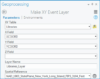
- 6.Run the tool and close it after it finishes. The libraries will appear as points in the map. This layer is temporary in the project, and the points should be exported as point features.
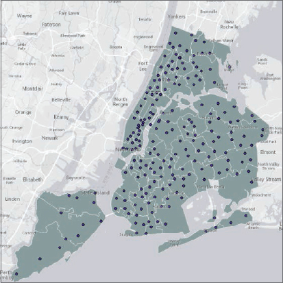
- 7.Export the Libraries_Layer as NYCLibraries to Chapter5.gdb as a permanent feature class. The library point features will automatically be added from the new location of Chapter5.gdb.
- 8.Remove the Libraries_Layer and original Libraries.dbf from the Contents pane, and save your project.
Export to a Google KML file
Google KML (Keyhole Markup Language) is the file format used to display geographic data in many mapping applications. KML has become an international standard maintained by the Open Geospatial Consortium (OGC). In this exercise you will export the New York City Council Districts to Google KML format.
- 1.On the Analysis tab, click the Tools button.
- 2.In the Geoprocessing pane, click Toolboxes > Conversion Tools > KML, and click Layer To KML.
- 3.Fill in the form as shown.
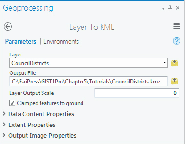
- 4.Run the tool and close it after it finishes.
- 5.Save your project and exit ArcGIS Pro. Although you won’t do it here, you could now open the .kmz file, the compressed version of a KML file, in an application such as Google Earth.
Tutorial 5-5: US Census map layers and data tables
A large and ever-expanding collection of spatial data—including vector and raster map layers and data tables with geocodes—is available for free download from the Internet or for direct use as map layers in projects. The advantage of downloading spatial data is that you can modify it as you wish. In this tutorial, you will learn about and use data from the US Census Bureau, a major spatial data supplier.
From the US Census Bureau’s website, you can download census-related map layers with unique identifiers for polygons such as census tract IDs, but not census attribute data such as population, age, sex, race, income, and so on. Because there are thousands of census variables, it is impractical to provide them all in map layer attribute tables. The map layers would be excessively large and cumbersome files. Instead, the Census Bureau provides the American FactFinder website in which you can build custom collections of variables for your needs. The Census Bureau continually updates this website, so you might find that some popular collections of data are already available and that the website’s menus may vary.
In this tutorial, you will download selected census demographic data separately, perform some data preparation steps, and finally join the data to the corresponding polygon boundary map layer. First, you will download TIGER (topologically integrated geographic encoding and referencing) shapefiles for tracts and county subdivisions of Hennepin County, Minnesota, where the city of Minneapolis is located.
Download census TIGER files
In a web browser, go to http://www.census.gov/geo/maps-data/data/tiger.html.
Alternatively, go to www.census.gov, and click Geography > Maps & Data > TIGER products. Here you will see options for downloading TIGER features, including shapefiles, geodatabases with limited demographic and economic data already joined, and KML files.
- 1.Under the heading “Which product should I use?” click TIGER/Line Shapefiles > expand Download, and click Web interface. If you have trouble finding this site, the direct URL to this link is http://www.census.gov/cgi-bin/geo/shapefiles/index.php.
- 2.Select 2010 for year and Census Tracts for layer type, and click Submit. Although there are newer dates, select 2010 for layers from the decennial census of 2010.
- 3.Under Census Tract (2010), select Minnesota; under Select a County, select Hennepin County; and click Download.
- 4.Save the compressed file to Chapter5\Tutorials\Downloads\Census, and extract all files associated with the shapefile here.
YOUR TURN
Download and extract 2010 County Subdivisions and Water (Area Hydrography) features for Hennepin County, Minnesota, to the Downloads\Census folder.
Download census tabular data
The Census Bureau provides detailed data on education, income, transportation, and other subjects through its American Community Survey (ACS) tables. In the 2000 and previous censuses, such data was collected in the census long form randomly from one out of six households, and was called SF3 (Summary File 3) data. Now, the Census Bureau collects ACS data monthly—approximately 3 million housing units receive a survey similar to the old long-form questionnaire. Annual, three-year, and five-year estimates produced from ACS samples are available. In this exercise, you will download commuting-to-work ACS data at the tract level for Hennepin County, Minnesota. The city of Minneapolis is ranked high in the nation for the quality of its transportation infrastructure, including bike lanes, according to several groups and publications (including the League of American Bicyclists and Bicycling). The census is a good starting point to analyze means of transportation to work by overall percentages, males, and females. You will first select the geography (all tracts in Hennepin County) and then the topic (commuting characteristics by sex).
- 1.In a web browser, go to factfinder.census.gov, click Advanced Search (under Guided Search), and the Show Me All button.
- 2.Click Geographies > Census Tract-140 as the geographic type > Minnesota as the state > Hennepin as the county > All Census Tracts within Hennepin County, Minnesota > and click the Add to Your Selections button.
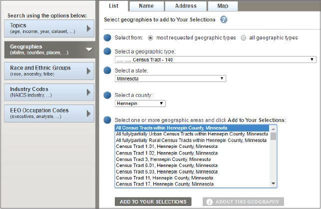
- 3.Close the Select Geographies window.
- 4.Select the check box on the left of S0801 (Commuting Characteristics by Sex) 2015 ACS 5-year estimates > Download button > and click OK. The Census Bureau constantly adds data to its website, so there may be newer datasets for ACS five-year estimates that you could use for updated studies. This tutorial uses data from the 2010–2015 American Community Survey and will work nicely with the 2010 Tracts.
- 5.Click the Download button again, and save the file to the Downloads\Census folder.
- 6.Extract the contents to the same Downloads\Census folder.
Process tabular data in Microsoft Excel
The census data that you downloaded in the previous exercise as a text table needs some cleaning up using software such as Microsoft Excel before you use the data in GIS. You will delete all columns except those needed for joining and the estimate of percentages of males and females who bicycle to work.
- 1.Navigate to Chapter5\Tutorials\Downloads\Census, and double-click the comma-separated file named ACS_15_5YR_S0801_with_ann. The file opens in Excel.
- 2.Select and delete fields C through (and including) BK.
- 3.In the resulting columns, delete H through (and including) JX. The resulting data columns are the total percentage of people who bicycle to work, the estimates of males and females, and the margin of error associated with the estimates. For this exercise, you will delete the margin of error fields and keep only the percentage estimates.
- 4.Select and delete margin of error fields HC01_MOE_VC12 and HC02_MOE_VC12.
- 5.Rename cell HC01_EST_VC12 as TOT_BIKE, cell HC02_EST_VC12 as MALE_BIKE, and cell HC03_EST_VC12 as FEMALE_BIKE.
- 6.Remove the periods from cells A1 and A2, and delete row 2.
- 7.Highlight columns C, D, and E, and change the field type from General to Number.
- 8.Rename the workbook BIKE_WORK. Your spreadsheet should look like the one shown next.

- 9.Save your work to the Downloads > Census folder as a comma-delimited file (CSV) named BikeWorkData.CSV, and close Excel.
Add and clean data in ArcGIS Pro
- 1.Open Tutorial5-5.aprx from Chapter5\Tutorials, and save it as Tutorial5-5YourName.aprx.
- 2.Import your downloaded county subdivisions (tl_2010_27053_cousub10.shp) into Chapter5.gdb as HennepinCountySubdivisions, census tracts (tl_2010_27053_tract10.shp) as HennepinTracts, water features (tl_2010_27053_areawater.shp) as HennepinWater, and your comma-delimited file (BikeWorkData.CSV) as BikeWorkData.
- 3.In the Hennepin County Bike to Work Study map, navigate to Chapter5.gdb, and add HennepinCountySubdivisions, HennepinTracts, HennepinWater, and BikeWorkData. You may need to close and reopen the map document to see the table (BikeWorkData).
- 4.Open the table for BikeWorkData. Note that GEOid2 is a numeric field.

- 5.Close the BikeWorkData table, and open the attribute table for HennepinTracts. The candidate field for joins is GEOID10 and is a text field.
- 6.Open Fields View from the Option button of the table, and create a numeric field (whose field type is double) named GEOIDNUM.
- 7.Save and close the Fields View.
- 8.Use Calculate Field to set GEOIDNUM equal to GEOID10. This step is necessary to join tables in which the join field must be the same type.
- 9.Close the HennepinTracts table.
Join data and create a choropleth map
- 1.Join the BikeWorkData table to HennepinTracts using fields GEOIDNUM (Input Join Field) and GEOid2 (Output Join Field).
- 2.Export the joined table/features as HennepinTractsBikeWork in Chapter5.gdb, and copy and paste the layer so there are two copies.
- 3.Rename one layer % Male bicyclists and the other layer % Female bicyclists.
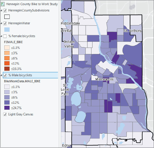
- 4.Create a choropleth map using the field Male_Bike, the color scheme Purple (5 classes), and upper values 1.5 %, 3 %, 6 %, 12 %, and 24.7 %.
- 5.Create the same map for FEM_Bike, using the color scheme Orange (5 classes) and values 1.5 %, 3 %, 6 %, 12 %, and 19.3 %.
- 6.Remove the original HennepinTracts layer and BikeWorkData table.
- 7.Move HennepinCountySubdivisions to the top of the Contents pane, and change its display to No Color and a black outline width of 1.5.
- 8.Label this layer using Name10 with a white halo.
- 9.Move HennepinWater below HennepinCountySubdivisions, and change its display to Water (area).
- 10.Zoom to the City of Minneapolis, and turn the layers on and off to see the difference in percentage of males versus females who bicycle to work, and then save your project. Do males or females bicycle to work in different parts of Minneapolis at a higher percentage?

Tutorial 5-6: Download data from the Living Atlas
You can access and quickly use content from the Living Atlas of the World. The Living Atlas is one of the foremost collections of geospatial data around the world. Data includes maps and data on thousands of topics in the form of imagery, basemaps, and features that can be added directly or saved locally. Examples include historic maps, demographics and lifestyles for the United States and many other countries, landscapes, oceans, Earth observations, urban systems, transportation, boundaries and places, and story maps. You can use and contribute data, maps, or apps to the Living Atlas. Like any other active website, more data is constantly added, so check livingatlas.arcgis.com often for updates.
In this exercise, you will search for and add a land-use raster map, and then extract it for only Hennepin County, Minnesota. Whereas vector maps are discrete—consisting of points, lines, and polygons connecting coordinates—raster maps such as the land-use map represent continuous phenomena and use many of the same file formats as images on computers, including Joint Photographic Experts Group (.jpg) and tagged image file (.tif) formats. All raster maps are rectangular, consisting of rows and columns of cells known as pixels. Each pixel has associated x,y coordinates and a z attribute value, such as altitude for elevation or some other properties of the earth’s surface. Raster maps do not store each pixel’s location explicitly but rather store data such as the coordinates of the northwest corner of the map, cell size (assuming square pixels), and the number of rows and columns, from which a computer algorithm can calculate the coordinates of any cell.
Open the Tutorial 5-6 project
In ArcGIS Pro, you can add data from the Living Atlas using the Catalog pane > Portal (Living Atlas) or by using the Add Data button.
- 1.Open Tutorial5-6.aprx from Chapter5\Tutorials, and save it as Tutorial5-6YourName.aprx.
Add a land-use layer from the Living Atlas
- 1.On the Map tab, click Add Data.
- 2.Click Portal > Living Atlas.
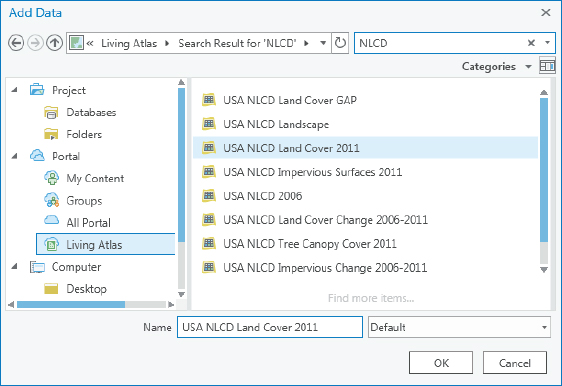
- 3.In the Search Portal: Living Atlas window, type NLCD, and press Enter.
- 4.Click USA NLCD Land Cover 2011, and click OK.
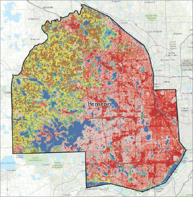
A land-use map for Hennepin County, Minnesota, with an updated legend shows areas of land use. Examples include development (red), open water (blue), forest (green), pasture/hay (yellow), and cultivated crops (brown).
Extract raster features for Hennepin County
A key aspect of raster maps is that they are very large files. So although you may store some important base-map raster files on your computer, these maps are perhaps best obtained as map services available for display on your computer but stored elsewhere such as the Living Atlas. If you want to extract a subset of the land use for one county and store the raster file on your local computer, you must use the Extract by Mask tool to do so.
- 1.On the Analysis tab in the Geoprocessing group, click Tools.
- 2.In the Geoprocessing pane, search for and open the Extract by Mask tool.
- 3.Select USA NLCD Land Cover 2011 as the Input Raster and Hennepin County as the feature mask data, and save the output raster as HennepinCountyLandUse to Chapter5.gdb.
- 4.Run the tool and close it after it finishes.
- 5.Remove the original land-use map, and zoom to the Hennepin County land-use layer. Notice the difference in Hennepin County with developed areas on the eastern side of the county and the forest, pasture/hay, and cultivated crops on the western part of the county.
YOUR TURN
Search for topics (for example, health or housing) or geographic areas (for example, China). Add and explore the contents of various Living Atlas layers.
Tutorial 5-7: Sources of data from government websites
In this tutorial, you will download data from two US government websites: USGS’s National Map Viewer and Data.gov. Agencies that contribute geospatial data to Data.gov include the US Department of Agriculture (USDA), Department of Commerce (DOC), National Oceanic and Atmospheric Administration (NOAA), US Census Bureau (Census), Department of the Interior (DOI), US Geological Survey (USGS), Environmental Protection Agency (EPA), and National Aeronautics and Space Administration (NASA). Many other agencies provide other data on federal websites such as Data.gov.
Download elevation contours from USGS
Walkability and bicycling studies often require knowledge of the topography of a city, and elevation contours are needed. You can get these contours from local GIS departments or the USGS.
- 1.In a web browser, go to http://viewer.nationalmap.gov/basic.
- 2.In the Search location box, type Minneapolis MN, and click Go.
- 3.Select Elevation Products (3DEP) and the check box next to Contours.
- 4.Under File Format, click Shapefile, and click Find Products.
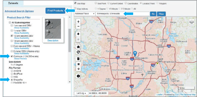
- 5.Click the Add this item to the cart > the View Cart button, and click Download.
- 6.Open the compressed downloaded file, and extract its contents to Chapter5\Tutorials\Downloads\USGS.
- 7.Open Tutorial5-7.aprx from Chapter5\Tutorials, and save it as Tutorial5-7YourName.aprx.
- 8.On the Map tab, click Add Data, and navigate to Chapter5\Tutorials\Downloads\USGS and the subfolder created.
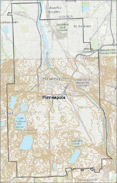
- 9.Add the Elev_contour shapefile to the map; in Contents, drag it below Minneapolis; and zoom to the Minneapolis layer. The map zooms to Minneapolis and contours of the southern part of the city, where you can see areas of the city that are flat. In chapter 7, you will learn how to clip these features to the city’s boundary.
- 10.Save your project.
Download geospatial data from Data.gov
Data.gov is the location of the US government’s open data, where you find many useful datasets to use in your GIS projects. It also includes links to resources such as cities and other local governments.
- 1.In a web browser, go to catalog.data.gov, and under Dataset Type, click geospatial. The type of data (for example, shapefile, Excel, KMZ) is listed below each dataset along with the source (for example, federal, local, university). You can also search for a dataset.
- 2.In the search box, type Africanized bees.
- 3.Click Spread of Africanized Honey Bees in the United States—Direct Download. This is a dataset of Africanized honey bees (killer bees) spread in the United States from the Agricultural Research Service, US Department of Agriculture (USDA). The data is saved using the Linux operating system command called “tar” and is saved as a compressed .tar.gz file.
- 4.Click the download button, and save the compressed file afrbeep020_nt00218.tar.gz to Chapter5\ Tutorials\Downloads\DataGov. The downloaded compressed file needs special software to extract the shapefile. The already extracted files, if needed, can be found in Downloads\DataGov\ AlreadyDownloaded. The downloaded shapefile does not have a coordinate system so you will next fix this using the Define Projection tool.
- 5.Close the USGS Elevation Contours map, and open the Africanized Bees Study map.
- 6.On the Analysis tab, click Tools, and type Define Projection in the search box.
- 7.Open the Define Projection tool, browse to Downloads\DataGov\AlreadyDownloaded, and select afrbeep020.shp.
- 8.Next to Coordinate System Unknown, click the Globe button
 , and select Geographic coordinate system > North America > NAD 1983.
 - 9.Run the tool, and close it after it finishes. The map features will be added to your map in the correct geographic location.
Create a map showing the migration of Africanized bees
- 1.Symbolize the map using graduated colors; field Year, 5 Classes; break values 0, 1994, 2000, 2005, and 2010; an orange-red color scheme; and a light-gray (30%) outline for all classes.
- 2.Type No Africanized Bees Yet for break value 0, and change its color to no color.
- 3.Type Africanized Bees 1994–2010 as the layer name.
- 4.Use the Lower 48 US States bookmark, and save your project. You can clearly see the southern states and the spread of Africanized bees between 1994 and 2010.

YOUR TURN
Explore other datasets on Data.gov, including local government data.
Tutorial 5-8: Maps from a university web service
Federal, state, and local governments are great sources of geospatial data. Universities and libraries are also clearinghouses for data. They often use Esri’s ArcGIS map services that allow you to connect to servers to directly add data. In this exercise, you will connect to Penn State University’s Pennsylvania Spatial Data Access (PASDA) ArcGIS map service and add imagery data.
Open the Tutorial 5-8 project
- 1.Open Tutorial5-8.aprx from Chapter5\Tutorials, and save it as Tutorial5-8YourName.aprx. The project opens with Pittsburgh parks displayed as semitransparent features and a yellow outline.
Connect to ArcGIS server map service
- 1.On the Insert tab in the Project group, click Connections > New ArcGIS Server.
- 2.In the Add GIS Server User Connection window, for Server URL, type http://imagery.pasda.psu.edu/arcgis/rest/services, and click OK. All the data and services provided by PASDA are free and open to the public without a password.
- 3.On the Map tab in the Layer group, click the Add Data button > Servers > click arcgis on imagery.pasda.psu.edu(user).ags > and click Open.
- 4.Double-click pasda, click AlleghenyCountyUrbanTreeCanopy2010, and click Select.
- 5.In the Contents pane, expand the AlleghenyCountyUrbanTreeCanopy2010 layer, and select the check box for AlleghenyCountyUrbanTreeCanopy2010.
- 6.Use the Point State Park bookmark. The details of the tree canopy in Pittsburgh’s Point State Park (where the three rivers meet) and parks along the riverfront are visible in the raster map.
YOUR TURN
Explore other map layers to add from PASDA’s web service. Try and find another university or library that provides Esri web services. Save your project.
Assignments
This chapter has two assignments to complete that you can download from this book’s resource web page, esri.com/gist1arcgispro:
- Assignment 5-1: Compare heating fuel types by US counties.
- Assignment 5-2: Study solar-heated homes by neighborhood.