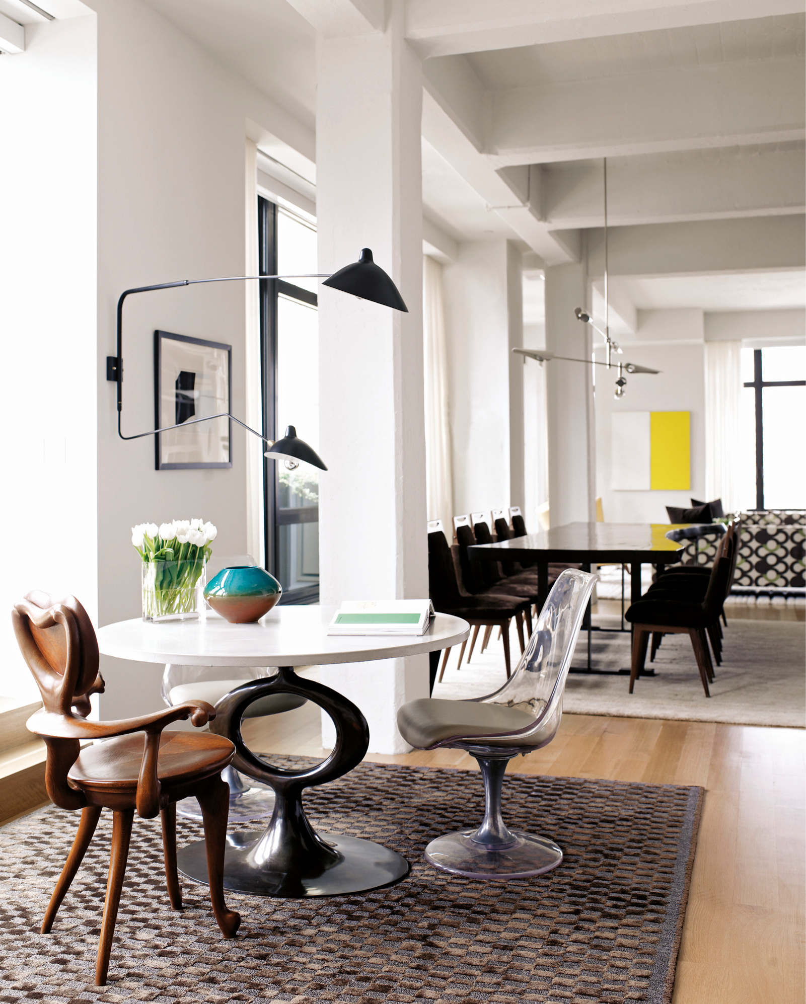
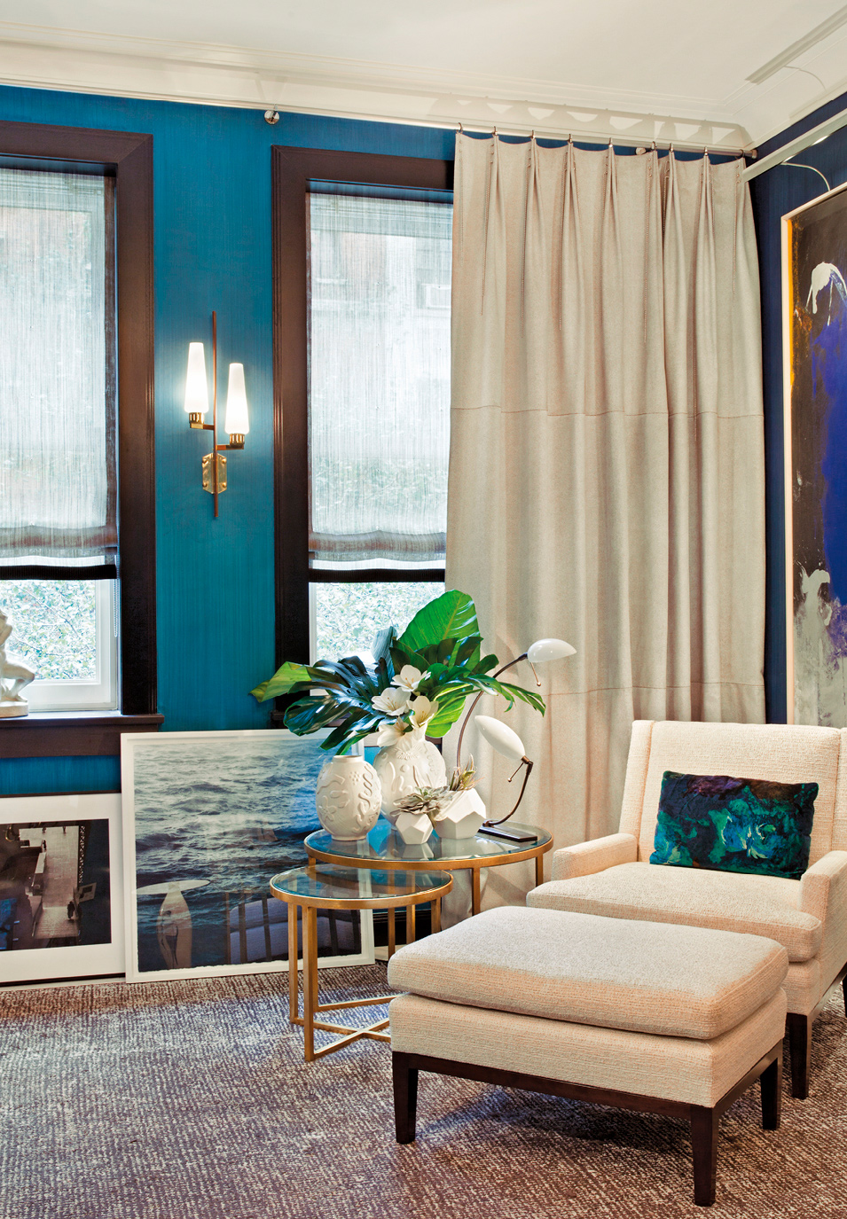
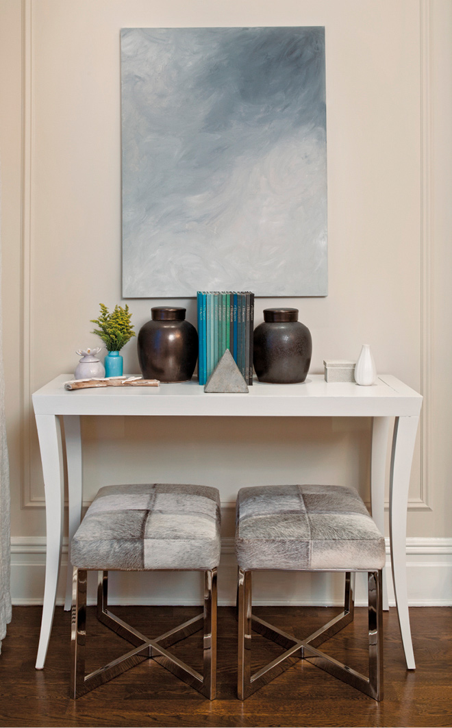
Carol Egan used area rugs to define discrete furniture groupings in an open-plan space.
SOFT FLOOR COVERINGS
Soft floor coverings, including any kind of rug or carpet, are a fundamental building block for many interiors. Installed from wall to wall, a carpet can unify a room, while an area rug creates an island in a larger space, demarcating zones or seating groupings. A cushy material underfoot warms up an environment and improves acoustics. Soft floor coverings also reinforce the design concept by conveying a certain personality: a rug’s color, pattern, scale, ability to reflect light, and even cultural origin or reference can establish or alter the very character of a space.
When selecting a carpet or rug, consider the entire residence. Pay attention to how floor coverings in each room will relate not only to their immediate surroundings but also to the overall design scheme.
THE OPTIONS
Most floor coverings are textiles, either woven or tufted, but hides and furs also fall into the category. Textiles come in two formats: wall-to-wall carpeting, which covers the entire floor (and is sometimes installed directly over the subfloor), and area rugs sized to the configuration of conversation areas or furniture groupings. Within those subgenres are a wide variety of materials—wool, linen, cotton, natural grasses, synthetics—and many methods of fabrication.
CHOOSE CARPETS AND RUGS THAT WORK IN CONCERT WITH THE TEXTURE, COLOR, AND PATTERN OF SURROUNDING FABRICS, WALL COVERINGS, AND WINDOW TREATMENTS.
Carol Egan used area rugs to define discrete furniture groupings in an open-plan space.
“I find wall-to-wall carpets in bedrooms in urban settings to be indispensable. They serve an acoustical purpose in absorbing unwanted noise and have the ability to make a space feel larger than with the use of an area rug. A plush and luxurious rug can set the right tone as your feet hit the ground in the morning. I always try to incorporate silk or viscose in bedroom carpets; that softness and sheen can have a tremendous impact.” —Phillip Thomas, designer

Area Rugs
There are many ways to fabricate a new area rug and numerous materials to choose from. Manufacturers produce them in standard sizes (see box below). Traditional or antique area rugs from around the world will come close to but never exactly match these sizes. Designers frequently commission a custom piece to suit the exact dimensions of a room and its furniture grouping. Area rugs are generally bound at the edges to prevent raveling.
Wall-to-Wall Carpeting
Long rolls of carpeting are laid side by side and stitched or seamed together to cover the entire floor. The most common type of wall-to-wall carpet is broadloom, which is woven in an extra-large format—up to 12 feet wide—so that there are few or no seams in the installations. Products come backed with a synthetic latex coating, sometimes supplemented with a scrim backing that lends dimensional stability, prevents snags and unraveling, and boosts moisture resistance. Broadloom is installed in one of two ways: glued down to the subfloor or tacked over a pad of jute or rubberized synthetic hair.
Carpet Tile
An alternative to broadloom is carpet tile, usually 18 to 20 inches square (or a slightly larger rectangle). The modular format means that tiles can easily be replaced if they get stained or damaged. As such, they are ideal for settings prone to heavy traffic, mess, or water damage: a child’s room, mudroom, basement-level play area, or workshop, for instance. Some carpet tiles have an integral pad that enhances their acoustical properties.

A hair-on cowhide rug lends texture and interest.

Boldly patterned wall-to-wall carpet is like a painting underfoot.
Layered carpeting: an antique area rug anchored by wall-to-wall sisal.

A zebra-skin rug is layered over sisal.
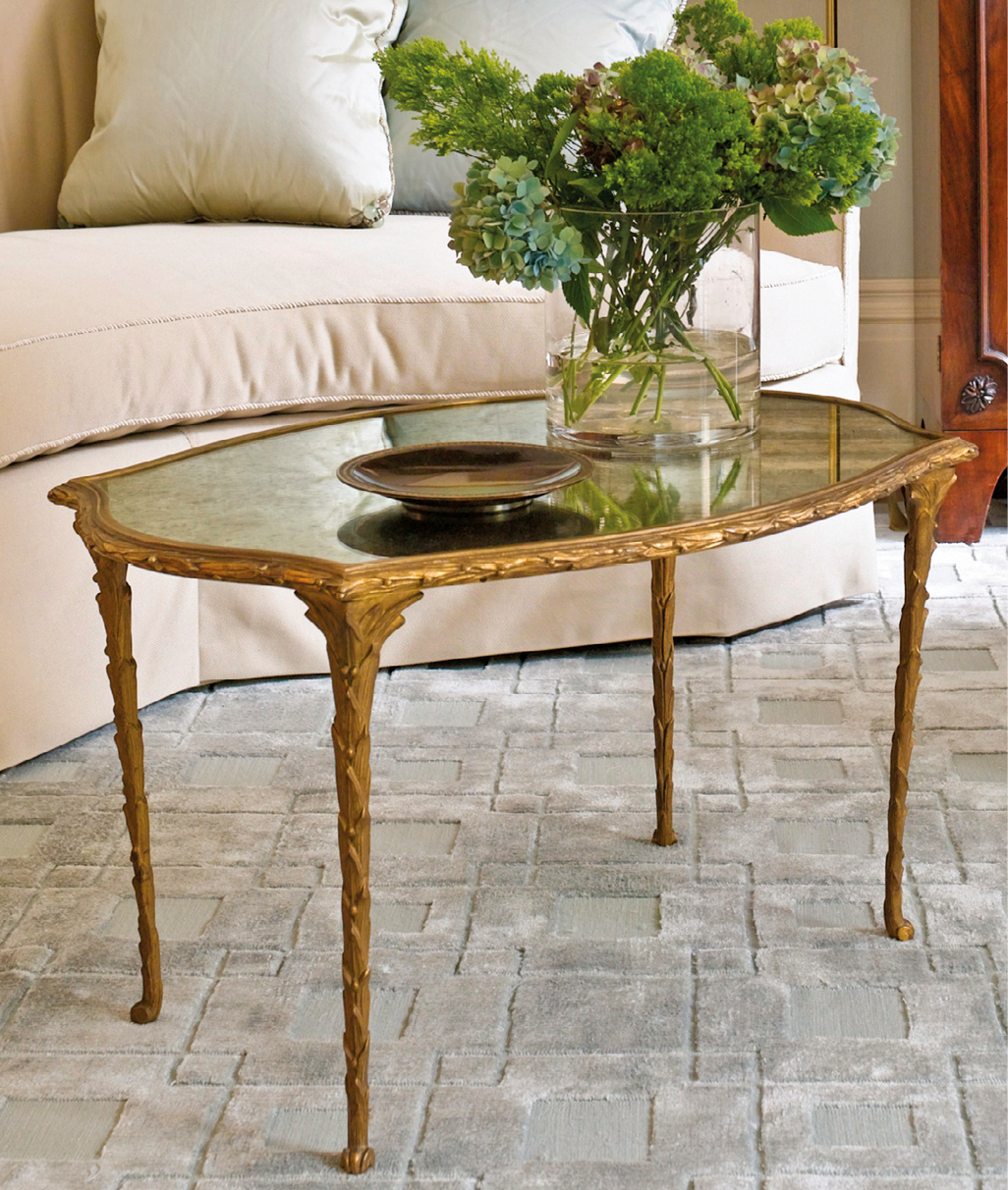
A custom area rug with a sinuous profile has been created to complement the design motif of the room.
DESIGN CONSIDERATIONS
Fundamental choices need to be made about material, construction, size/format, color, and pattern for carpets and rugs.
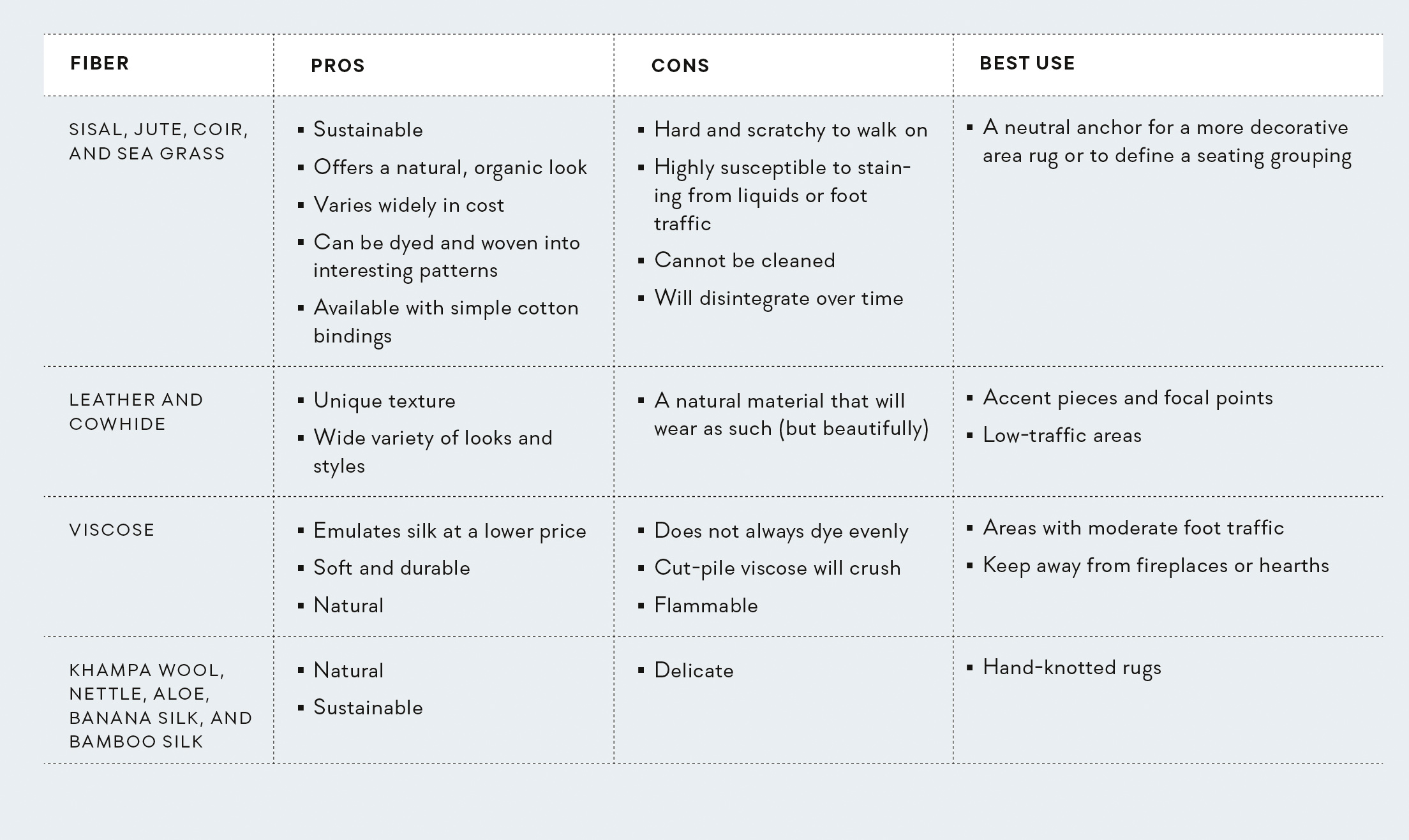
Materials
Many natural and synthetic fibers are used to make carpets and rugs; the most common are wool and nylon. Each material features unique properties of durability, appearance retention, stain resistance, and ease of maintenance (see this page).
Construction
The yarns of carpets and rugs are either woven together on a loom or punched (or looped) onto a backing material (a process called tufting).
WOVEN
Woven floor coverings are made on a loom and have a specific weave direction. They boast an artisanal feel, which creates a more casual look but means they may not be perfectly square or lie completely flat. Woven carpets come bound on the ends only.
TUFTED
The majority of carpeting manufactured in the United States today is tufted. In tufting, the fibers are punched onto a canvas backing that stabilizes the textile, prevents stretching, and lies very flat on the floor. Rugs and carpets are tufted either by machine or by hand:
Hand-tufting is an excellent medium for customization; because it is not limited by the constraints of automated mechanisms, it offers much creative flexibility. These floor coverings can be made in any shape and size and tufted in any direction to ensure that the texture correlates with the design motif.
Pass-machine tufting. This mechanized alternative to hand-tufting creates a cost-effective yet luxurious product. (Due to the complex setup, producers usually stipulate a minimum on custom orders.) The canvas backing is passed through a row of needles and then repositioned for the next parallel pass—a process similar to that of a sewing machine. Patterns are limited to stripes, twists, and other linear motifs, although simple designs can be hand-tufted on top. Machine-tufted carpet can be made in any shape and size for an installation with no seams.
The treatment of the pile (the fibers that make up the top of the carpet) affect the performance, appearance, and price of a tufted carpet.
Pile type. How do the fibers adhere to the backing? Are they are cut? How are they cut?
» With loop pile, both ends of the yarn are adhered to the backing, meaning the side of the yarn creates the surface of the rug. This renders the rug more durable—and the design more visually consistent.
» With cut pile, one end of the yarn is adhered to the backing and the other creates the surface. The same color appears darker in cut pile since the ends of the yarn absorb more light. It feels more velvety than loop pile, but will show walking patterns and vacuum lines and can pill, pool, or shade.
» Shearing is done with a tool that partially cuts the looped surface, exposing tiny end fibers that are darker than the side of the yarn to lend depth and richness. The level of shearing varies from 30 to 80 percent (100 percent shearing equals cut pile).
» A combination of cut and loop pile is often used to create textural emphasis or subtle patterns.
Density. Denser tufting holds the pile up firmly, which allows for better wear and more detailed patterning. The denser the carpet, the more durable and dirt-repellent it is—and the more it costs.
Pile height. When the pile is high, the individual yarns have less support and may fall over or be crushed. Footsteps will show on a high-pile sheared or cut carpet. (Longer yarns will read as a “shag” carpet.) Low pile is the more durable option.
Special effects. Various effects can be achieved by treating the yarns in a specific way prior to tufting:
» Twisting. Tightly winding together twisted yarns in two or more colors before threading the tufting needle creates a tweed-like or heathered texture. Tone-on-tone hues offer a subtler effect than do contrasting yarn colors.
» Stria (or striation). Loosely winding together two or more different-colored yarns before threading the tufting needle creates a watery pattern.
» Ombré. A gentle gradation between hues is created by using twists and/or striations of colors.
HAND-KNOTTED
Area rugs are woven in linear rows, so small, curving details may have a slightly pixelated look at lower knot counts (i.e., fewer knots per inch). Color, design, and pile can be customized in this labor-intensive method. Hand-knotted rugs may be slightly irregular in shape and size; corners don’t always lie flat.
Which Tuft to Choose
When commissioning a custom rug, pile heights and different qualities may be combined.
|
APPLICATION |
CHOICE |
|
Graphically complex rugs or carpets |
Tight, low loops or a dense, short cut pile |
|
Small design details |
Small, dense loops or a low cut pile (larger loops—or a less dense or taller cut pile—will distort) |
|
Textural effects |
Mix of loop and cut piles, or piles at different heights |
NEEDLEPOINT
Needlepoint rugs based on the centuries-old Portuguese Arraiolos stitch are entirely handmade, and the format does not lend itself to small design details. This expensive and labor-intensive process translates to longer lead times. Needlepoint rugs should not be used in high-traffic areas.
AUBUSSON CARPET
The Aubusson carpet industry was originally established to service the Royal Court of France. These carpets are labor intensive to produce—but the result is strong and durable. The tiny knots characteristic of this method allow for great detail and elaborate design.
Coloration and Dyeing
Carpet showrooms present their color selections on “poms”: small balls of yarn that are looped on one end and cut on the other. The loop side of the pom is always lighter in color than the cut end, because the latter reflects less light. When analyzing a pom for color, be sure to inspect the end that corresponds to the final carpet design, whether loop or cut pile. And always squeeze the pom end tightly, since it will better represent the density of the final carpet—and thus the true color.
Yarns are dyed in one of two ways:
Vegetable dyeing uses natural materials; therefore, the result will show natural variegation. Vegetable dye is typically used for hand-knotted and antique rugs.
In solution (i.e., chemical) dyeing, the color is integral to the fiber; therefore, the result is long lasting and resistant to fading, and the coloration is even. Solution dyeing cannot be used for natural fibers and yarns.
Customization
When an interior designer is involved in a project, she will often pursue the custom route, envisioning a rug or a carpet that is the perfect size, color, and pattern for the space. Customization is necessary when traditional or standard options are not available. Custom rugs must be ordered well ahead of installation, to allow for approval of the color rendering and sample (called a strike-off) prior to fabrication. Lead times can be very long (up to twenty-six weeks); specially commissioned needlepoint rugs can take an entire year from order to installation.
Custom rugs are most commonly made of wool, silk, a wool-silk blend, or nylon. Hand-tufted rugs offer the most versatility and options for customization, but even leather and hide can be made into bespoke designs. Irregularly sized spaces and stairways should be professionally measured and templated to ensure a proper fit. Developing a solid relationship with a quality vendor is advisable, given the myriad variables involved in customization.
A wool rug with silk accents creates an aqueous vibe in a beachfront home.
Varying pile heights create a geometric pattern on a tufted wall-to-wall carpet in a living room.

A high-pile carpet with silken threads.

INSTALLATION CONSIDERATIONS
Wall-to-wall carpet will be more complicated to install than an area rug, since it is fixed to the floor. It will also be vital to resolve issues like where seams are to be placed and how the carpet edge interfaces with adjacent hard flooring.
TEMPLATING
Custom wall-to-wall installations—as well as area rugs that are not rectangular—generally require that a template of the exact dimensions be made at the project site. This is especially true if the rug must be shaped exactly to a furniture grouping or to surrounding baseboards, hearths, built-ins, or other margins.
ORDERING
Wall-to-wall carpet is sold by the square yard and comes on a roll, typically 12 feet wide.
SEAMS AND DIRECTIONALITY
The designer or client must collaborate with the installer to create a seaming diagram that stipulates exacly where the seams of wall-to-wall carpet will lie to make them least visible—ideally in areas less prone to foot traffic, as they tend to fray when walked on. Because broadloom is directional, all rolls needs to be laid in the same orientation and come from the same dye lot so that color is consistent across the floor. The location of the seams will determine the amount of carpet to be ordered.
PADDING
In residential installations, broadloom is typically attached to wooden strips nailed around the room’s perimeter, which feature sharp, protruding tacks that grab the carpet. (Borders, if specified, are made separately and hand-seamed on-site before the carpet is “kicked” into place.) Installation over a pad increases the life of the carpet and enhances its insulating properties. Padding is typically made of rubber or a combination of synthetic hair and jute. Higher density equals increased durability—of the pad and the carpet. Pads differ in the amount of cushioning they provide; a 3⁄8-inch-thick pad is recommended for most residential wall-to-wall applications. Area rugs should be installed over a 1⁄16-inch-thick nonskid rubber mat (available when purchasing the rug).
GLUE-DOWN CARPET
A more budget-conscious method is to glue carpet directly to the subfloor using heavy-duty mastic. This is not recommended for high-end carpeting, as any discrepancies in the subfloor will be telegraphed, or show through the carpet. Glue-down carpet is also hard to remove.
WHERE CARPET MEETS A FLOOR
Transitioning from a fully carpeted floor to tile or wood is tricky. Counterintuitively, it is the edge of the hard material that is delicate and needs protecting. There are a few transitional choices, including aluminum strips that cover both edges and rubber extrusions that ease the change in height or material. For wood floors, a small saddle or wood strip is best.
CARPETING STAIRWAYS
Stairway installations are complex and generally pricey. There are two methods:
A waterfall installation allows the carpet to fall diagonally from the riser above to the crotch below, where it is tucked in.
A Hollywood installation wraps the carpet around the bullnose of the tread, and hugs the riser down to the crotch; this is more labor intensive, but more tailored.
When applying a carpet with a linear weave direction, run the weave perpendicular to the step. Rows will separate slightly when they bend over the bullnose, showing the canvas; this is referred to as a “smile.” (The backing can be dyed a similar color—at an additional cost—so the smile will not show.) The type of stairway determines how the carpet is installed:
Carpet for a straight flight is made in long or individual pieces. Each step is calculated at 24-inch lengths (12 for the riser, 12 for the tread). The sides of straight stairway runs are usually bound and the ends unbound.
Carpet for curved or shaped stairways is made individually for each step and installed on-site. Templating is a must for an exact fit. This requires making a blueprint of each tread and engineering the pattern and border specifically for it. Each step is ordered with 3 inches of overage on the ends, and the sides are bound (unless borders are to be seamed on-site, as is the case when ordered before stairs are built or completed).
Margins are measured from the rug to the inside edge of the banister post(s)—not to the outside of the step. The margin depends on how wide the steps are and how much of the flooring material is to be shown on the sides. If the project is under construction at the time the order is placed, actual stair widths can only be determined from a plan. Add overage to the sides of the steps and have borders seamed on-site.

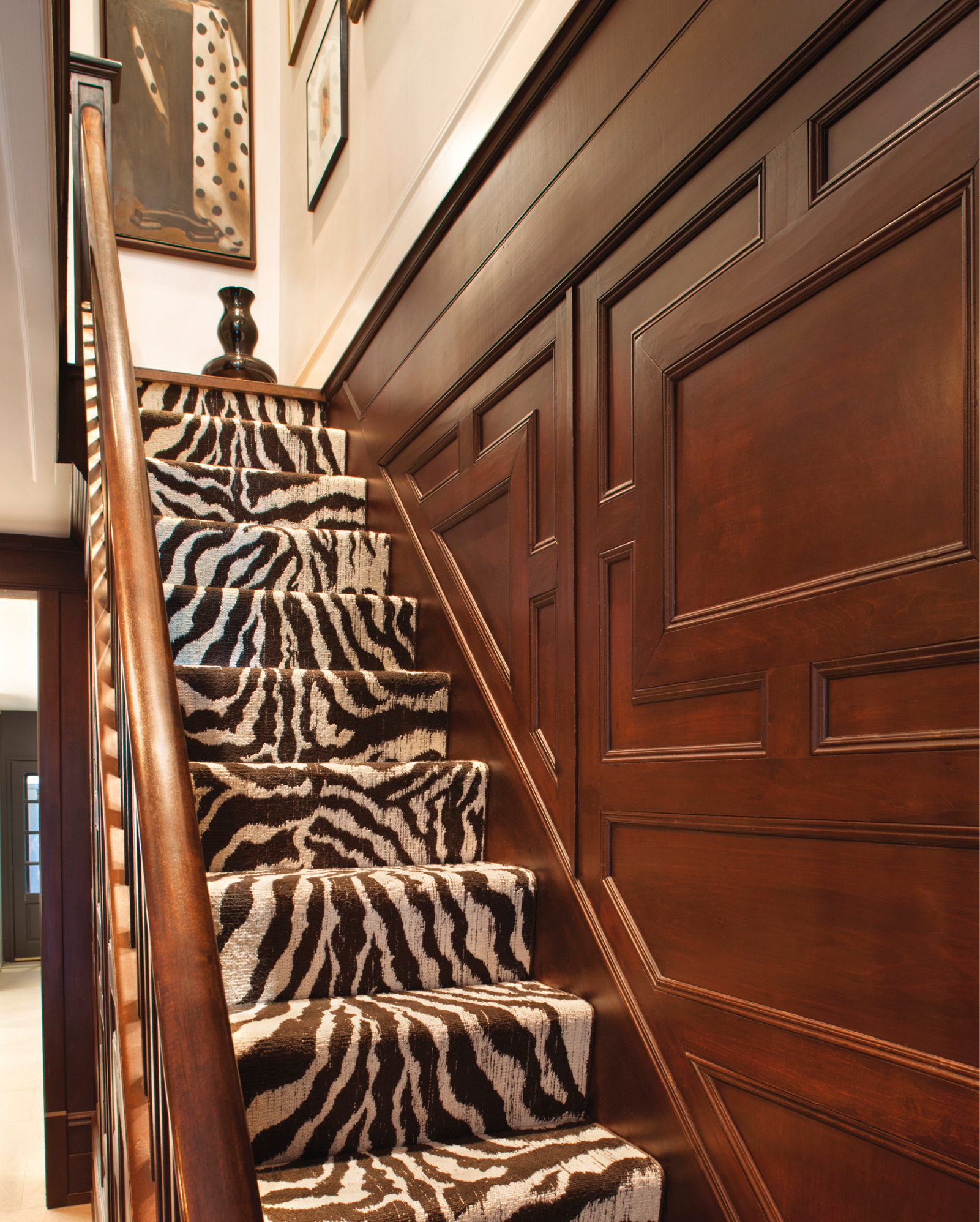
A zebra-print runner installed using the waterfall method dresses up a straight-run staircase in a townhouse by Joan Dineen.
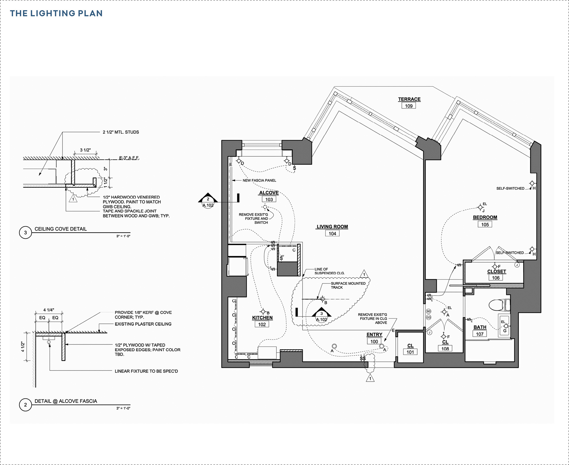
LIGHTING
Lighting has a huge influence on a room’s ambience, imbuing atmosphere and evoking emotion. The right scheme can create mystery, excitement, richness, or calm. Illumination also has a psychological and physiological dimension, essential as it is to physical and mental health. With increased access to natural light, schoolchildren achieve higher literacy scores and hospital patients recuperate faster; in a residential setting, a well-lit room improves mood and well-being. Full-spectrum artificial light can provide similar benefits to daylight.
Of course, light is not only a design feature in its own right but also the means by which the eye discerns form and detail. Full appreciation of every facet of an interior decor depends on proper illumination: a nuanced and layered scheme.
“PEOPLE ARE VERY PARTICULAR ABOUT LIGHT. SOME LOVE AMPLE ILLUMINATION—THE BRIGHTER, THE BETTER—WHILE OTHERS FEEL COMFORTABLE IN LOW, EVEN LIGHT.”
—Addison Kelly
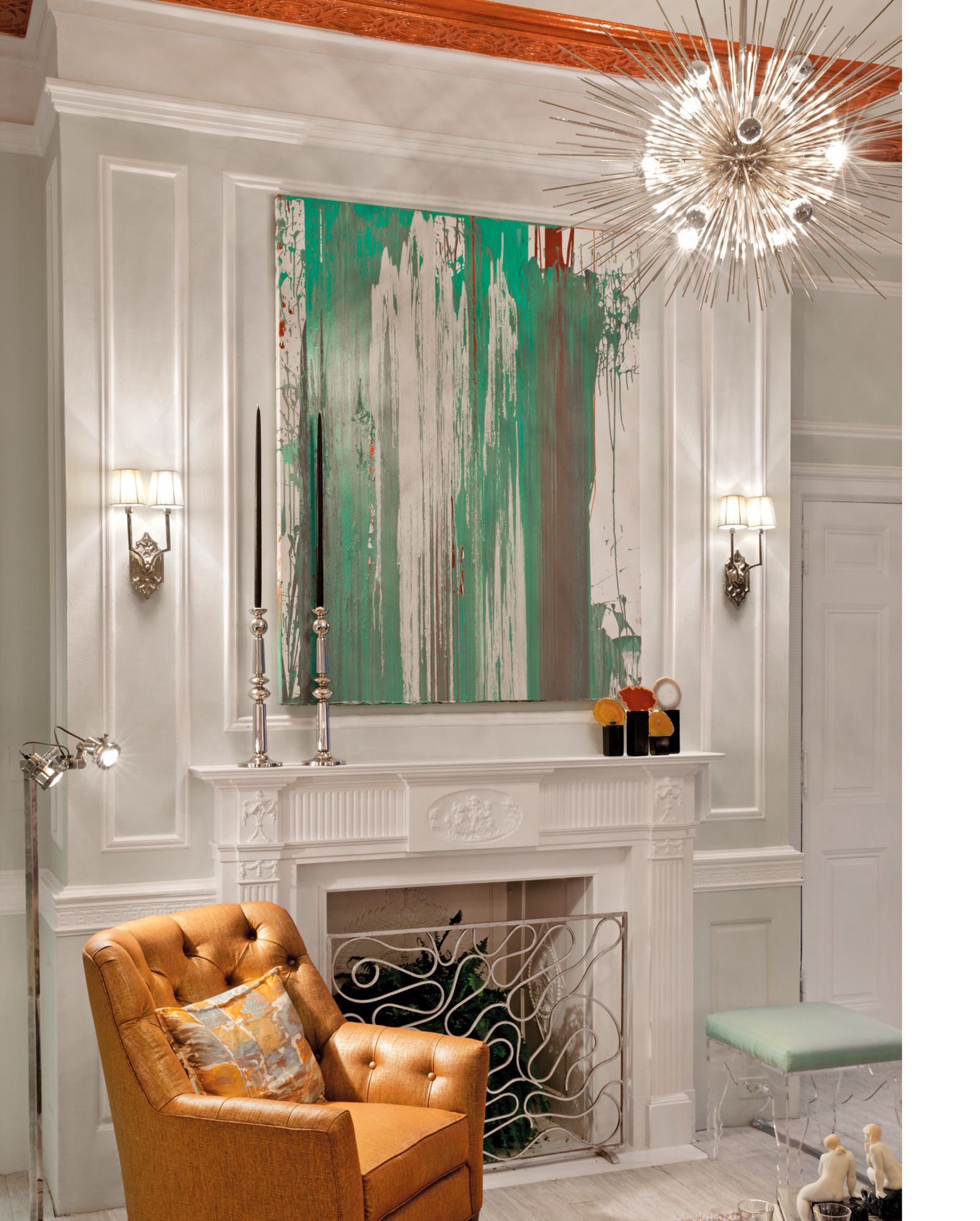
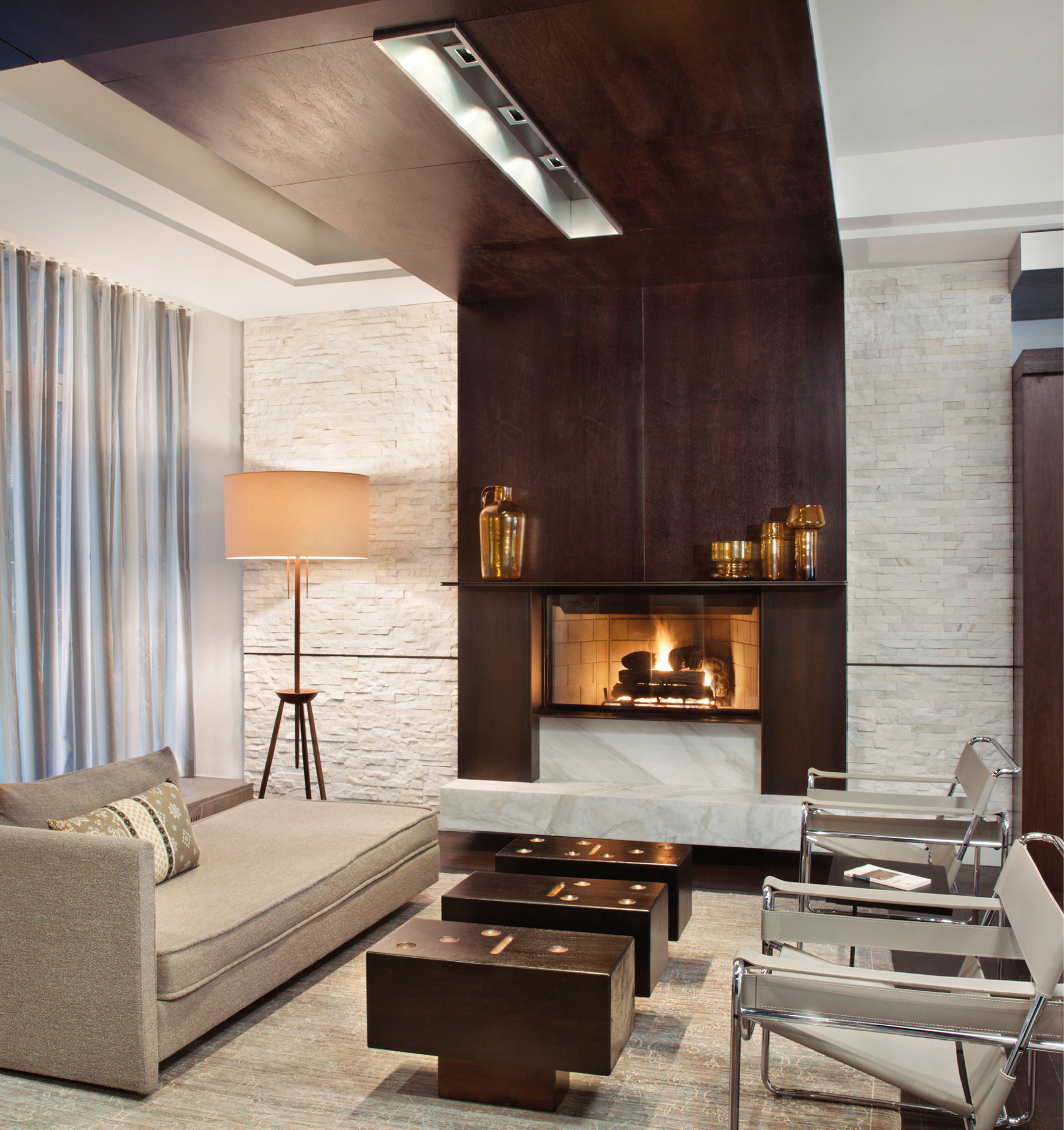
Precious sconces flank a large-scale artwork above a fireplace. A Sputnik-esque ceiling pendant and industrial-inspired floor lamp round out the mix in an eclectic living room by James Rixner.
THE LIGHTING CONCEPT
The key to creating a smart lighting plan is to approach the exercise just as you would select a color palette or fabric scheme: with a vision for the entire room in mind. “You can’t start by asking, ‘Should I choose incandescent or LEDs, a chandelier or ceiling track?’” explains lighting designer Addison Kelly. “Begin with a concept. How do you want the space to feel: dramatic, soft, sharp?”
With a concept in hand, it will ultimately be much easier to determine what the focal point of the lighting scheme should be, whether concealed or exposed fixtures will make sense overhead, and if they should be minimal or decorative. For example, if the concept is “retreat”—often the case for bedrooms—then a quiet and restful scheme may be preferable. This may translate to dimmable fixtures, delicate bedside sconces with pastel silk lampshades, and warm low-wattage bulbs. In a dining room, the idea of a congenial, emanating glow could be upheld by a large pendant with a drum shade, while a master bath could be designed to switch between a range of effects, from soothing to glamorous to makeup-studio bright.
A dramatic, layered lighting scheme by Charles Pavarini combines a wall sconce, picture light, and table lamp to artfully illuminate fine finishes, including lapis-hued strié walls and embossed leather drapery.
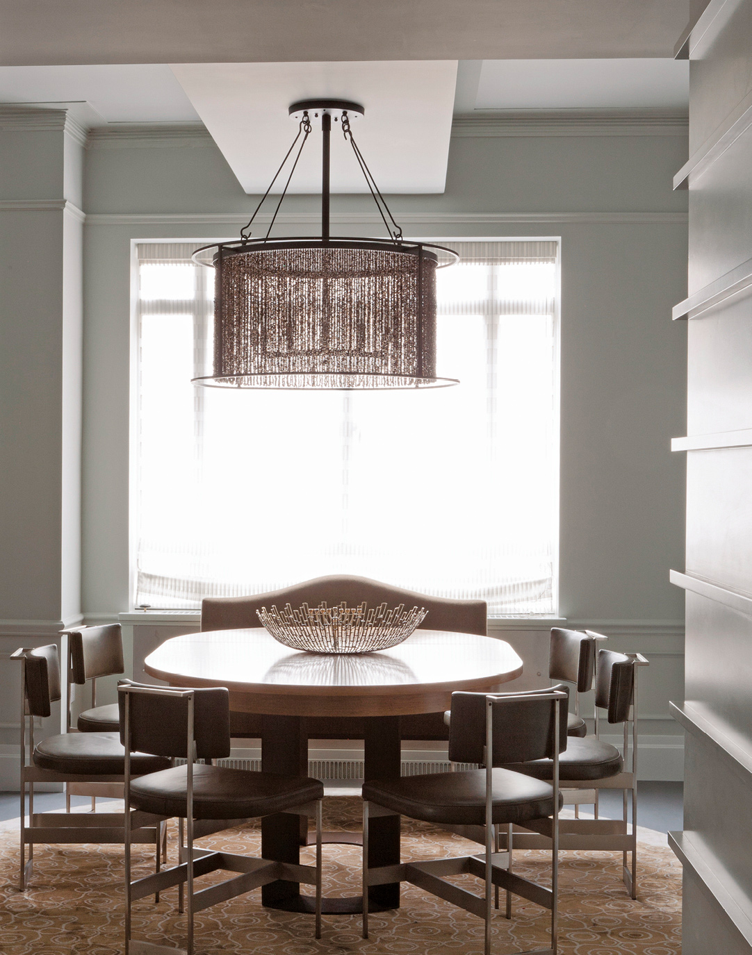
An overscale round pendant light creates a focal glow over a dining table in an apartment by Laura Bohn.

In an all-white room by Darryl Carter, an elaborate chandelier with black shades pairs with candelabra sconces in the same hue.

Donald Billinkoff illuminated a corridor with recessed architectural lighting.
(+ FOLLOWING): Subtle recessed architectural light and spotlights inset into the floor keep the focus on the spare, gallery-like room design.
From Concept to Scheme
|
DESIRED EFFECT |
LIGHTING ACTION PLAN |
|
SHARP |
Illuminate high-luster surfaces with brilliant light sources that have clear coatings. |
|
COZY |
Use fully dimmable soft-edged light from diffused sources with relatively low Kelvin ratings (between 2700K and 3000K). |
|
DRAMATIC |
Highlight objects and features with accent lights. |
|
THEATRICAL |
Graze surfaces with light to exaggerate texture and color. |
|
SOFT |
Illuminate low-luster surfaces with soft light sources that have frosted coatings. |
|
WARM |
Illuminate warm color palettes via light sources with relatively low Kelvin ratings (between 2700K and 3500K). |

Special elements accommodate recessed lighting in an apartment with concrete ceilings. Tamara Hubinsky unified the open-plan living/dining area via a shared materials palette and a contrast of light and dark elements.

A feathery pendant reiterates this vignette’s textural theme.
THE PLAN
Every space needs a mix of lighting types, from general illumination to lighting for specific activities such as cooking, grooming, and reading. “It is so important to have varied light sources in a room,” says interior designer Timothy Corrigan. “Mixing task and atmosphere lighting at staggered heights—overheads, desk lamps, floor lamps—is key. Having only a single overhead makes a room look washed out.” Think about a space holistically, taking every surface and activity area into account. “Don’t just fixate on task lighting: You must formulate the whole room together,” explains Addison Kelly. “Lighting design is about layering.” A carefully calibrated mix of sources will also ensure an even, not spotty, glow. Rooms should have a combination of the following:
Ambient lighting. Fixtures providing overall illumination: for instance, a ceiling-hung pendant that combines uplighting and downlighting.
Task lighting. Focused and controlled illumination—such as a desk lamp or under-cabinet kitchen lighting—to support a particular activity. Site the light source in close proximity to the surface to be set aglow, and in a manner that minimizes glare.
Accent lighting. Lighting used to set off certain features of the architecture or decor, such as a fireplace, prominent works of art, or a focal wall. Scones or library lights, for example.
These categories were derived from the writings of the late architectural lighting designer Richard Kelly, the founding father of the discipline. He described these necessary qualities as focal glow (making it easier to see), ambient luminescence (which makes surroundings safe and reassuring), and a “play of brilliants” to stimulate the spirit.
A properly illuminated space will feature all these elements, but the exact ratio will depend on the uses for the space, the overarching design concept, and the desired effect. In a foyer, ambient illumination may be most important; task lighting less so. In a utilitarian home office area, task lighting is essential but accent lighting not as much of a priority. Regardless, a designer will first identify the activity areas or special moments in a room deserving of focal lighting and use these as starting points, seamlessly layering in the additional lighting needed.
A lighting plan should not be permanent and set in stone. Remember that a space is always in flux, Addison Kelly advises. “Rooms evolve over the course of the day, as sunlight shifts and different activities take place. And life changes too—you have a baby, you take up pottery. Your lighting will also need to change and evolve.” It can take time and observation to understand what a space needs, and how daylight comes into the room. “Sometimes the best thing is to live in and understand the space gradually, and then finesse the plan as you go,” Kelly adds. With this approach, the fixed lighting should be designed for flexibility and applicability across a range of design schemes.
The lighting plan of an apartment by architect Terry Kleinberg.

In an apartment by Cullman & Kravis, a ceiling cove uplit with hidden fixtures creates an ethereal glow that highlights the moldings.
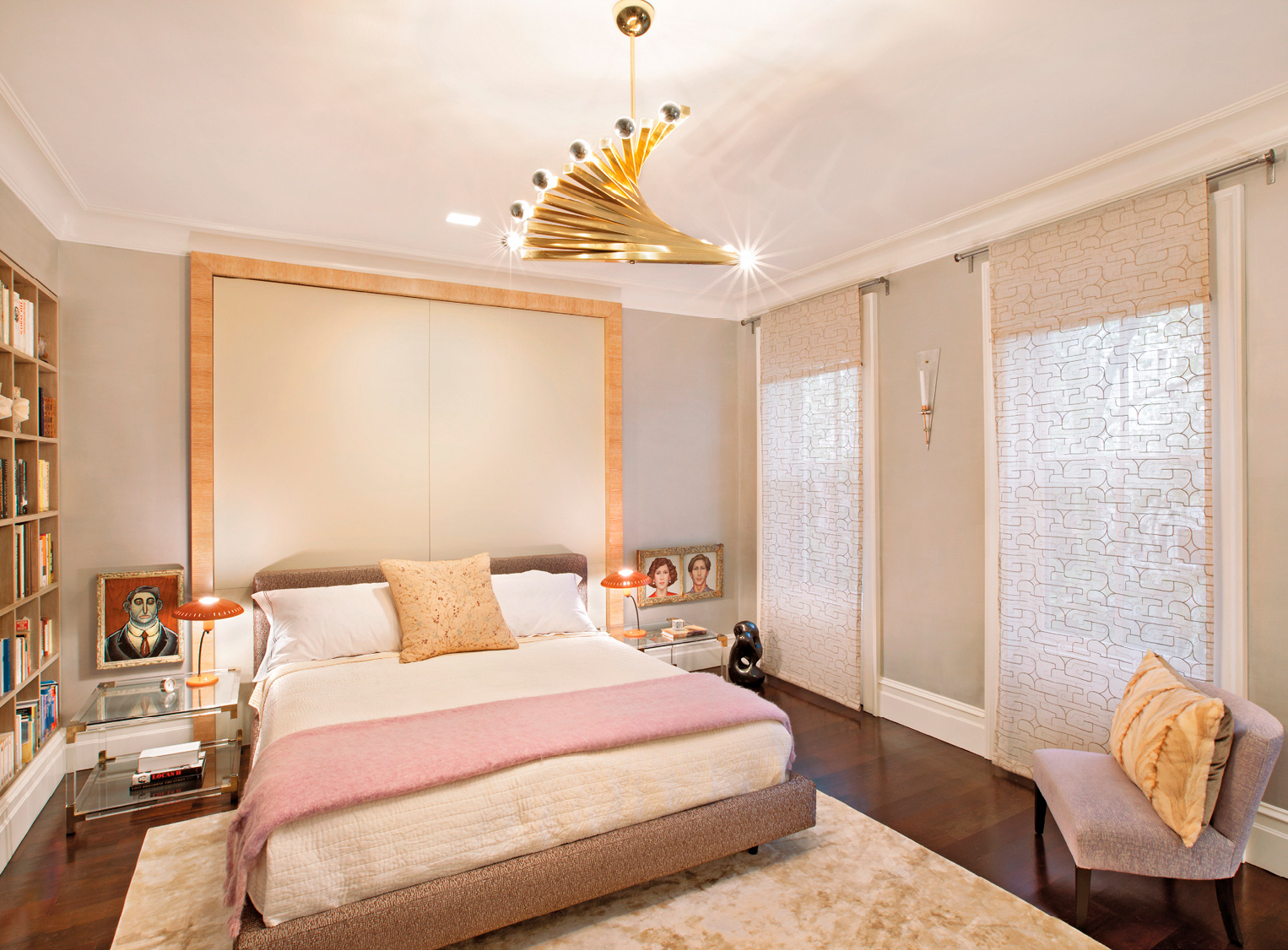
Joan Dineen designed a multipurpose bedroom that’s calm and comfortable all day long, thanks partly to a layered lighting scheme—including a vintage chandelier and low bedside lamps.
THE OPTIONS
There are various genres of fixtures to choose from, each capable of adding a different layer to the overall composition. Lighting can also be poetic or utilitarian—or some combination thereof. Chandeliers, pendants, sconces, and table and floor lamps—decorative lighting—are often highly sculptural and works of art themselves. Use them for great effect over a dining table or above a console.
Lighting Types
In determining the right fixtures, plan for a combination of these types of light:
Indirect light. Wall washing, reflected light, and ceiling coves fall into this category. Casting a glow on walls and ceiling—the room’s boundaries—makes the space seem bigger that it is.
Direct light. This category includes task and accent light; it confers a greater sense of coziness and intimacy in a room.
Focal (or point). The light itself creates a point of interest.
Light’s defining counterpart is, of course, darkness (or shadow). Exploit a contrast between light and dark to focus a pool or a spot, wash light over a beautiful surface, or frame an important image.
Fixtures
Every room should have a mix of the following fixture types:
Architectural lighting. The choice between concealed (i.e., recessed into the ceiling plane) and exposed (as in track lighting) will depend on a few variables. In some cases, the building structure prohibits inclusion of recessed lights; a surface-mounted fixture is therefore the only option. Aesthetics is also an important consideration. To reinforce a loftlike ambience, exposed fixtures are appropriate and desirable. Recessed cans offer a cleaner, sleeker look and are generally preferable in a traditionally minded space. Hidden fixtures are more mysterious too, emanating a glow without drawing attention to the source itself.
Ceiling fixtures. Whether surface-mounted flush with the ceiling or hung like chandeliers and pendants, these fixtures illuminate while creating visual interest in the dead space just below the ceiling plane.
Wall sconces. Usually installed in pairs, these decorative wall-mounted fixtures can be positioned to provide symmetrical emphasis—on either side of a mirror or a fireplace, for example—or at regular intervals to break up and illuminate a long passageway.
Floor and table lamps. The illumination workhorses of most spaces provide ambience as well as task light. Their shades also play a strategic role by adding layers of softness, color, and texture.
Light Source
Besides the function, design, and location of the fixture, the light source itself, or the bulb, is an integral aspect of residential illumination. In the field of lighting, bulbs are referred to as “lamps.” Every lamp has specific attributes—focus, color, and distribution—that should be part of the design process. For architectural lighting, lamps are detailed in drawings as part of the specifications.
|
LAMP |
CHARACTERISTICS |
LIGHT COLOR |
|
LED |
Low energy consumption and low maintenance—but bright white light |
Warm-cool (2400K–6500K) |
|
FLUORESCENT/CFL |
Poor color rendition |
Warm-cool (2800K–4500K) |
|
INCANDESCENT |
Offers a decorative appearance and warm color |
Warm (2700K–2900K) |
|
HALOGEN |
Moderately higher efficiency than incandescent |
Neutral (3000K–3500K) |

Set over a credenza, a sconce bathes the wall in light and serves as a decorative accent in a vignette by Ingrao.

Swing-arm sconces above a sofa.
DESIGN CONSIDERATIONS
Lighting effects are achieved through the selection of fixtures, their arrangement within the interior, and the choice of bulb. Specialists (and seasoned designers) use calculations to determine each of these; however, there are some simple ways to think about the placement and selection of lighting within the home.
Focal Points
To get from concept to scheme, start with a focal point. What about the room does the homeowner want to emphasize—a tapestry, an artwork, a rug, or a fireplace? It needs to be properly lit. Each seating group in a living room will need its own glow, to draw people in. Even a beautiful reading nook can serve as a focal point. Personal preference can hold sway here: for instance, lighting a beloved book collection may call for bookcases washed in light, accented with gleaming, shelf-mounted library lighting. But if the intent is for the bookcases to recede a bit, then no special lighting is required.
Factoring in Finishes
Be sure to consider the connection between lighting and the surrounding materials and finishes. Glossy surfaces will reflect light; textured ones will absorb it. The exact same lighting scheme will read much darker in a red-lacquered room than in a whitewashed one.
Dimmability
Adjustability is an important feature of lighting, to allow for a change of brightness and mood. Install dimmers wherever possible to ensure the greatest flexibility. Dimmability also depends on the type of lightbulb: for instance, some LEDs are completely dimmable, while compact fluorescents are only dimmable to 20 percent. Halogen and incandescent bulbs give the widest range. The technology is currently undergoing rapid change, so do your research.
LIGHTING IS A DESIGN ELEMENT LIKE ANY OTHER: THE PRINCIPLES OF REPETITION, RHYTHM, BALANCE, AXIS, EMPHASIS, SHAPE, AND FORM GOVERN ITS USE.

Library lights are mounted over built-in shelving.

Bookshelves illuminated from within set off a special collection, creating a focal point at one end of a living room by Addie Havemeyer.
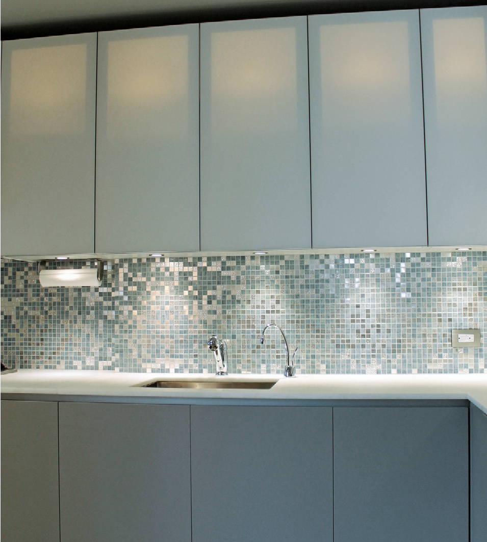
Under-cabinet lighting in a kitchen by Laura Bohn is supplemented by the warm, lantern-like glow of internally lit translucent upper cabinets.
INSTALLATION CONSIDERATIONS
Decisions about where to place permanent lighting must be made long before fixtures and bulbs are purchased. When preparing for installation, keep the following elements in mind:
Channeling. In cases such as concrete-slab construction, where there is no “pocket,” or depth, for installation, recessed ceiling fixtures will require costly channeling or a dropped ceiling over some or all of the space—solutions that will drive many other architectural decisions.
Junction boxes. A designer will note specific locations for sconces and chandeliers in his drawings based on the furniture plan. These placements must be determined before renovations begin, because the electrician will install a junction box early in the process.
Electrical cords. Think about the furniture plan and the proximity to an electrical supply. Are there ample outlets to plug in all the specified lamps, and are they well placed to avoid awkward stretching of cords? For instance, a cord for a Parson-style console in an entrance hall can be hidden more easily if an outlet is placed at tabletop height to avoid seeing it dangle below. Consider flush-mounted floor outlets for groupings that float in the center of a room.
Floor outlets. Advance planning allows for outlets to be mounted flush to the floor surface under a side table or a seating area. A small slit is sometimes made in a rug or wall-to-wall carpet to allow access.
Controls and switches. New construction or renovations require a switching diagram (or plan) that illustrates which fixtures (or sets of fixtures) are controlled by which switches, and their locations. The diagram will include simple switches, dimmers (rheostats), occupancy sensors, timers, and touch pads. Details that deserve attention include locations, groupings of multiple switches, three- or four-way switching of one set of fixtures or outlets, and special situations such as installation into tile or upholstered walls.
Cover plates. A small but critical design element is selecting or customizing cover plates for light switches and outlets. There are long lead times for them.

Recessed lights are designed to look as though parts of the wall are peeling away in a stairwell by David Scott.
LAMPSHADES
The right shade can impart grandeur to a decorative lamp and reinvent its character. Attentiveness to details such as edge trims and proper sizing in relation to the base is the key to a professional touch.
In sizing a shade properly, it is vital to use standard measurements; this will help the designer write a PO for a custom order.
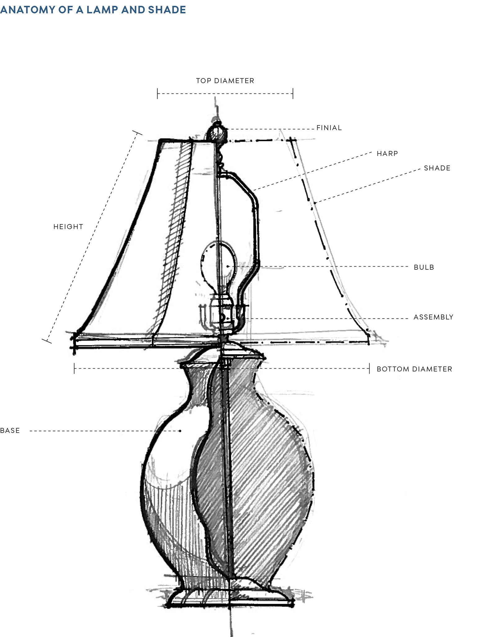
HOW TO SCALE A SHADE
Measurements are expressed as top diameter by bottom diameter by length of slant. A fourth dimension sometimes listed is the drop created by an Uno harp (or washer).
Height. The height of a lampshade (i.e., its slant) must be proportionate to the height of the lamp base. For a table lamp, the shade should be 65 to 80 percent of the base-to-socket height. For a floor lamp, the shade should be about 47 percent (or slightly less than half) of the base height.
Diameter. Lampshade sizes are typically described in terms of the bottom diameter. This measurement should be within (and never exceed) 2 inches of the base height. The appropriate diameter is also a matter of safety: shades on floor lamps should clear the widest part of the bulb by 3½ inches all around—particularly when hot-burning incandescent, halogen, or high-wattage bulbs are used.
Start with these basic guidelines but then scale up or down a bit to fit the dimensions of the room and the surrounding vignette, advises Lisa Simkin of Blanche P. Field, a maker of custom shades. “A half-inch difference is a lot; it’s like two inches visually. Scaling a lampshade is like attempting to find the right hat for your head; try different shade sizes and shapes on your base.”
David Scott chose a subtly curved lampshade for a sinuous base.

A simple white silk lampshade contrasts with a faceted black base.

THE OPTIONS
There are many choices to make when designing a bespoke lampshade or buying one off the shelf. From fabric to trims to shape, no detail should be ignored.
SHAPE
The profile of the shade should somehow complement—or deliberately contrast with—the base. For a fully custom lampshade, the metal frame that supports the shade material is handcrafted to order. Therefore, almost any shape is possible so long as it’s structurally sound. If a lamp is to be placed close to a wall, an oval, a rectangle, or a flattened shape will create the narrowest footprint. Here are some of the most common profiles:
Bell. This sinuously flared profile lends a girlish flourish.
Cone. The steep, straight slant—like a poodle skirt caught midtwirl—looks best on thin, attenuated forms, such as a lamp with a candlestick base.
Drum. A simple, classic cylinder suits a variety of lamp styles, and is especially apropos for a curvy or gourd-shaped base.
Empire. This slightly tapered design suits myriad lamp-base styles.
Hexagon. With its faceted form, a six-sided shade confers a traditional touch. It demands a lamp base with a similar spirit of rigor and shapeliness.
Square. The bold geometry of a square shade pairs well with a slightly architectural base, such as a rectangular or faceted one. It also looks nice capping a spherical base.
SOFT VERSUS HARDBACK
Shades are either laminated to a backing such as plastic (also referred to as hardback) or hand-sewn. Laminated shades confer a more modern look but will show every nick and dent. Softer hand-sewn versions are often quite traditional and elaborate, as well as more forgiving of wear.
MATERIAL
Many materials are suited to shades: paper, silk, cord, cork, and even string, which can be wrapped around plain paper or a printed fabric for a layered look. “I’ve even had clients bring in a favorite vintage shirt to sew into a shade—a Pucci or Etro print is especially cool,” says Simkin. Soft fabrics are either sewn around an armature or laminated to a backing. When choosing a material, consider both the style of the lamp base and any surrounding decorative elements, such as wallcoverings and upholstery.
Paper. The most commonly used (and affordable) material, paper comes in various colors and opacities and can be detailed with painting, stenciling, cutouts, and other decorations. Paper can even be shellacked to a patinated sheen. Most fabric shades are laminated to a paper backing for support.
Cotton. Versatile cotton is ideal for many applications. It has a nice body that lends itself well to pleating treatments.
Silk. The most formal of fabrics, shimmery silk also has a subtle texture that bestows depth and dimension to a solid-color shade. The material transmits light beautifully. Note that certain silks cannot be laminated.
Burlap. Rough-hewn burlap—as well as jute and raffia—offers a casual flavor, injects texture, and works well with aesthetics ranging from midcentury modern to French country. The relatively open weave also admits a fair amount of light.
TRANSLUCENCY
Some applications will demand a relatively translucent, light-emitting shade, notably work and reading areas where ample illumination is a must. For accent or mood lighting, a greater degree of opacity is often desirable to impart an atmospheric glow. The choice of shade material (as well as any embellishments applied to it) will affect translucency. The bulb can create a visual hot spot on hand-sewn fabric shades, which can be diffused with the addition of a lining.
DECORATIVE TRIM
Fringe, gimp, tape, ribbon, beads, ruffles, and piping are among the many accents that can enhance a shade’s design. Contrasting tape encircling the top and bottom bestow a graphic look that can swing modern or traditional, while pom-pom edging can add a sweet touch to a lamp destined for a young girl’s bedroom.
PLEATING
There are many pleating options, from spare to fancy. How much fabric is needed depends on the diameter of the shade: from ¾ yard for a 6-incher to 3-plus yards for a shade spanning 30 inches. Bear in mind that not all fabrics will be suited to all pleating styles.
Flat pleat
Open box pleat with space
Opaque box pleat with space
Flat pleat with cuff
Shirring
Smocking
TYPE OF CONNECTION
A shade typically connects to the light fixture by way of a harp. This wire armature is integrated into either the fixture or the shade itself. The existing connection will dictate the inner structure needed for a custom shade. When purchasing a ready-made shade, choose one for the particular connection type you have. A lamp can also be rejiggered to accommodate a different connection style (harp being the most flexible). There are three types of harps:
Spider. A spider harp clicks into grooves near the lamp socket and wraps over the bulb; the shade is set on top and secured with a screw-on finial. New shades may require swapping out the existing harp for a new size. (Fortunately, they are inexpensive, readily available, and easy to change.)
Uno (or recessed). This type of connection is integral to the shade itself. Affixing the shade to the lamp is a matter of simply unscrewing the bulb, slipping the Uno ring over the socket, and screwing the bulb back in. No finial is required; the bulb locks the shade into place.
Clip-on. Rather than connect to the lamp base, this simpler style clasps directly to a round (not spiral CFL) bulb.
FINIAL
Many lamps are capped with a finial, the element that secures the shade to the harp. Although its purpose is overtly functional—it’s essentially a screw—the finial also allows for decorative indulgence. Styles range from simple, unobtrusive metal cylinders and small wooden balls to figurative elements (leaves, shells) and precious materials such as crystal and coral.
DESIGN CONSIDERATIONS
Account for the type, style, and shape of the lamp base, the interior of the room within which the lamp is being installed, and the function of the light source. Those factors will narrow the choices and help refine the selection of color, pattern, and material. Here are some questions to ask.
What Is the Purpose of This Lighting?
Ambient lighting. An open or broad shade in a translucent material will be most effective to admit ample illumination.
Task lighting. Shades for task lighting are often integrated into the lamp itself. Opt for a translucent or opaque shade in a style that concentrates a pool of light on the reading or work surface below.
Decorative lighting. Take creative license by experimenting with opaque shades or ones made of unusual materials, such as metal. Incorporate ribbons, fringe, or other decorative trimmings.
Where Will the Lamp Be Placed?
The bulb-and-socket assembly must be completely hidden from view. Most designers like to cover the base cap unless it’s decorative. In addition, the bottom of the shade should fall at the user’s eye level. For a lamp placed on an end table, the shade can be a bit shorter in proportion, because its bottom edge will likely fall below the line of vision anyway. A return—whereby the bottom of the shade folds under to screen the bulb from view—is also possible. A lamp set on a higher surface, such as a tall cabinet or dresser, demands a shade sized to cover the bulb and socket assembly. A top diffuser, which is a translucent disk that shields the direct view of the bulb, is desirable in certain situations—for example, when a lamp on a console alongside a staircase will be viewed from above. (The design must allow heat rising from the bulb to escape.)
What Is the Design of the Lamp Base or Fixture?
In general, it’s best to choose two related styles or play against type: echo the shape of the lamp base or deliberately contrast with it. A 1950s ceramic base with textured glaze might suggest either a similarly tactile burlap Empire shade or a more polished, sophisticated variety that echoes its silhouette.
What Is the Style of the Room?
Where does the aesthetic fall on the continuum of traditional to modern? Choose a style that reinforces the design concept and overall decor.
DESIGNING A CUSTOM SHADE
Envisioning a custom shade requires collaborating with a workshop or an artisan who can help evolve and finesse the design. It is the designer’s job to communicate her intent and work out how the shade will fit into the surrounding interior.

Custom lampshade fabrication process at the New York atelier of Blanche P. Field.
ART & ACCESSORIES
Decorative and functional art and accessories—from paintings and family photos to vintage pottery and desk sets—are an essential means of bestowing a space with character, quirk, and a lived-in patina. “Art and accessories are a layer of decorating that’s every bit as important as the bigger items—the furniture, the rugs, the window treatments—and make a house look like a home and not a showplace,” says designer Allison Caccoma.
While not everyone has important artwork, even the tightest budget has room for framed posters and photographs, or the display of a personal collection of memorabilia. Without paintings, prints, objets d’art, and the like, a room can look unfinished, even a bit generic. Accessories channel and telegraph the history and personality of a home’s inhabitants. Although the term “accessory” can imply something incidental or secondary, the smaller goods bring meaning to one’s everyday surroundings, especially if items are curated and arranged with personal significance and emotional attachment in mind.
“PUTTING TOGETHER A ROOM OR A HOUSE IS A COMPREHENSIVE PACKAGE, THOUGHT OUT DOWN TO THE TINIEST DETAIL.”
—Allison Caccoma

Stairwell walls are a willing canvas for a more-is-more installation of art. Philip Mitchell hung a salon-style array of framed works against patterned but softly toned wallpaper. The free-form arrangement of artworks is unified by shape.
ARTWORK
Even a budding collection of art can express or support the space’s design concept. Apply the principles of repetition, rhythm, and symmetry, and group items according to color, shape, or theme.
Where to Put It
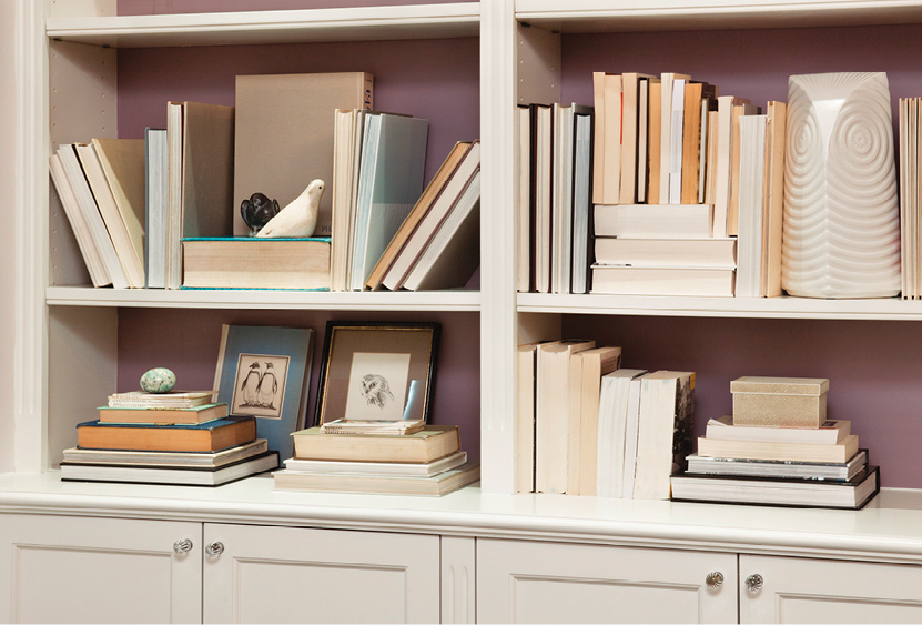
Walls are the obvious place to hang artwork. Above the sofa or the dining room credenza are popular focal points. But look beyond those expected areas; an odd corner of a room without much else going on can become a special moment of pause with the addition of an artwork cluster. A hallway or a staircase is ideal for conversion into a gallery. So is a bookcase: intersperse small paintings and sculptures among the books, and hang framed works from the front edges of the shelves.
How to Hang It
The method of hanging the artwork is an important consideration. Most common are standard picture hooks, but rails are a more decorative option that allows for frequent rearrangement. Shelves and brackets can also be serviced to display collections on walls. Propping artwork—on a ledge, atop a console, on the floor—is an informal style that affords the ability to switch arrangements frequently. Artwork and mirrors should always be hung by a professional.
The Arrangement
Framed art is usually hung in a linear arrangement, an asymmetrical cluster, or a salon-style collage; keep the following two display strategies in mind:
Alignment. One secret to displaying framed art is to imagine a line from which pictures can “hang,” aligned along their top edge. Alternatively, pictures can all be lined up across their horizontal centerlines, set at about 64 inches from the floor. Art can even be leaned on a shelf, thereby aligning along the bottom edges.
Free-form compositions. “Many people are afraid of venturing beyond a uniform grid, but there are so many other hanging options,” says designer Alexis Givens. The primary decision is whether or not the installation should be symmetrical. “Template everything with paper first to test out arrangements; adjustments will inevitably happen once you begin hanging pieces.” It pays to enlist an expert installer to help with this task.
Framing
The choice of frame and mat color, size, and style can make a big impact. Gilded or metal-leaf frames impart a rich, classical look, as does carved or shaped wood in a rich tone. Frameless mounting adds a modern gallery-like edge to an arrangement.
To unify seemingly disparate images, frame them all the same way: for instance, in a square profile matte black or steel frame. This will put the emphasis on the artwork.
A good frame shop can guide frame and mat selection, which is often a bewildering task. “You can even create renderings in Photoshop to better envision the final result,” advises Givens. “I often do this to help clients visualize what their artwork will look like in the chosen frame style.”
The Backdrop
The wall surface behind hung works must also be considered. Should it be neutral? Patterned? Dark or light in hue? The color of the plane behind a framed work impacts the perception of it. Think about the wall as a key part of an overall composition comprising the artwork, the frame, and the larger setting. Dark or neutral tones can set off monochromatic photography. The hues in an important painting might inspire the color scheme of the wall or surrounding room.
Commissioning Artwork
Team with an art consultant or directly with a fine artist to commission a custom piece: a painting, a photograph, a portrait, a work on paper, a sculpture, or even a functional object. Every artist has a different working process, but most commissions will require that the homeowner (or designer or art consultant working on his behalf) make a few trips to the studio; some degree of back and forth via phone conversations, drawings, samples, maquettes, and models will also be needed to finalize the creative direction. If the work is a site-specific installation or being commissioned for a particular spot—above the sofa, in an entrance gallery—then the artist may need to come and take measurements and observe various aspects of the space, including lighting, wall construction, and moldings.
In terms of payment, many artists request a 50 percent deposit. Always discuss financial terms up front, and find out what amount (if any) might be refundable or transferable to a new artwork if necessary.
The New York apartment of an art collector by Cullman & Kravis.
A hand-painted decorative screen is a work of art in its own right.

A site-specific installation of porcelain flowers seems to spout from an entryway’s molding.
Lucite wall brackets form pedestals for vases that flank a drawing spotlighted with a picture light.

Crayon and pastel sketches of nudes create a delicate collection in contrast to the heavy piece below.

In a dining room by Villalobos Desio, a spotlight easel stands beside a dining room display case—one part china cabinet, one part cabinet of curiosities.
ACCESSORIES
Accessories are often chosen to add a dose of color—bringing a jolt to a more neutral space—yet their scale and shape are just as important. Pint-size possessions confer a sense of intimacy, adding an ornamental layer to the many horizontal surfaces that make up an interior. They also help to round out the scale of larger furnishings. Think about objects that could enhance the function of a room or an area while adding a design component: a sterling pencil cup and stationery pad next to the phone, a crystal carafe set on a nightstand in the guest room, an ornamental box to hide remotes on a table in the family room.
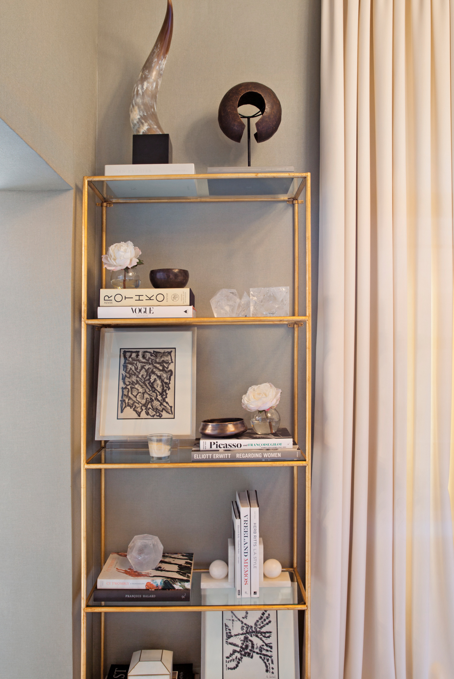
Kapito Muller Interiors propped an étagère with artworks and sculptures grouped by hue.
How to Choose Them
Accessorizing a space generally entails a combination of editing existing items and adding new ones of varying scale and size to round out the mix or finish a tableau. Items should not only fit in with the decor but also suit the homeowner’s personality and lifestyle.
Even the most acquisitive collectors often neglect to procure the slightly larger objects that form a sort of connective tissue. “People tend to have small objects, but what you really need on a tablescape are items that bridge scales and add height,” says Allison Caccoma. “Often the task at hand is to add in some new, bigger accessories: decorative boxes, porcelain bowls, a glass hurricane, a stack of books.”
Finding the Gems
“Sometimes my clients say they don’t have anything suitable for accessorizing, but then I go through their china cabinets, attics, and closets and discover all sorts of forgotten gems,” says Alexis Givens. “Most people can’t see through their own stuff.” Take a cue from how designers approach the exercise of establishing arrangements: gather all your accessories in one place—a dining room table—and then group items by color, material, form, or another common element. Then test out the arrangements in various locations around the house.
Where to Put Them
Consider not only the obvious canvases for vignettes—coffee tables, glass-fronted china cabinets, sideboards—but also oft-overlooked spots such as bookcases and dining room tables. And don’t attend to special-occasion spaces alone; windowsills, kitchen counters, bathroom vanities, and other locations used every day make wonderful surfaces for “scaping” too, whether with vases or functional items like pretty soap dishes. And don’t ignore these good spots to accessorize:
Accent tables. From coffee to side tables, this genre of furniture is an ideal anchor for an arrangement. Choose objects of different heights to create a sort of skyline; use books as props or pedestals to anchor smaller objects. “I can’t overstate the importance of height on a coffee table, which can be achieved by complementing small objects with taller ones like candlesticks and hurricanes, or even a plant in a decorative cachepot,” says Caccoma. On a low table, consider a bowl that’s ornamented on the inside, so it looks nice even when empty. Use an accent lamp to anchor a tableau. Of course, don’t give over the whole surface to an arrangement of ornamental objects; save space to put down a glass or a book.
Consoles. From a styling perspective, the long surface allows ample room to play with color, scale, and texture. Consoles also provide vertical space above (on the wall) and below (the empty space and floor underneath). This extremely versatile piece works in myriad locations, from entryways to bedrooms. Sideboards and credenzas offer the same styling opportunity.
Dining room tables. Even when not in use for mealtime, dining room tables are great canvases. “People neglect their dining rooms—they’ll just put a few random bowls or a pair of candlesticks there and call it a day,” says Givens. “Not much thought is typically given to the table. But the large surface is perfect for displaying a collection”—a mélange of vintage pottery, stacks of dishes, or a sculptural array of mismatched candlesticks.
Nightstands. Keep the arrangement neat and spare. These surfaces are often used to stash a bedside glass of water, a book, and a watch or eyeglasses. Select functional objects such as trays and bowls that double as catchalls.
Desks. Keep form and function in mind when choosing accessories such as blotters, penholders, and tape dispensers. A desk can always benefit from decorative boxes, trays, and other organizing devices.
Fireplaces. The mantel is an expected home for art and accessories, but don’t forget the firebox itself. A well-designed fire screen or set of andirons is always nice. Consider propping the firebox of a nonworking fireplace with decorative objects.
Bookcases and shelves. Bookshelves are ideal for showcasing collections. Use them as framing devices for an artful assemblage.
How to Arrange Them
There are many design elements and compositional strategies to put into play when styling.
Symmetry and pairs. The surest route to balance and calm is to exploit sameness. Place two identical objects on either side of a long console or mantel, or choose ones with similar visual weight.
Color balance. Varied objects all in the same palette or color harmony will look like they belong together. Grouping by color keeps an arrangement from feeling too busy.
Rules of three. A trio of accessories, whether disparate or of a piece, is always a safe bet. Choose items of different shape, color, height, and material to give a grouping some frisson.
Elevation changes. Pair low with high to give a tableau a sense of energy.
Positive/negative space. Important objects need breathing room while less special pieces can benefit from being grouped together so the beauty is in the aggregate.
Telescoping. Stack and arrange objects from large to small.

Open shelves are used as display niches for objets d’art united by form and color.

A niche fitted with glass shelves forms a de facto showcase for sculptural objects.
ONE BOOKCASE, FOUR WAYS
Alexis Givens styles a bookcase in various arrangements.
1. TIE TOGETHER A TABLEAU WITH A THEME: Here, a bird motif takes center stage through images and sculptures; even the leaning books look like wings. Turn colorful spines to face in for a quieter look and neutral palette—although this strategy only works for infrequently referenced books or those not in heavy reading rotation!

2. SHOWCASE COLLECTIONS: Similarly hued books have been grouped together to create stripes that mimic the decorative box on the left, giving the composition some energy and visual weight. Outfitting a shelf with a small mirror and lamp brings light to a typically shadowy space.
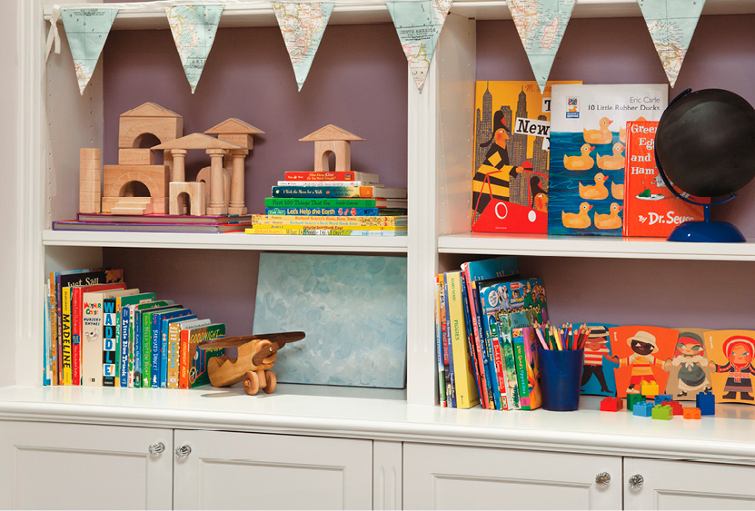
3. KIDS’ POSSESSIONS: For shelves in kids’ rooms, the goal is to display and play. Use bookcases as a rotating space for artwork, block creations, and beloved books so that kids feel pride and a sense of ownership. Add whimsy by trimming a shelf with fabric bunting, ribbon, or washi tape.
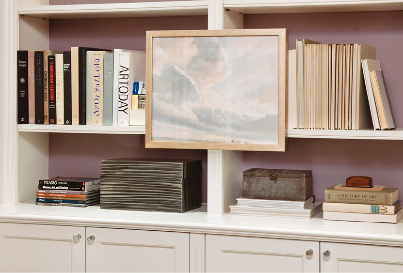
4. MOUNT ART: Transform simple shelves by hanging a piece of art in front.
THE ART OF STYLING
Alexis Givens explains the design principles she deployed to create alternative scenarios for a console. She used artwork, accessories, books, and natural ephemera as props. The same thinking could be applied to a tabletop, shelves, or any other surface. It’s possible to learn the fine art of arrangement through both trial and error—keep tweaking until a tableau starts to gel.
This symmetrical and rectangular setup is very balanced visually, largely because of pairs: two ottomans, two ginger jars (decorative elements that double as bookends). The eye settles nicely on a central point. The large painting becomes the background for everything else and introduces verticality to the composition. Sculptural objects in classic shapes like triangles, squares, circles, and rectangles intermingle to impart geometric balance. Be attentive to the area below a console: a pair of ottomans fills the dead space (generally a great spot for tucked-out-of-the-way supplementary seating).

A few of the same items were reused for this scenario. A pair of desk lamps adds symmetry, while their unexpected shape introduces a curve. (They also act as spotlights.) Books function as platforms for small decorative items and add height. The two stacks helped fill the sliver of visible wall space between the table and painting. Below, just one ottoman was used; filling the space is a bowl in a similar metallic finish as the lamps and ginger jars. Light and dark items invite a play of contrast.

Wall-hung mini canvases coupled with an array of small items on different-level platforms work in concert to make an intriguing vignette. The triangular tabletop setup comprises a jam-packed assortment of books. A round mirror throws a curve into the otherwise linear arrangement of books and helps to pull light into this corner of the room. The smaller items may look haphazard, but taken as a whole the grouping creates a pretty shape.

The two paintings in this arrangement are layered to give the elevation an angling that speaks to the topography of books below—the eye moves in a zigzag to take it in. Here, the negative space below the console was serviced for display: towers of books grouped by hue and casually stacked. Flowers add life and an organic shapeliness. With so much dynamism and color below, the tabletop itself merited a sparser approach.
COLLECTING & CONNOISSEURSHIP
Ranging from fine art and antiques to small-scale design objects and vintage furnishings, a collection can give a home a sense of culture, taste, history, and pedigree. “The market for collectible design has exploded in recent years as more movements and makers from design history—especially twentieth-century modernism—have been rediscovered and appreciated,” explains decorative-arts specialist Daniella Ohad. “The industrial aesthetic of French midcentury design, the biomorphic sculptural curves of the ’80s, the unpretentious forms of mid-century Nordic, the crafted pieces of the Studio Movement, the colorful plastic objects of Italian Postmodernism—all are now highly coveted.”
It can be quite challenging for novices to get started. It’s best to begin with something you love—a historic period, a color, a place, an artist—and let that be the kernel of a collection. Love 1930s kitchen canister sets? Acquire five sets and line them up in a glass-doored étagère. Inspired by a Caribbean vacation? Start a collection of paintings from the islands. As you go, you will become more aware of which artists are more well-known and which scenes or images you love best, and that will guide you as you grow and refine your collection.
An understanding of value and an educated eye are more necessary than ever in the process of creating a home, and this is an area where the assistance of a professional is often a plus. Whether her work tends to skew more classic or more contemporary, a well-educated designer will be versed in all periods. “A grounding in the history of design is important even when embarking on a modern collection,” explains historian and writer Judith Gura. “Knowing the terminology and the common language and signature motifs of each era is key to knowing what pieces go with what, what eras are compatible, and why.” In other words, it takes some expertise for a collection to work with—or in contrast to—its setting.
Whether you hope to build a collection, upholster your early-nineteenth-century Gustavian settee in a fabric appropriate to the time, or simply expand your knowledge, here are some ways to educate yourself and become conversant with design history and the collectibles landscape:
Visit museums. “The growing popularity and awareness of design has brought museum curators to expand their collections and to assemble exhibitions that shed light on formerly neglected chapters in design history,” says Ohad. A museum is also a great place to look at antiques and gain a sense of what contemporary reproductions are high quality.
Peruse galleries. Galleries have also taken a leading role in promoting vintage gems and in discovering new talents. Many have become producers of contemporary collectibles, working with artisans and designers to release furniture and objects in limited editions.
Attend auction previews and review catalogs (in hard copy or online). “Auction houses have adopted the notion of curated sales, resulting in dozens of elaborate and didactic catalogs every year,” says Ohad. Experts are often present at previews and are happy to answer questions about a piece or provide insight on a particular genre or era. Some auction houses host classes and public-education programs.
Seek out antiques shows and design fairs. The dozen upscale fairs that make up the annual circuit have made collectible design available to view and more accessible to acquire, explains Ohad. In most cases, the proprietor is present in the booth and happy to share knowledge about their specialization.
Attend lectures. Design schools and cultural organizations are among the institutes that offer continuing-education programs and lectures targeted to the public.
Read books and design magazines. Books on period design are one of the best ways to educate yourself. So are designers’ monographs and other interiors tomes: See how designers use a client’s collections to create drama and focus, emphasize color or line, and express the personality of a home.
Work with a consultant. If you are intent on building a valuable collection, retaining an art consultant is a must. Many gallerists or curators often also work independently with individual clients. Or find a designer who seems comfortable with art and antiques of particular periods, and see if he would be willing to assist.
NOTES ON PROCESS
Despite the fun and whimsy accessories impart, the selection process itself can be laborious and time consuming, especially if the project scope entails purchasing all of them (as in the case of a second home or for a major upsizing).
STAGING
Designers sometimes borrow an array of items on approval and stage them in the client’s home during the installation process for a test drive before committing. “It’s one thing to admire a beautiful objet d’art or figurine in a boutique, and quite another to observe it in context, arrayed just so,” says Allison Caccoma.
BUDGETING
Many designers reserve a budget for accessories and art at the project’s inception in order to purchase or specify them over a period of time. Some clients choose to wait until the project is close to completion before deciding if they want the project to include the final layer of accessories.
PLAN AHEAD
Thinking about accessories early in the design process helps with selection of finishes. “We start talking about them in the design-concept phase,” says designer Pam Shamshiri. “When we present clients the kitchen finishes, for instance, we show the cutlery and the glass and the plates at the same time. You want to think of what will live on the countertop when you pick the material.”
UNIVERSAL DESIGN
The built environment should be designed to guarantee ease of mobility and habitability for people of all abilities. That includes young children, the elderly, and those with temporary or permanent physical, psychological, or visual disabilities or challenges. This is the goal of universal design, a philosophy—and set of standards—that expands upon accessibility tenets codified in the Americans with Disabilities Act of 1990.
Although accessibility is obviously paramount in public spaces, it’s no less essential in private residences. Even if a homeowner is able-bodied, she may plan to have children one day, welcome guests or visitors with varying needs, or wish to remain in her abode as she ages. Maximizing daylight and minimizing tripping hazards are smart ideas for every room. Anyone can benefit from being able to find the light switch in a dark and unfamiliar room, and not having to crawl on hands and knees to unplug a cell phone. A universally designed space is easy to navigate and use no matter what one’s limitations or abilities.
Keep the following principles in mind when designing a space:
Accommodating a wide range of preferences and abilities where possible—for instance, both right- and left-handed access
Eliminating unnecessary design complexity to ensure simple, intuitive use
Designing and specifying features that require minimal physical effort to use, such as lightweight doors, lever handles, and soft-close drawers
Allowing users to maintain a neutral body position (without stretching or bending) and to minimize repetitive actions
Providing adequate space for wheelchairs and other assistive devices and for approaching, reaching, and using elements from a seated position
A UNIVERSALLY DESIGNED HOME SUPPORTS THE RITUALS OF DAILY LIVING, ENSURING COMFORT, SAFETY, AND SOUND ERGONOMICS.
AGING IN PLACE
Most elderly people need to leave their home (or independent living situations) when they can no longer perform daily tasks unassisted: preparing meals, dressing, bathing. But long before that point, many older adults experience difficulty seeing, hearing, maneuvering, and with memory. They have uncertain gaits and reduced stamina, feel dizzy or unsteady, and can no longer see well enough or distinguish colors and the edges of furnishings and interior elements.
If the residents intend to remain in their home for as long as possible, then specific features should be planned from the inception of the design process:
Designing a stepless entry
Locating a bedroom and an accessible bathroom on the ground floor and stacking two closets for a future elevator install
Specifying lever handles and pulls instead of knobs
Installing a curbless walk-in (or drive-in) shower
Siting kitchens cabinets, counters, equipment, and fittings within easy reach from a seated position
Installing outlets, switches, and receptacles at 42 inches above the floor, or at counter height if possible
Accommodating wheelchair use via 32- to 36-inch-wide doorways, minimal level changes, and hard flooring
Incorporating open shelving and low counters
VISITABILITY
The principle of visitability is a pillar of universal design. A home should welcome guests of all abilities by offering a way to gracefully and easily enter, join a gathering, and fully and independently navigate main spaces. Key points include stepless entries, low door saddles, wide doorways, halls and rooms with areas to turn, and circulation paths with few obstacles. Kitchens and baths are high-use areas for residents and for visitors alike; see this page and this page for incorporating universal features in those spaces.
BEING MOBILITY-IMPAIRED SHOULD NEVER PREVENT SOMEONE FROM FEELING WELCOME. ACCESSIBLE FEATURES ON THE MAIN FLOOR ARE FUNDAMENTAL TO A PHYSICALLY, PSYCHOLOGICALLY, AND SPIRITUALLY BARRIER-FREE HOME.
DESIGN CONSIDERATIONS
Universal design is an all-encompassing worldview that ensures not only physical usability but also visibility (via bright and high-contrast finishes) and audibility (loud-enough doorbells). Another essential detail is preventing scalding from hot water. Many design features customary in health care settings can be reinterpreted for private residences, from nonslip flooring to flat-entry shower stalls.
Think about providing the following:
PATHWAYS AND NAVIGATION
Clear, obstacle-free walkways: hallways at least 42 to 48 inches wide; exterior pathways of at least 36 inches
Doorways to all rooms (and closets) that are 32 to 36 inches wide, with a half-inch (or lower) beveled-top threshold
A 5-foot-diameter clear, open space in every room for turning a wheelchair
A 36-inch clear space on both sides of the bed (60 inches on the closet side)
Secure, easy-grip handrails on all ramps, steps, stairs, and porches
Lever-set easy-to-grasp door handles mounted at 37 inches and, for front and back doors, a dual-function release dead bolt
Lightweight interior doors requiring no more than 5 pounds of force to open
An absence of floor elevation changes in rooms (and wherever else possible)
Windowsills no higher than 30 inches for fire egress
VISIBILITY
Thermostats and touch pads with easily readable large-print numbers and controls, mounted at 53 inches above the floor (48 inches for wheelchair users)
Contrasting colors between doorjambs and adjacent walls
Light or off-white walls and countertops; avoid dark-colored paint and finishes where possible
FLOORING
Easy-to-maintain commercial-grade nonslip flooring and dense low-pile or -loop carpeting over thin, dense commercial-type padding
Antislip backing for all large area rugs (avoid using small throw rugs)
Use dense low-pile or no-pile rugs as much as possible
Easy-to-maintain water- and slip-resistant floor-surface materials in light colors for the kitchen, laundry, and bathrooms
Avoid ceramic and porcelain tile unless it has rectified edges that allow it to be installed butt-joined, without grout
FURNISHINGS
Furniture with rounded corners that is properly scaled for the room and adequately firm (so it’s easy to get into and out of)
Mattress top no higher than 22 inches
Chairs and sofas with arms to facilitate rising
NATURAL AND ARTIFICIAL ILLUMINATION
Glare-free illumination
Use skylights wherever possible to maximize daylight
High-quality general-illumination and task lighting
Light fixtures with electronic ballasts and linear or compact fluorescent lamps in 3500K to 4100K color range or LEDs
Large illuminated rocker-type light switches located within easy reach of room entrances and mounted at 42 inches above the floor
Automatic on/off night-lights in bathrooms and along the pathway between bed and bath
Energy-saving motion-sensor controls for bathrooms (also consider for closets and exhaust fans)
HOT WATER
Whole-house antiscald valve set at 120 degrees max (100 degrees for those with spinal-cord injuries) and located at the outlet-line side of the main hot-water heater; alternatively, install at the hot-water line of all sinks and the bathtub
Heat-insulate all exposed waste and hot-water lines and site them below the sink or place behind an easily removable recessed panel
MATERIALS
Products and finishes requiring minimal maintenance and upkeep and that do not produce VOCs
ELECTRICAL
Ground fault interrupter (GFI) electrical wall outlets mounted at wet locations 42 inches above the floor
Mount telephone jacks in all rooms at 12 to 16 inches above the floor; install wall-mounted safety phones in bathrooms, the laundry room, and the kitchen
Choose Energy Star–rated exhaust fans with correct airflow capacity and very quiet operation (1.0 sone or less). Mount control switch at counter front (or where it is easily reachable when seated)
CLOSETS
Height-adjustable poles and shelving
Pull-out open shelves
Fluorescent lighting with switch mounted outside and directly adjacent to the door (or automatic door switch)
LAUNDRY/UTILITY ROOM
Front-loading washer and dryer with front-mounted, easy-to-use and -read controls; platform-mount both approximately 9 inches above the floor
Note that all measurements are to center and above the finished floor.
A millwork element that accommodates overhead lighting folds down to create a fireplace surround in an apartment by Tamara Hubinsky.