Bullet points (‘WiT’)
‘WiT’: the seriously better alternative to many bullet points
- Why bullet points often don’t work
- An alternative way to give real impact to your findings and comments: ‘WiT’
- How ‘WiT’ helps readers and writers
- ‘Before’ and ‘after’ – slides, notes, reports, client pitches, KPIs, CVs, and so on
- When bullet points are acceptable
For the naïve, bullet lists may create the appearance of hardheaded organised thought.
Professor Edward Tufte, The Cognitive Style of PowerPoint (page 16)
This chapter is on ‘WiT’, which stands for ‘Words in Tables’. If I were a chef, it would be my signature dish. On my courses, it’s everyone’s favourite bit, the mantra they take away at the end. ‘WiT’ is simple yet effective. It’s seriously good, seriously underused and gives immediate impact to your reports and slides. It’s what they never teach you on report-writing or presentation courses.
And it is a dramatically better alternative to many of the bullet points we see today. Talking of which, let’s quickly see why bullet points often don’t work.
The problems with bullet points
What do you do if you have a particularly complex piece of analysis to communicate, either in a report or on a slide? In the old days, you would have a good hard think and work out an effective way of doing it. But nowadays, we can avoid all that hard thinking, computers have given us the answer – we write our complex analysis down in words, then divide our words into bullet points. Or rather:
- We write our complex analysis down in words.
- Then divide our words into bullet points.
These little black dots seem to be the panacea for all our communication problems. Got a slide to do? Bullet points will do nicely. Got a series of isolated findings to write about in a report? I know – show the findings as bullet points. Got a linear series of arguments that take the reader from (a) through to (f) and then on to a conclusion? Here’s an idea – list each step of the argument as a bullet point. Got to analyse a series of pros and cons for different alternatives (go in-house, outsource or do a joint venture)? Hey, guess what? List the pros and cons as bullet points.
And yes, bullet points have had their moments. When they first took off in the mid 1980s, they did create a new and welcome break to an intimidating page of dense text. Back then, they were a novelty, an innovative typographical artefact. Given how ubiquitous they are today, it seems the novelty hasn’t worn off.
As well as making the page more inviting, bullets also help make text easier to grasp – or at least in theory they do. Bullets divide the analysis into a series of smaller points, so – in theory – each should be easier to grasp. It’s like the kid’s joke: How do you eat an elephant? Answer: One chunk at a time. The bullet points allow us to digest complex analysis one chunk at a time.
So that’s the theory and history of why bullets help. But if we look at current-day reality, it’s a different story. Often bullet points don’t help, they actually hinder because they suffer from four massive shortcomings:
Many bullet points fail to influence, inform or impress. They are unmemorable, often incomplete, visually unappealing and difficult to refer back to in discussion. And because we see bullet points everywhere, they have long lost whatever impact they once might have had.
The answer – ‘WiT’
If you’re wondering what ‘WiT’ is and can’t wait to see it in action, you already have – see above. I didn’t do bullet points to explain why bullet points were bad. I put the ‘Words in a Table’, and the first of many benefits is obvious: the key points are easier to refer back to than if in a list of bullet points – they aren’t hidden deep in text but stand proud and are easy to see in the left column of the table.
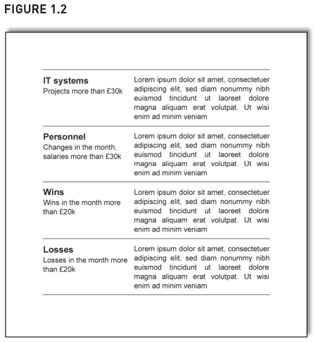
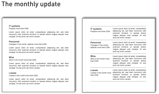
Let’s do another example, but this time let’s show both the ‘before’ and ‘after’. Figures 1.1 and 1.2 are two ways to show a page from a monthly update report. The page gives brief updates on the IT systems, personnel and client wins and losses. The detailed commentary is in Latin – I want you to focus on the structure of the page, not the detailed comments.
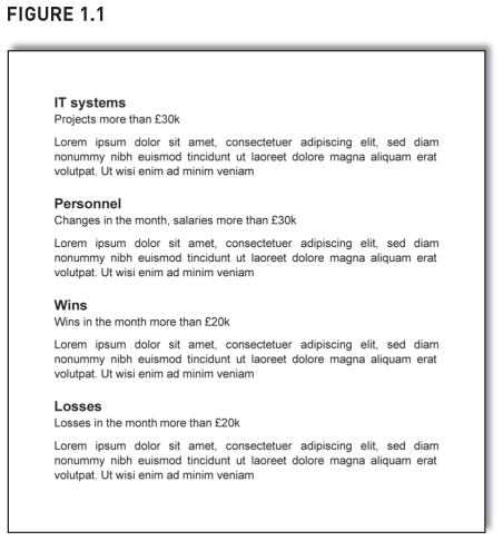
Figure 1.1 is a linear sequential layout down the page. It is visually uninspiring, and its layout doesn’t help people navigate around the page to find particular points. Short bits of text stretch all the way across the page, so readers’ eyes have to flick back and forth unnecessarily. All in all, the page looks a bit basic, a bit amateurish.
Figure 1.2 shows the page redone as ‘WiT’. Nothing else has changed, but the difference is dramatic. It is much more visually appealing. Even though both pages have the same number of words, Figure 1.2 creates white space more effectively. It’s easier to navigate around. It’s easier to read, since the text is in columns (and columns are easier to read). It looks more designed, more professional. All those benefits have come simply from putting the ‘Words in a Table’. Notice that Figure 1.1 didn’t have bullet points – ‘WiT’ improves documents that don’t even have them.
And that is ‘WiT’. Simple, really.
The rest of this chapter looks at the ‘why and when’ of ‘WiT’. It shows when ‘WiT’ helps – for presenting a series of arguments that build on each other, for presenting a list of findings, for comparing alternatives, and so on. It shows the wide range of documents that would benefit from ‘WiT’ – slides, notes, client pitches, reports, key performance indicators and more. It explains the different benefits of ‘WiT’. We’ve already mentioned some, but we will see several more.
Also, for those that don’t just use bullets but sub-bullets and sub-sub-bullets, we see how ‘WiT’ can do that as well (and do it beautifully). Then we see when you needn’t do ‘WiT’. For example, why aren’t these last two paragraphs in ‘WiT’?
But hang on, I hear you say, why the fuss? This isn’t new. Yes, some of you will have seen documents or slides where there were words in tables – maybe you’ve prepared some yourself. But it’s done very rarely – study other documents and slides and check out just how little it’s done. And when it is done, it’s an arbitrary, intuitive and almost experimental act, done without a full understanding of when to do it and without an awareness of the benefits it brings. Without this awareness, people don’t do ‘WiT’ as often as they should.
That will now change. You will learn the two conditions when you can use ‘WiT’. Armed with these, you will use ‘WiT’ consciously, not randomly, and you will give your work real impact.
Why editing often addresses the wrong problem
People are usually too busy tweaking words to think about changing the physical layout of draft documents and slides. They realise something isn’t quite right, but then tackle the wrong problem. They believe that, if the words don’t work well, the answer is to choose different words. So they tinker, making small changes here and there. They try to change emphasis by adding or changing an adjective – ‘we are very concerned’ becomes ‘we are extremely concerned’. Then someone else comes along and feels that that is coming on a bit strong and tones it down slightly to ‘mostly we are extremely concerned’. So it goes on.
But often these tweakings miss the point – changing the words doesn’t improve their overall format and structure and so won’t make much difference to the document’s clarity. Format is about document design (font sizes, alignment, etc.) and is in Chapter 7. And this chapter is about structure. Sort both of these out and the words sort themselves out much more easily.
Turning a bullet point list into ‘WiT’
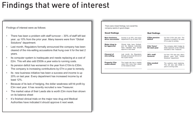
Rather than going straight to another ‘before’ and ‘after’, let’s get there over a few steps (and ‘WiT’ isn’t until step 6). Each step will illustrate something that helps. By starting at the beginning it will reinforce just how far we’ve progressed when we reach the end. Figure 1.3 is a typical bullet point list of findings from studying a company. Its layout probably looks familiar.
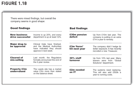
The list is a mix of the quantitative and qualitative. Some points are financial, e.g. the property is worth £3m more than the balance sheet says. Some are quantified but aren’t financial, e.g. staff turnover is 30%. Some are qualitative, e.g. the company has been cleared of mis-selling. Because of this, we can’t shoehorn the findings into a simple numerical table.
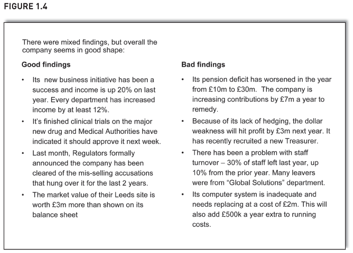
But we can still improve it. In Figure 1.4, we’ve put a conclusion at the start, we’ve grouped the points and we’ve put the list in columns. Each is discussed in more detail below. If you’ve read books or attended courses on report writing, you can probably quickly skim through steps 1 to 2, though start paying attention again from step 3, because it gets different from then on.

Step 1: Put the conclusion at the start (‘start at the end’) Write a conclusion or summary and put it first. In the redone example (Figure 1.4), the conclusion says: ‘There were mixed findings, but overall the company seems in good shape.’ This gives readers context with which to grasp and judge the findings that follow. As they read each bullet, they mentally compare it with the overall finding: ‘Yes, that one is good news – and that one is not good, but not that important … yup, I see where the author is coming from.’
Compare this to the previous version which didn’t give a summary. It just led into the bullet points with the comment ‘Findings of interest were as follows’, so readers are forced to work out the summary themselves. What readers do next is both laborious and all too common. They read the points once, reach the end and realise they haven’t quite grasped what they probably are meant to grasp – overall, is it good or bad news? So they might then get out their pencil and go over the points again, this time putting a tick against good findings and a cross against bad ones. They might even put a double tick against particularly good points or a double cross against particularly bad ones. Then having done that, they would add up the ticks and crosses to get a feel for whether it’s good or bad overall.
No wonder so many readers struggle to grasp the points that reports and slides try to make.
Newspapers summarise well. By the time you reach the end of the first paragraph, you know the overall story and have the context. The rest of the article is simply putting flesh on the bones. It is a very effective way of writing clearly.
So start with the summary – it gives readers context. Sorting the bullet points helps give further context. We look at this next.
Why we don’t start at the end
Starting at the end is the opposite of what we were taught to do at school and college. We were told to start with our objectives, then outline our methodology, then give the analysis, then – and only then – reach the conclusion.
Well, that’s fine for school and college where the person marking your work already knows the answer and is merely seeing how close you got to it. In business though, your audience only know the answer when you tell them. And they prefer you to tell them sooner rather than later so they then have context to judge your analysis that follows.
As an example, assume your report lists the seven items that have hit costs this year. Assume the first one you mention is the new compliance procedures that cost the company £2m. If you haven’t yet told readers by how much costs changed overall, they have no context to judge that £2m figure. Is it £2m out of a £3m total increase in costs? Or £2m out of a £103m total increase? They don’t know what to make of it – and won’t know until they get to the end of the list and find out the total change in costs.
And this leads into the second reason why many people struggle to start at the end – it is how we draft the document. We write down the seven items, then get out the calculator, add them up and write the last line of our report: ’The total costs went up £15m.’ The conclusion is at the end because we didn’t write it until the end – and that’s where it stays.
Correct this with a simple bit of cut and pasting in your documents. Use the mouse to highlight your conclusion, then pick it up and put it down at the start of the report. Then tweak the odd word to accommodate its new position in life. That’s all it takes to make your report much better.
Step 2: Segment, order, maybe strip out Look back at the original list of bullet points (Figure 1.3). They don’t seem to be in any particular order – but actually they are. They are in the most popular order of all, the haphazard order in which they were first written.
Never leave like them that. Segment them. Order them. Edit them and strip a few out. Maybe do all three. (I feel another ‘WiT’ coming … yup, here it is.)
To recap, so far we’ve started with the conclusion and then segmented the points. Both these steps are fairly well known. Step 3 onwards gets more unusual. (As an aside, I haven’t reordered any of our good and bad findings, nor stripped any out. That’s because I want the final ‘before’ and ‘after’ to be as comparable as possible.)
Step 3: Put in columns In the redone example (Figure 1.4), the good findings are in one column, the bad findings in another. People find it easier to read columns of words rather than text that spreads all the way across a sheet of A4. After all, newspapers are in columns (see page 198).
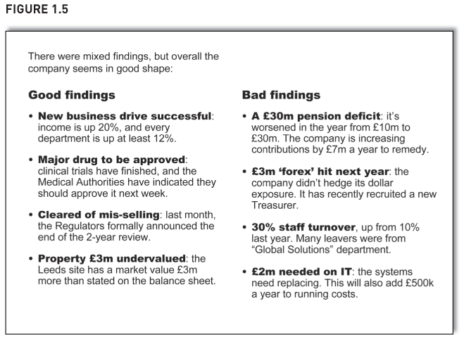
The list of points is already significantly better. But there is still much more we can do. In Figure 1.5 we see the result of steps 4 and 5: ‘Start each paragraph at the end’ and ‘Give the start of each bullet some typographical contrast’.
Step 4: Start each paragraph at the end Just as we started with the overview for the page as a whole (‘overall in good shape’), we can do likewise for each individual bullet point. The first point now starts with the phrase ‘New business drive successful’ and this helps people skim-read. Readers that are familiar with the new business drive needn’t read any further than this subheading and can skip to the second point. It also helps readers find a comment when referring back to the report. If the board is discussing the findings, readers can easily flick through the report and find a particular point (‘Here, see – remember the new business drive has pushed income up 20%’). If the findings are embedded deep within wordy paragraphs, it’s more of a struggle to find the point.
Step 5: Give the start of each bullet some typographical contrast Each point’s lead-in is now in Arial Black, a typeface that has much more impact than doing Arial in bold. Doing this makes the page look less visually the same and dull. It gives the lead-in more prominence, making it easier for readers to find information.
Now we’re ready for the big change: get rid of the bullets and put the words in a table – ‘WiT’.
Step 6: Put the words in a table (‘WiT’) In step 5, we gave some typographical contrast to the opening bit of each bullet and it made a bit of a difference – but we can do more. Previously, we laid out the first bullet as follows:
To make the opening bit stand out even more we could show it in a separate column and give it its own uninterrupted vertical space:

(The ‘WiT’ is a table one row high by two columns wide.)
And if we do the same for all points, the information is as Figure 1.6.
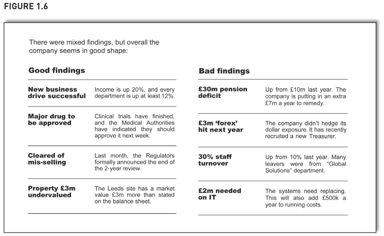
Now we have clear information. Compare it to the linear, sequential, unordered outpouring of bullet points in Figure 1.3. This layout has visual interest, white space and summaries. Hey, it even looks sharp. Readers can navigate around easily to find or refer back to particular points of interest. ‘WiT’ forces words into columns and we find it easier to read text in columns. These are the benefits we’ve seen so far from putting ‘Words in Tables’.
Let’s recap what we’ve done to the bullet points. We put the overall conclusion at the start, we segmented between good and bad, we put in columns, we started each paragraph at the end, we gave the start of each bullet some typographical contrast. Then we put ‘Words in Tables’. And the difference is dramatic.
The rest of this chapter looks at ‘WiT’ in all its fantastic and beautiful forms and we will see several more of its benefits. It will put ‘WiT’ firmly in your business toolkit, ready to give impact and immediacy to your notes, slides, reports and packs.
Next we study a client proposal and see how ‘WiT’ helps ensure your analysis is complete.
How ‘WiT’ helps ensure completeness
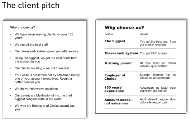
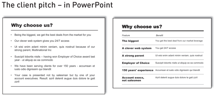
Figure 1.7 shows a typical page from a report that is pitching for business. It says why you should be chosen in preference to your competitors. The comments probably resonate with those that write or read client pitches, because similar comments are made the world over. Similar layouts are adopted too – the ubiquitous bullet point list. It’s all a bit uninspiring.
Here we have nine bullet points, which is quite a number for readers to grasp. If we could segment them, it would greatly help readers make sense of them.
But how to segment? Try this: segment by importance – some comments are important and make a difference, and some are vacuous and a waste of space. The vacuous ones are ‘We recruit the best staff’, ‘Our clients are King’ and ‘We deliver innovative solutions’. Who would ever say they don’t recruit the best staff, or that they don’t put clients first? (Some might say they don’t deliver innovative solutions, but they wouldn’t be in this particular beauty parade.) These statements fail the ‘not’ test. If no one would ever say they don’t recruit the best staff, what’s the point in saying you do, why waste space saying it?
So I’m going to strip them out. If you have to or really want to keep them, at least relegate them to a secondary list under the main list.
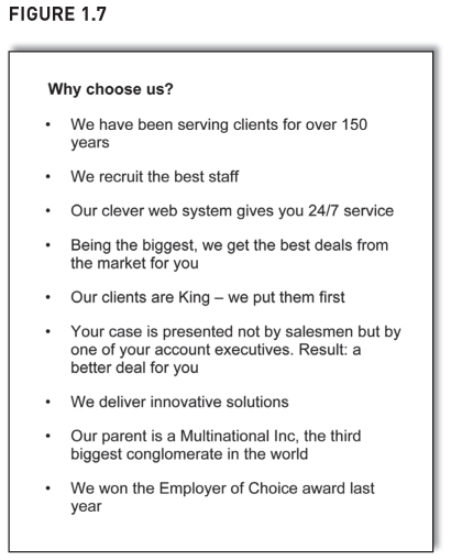
That leaves six of the original nine bullet points, so let’s do ‘WiT’ with them (Figure 1.8). Here we’ve done a table of features and benefits, a standard and useful way of selling a company or product. But if we put the six bullet points into a ‘features and benefits’ table, we have a problem. For four out of the six bullet points, we didn’t talk about the benefit to the client. We only mentioned the feature. OK, we have a strong parent company, but so what? What’s the advantage to the client of this?
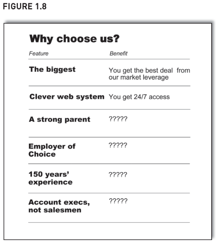
This is another benefit of ‘WiT’. Tables impose a discipline on writing, one that helps ensure the information is complete. If something is missing, it’s much more obvious – there’s a blank cell in the table. ‘WiT’ not only helps those that read the report, it helps those that write it. Compare this to bullet points which are often a random list of whatever authors can remember to comment on. If they don’t remember to comment on something, it’s not in the list. And often readers won’t spot the omission either, because bullet point lists rarely have a structure that helps highlight the omission. Getting complete information will be a recurring benefit to ‘WiT’.
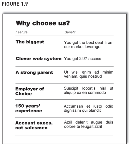
Returning to the client proposal (Figure 1.9), I have put some Latin text into the missing cells – I don’t have the heart to work out why being 150 years old is a benefit, and even if I did, you’d probably disagree and it would just be a distraction from the point I am making. And that point is: we now have a complete table. Also, readers can skim around, finding summary points or detail with ease. This table is far better than the linear listing of bullet points we started with.
These improvements make it easier for readers to choose you instead of the competition. Every decision-maker has a manager to answer to, and that manager will stroll into the decision-maker’s office and ask: ‘I gather you went for Jones Limited. Why’s that?’ If your company’s features and benefits are hidden deep within bullet points, the decision-maker will struggle to find them. The manager will be hovering around while the decision-maker scans the bullet points trying to find something to say. Eventually half a reason will emerge: ‘Ah-ha, got it, here it is – they have a strong parent.’
It won’t inspire confidence in the decision. And if the manager then says ‘OK – but why’s that a benefit, though?’, the decision-maker will struggle again.
‘WiT’ makes it easy for the decision-maker to say to the manager quickly and efficiently: ‘I like that they are the biggest – it means we get the best deal. Also, they have a strong parent – the benefit of that is . . .’. Much cleaner, crisper and authoritative. ‘WiT’ helps decision-makers be your advocate, it helps them find and repeat your messages on your behalf to their people.
So ‘WiT’ helps ensure your analysis is complete. However, we haven’t finished with the client pitch. Next we see it again, but this time on slides – and ‘WiT’ is great for them too.
How ‘WiT’ is great for slides too
We’ve got the same words as before, but now in landscape format. It could be part of a handout on people’s desks or up on the screen as a slide. Here, in Figure 1.10, assume it’s a slide. If you’ve ever sat through sales pitches by suppliers, its layout probably looks depressingly familiar – to show how different they are, companies show slides that look just like everyone else’s. How bizarre.

The bullet points don’t communicate well – visually uninteresting with no white space, important details embedded deep in wordy sentences, difficult to refer back to.
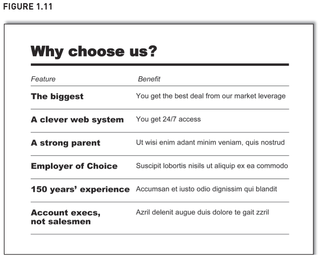
Time to do the slide as ‘WiT’. And yet again, the difference is dramatic (Figure 1.11). It’s much more inviting; the points visually lift from the page.
‘WiT’ is seriously good for presentation slides. (In common with many examples I give in this chapter, the redo doesn’t have the ‘conclusion at the start’. That’s because I want you to focus on putting ‘words in tables’ and not be distracted by a summary you might not agree with.)
The next example is a progress report on plans made at the start of the year. It illustrates yet another new benefit to ‘WiT’ – it helps cut out words.
How ‘WIT’ helps cut out words
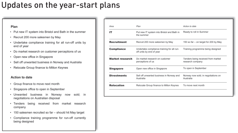
Figure 1.12 shows a page from a ‘key performance indicator’ (KPI) pack, it gives an update on the year’s plans. The plans made at the start of the year are listed on the top half of the page, and the progress against those plans is listed on the bottom half.
The layout makes it difficult to compare ‘Plan’ and ‘Action to date’; they are not physically close to each other. The layout also makes the document unnecessarily wordy. Look at the ‘Plan’ to sell unwanted business in Norway and Australia (top half of the page, sixth bullet point).
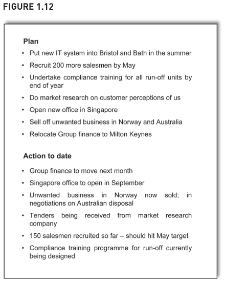
As for the related ‘Action to date’, it’s further down – the third bullet point in the bottom half of the page (third? Why not sixth?). It says ‘Norway now sold; in negotiations on Australia’. Except it doesn’t say it that succinctly, it uses eleven words instead of seven – it says ‘Unwanted business in Norway now sold; in negotiations on Australian disposal’.
These extra words are to remind readers that the businesses were unwanted – and readers need reminding because of the physical separation between the plan and action to date.
Four extra words don’t sound much but if you can remove words like this throughout the document, it collectively makes a big difference. The document is much easier to read, much less flabby.
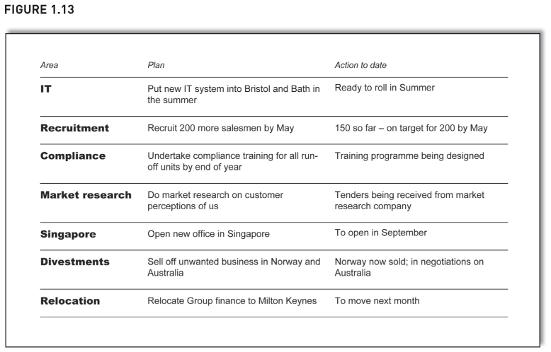
Figure 1.13 shows the words as ‘WiT’. Note its left column. It is a further aid to help readers navigate around the report – one or two words to describe the topic that is being commented on.
Also, guess what we find when we did ‘WiT’? The information wasn’t complete, there was an empty cell in the table. The original page mentioned seven plans, yet only gave updates on six of them – we hadn’t given an update on the new IT system. Yet this omission was not apparent because of the way in which the information was originally presented. I know it’s not apparent because I have given this example on my courses numerous times, and no one spots this omission until I point it out.
If you think this would never happen, this is a real example. A client’s KPI reports gave updates on plans, and laid them out down the page, not in a table – and some updates were missing.
What order should the table be in? We haven’t put it in any obvious order, and we should have. Maybe we could sort the list between projects that are going well and projects that are going badly. Maybe we could have a third category: projects which aren’t due to start just yet. If the market research project is not due to start for another six months, it is neither going well nor badly. The best order depends on your objectives or those of the audience.
Whatever we do, we should not leave it in alphabetical order or the order in which it was first written. Also, we should ensure readers know the order.
Two final points. Firstly, take care if thinking of using ‘Red, Amber, Green’ traffic lights to signal how well items are progressing. The section on page 223 explains why.
Secondly, ‘WiT’ doesn’t just improve bullet points, it improves narrative too, such as this narrative version of the KPI bullet points:
We started the year with well-defined key strategic action points. First was to put in a new computer system in Bristol and Bath over the summer. Next we looked to recruit 200 more salesman by May … [until all seven plans have been listed].
Now let’s see how we’ve progressed. First, we are pleased to say that we are on track with the Group finance relocation to Milton Keynes — it is due to move next month.
Needless to say, ‘WiT’ does wonders for this narrative. It visually lifts points from wordy paragraphs and makes it easy to skim and refer back to them. Also, it cuts out even more words than were cut from the bullet point list.
So ‘WiT’ stops you writing unnecessary words. Next we see another benefit: ‘WiT’ reassures readers and stops them reading unnecessary words.
How ‘WIT’ reassures readers
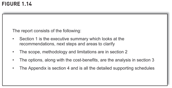
Figure 1.14 shows a typical note that describes the contents of a report. The note is to help readers see the structure of the report and navigate around. But readers struggle to navigate the note, let alone the report. Section numbers, titles and contents are hidden within the bullet points. Also, readers feel obliged to read it all just in case – after all, there might be something unusual or important hidden within it (e.g. ‘Section 3 is from the Internet’). Readers have to read the note in full.
If you do ‘WiT’, however, the usual benefits apply (Figure 1.15) and there’s more. The table reassures readers more than bullet points. A table has a rigid structure and is less likely to have something unusual in it – this table is simply: column 1 = numbers, column 2 = titles, column 3 = content. Simple. If the writer wished to flag something unusual to readers, he or she would probably do a note on it either above or beneath the table but not within it – unusual items don’t fit well within the structure of a table.
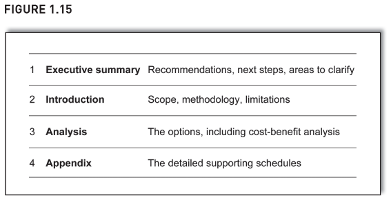
And if any readers still felt they had to check there was nothing unusual, they need scan only the third column. And because the note is a ‘WiT’, readers won’t take long to scan it, since there aren’t many words in the third column.
So ‘WiT’ helps reassure readers. But there’s more. Next we see how it helps ensure the analysis is consistent. After that, we run out of benefits and start to draw the threads together.
How ‘WIT’ ensures consistent writing
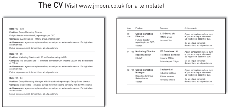
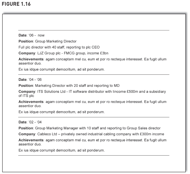
Most CVs show a career history in reverse date order like the part of a CV shown in Figure 1.16. The layout is a repeating pattern of rows – date, position, company, achievements, then again, date, position, company, achievements, and so on.
Figure 1.16 might look familiar but it isn’t effective. Firstly, it’s visually unappealing. More importantly, it makes readers hunt to find information. To see the achievements, readers’ eyes flick down the page, skipping over stuff they don’t want: ‘ “Date” – nope. “Position” – nope. “Company” – nope. Ah, at last – “Achievements”’. After reading the first set of achievements, the hunt starts afresh as readers look for the second set, again skipping over stuff they don’t want. And to see positions held over the years, it’s the same painful procedure.
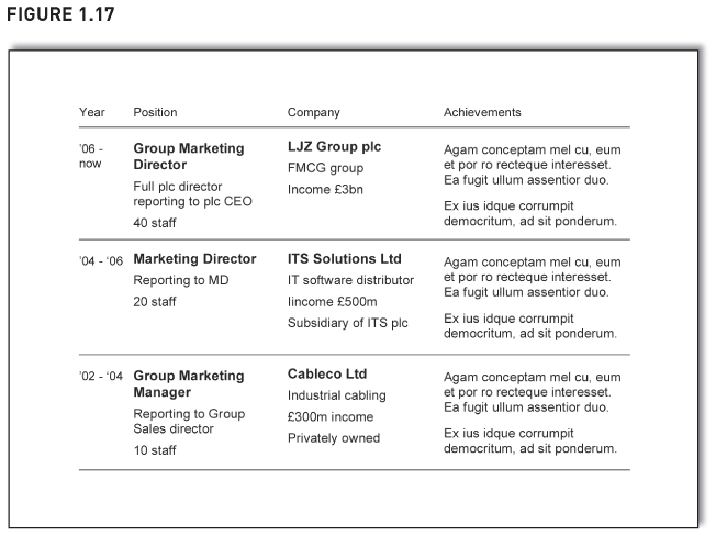
In Figure 1.17 we’ve done it as a ‘WiT’. Achievements are now easy to see – just scan down the right column. Want to see positions held? Scan the second column. Want to see what was happening in 2003? Scan the third row. Readers can navigate around easily and find the information they want. Also, it’s got more effective white space. It has impact.
But there is a new benefit too – ‘WiT’ helps ensure consistent writing. Imagine the author of the CV is a bit flaky in his or her thinking and accidentally writes as an achievement ‘Ran the Marketing Department for two years’, even though it’s a responsibility, not an achievement. In a traditional CV, this error might go unnoticed because of the stop–start staccato way readers are forced to read the achievements – read an achievement, then hunt down a few rows to find the next, read another, then hunt down a few more rows, read another, and so on.
When the CV is in ‘WiT’ and all achievements are in a column, the error would stand out. Comparable items are much easier to compare because they can be read in one quick uninterrupted sweep of the eye, and inconsistencies stand out much more. If readers scanned the achievements, they’d spot the anomaly – ‘Ran the Marketing Department’ just wouldn’t chime properly alongside the other genuine achievements.
So we have the final benefit of ‘WiT’ – it helps ensure consistent writing. Let’s summarise the benefits. Needless to say, I’ve shown them as ‘WiT’:
| It helps the writing | It helps ensure the writing is complete and consistent. It helps cluster items and sharpens the thinking (see below). It cuts out words. |
| It helps the reading | It makes the page more inviting with better white space. It’s easier to scan and skip sections. It’s easier to refer back to. It forces words into columns and columns are easier to read. Its rigid structure reassures readers. |
‘WiT’ really does sharpen the writing. When I first wrote the above list of benefits, I just blasted them down in narrative. Then, given what I was writing about, I decided to show them as ‘WiT’ – and it really forced me to think. I realised that some benefits help the writing, others help the reading, so I clustered them and edited them until I got to the table above. Much better.
Next we see the two conditions when you can do ‘WiT’.
When to ‘WiT’: repeating patterns, brief sections
There is a common theme running through many of these examples: the text has a repeating pattern. The CV had ‘Date’, ‘Position’, ‘Company’, ‘Achievements’. The client pitch had ‘Features’ and ‘Benefits’. The KPI had ‘Area’, ‘Plan’, ‘Action to date’. The index had ‘Section’, ‘Title’, ‘What it covers’. In each case, the text repeated the same captions.
Look out for this. If your text repeats similar captions, it would probably be better as ‘WiT’. Recently, a client looked at a dense page of text that gave historical background on a competitor. It had a repeating pattern – one long paragraph gave details about acquisitions the company had made in the 1960s. The next two paragraphs talked about the 1970s when the company developed new products. Finally, there were details about diversification in the 1980s. The repeating pattern was ‘Date’, ‘Overview’, ‘Detail’, and the text was crying out to be in a table. It would be easier to navigate around. It would have white space. It would be easier to refer back to. It would force words into columns that are easier to read. Also, if readers already knew about the new products in the 1970s, they could skip that detail, confident that nothing of relevance would be missed.
However, there is more. Even if there is no repeating pattern to the text, still do ‘WiT’ if there are sections or comments that are brief. The ‘good findings, bad findings’ example didn’t have a repeating pattern, it was just a list of brief isolated comments. The first was about new business, the second about the new drug. OK, we sorted them into good and bad findings, but that is a grouping of like items, not a repeating pattern to the underlying text. All the same, ‘WiT’ worked brilliantly for these bullet points (Figure 1.18).
Earlier we showed part of a monthly update as a ‘WiT’ (Figure 1.19). There wasn’t a repeating pattern to the text, other than (arguably) section, then detail. But there were brief sections: a section on IT, then a few words on it; a section on personnel, then a few words on it, and so on. Which means it is ideal for ‘WiT’.
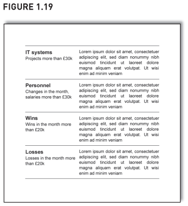
And with brief sections, ‘WiT’ really does help cut out words. Within the monthly update, the original layout stretched the text out across the page (refer back to Figure 1.1) and each section looks a bit insignificant with just three lines of comment (sometimes the comments might be only two lines of text). Many authors would be tempted to flesh out the commentary to four or five lines so it didn’t look so barren. But when we did ‘WiT’, it became five lines anyway and hence looks less insubstantial. Also, with ‘WiT’, you have less space to write comments, so you choose words more carefully.
Minutes of meetings are great for ‘WiT’ – they meet both criteria: brief sections and a repeating pattern (section number, heading, detail, who to action). I show a ‘before’ and ‘after’ of a client meeting note on pages 208–209.
Now you know when to use ‘WiT’, keep your eyes peeled: you will spot repeating patterns or brief sections in every report, note, slide presentation and information pack. And you now know you can ‘WiT’ them all.
Next we look at a slightly different application for ‘WiT’, one that needs a bit more introduction than normal. Until now, each row of ‘WiT’ has been distinct from other rows – with the good and bad findings, each good finding was different and unique from other good findings. One was about a new drug, another was about the end to some litigation. In the monthly update, one section was on IT, another on personnel. Again, they are distinct and different.
But the rows don’t have to be distinct, they can follow on from each other. Next we use ‘WiT’ to powerfully present a sequential series of arguments that take the reader from (a) to (c) and then to a conclusion.
How ‘WIT’ can develop a line of argument
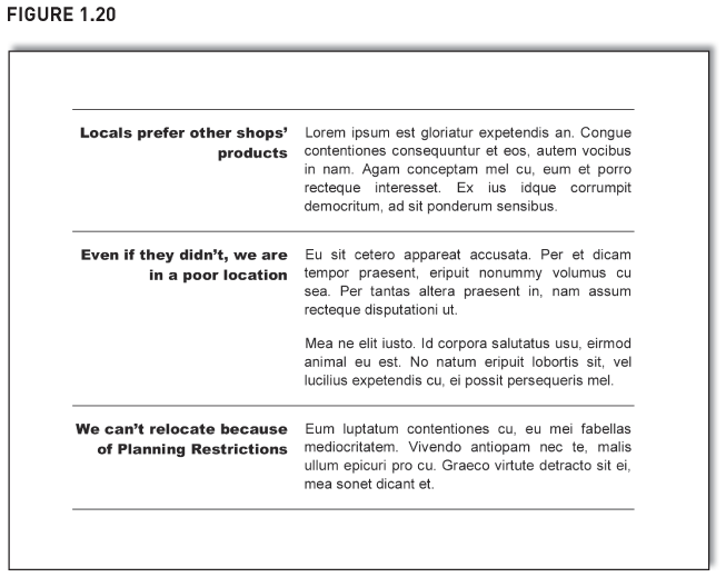
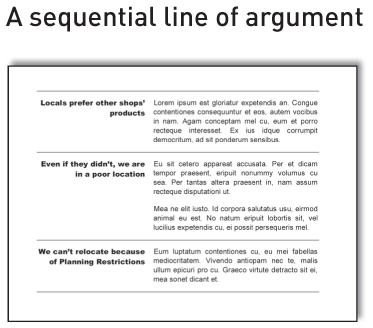
Assume a retail group is thinking how to improve the performance of its store in a particular town. Figure 1.20 shows a page from a report on the store. The ‘WiT’ outlines a sequential line of argument running down the page. The left column of the ‘WiT’ is each conjecture in the argument, and the right column contains the detailed comments that support them (albeit in Latin in this example).
The page powerfully argues why the store is a bit stuck. Each row of the table looks at a different part of the argument, and as readers progress down the page, the argument progresses too. The first row starts with the first thought: ‘Locals prefer other shops’ products’. The second row then moves to the follow-on thought: ‘Even if they didn’t, we are in a poor location’. The third row gives the final thought: ‘We can’t relocate because of Planning Restrictions’. (At this point, the conclusion is probably ‘close the store’, but it doesn’t say that at the top of ‘WiT’ because, again, I don’t want you distracted by the summary point.)
Visually, the important bits stand out – readers can scan the left column and see the summary points progress logically down the page, and the detail is there on the right if needed. ‘WiT’ gives clarity, impact and immediacy to the train of argument.
So we’ve seen how ‘WiT’ is great not only for isolated points but also for narrative that builds and develops down a page. It’s great for bullet points and continuous text too. Take your dauntingly dense page of continuous text and turn each paragraph into a row of ‘WIT’ with its key point in the left column and the detail on the right. This not only helps the reader but helps the writer too. It really does sharpen the thinking.
Meanwhile, let’s study the layout. Notice that the text in the left column is right aligned and looks good. Also, this layout looks really good if you have text above and below it on the page that you align similarly, like the one in Figure 1.21.
It’s worth taking three paragraphs to study the page layout. The text at the top (just underneath the thick rule at the top) is the introductory prose. Even though it isn’t part of the ‘WiT’, we’ve aligned it both left and right with the text in the right of the ‘WiT’. We’ve also similarly aligned the concluding comments at the bottom of the page underneath the ‘WiT’. All this makes the page look neat and aligned and also helps the comments in the left column of the ‘WiT’ to really stand out. It is an immensely effective way of presenting findings. (It is not too dissimilar to ‘pull quotes’ which we look at on page 211.)
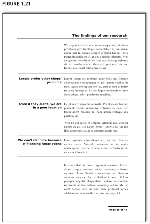
Notice how the left column gives conclusions, not just descriptions of the right columns. If the top left cell had said ‘Do locals prefer other shops’ products?’, readers would have to read the right column to find the answer. Because the left column gives the conclusion, skim-readers see the answer immediately. Great ‘WiT’ is when the left column summarises the right column, not just describes it.
Finally, see the page number at the bottom: it is typographically similar to the top of the page, i.e. a thick rule, in Arial Black font, right aligned. It helps keep readers on the page. Let me explain. Often when reading, people reach the end of the text at the bottom of the page and their eyes just wander off – they’ve nowhere else to go. If that’s what you want, fine. But sometimes you want them to linger a bit longer – maybe the page has tables of numbers, and you don’t want readers to lazily skim over them, reach the bottom, then turn the page. In which case have something at the bottom that’s typographically distinct and similar to something at the top. Readers’ eyes hit the bottom bit, then bounce back to the top and lo, readers are kept on the page. It’s a well-known typographical trick. Look out for this in magazine adverts, business cards and so on.
What if you want not just bullet points, but sub-bullet points, and sub-sub-bullet points? Don’t worry, ‘WiT’ can still more than cope, and, as will be seen next, it delivers beautifully.
How ‘WIT’ can do headings and subheadings
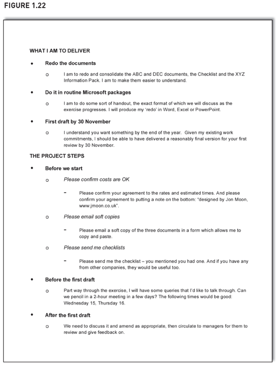
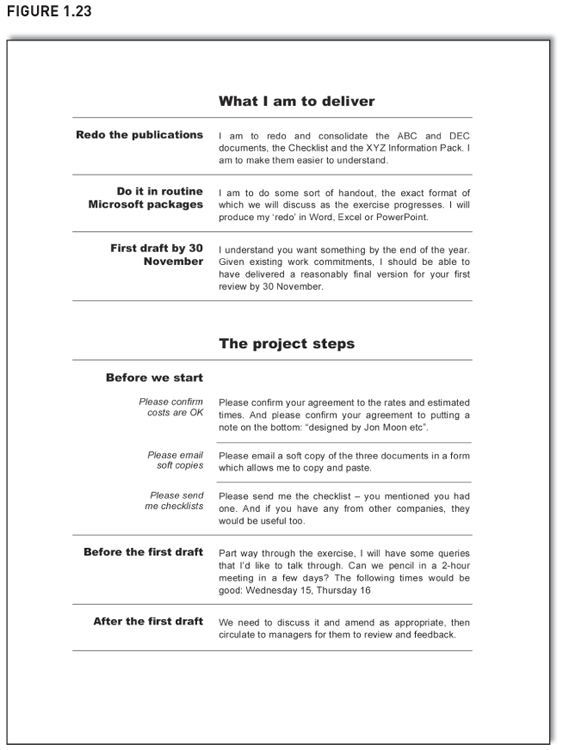
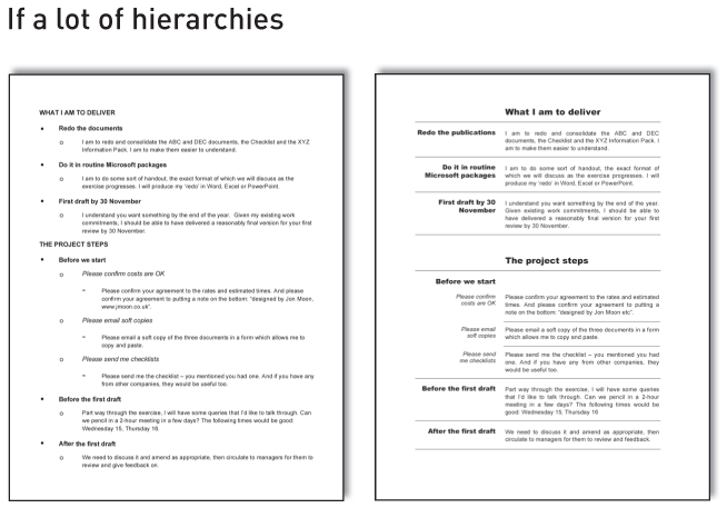
Figure 1.22 shows a proposal from me to a client. The top half of the page tells the client what I am to deliver, and the bottom half lists the parts of the project.
There are then three main parts to the top half of the page: I am to (1) redo documents (2) in Microsoft packages (3) by the end of November. However, the bottom half – the project steps – is more complicated.
As before, there are three main parts: (1) before we start, (2) before the first draft, and (3) after the first draft. But within ‘before we start’, there are three steps too – three sub-parts. We now have another hierarchy.
Many documents show this hierarchy by the use of different-shaped bullet points. Here, we’ve shown the hierarchy with a black circle, a white circle, and a dash. As a typographical tool, though, these different bullet points are rather useless. The page is not easy to navigate around and skim-read. Visually it is dull, not helped by the unimaginative use of fonts (all the same size, with just a bit of upper case and bold to try to create distinctions). Also, all the indenting and further indenting makes the page look inelegant, amateurish. (Please don’t dismiss these sub-sub-bullets as an exaggerated parody. Stuff like this appears everyday at work.)
With ‘WiT’ (Figure 1.23), it looks much more professional. We’ve divided the top and bottom half of the page by using a much bigger font to say ‘What I am to deliver’ and ‘The project steps’. The two-part structure of the document is immediately obvious (much more so than in Figure 1.22 that just uses bullet points).
We then do ‘WiT’ for the three parts of each half. See the bottom half of the page – the three parts are ‘Before we start’, ‘Before the first draft’ and ‘After the first draft’. Then in the first of these three, we use different typography to signal the difference between a part (‘Before we start’) and a sub-part (e.g. ‘Please confirm costs are OK’). In the left column, we’ve put sub-parts in Arial, not Arial Black, and we’ve used italics.
‘WiT’ doesn’t just cope with these levels of hierarchy, it excels at them. It shows them beautifully. And it’s got all the usual benefits of ‘WiT’. The page has impact.
What if we want yet another level of hierarchy? An obvious answer is: do you really need that many? Maybe there is some other way to communicate – both author and reader would struggle to conceptualise too many levels of hierarchy.
But this is ducking the question. Assume that, within ‘Please email soft copies’, you want to talk about the three documents you need emailing to you. Those three documents create another level of hierarchy – or at least they do in today’s bullet point-obsessed world. People show it like Figure 1.24 (from now on, the mock-ups only show the first two sub-parts of the project steps).
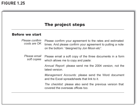
It is getting surreal – a heading, a bullet, a hollow bullet, a dash, a tick. For the three documents, why not just put the title of each document in italics and show it as a separate paragraph? See Figure 1.25. Readers can easily refer to the note to see which documents to send, and the page retains its strong alignment and looks sharp.
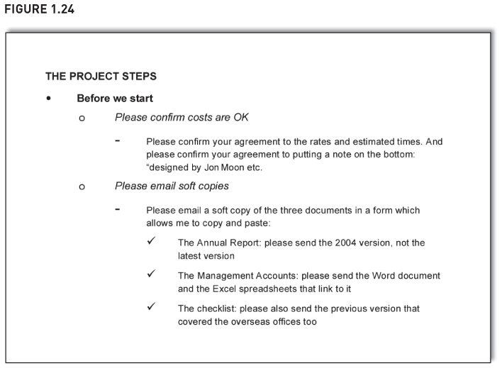
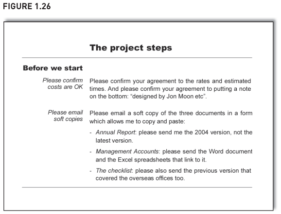
And if you want the list of documents to have a typographical cue, then I know something you could try – a bullet point (Figure 1.26). You didn’t expect that, did you? Soon we will look at when bullet points are acceptable and this is one such occasion. Also, here they are made even more acceptable because of the italicised opening words and the less visually intrusive dash (rather than the more popular black dot).
So ‘WiT’ is great, but can you have too much of a good thing? We answer this one next.
Can you have too much ‘WiT’?
The short answer is: it depends on the document. The long answer is as follows:
| Presentation slides can have too much | Imagine 25 slides on the trot, all done as ‘WiT’. The audience would struggle – they might even cry out for a bullet point. With presentations, you need to ring the changes. Chapter 5 gives ideas how. |
| Business reports rarely can have too much | There are many reasons why business reports really need ‘WiT’. Often, they aren’t written that brilliantly and their layout is not that great, especially if done for an internal audience (client reports get spruced up more). Also, their readers are usually short of time and want to refer back to the report when discussing it. ‘WiT’ helps all these problems (and more). I have done 100-page reports all in ‘WiT’ and it’s been fine. |
| Emails need help to have any | With emails, you need to make an effort to create ‘WiT’, because it’s not easy to do it on the face of the email. If I want to say something that is more than just very simple, I do the note in Word then attach it to the email. In Word, I can do ‘WiT’, and format the page better. |
| Unfortunately, a Blackberry somewhat puts a spanner in the works. I have not worked out how to do ‘WiT’ that can be read on the screen of a Blackberry. Also, Blackberry users aren’t keen on attachments. |
Next we show mercy on bullet points and see when they are acceptable.
Why isn’t this book entirely in ‘WiT’?
If I’ve written 100-page reports almost entirely in ‘WiT’, why didn’t I do more of this book that way? Two reasons why: I didn’t need to and I didn’t want to. Let me explain.
‘WiT’ helps readers refer back to points, helps ensure ideas are complete and helps break up dense pages of text. But for much of this book, I didn’t need help on any of these. For instance, when I previously listed reasons why you should read about ‘WiT’, I couldn’t imagine you’d ever want to refer back to the list. Also, it doesn’t matter if the list isn’t complete. Finally, the page didn’t look dense and intimidating – the book designer has done a great job.
So I didn’t need ‘WiT’ – and I didn’t want ‘WIT’ either, because tables can have a clinical feel. For this book, I wanted a more breezy style, one that ebbs and flows with the narrative.
However, the clinical feel of ‘WiT’ is exactly why I’ve done long reports that way. One was a market research report where many people made very impassioned comments. I did the entire report in ‘WiT’ because its clinical feel helped tone down the emotional levels and give an air of objectivity and neutrality to the report. Also, I didn’t struggle to compose all those short phrases needed to join together bits of prose (‘and next we move on to another key point’). They aren’t needed in ‘WiT’.
When bullet points are acceptable
A lot of bullet points aren’t any good, eh? Given how popular they are, it’s quite a message – and I say it unrelentingly.
Here’s where I pull back from the precipice. Below we see when bullet points are acceptable. Also see page 166 for how to do them properly. Finally, notice that there are bullet points below. I explain why soon.
In general, bullet points are acceptable if:
- you use them in moderation;
- you use them to denote only a single hierarchy, not multiple ones;
- you don’t expect too much from them (they don’t visually lift points).
Each of these reasons applied in Figure 1.26 which had bullets to show the three documents to send.
In practice, you can use bullets as follows:
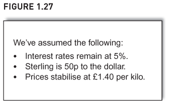
- They can be acceptable if each point is brief and if there is no repeating pattern. For example, in Figure 1.27 each bullet point is less than a full row of text, so readers can scan down and see the key points more easily than if written in a paragraph. Also, because there’s only three points and because each is brief, we don’t need to start at the end for each bullet nor make the start of each typographically different, e.g. ‘• Interest rates:…’. (For a reminder of these ideas, see page 10, steps 4 and 5.)
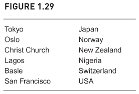
However, if there is a repeating pattern within the rows of text, don’t do bullet points – use ‘WiT’ even if each point is less than a full row of text. Confused? Let me illustrate. You wish to list your company’s offices – city and country. Figure 1.28 uses bullets, and the country names aren’t aligned well, which makes it more difficult for readers to scan them. Figure 1.29 is ‘WiT’. Country names are aligned, so scanning is easier.

- Secondly, the occasional bullet point list can help break up a page of dense text if nothing else offers itself up. Usually something does, though, e.g. ‘WiT’ or some decent document design, so this second reason rarely applies.
- Thirdly, if you’re not fussed about readers quickly seeing the key points, bullets are just about acceptable in small doses – and this is my somewhat limp justification for using them here. But it’s not that convincing – why do something average (show information in bullet points) when you can do something well (show it in ‘WiT’)?
- The fourth occasion is the usual escape clause: remember your audience – some of them might like bullet points, even after you’ve told them the joys of ‘WiT’. Take care, though, because there will be others in the audience that don’t like bullets.
- Finally, use bullets if they are part of the design template you must follow … That’s why this book has bullet points at the start of each chapter (albeit they are arrows, not black dots).
Before we reach the chapter summary, here’s one last question: does ‘WiT’ dumb down? After all, many people think bullet points dumb down. And yes, people will still shoehorn simplistic dumb comments into ‘WiT’ just as they do with bullet points. Which is why ‘WiT’ is like a razor blade. After the collapse of Barings Bank in 1995, James Morgan in the Financial Times (4 March 1995) said:
A derivative is like a razor. You can use it to shave yourself and make yourself attractive for your girlfriend. You can slit her throat with it. Or you can use it to commit suicide.
Well put, even if a bit scary.
So it is with ‘WiT’. It can make your work attractive, intelligent and elegant. Arguably, ‘WiT’s better layout and greater impact also encourages people to engage with information more intelligently. But in the wrong hands, ‘WiT’ can still do damage. If this isn’t that positive, many things in life are like this – from cars to food to exercise. But not bullet points. Far too often, they do damage – and I challenge anyone to say they are elegant.
A final thought: when not to have lines between ‘WiT’ rows
Every ‘WiT’ we’ve seen has faint horizontal lines between rows. The lines look smart and help create a distinction between different parts of the ‘WiT’.
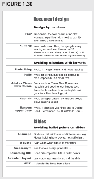
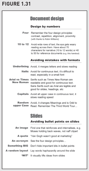
However, avoid horizontal lines if your ‘WiT’ rows are numerous and unusually narrow. This is often applies to reference documents (you will see in Chapter 7 that such documents need narrower rows of text). And one of my course handouts is an example of such a document – it is an A4 pamphlet printed double-sided on card and then folded twice so it will tuck into a top pocket. And because it’s folded twice, its columns are narrow. Figures 1.30 and 1.31 show one of the columns. In Figure 1.30 the lines are a bit intrusive because there are so many of them. Figure 1.31 doesn’t have the lines – and because the rows are so narrow, it doesn’t need them. It’s clearer and cleaner.
Now let’s summarise the chapter.
Final thoughts and recap
We’ve seen lots of ‘before’ and ‘after’ examples. Here’s a reminder of how ‘WiT’ dramatically improves so many different documents.
In the 1980s, bullet points were neat and new, but now they aren’t the force they used to be. ‘WiT’ will often be much better; it gives documents immediate impact. Only use bullet points when it’s valid to use them and don’t do them a disservice by using them as follows:
- Badly.
Recap
| The benefits of ‘WiT’ | |
| It helps the writing | It helps ensure the writing is complete and consistent. It helps cluster items and sharpens the thinking. It cuts out words. |
| It helps the reading | It makes the page more inviting with better white space. It’s easier to scan and skip sections. It’s easier to refer back to. It forces words into columns and columns are easier to read. Its rigid structure reassures readers. |
| ‘WiT’ for particular formats | |
| Slides avoid too much ‘WiT’ |
‘WiT’ is great for slides but don’t overuse – 25 ‘WiT’ slides on the trot is a bit much. Ring the changes. |
| Business reports do lots of ‘WiT’ |
You’d really struggle to have too much ‘WiT’ in a business report. ‘WiT’ till you drop. |
| Emails put in attachments |
Except for the most basic email, do it in Word and send as an attachment – that way, you can do ‘WiT’. |
| Constructing your ‘WiT’ | |
| ‘WiT’ does beautiful hierarchies | This table has three hierarchies: a section called Constructing your ‘WiT’, then an overview comment in the left column, and finally the detail on the right. |
| Cluster and order within your ‘WiT’ | Group them between good and bad, important and unimportant or whatever. Order them within their grouping. |
| If possible, summarise in the left column | Use the left column to summarise the right column, not describe what it covers. Do ‘WiT’ so readers can skim the left column and grasp the points being made. Also, try right aligning the comments in the left column and do them in a typeface like Arial Black. |
