Slides
Slides that inform and influence
- How to do slides so people remember your messages
- Great alternatives to bullet points – a reminder of ideas from other chapters
- Getting the audience to listen to you, not read your slides
- Presenter’s props – if you have fewer bullet points, how will you remember what to say?
- For the bullet points you want to keep: how to do them better
- Doing better handouts
People talking without speaking, people hearing without listening.
Simon and Garfunkel, ‘The Sound of Silence’
You’re presenting your six-point action plan at a get-together of senior managers. Or maybe you’re presenting your new investment proposal to the board. Or you’re pitching for a new account, one you’ve been stalking for some time, and you have at last got the undivided attention of key decision-makers. Either way, you are at the front of the room, you have your big moment, your chance to inspire, inform, influence, motivate, impress. And you put up slide after slide of bullet points and read them to the audience.
What a wasted opportunity. Often there are better alternatives to bullet points – which is what this chapter is about. Next time you’re preparing a presentation, dip into this chapter for inspiration and ideas, for better ways to reinforce, engage and remind, better ways to influence, impress and make an impact. And to do them, you don’t need to buy any fancy new software or attend Advanced PowerPoint courses.
As for your slides that rightfully stay as bullet points, we see how to do them better. Also, if bullet points are your script and you can’t imagine how to cope without them, we cover that too.
Two last points. Firstly, this chapter is not a triumph of style over content, about making your slides look groovy and sexy with fancy arrows and icons. It’s about communicating your information more clearly and effectively. In common with the rest of this book, it’s about clarity and impact.
Secondly, a lot of this chapter relates to other chapters. Slides have bullet points, graphs and tables. People use slides to make comparisons and show numbers. Also, people want slides to be designed. Given that the italicised words are other chapters, we’ll be referring to them fairly regularly, as you’ll see.
The first section looks at ideas that not only get your message across but also help ensure it’s remembered.
How to get your message remembered
Sometimes, you want your audience not only to understand your message but also to remember it, to have unprompted recall of it. Maybe it’s because you want to win over not just your audience but your audience’s audience too. If you can give your audience something they can use in their conversations, you will help them to help you in your cause.
And the answer isn’t bullet points. Of all the bullet points you’ve seen over the years, how many can you remember? Bullet points don’t win hearts and minds. At best, they lay out an argument in a linear, sequential, logical way. At worst, they bore into submission.
So here’s some alternatives, four ways to do slides your audience will remember: be big, use an acronym, use a memorable quote, or find a picture that reinforces (i.e. not clipart).
The first is: BE BIG.
Be big
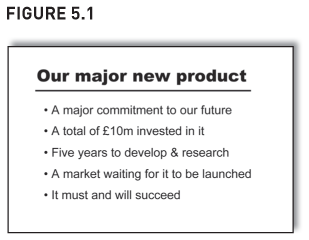
You are launching a new product to the sales force and want to reassure and excite them with just how much time and money you’ve spent developing it. So you show them some bullet points which spell out the numbers along with some boosterish catch phrases (‘It must and will succeed’) – see Figure 5.1.
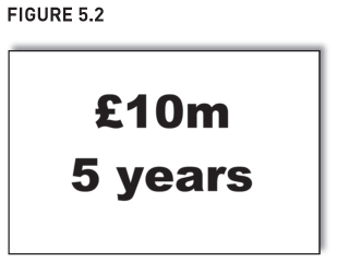
But the two points you really wish to convey are hidden deep undercover, submerged by the words and bullet points. If you want the sales force to remember ‘£10m’ and ‘five years’, try the slide in Figure 5.2 instead.
Also, this approach helps create an air of seniority for the presenter. There is something quite confident, almost cocky, about keeping slides this minimalist and being so ‘big picture’ and in-your-face with the two numbers. The slide is more likely to be done by a senior manager than a middle one.
People often hide key numbers deep in slides. To show how a company has grown 15% a year for the last five years, I’ve seen slides with five years of profit and loss accounts, each with about 10 numbers (income, cost of sales, gross profit, overheads, etc). Fifty numbers, but the one number that was important – ‘15%’ – wasn’t even shown. Instead, do a slide with a massive ‘15%’ on it. That spells it out.
Be big with words too – it makes it impossible for the audience to misunderstand you. Often, bullet points don’t engage. People don’t give them sufficient critical thought, especially after the 100th bullet point appears on the screen. Also, people often ponder each bullet in isolation from the others, and even in isolation from their own values and beliefs. They accept each bullet individually but still walk away from the presentation rejecting them collectively. A presenter can show the six steps to manage a project, and the audience will nod along with it all, and yet still go away and do exactly what they did before – dive into a project without doing a timetable.
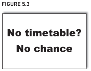
Instead, be big. Confront the audience in a way that ensures even a dulled set of faculties will hear the message. Don’t bother with all the steps for managing a project, just put this on a slide (Figure 5.3) – it won’t be misunderstood or forgotten:
This is simply following one of the principles of communicating: ‘Avoid too many messages – if you try to get too many across, you will get none across.’ In Figure 5.3, we’ve ignored all the more minor tips on project planning and instead have gone for the jugular, the one point we fear everyone will nod along to but then ignore – doing a timetable. Which is also following another of the communicating principles: ‘What outcome do you seek?’ Here, we want people to do a timetable, and the slide has been utterly single-minded in emphasising that.
There is one problem with these ‘big’ slides, though: they don’t make a good stand-alone handout. I discuss this later.
Next we look at the second way to get your slides remembered: it’s ‘DANA’ – Do A Neat Acronym.
‘Never have more than five bullets or four numbers on a slide’
You can read this advice on the Internet. Given that I’ve just been saying ‘be big’, you might think I agree with it.
I don’t. Even though we’ve all seen a bad slide with 50 numbers on it, it doesn’t mean all slides with 50 numbers are bad. All dogs are animals, but not all animals are dogs. It depends on what the presenter wants to say and what the audience are interested in and hope to hear.
If I was a knowledgeable football pundit, and if the audience were keen football fans, I could show the latest Premiership football table on the screen and talk about it for 30 minutes. I could highlight how City are currently above Rovers on goal difference simply because United got whipped 5–0 by City a month ago. I could talk about how last year’s promoted teams are doing. And the table of numbers on the screen would act as a backdrop, a reference point for my comments. And everyone would have a great time.
But there would be over 200 numbers on the slide, so that can’t be right, can it? Yes, it can. Sometimes 200 numbers can be fine, sometimes just 10 is too many. It depends. The key is not ‘How many numbers should be on a slide?’, but ‘What are you communicating, to whom, why, and which way works best?’
An acronym
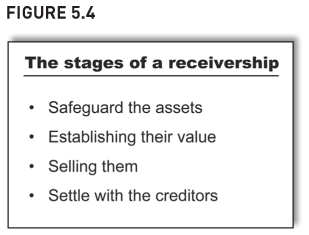
You want your audience to remember the four stages of a receivership so you put up a slide with four bullet points (Figure 5.4).
They will not be remembered. Instead, try a slide with the acronym ‘HELP’ – Hold, Evaluate, Liquidate, Pay (Figure 5.5).
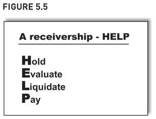
As anyone who has sat exams knows, a good acronym is a great way to remember things. ‘Every Good Boy Deserves Food’ for music, ‘CRAP’ for document design (if you haven’t yet looked at Chapter 7, this last one will confuse you). And I will always remember the stockbroker’s report on Robert Maxwell’s empire before it went bust: ‘Can’t Recommend A Purchase’.
If you want your staff to remember the five key action points for the year, don’t expect your bullet point list to stick in their brains. Try an acronym. One of my clients was presenting its five action points that were going to knock the competition into a cupped hat. By marginally changing one word in the list, the five points created an acronym: ‘FIRST’.
These acronyms work because they are a bit different. I do wonder, though, about ones like the 7Ss (for strategy) and the 5Ps (for marketing); they seem to have an air of contrivance about them. It’s too much of a coincidence that every important bit of strategy starts with an ‘s’, and every important bit of marketing starts with a ‘p’.
Next, we look at a third way to get your audience to remember your message: use a good quote. After all, ‘You can’t always get what you want, but if you try sometimes, you just might find you get what you need’. Mick Jagger sang that.
A memorable quote
You wish to tell staff why marketing is vital. You can do bullet points that intellectualise about its importance. Or maybe you could recite case studies of marketing successes and sound like some business school lecturer. But neither are likely to win hearts and minds. Neither gives your audience much they can use on their audience and repeat on your behalf.
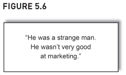
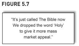
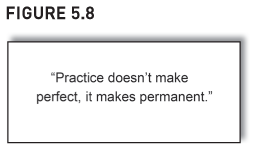
Instead, find a memorable quote. The one in Figure 5.6 is neat. It was said by the auctioneer about Van Gogh after his Sunflowers painting had been sold in 1987 for $40m, despite being considered worthless in his lifetime.1 Or maybe try the quote in Figure 5.7. This was said by a spokesperson from Hodder & Stoughton, the publisher of The Bible.2 Finally, if trying to convince people of the need to train properly and learn from professionals, don’t bore with bullet points (‘You learn best practice, you learn from other people’s mistakes, etc.’). Instead, put up a memorable quote – see Figure 5.8 for a pithy comment from Warren Buffet’s golf pro.
A decent quote gets remembered – as does a decent cartoon, and this is the next and final idea for getting your audience to remember your message.
A cartoon that reinforces
Don’t get me wrong, I am not advocating clipart. I hate the stuff. Some pictures may paint a thousand words, but clipart isn’t one of them. It doesn’t help your audience internalise your message, it is just colouring for a dull bullet point.
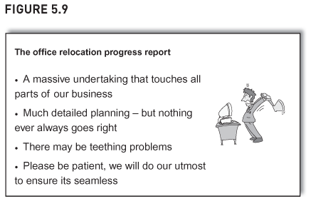
You are in charge of the office relocation that’s happening next week and are telling staff the timetable. Your real objective, though, is to plead for patience, to manage the audience’s expectations and to ask for tolerance with any teething troubles. You could put up a slide with lots of typographically bad bullet points, bad grammar (‘its’) and clipart of a man smacking the computer (Figure 5.9).
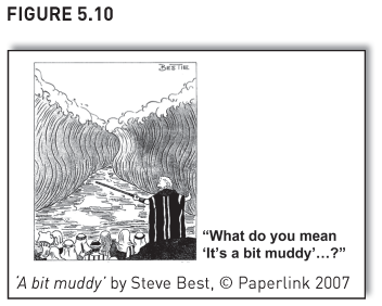
No one will remember the bullet points. As for the clipart, at best it doesn’t help your message, at worst it hinders if your audience hate clipart (many do). So instead show something like the cartoon in Figure 5.10, I found it on a birthday card.
It’s a striking cartoon, one that sticks in the brain. It reinforces your message and does it memorably – it doesn’t even need a title. Also, it gives a vocabulary for the future. If someone asks how it’s going, you say ‘A bit like Moses and his Red Sea – it’s a bit muddy’. With luck, it might even become part of the lexicon of the company, so that if people moan that their computers take longer to fire up, their peers will say to them ‘What do you mean … “It’s a bit muddy”…?’ Their peers will go into bat for you, since you have given them the means to do so.
We have found an image that is so apposite, it doesn’t just ‘liven’ up bullet points, it replaces them.
There are a few points to watch, though. Don’t breach copyright. Also, think of your audience, some of whom may think cartoons trivialise presentations. And avoid pictures of trite metaphors and parallels – to emphasise the need to change, people show an ostrich with its head in the sand, and to emphasise teamwork, they show a tug-of-war. Trite pictures like these aren’t memorable or engaging, they are clichéd and overworked.
Never hang your entire presentation on a metaphor, it is tedious and contrived. Yes, refer to a good metaphor once or twice or three times, but don’t contort every section of the talk to fit the metaphor.
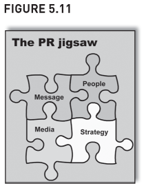
Also, don’t confuse a memorable cartoon with ‘PowerPoint Paraphernalia’, the stuff and fluff that people put on slides to appear sophisticated. The ‘jigsaw’ slide (Figure 5.11) probably once seemed sophisticated, but it’s now overused, clichéd and passé (and it’s not only the PR department that does this sort of thing). I suppose people think it pads out an empty slide, surmising that if the slide simply had four words on it, it would be a bit dull.
And fancy intriguing arrows (Figure 5.12) are often a sign of flabby thinking or a paucity of decent ideas. If someone hasn’t got much to say, if they’re a bit short of decent content, no worries – just do a few groovy arrows, that’ll fool the audience … won’t it?
Next are ideas we’ve seen in other chapters. We saw them then because they are great for reports, and they briefly reappear here because they are great for slides too.
Other better alternatives to bullet points
In other chapters, we’ve seen alternatives to bullet points that are better because they achieve greater clarity or comparability. This section quickly reminds us of five that are great for slides too: ’WiT’, two-by-two grids, decision trees, cluster charts, and tables of ticks and crosses. See the other chapters for the full details.
‘WiT’ – Words in Tables (Chapter 1)
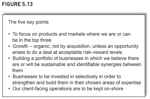
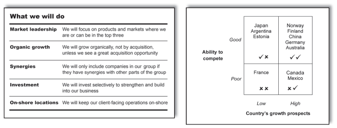
In Chapter 1, we showed how powerful and versatile ‘WiT’ (Words in Tables) is. Below is another ‘WiT’ slide example – to present the five key strategies to your management team, you do the following bullet point slide (Figure 5.13):
Instead of listing the points out with visually indistinct bullets, try doing ‘WiT’ (Figure 5.14):
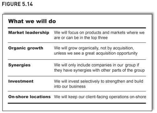
The difference is dramatic. The slide has much more impact – the key points lift from it. Also, by putting ‘Words in Tables’, we use the slide’s white space more effectively, which makes it more visually interesting. However, there are two other reasons why the ‘redo’ is better. Firstly, the slide is typographically more interesting – there is contrast. The heading is no longer bland and indistinct, it is bold and confident – as is its underline at the top.
Secondly, the writing has much more impact. The first version was grammatically inconsistent – one bullet started with an imperative, the next with a noun, the next with a gerund, and so on. The second version is more consistent – and this doesn’t just keep grammatical pedants happy, it creates impact. The redone slide is all in the active voice, which is engaging, humanising and action oriented. And it benefits from the power of repetition: all the points start ‘We will’. It is emphatic, like the middle bit of Winston Churchill’s famous speech in which the phrase ‘We shall fight’ ran through it repeatedly. Listeners are left in no doubt as to what is being said:
We shall fight with growing confidence and growing strength in the air, we shall defend our Island, whatever the cost may be, we shall fight on the beaches, we shall fight on the landing grounds, we shall fight in the fields and in the streets, we shall fight in the hills …
Imagine how this might’ve been done in a slide:
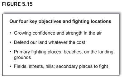
Ridiculous.
‘WiT’ is a dramatic improvement, but doing tables in PowerPoint can be fiddly. If doing your slides on a train to the presentation, you probably won’t want to muck about creating ‘WiT’. To overcome this, set up a template, it saves doing ‘WiT’ from scratch. Also, maybe keep ‘WiT’ for important slides, the ones you wish to make an impact with or that you will reuse a lot.
And plan your work better so you don’t have to do it on the train.
The next four ideas are all from Chapter 4. Presenters often need to compare alternatives, and here are quick reminders of ways to do this.
Two-by-two grids (or three-by-three, etc.)
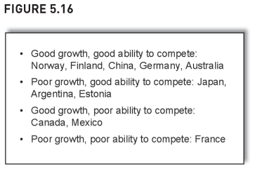
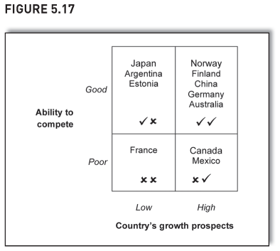
You are reviewing your portfolio of overseas offices. Some are in high-growth countries, some in low-growth ones. Some have a strong ability to compete, others are not so hot. Figure 5.16 is a bullet point version of your findings. Figure 5.17 is a two-by-two grid which is far better at showing both overview and detail. Groupings are easier to pick out – many countries are top right (and the double tick signals to readers that ‘top right’ is best), and only one is bottom left (bad news obviously, it’s a double cross).
Decision trees
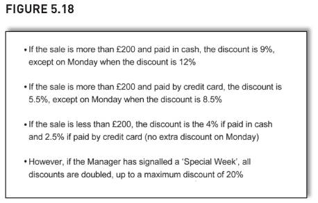
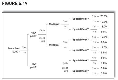
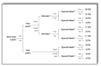
You are explaining to staff the rules for discounts. Figure 5.18 shows the rules as bullet points. It takes a fair amount of concentration to work out the discount to give. Figure 5.19 is a decision tree of the same rules. Staff can easily use it to work out the right discount.
Decision trees are not just for administrative points such as working out discounts, they are great for big strategic decisions too – see Chapter 4 for a decision tree on the options a CEO has for his non-core subsidiary: sell it, just hang onto it, or give it money to make a big acquisition so it becomes a market leader?
If your slides have lots of bullet points that say ‘if this, then that, if that, then the other’, try a decision tree instead.
Cluster charts
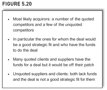
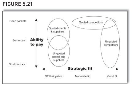
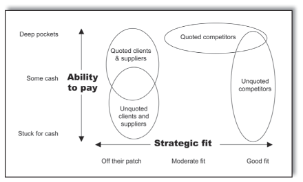
You are looking at which types of company might buy one of your subsidiaries and you categorise groups of potential purchasers according to two questions: (1) strategic fit: the degree of overlap with your subsidiary’s line of business; and (2) ability to pay: the ease with which a potential purchaser can get the funds to do the deal.
Bullet points are wordy and make it difficult to spot interrelationships (Figure 5.20). The cluster chart is far better (Figure 5.21). It shows both overview and detail and helps readers make comparisons – the information visually lifts from the page. Cluster charts really can paint a thousand words. Use them instead of two-by-two grids if your analysis gives ranges rather than specific answers (e.g. the ‘strategic fit’ for quoted competitors ranges from ‘good fit’ to ‘moderate fit’).
Ticks and crosses
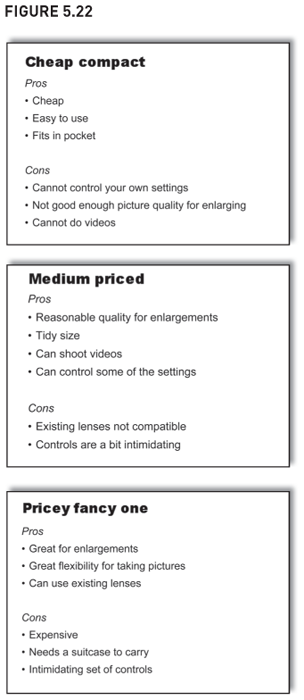
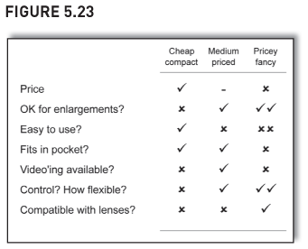
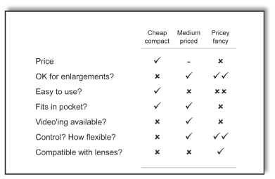
You are comparing three different cameras – a cheap compact, a medium-priced one and a pricey fancy one. Figure 5.22 are bullet point lists of the pros and cons spread over a series of slides. The slide in Figure 5.23 is a table of ticks and crosses. The table is better because readers can more easily make comparisons. Also, the analysis is less repetitive and more likely to be consistent and complete. It allows a greater granularity and is easier to refer back to.
These five ideas helped us achieve far greater clarity and comparability than their bullet point equivalent and should be part of every presenter’s toolkit.
The next section is a bit different and based on an obvious premise: to stop people reading slides when you don’t want them to, make it difficult to read or don’t give them anything to read …
Getting the audience to listen, not read slides
A haphazard layout
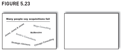
You want to tell your audience that acquisitions fail more often than they succeed. To support your conjecture, you show a list of companies who have done reports showing this (Figure 5.24).
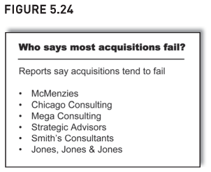
Because you’ve gone to the trouble of writing the bullet point list, your audience will feel obliged to read it – which sets up a conflict: do the audience read the words or listen to you? And if they read the words, the presenter and audience get out of sync – people read faster than they can speak.
Yet this is all so unnecessary. You actually don’t want people to read the names, you just want to give the impression that quite a few companies say acquisitions fail.
So instead do a slide that gives that impression but which doesn’t set up a conflict, one which doesn’t invite people to read it so much. Lay the words haphazardly around the page, rather than linearly down the page (Figure 5.25). At a glance, readers get the general impression that eminent names have said acquisitions fail. Then, rather than twisting and turning their necks one way then another to try to read it, there is a good chance that the audience will give up and instead listen to your words.
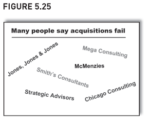
Which is what you wanted them to do all along.
Show nothing
If a slide helps bring across your point more effectively, do one. If not, don’t bother.
When giving training, I start by saying the course is one-third tables, one-third graphs, one-third words. Then a little while later, I return to this comment and say that it might have confused some people – after all, I merely said it. Maybe some people would grasp the comment better if I showed a bullet point slide – and then I click to the one shown in Figure 5.26. Then I say that some people like to grasp their information visually – ‘the trend is their friend’. So to help them, I show another slide, this time of two graphs (Figure 5.27).
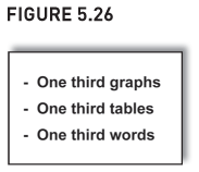
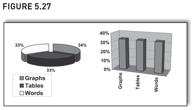
Of course, both slides are preposterous. Neither was necessary – the comment was fine on its own. You don’t need to accompany every comment with a bullet point, you don’t need to plot a graph or do a table every time you have some numbers.
Some presenters or audiences might prefer something other than a blank screen or the previous slide that’s still sitting up there. So, if talking about why the company is restructuring, just show a slide that says ‘Why restructure?’ and then talk over it. The slide will remind people what you are talking about if their minds wander off for a bit.
Also, writing ‘Why restructure?’ keeps your presentation flexible. If your points change just before you give the talk, you don’t have to change your bullet points. And keeping the slide so minimalist is similar to just showing two big numbers (‘£10m’, ‘five years’) – it’s a confident, ‘big-picture’ approach to presenting and, again, it helps you look like a senior manager. (Maybe you are.)
We’ve now seen many different ways to show information in slides, ways that help you achieve your goals more effectively than bullet points. But if we get rid of bullet points, how will presenters know what to say? The next section explains how.
‘Let’s just talk about your business’
A corporate buyer once told me how he wanted companies to pitch for business by having a conversation with him. He didn’t want to sit and passively listen to a presentation and read some slides. He wanted to explore how two companies could work together as client and supplier. His sentiments are echoed in a book by Louis Gerstner who describes his early days as President of IBM.
One of the first meetings I asked for was briefing on the state of the mainframe computer business … At that time, the standard format of any important IBM meeting was a presentation using overhead projectors
and graphics that IBMers called ‘foils’ (projected transparencies). Nick was on his second foil when I stepped to the table and, as politely as I could in front of his team, switched off the projector. After a long moment of awkward silence, I simply said, ’Let’s just talk about your business’.
I mention this episode because it had an unintended, but terribly powerful ripple effect. By that afternoon, an e-mail about my hitting the Off button on the overhead projector was crisscrossing around the world. Talk about consternation! It was as if the President of the United States had banned the use of English at White House meetings.
Source: From Who Says Elephants Can’t Dance? Inside IBM’s Historic Turnaround by Louis Gerstner Junior (2002, HarperCollins page 43) – and thanks to Edward Tufte’s book for bringing it to my attention.
‘But the bullets are my script …’
Bullet points are often for the presenter’s benefit, not the audience’s. They are to remind the presenter what to say. In which case, is it possible to replace lots of bullet point slides with cartoons, acronyms, cluster charts, tables of ticks and crosses, and so on? Without bullets, presenters will have to remember the script, and whilst this might be OK for trainers who present the same thing week in, week out, is it practical for business people doing one-off presentations to client targets? Also, having the script on the screen does help presenters who are a little nervous.
Life with fewer bullets needn’t be a problem, though. Presenters may even find it easier without them, not harder, and because of the different dynamic it creates between slide, presenter and audience, you will be seen to be a better presenter. The table below explains why:
Yes, it may be intimidating for presenters when they first move away from a slide show designed almost entirely around bullet points. But it’s also amazingly liberating, both for presenter and audience. And it’s a virtuous circle. The more you do it, the more you crave to do again. Once the genie is out the bottle, once contact has been made with the audience, it’s difficult to go back to how it used to be.
Having encouraged you to try something different to bullet points – or even do without them – the next section tells you how to do better bullet points.
Better bullet points
The section starting on page 32 explained when bullet points are acceptable, and its comments apply to slides as well as reports. Bullet points are a way of showing a list of brief items (sounds obvious, doesn’t it?). To tell your audience the five topics that the presentation will cover, five bullet points pretty much do it. To remind the audience of the six countries that are struggling, six bullets do the trick. In the middle of a complex presentation, bullet points are easy on the brain and your audience might appreciate the mental break from more unusual slides.
However, even though bullet points have a valid part to play in presentations, below are some dos and don’ts. The first few apply to all bullet points, be they in slides or reports, whilst the rest are more just for slides. Also, remember the caveats listed on page 32, they apply to slides too:
- Use bullet points in moderation.
- Use them to denote only a single hierarchy, not multiple ones (use ‘WiT’ if multiple hierarchies).
- Don’t expect too much from them – they aren’t memorable nor visually lift points from the slide.
| (Bracketed numbers cross-refer to other chapters and sections for more detail.) | Tips for all bullet points |
| Start at the end and maybe start at the end for each bullet? And make the summary typographically different from the rest of the bullet |
Put the overall conclusion as the lead-in to the bullet points, it gives readers context and helps the skim reader. It makes it easier to refer back and find information (step 1, page 7). |
| Segment, order, maybe strip out | Sort between good and bad, important and unimportant, recurring and non-recurring or whatever. Then put in some order other than merely alphabetical. Also, strip out less material items, they lessen the impact of the comments that really do matter (step 2, page 8). |
| Maybe number your points instead | If you number them, you are more likely to think about their order. Also, it’s easier to refer to a particular point in a numbered list. |
| Put in columns | Readers struggle with wide rows of text (see page 198). |
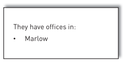
| Avoid just one bullet | It looks silly and is pointless: |
|
|
| Is that it? Just the one? Has the author forgotten to mention a couple? | |
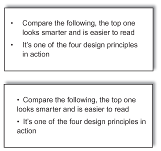
| Indent all the text in the bullet, not just the first line | Compare the following – the top one looks smarter and is easier to read. |
|
|
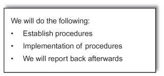
| Ensure grammatically consistent | Each bullet is grammatically different to the others. It’s similar to the example on page 159 – remember Winston Churchill’s speech done in PowerPoint? It’s unprofessional. Also, poor writing is a sign of poor thinking – if the authors can’t be bothered to correct the grammar, they probably haven’t sorted, grouped or clustered either. The underlying analysis is probably suspect too. |
|
|
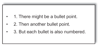
| Avoid numbering as well as bullets | This is what I mean by ‘numbering as well as bullets’: |
|
|
| Very weird. Very freaky. |
| More relevant for slides | |
| Use a sans serif typeface | Fonts such as Arial are legible, so are better for readers to glance at on a screen. Compare this to Times New Roman which is readable and better for continuous text on a page (page 197). |
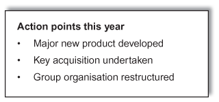
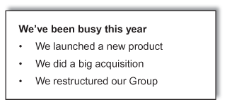
| Use the active voice ‘we’ and ‘you’ | Don’t do a slide that says: |
|
|
| Instead, write this, you will engage and inspire more: | |
|
|
| If appropriate, give the slide a decent lead-in title* | To tell people how well the new product is doing, don’t head up the slide ‘New product update’. Say ‘A fantastic first year for the new product’. If telling people how busy this year’s been, don’t head up the slide ‘Key initiatives undertaken’. Say ‘A busy and productive year’. Maybe even try the ‘we’ word – ‘We’ve been busy and productive’. See above about using the ‘we’ word. |
| Also do this if reporting conclusions. If you’ve researched which countries to enter and a slide says it’s Australia, don’t head it up ‘Which country to enter?’ Say ‘Australia is best to enter’. | |
| Do a decent lead-in title* for all slides other than deliberately cryptic or kooky ones such as the massive ‘£10m’ (page 153) or ‘He wasn’t good at marketing’ (page 156) or the cartoon of Moses (page 157). | |
| *But remember your audience: some people don’t like this. Also, I haven’t done lead-in titles for slides in this chapter because I want you to compare the ‘before’ and ‘after’, rather than be distracted by my choice of lead-in title.) | |
| Avoid pidgin English, it can confuse | The slide says ‘ABC used to reduce errors’. Is this saying that ABC is a way to reduce errors? Or that ABC once reduced errors, but no longer does? Is it ‘yoozd’ or ‘yoost’? |
| The slide says ‘Competitor Z may be differentiated with new products’. Again, what does it mean? That Z has released new products already, but we aren’t sure if they’ve helped Z differentiate itself? Or Z could differentiate itself if it were to release some new products? | |
| Avoid Random upper Case, it’s distracting and Changes meanings | On bullet Points, some People Use ‘upper case’ whenever They want, Especially on Slides. Don’t, upper case isn’t A lifestyle Choice. It’s mandatory When you should use It and Not an option When you shouldn’t. I’m Not being pedantic, Worrying about ‘correct Usage’. Rather, upper Case creates ‘defined’ Terms that Have particular meanings. Also, it Is Distracting. Like This. |
| A closer look at the itinerary revealed that this was not to be our third world tour but a Third World Tour. And, really, there’s not a lot of logistics involved except ’Where’s the electricity?’ This is Spinal Tap, The Official Companion (2000, Bloomsbury, page 189) |
Also on bullet points in slides, how should you punctuate them? Personally, I don’t think it matters hugely so long as the punctuation is consistent.
But if you need some guidance3 try this:
- If there is a comma or semicolon at the end of each bullet, the next bullet should start ‘lower case’, and the last bullet should end with a full stop.
- If there is a full stop at the end of each bullet, the next bullet should start ‘upper case’.
- If there is nothing at the end, start the next bullet how you want, either in ‘upper’ or ‘lower’ case – but Avoid random Upper case.
My personal preference is to start each bullet in ‘upper’ case and have no punctuation at the end. It is more minimalist, and for slides, less is definitely more.
Finally, for a more hard-line view of bullet points, read Edward Tufte’s fascinating 32-page pamphlet that pretty much argues for a worldwide ban on PowerPoint. It’s interesting and thought-provoking stuff. See the Bibliography for more.
The next section looks at which tips in this book can be ignored when doing slides.
When to bend ‘rules’ for slides
The dynamic for a presentation is different to that for a report. With a report, readers can go at their own pace. If they find something tough, they can skip and go back later, or they can read it again and again until they’ve got it. If they’re a bit bored, they can take a break. With presentations, though, the audience has to go at the same pace as the presenter, so presenters need to be a bit more flexible. Which is a euphemism for ‘for slides, ignore some of the ideas in the rest of this book’.
Finally, before we summarise, we look at handouts. They are often done badly and we explore how to do them better.
How to do a great handout
Remember this slide (Figure 5.28)? It doesn’t make a good handout – it isn’t much of a reminder of a presentation’s content. It also isn’t much use for those that didn’t attend the talk – what exactly is the slide saying?
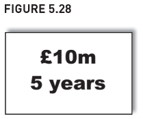
The answer is not to change the slide but to change the handout. To better understand this, let’s step back and see how slides are created. Someone decides they want to put a few bullet points on a slide. Then someone realises the slides are to be printed off and handed out as a reminder of the presentation and to provide the detailed support for some of the presentation’s comments. So the presenter crams more detail on the slide, e.g. a table of figures, or more explanatory words or whatever, and, yes, the slides now give the detail.
Which means the slides end up too detailed to be a decent presentation and not detailed enough to be a decent stand-alone report. Because the slides have tried to serve two masters, they have failed in both.
The answer is to produce two different documents: slides that work as a presentation, and a report that works as a stand-alone document. This is not the answer you want to hear: people never have enough time to prepare the slides, let alone prepare two separate documents. But it is a trade-off: do you wish to fail on both counts, or put in a bit of extra effort and succeed on both?
Anyway, when preparing slides and reports, many jobs go to the wire not because insufficient time was allowed to do the job, but because of poor project planning and control – everything gets concertinaed into the last week. So with better project planning and control, you should be able to do a handout that is more than just a printout of the slides. (It’s easy for me to sit here saying this.)
If you do, you’ll have slides that work as slides and a handout that works as a handout. Which is a target worth aiming for.
Final thoughts and recap
Bullet point slides aren’t evil, it’s what people do to them and expect of them that makes them sometimes seem evil. People use too many, show 50 bullet point slides on the trot and the audience end up inwardly screaming for it to end. Others use bullet points as their script with slides crammed full of words that the presenter reads out. When done to excess, the presenter isn’t even needed, because the audience could simply read the slides themselves. Others believe bullet points possess magical powers to visually lift points from slides, to explain complex interrelationships, to inspire audiences or help people remember things.
They don’t. But there are ways to do these and this chapter has given a few ideas. Flick through them when next preparing a presentation. Use them to help you achieve your goals. Use them to reinforce better. Use them to give more impact, interest and variety to your presentation.
Recap
Try ‘WiT’ (Words in Tables) or two-by-two grids.
Or maybe decision trees, tables of ticks and crosses or a cluster chart.
If you want your audience to remember your message, to have unprompted recall of it, try a quote, an acronym, a cartoon or just show one or two really big numbers or words.

If you want your audience to listen to you rather than read your slide, don’t give them a slide to read. Lay items around the page haphazardly or just show nothing. It’s surprising how often this last one is best. If a slide helps bring across your point more effectively, do one. If not, don’t.
Along the way we stumbled across other points and tips:
| Avoid PowerPoint paraphernalia | Avoid clipart, trendy arrows and ‘jigsaws’. Don’t let style triumph over content. |
| Never have a metaphor run through the entire presentation | Don’t contort all your points to fit a particular sporting metaphor, it becomes tedious and contrived. |
| Build a library of ideas | Look out for interesting cartoons, images or acronyms. Look out for decent quotes. Crib ideas from other people’s presentations. |
| Ring the changes to keep your audience on board | Mix up your slides a bit. Don’t have too many similar slides one after the other (e.g. 20 bullet point slides one after the other, or 20 graphs, etc.). Use a bit of colour. And remember your audience. |
| If using bullet points … | Start at the end. Segment, order, maybe strip out. Maybe number the points (but don’t use bullets as well). Put in columns, not wide rows of text. Avoid just one bullet. Indent all text, not just the first line. Ensure grammatically consistent. Use a sans serif face. Use the active voice, use the ‘we’ and ‘you’ words. Give slides a decent lead-in title. Avoid pidgin English. Avoid Random upper Case. |
| Try to avoid using your slides as a handout | Do a handout that is more than just a copy of your slides. If not, you will be asking your slides to meet two different objectives and they can all too easily fail at both. |
If this sounds a lot of work, it isn’t all bad news – sometimes it can save work. Try this question: Which of these takes more time to edit and get everyone to agree on the words:
- A slide with six bullet points, each with about 12 words?
- A slide that simply says ‘He wasn’t very good at marketing’?
If the detailed points change, which slide takes longer to edit to reflect the changes?
And with the quote, not only will you save time, but you will inform, influence, engage, reinforce and internalise.
Which is not bad for just six words on a slide.
1Quote taken from The Business Book of Quotations, compiled by Eugene Weber and originally printed in Fortune, 27 April 1987.
2Taken again from The Business Book of Quotations, compiled by Eugene Weber and originally printed in the Financial Times list of ‘Quotes of the Year’, 30 December 1989.
3If you’ve read Chapter 4, you’ll realise how this guidance should be shown. Because it says ‘if this, then that, if that, then the other’, it should be in a decision tree. But if I were to do a decision tree for punctuating bullet points, you’d think I’d gone mad.
