Figure 65: A Sample Android Screen
There is a decent chance that you have already done work with widget-based UI frameworks. In that case, much of this chapter will be review, though checking out the section on the absolute positioning anti-pattern should certainly be worthwhile.
There is a chance, though, that your UI background has come from places where you have not been using a traditional widget framework, where either you have been doing all of the drawing yourself (e.g., game frameworks) or where the UI is defined more in the form of a document (e.g., classic Web development). This chapter is aimed at you, to give you some idea of what we are talking about when discussing the notion of widgets and containers.
Wikipedia has a nice definition of a widget:
In computer programming, a widget (or control) is an element of a graphical user interface (GUI) that displays an information arrangement changeable by the user, such as a window or a text box. The defining characteristic of a widget is to provide a single interaction point for the direct manipulation of a given kind of data. In other words, widgets are basic visual building blocks which, combined in an application, hold all the data processed by the application and the available interactions on this data.
(quote from the 7 March 2014 version of the page)
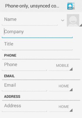
Take, for example, this Android screen:
Figure 65: A Sample Android Screen
Here, we see:
Everything listed above is a widget. The user interface for most Android screens (“activities”) is made up of one or more widgets.
This does not mean that you cannot do your own drawing. In fact, all the existing widgets are implemented via low-level drawing routines, which you can use for everything from your own custom widgets to games.
This also does not mean that you cannot use Web technologies. In fact, we will see later in this book a widget designed to allow you to embed Web content into an Android activity.
However, for most non-game applications, your Android user interface will be made up of several widgets.
Widgets have some sort of size, since a zero-pixel-high, zero-pixel-wide widget is not
especially user-friendly. Sometimes, that size will be dictated by what is inside the
widget itself, such as a label (TextView) having a size dictated by the text in the
label. Sometimes, that size will be dictated by the size of whatever holds the
widget (a “container”, described in the next section), where the widget wants to take
up all remaining width and/or height. Sometimes, that size will be a specific set of
dimensions.
Widgets can have margins. As with CSS, margins provide separation between a widget and anything adjacent to it (e.g., other widgets, edges of the screen). Margins are really designed to help prevent widgets from running right up next to each other, so they are visually distinct. Some developers, however, try to use margins as a way to hack “absolute positioning” into Android, which is an anti-pattern that we will examine later in this chapter.
Widgets can have padding. As with CSS, padding provides separation between the contents of a widget and the widget’s edges. This is mostly used with widgets that have some sort of background, like a button, so that the contents of the widget (e.g., button caption) does not run right into the edges of the button, once again for visual distinction.
Containers are ways of organizing multiple widgets into some sort of structure. Widgets do not naturally line themselves up in some specific pattern — we have to define that pattern ourselves.
In most GUI toolkits, a container is deemed to have a set of children. Those children are widgets, or sometimes other containers. Each container has its basic rule for how it lays out its children on the screen, possibly customized by requests from the children themselves.
Common container patterns include:
In the sample activity above, the dominant pattern is a column, with things laid out from top to bottom. Some of those things are rows, with contents laid out left to right. However, as it turns out, the area with most of those widgets is scrollable.
Android supplies a handful of containers, designed to handle most common scenarios, including everything in the list above. You are also welcome to create your own custom containers, to implement business rules that are not directly supported by the existing containers.
Note that containers also have size, padding, and margins, just as widgets do.
You might wonder why all of these containers and such are necessary. After all, can’t you just say that such-and-so widget goes at this pixel coordinate, and this other widget goes at that pixel coordinate, and so on?
Many developers have taken that approach — known as absolute positioning – over the years, to their eventual regret.
For example, many of you may have used Windows apps, back in the 1990’s, where when you would resize the application window, the app would not really react all that much. You would expand the window, and the UI would not change, except to have big empty areas to the right and bottom of the window. This is because the developers simply said that such-and-so widget goes at this pixel coordinate, and this other widget goes at that pixel coordinate, regardless of the actual window size.
In modern Web development, you see this in the debate over fixed versus fluid Web design. The consensus seems to be that fluid designs are better, though frequently they are more difficult to set up. Fluid Web designs can better handle differing browser window sizes, whether those window sizes are because the user resized their browser window manually, or because those window sizes are dictated by the screen resolution of the device viewing the Web page. Fixed Web designs — effectively saying that such-and-so element goes at such-and-so pixel coordinate and so on — tend to be easier to build but adapt more poorly to differing browser window sizes.
In mobile, particularly with Android, we have a wide range of possible screen resolutions, from QVGA (320x240) to beyond 1080p (1920x1080), and many values in between. Moreover, any device manufacturer is welcome to create a device with whatever resolution they so desire – there are no rules limiting manufacturers to certain resolutions. Hence, as developers, having the Android equivalent of fluid Web designs is critical, and the way you will accomplish that is by sensible use of containers, avoiding absolute positioning. The containers (and, to a lesser extent, the widgets) will determine how extra space is employed, as the screens get larger and larger.
In Web development, we have had stylesheets for quite a while. Through such Cascading Style Sheets (CSS) files, we can stipulate various rules about how our Web pages should look. This includes:
<h1> and <h2> elements)<div> to a certain number of CSS pixels)In Android, the equivalent concepts can be found in styles and themes. Styles are a collection of values for properties (e.g., have a foreground color of red). These can be applied to specific widgets (e.g., this label should adopt this style), or they can be employed by “themes” that provide the default look for all sorts of widgets and other elements of our UI.
Of course, you do not have to declare any theme for your app. Android will
give you a default look-and-feel without any specific theme. That look-and-feel
has varied over the years, though, affecting the visual fundamentals of
various Android widgets. These themes have names by which we refer to them:
Theme, Theme.Holo, and Theme.Material.
Way back in Android 1.0, the default theme was known simply as Theme.
Technically, all themes inherit from Theme, much as how later CSS stylesheets
effectively “inherit” the settings established by prior stylesheets.
The Theme UI had a particular look to it:
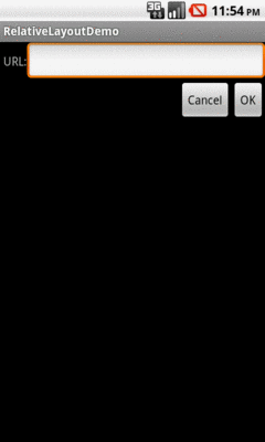
Figure 66: Labels, Fields, and Buttons in Theme
For example:
EditText widget) had a bright orange
outline, whereas normally it was a plain white rectangleAndroid 3.0 (API Level 11) introduced a new default theme,
Theme.Holo, with the so-called “holographic widget theme”.
This changed the look of our UI somewhat:
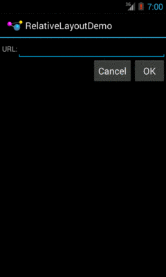
Figure 67: Labels, Fields, and Buttons in Theme.Holo
Now:
Android 5.0 changed the default theme yet again, to
Theme.Material:
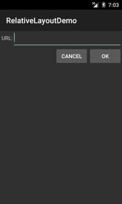
Figure 68: Labels, Fields, and Buttons in Theme.Material
Now:
Theme.Holo
Of course, we can do a lot more than just use these. There are other stock themes, with different characteristics. Furthermore, we can customize the themes, by defining our own (inheriting from a stock theme) and changing some of the properties (e.g., replacing the teal color with something else).
We will get much more into creating custom styles and themes later in the book.
However, we will see the effects of Theme, Theme.Holo, and
Theme.Material on stock widgets in an upcoming chapter.