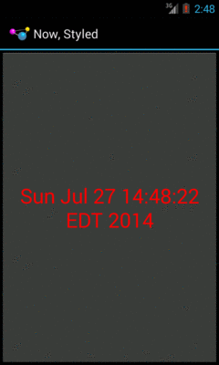
Figure 186: The Styles/NowStyled sample application
As noted in an earlier chapter, Android offers styles and themes, filling the same sort of role that CSS does in Web development. In that earlier chapter, we covered the basic roles of styles and themes, plus introduced the three classic theme families:
ThemeTheme.HoloTheme.MaterialIn this chapter, we will take a slightly “deeper dive” into styles and themes, exploring how you can create your own and apply them to your app’s UI.
The purpose of styles is to encapsulate a set of attributes that you intend to use repeatedly, conditionally, or otherwise wish to keep separate from your layouts proper. The primary use case is “don’t repeat yourself” (DRY) — if you have a bunch of widgets that look the same, use a style to use a single definition for “look the same”, rather than copying the look from widget to widget.
And that paragraph will make a bit more sense if we look at an example,
specifically
the Styles/NowStyled sample project.
This is a trivial project,
with a full-screen button that shows the date and time of when the activity was
launched or when the button was pushed. This time, though, we want to change
the way the text on the face of the button appears, and we will do so using a
style.
The res/layout/main.xml file in this project has a style attribute on
the Button:
<?xml version="1.0" encoding="utf-8"?>
<Button xmlns:android="http://schemas.android.com/apk/res/android"
  android:id="@+id/button"
  android:text=""
  android:layout_width="match_parent"
  android:layout_height="match_parent"
  style="@style/bigred"
/>
Note that the style attribute is part of stock XML and therefore is not in
the android namespace, so it does not get the android: prefix.
The value, @style/bigred, points to a style resource. Style resources are
values resources and can be found in the res/values/ directory in your
project, or in other resource sets (e.g., res/values-v11/ for values
resources only to be used on API Level 11 or higher). The convention is for
style resources to be held in a styles.xml file, such as the one from the
NowStyled project:
<?xml version="1.0" encoding="utf-8"?>
<resources>
  <style name="bigred">
    <item name="android:textSize">30sp</item>
    <item name="android:textColor">#FFFF0000</item>
  </style>
</resources>
The <style> element supplies the name of the style, which is what we use when
referring to the style from a layout. The <item> children of the <style>
element represent values of attributes to be applied to whatever the style is
applied towards — in our example, our Button widget. So, our Button
will have a comparatively large font (android:textSize set to 30sp) and
have the text appear in red (android:textColor set to #FFFF0000).
Just defining the style and applying it to the widget gives us the desired results:
Figure 186: The Styles/NowStyled sample application
There are four elements to consider when applying a style:
The style attribute can be applied to a widget, to only affect that widget.
The style attribute can be applied to a container, to affect that container.
However, doing this does not automatically style its children. For example,
suppose res/layout/main.xml looked instead like this:
<?xml version="1.0" encoding="utf-8"?>
<LinearLayout xmlns:android="http://schemas.android.com/apk/res/android"
    android:layout_width="match_parent"
    android:layout_height="match_parent"
    style="@style/bigred">
  <Button
    android:id="@+id/button"
    android:text=""
    android:layout_width="match_parent"
    android:layout_height="match_parent"
  />
</LinearLayout>
The resulting UI would not have the Button text in a big red font, despite
the style attribute. The style only affects the container, not the contents
of the container.
You can also apply a style to an activity or an application as a whole, though then it is referred to as a “theme”, which will be covered a bit later in this chapter.
When styling a widget or container, you can apply any of that widget’s or container’s attributes in the style itself. So, if it shows up in the “XML Attributes” or “Inherited XML Attributes” portions of the Android JavaDocs, you can put it in a style.
Note that Android will ignore invalid styles. So, had we applied the bigred
style to the LinearLayout as shown above, everything would run fine, just
with no visible results. Despite the fact that LinearLayout has no
android:textSize or android:textColor attribute, there is no compile-time
failure nor a runtime exception.
Also, layout directives, such as android:layout_width, can be put in a style.
You can also indicate that you want to inherit style attributes from another
style, by specifying a parent attribute on the <style> element.
For example, take a look at this style resource:
<?xml version="1.0" encoding="utf-8"?>
<resources>
  <style name="activated" parent="android:Theme.Holo">
    <item name="android:background">?android:attr/activatedBackgroundIndicator</item>
  </style>
</resources>
(note: in some renditions of this book, you may see the <item> element split
over two lines — this is caused by word-wrapping, as this element should
be all on one line)
Here, we are indicating that we want to inherit the Theme.Holo style from
within Android. Hence, in addition to all of our own attribute definitions, we
are specifying that we want all of the attribute definitions from Theme.Holo
as well.
In many cases, this will not be necessary. If you do not specify a parent, your attribute definitions will be blended into whatever default style is being applied to the widget or container.
That ?android:attr looks a bit bizarre, but we will get into what that
syntax means in the next section.
Typically, the value that you will give those attributes in the style will be
some constant, like 30sp or #FFFF0000.
Sometimes, though, you want to perform a bit of indirection — you want to
apply some other attribute value from the theme you are inheriting from. In
that case, you will wind up using the somewhat cryptic ?android:attr/ syntax,
along with a few related magic incantations.
For example, let’s look again at this style resource:
<?xml version="1.0" encoding="utf-8"?>
<resources>
  <style name="activated" parent="android:Theme.Holo">
    <item name="android:background">?android:attr/activatedBackgroundIndicator</item>
  </style>
</resources>
Here, we are indicating that the value of android:background is not some
constant value, or even a reference to a drawable resource (e.g.,
@drawable/my_background). Instead, we are referring to the value of some
other attribute — activatedBackgroundIndicator — from our inherited
theme. Whatever the theme defines as being the activatedBackgroundIndicator
is what our background should be.
This portion of the Android style system is very under-documented, to the point where Google itself recommends you look at the Android source code listing the various styles to see what is possible.
This is one place where inheriting a style becomes important. In the
example shown in this section, we inherited from Theme.Holo, because we
specifically wanted the activatedBackgroundIndicator value from Theme.Holo.
That value might not exist in other styles, or it might not have the value we
want.
Themes are styles, applied to an activity or application, via an
android:theme attribute on the <activity> or <application> element. If
the theme you are applying is your own, just reference it as @style/..., just
as you would in a style attribute of a widget. If the theme you are applying,
though, comes from Android, typically you will use a value with
@android:style/ as the prefix, such as @android:style/Theme.Holo.Dialog or
@android:style/Theme.Holo.Light.
In a theme, your focus is not so much on styling widgets, but styling the
activity itself. For example, here is the definition of
@android:style/Theme.Holo.NoActionBar.Fullscreen:
<!-- Variant of the default (dark) theme that has no title bar and
          fills the entire screen -->
<style name="Theme.Holo.NoActionBar.Fullscreen">
  <item name="android:windowFullscreen">true</item>
  <item name="android:windowContentOverlay">@null</item>
</style>
It specifies that the activity should take over the entire screen, removing the
status bar on phones (android:windowFullscreen set to
true). It also specifies that the “content overlay” — a layout that
wraps around your activity’s content view — should be set to nothing
(android:windowContentOverlay set to @null), having the effect of removing
the title bar.
Most of the sample apps that we have examined so far have not defined
a theme, either at the <application> level or the <activity> level.
What happens here then depends upon the device that your app runs upon:
Theme as your thememinSdkVersion or targetSdkVersion
is 11 or higher, you will get Theme.Holo as your theme; otherwise,
you will stick with Theme as your themetargetSdkVersion is 14
or higher, you will get Theme.Material as your theme; otherwise,
your app behaves as in the 3.x/4.x scenario aboveAs a result, your app is far from “broken”, despite the lack of an explicit theme. It does mean, though, that your app will have a different look on those different Android OS levels, a look that will tend to have your app blend in more with other apps on that same device.
However, once you want to start customizing your theme, you will now
run into a problem: having different themes for different OS versions.
An Android 2.x device knows nothing about Theme.Material, for example,
so you cannot simply create a custom theme based on Theme.Material
and expect it to work. As we will see
in a later chapter, the solution
winds up being versioned resources, where you have different theme
definitions for different API levels.
Of course, if your minSdkVersion is high enough, resource versioning
is less of an issue. For example, if your minSdkVersion is 21, all
devices that your app runs upon should know about Theme.Material, just
as if your minSdkVersion were 11 or higher, all devices that your app
would run on would know about Theme.Holo.
On Android Studio 1.5 and higher, there is a dedicated theme editor, which allows you to (somewhat) preview your theme and (somewhat) modify it visually.
When you open a style or theme resource, you will get a banner across the top of the XML editor, offering to open the theme in the theme editor:

Figure 187: The Styles/NowStyled Style Resource, with Banner
Clicking the “Open editor” link in that banner will bring up the Theme Editor tab:

Figure 188: The Android Studio Theme Editor
If the style resource does not define a style being used as a theme –
as is the case with the NowStyled sample app, you wind up with a
pretty, albeit read-only, way of seeing how colors and settings
in the theme will affect the action bar (labeled here as the “app bar”),
buttons, and so forth.
If you open the Theme Editor on a style resource that is being used as a theme, you may get a preview of that custom theme:
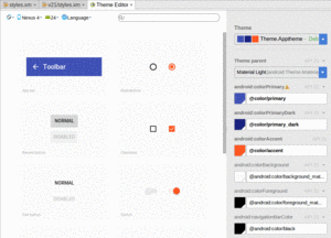
Figure 189: The Android Studio Theme Editor, For an Actual Theme
In places where you have overridden certain colors, such as the
android:colorPrimary attribute for a Theme.Material-based
theme, you can use a color picker to replace that color with a different
value:

Figure 190: The Android Studio Theme Editor’s Color Picker Dialog
As the dialog notes, if you change the color in the dialog, the editor will update the associated resources to match, and show you the revised value in the preview:
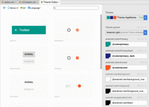
Figure 191: The Android Studio Theme Editor, For an Revised Theme
It is possible that this tool will gain greater utility in the years to come.